
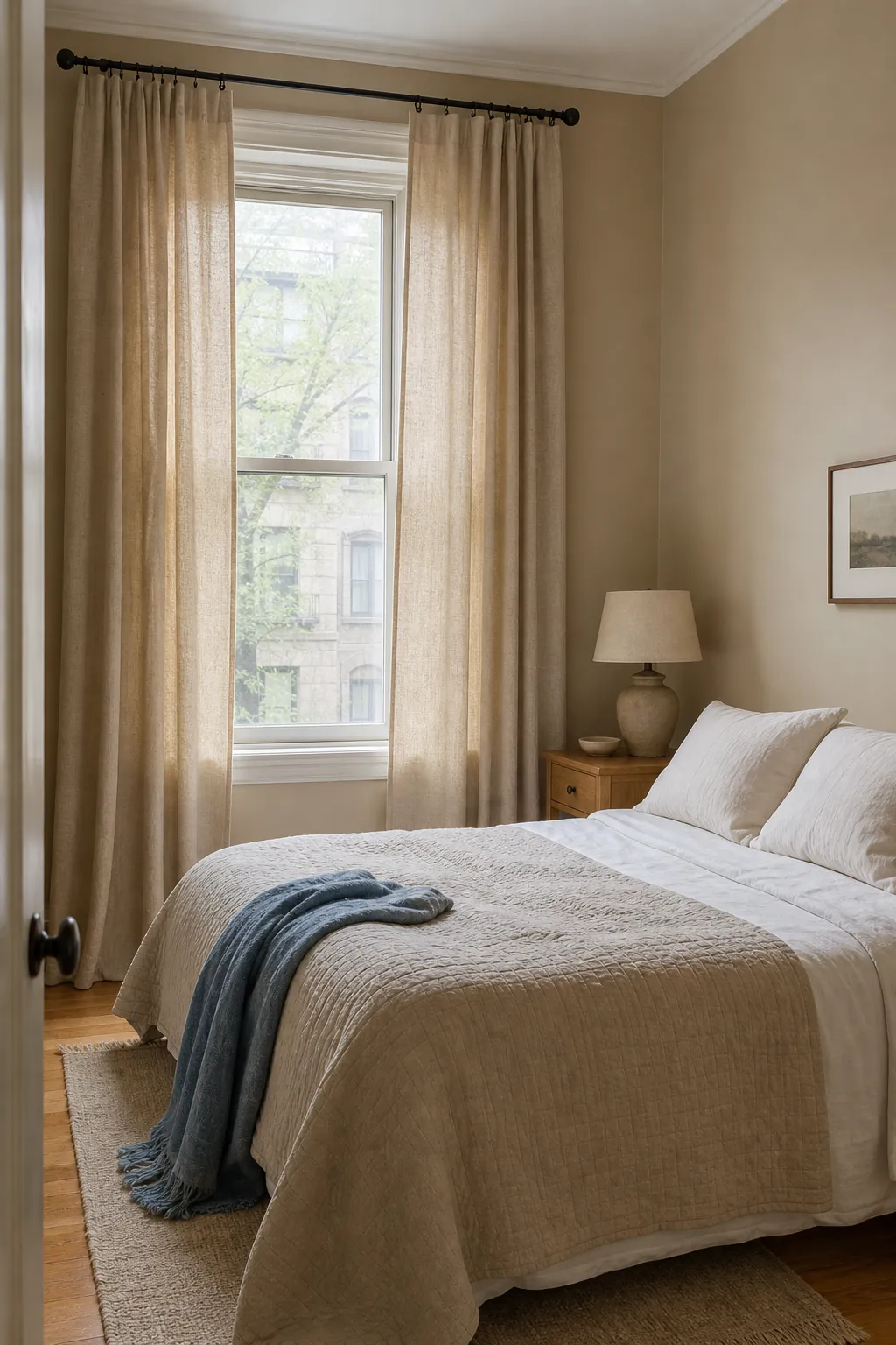
Beige walls and soft bedding give a bedroom a calm base, but the wrong curtains can flatten everything into one oatmeal-colored blur. The better approach is to treat window treatments as the room’s balancing layer: they can add contrast, repeat a bedding accent, sharpen the architecture, or quietly deepen the texture. These bedroom curtain ideas focus on combinations you can actually live with—good light control, believable fabric, and colors that remain restful at night.
Warm Ivory Linen Panels
Choose warm ivory rather than optic white when your beige walls lean yellow, tan, or sandy. The small undertone shift matters: stark white can make warm paint look dingy, while creamy linen keeps the transition gentle. A visible slub weave gives a neutral bedroom depth without introducing a busy pattern. Hang the panels near the ceiling and let them just kiss the floor so the window feels taller and the fabric stays clean.
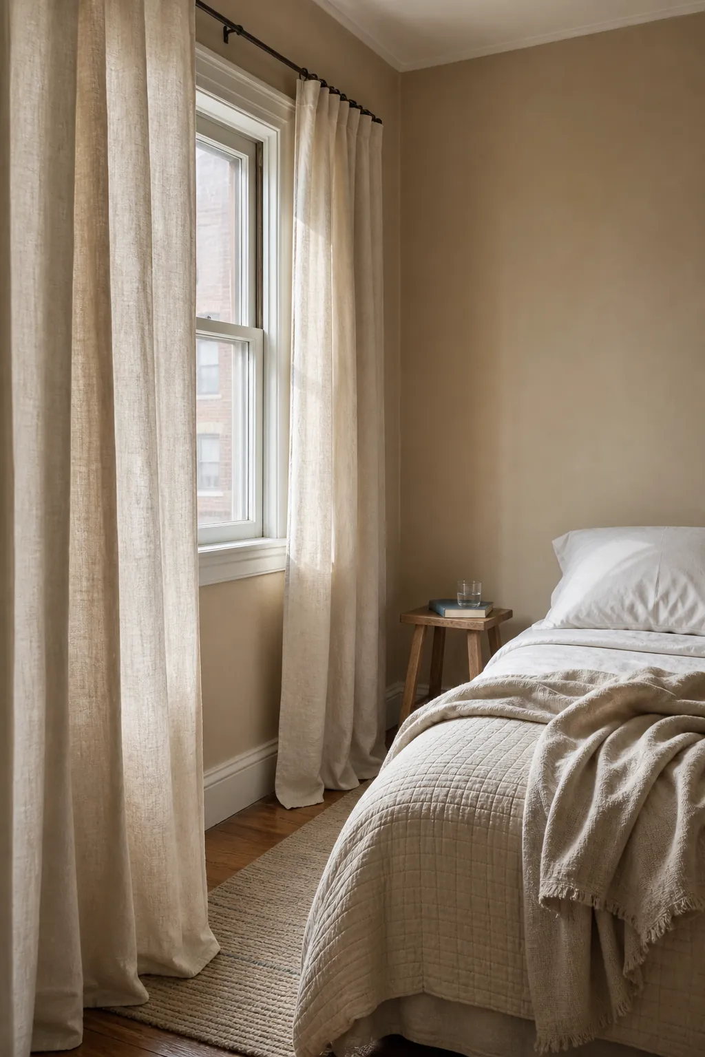
Mushroom Taupe Tonal Drapes
Mushroom taupe works when you want a cocooning neutral bedroom rather than obvious contrast. Pick a curtain one or two steps darker than the wall and compare samples in morning and lamplight; gray-heavy taupe can turn dull beside warm beige. Break up the tonal palette with white sheets, a nubby throw, and a darker wood bedside table. The room feels layered because values change, even though the colors stay quiet.
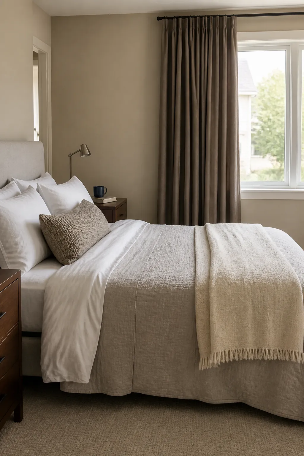
Dusty Blue Curtains for Cool Contrast
Dusty blue cools a warm beige room without making it feel stark. Choose a muted mineral blue rather than a sugary pastel, then repeat it once in a lumbar pillow or the narrow border of a quilt. Keep the rest of the bedding ivory, oatmeal, or pale gray. This controlled repetition makes the curtains look intentional while preserving the bed as the softest visual element.
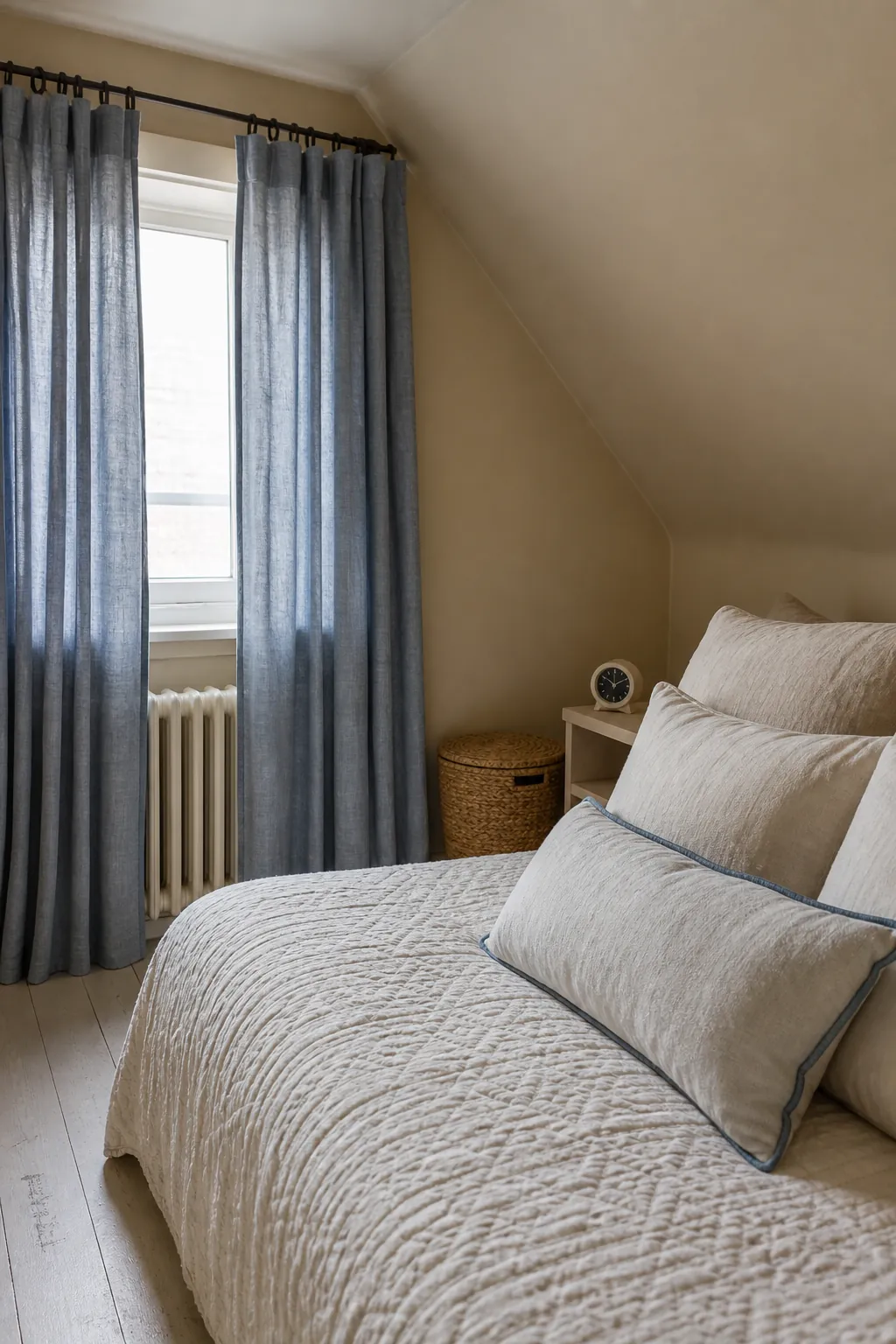
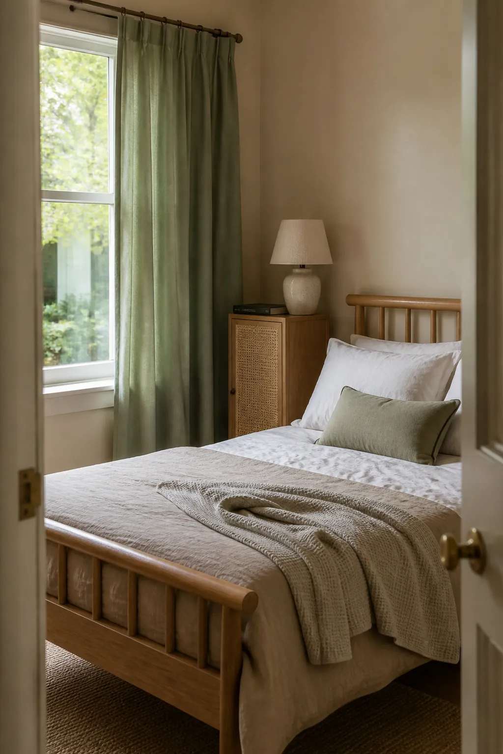
Sage Green Panels With Natural Texture
Sage green brings a grounded, botanical note to beige walls while remaining subdued enough for sleep. It looks especially convincing with washed cotton bedding, oak furniture, and woven baskets. Avoid pairing it with too many decorative plants or leaf prints; one muted green field is more restful than a themed room. A matte cotton-linen blend also keeps sage from reading shiny or synthetic.
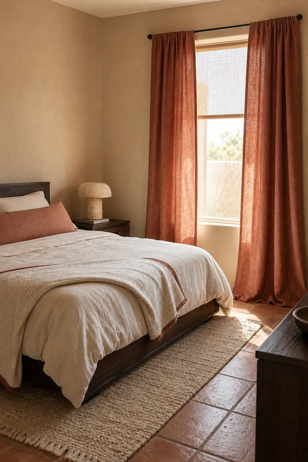
Soft Terracotta as a Warm Accent
Soft terracotta wakes up beige without pushing the bedroom into high contrast. Look for clay, cinnamon, or faded brick rather than vivid orange. Balance the color with a cream duvet and a single rust-toned throw folded at the foot of the bed. The curtains become the warmest note in the room, while pale bedding keeps the composition breathable.
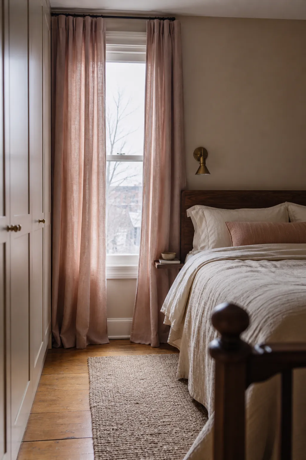
Blush Curtains With Oatmeal Bedding
A muted blush can soften beige walls without looking juvenile. Test rose-beige, dusty pink, or plaster pink fabrics against the paint and reject anything overly candy-colored. Oatmeal bedding, walnut wood, and aged brass keep the result grown-up. Texture does more work than saturation here: washed linen or brushed cotton makes blush feel calm and tactile.
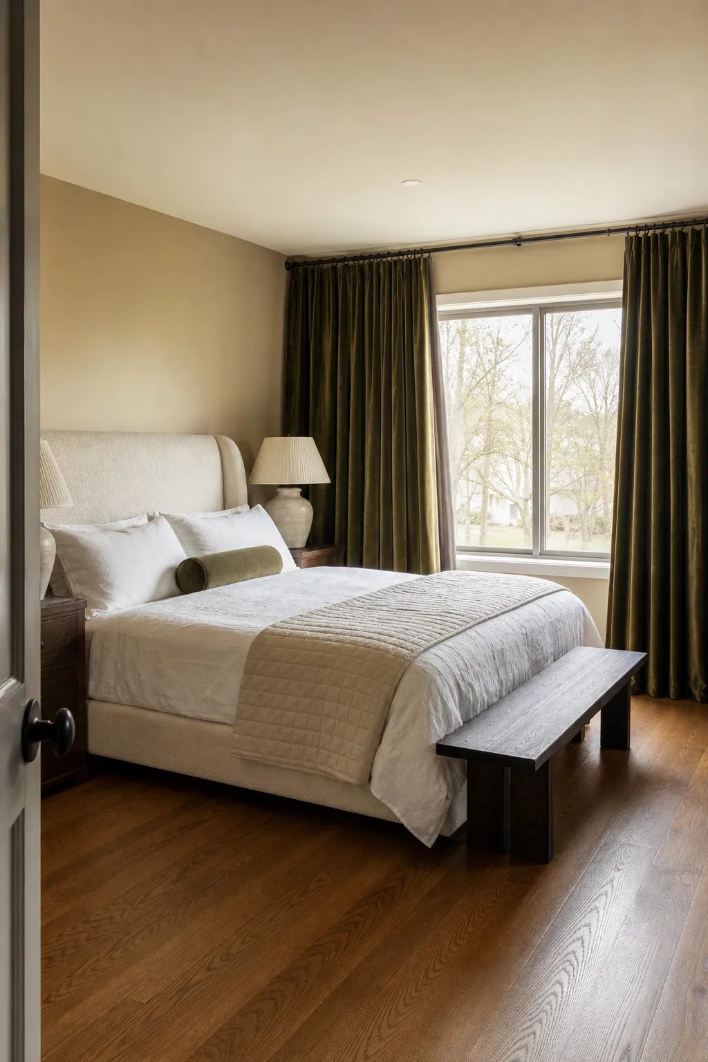
Olive Velvet for a Deeper Mood
Olive velvet is useful in a bright bedroom that needs visual weight and better evening darkness. The dense fabric frames pale bedding and makes beige walls feel warmer by comparison. Choose a low-sheen velvet, since glossy fabric can look theatrical. Repeat olive sparingly in one cushion or a small ceramic lamp, then let cream sheets and a light quilt prevent the room from becoming heavy.
Chocolate Brown Curtains With Crisp Sheets
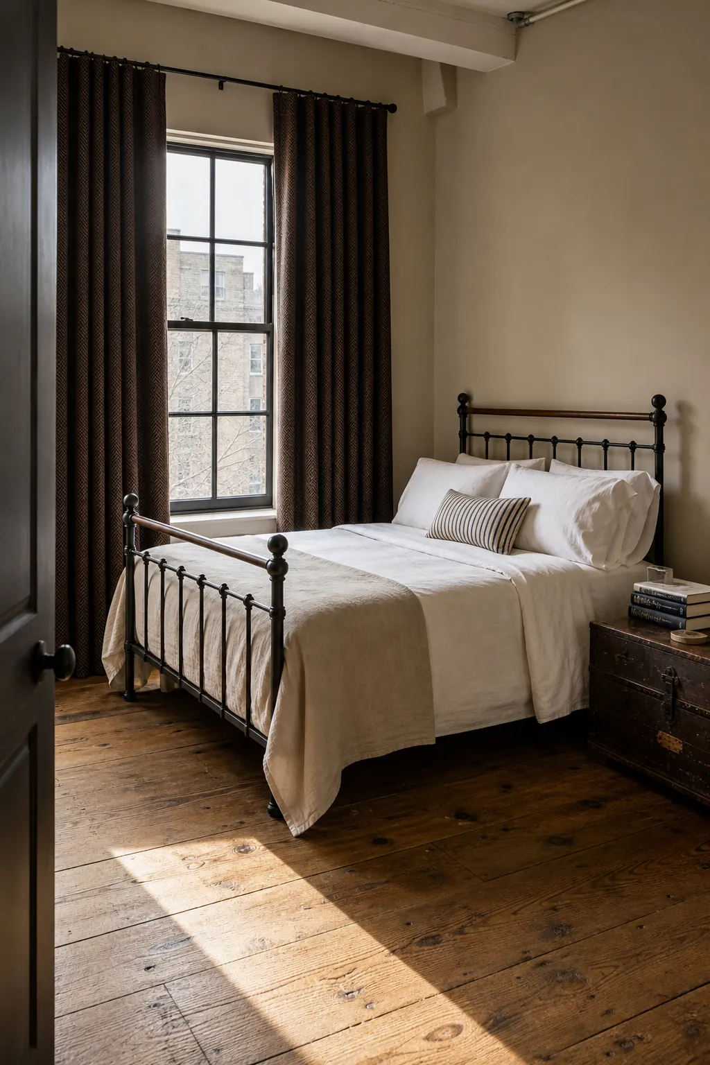
Chocolate brown outlines the window and gives an all-neutral scheme a clear anchor. It works best when the bedroom already has dark wood, bronze, or black accents that can carry the depth around the room. Pair the curtains with crisp off-white sheets and a beige coverlet. Dark curtains need light bedding nearby so the window does not become a visual hole.
Double-Layer Sheers and Blackouts
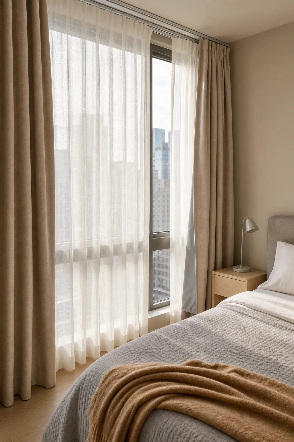
Layering solves the common bedroom conflict between daytime privacy and nighttime darkness. Mount a translucent ivory sheer closest to the glass and a lined neutral drape toward the room. Use a double rod or a track system with enough clearance for both layers to move freely. The sheer filters glare during the day, while the outer panel handles sleep, insulation, and streetlight.
Subtle Beige Stripe Curtains
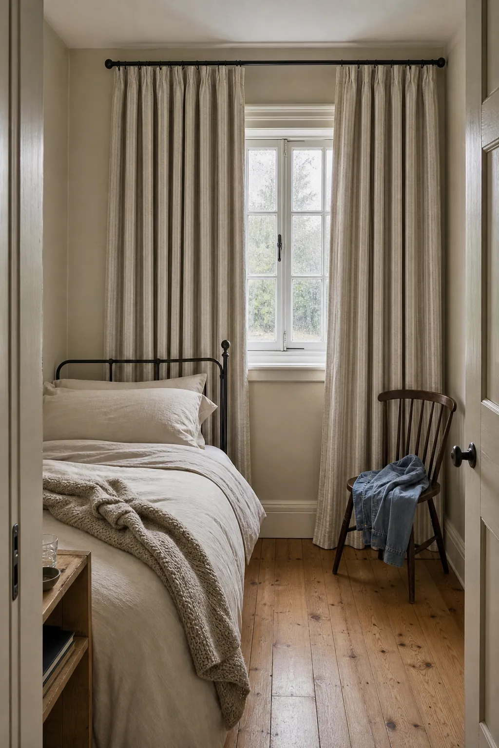
A narrow woven stripe adds rhythm without competing with soft bedding. Look for alternating ivory and flax yarns rather than a printed high-contrast stripe. Vertical lines reinforce the height of floor-length panels, especially when the rod sits several inches above the frame. Keep duvet covers mostly solid so the eye reads the curtain pattern as a quiet architectural detail.
Tiny Botanical Print Panels
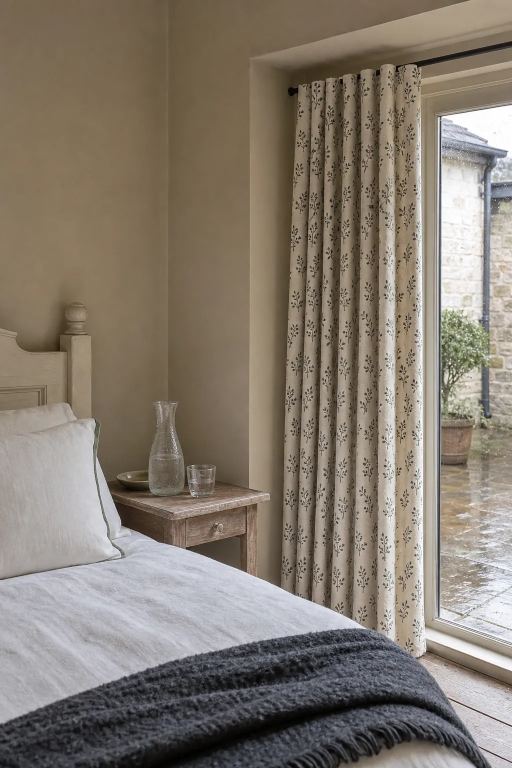
Small-scale botanical curtains suit beige bedrooms that feel too plain but do not need a bold feature wall. Pick a restrained print with two or three colors, such as charcoal stems on an ivory ground with faded green leaves. Pull only one print color into a pillow. The pattern should be legible up close and dissolve into texture from across the room.
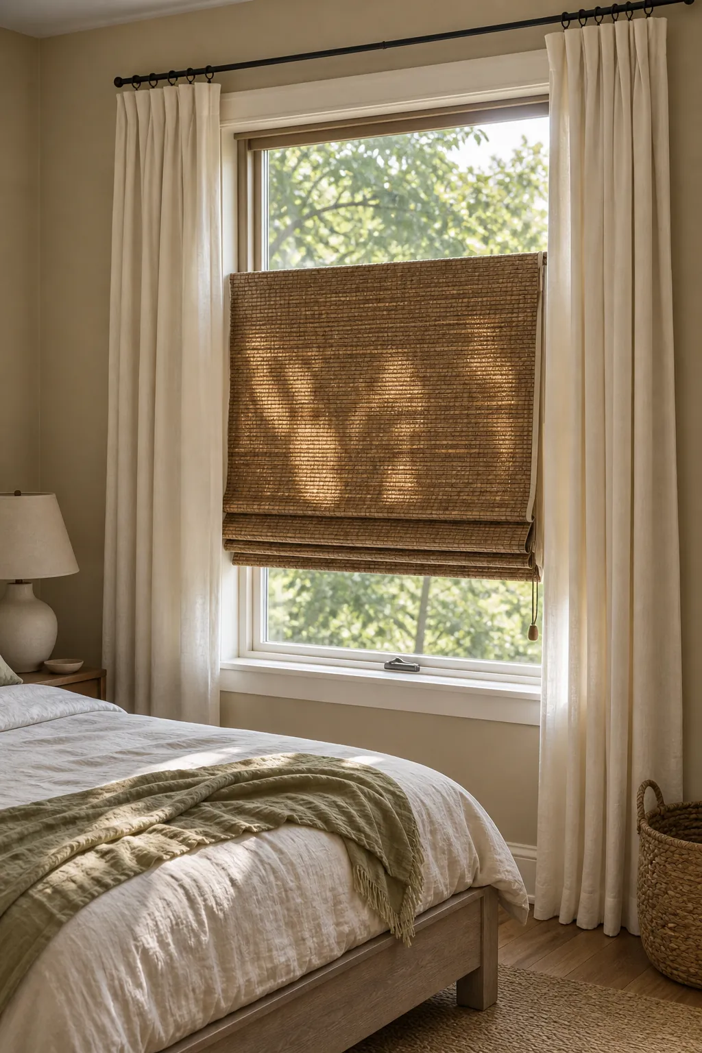
Natural Woven Shades With Side Panels
Pairing a bamboo or woven-grass shade with simple side panels gives a neutral bedroom more material contrast. The shade provides privacy and a defined window edge; the fabric panels soften the hard lines and widen the composition. Add a privacy or blackout liner if needed, because loosely woven shades alone rarely block silhouettes or early sun. This combination works particularly well with linen bedding and pale wood.
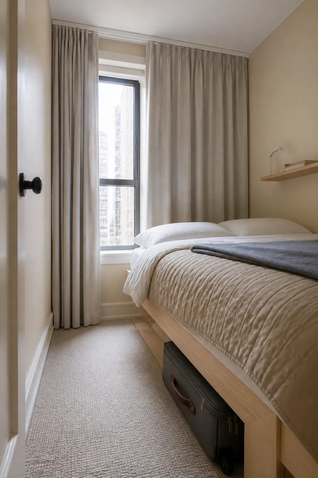
Ceiling-Height Curtains for a Small Bedroom
In a compact room, take the rod or ceiling track upward instead of adding more decoration. Full-height panels stretch the wall visually and conceal an awkwardly short window. Extend them beyond the frame so the fabric stacks mostly over the wall when open, preserving daylight. Measure finished length after the hardware is chosen; guessing is how otherwise elegant curtains end up hovering several inches above the floor.
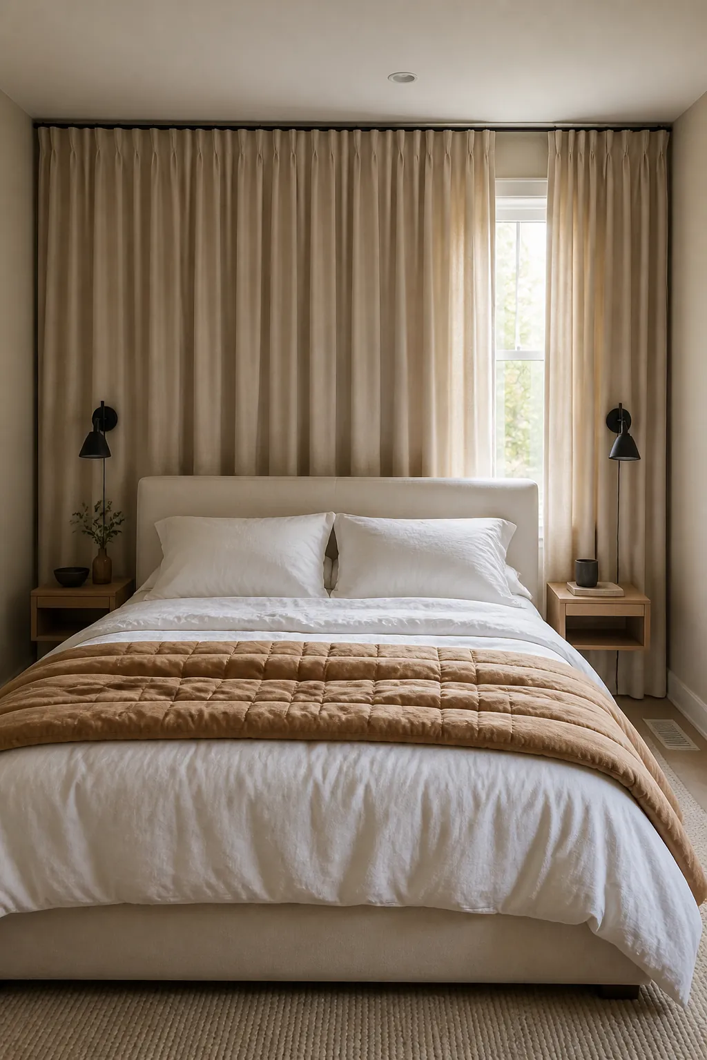
Wall-to-Wall Curtains Behind the Bed
A wall-to-wall curtain can correct an off-center window behind a bed and create the effect of a soft upholstered backdrop. Use a ceiling track, generous fullness, and a fabric close to the wall color so the surface feels architectural rather than theatrical. Confirm radiator, vent, and headboard clearances first. This treatment is especially effective when symmetry matters more than showing the exact window location.
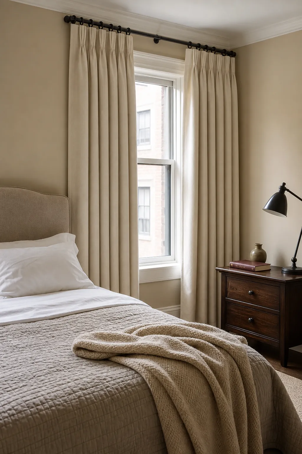
Pinch-Pleat Drapes With Tailored Bedding
Pinch pleats bring order to a bedroom filled with relaxed blankets and pillows. Their repeated folds look polished even when the curtains are open, and rings make them practical to draw each night. Pair the structured heading with a simple duvet, a neatly folded quilt, and fewer decorative cushions. Contrast in structure—not necessarily color—can make soft decor feel finished.
Relaxed Rod-Pocket Cotton Curtains
Rod-pocket cotton panels have an informal softness that suits cottage, casual, and budget bedrooms. They are best on windows you do not open and close constantly, because gathered fabric can drag on the rod. Choose substantial cotton with a sewn lining rather than a thin sheet-like panel. The imperfect gathers echo rumpled linen bedding without making the room look unfinished.
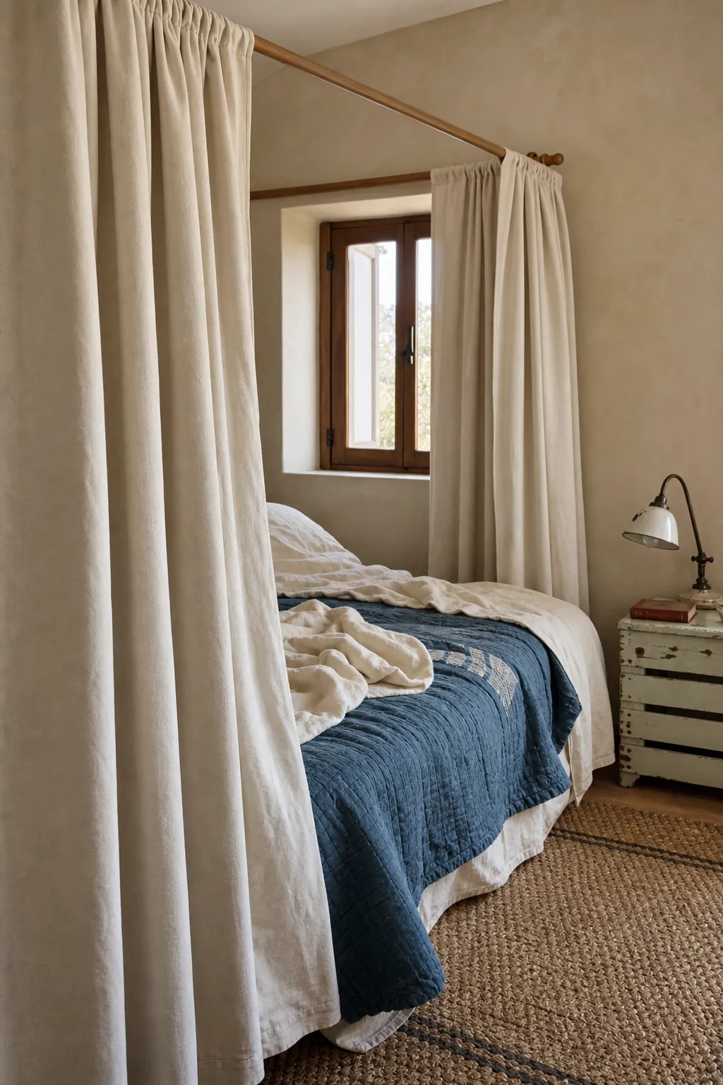
Black Curtain Rod With Pale Panels
A slim black rod gives pale curtains a crisp outline and links naturally to black lamps, picture frames, or bed legs. Keep the finials simple and repeat black only a few times, since heavy dark hardware can interrupt a restful palette. This is a useful fix when ivory-on-beige feels washed out: the narrow line adds definition without sacrificing lightness.
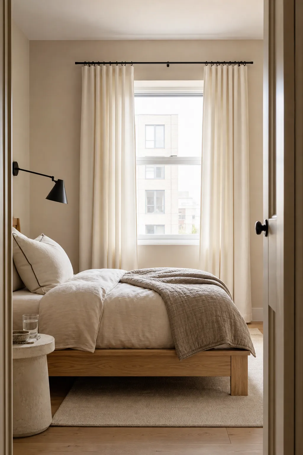
Antique Brass Hardware With Cream Drapes
Antique brass introduces warmth and a small amount of reflected light without the sharpness of chrome. Pair it with cream drapes, warm beige paint, and wood furniture that has similarly golden undertones. Choose one brass finish and repeat it in a bedside sconce or drawer pull. Mixing too many polished metals can distract from the fabric and make a simple bedroom feel busier than intended.
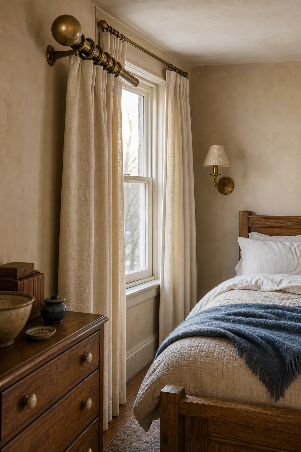
Perfectly Matched Beige With Rich Texture
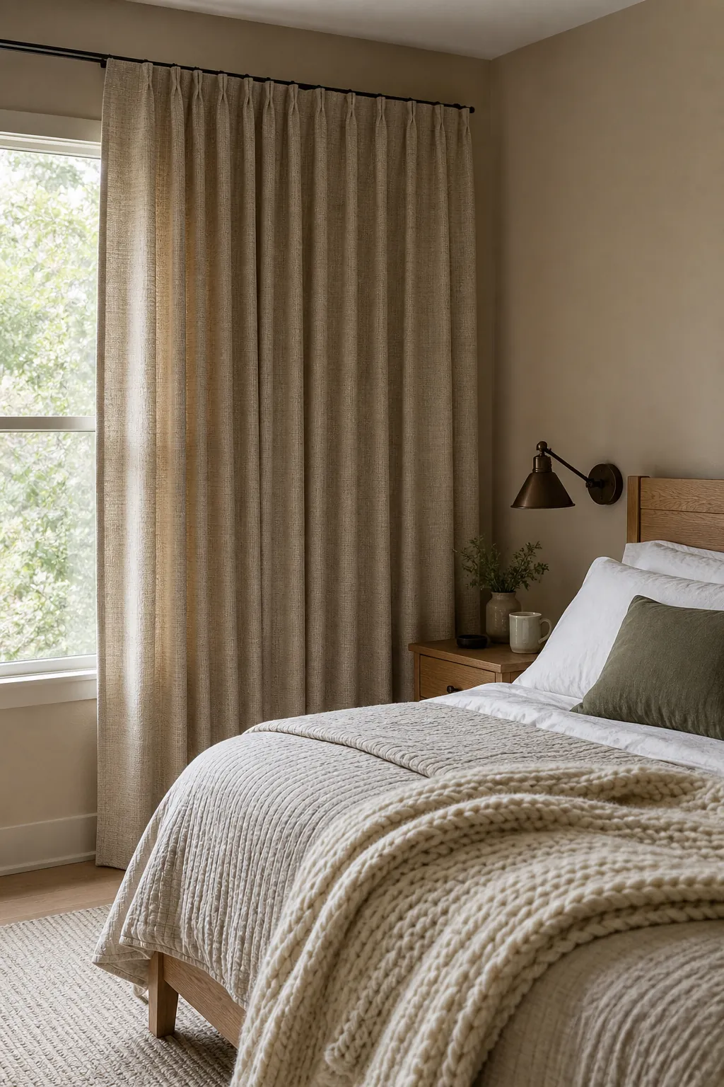
Matching beige curtains to beige walls can work beautifully when texture, lighting, and proportion do the separating. Take a paint chip to the fabric sample, check both in daylight, and favor a cloth with visible linen grain or a subtle basket weave. Use fuller panels so folds create natural light and shadow. Then layer the bed with smooth cotton sheets, a quilted coverlet, and one chunky throw. The goal is not a perfect showroom match; it is a calm envelope with enough tactile variation to feel inhabited. If the room still looks flat, add one small darker note in wood, bronze, or muted olive rather than introducing several competing accents.