
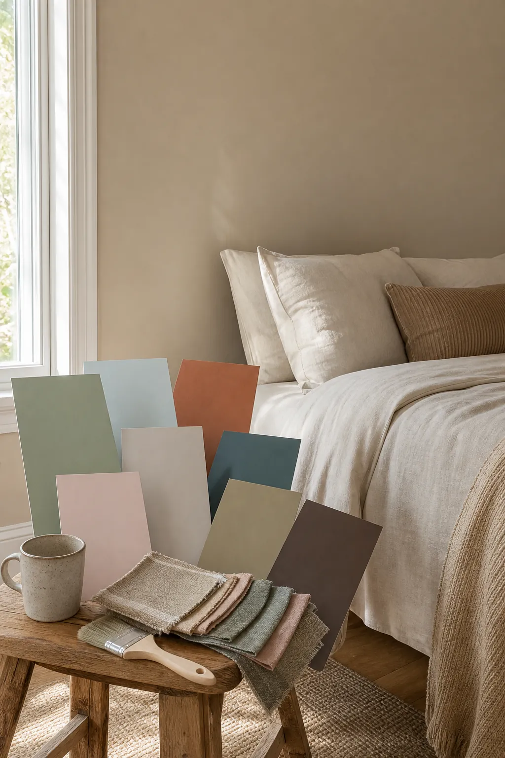
The best bedroom color is not just the prettiest swatch. It is the color that still feels good at night, works with your bedding and floor, and does not turn strange when the lamps come on. That is why a good bedroom palette has to answer practical questions: does the room need more warmth, more contrast, more light, or more calm?
These bedroom color ideas focus on real rooms, not perfect paint chips. Use them as a starting point for your own colour palette for room planning, then test large samples beside your trim, curtains, flooring, and bedding. Always judge the color in morning light, afternoon light, and warm lamp light before painting the whole room.
Warm Greige With Linen White
Warm greige is the safest color idea when you want the room to feel designed, not rented. It gives you more depth than builder white, but it still behaves like a neutral beside oak, walnut, black metal, cream bedding, and natural rugs. The trick is choosing a greige that reads warm in lamp light, because bedrooms are often judged at night rather than at noon.
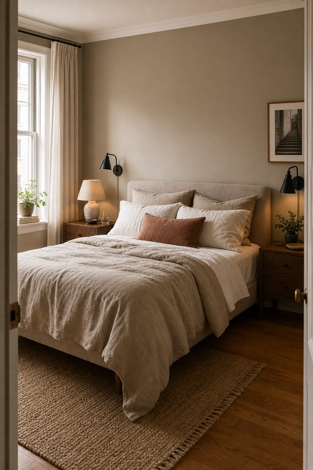
Use this wall colour idea if your furniture already has mixed finishes. A warm greige wall can pull those pieces together while leaving room for seasonal bedding changes. For an aesthetic color for room boards, pair it with linen white sheets, a quiet tan throw, matte black lamps, and one muted accent such as clay, sage, or dusty blue.
Soft Sage For A Restful Natural Room
Soft sage works because it feels like color without asking the room to become dramatic. It is especially good in bedrooms with natural wood, woven shades, rattan, cream bedding, and plants. Choose a muted sage with gray in it, not a bright mint, if you want the space to feel adult and restful.
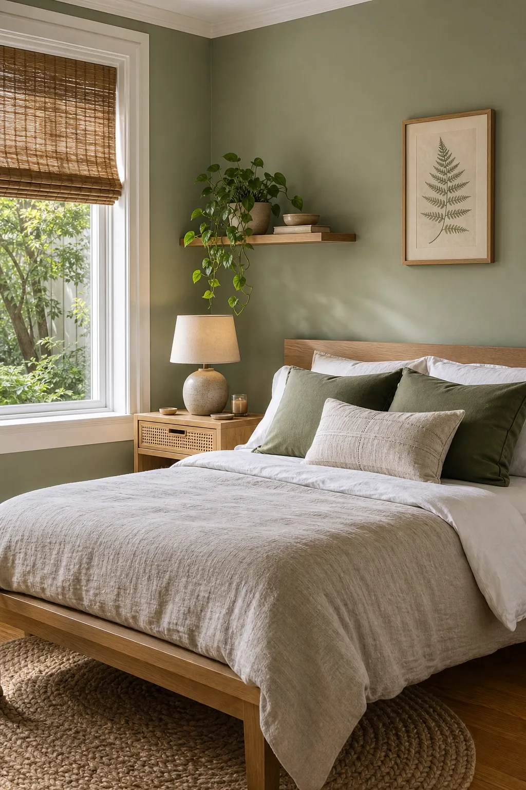
This is one of the easiest color ideas for room makeovers because it can carry cottage, organic modern, or minimalist furniture. In north-facing rooms, test it carefully so it does not turn muddy. In sunny rooms, sage can look fresh all day and soft at night with warm bulbs.
Misty Blue With Warm Wood
Misty blue is calm without feeling cold when you anchor it with warm wood. This is the shade to try if you love blue bedrooms but worry about a nursery look or a chilly hotel feeling. Look for blue with a little gray or green in the undertone, then keep the bedding creamy instead of bright white.
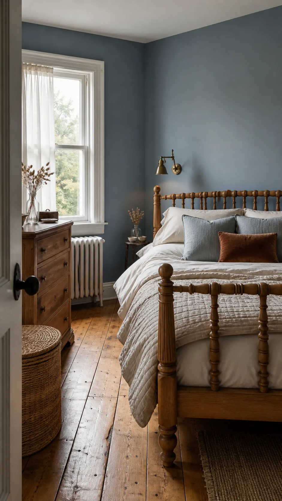
The best part is flexibility. Misty blue can lean coastal, traditional, or modern depending on the furniture. It also makes a great backdrop for brass, medium oak, honey wood, and woven textures, which keep the palette warm enough for sleep.
Plaster Pink That Feels Grown Up
Plaster pink is softer than blush and less sugary than pastel pink. It works when you treat it like a warm neutral: pair it with taupe, dark wood, stone, linen, and aged brass. The goal is clay-pink warmth, not candy color.
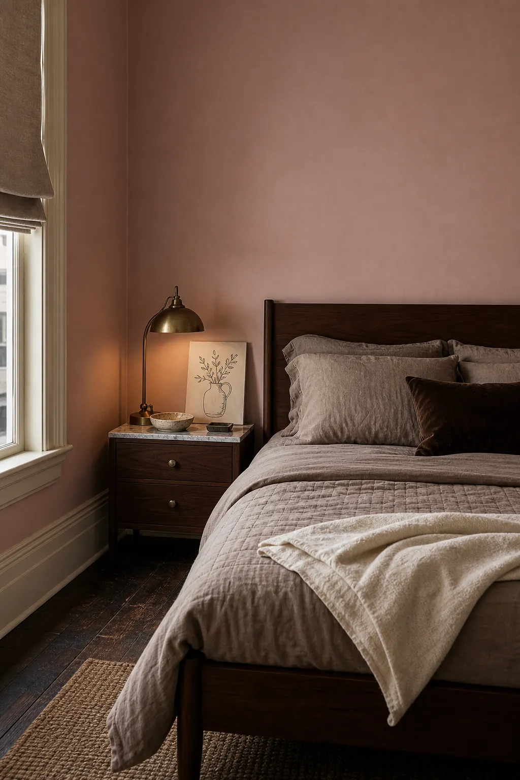
This is a strong bedroom colour aesthetic for rooms that feel flat, gray, or too cool. It can make pale morning light more flattering and give inexpensive furniture a more collected look. If you are nervous, paint one wall first and repeat the pink through a pillow or print.
Clay Terracotta For A Cozy Earth Tone
Clay terracotta gives a bedroom instant warmth. It is best when the shade is dusty and earthen instead of bright orange. Use it with cream bedding, dark wood, woven shades, and matte black or bronze details. This color rewards restraint, so let the wall do the work.
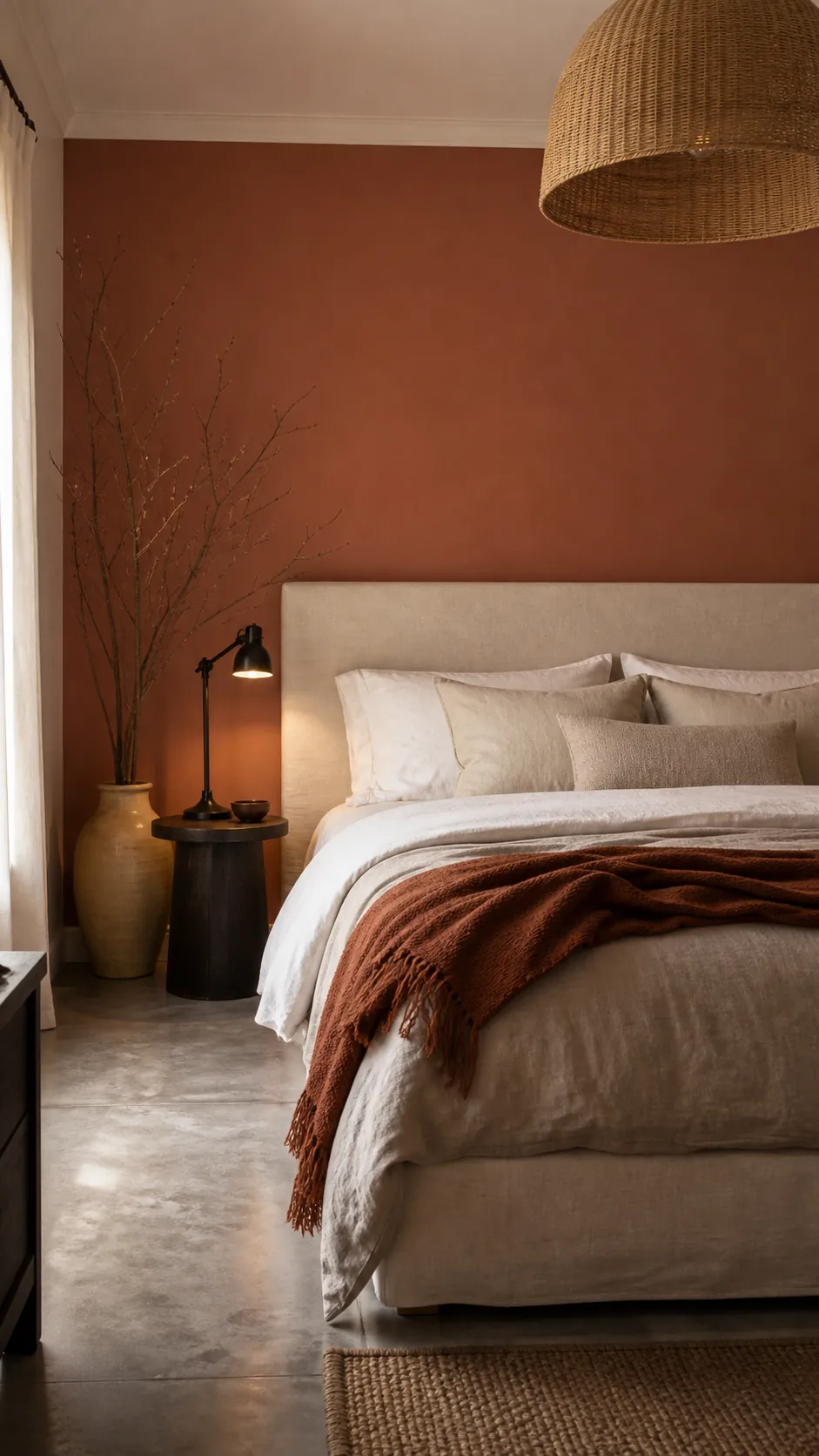
If a full room feels too much, try terracotta behind the headboard and keep the other walls warm white. It is a good home painting colour for bedrooms that need coziness, especially spaces with cool gray floors or furniture that feels too pale.
Buttery Cream Instead Of Stark White
If white walls feel too sharp, buttery cream can fix the room without making it yellow. It reflects light, flatters skin tones, and works with almost every bedding color. Pick cream by undertone, not by name, because some creams turn lemony beside cool daylight.
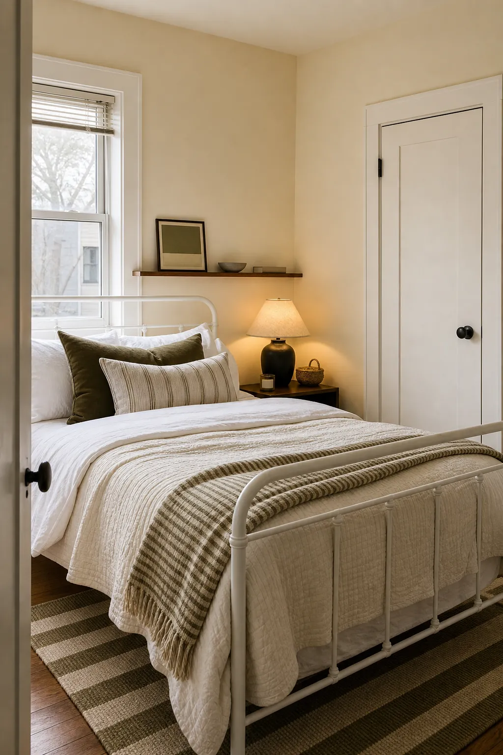
This is the low-risk choice for a small bedroom, a dark bedroom, or a rental-inspired refresh. Add contrast with black lamps, walnut frames, olive pillows, or a striped rug so the room reads layered rather than plain.
Deep Olive For A Quiet Moody Look
Deep olive is the moody bedroom color for people who do not want navy or charcoal. It feels grounded, natural, and surprisingly neutral beside wood furniture. Use warm bulbs and cream bedding so the room feels cocooned instead of heavy.
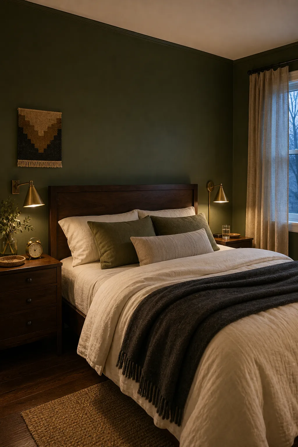
Olive is also forgiving with black, brass, rattan, leather, and patterned textiles. If the room is very small, consider painting trim the same olive for a wrapped effect, or keep trim cream for a sharper, brighter edge.
Smoky Teal For Soft Drama
Smoky teal gives you drama with more softness than navy. Because it sits between blue and green, it can work with warm woods, black accents, cream bedding, and rust or blush textiles. Choose a grayed teal so it relaxes at night.
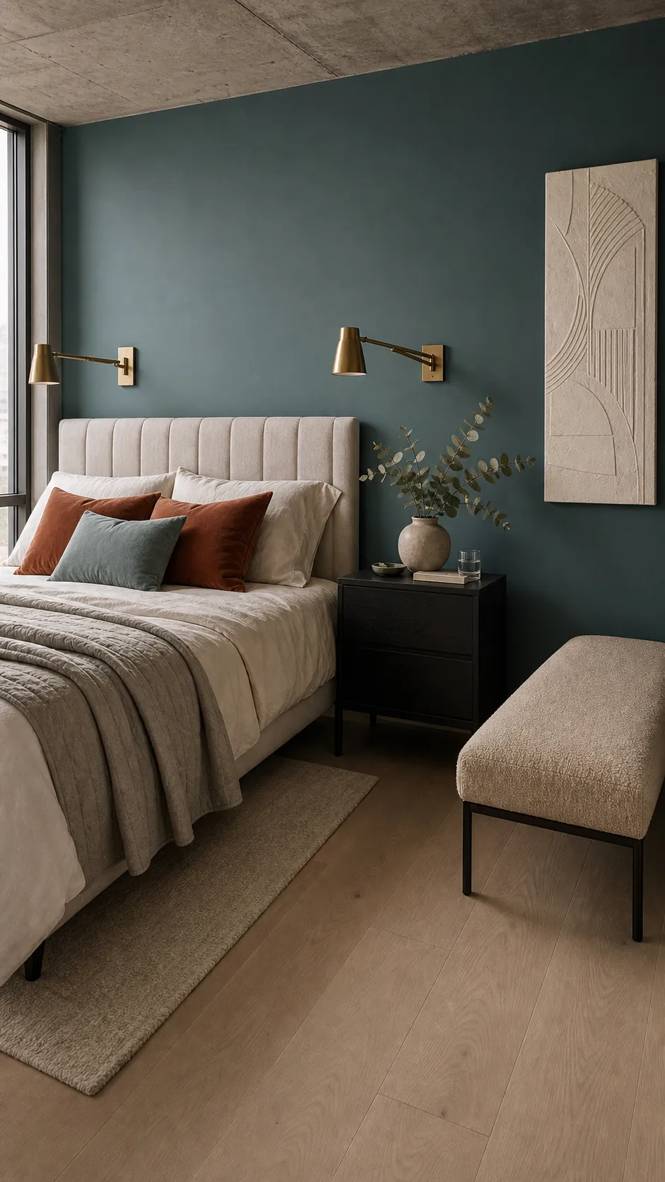
This shade is best when the rest of the palette is edited. Let the teal wall be the color story, then repeat it once in a pillow, vase, or throw. Too many competing brights can make the room feel busy instead of calm.
Taupe Linen For A Hotel Calm Feeling
Taupe linen sits between beige, gray, and brown, which makes it perfect for a calm bedroom that still has depth. It is less trendy than a strong accent color and more forgiving than pure white. Use texture so the palette feels rich instead of flat.
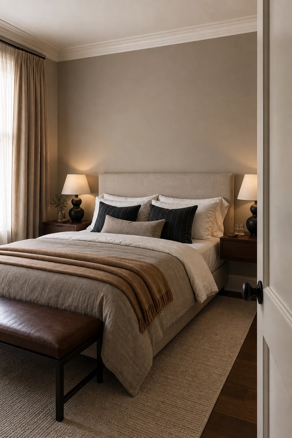
Try taupe walls with white bedding, tan drapery, dark wood, and soft black accents. This colour palette for room planning works especially well if you want a boutique hotel feeling at home without using high-contrast colors.
Dusty Lavender With Gray Undertones
Dusty lavender is a smarter choice than bright purple because the gray undertone keeps it restful. It can be beautiful with taupe, cream, pale oak, charcoal, and soft brass. Think lavender shadow, not grape candy.
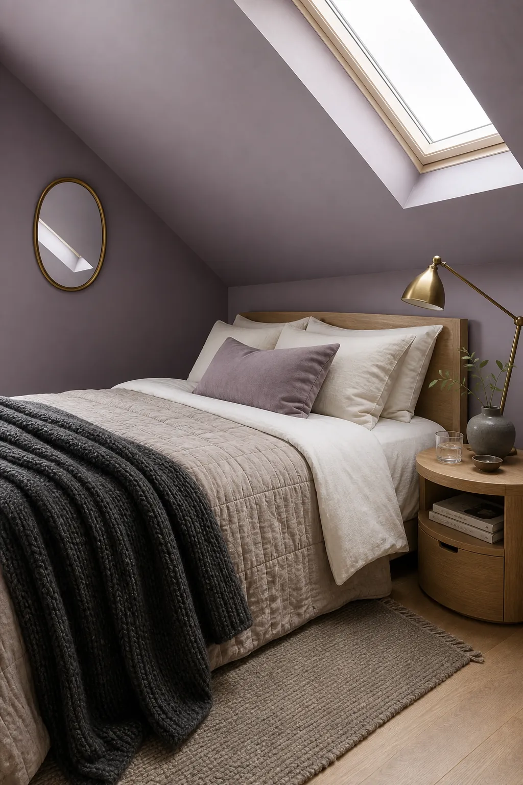
This is a good choice when you want a bedroom that feels personal but still quiet. Test it beside flooring and curtains first, because lavender can swing pink, blue, or gray depending on the light.
Cocoa Brown For A Cocoon Bedroom
Cocoa brown is bold, but in a bedroom it can feel incredibly calm. The shade works best when it has warmth and softness rather than blackness. Balance cocoa walls with cream bedding, warm lamps, and lighter floors so the room feels wrapped, not heavy.
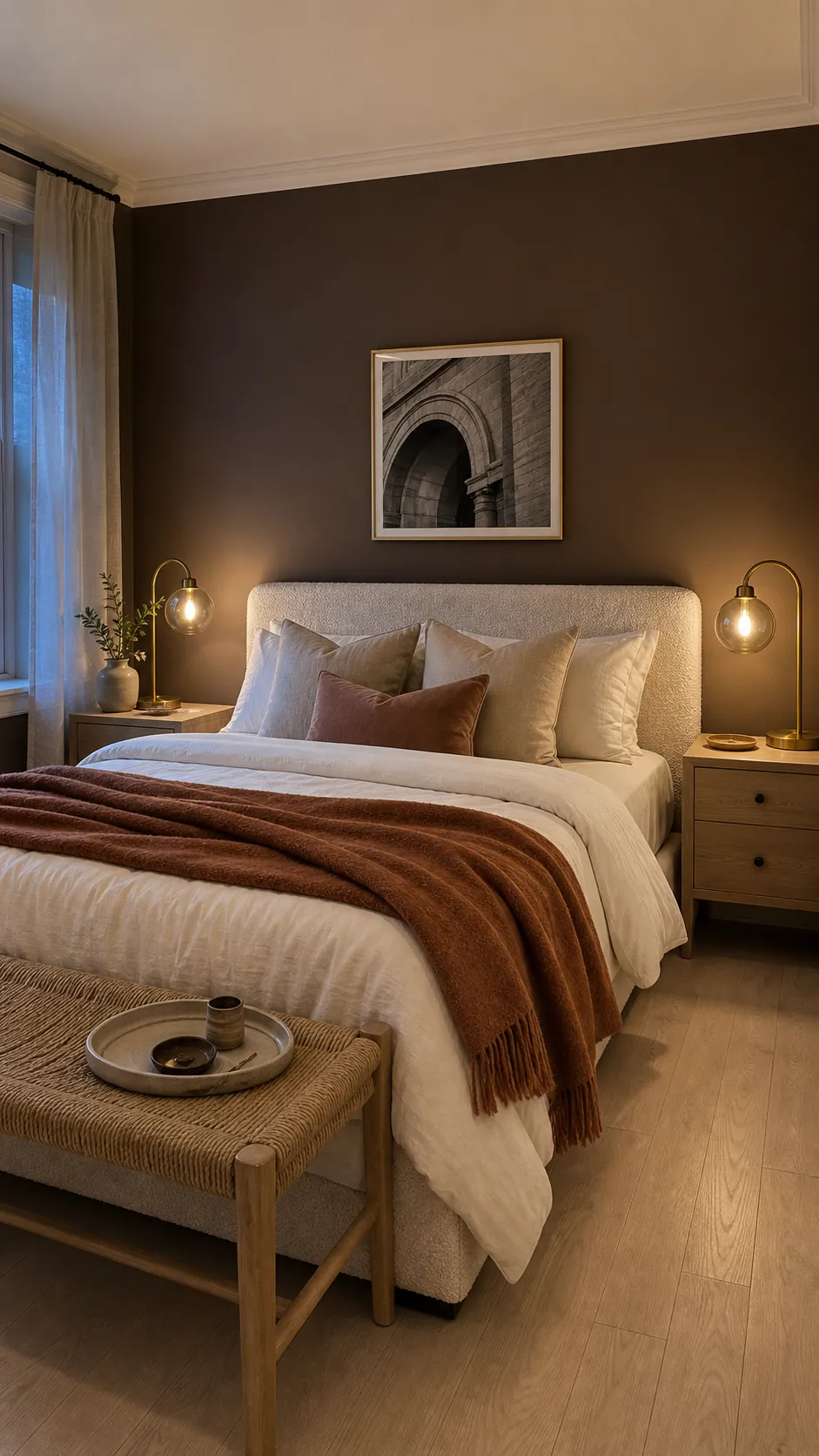
This is a strong choice for anyone tired of pale rooms. It also pairs beautifully with blush, rust, oatmeal, brass, and natural wood. Use matte paint to keep the color rich instead of shiny.
Pale Aquamarine For Airy Freshness
Pale aquamarine sits between blue and green, so it can feel fresh without going icy. It is a good option for a bedroom that needs lightness but not another white wall. Keep the trim warm and the textures natural so the color feels grown up.
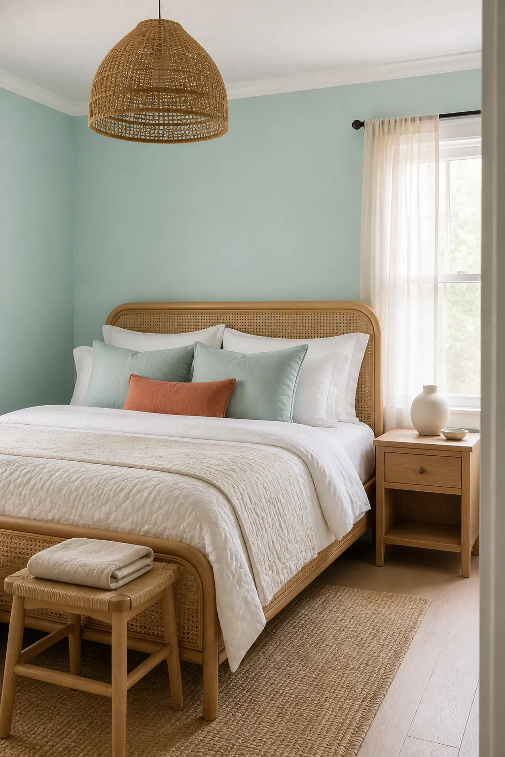
Use aquamarine with cane, rattan, warm white bedding, pale oak, coral accents, or muted navy. If the room gets strong sun, choose a slightly grayed version so it does not become too bright.
Charcoal Accent Wall With Soft Neutrals
Charcoal can work in a bedroom if you use it deliberately. A single charcoal wall behind the bed adds shape and contrast without swallowing the whole room. The rest of the palette should stay soft: ivory, oatmeal, pale wood, and warm lighting.
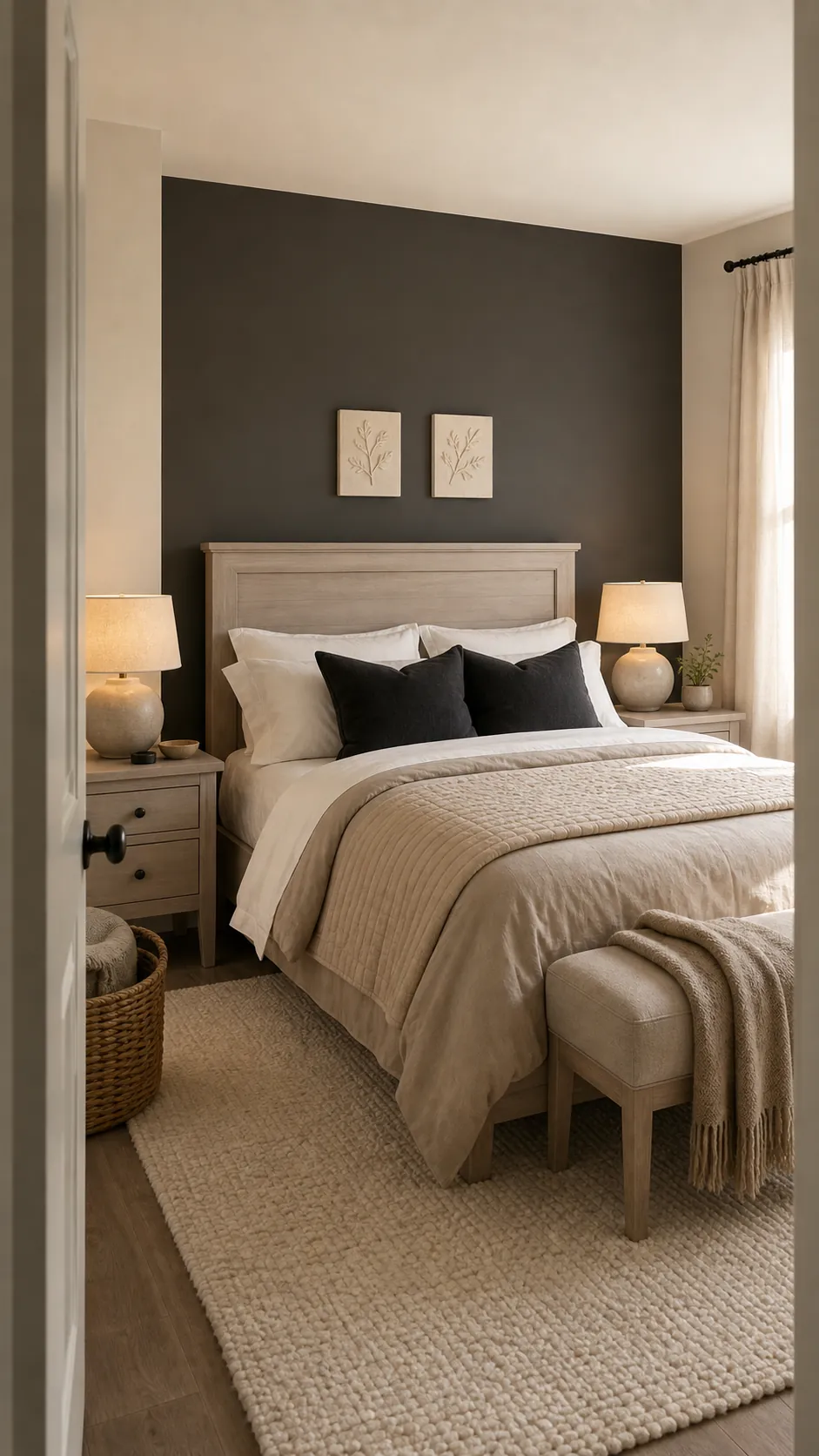
Avoid blue-black charcoal if your room already feels cold. A warmer charcoal with brown or green undertones is easier to live with and pairs well with natural fibers.
Mushroom Beige For Soft Warmth
Mushroom beige is warmer than gray and calmer than tan. It is ideal when you want a neutral bedroom that still has softness on cloudy days. Look for a beige with a little gray-brown in it, especially if your flooring is orange, yellow, or very cool.
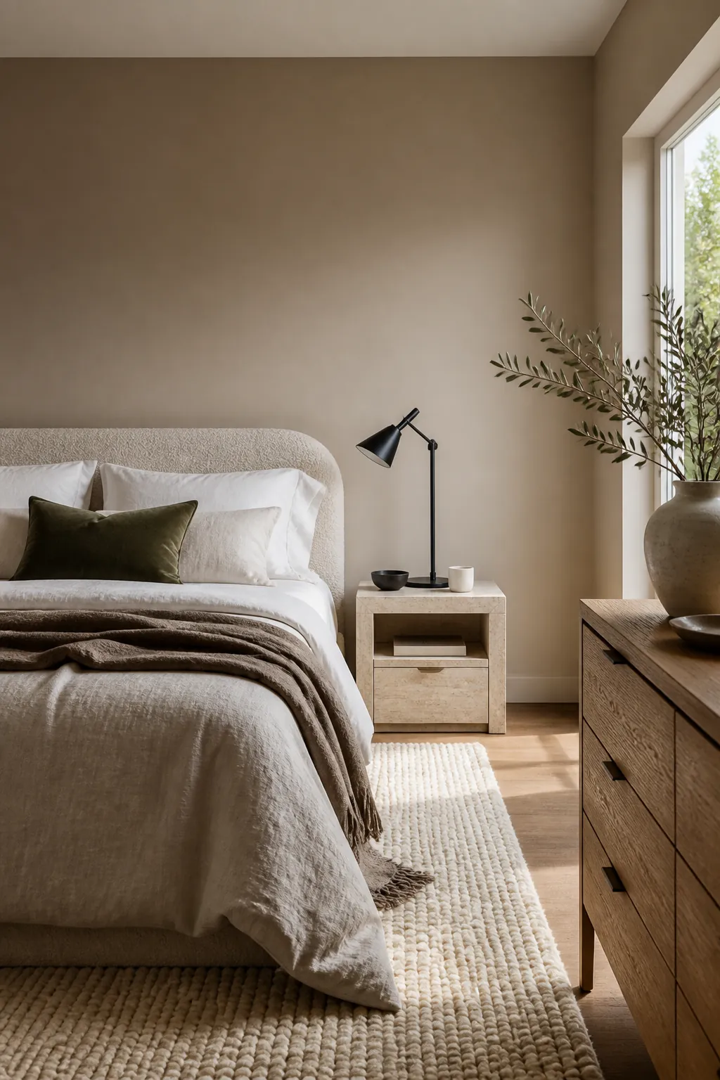
This colour palette for room design works with boucle, linen, oak, travertine, black accents, and muted greens. Add one deeper tone so the room does not become a beige blur.
Muted Coral As A Warm Accent
Muted coral is cheerful, but it needs to be dusty enough for a bedroom. Use it on a headboard wall, inside a niche, or behind open shelving if a full room feels too bright. Balance coral with cream, rattan, walnut, and soft gray-green.
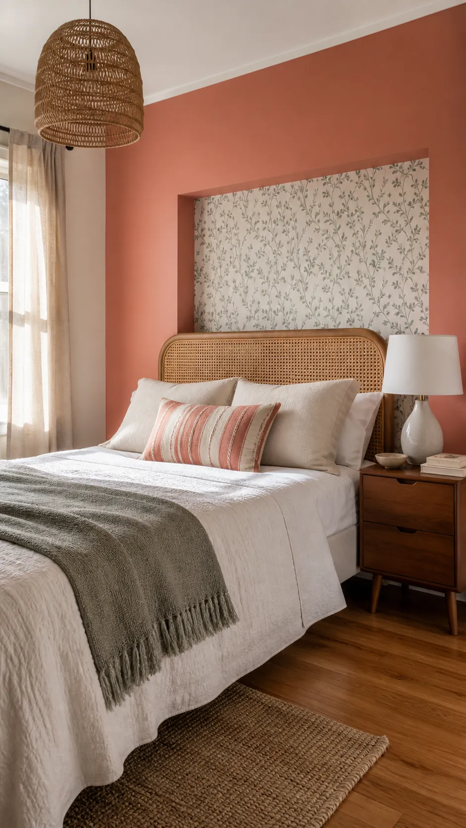
This idea works well when the bedroom feels lifeless but you do not want a dark wall. It also photographs beautifully for #RoomInspo when the color is repeated in small touches instead of everywhere.
Blue Gray For A Calm Classic Room
Blue gray is a classic bedroom choice because it has enough color to feel peaceful and enough gray to stay subtle. It works especially well with traditional wood furniture, white bedding, and brass or nickel accents. The best versions are softened, not icy.
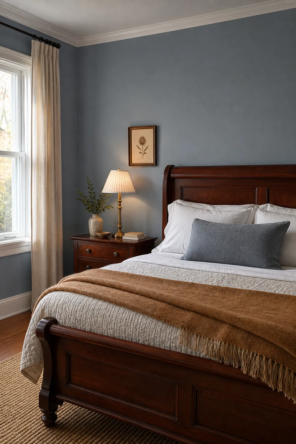
If your room gets northern light, avoid blue gray that looks too steely. Add warm wood, oatmeal textiles, and lamps with warm bulbs to keep the space restful.
Universal Khaki For Modern Warmth
Khaki is having a strong moment because it is warmer than gray but more tailored than beige. In a bedroom, it can make black accents, natural wood, and white bedding feel pulled together. Choose a khaki that looks earthy, not army green.
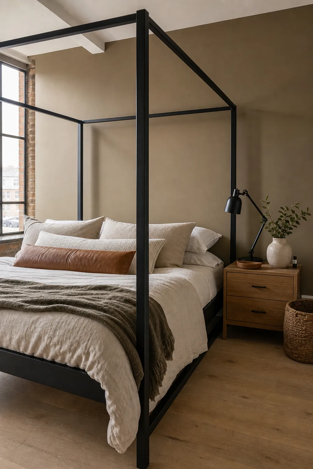
This is a smart aesthetic colour for home updates when you want a neutral with personality. It also handles natural materials well: oak, rattan, linen, stone, leather, and clay all sit comfortably beside khaki walls.
Burgundy Used In Small Doses
Burgundy can be gorgeous in a bedroom, but it is strongest in a controlled dose. Paint a headboard alcove, built-in niche, or lower half of the wall, then soften it with cream, taupe, and warm wood. A brown-red burgundy feels calmer than a purple wine shade.
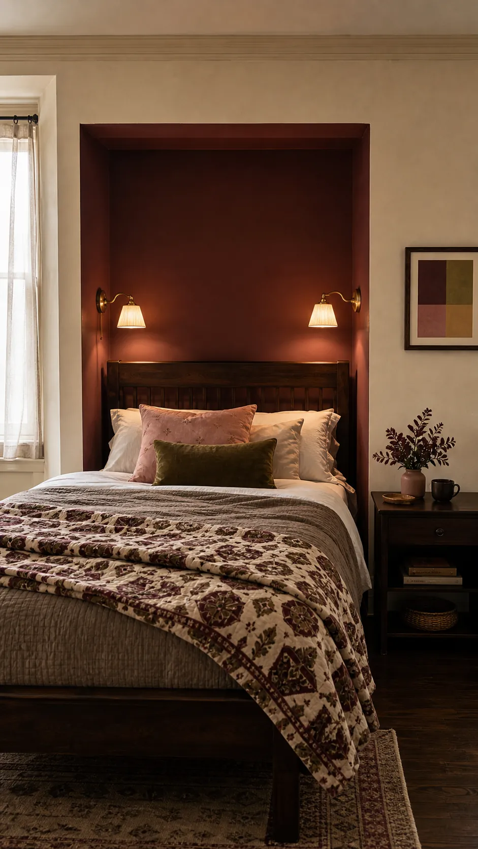
This idea is good for adding richness without repainting the entire room. It also pairs well with antique brass, dark wood, soft pink, olive, and patterned quilts.
Forest Green With White Bedding
Forest green is deeper and cleaner than olive, so it feels more dramatic. White bedding keeps it crisp, while black or dark wood furniture makes it feel intentional. Choose forest green when you want contrast, not when you want the softest possible room.
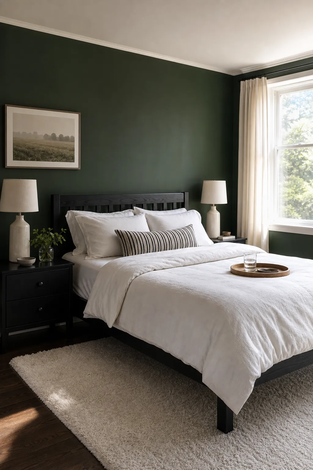
It can work beautifully in bedrooms with good natural light. If the room is dim, add larger lamps, a pale rug, and warm white curtains to keep the green from feeling too dense.
Peachy Nude For A Flattering Glow
Peachy nude is warmer than beige and less pink than blush. It can make a bedroom feel sunny and flattering, especially if the existing floor or carpet reads gray. Keep it muted and skin-toned rather than bright peach.
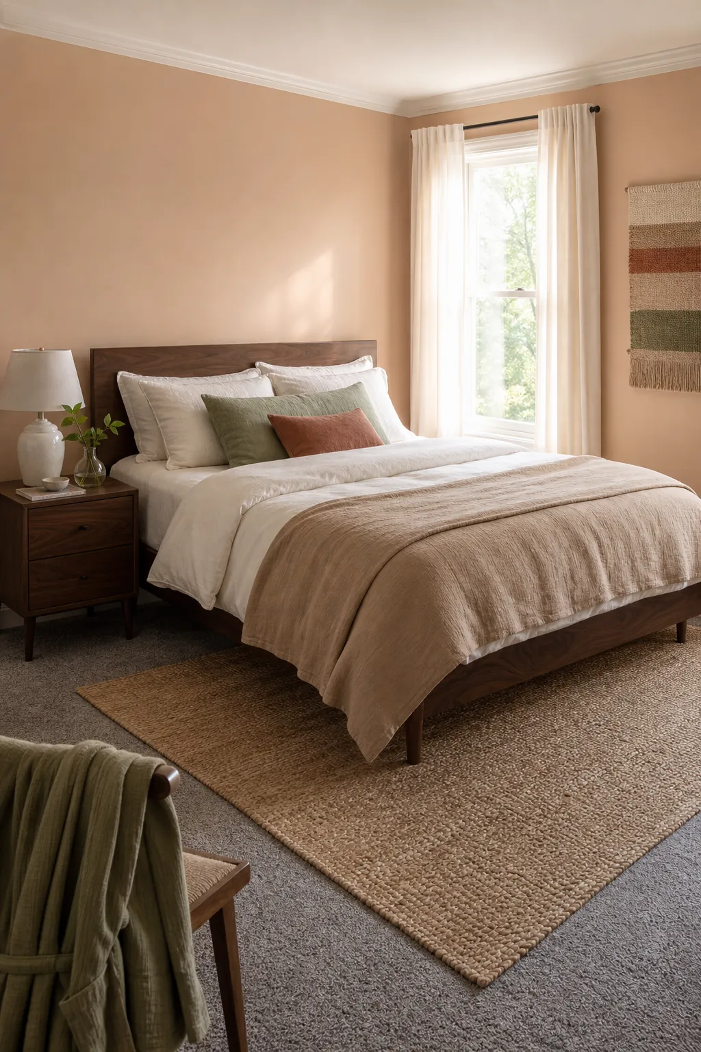
Pair it with cream, walnut, tan, white oak, soft green, or clay. This aesthetic wall paint colour is especially good when you want warmth but terracotta feels too strong.
Cream And Black For Graphic Contrast
Cream walls with black accents are a color idea, even if the walls stay light. The contrast gives the bedroom structure and makes simple furniture look sharper. Use black in thin lines: lamps, frames, curtain rods, hardware, or a painted door.
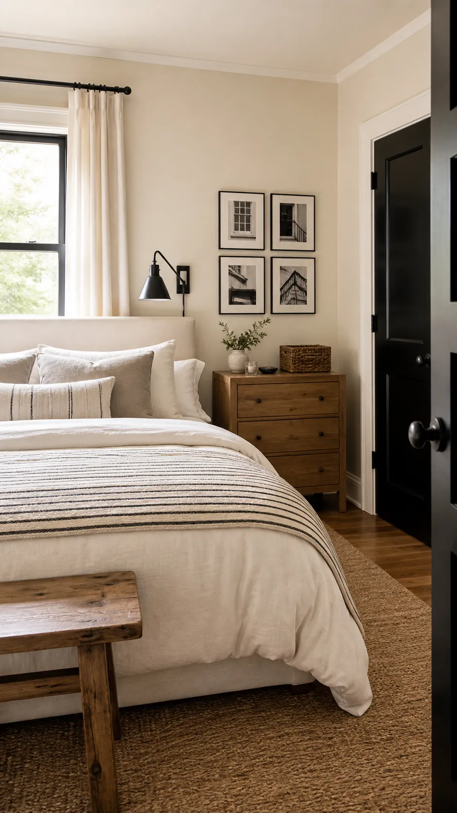
This is the best choice when you want a clean aesthetic room wall paint approach but do not want color everywhere. Add warmth with wood, woven texture, and soft bedding so the black does not feel harsh.