
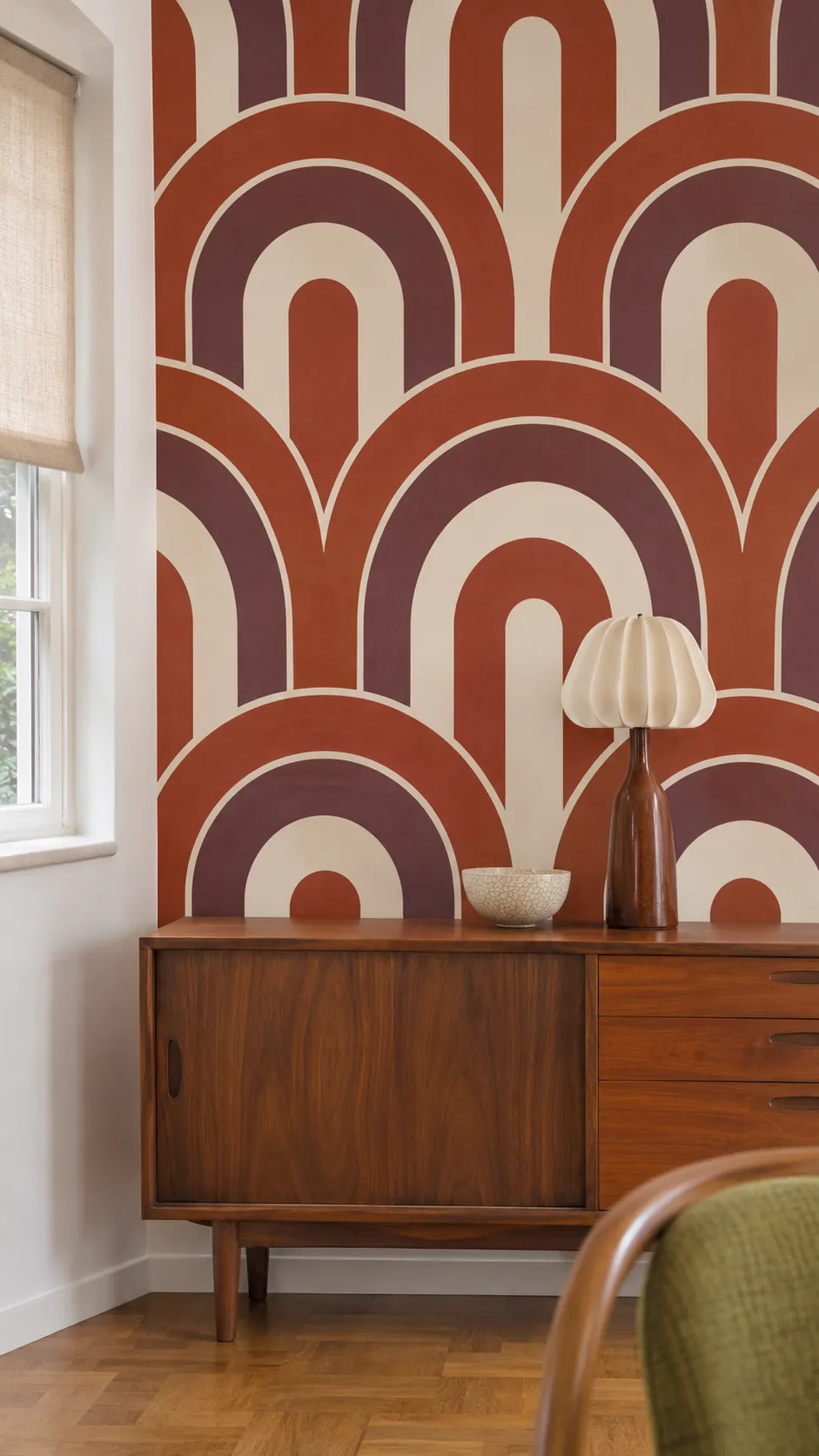
A pattern that looks calm on a sample can take over once it repeats behind the whole sofa. Look at a full repeat at the distance you normally see the wall. Then check what a door, shelf or headboard will hide. A strong print often works best when you choose its boundaries as carefully as its colors.
Use Atomic Starbursts Behind a Sideboard
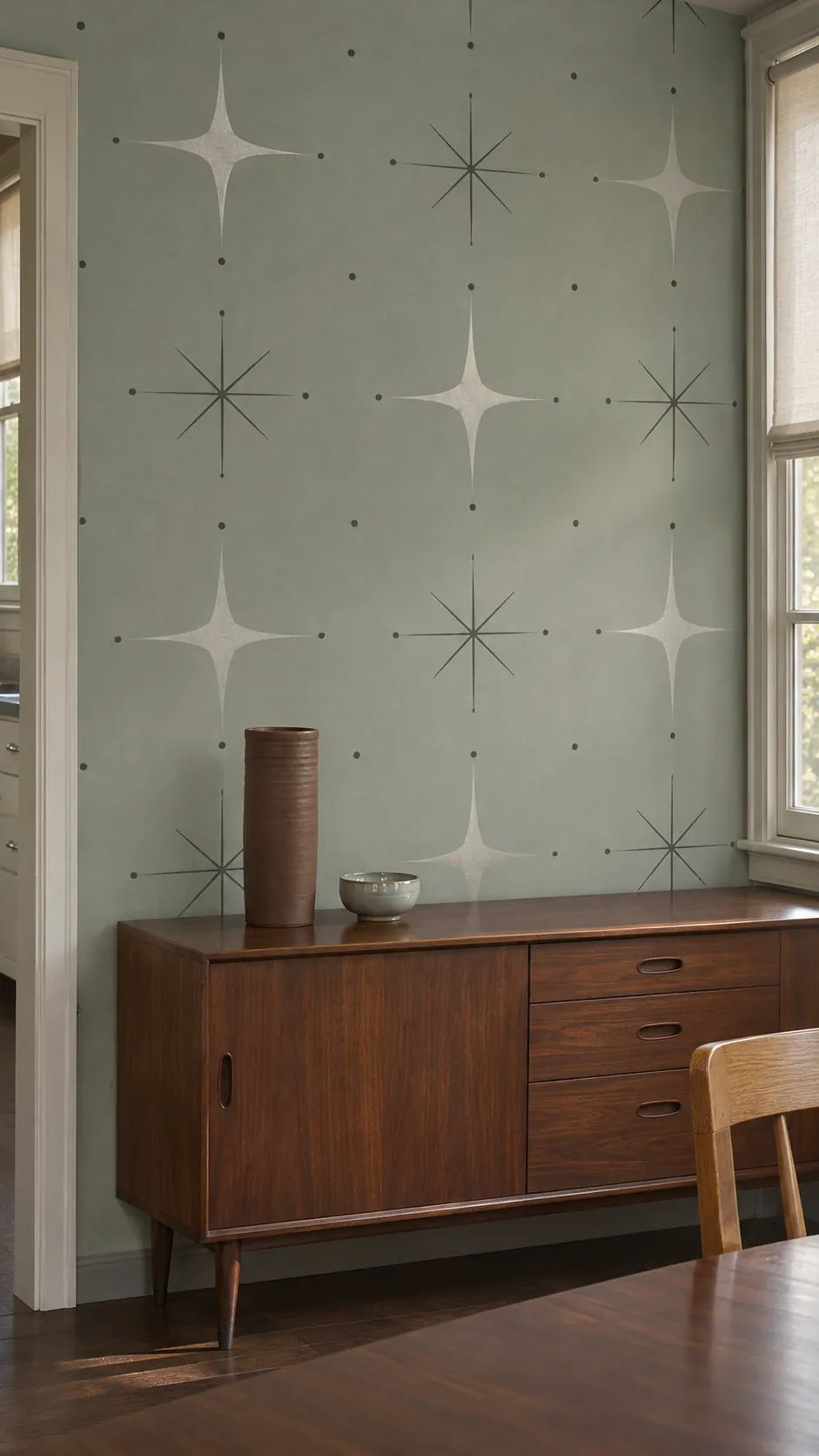
A field of fine starbursts gives walnut furniture the lightness of a mid century drawing. Mark the height of the sideboard on a sample so you can see how much of the repeat will disappear behind it. In a small dining room, a few widely spaced bursts often read more clearly than a tight scatter.
Try Oversized Ochre Daisies
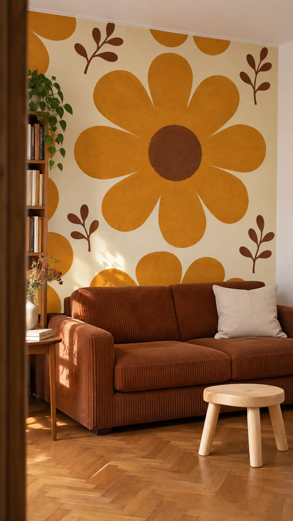
A large daisy gives 70s wallpaper its recognizable scale even when you can see only part of a wall. Pick a wall where at least one full flower can sit clear of the furniture. If the aisle is short, stand at the doorway with a full repeat sample before deciding.
Set Rounded Arches in an Alcove
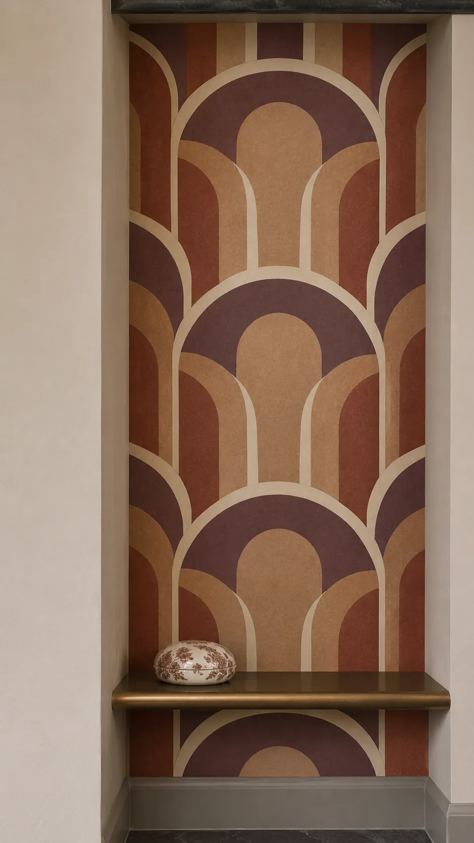
Stacked arches make a shallow alcove look planned. Check the repeat against both inside corners before picking your starting line, so a sliver of a motif does not run up the most visible edge. Take the width at the top and bottom of the recess.
A solid color on the adjoining walls gives the arches a natural stopping point. You can use a paper sample to check the view from the main room. Mark a center line if the two inside corners are uneven.
Soften a Bedroom With Block Printed Vines
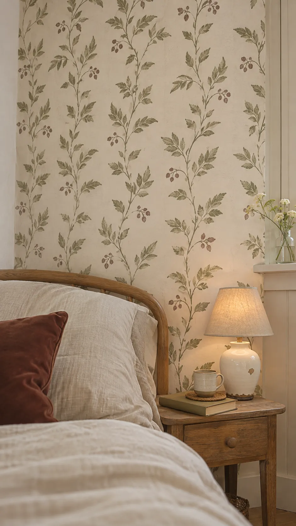
A small vine design in faded green and cream works behind a headboard with simple lines. Look for useful variation in the printed impression if you like the character of older paper. Check the sample against your bedding under both daylight and your bedside lamp.
Give a Nook Orange and Brown Waves
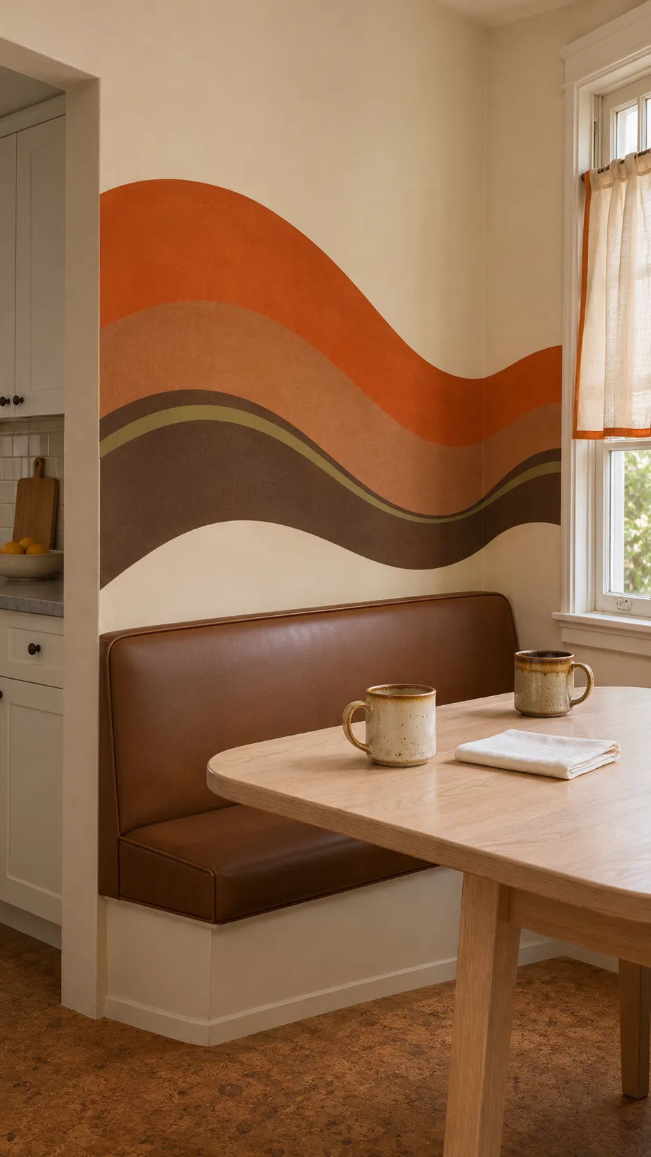
A wide rolling stripe makes a breakfast nook feel distinct from an adjoining kitchen. Pick one color from the print for nearby seating and let the other colors stay on the wall. Smoother matte surfaces will keep the curves visible when afternoon light comes in sideways.
Choose a Flat Leaf Repeat
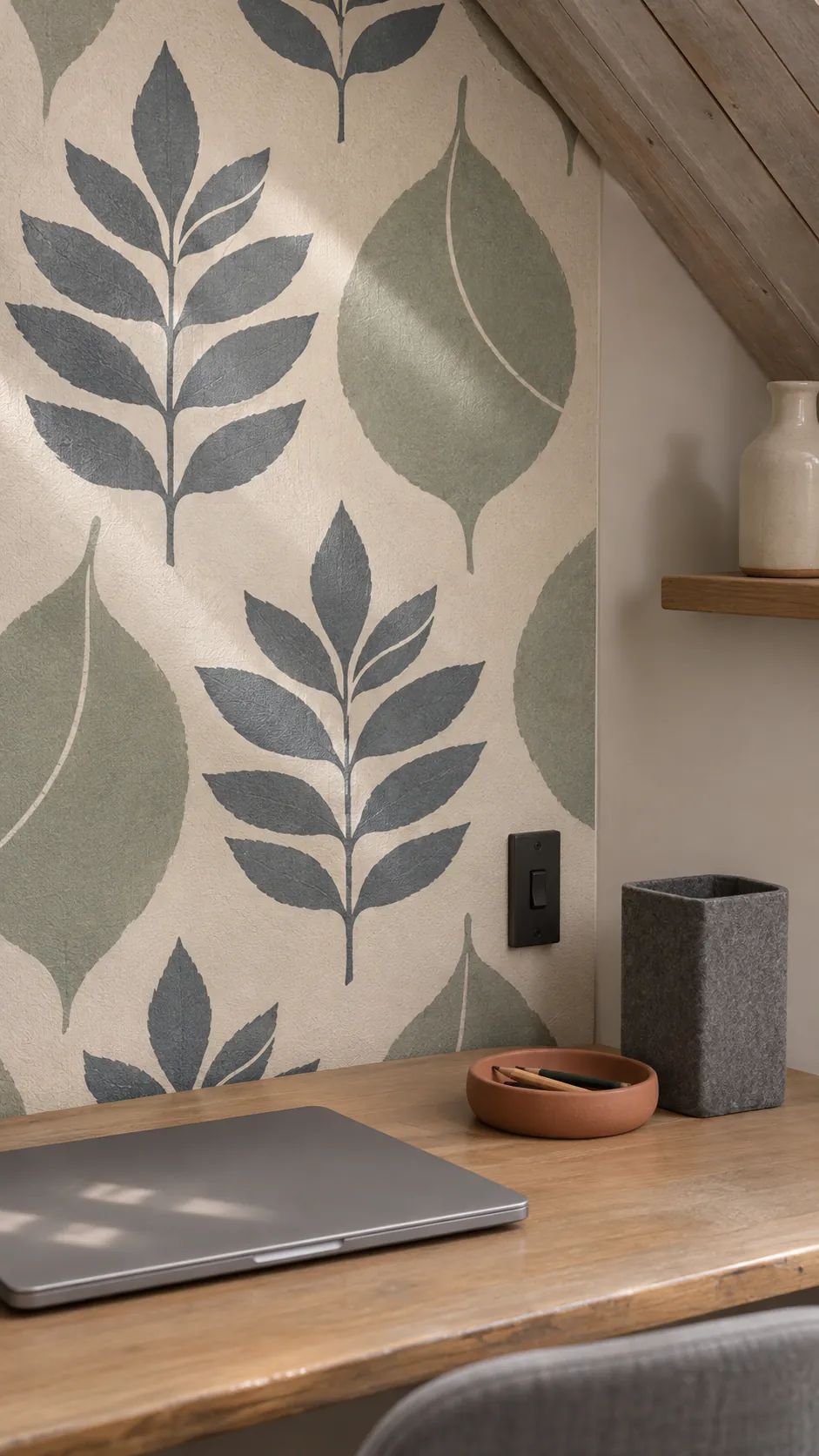
Repeated two tone leaves can give an office a period look without adding many colors. Check how the pale shapes read behind a shelf or desk where objects break up the repeat. A subdued contrast is easier to live with close to a monitor.
Put a Checkerboard in the Mudroom
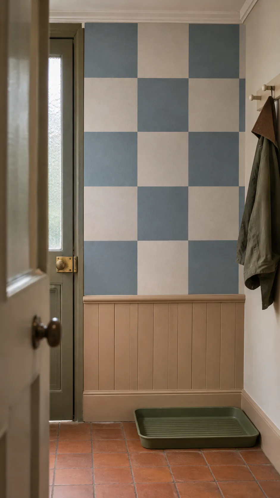
Squares make a short wall easy to see from the next room. A muted blue with a light putty square takes the edge off a hard black and white grid. Mark the center of the wall and compare tiles at the visible corners before hanging.
Use a Printed Basket Weave in the Hall
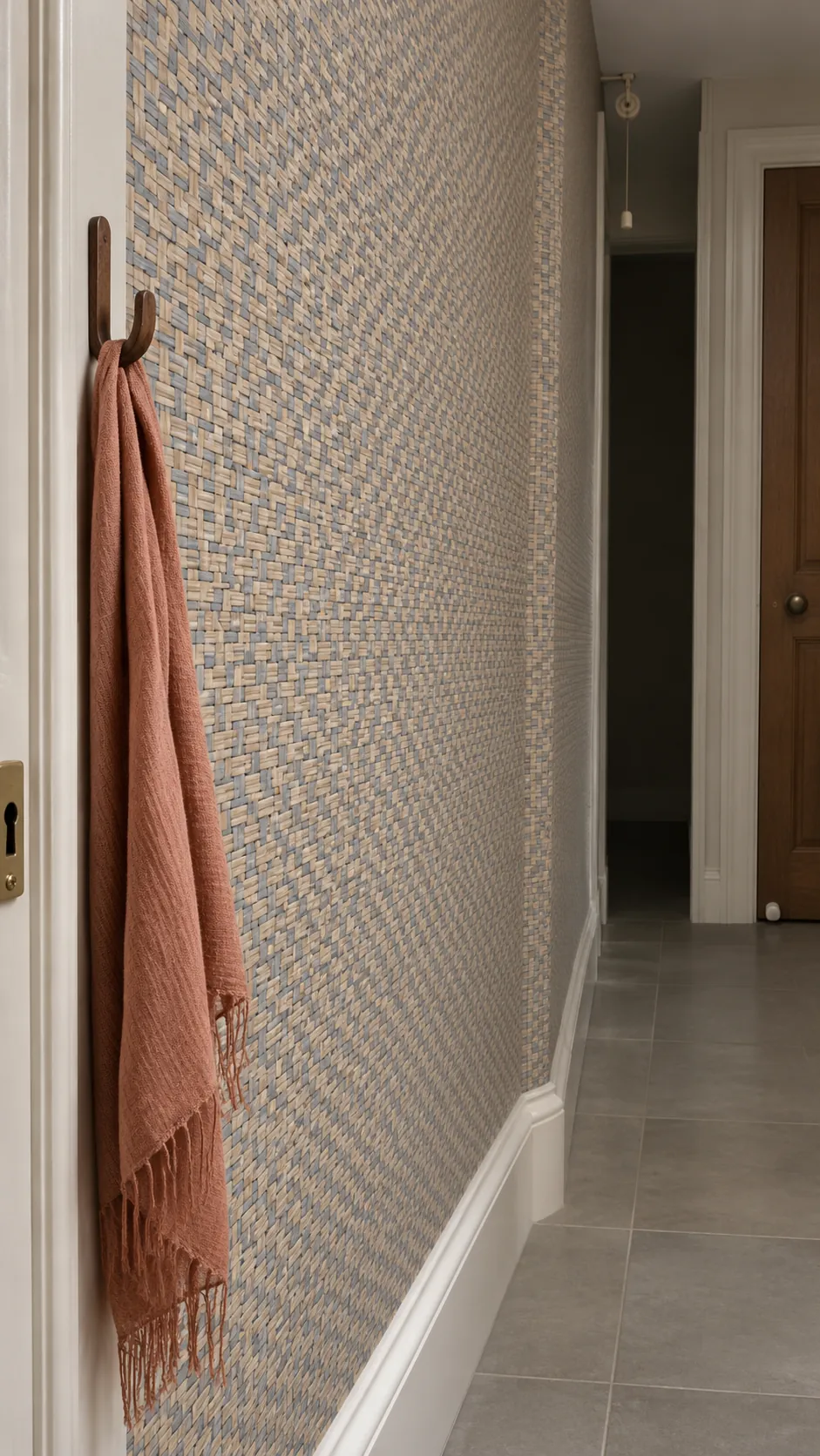
A flat weave print gives the impression of woven wall covering in a passage where shoulders and bags brush past. Small tan and slate shapes add definition at arm’s length. Check washability on the product label and ask how its finish handles scuffs.
Pull the Eye Up With Pinstripes
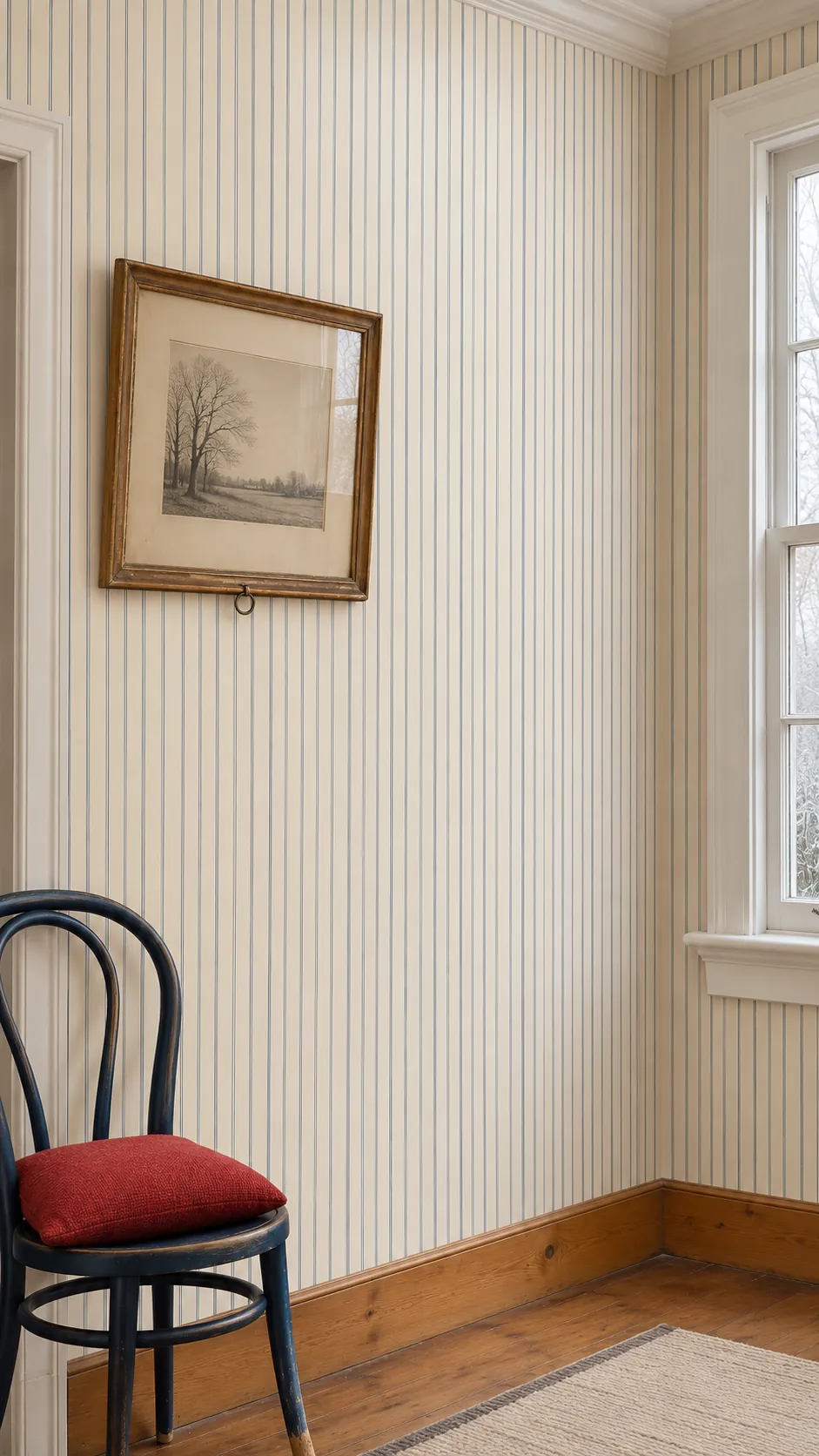
Fine vertical stripes work especially well on a wall with few interruptions. Start from a plumb reference line because older corners and casings can lean. A pale ground lowers the contrast at the top and leaves more room for furniture color.
Work in a Vintage Bird and Branch Print
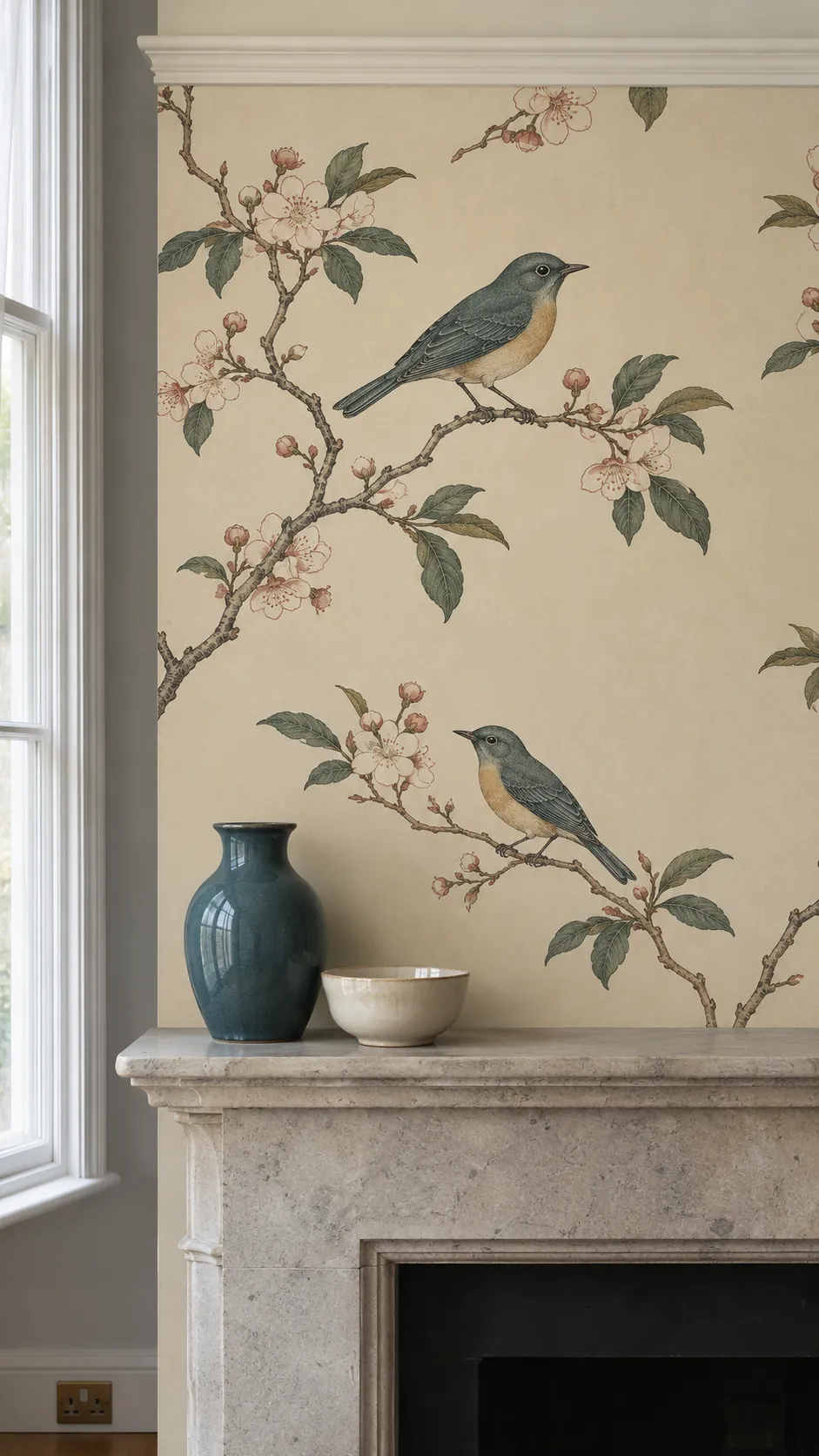
An airy branch print can bring some movement above a shallow mantel. Check that no window trim removes all of a distinctive bird, and place a complete branch junction away from the center seam if the repeat allows. A few understated ceramic pieces help leave the paper readable.
Let a Citrus Print Carry the Kitchen Corner
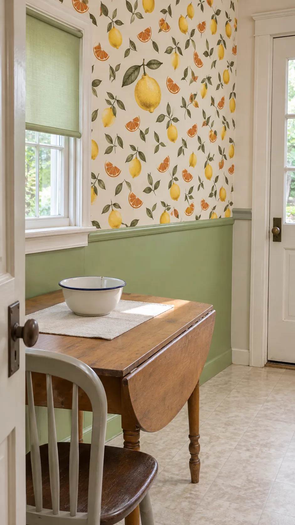
Small slices and leaves suit the half wall behind a kitchen table. Keep real cooking splash zones in mind and use a finish that is approved for the location. Pull one green or cream out of the pattern for a blind or shelf bracket.
Use a Terrazzo Print Above a Utility Counter
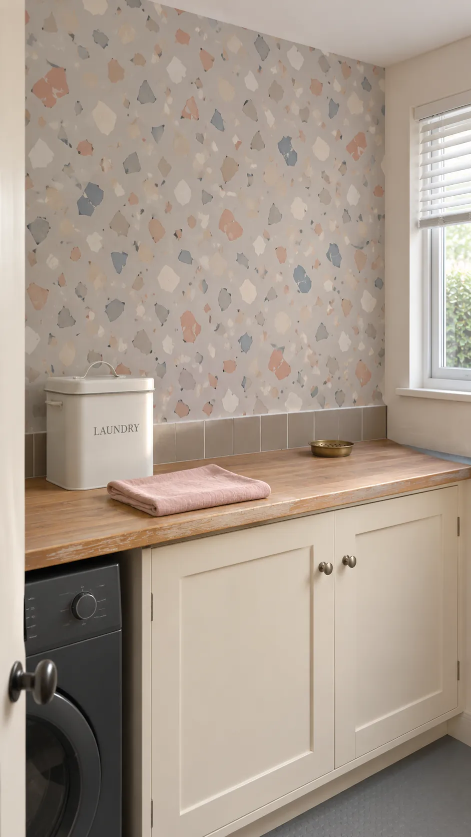
A printed scatter of stone shapes suits a wall whose lower half already sees rough use. Keep the largest chips small enough that the eye reads separate pieces around cupboards. Check the material’s humidity and cleaning instructions before choosing it for a laundry room.
Give a Powder Room One Wall of Deco Fans
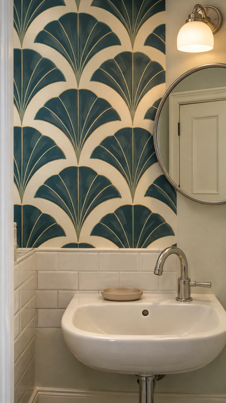
A fan pattern can make a tiny powder room look more finished from the doorway. Position a few full fans above the basin and keep their center points away from the mirror’s edges if possible. Choose a paper rated for the room and keep it outside direct splash unless the maker specifies otherwise.
Bring in Poppies on a Dark Ground
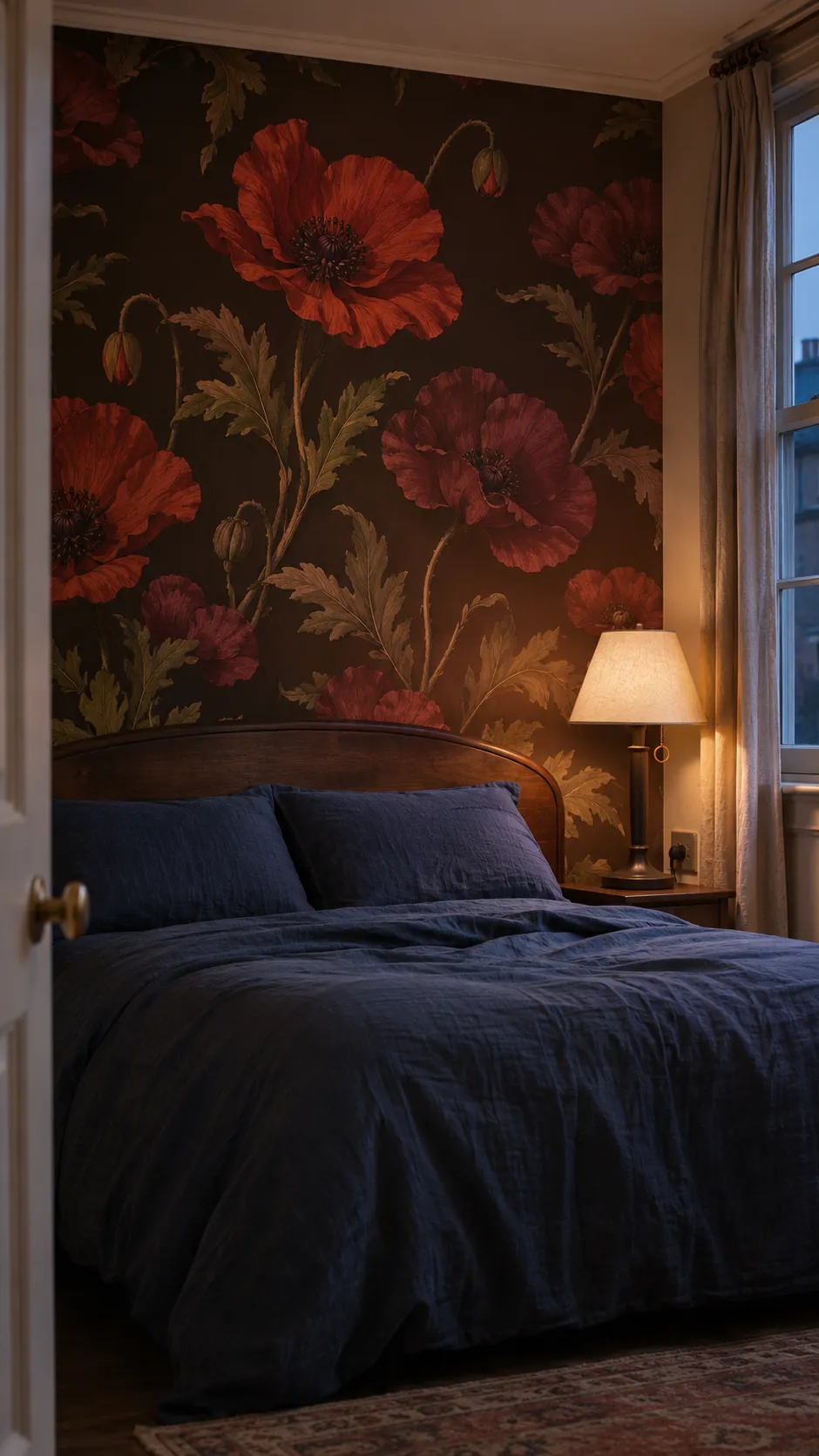
A dark background makes old botanical colors read like pigment under a lamp. Try it on the wall behind a bed or solid piece of furniture, leaving room above the piece for several blooms. A brown or burgundy ground can soften hard shadows.
See a sample on the wall at the time of day you usually use the room. Leave a small unpatterned area near the lamp to see the difference in contrast. Look at the sample again with the lamp off so you can judge how much the darker ground changes.
Try Two Tone Diamonds on a Stair Wall
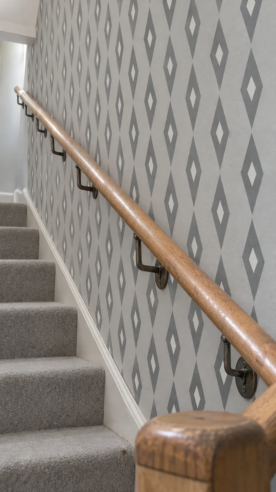
Diamonds offer a steady reference across a long stair flight. Be sure the sides run plumb before cutting for a sloped base, and plan matching at the top where you will see it straight on. Tight rooms can take a small repeat with enough margin around the railing.
Use Tiny Dots Behind Open Shelves
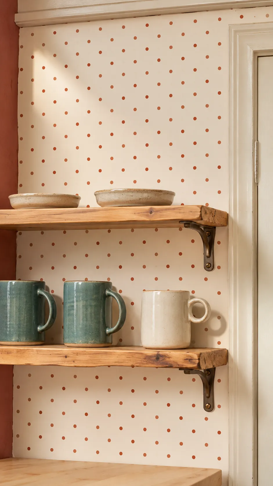
Little dots keep some visible rhythm after the paper is partly concealed by mugs or books. Test the print with a shelf edge and a few objects so you can judge the density. If the pattern disappears in shade, choose a slightly darker dot before you size up the motif.
Choose a Quiet Damask for a Dresser Wall
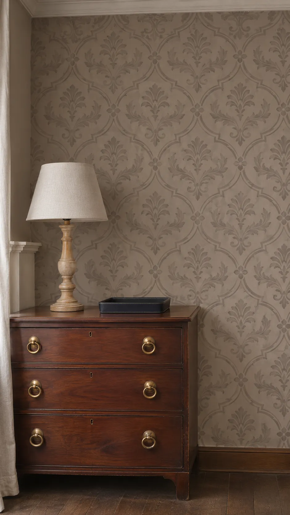
A muted damask can retain an older silhouette with very little contrast. Place the sample at the height of your eyes to see which edges catch light behind the dresser. A pale matte print stays readable beside shiny handles or lamp hardware.
Try a Broad Cafe Stripe in a Breakfast Bay
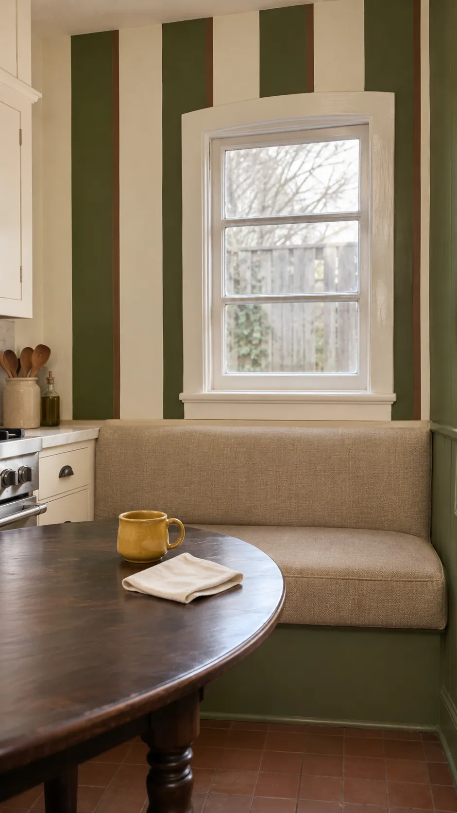
A broad stripe gives a compact eating area an old shop feel. Compare where the darker band lands at each window casing before hanging the first length. A seat cover in a solid color makes the stripe easy to see from the kitchen.
Use Faux Bois Above Real Timber
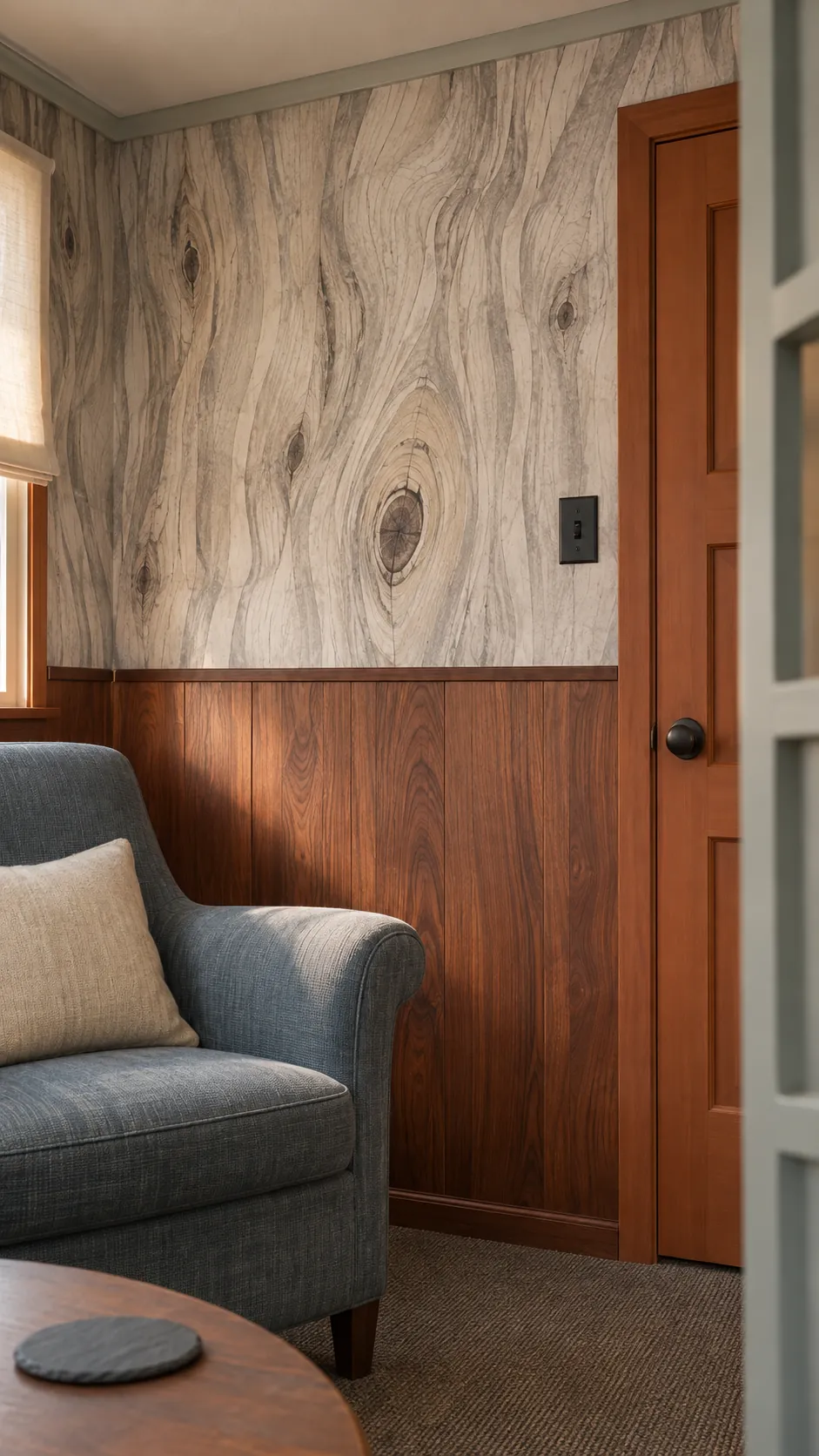
A woodgrain print can look playful when its grain direction contrasts with real wood below. Use it in a small den or on a narrow upper wall and look at the sample next to the timber before buying. Let one of the two surfaces stay quieter in color.
Try Flat Poster Style Blooms in a Playroom
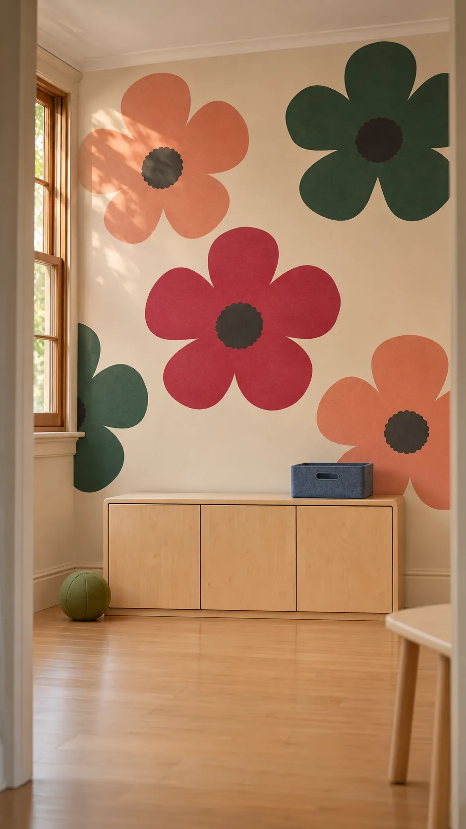
Poster style blooms hold their shape from a busy doorway. Low furniture helps leave at least one full head visible near child height. Choose wall covering you can clean according to the label and leave any direct contact zone easy to maintain.
Use a Small Celestial Repeat in a Reading Nook
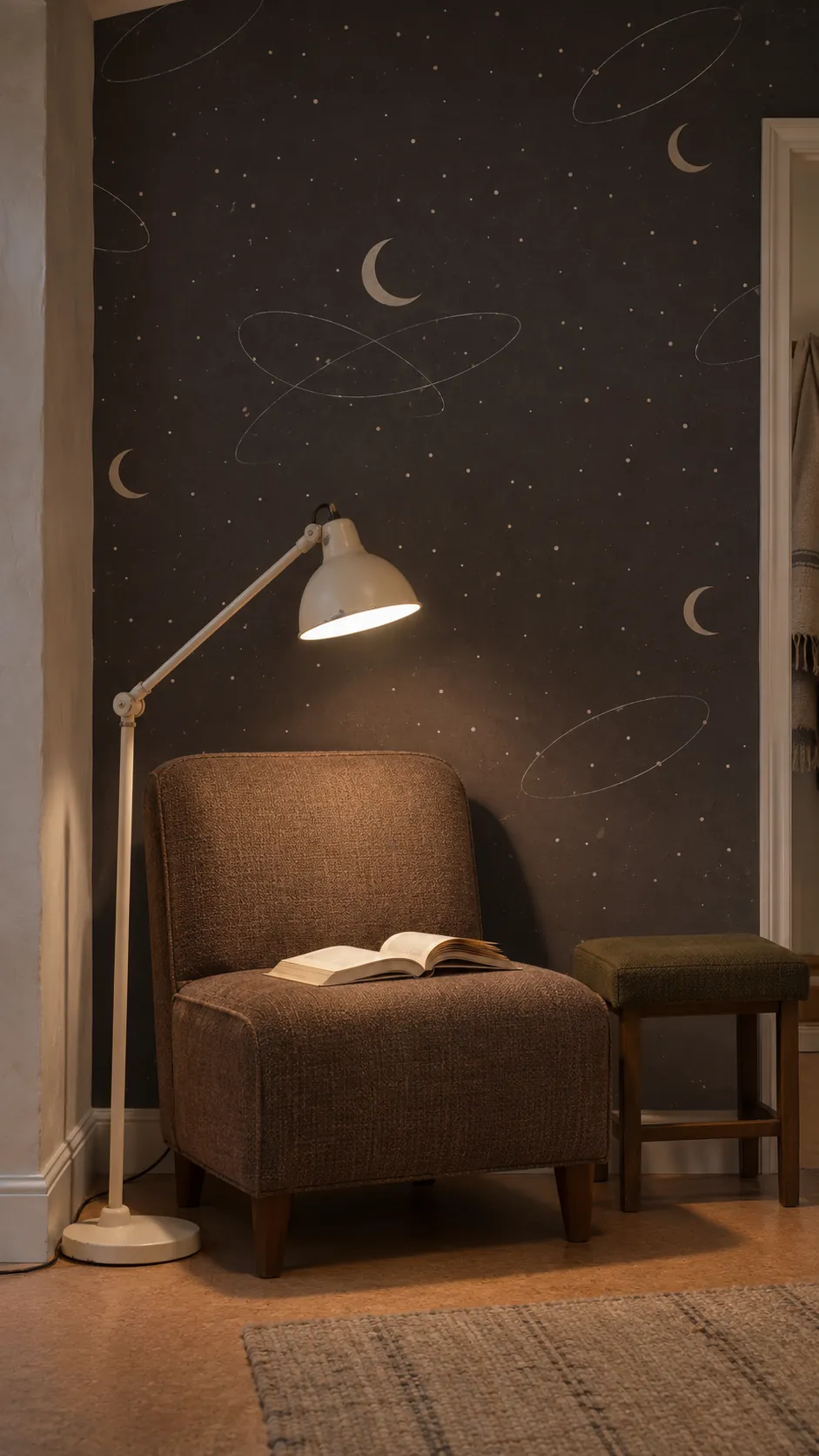
Tiny moons and orbit lines bring an atomic pattern into a small space without competing with the books. A matte ground keeps tiny marks easy to see beneath a reading lamp. Start with one wall behind the chair and see how the corners read before wrapping the nook.
Fit a Fine Harlequin Pattern in a Vestibule
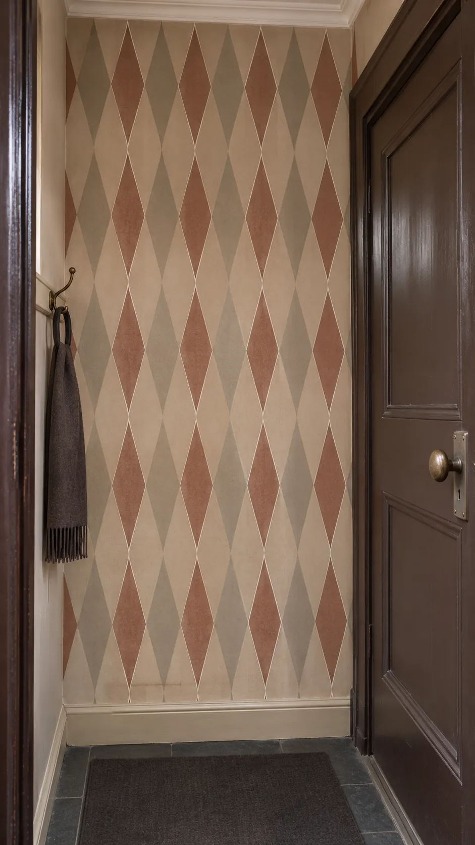
A long narrow diamond can suggest older circus or theater graphics even in subdued colors. Cut from a plumb center line and check the diamonds at the top and bottom of the doorway. Keep dark border pieces close to the trim color when the vestibule has several doors.
Set Scallops Above Low Wainscoting
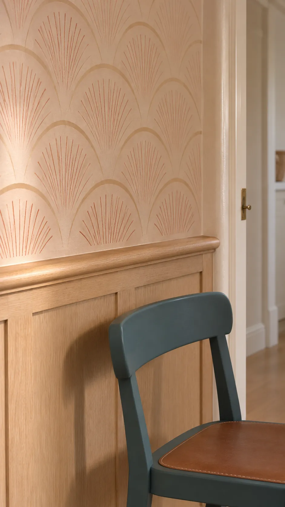
A row of scallops picks up the line of chair rail without borrowing its straightness. Check that the first full arc sits above the wood at a clean height. Try a warm terracotta ground against painted plaster or pale oak paneling.
Let Gingham Fill a Pantry Door Recess
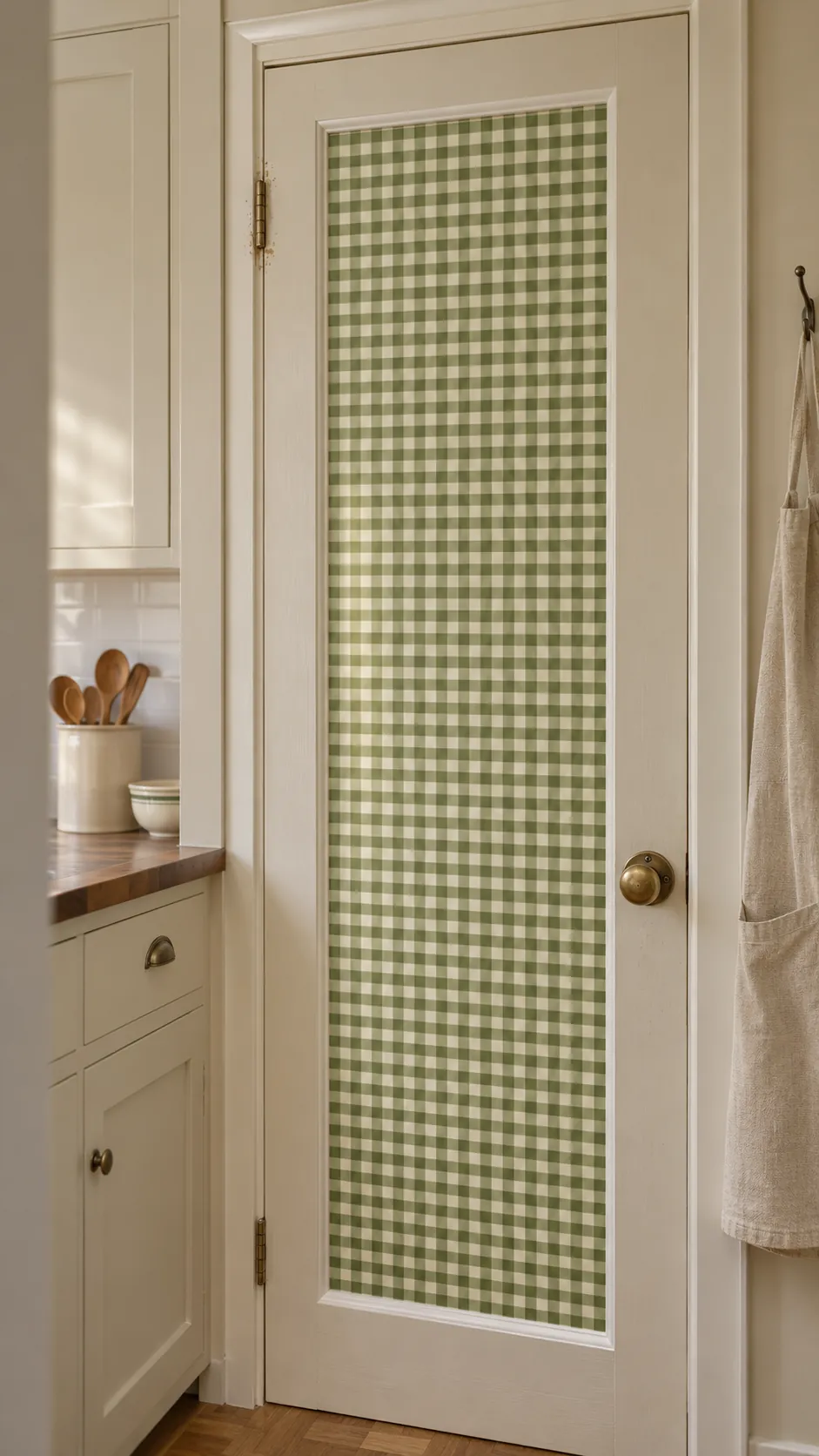
Small checks in an inset door panel show up in a kitchen where multiple surfaces compete. Look for a removable option only if its maker specifies the door’s surface and finish. Clean the panel as directed and test in an out of view place before covering it.
Put Groovy Paper on Wardrobe Panels
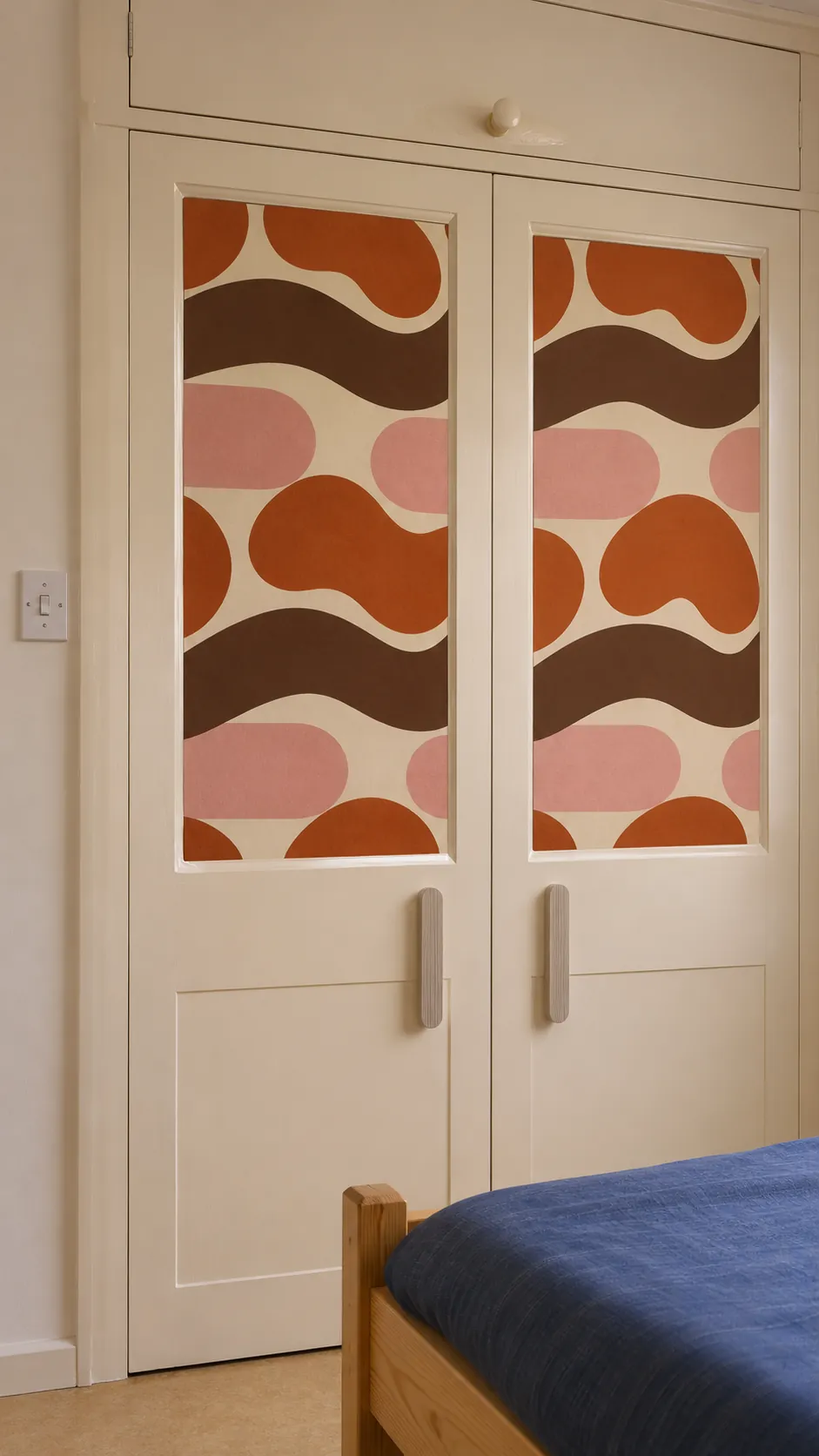
Flat removable panels let you enjoy an assertive print at furniture scale. Measure the inset each door actually offers and plan the middle of each motif before you cut. Check with the maker that the adhesive suits the panel finish and test how it comes off.
Make a Portable Papered Panel
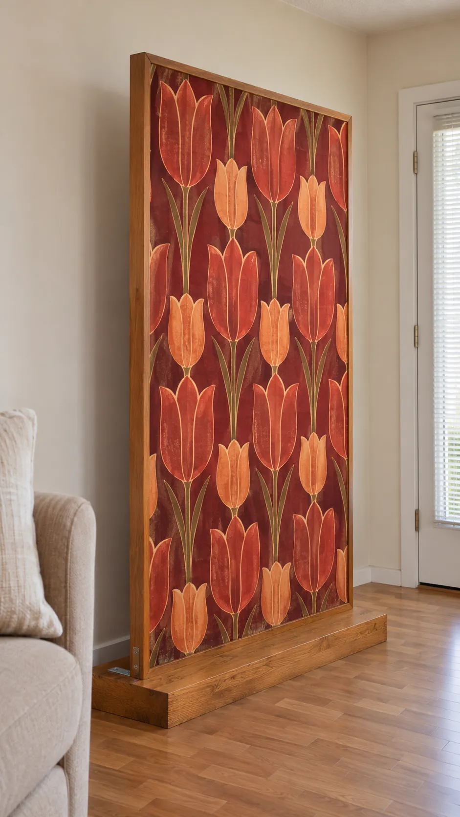
Cover a separate smooth board if you need a pattern you can take with you. Choose a stable support that cannot tip and use a fixing method that your lease allows. Wrap the edges or finish them with slim trim so the panel looks made for the spot.
Reveal a Floral Print Inside a Closet
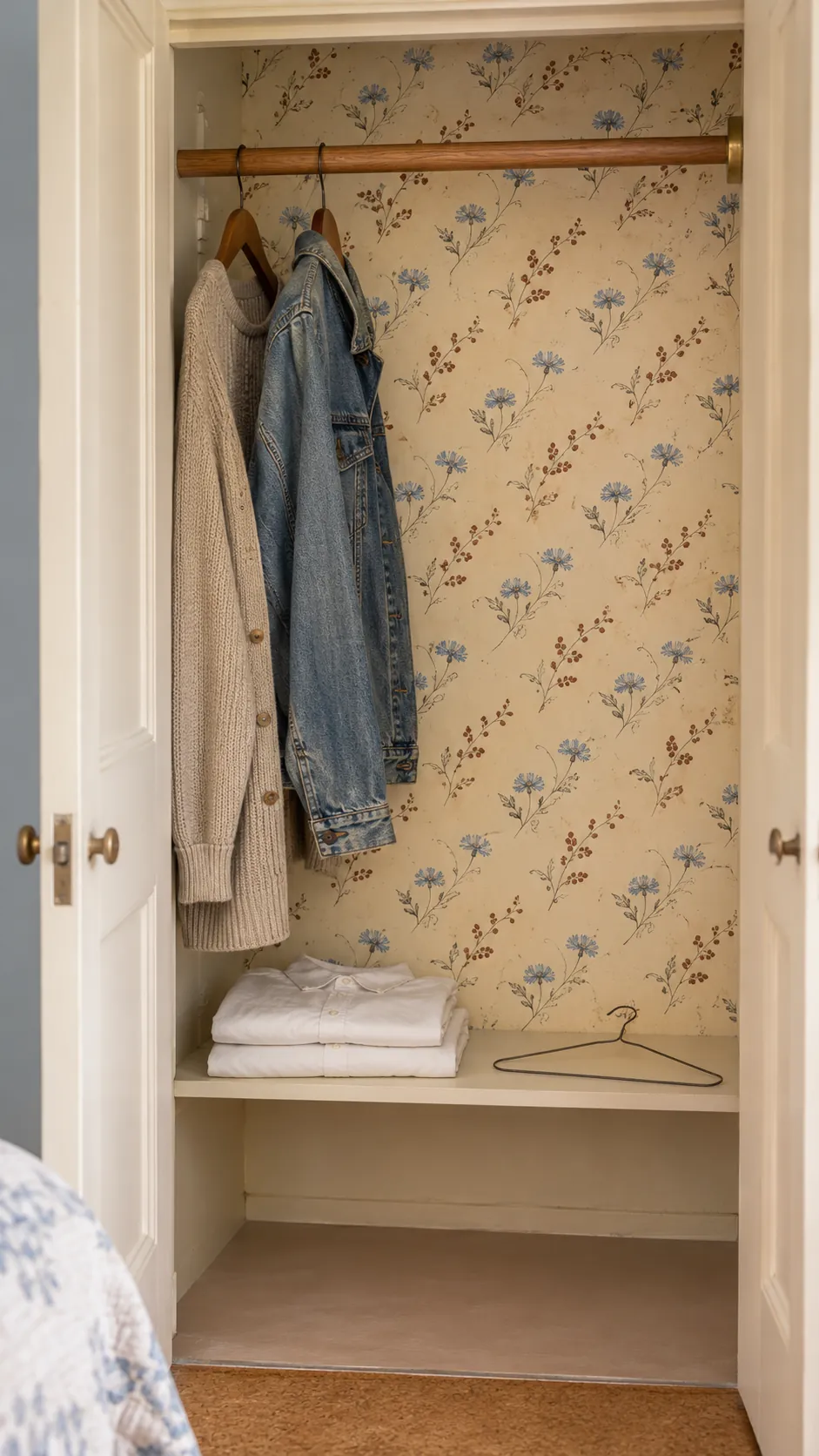
A print on the back of a closet shows when the doors are open without changing the whole bedroom. Small flowers still read behind a few hanging items. Leave some free space so the paper does not wear where hard hangers hit the back.
Paper a Small Ceiling With Graphic Clouds
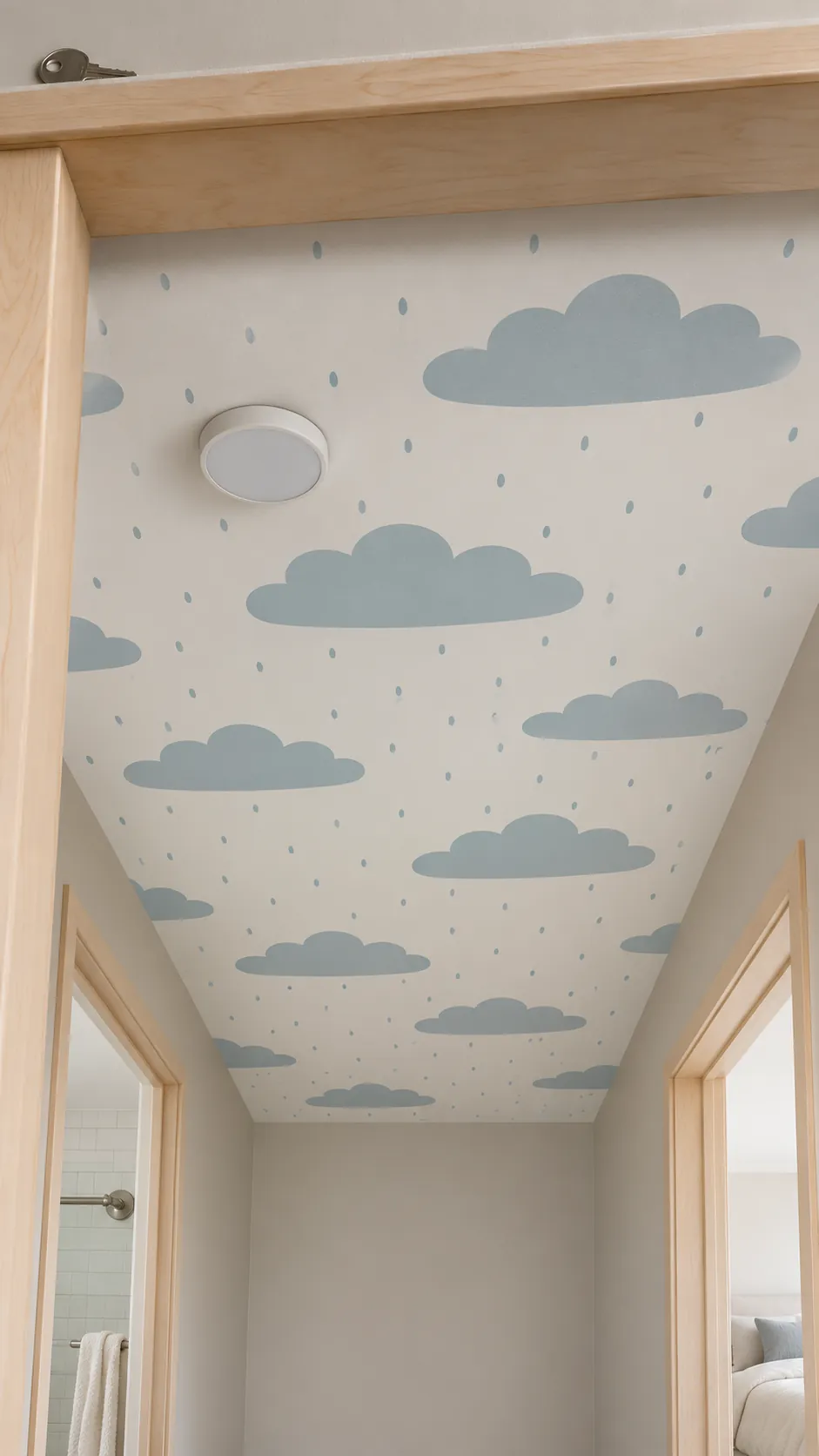
A small ceiling can suit a light repeat that looks clear from below. Check both directions of the print before you choose the layout, especially if the ceiling is visible from two rooms. Follow the product directions for overhead installation and ask an installer about the surface if you are unsure.
Test a Removable Print Where It Will Go
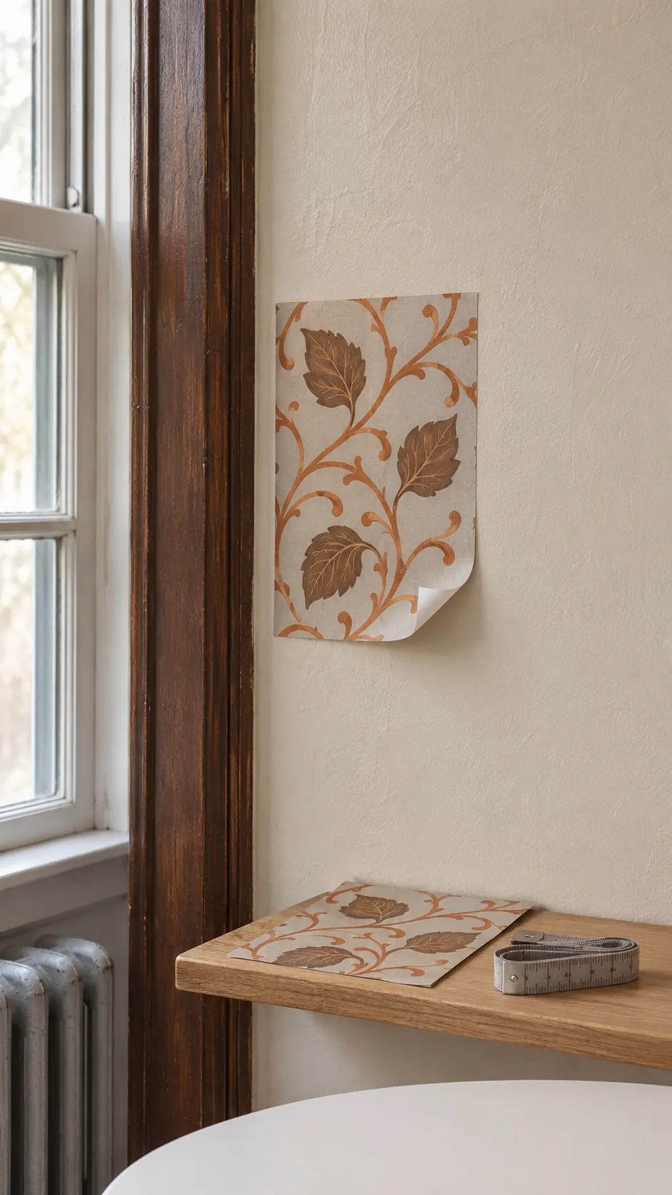
Before you commit to a retro accent wall, look at the wall in light from the side and run a hand over the surface. Removable products vary and old, textured or uncured paint can cause trouble. Use a sample large enough to show the color in your light.
Get the property owner’s permission where required and follow the maker’s test and removal directions. Take the sample down before ordering if you need to know whether the finish will lift. Check the printed instructions for how long the sample should stay in place.
Lay Out the Full Repeat Before Ordering
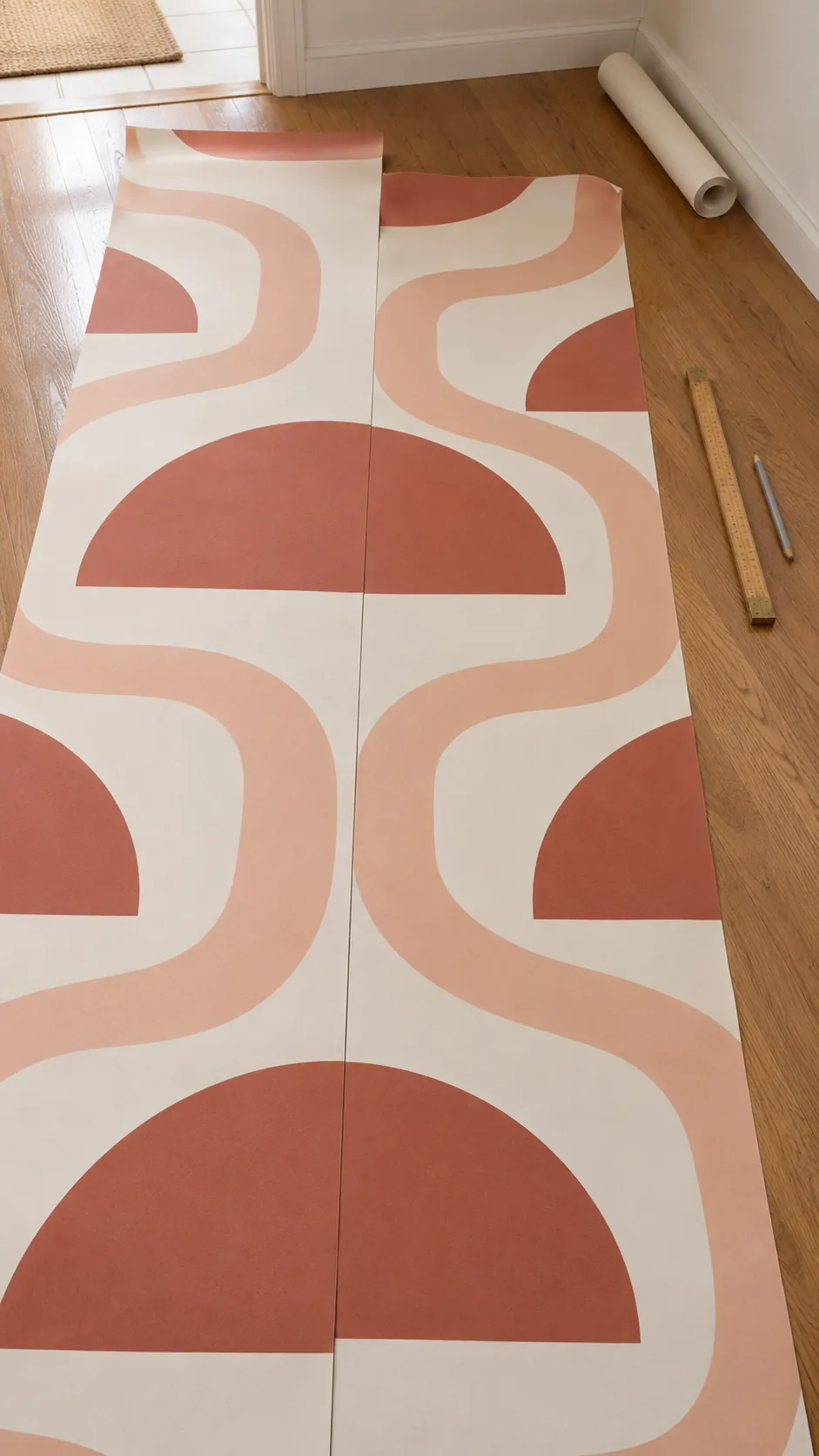
A bold print can use more material when the next drop must start much farther down the roll to match the motif. Use the maker’s repeat and match details, then allow for height variation and trimming. Put two adjacent drops on the floor or on a clear work surface and find the alignment. If a door or tall cabinet crosses the wall, check which part of the paper will actually be seen before finalizing the layout.