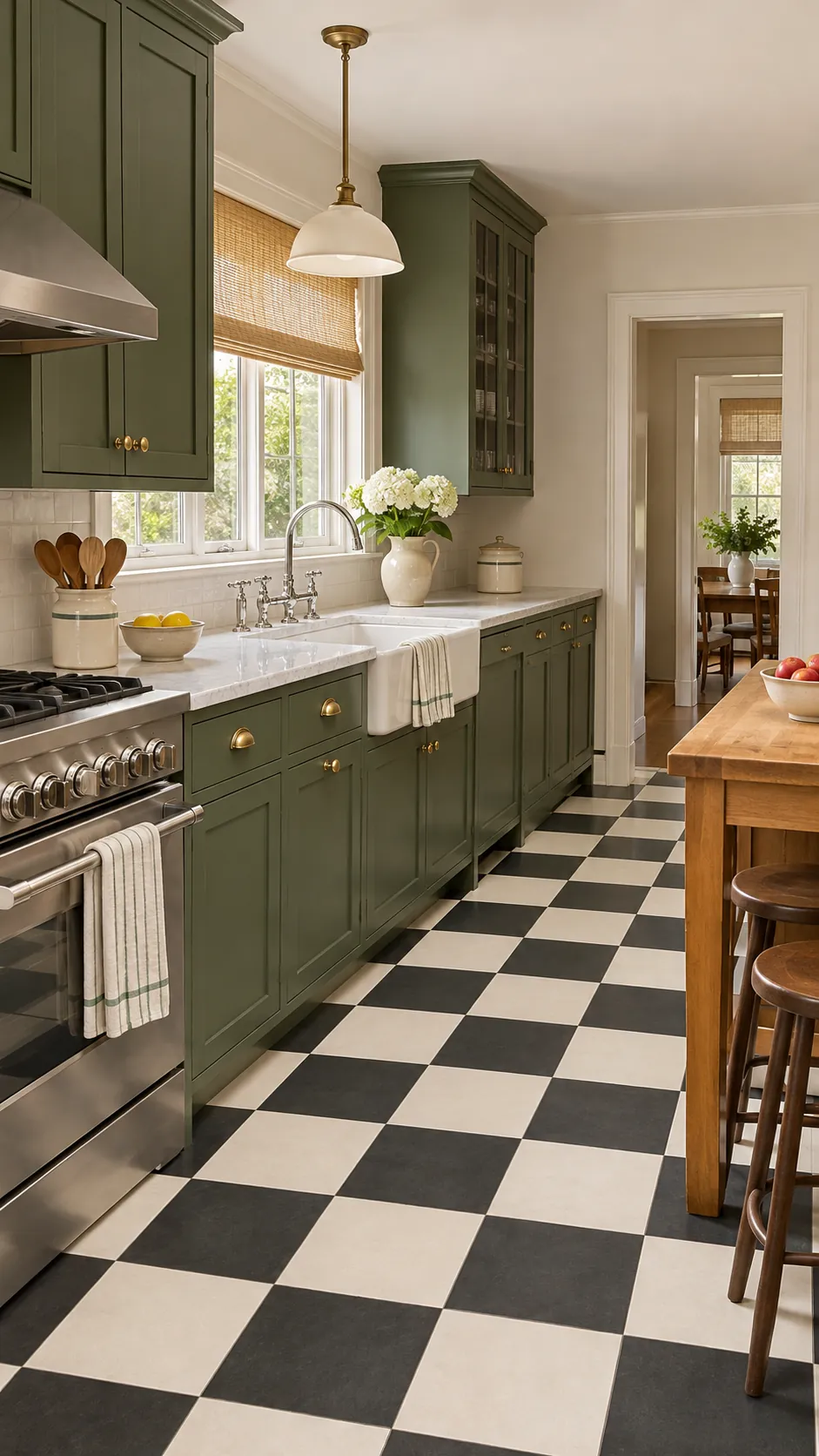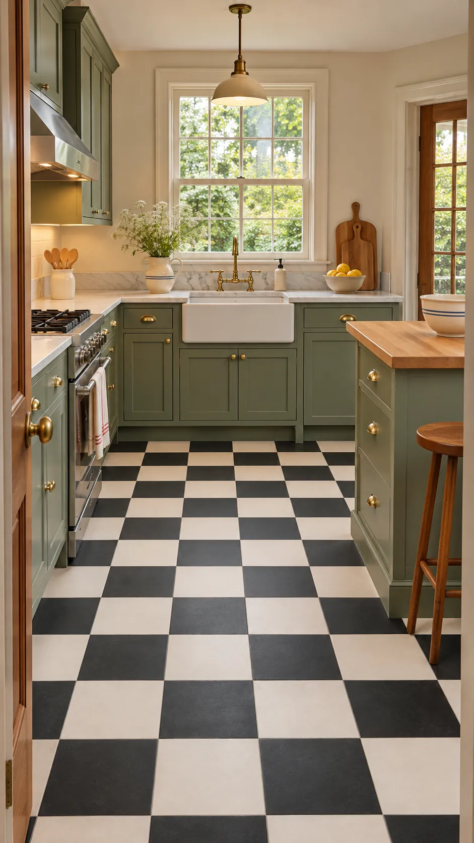
A checkerboard floor changes the entire room, so color and scale deserve more attention than trend alone. The strongest designs align the grid with the kitchen, preserve safe footing, and let cabinets remain readable. Material choice matters as much as the pattern because kitchens face water, grease, and daily traffic.
Classic Black And White
Black and white creates the clearest checkerboard and suits kitchens with simple cabinetry. Use a warm white on walls so the contrast does not feel harsh. Medium grout makes everyday dust less obvious.
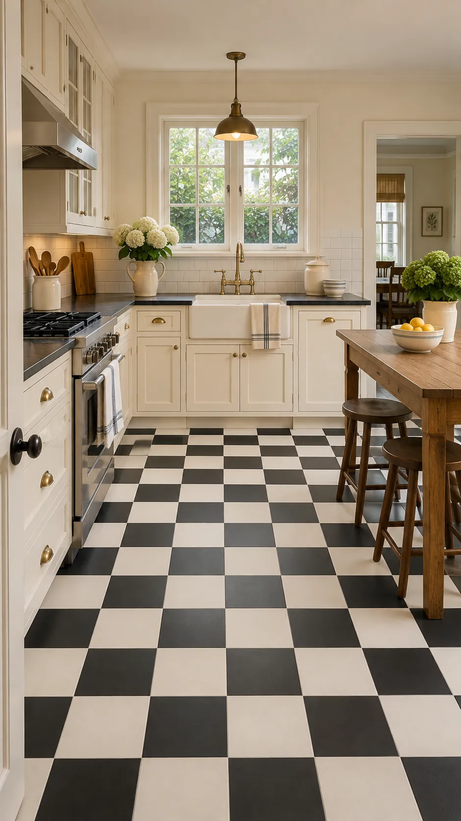
Warm Cream And Charcoal
Charcoal and cream preserve the graphic rhythm while softening the extremes. The warmer pair works especially well with walnut and aged metal. Sample both colors under daytime and evening light.
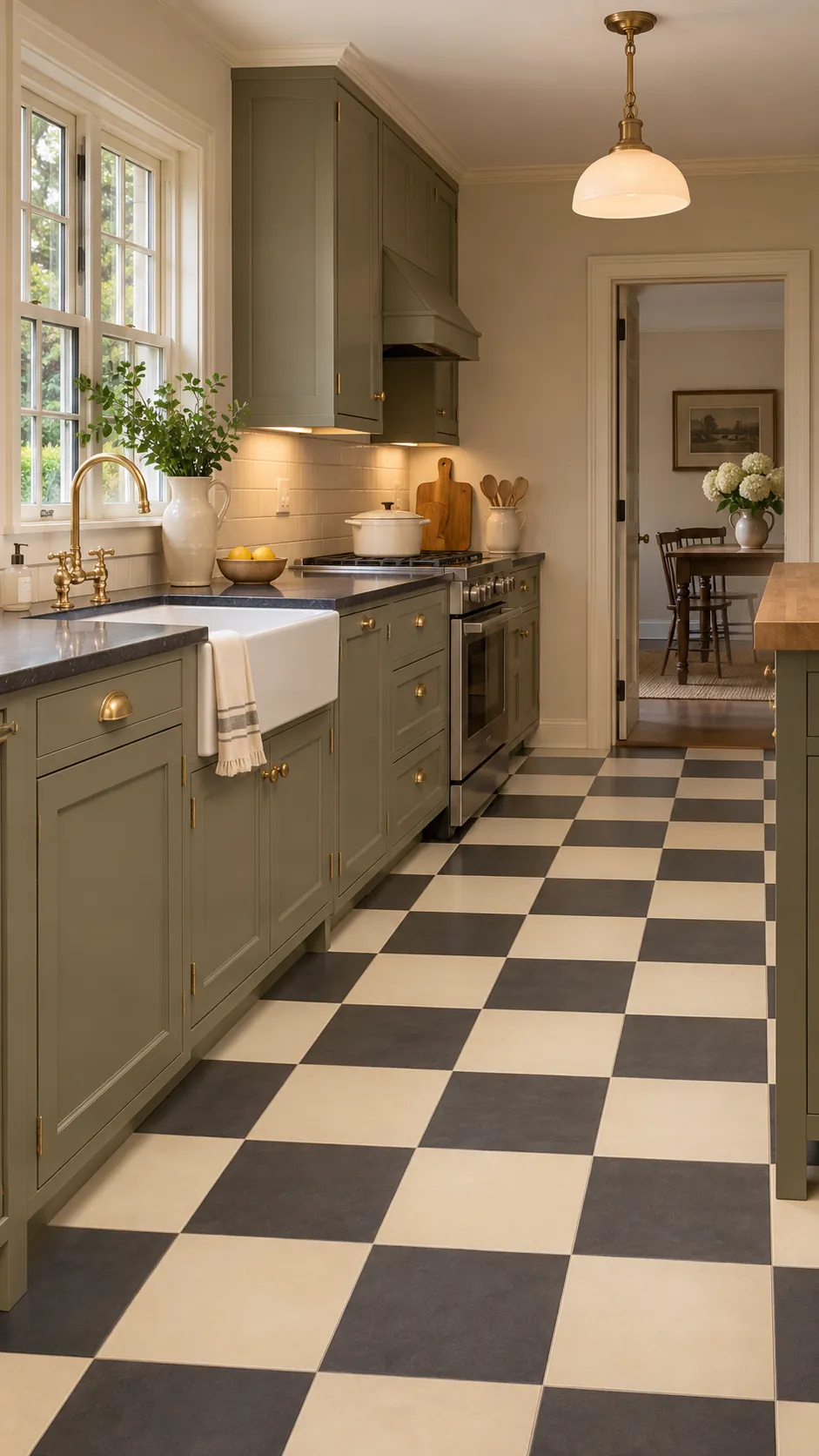
Sage Green And White
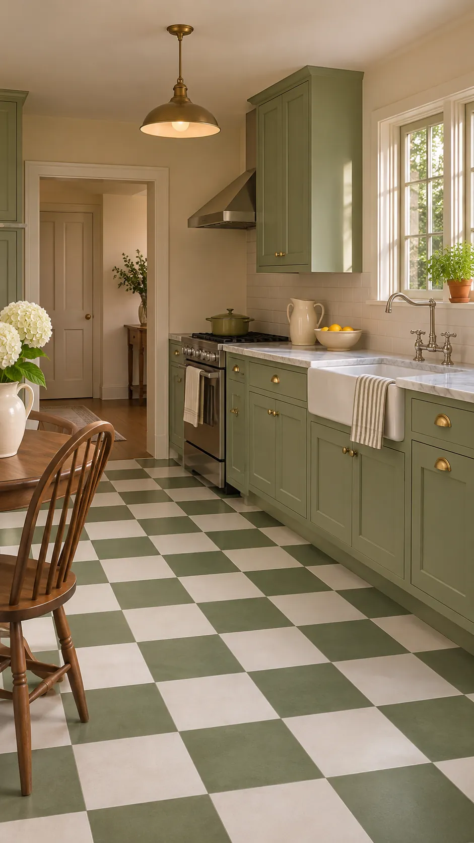
Sage checks introduce color without making the floor dominate every other surface. Keep cabinets cream or natural wood to let the green breathe. Repeat sage once in a small textile or ceramic.
Oxblood And Cream
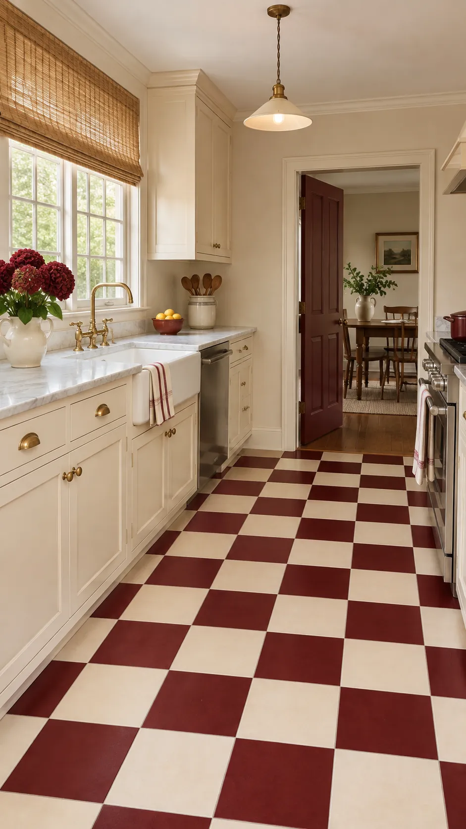
Oxblood tiles bring depth to a vintage kitchen and disguise some staining. Pair them with creamy squares rather than pure white. Use the red sparingly elsewhere so the floor remains the focal point.
Terracotta And Ivory
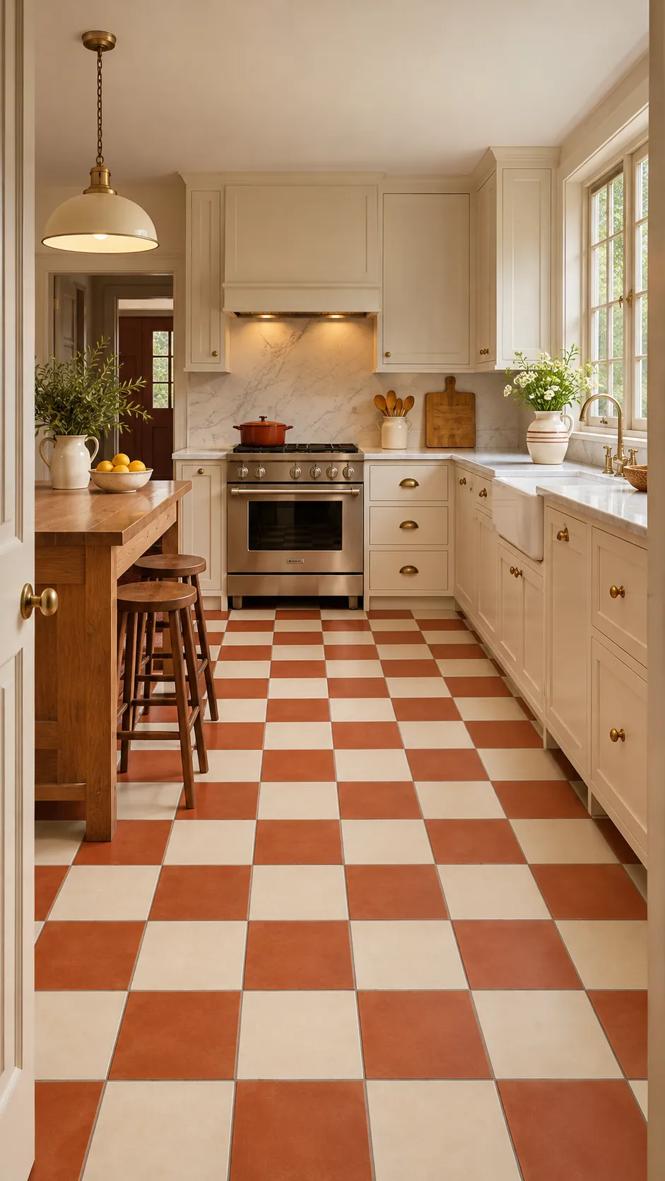
Terracotta and ivory make the grid feel sun warmed and relaxed. Choose a sealed surface that tolerates kitchen spills. Natural wood and woven shades support the earthy palette.
Blue Gray Checkerboard
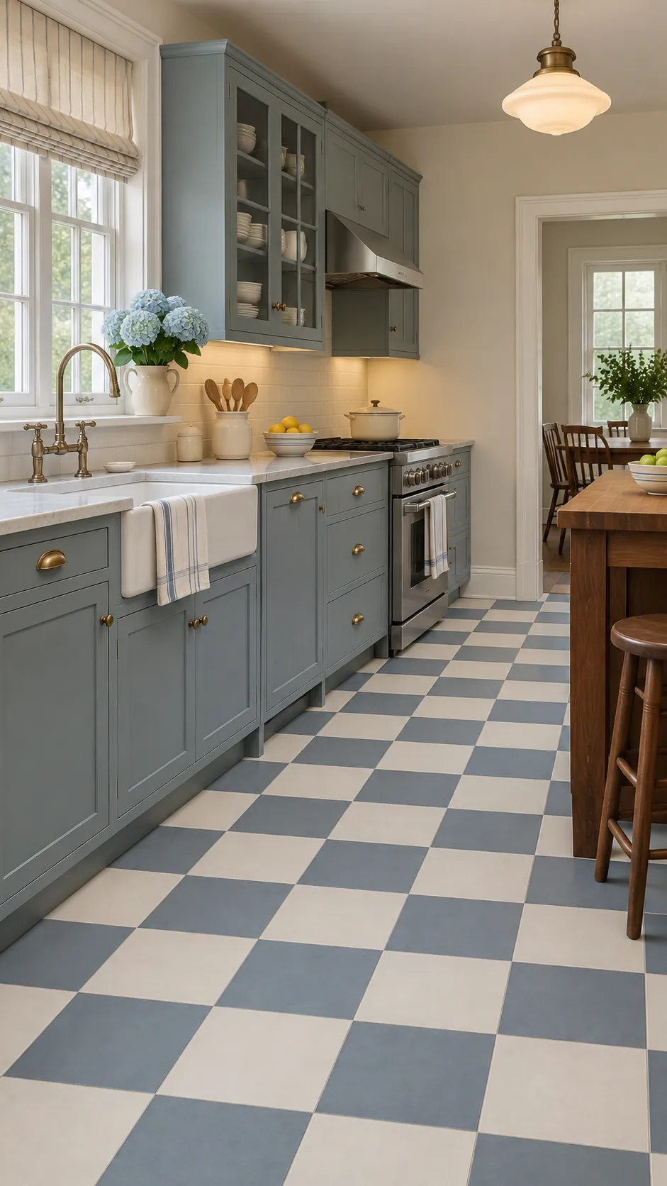
Blue gray squares suit stainless steel and cool daylight while still feeling vintage. Balance them with warm timber or cream paint. Avoid adding several other cool blues that flatten the scheme.
Mustard And Off White
Mustard checks provide a playful 1950s note in a compact space. Keep the second square muted and the cabinetry restrained. A small amount of black hardware can sharpen the pale palette.
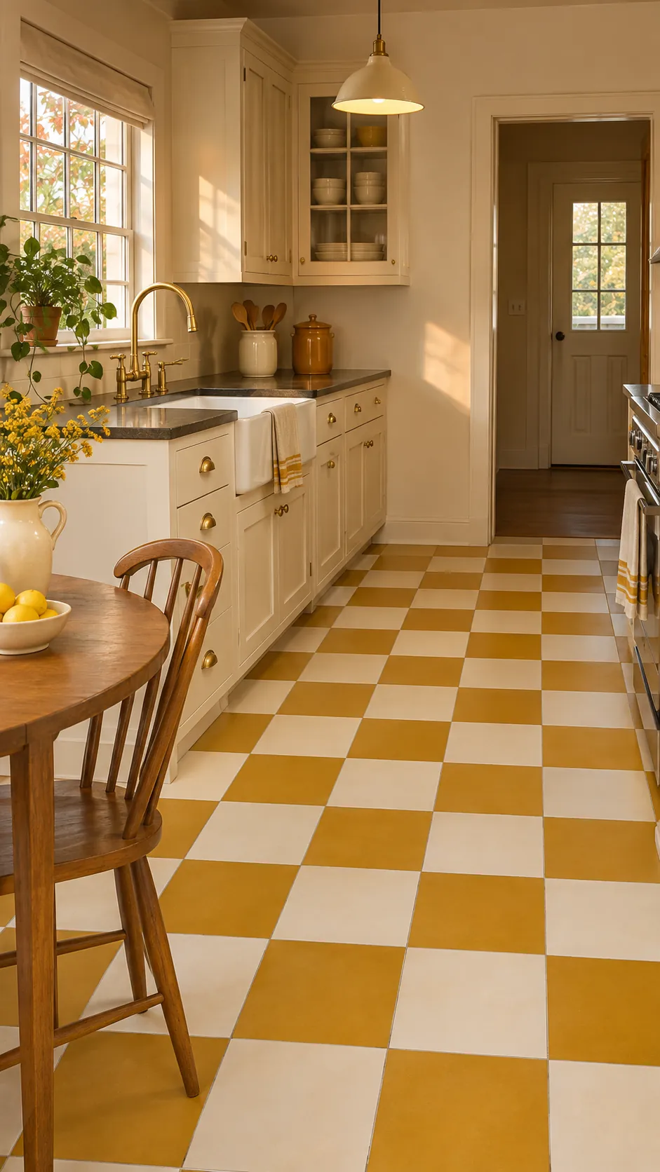
Small Scale Mosaic Checks
Small mosaic checks add texture without enlarging the apparent tile scale. They fit a narrow kitchen when the grid remains precisely aligned. Choose grout that does not break the pattern into noisy outlines.
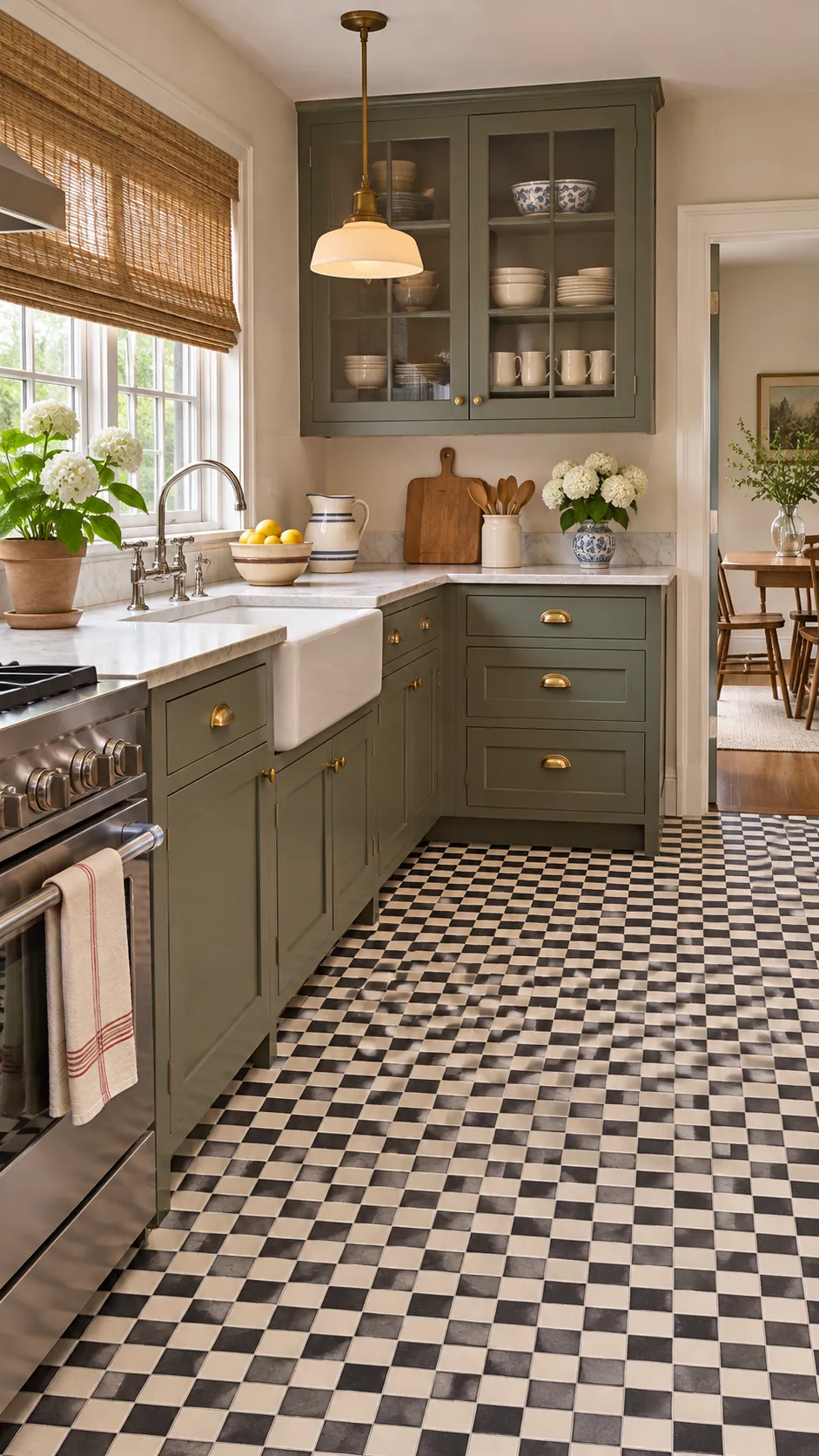
Oversized Graphic Squares
Oversized squares make a confident floor and can simplify a large open kitchen. Center the pattern on the main aisle rather than an isolated corner. Limit competing patterns on backsplashes and curtains.
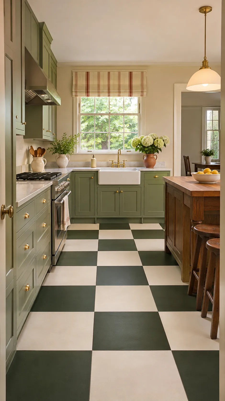
Diagonal Tile Layout
A diagonal layout draws the eye across the room and can broaden a narrow plan. Expect more cuts along walls and cabinet bases. Plan the center line before installation to avoid awkward slivers.
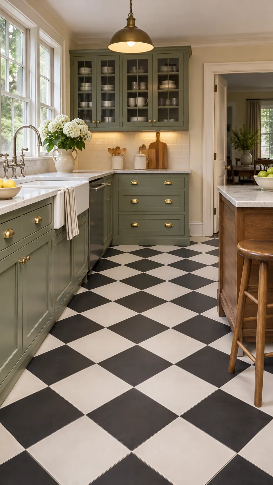
Straight Grid Alignment
A straight grid emphasizes cabinet alignment and gives the room a calmer order. Run joints parallel to the longest wall. Check old walls for irregularity before using them as the only reference.
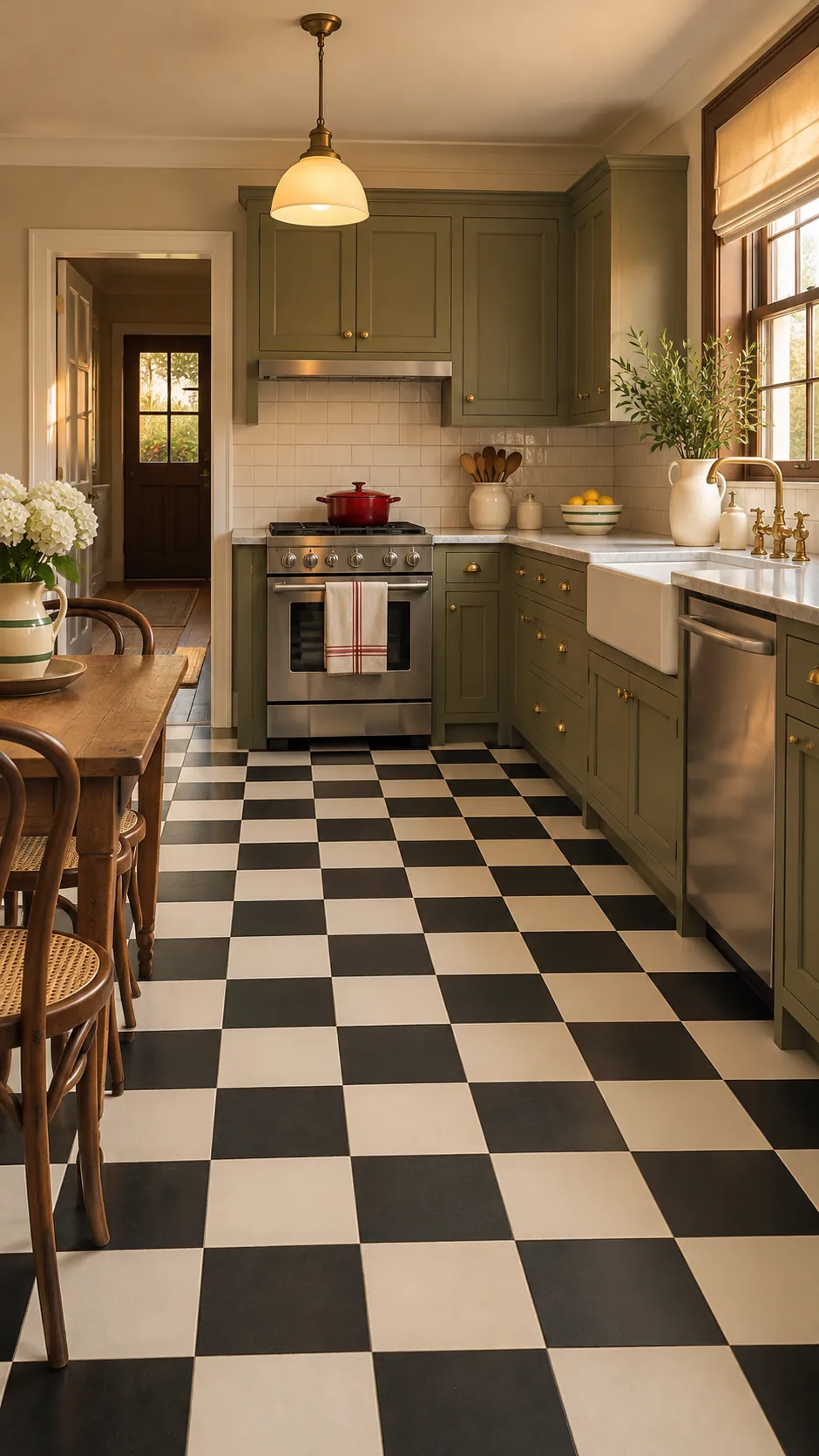
Matte Porcelain Finish
Matte porcelain offers grip and hides small smudges better than a polished surface. Select a finish rated for floors and wet areas. Subtle texture should not be so deep that crumbs collect.
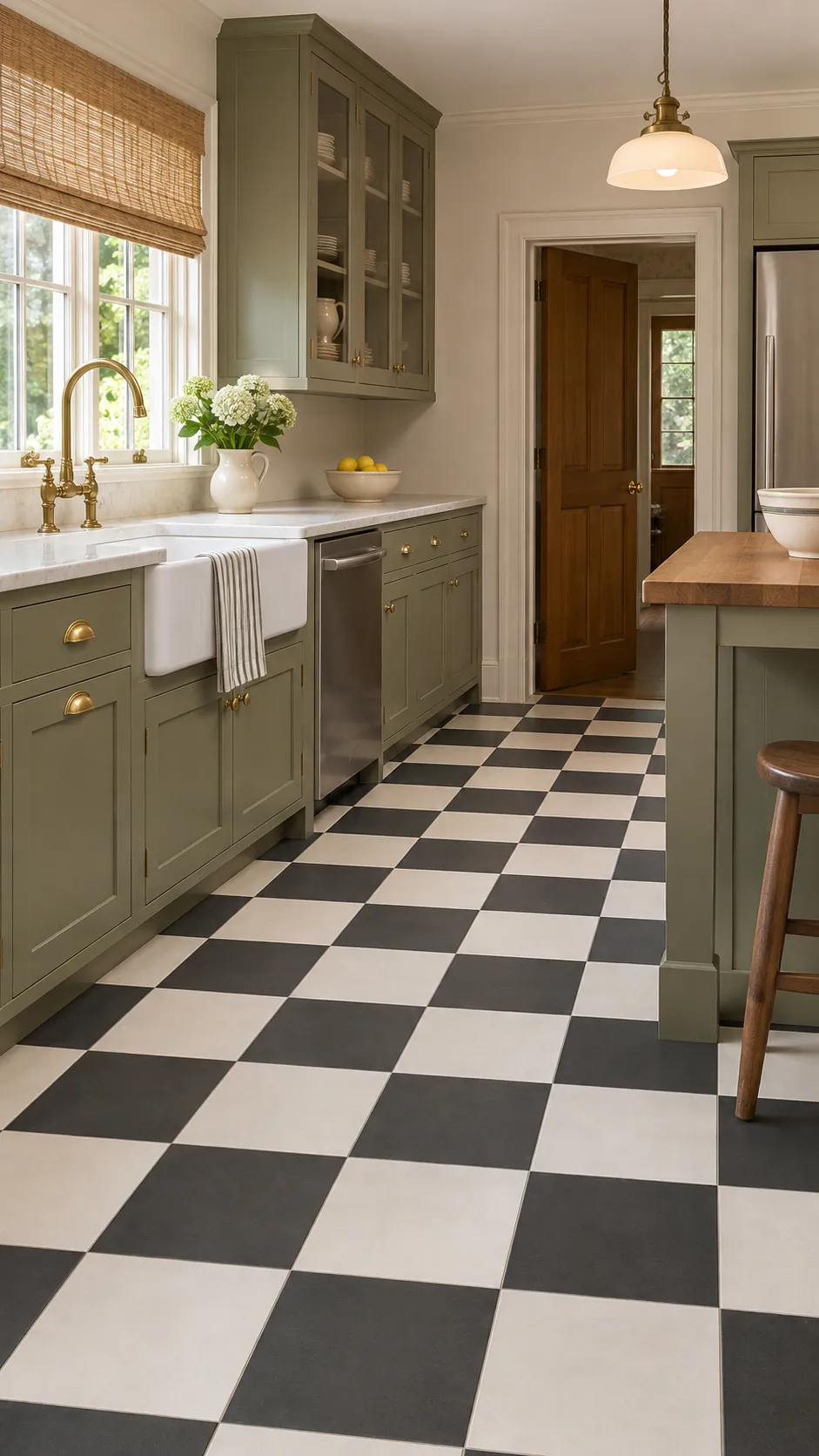
Glazed Ceramic Shine
Glazed ceramic reflects light and suits a carefully maintained vintage kitchen. Use it only when the product carries a suitable floor rating. Place washable mats where water commonly falls.
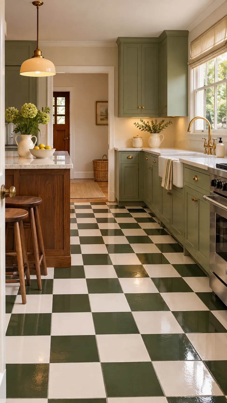
Natural Stone Checks
Stone checks create natural variation in every square. Seal porous material and confirm both stones have compatible wear characteristics. Wider tonal movement makes the pattern feel less mechanical.
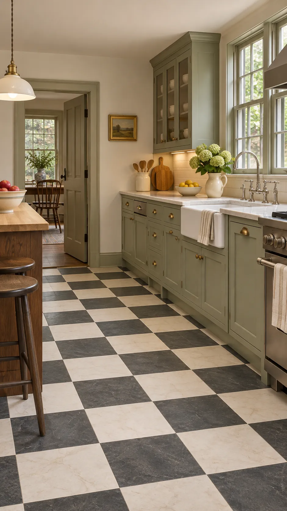
Painted Wood Checkerboard
Painted wood can reveal checkerboard character without removing sound floorboards. Prepare the surface thoroughly and use durable floor paint. A clear protective coat makes future cleaning easier.
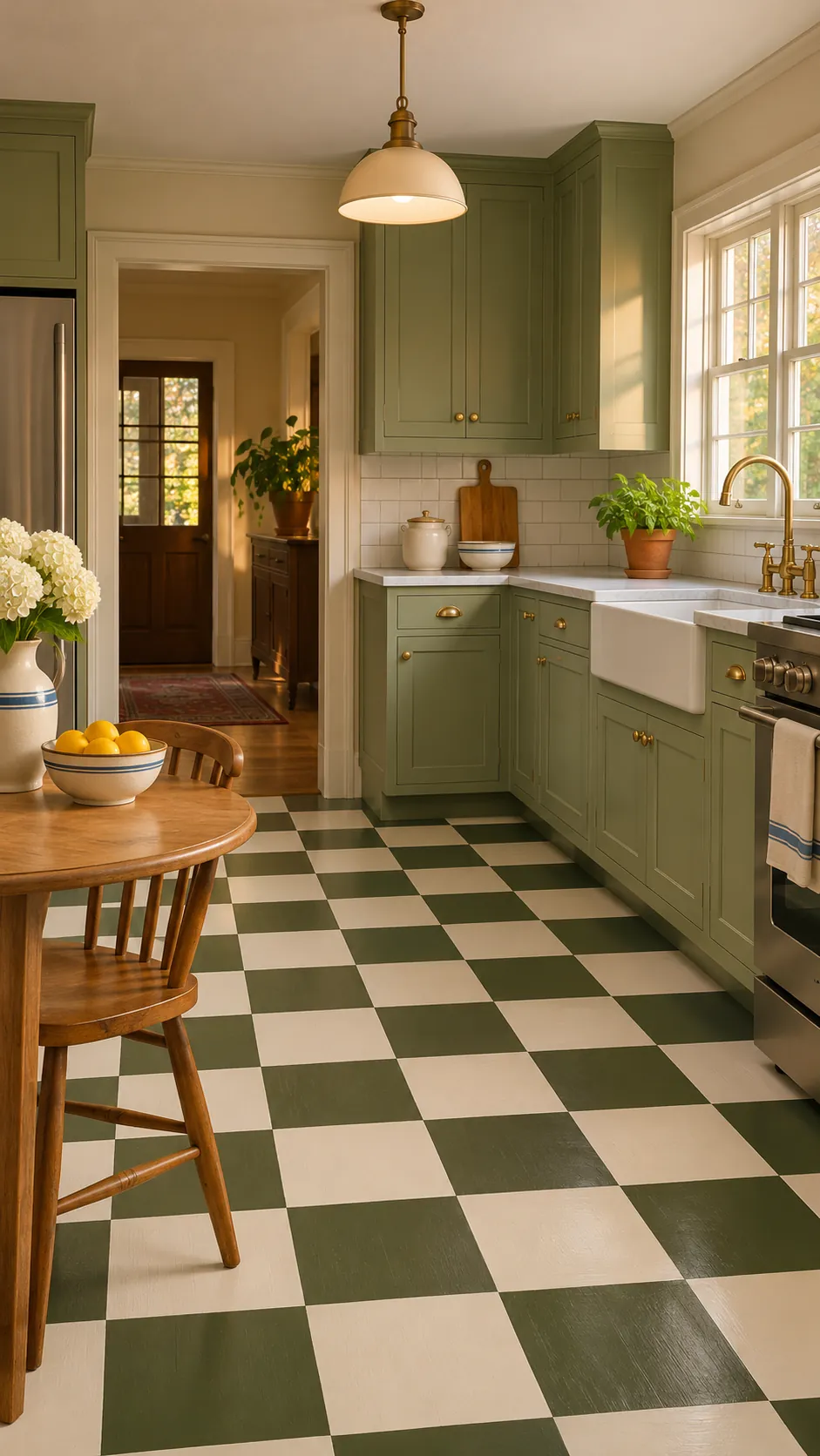
Vinyl Tile Update
Peel and stick or commercial vinyl tile can deliver a quick graphic update. A smooth, stable substrate determines whether edges remain flat. Follow temperature and adhesive instructions before loading the room.
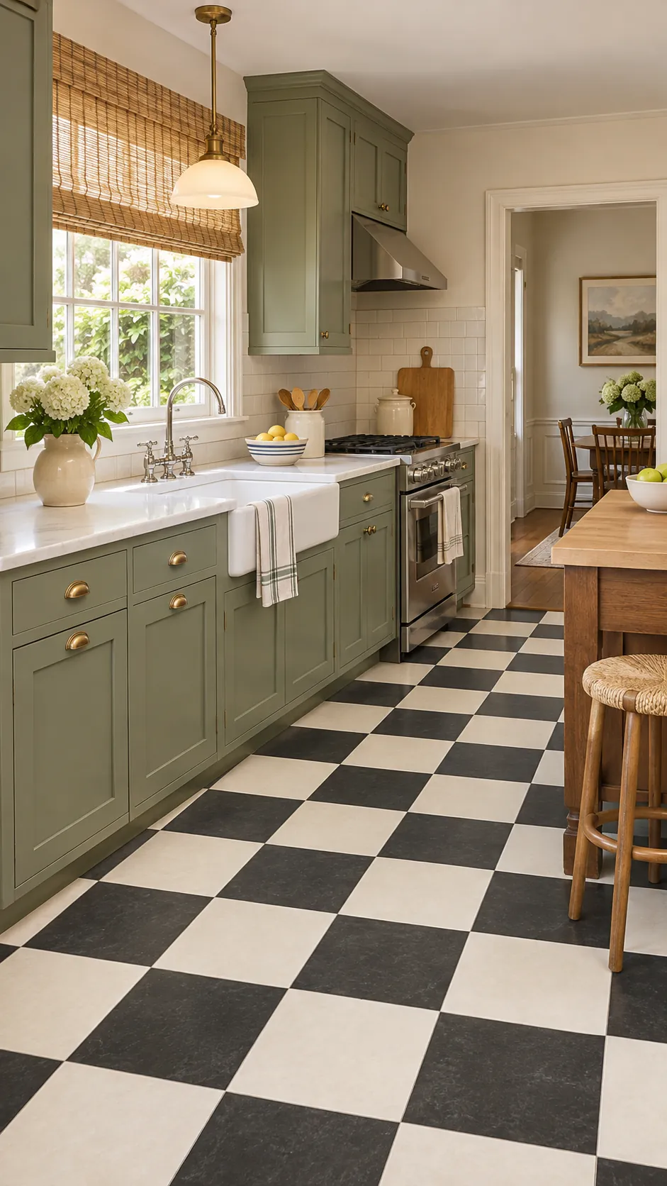
Linoleum Retro Floor
Sheet linoleum gives a resilient floor with period credibility and softer sound. Professional seaming helps the pattern stay accurate. Protect the material from prolonged standing water at edges.
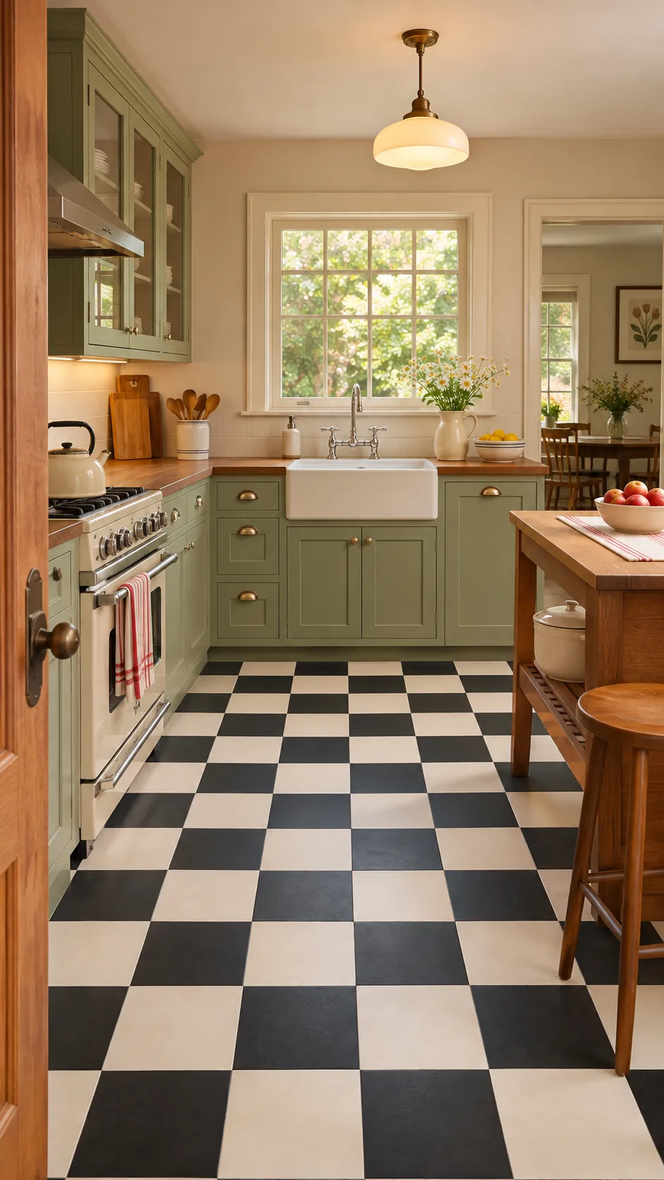
Checkerboard Border Detail
A plain border can frame checkerboard tile and solve awkward cuts near walls. Keep the band width consistent around fixed cabinets. Match it to the darker square for a crisp outline.
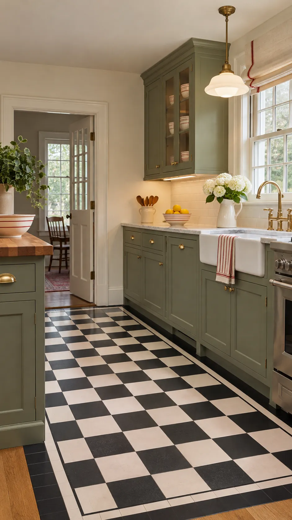
Checkerboard Breakfast Nook
Using checks only in a breakfast nook creates a distinct zone without covering the whole kitchen. Align the transition with architecture or furniture. A clean threshold prevents the insert from looking accidental.
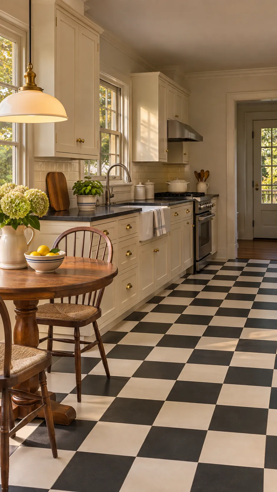
Checks With Walnut Cabinets
Walnut cabinets warm a black, cream, or sage checkerboard. Let the wood grain remain the main vertical texture. Simple counters stop the combination from becoming busy.
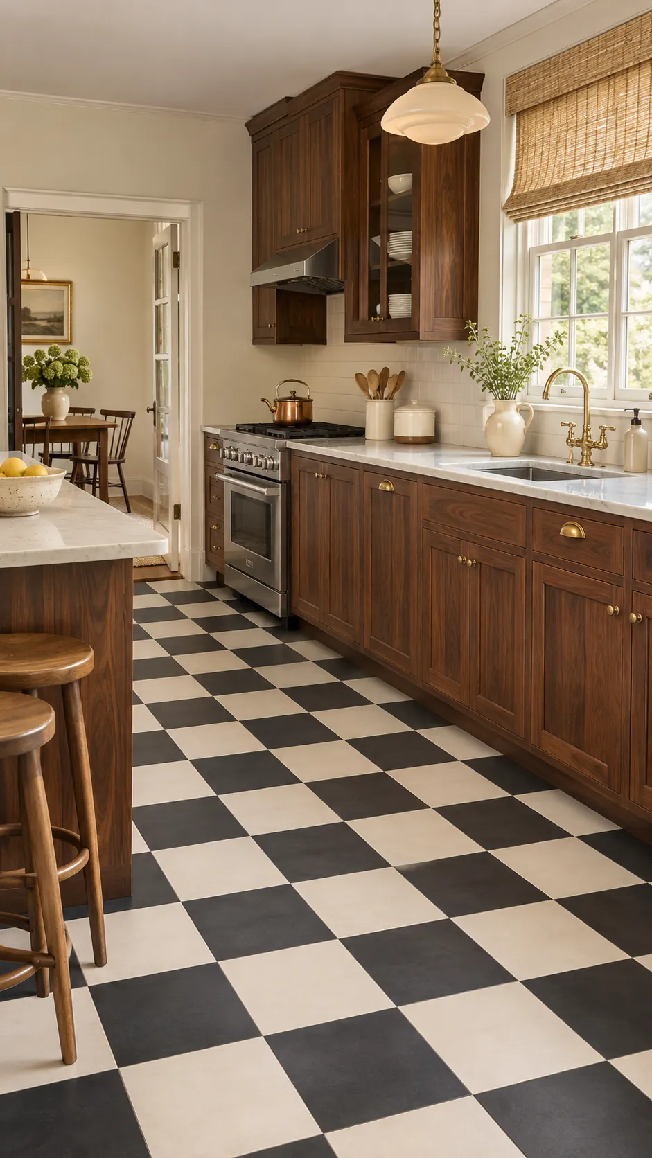
Checks With Green Cabinets
Deep green cabinets and pale checks create a cohesive vintage palette. Choose a floor green that is clearly lighter or darker than the paint. Brass or cream hardware can separate the two surfaces.
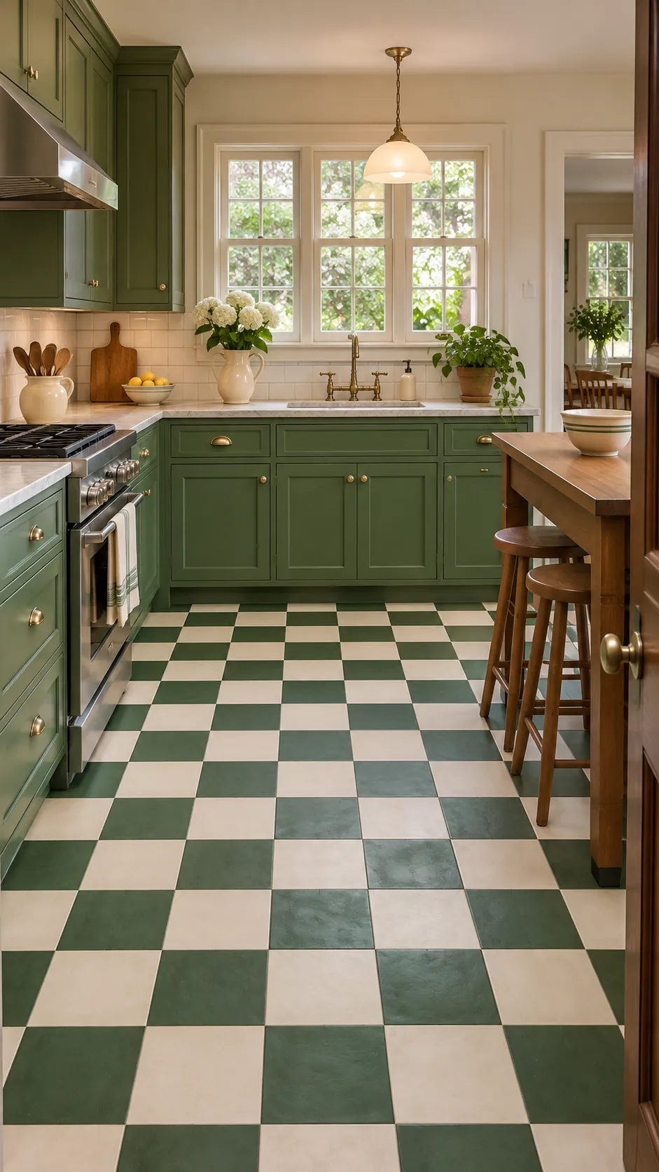
Checks With Red Cabinets
Red cabinets already carry strong color, so the checkerboard needs restraint. Use charcoal and warm white rather than adding another saturated hue. Keep walls and counters quiet.
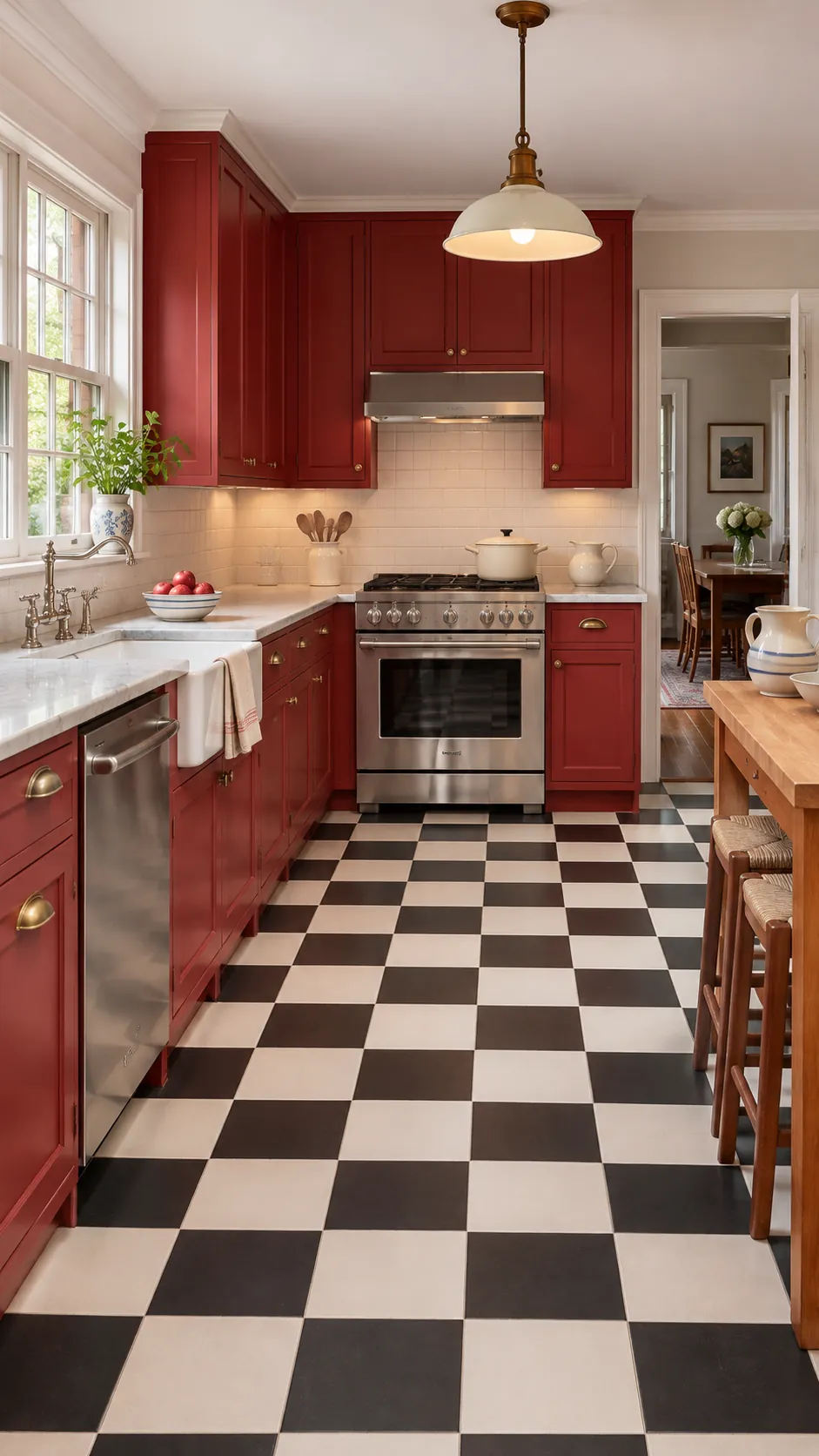
Checks With Cream Cabinets
Cream cabinetry lets a darker checkerboard read clearly while preserving brightness. Select a cream that relates to the light floor square. Walnut stools or shelves add needed depth.
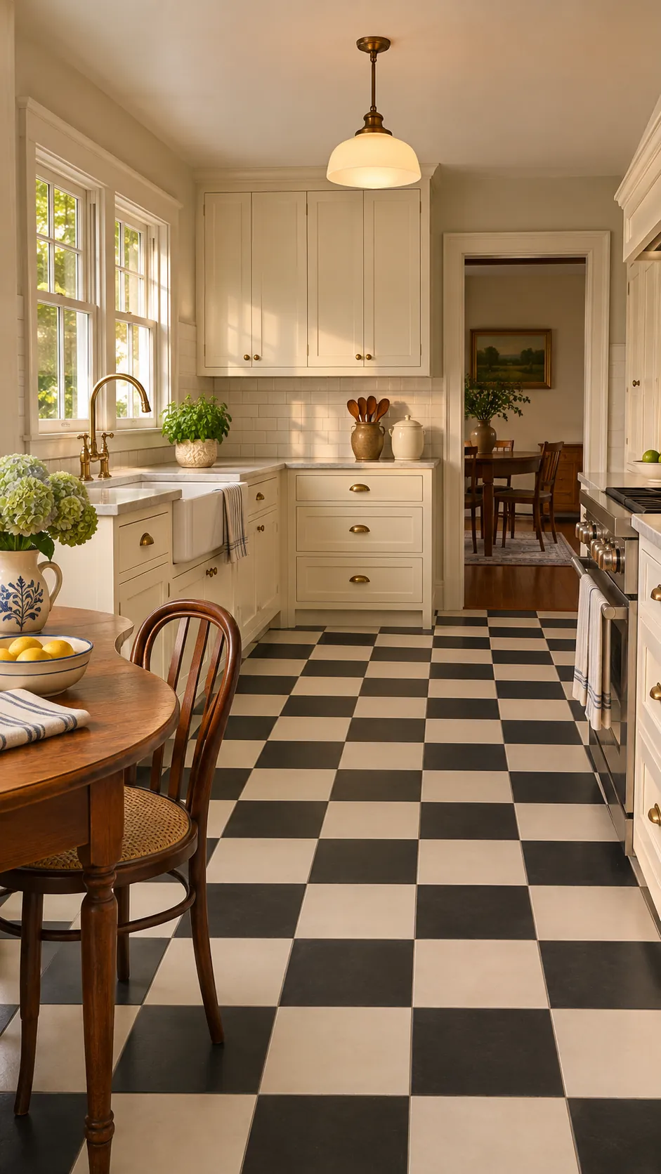
Checks With Open Shelves
Open shelving exposes more wall and makes the floor pattern feel stronger. Limit visible dishes to a consistent palette. Closed lower storage keeps the room practical.
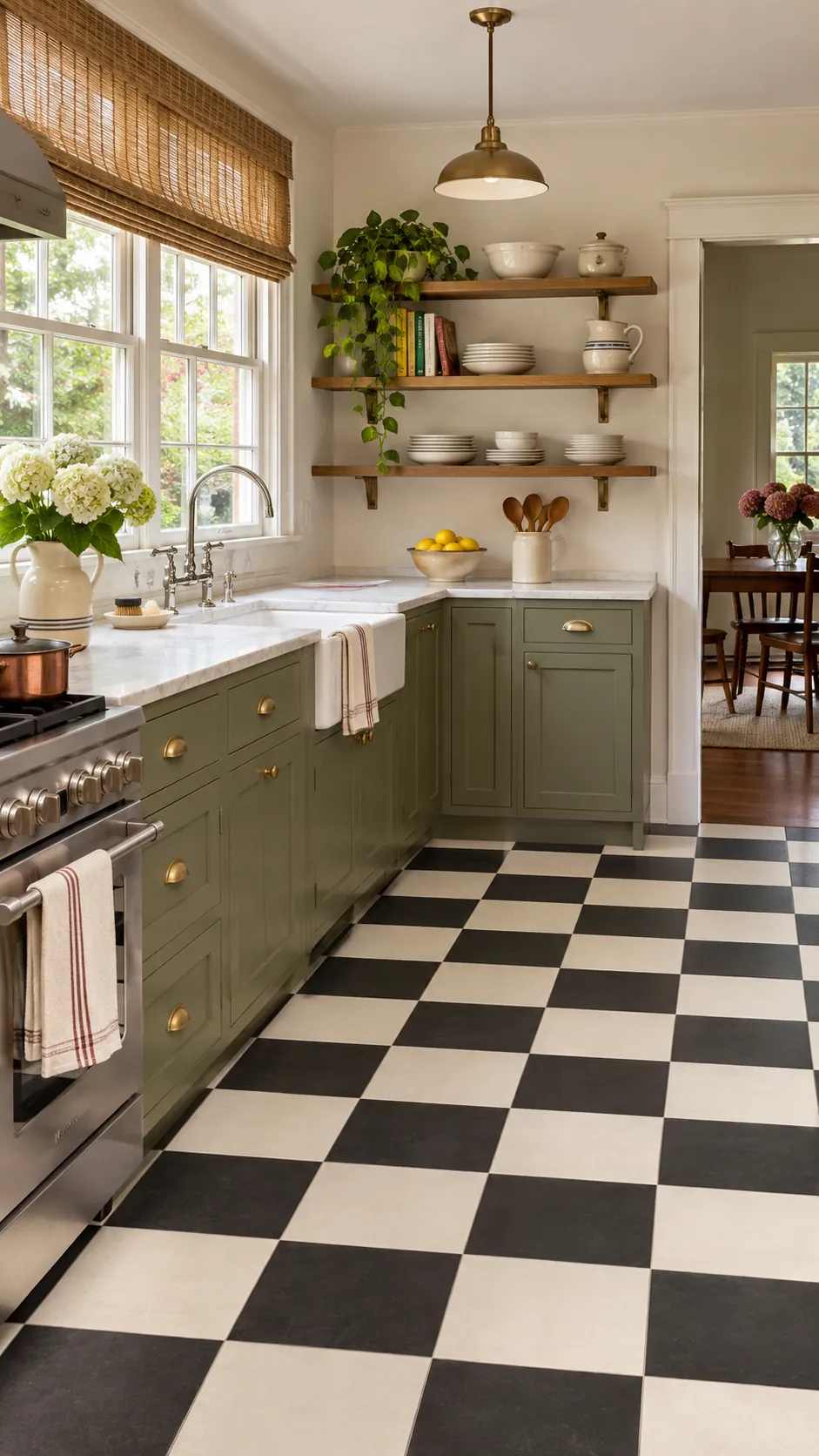
Checks In A Galley Kitchen
A galley benefits from checks scaled to show several repeats across the width. Center a full sequence down the aisle when possible. Straight grout lines reveal installation errors quickly.
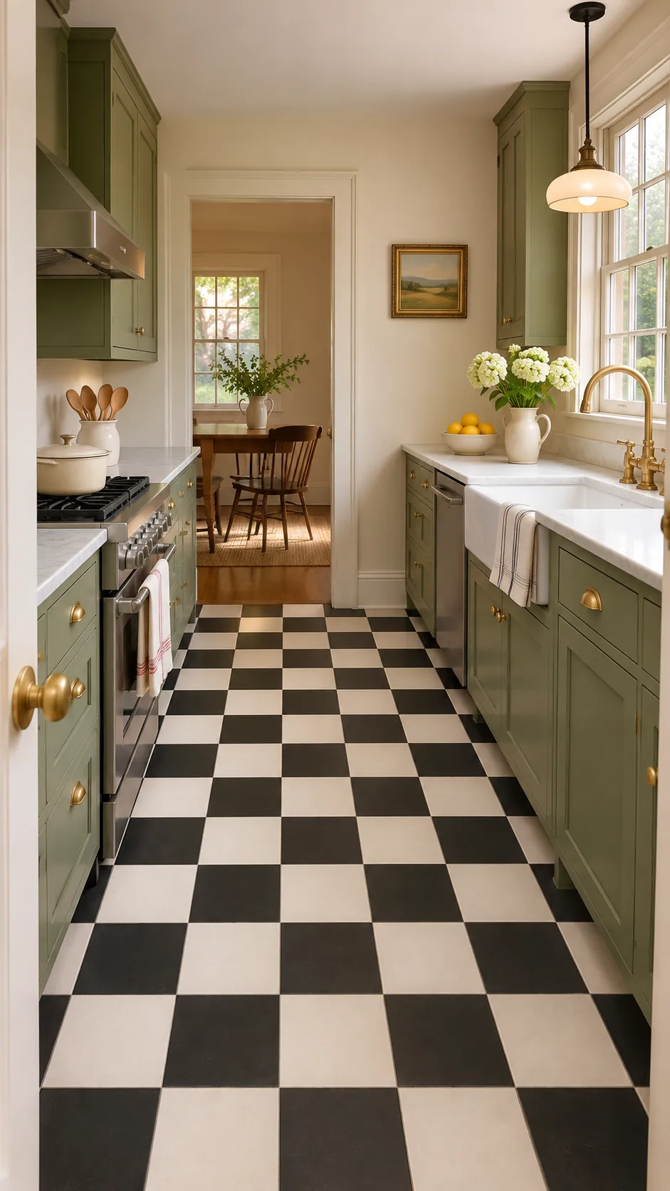
Checks In A Tiny Kitchen
In a tiny kitchen, two close tones can suggest checkerboard without making the space flicker. Small or medium squares show enough repetition. Preserve clear floor area by avoiding extra carts.
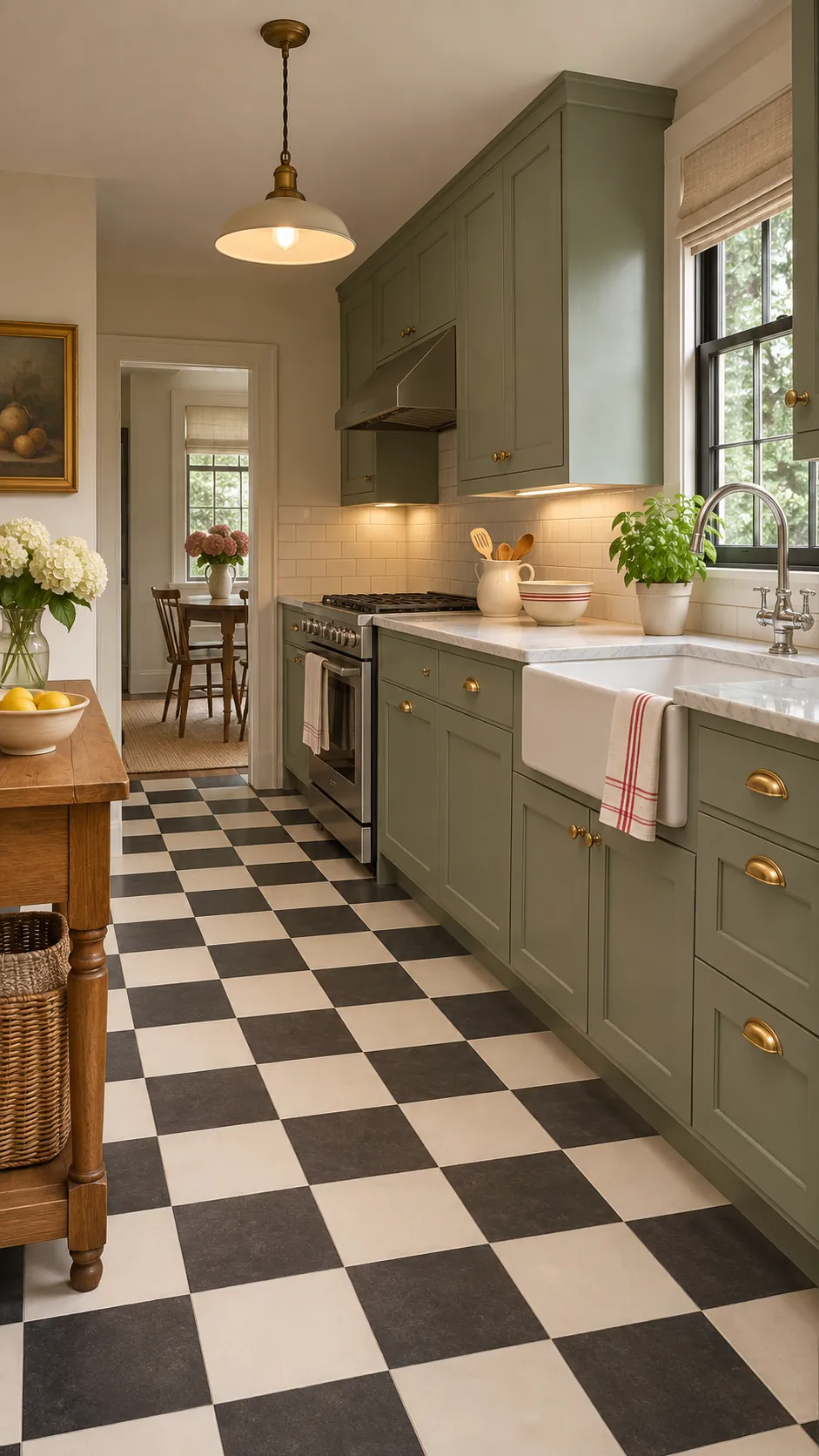
Checks Around An Island
An island interrupts the grid, so establish the pattern from the visible perimeter. Dry lay tiles around corners before fixing them. Keep narrow cuts away from the most prominent approach.
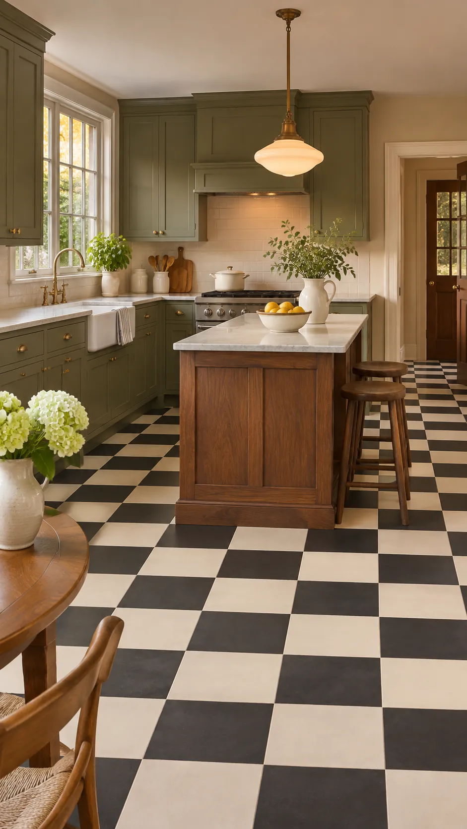
Checks With Chrome Accents
Chrome accents reinforce diner style when used on lights, handles, and stool legs. A black and white floor provides a clean base. Avoid filling every surface with reflective metal.
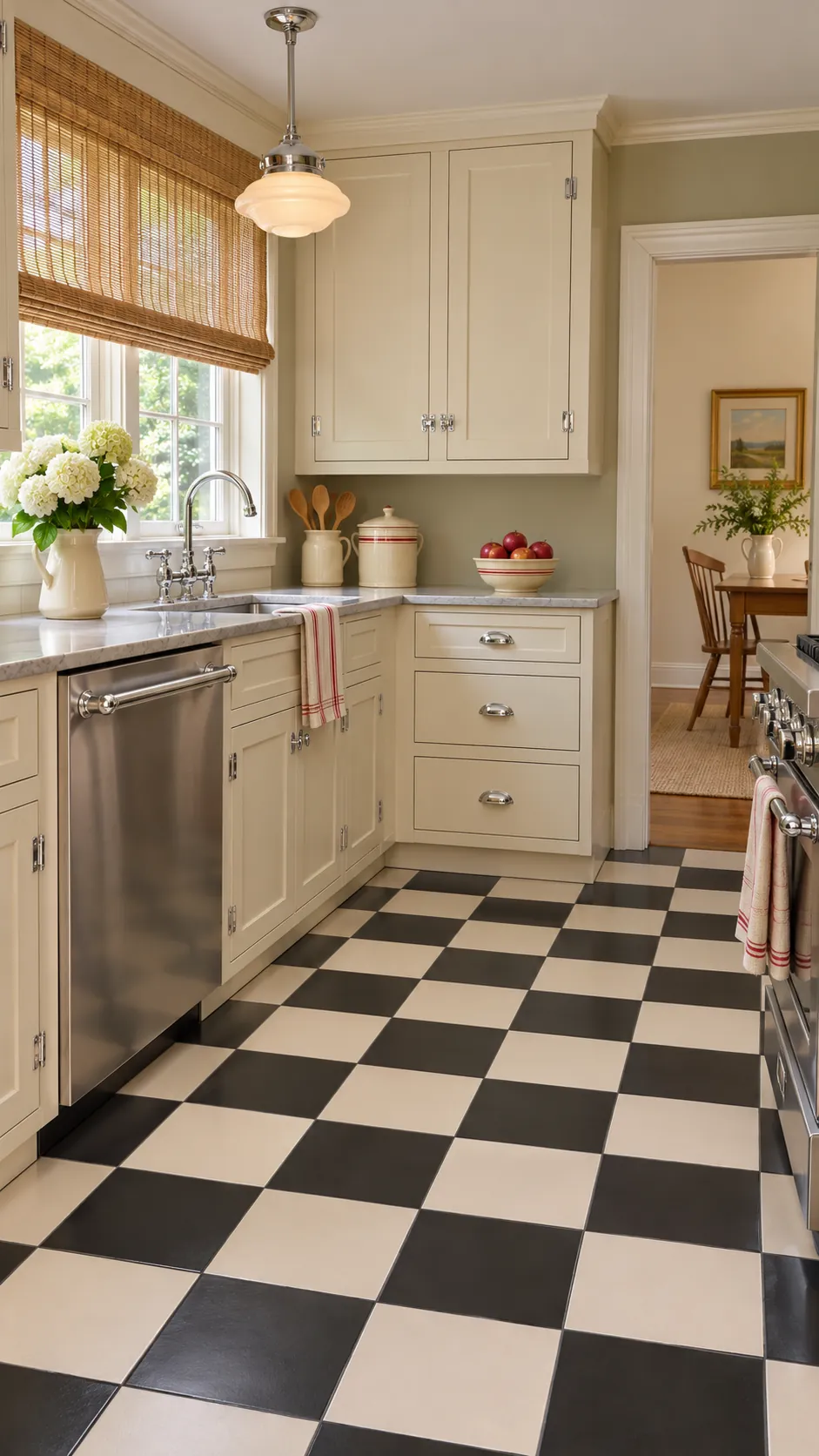
Checks With Brass Accents
Brass warms charcoal, cream, green, or oxblood checks. Choose one brass finish and repeat it in limited functional pieces. Patina keeps the effect softer than polished gold.
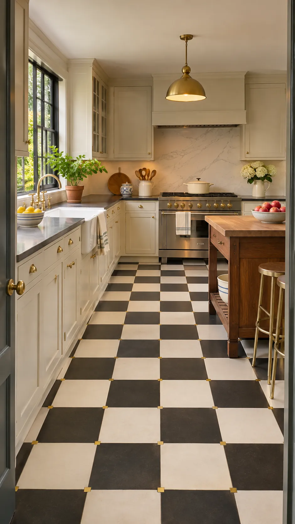
Checks And Subway Tile
A subway tile backsplash can coexist with checks when its grout is quiet. Let the floor use the stronger contrast. Aligning every wall and floor joint is unnecessary and can look rigid.
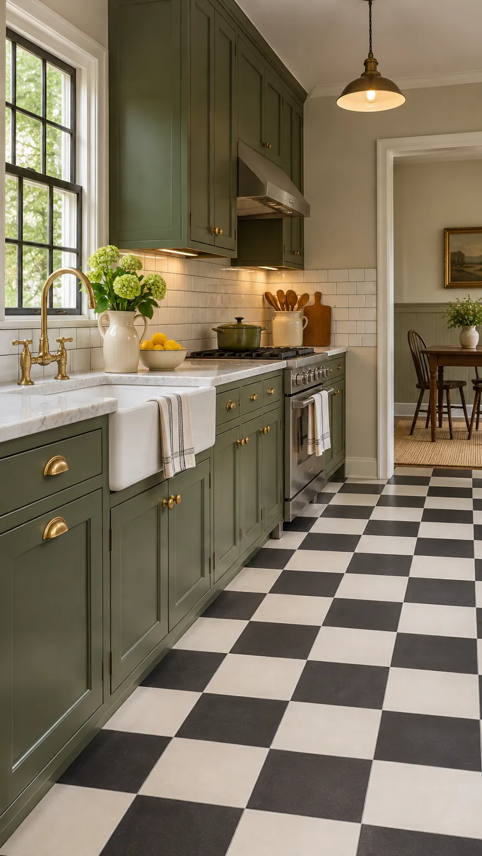
Soft Neutral Checkerboard
Taupe and ivory checks give renters or minimal kitchens a gentler statement. Texture and sheen must separate the squares enough to preserve the pattern. Dark wood provides a useful anchor.
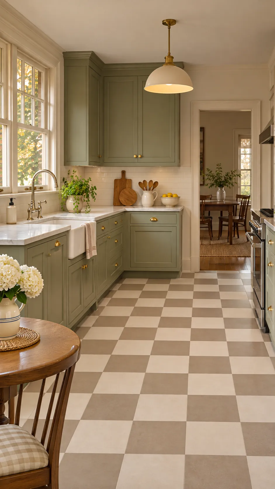
Balanced Statement Floor
The best floor supports cabinet color, room width, light, and daily cleaning needs at once. Test a full group of sample squares rather than judging one tile alone. Confirm the layout from every doorway before installation.