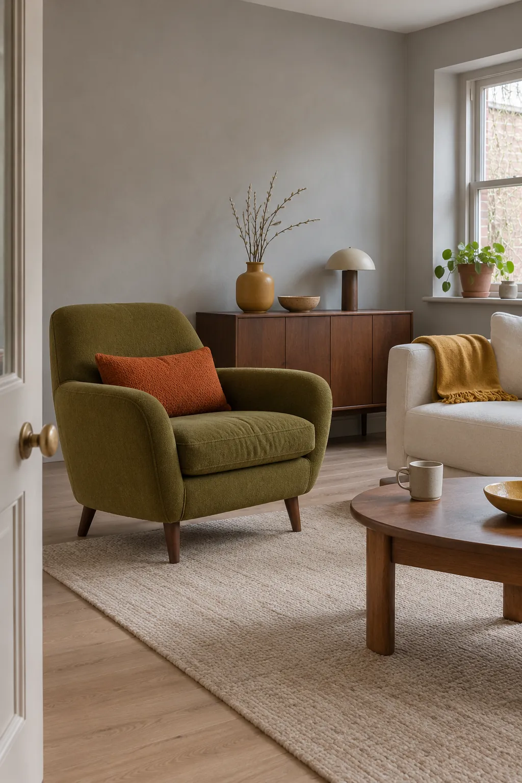
A mustard cushion can look lively on its own and muddy beside an orange floor. Before choosing a second accent, look at the colors already taking up the most space. Wood paneling, tile and a sofa can each do part of the work. Then give the shade you want to notice a clear place in the room.
Avocado green and cream for a kitchen
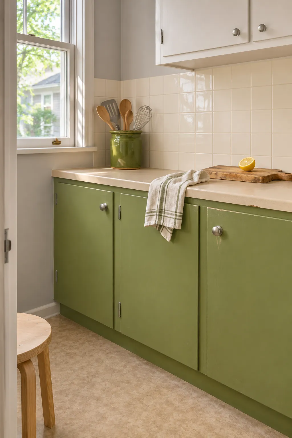
Let avocado green sit where you want the eye to stop. A single run of lower cabinets is a good starting point if the room already has cream tile or pale laminate. Keep the area around the window light so you can see the difference between the green in direct light and its warmer olive undertone in the corner.
Paint two sample boards and stand one against the wall and the other close to the worktop. Floor color also matters. A strong pink tile can make some yellow greens look sharper, while a sandy floor keeps the pairing quieter. Try a green utensil crock first if you want a small change you can lift away.
Burnt orange and chocolate brown for a living room
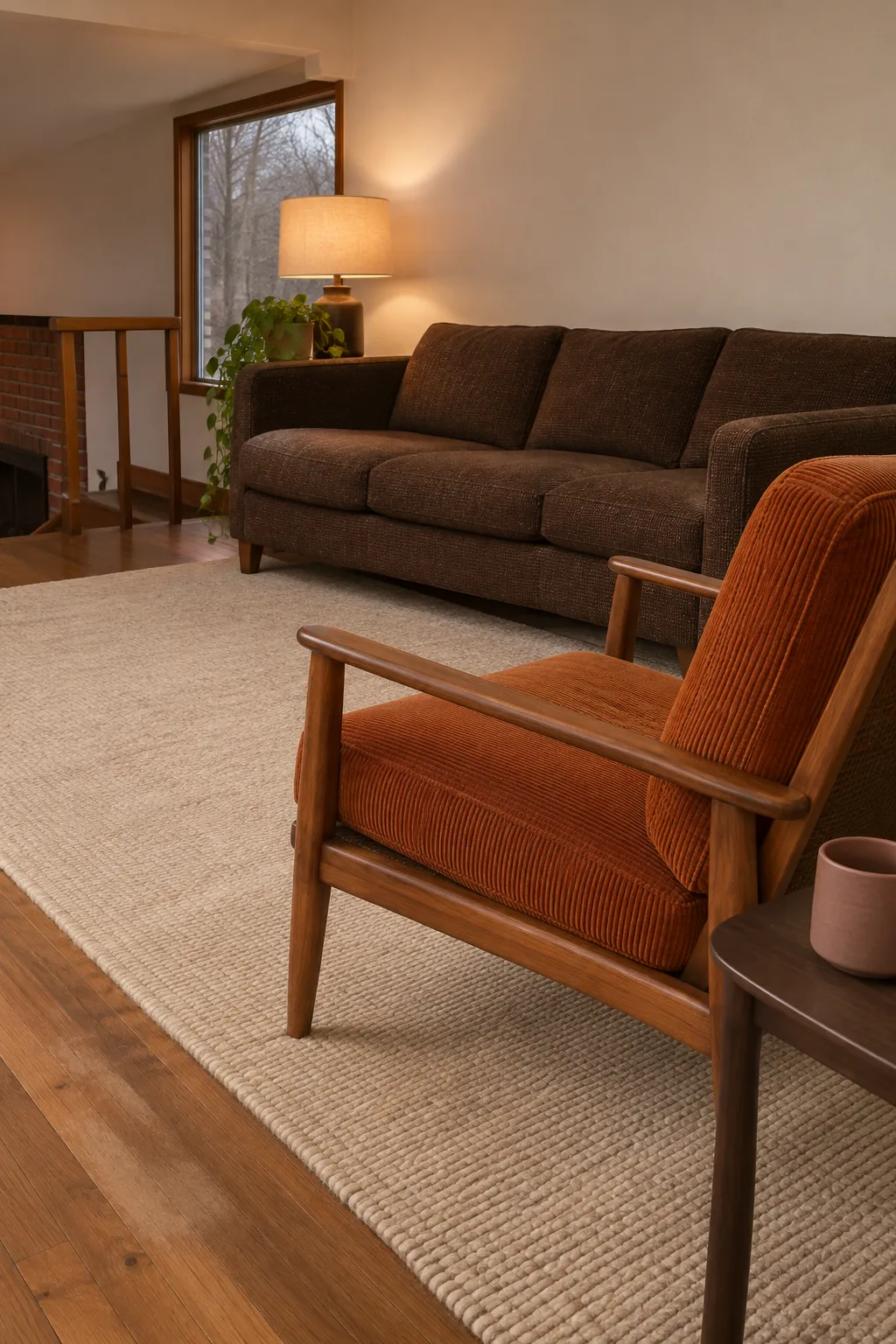
A chocolate brown sofa or cabinet can serve as the deep color in the room. Give burnt orange a smaller job, such as a firm seat cushion on an existing wood chair. Use cream or a natural woven rug to leave a lighter stretch of floor between the two.
Take a fabric swatch to the room at night. Warm bulbs can move orange toward red and make a dark sofa lose visible detail. Put the swatch by the seat instead of under the lamp to judge how it will look most of the time.
Harvest gold with walnut and warm white
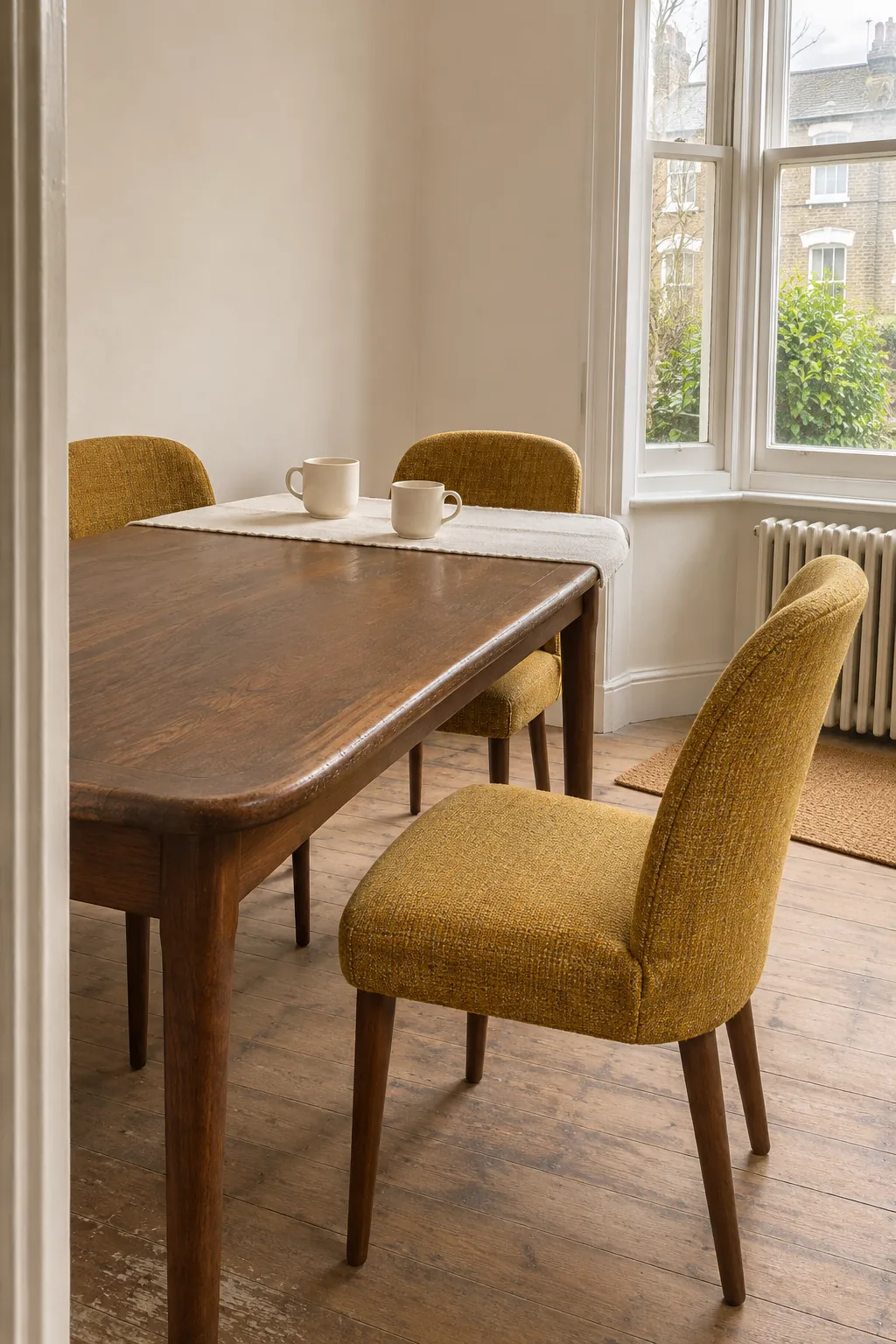
Use harvest gold when you want an earthy yellow that works with dark grain. In a dining nook, a warm white wall can keep much of the room bright while a small group of yellow chairs sits around a walnut table. Leave the largest walnut surface in view so the yellow has a darker neighbor.
Mustard and harvest gold labels vary by maker, so use the swatch in front of you. Hold it against a plain warm white card first, then against the wood. Choose the color you still like when the bright window is behind you, since a sunlit sample will show only one side of how it looks.
Rust and olive with oat textiles
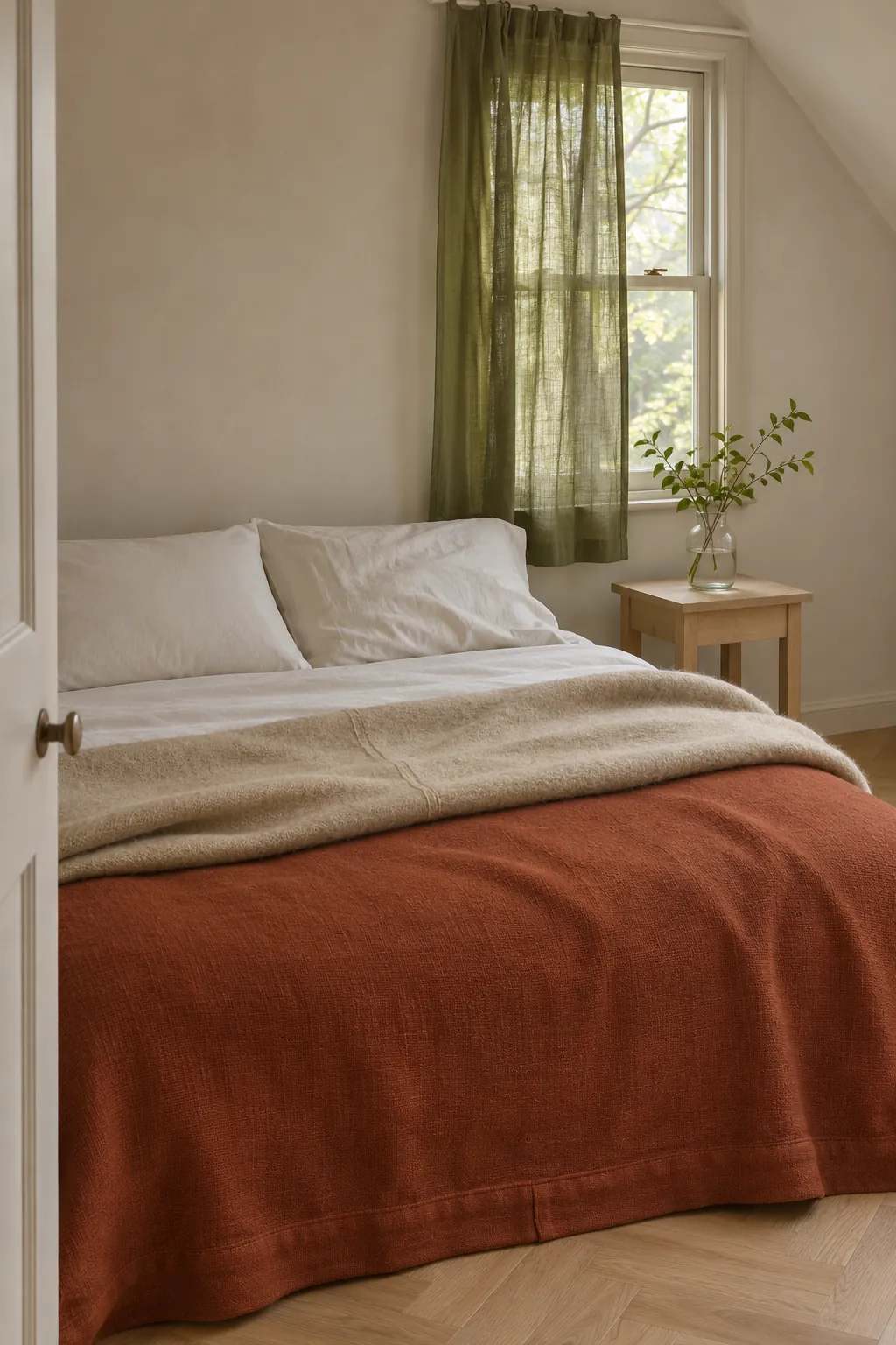
Rust and olive can sit close together in a bedroom when they are both muted. Put the heavier color on the lower half of the bed and reserve the second one for a pillow or a curtain. An oat colored blanket with visible weave helps separate the two.
If you have an olive curtain, look at its fabric from the bed at midday. Light passing through a loosely woven cloth will change both its value and its green. A rust bedcover has more room to stay steady if the main walls are light.
You can also reverse the balance. Put olive on the bed and let a small rust shade or throw carry the warmer color.
Plum and petrol blue for deeper retro color
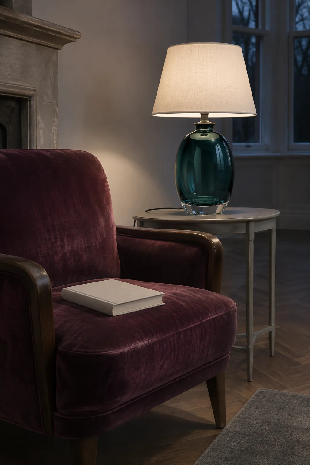
If orange and avocado feel too warm, try one of the period’s richer color combinations. Plum and petrol blue work in a reading corner where the neutral pieces can do most of the work. A plum seat beside a blue glass lamp gives the colors different finishes, so each stays distinct even in a small area.
Check how both colors look at night. Some dark blues lose their blue in a warm pool of light. A lamp with a neutral white bulb and plain shade gives you a clearer view of what the fabric and glass actually look like.
Terracotta, denim blue and natural wood
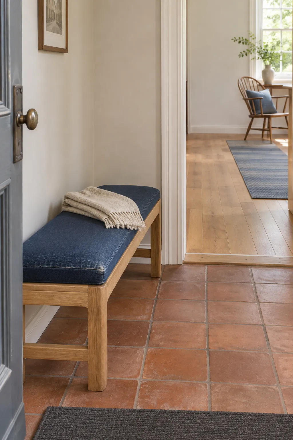
Start with the fixed brown or orange surface you see from the door. Terracotta tile can take the warmer role on its own. Set denim blue in a place where its matte surface is easy to read, such as a fabric bench pad near the entry.
Repeat the blue only if it helps connect the next room. A slim cloth runner near a chair might be enough if the wood already carries through both spaces. Look back at the entry after dinner with the lights you use most. If the whole room feels dark, first introduce a light textile or give an existing light surface more room to show.