
Have you ever walked into a room that felt instantly calming, even though there weren't any bright colors? That is the power of a well-executed neutral palette. Many people think neutrals are just 'boring beige,' but a modern interior color palette uses a sophisticated mix of tones to create depth and warmth without cluttering the visual space.
This guide will show you how to move beyond basic white walls. We will look at how to balance warm and cool tones, how to use texture to prevent a flat look, and how to coordinate your furniture with your home decor color palettes for a professional finish.
Difference between warm and cool neutral tones

Understanding the undertones of your paint is the first step in creating a successful interior design color palette. Warm neutrals have hints of yellow, orange, or red. These colors make a room feel cozy and inviting, which is why they are popular in living rooms and bedrooms. Cool neutrals, on the other hand, have blue, green, or purple undertones. These shades feel crisp, clean, and modern. If you want a space to feel airy and clinical, go cool. If you want it to feel like a hug, go warm.
How to build a modern interior color palette with greige and taupe
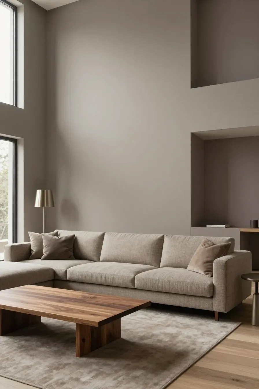
Greige and taupe are the workhorses of the modern colour palette. Greige is a mix of gray and beige. It is popular because it bridges the gap between the coldness of gray and the dated feel of old-fashioned beige. Taupe is a more complex neutral that usually leans toward a brownish-gray with hints of violet. To build your palette, start with one of these as your 'bridge' color. Use it on the largest wall surfaces to ground the room. It allows you to mix both warm wood furniture and cool metal accents without anything looking out of place.
Using texture to keep a contemporary color palette from looking flat
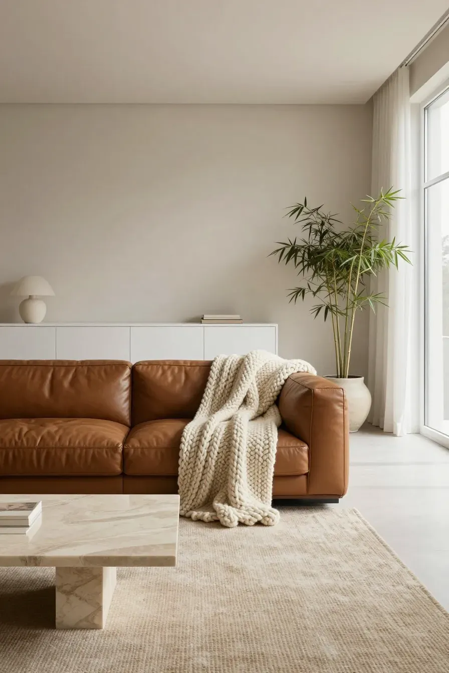
A common complaint about a contemporary color palette is that it can feel 'dead' or one-dimensional. You can fix this with texture rather than more color. In a neutral room, the eye looks for physical variety. Think about a chunky wool throw on a smooth leather sofa, or a matte painted wall next to a high-gloss cabinet. Natural materials like bamboo, linen, and stone add visual weight. When every item in a room has a different feel, the house color palette interior feels rich and expensive even if the colors are very similar.
Choosing a modern colour palette based on natural light

Light changes how we see color. A shade that looks like a soft sand in the store might look like muddy green in a north-facing room. North-facing rooms get cool, bluish light, so they benefit from warmer neutrals to balance the chill. South-facing rooms get strong, warm sunlight, which can make warm beiges look too yellow; these rooms often handle cool grays very well. Always paint a large swatch on your wall and look at it at different times of the day before committing to your interior design colour palette.
Ways to add accent colors to an interior design colour palette
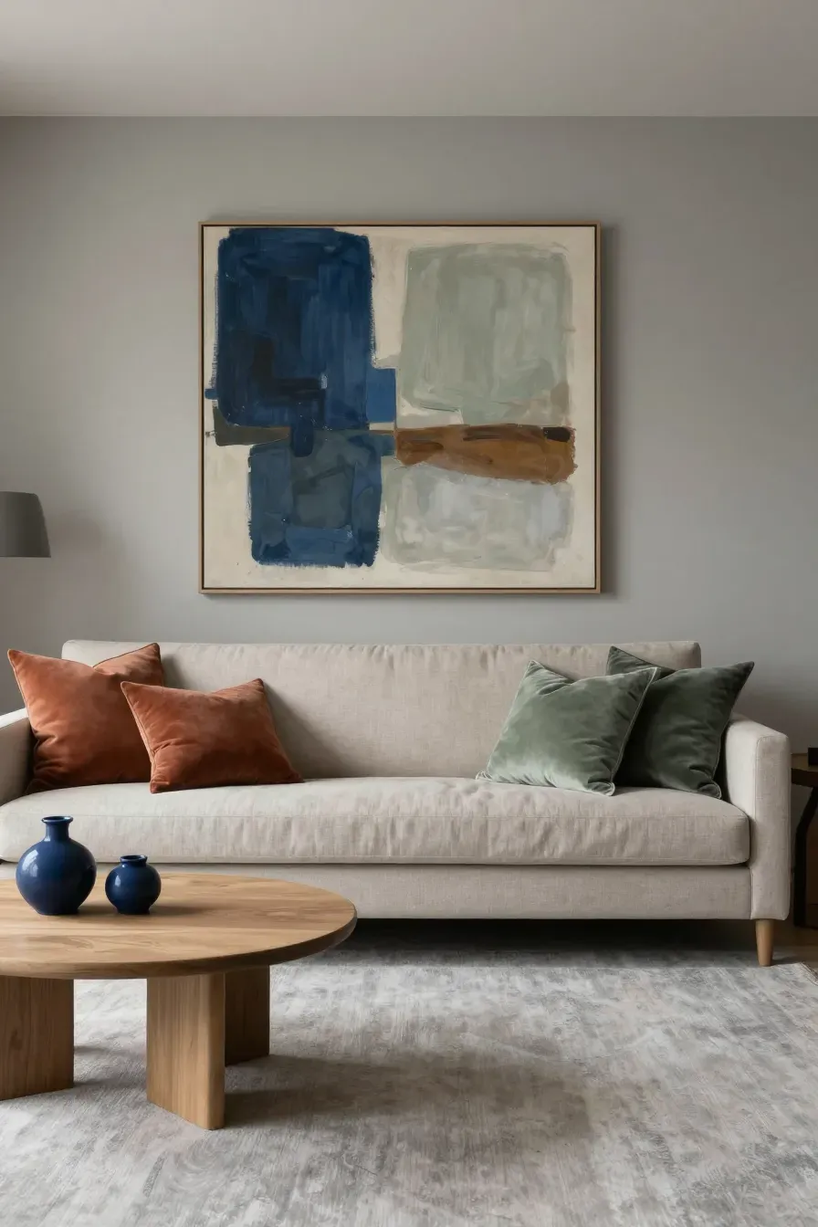
A neutral base doesn't mean you can't use color at all. The best way to add accents to an interior design color palette is through 'low-stakes' items. Think pillows, rugs, or artwork. If you have a greige base, muted earth tones like terracotta, sage green, or navy blue work well. These colors feel grounded and natural. The trick is to keep the accent colors slightly desaturated so they don't jump out too much and ruin the calm vibe of your home color palette interior.
Selecting the right finishes for a house color palette interior
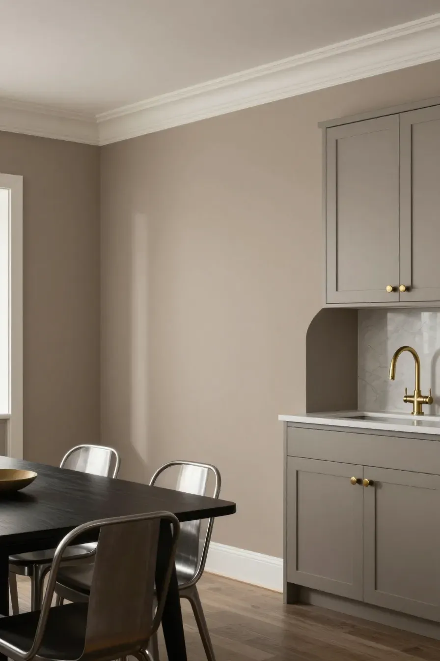
The finish of your paint and materials is just as important as the color. For walls, a flat or eggshell finish is usually best for neutrals because it hides imperfections and looks more natural. For trim and doors, a satin finish provides just enough contrast. When choosing hardware for your indoor color schemes house, consider how metals interact with your tones. Brass and gold add warmth to cool grays, while black or brushed nickel can make a warm taupe room feel more modern and edgy.
Common mistakes when planning indoor color schemes house projects

One big mistake is matching everything too perfectly. If your walls, rug, and sofa are the exact same shade of tan, the room will disappear. You need contrast in value—meaning some light neutrals and some dark neutrals. Another mistake is ignoring the floor. Your flooring is the largest 'color' in the room. If you have orange-toned oak floors, a cool gray wall might clash. Always ensure your home decor color palettes account for the fixed elements like flooring and cabinetry.
Coordinating furniture with your home decor color palettes

Your furniture should act as an anchor. If your walls are light, try a sofa that is a few shades darker to create a focal point. Using natural materials is a safe bet for any modern interior color palette. A bamboo coffee table or a wooden dining set adds an organic element that softens the straight lines of modern design. Keep the large pieces neutral, and you will find it much easier to refresh the room's look later just by swapping out smaller decor items.
Creating a modern neutral home is about more than just picking a shade of white. By focusing on undertones, light, and texture, you can build a space that feels both sophisticated and comfortable. Start by testing a few shades of greige or taupe in your favorite room and see how the light hits them. Once you have your base, layer in textures and subtle accents to bring the space to life.