
Have you ever walked into a room and felt your shoulders immediately drop an inch? That feeling of instant relaxation is rarely an accident. In bedroom design, the colors on your walls do the heavy lifting when it comes to setting a mood for sleep. While bright colors can be fun, they often stimulate the brain when you should be winding down.
This guide explores how to use a neutral interior design color palette to turn your bedroom into a quiet retreat. We will look at specific shades like greige and taupe, and discuss how to layer these tones so your space feels cozy rather than cold.
Warm Whites and Creams for a Soft Atmosphere

Standard stark white can sometimes feel medicinal or clinical. For a bedroom, look for whites with a hint of yellow or peach. These warm whites and creams create a soft, glowy atmosphere that feels like being wrapped in a blanket. When building your house color palette interior, these shades serve as a gentle backdrop that won't distract you at night. They make small rooms feel larger while maintaining a sense of comfort.
The Versatility of Greige in a Modern Interior Color Palette

Greige is a mix of gray and beige, and it has become a staple in the modern interior color palette for good reason. Pure gray can feel too chilly, while pure beige can sometimes look dated. Greige strikes a balance. It provides a sophisticated look that works with almost any furniture style. It is a reliable choice for an interior design colour palette because it shifts slightly throughout the day, looking warmer in the evening and crisper in the morning.
Using Earthy Taupe to Ground Your Bedroom Design
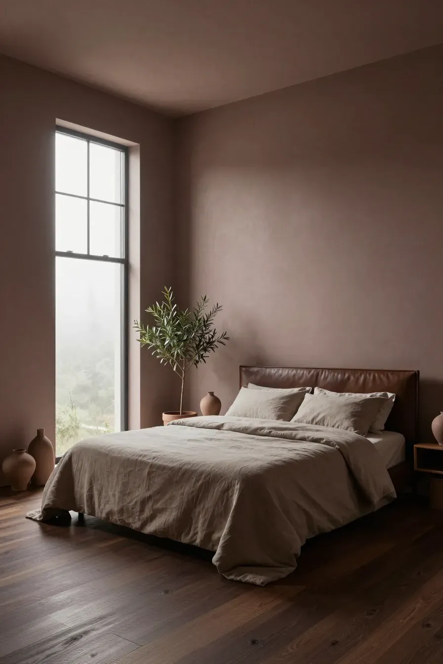
If you want a bit more depth than off-white, taupe is an excellent option. Taupe has brown and violet undertones that give it an earthy, grounded feel. In a contemporary color palette, taupe acts as a bridge between light walls and dark flooring. It is a quiet color that doesn't demand attention, making it ideal for a room meant for rest. Try it on a single accent wall or for all four walls to create a cocoon-like effect.
Soft Light Gray for a Clean Contemporary Color Palette
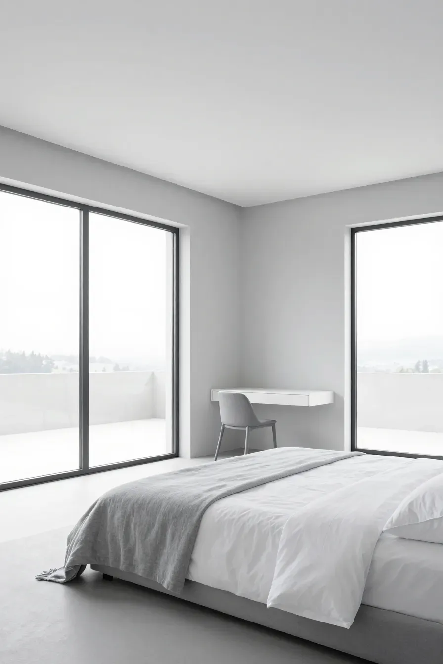
For those who prefer a more minimalist look, a soft light gray is a key part of a modern colour palette. The trick is to find a gray with 'barely-there' blue or green undertones. This keeps the room looking clean and fresh. Light gray is particularly effective at making bedding and curtains pop without using loud colors. It is a versatile base for many indoor color schemes house owners use to achieve a timeless look.
How to Layer Different Tones in a Home Color Palette Interior
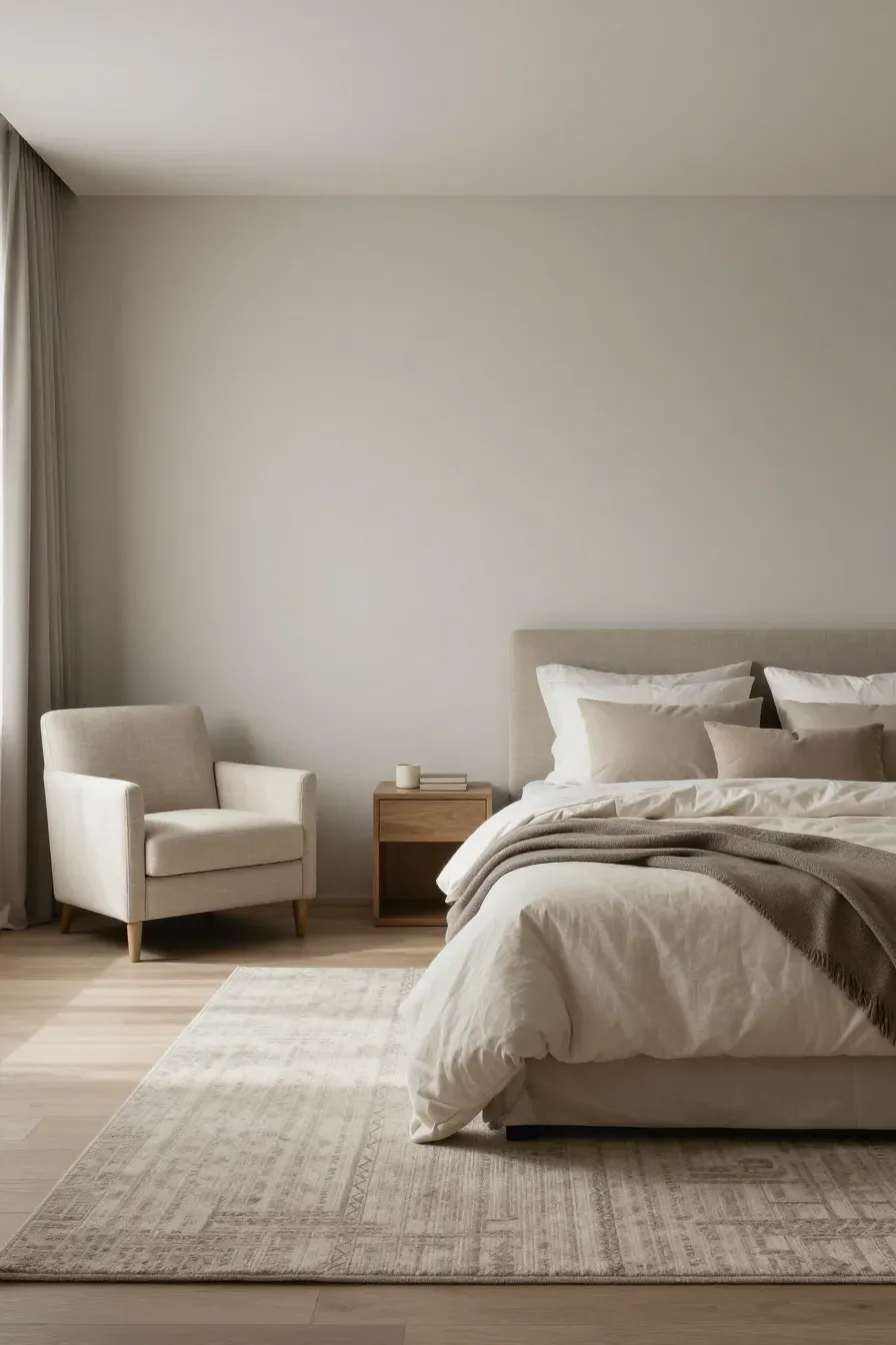
A common mistake with neutrals is using only one shade, which makes a room feel flat. To make a home color palette interior successful, you need to layer. If your walls are light greige, choose a slightly darker taupe for your rug and an ivory for your duvet. This variation creates visual interest and comfort. Think of it like a landscape; different shades of the same color family add depth and make the space feel finished.
Adding Depth to Indoor Color Schemes House with Muted Textures

Colors don't just come from paint. In indoor color schemes house designs, texture acts as a color of its own. A linen pillow in a muted sand tone looks different than a velvet pillow in the same shade. Use chunky wool throws, silk curtains, and woven baskets to add 'visual weight.' These textures prevent a neutral room from feeling boring and help the colors feel more rich and intentional.
The Role of Natural Light in Your Interior Design Color Palette
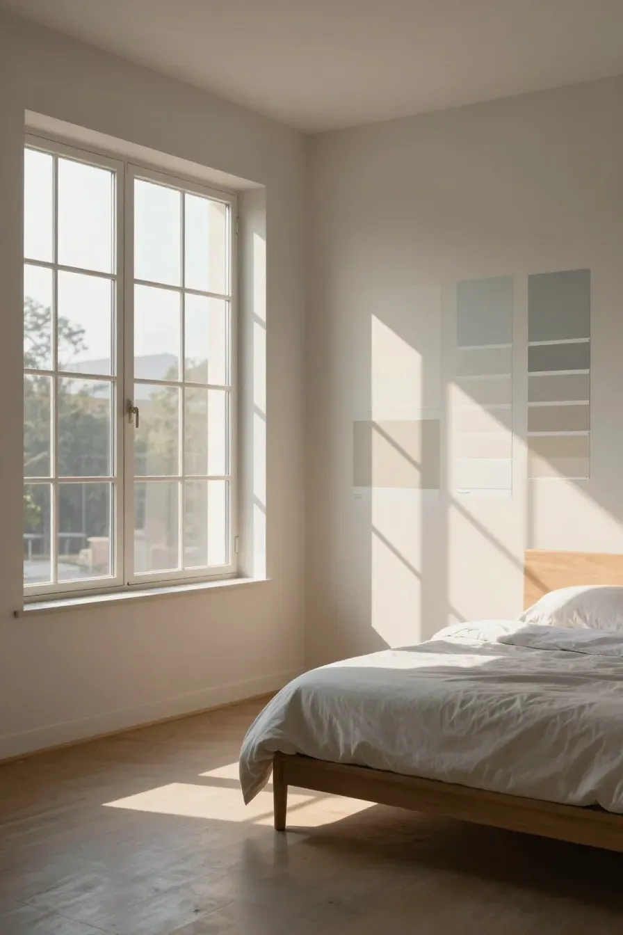
Before you commit to a paint color, look at your windows. Natural light significantly changes how an interior design color palette appears. North-facing rooms often have a cool, bluish light, which can make grays look icy. South-facing rooms get warm, bright light that can make yellows look intense. Always test paint samples on different walls and check them at noon and again at sunset to see how the color shifts.
Pairing Neutral Walls with Natural Wood and Stone

Neutral home decor color palettes shine when paired with natural materials. A light oak bed frame or a stone lamp base brings an organic element to the room. The warmth of wood grain complements greige and cream beautifully. These materials provide a 'living' element to the room, ensuring that your neutral space feels connected to nature rather than artificial.
Creating a Balanced Modern Colour Palette with Cool and Warm Tones

The most interesting rooms often mix temperatures. You can create a balanced modern colour palette by pairing cool gray walls with warm brass fixtures or a warm tan leather chair. This contrast prevents the room from feeling one-note. When you balance a cool base with warm accents, the bedroom feels curated and comfortable for all seasons.
Choosing the right neutrals is about more than just picking a paint chip; it is about creating a space where you can truly decompress. By layering tones and paying attention to light, you can build a bedroom that feels both modern and cozy. Start by grabbing a few samples of greige or warm white and see how they look in your space throughout the day.