
A blank wall in the living room often feels like a missed opportunity to show off your personality. A gallery wall solves this by turning a collection of art, photos, and objects into a single focal point that anchors the space. It is more than just hanging a few pictures; it is about creating a visual story that feels intentional rather than cluttered.
In this guide, you will learn how to choose the right layout, select frames that complement your home, and mix different media. We will also cover the practical side of measuring and lighting so your display looks professional. By the end, you will have a clear plan to build a wall that reflects who you are.
Choosing a Layout That Fits Your Wall Space
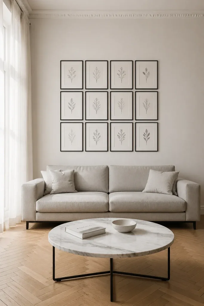
The first step is deciding on the shape of your arrangement. A grid layout works well for a formal, clean look. This involves using identical frames and spacing them exactly the same distance apart. It is a great choice for a series of botanical prints or black and white photography. If your living room is more relaxed, an organic or salon-style layout might be better. This style allows you to grow the collection over time by adding pieces around a central core.
Consider the size of the wall itself. A large, high-ceilinged wall can handle a floor-to-ceiling display, while the space above a sofa usually looks best with a horizontal arrangement. Make sure the total width of your gallery is about two-thirds to three-quarters the width of the furniture below it so the wall does not feel top-heavy.
Selecting Frames to Match Your Interior Style
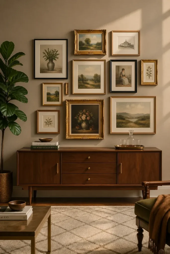
Frames act as the bridge between your art and your room's decor. If you want a modern, minimalist vibe, stick to thin metal or wood frames in a single color like black or white. This keeps the focus entirely on the artwork. For a more eclectic or traditional feel, you can mix different finishes like gold, natural oak, and painted wood.
To keep a mix of frames from looking messy, try to find one common element. This could be the color of the matting or the thickness of the frames. Natural materials like bamboo or light wood can add warmth to a room without feeling heavy. If you are unsure, start with a unified color palette for the frames and let the art provide the variety.
Mixing Different Types of Art and Objects
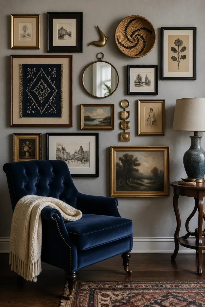
A gallery wall does not have to be limited to framed paper. Mixing textures makes the wall more interesting to look at. You can include mirrors to bounce light around the room, or small wall-mounted sculptures for depth. Textiles like a small tapestry or a woven basket can also add a soft touch to a group of hard-edged frames.
Personal items like an old key, a pressed flower, or a vintage postcard add character. Try to balance the visual weight of these objects. If you have a large, heavy oil painting on one side, balance it with a group of smaller items on the other. This variety prevents the wall from looking like a retail display and makes it feel like a curated collection.
Measuring and Planning the Arrangement Before Hanging
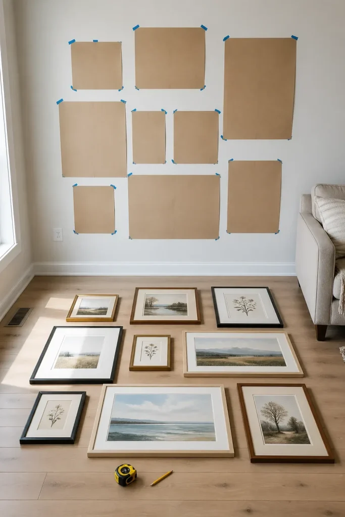
The biggest mistake people make is reaching for the hammer too soon. Instead, clear a space on the floor that matches the dimensions of your wall area. Arrange your pieces on the ground until you find a composition you like. Take a photo of the layout from above so you don't forget it.
Another helpful trick is to trace each frame onto kraft paper or newspaper. Cut out these templates and tape them to the wall using painter's tape. This lets you see how the scale feels in the actual room. You can move the paper around easily without leaving holes in the drywall. Once you are happy with the paper layout, you can mark exactly where the nails should go through the paper.
Maintaining Proper Spacing and Eye Level Alignment
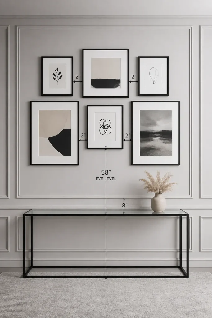
Consistency is what makes a gallery wall look cohesive. Aim for about two to three inches of space between each frame. If the pieces are very large, you can increase this to four inches. If they are small, keep them closer together so they look like a single unit rather than scattered dots.
The center of your entire arrangement should be at eye level, which is generally about 57 to 60 inches from the floor. If you are hanging the gallery above a sofa or a sideboard, leave about six to eight inches of breathing room between the bottom of the lowest frame and the top of the furniture. This prevents the pieces from feeling disconnected from the rest of the room.
Adding Lighting to Highlight Your Collection
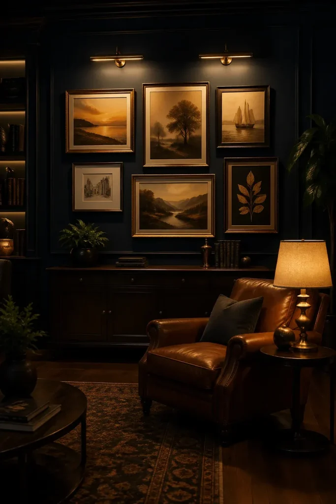
Good lighting can make an inexpensive print look like a gallery masterpiece. Picture lights that attach to the top of a frame provide a classic look and direct light exactly where you need it. If you prefer a cleaner wall, track lighting or adjustable recessed ceiling lights can be aimed at specific pieces in the arrangement.
Avoid placing your gallery wall directly opposite a window where it will get harsh afternoon sun, as this can fade the art and cause distracting glare. If you have to deal with natural light, consider using UV-protective glass or acrylic. Soft, warm LED bulbs are usually the best choice because they do not emit heat that could damage delicate paper over time.
Building a gallery wall is a process that can change as your tastes evolve. By starting with a solid plan and paying attention to spacing and framing, you create a professional-looking display that makes your living room feel complete. Grab some kraft paper and start experimenting with your favorite pieces today.