
A dining room is often the heart of the home, where families gather and friends share meals. While the table and chairs are the functional stars, the walls set the mood. A gallery wall offers a way to fill a large space with personality, but it can easily feel messy if it lacks a clear plan. By focusing on balance and theme, you can create a display that feels intentional and warm.
Key Takeaways:
- Select a wall that doesn't compete with windows or large furniture.
- Use a consistent element, like frame color or art style, to tie everything together.
- Scale the arrangement to the size of your dining table.
- Use proper spacing to ensure the wall looks organized rather than cluttered.
- Rotate pieces occasionally to keep the space feeling fresh.
Choosing the Right Wall and Scale for Your Space
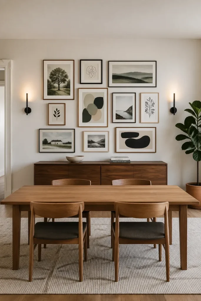
The first step is identifying the wall that will host your collection. In most dining rooms, the largest unobstructed wall is the best candidate. You want a surface where people can view the art without leaning back dangerously in their chairs. Avoid walls with too many light switches, thermostats, or vents, as these can break the flow of your arrangement.
Scale is just as important as location. A small cluster of photos on a massive wall will look lost, while an oversized display in a cramped nook can feel overwhelming. Aim for the gallery to cover about two-thirds to three-quarters of the wall width above a sideboard or the dining table itself. This creates a visual anchor that makes the room feel grounded.
Mixing Frames and Textures Without Creating Clutter
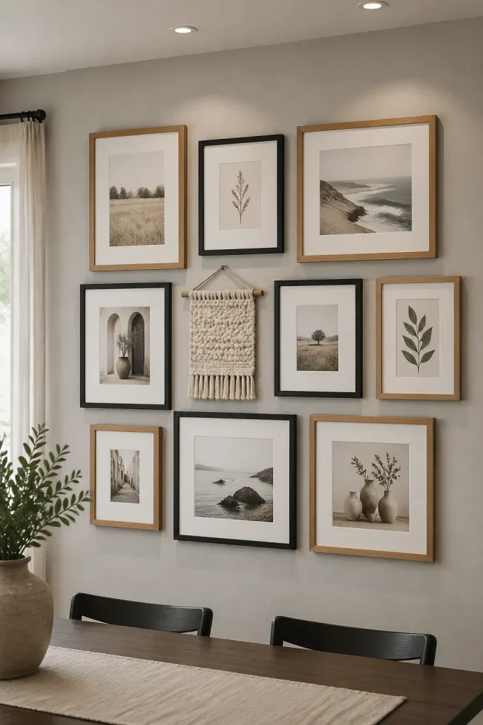
You don't need matching frames to have a cohesive look. In fact, mixing textures like wood, metal, and painted finishes can add depth. To keep it from looking like a flea market, stick to a limited color palette. For example, you might mix natural oak frames with black metal frames. Because they share a clean, modern aesthetic, they will work together despite the different materials.
Consider the texture of the art itself. Mixing flat prints with canvas or even a small woven textile can make the wall more interesting. If you feel the look is getting too busy, use white or off-white matting for all the pieces. This creates a 'buffer' of negative space that lets each image breathe and ties the different frames together.
Arranging Art to Complement Your Dining Table and Lighting
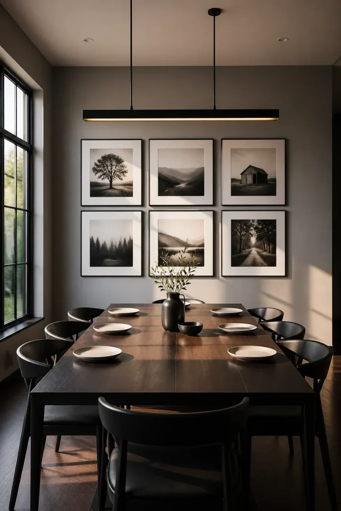
Your gallery wall should talk to the furniture around it. If your dining table is long and rectangular, a horizontal or grid-based arrangement often works best. For round tables, you might try a more organic, circular cluster. The bottom of the lowest frame should typically sit about 6 to 10 inches above the top of the table or sideboard to ensure it feels connected to the furniture.
Lighting also plays a major role. If you have a chandelier or pendant light, make sure the center of your gallery wall isn't blocked from view when guests are seated. If possible, use picture lights or adjustable recessed lighting to highlight the art. Be mindful of glare on glass frames; using non-reflective glass can help if your dining room gets a lot of direct sunlight.
Using Personal Photos and Found Objects for a Unique Look
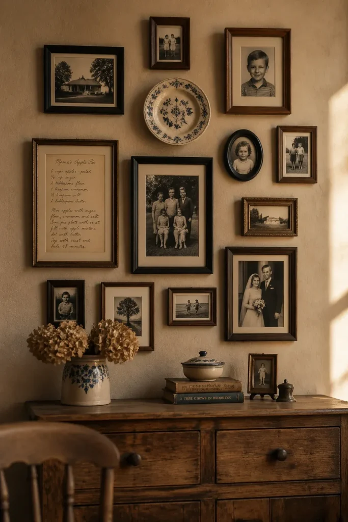
A dining room should feel personal. While store-bought prints are fine, incorporating family photos or objects with history makes the space more inviting. You might frame an old family recipe, a menu from a memorable vacation, or even a vintage plate. These items break up the standard rectangular shapes of most frames.
When using personal photos, try converting them to black and white or sepia. This is an easy trick to make photos from different eras and cameras look like they belong in the same collection. It also keeps the focus on the emotion of the image rather than clashing colors from the backgrounds.
Spacing and Hanging Techniques for a Professional Result
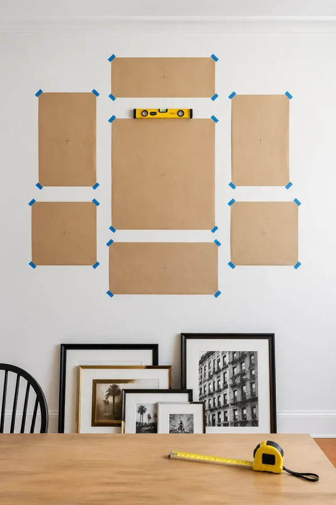
The difference between a DIY project and a professional-looking gallery is the spacing. A good rule of thumb is to keep 2 to 3 inches between each frame. If the frames are very large, you can go up to 4 inches. Consistency is what matters most here. If one gap is 2 inches and another is 4, the whole wall will feel off.
Before you hammer any nails, trace your frames onto kraft paper and tape the cutouts to the wall. This allows you to move things around without leaving holes. Once you like the layout, mark the nail placement directly through the paper. Use a level to ensure every piece is straight, as even a slight tilt can be distracting during a long dinner.
Updating Your Gallery Wall for Different Seasons and Occasions
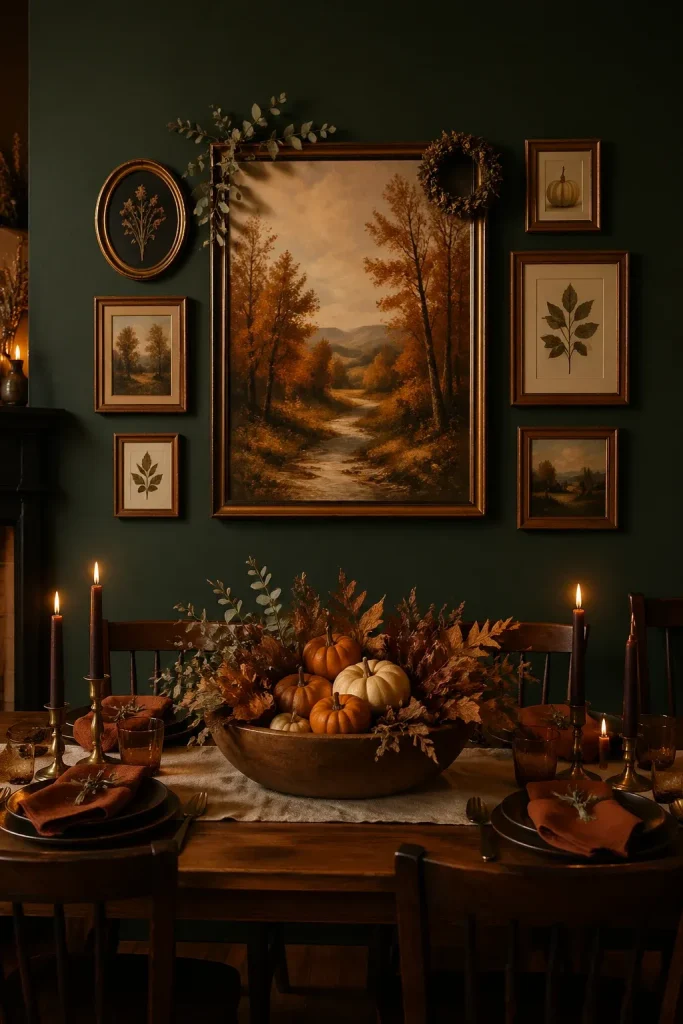
A gallery wall doesn't have to stay the same forever. You can easily swap out a few pieces to reflect the time of year. In the fall, you might replace a bright floral print with a landscape in warmer tones. During the holidays, you could tuck a few sprigs of dried greenery or a small wreath into the arrangement.
If you host a lot of dinner parties, consider using one frame as a rotating 'feature' spot. You can put a printed menu there for a special event or a welcome sign for a guest. Since the frames are already hung and leveled, swapping the art inside takes only a few minutes and keeps your dining room decor feeling active.
Building a gallery wall in your dining room is a rewarding way to share your story with everyone who sits at your table. By paying attention to scale, spacing, and a few consistent design elements, you can create a display that feels both professional and personal. Start by gathering the pieces you love, and don't be afraid to take your time finding the right arrangement that makes your house feel like home.