
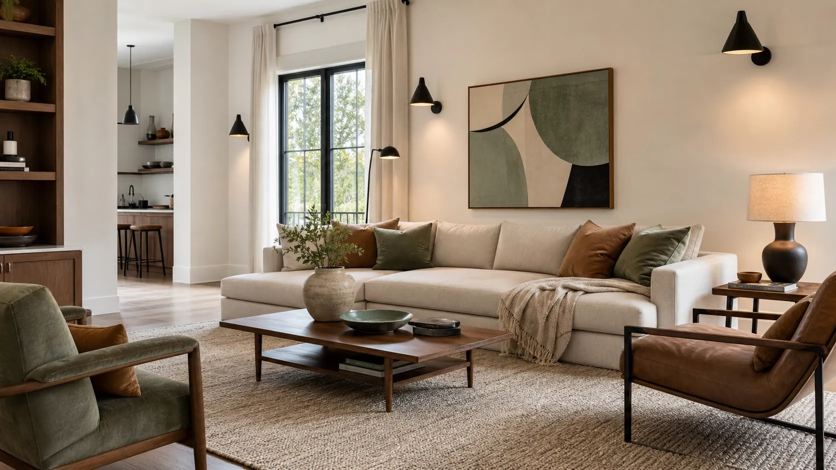
Modern living room color schemes work best when they start with the pieces that already control the room: the sofa, rug, flooring, fireplace, curtains, and the quality of the light. Paint is usually the loudest decision, but it should not be the first one. A wall color that looks perfect on a tiny card can turn cold beside gray flooring, muddy beside warm oak, or too flat once it fills every wall.
The better move is to build a small color palette first. Choose one main neutral, one grounding tone, one texture color, and one accent that can repeat through art, pillows, ceramics, lamps, or a side chair. That gives the room direction without making it feel matched from a showroom.
These modern living room colour ideas are designed for real homes: rooms with brown wood, beige sofas, black metal, pale walls, TV units, open layouts, and rugs that already bring several colors into the space. Use them as starting points, then test your best wall colors for living room light on large sample boards next to your existing finishes.
Start With the Fixed Colors Before You Pick Paint
The most common color mistake is choosing a wall color in isolation. In a living room, the fixed colors are often stronger than people realize: wood floors, a stone fireplace, a brown couch, a gray sectional, a large rug, or a built-in TV unit. Those pieces decide whether a palette needs warmth, contrast, softness, or a cleaner edge.
If your room already has warm wood, cream upholstery, and brass, a cool gray wall can make the whole palette feel slightly off. If your room has cool floors and a charcoal sofa, a yellow beige may look dull instead of cozy. Hold samples beside the floor, sofa fabric, rug, and trim, not only against the current wall. The old wall color will disappear; the fixed finishes will stay.
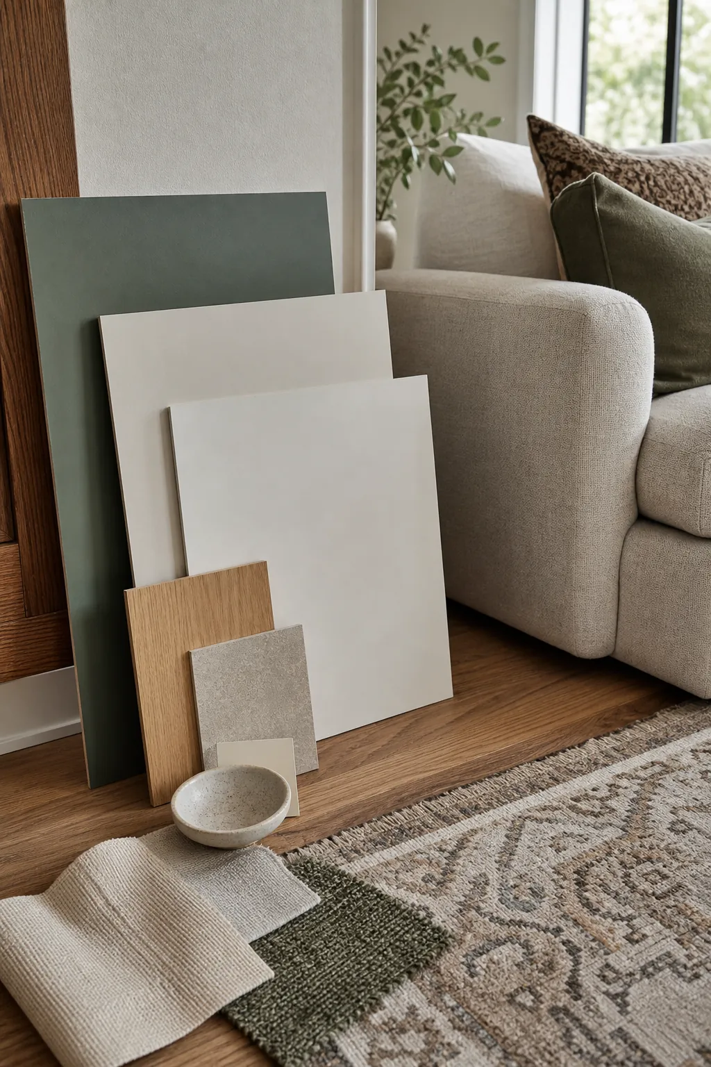
Warm White, Walnut, and Soft Black
This is one of the safest best color combinations for living room spaces that already have strong architecture or good furniture. Use a warm white or creamy off-white on the walls, walnut or medium wood as the main texture, soft black for frames and lighting, and a small accent in olive, rust, or denim blue.
The reason it feels modern is restraint. The white is not stark, the black is not glossy and harsh, and the wood keeps the room from looking sterile. It works especially well with boucle chairs, linen curtains, low-profile sofas, black picture frames, and simple sculptural lamps.
Use this palette if you want a modern living room paint color idea that can survive changing pillow covers, seasonal branches, or new art. Keep the accent color under control: two or three repeats are enough.
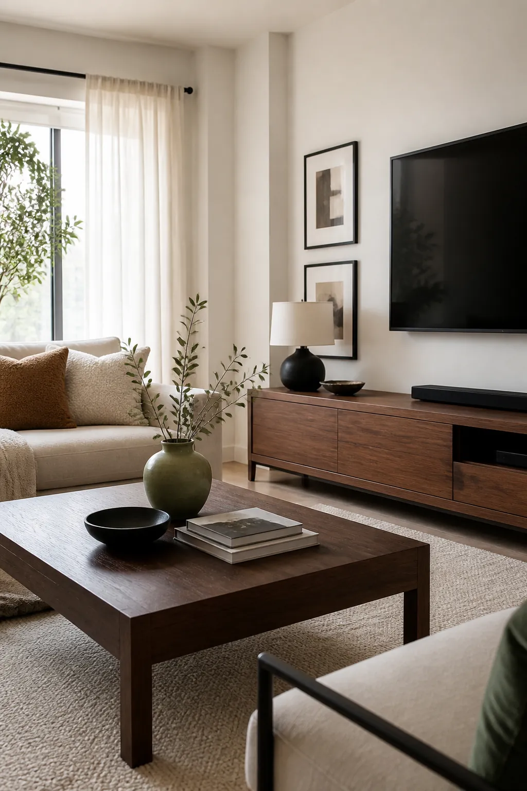
Greige, Cream, Clay, and Natural Fiber
Greige can look flat when everything around it is also beige. It becomes much better when it is paired with cream, clay, cane, jute, woven baskets, and a few darker lines. This is a good colour palette for living room spaces where you want warmth but do not want the room to turn orange or brown.
Choose a greige wall with a soft warm undertone, then bring in clay through pillows, pottery, art, or a vintage-style rug. Cream upholstery keeps the palette lifted. Natural fiber adds quiet texture so the room does not depend on color alone.
This scheme is useful for open-plan homes because it connects easily to kitchens with white cabinets, light oak, tan leather stools, or stone countertops. The trick is to include one deeper note, such as espresso wood, blackened bronze, or dark framed art, so the room has definition.
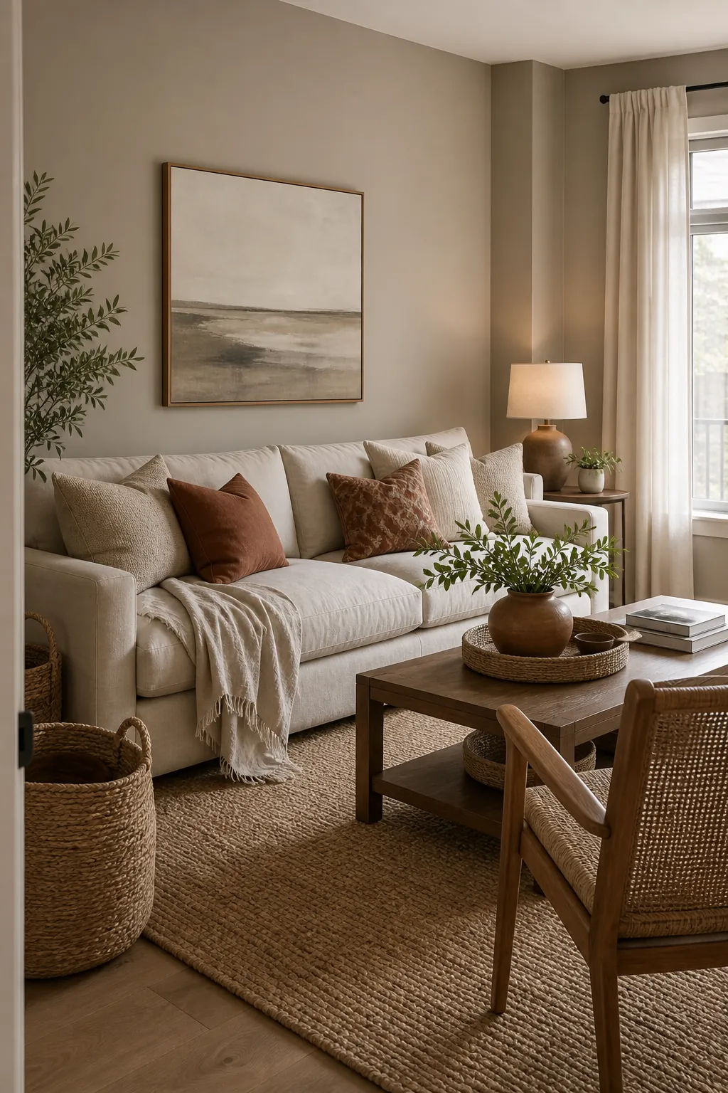
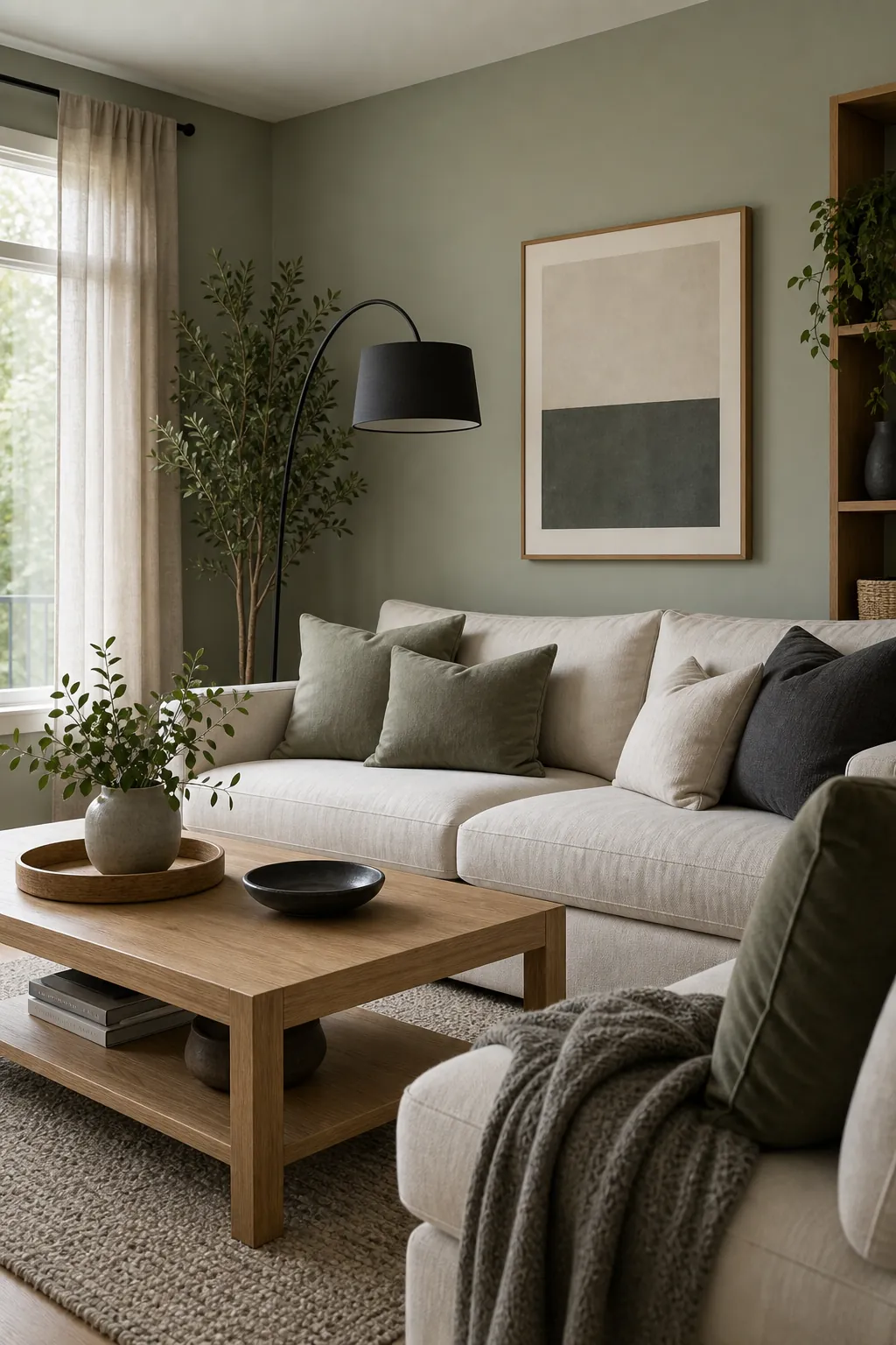
Sage, Oak, Linen, and Charcoal
Sage and olive greens are popular because they solve two problems at once: they add color without shouting, and they sit naturally beside wood. For modern living room color combinations ideas, pair muted green with oak, linen, off-white walls, and a charcoal detail.
The green can live on the walls, a sofa, a cabinet, or just in art and textiles. If the room is north-facing or low on daylight, keep the wall color lighter and use the deeper green in accents. If the room gets strong sun, a richer olive can look calm and tailored.
Charcoal matters here because green and oak can become too soft together. A charcoal lamp, coffee table, picture frame, or fireplace surround gives the palette a cleaner modern edge.
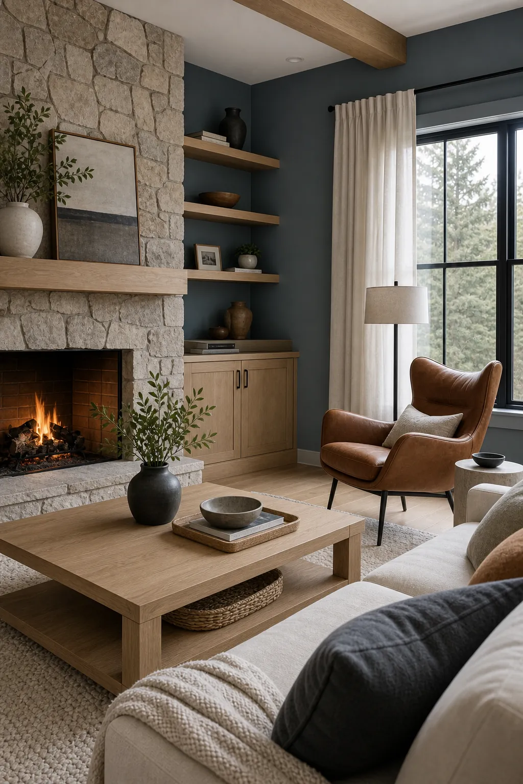
Blue Gray, Stone, White Oak, and Camel
Blue gray is a strong option when you want a modern palette that feels airy but not plain. It works well with stone fireplaces, pale rugs, white oak furniture, and camel leather. The color has enough mood to feel designed, but it still behaves like a neutral.
This is especially helpful in living rooms where bright white walls make the furniture look disconnected. Blue gray can bridge cool stone, pale floors, and warm leather in a way that simple beige cannot. Add white or cream to keep the palette crisp, then repeat camel in one or two places so it looks intentional.
If your room has very little natural light, avoid a blue gray that is too icy. Look for a softened version with a touch of green or warmth, and test it at morning, afternoon, and night.
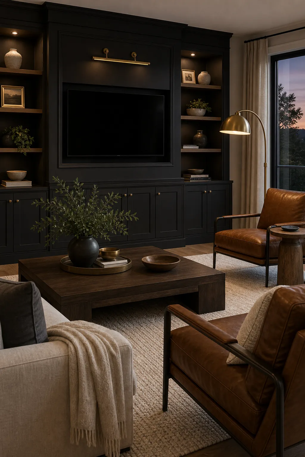
Charcoal, Ivory, Cognac, and Brass
For a moodier modern room, charcoal can be beautiful when it is balanced with ivory and warm materials. Use charcoal on one architectural surface, built-ins, a media wall, or a deep sofa. Then lift the room with ivory walls, a pale rug, cognac leather, brass, and warm wood.
The key is contrast. Charcoal beside other medium grays can feel heavy and unfinished. Charcoal beside ivory, cognac, and brushed brass looks deliberate. This palette also works with a modern TV unit design because dark cabinetry can make the screen feel less visually loud.
Use matte and satin finishes instead of shiny black everywhere. A mix of linen, leather, wood grain, and metal keeps the palette tactile rather than severe.
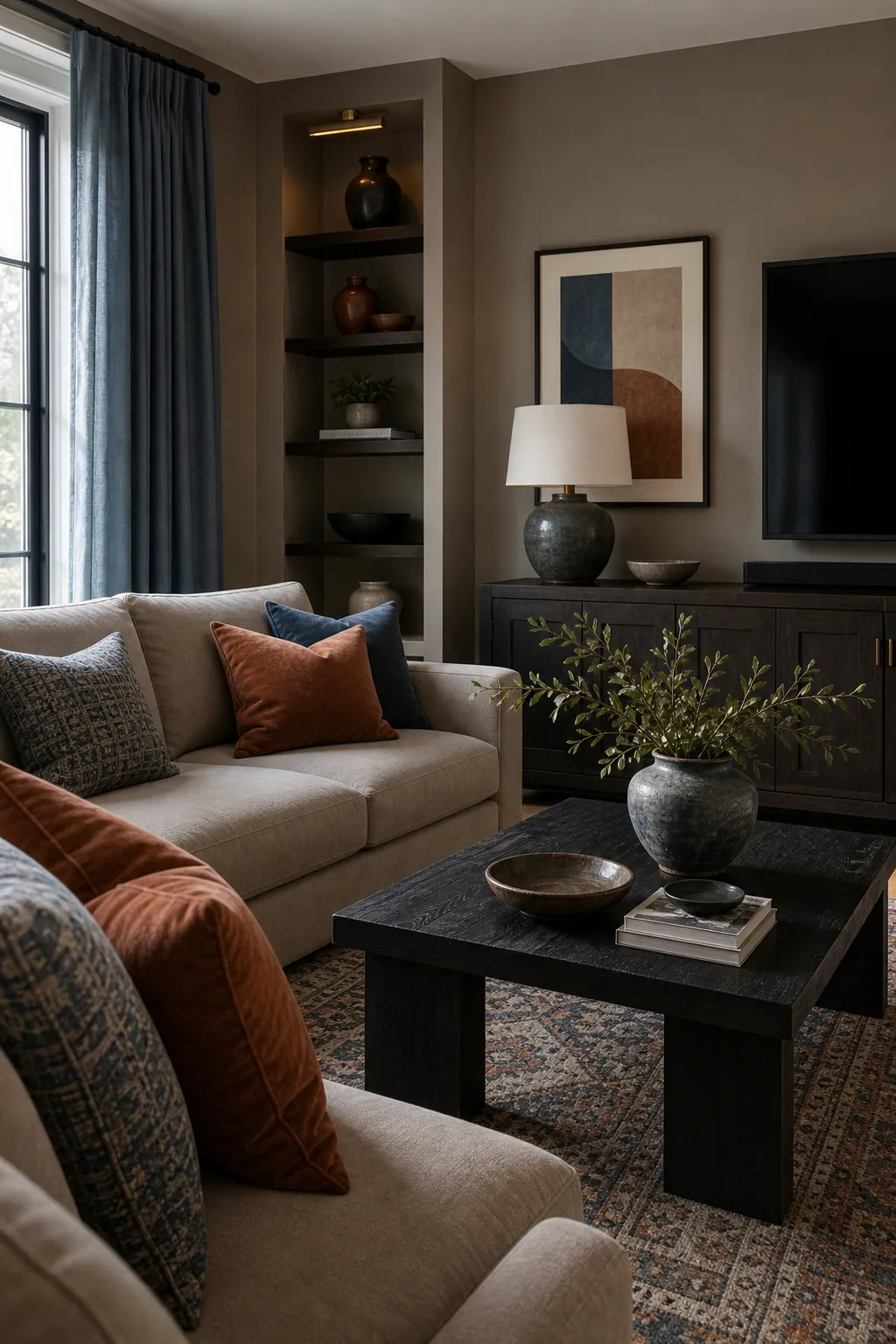
Taupe, Dusty Blue, Rust, and Blackened Wood
If you like color but do not want a bright room, try taupe with dusty blue, rust, and blackened wood. It is softer than navy and white, warmer than gray and black, and more layered than beige alone. This is one of the best colours for living rooms that need warmth, color, and a little polish.
Taupe can be the wall or sofa color. Dusty blue can appear in art, drapery, a patterned rug, or pillows. Rust adds the warm note that keeps the blue from feeling cold. Blackened wood or dark metal gives the palette structure.
This color combination works well when the room already has mixed finishes, such as pale walls, a dark coffee table, medium wood floors, and a neutral sofa. Instead of trying to match everything, it gives the room a clear rhythm.
How to Keep a Modern Living Room Palette From Looking Flat
A modern palette does not need many colors. It does need enough difference. If the walls, sofa, rug, curtains, and wood are all the same middle value, the room can feel tired even if every individual color is pretty.
Check four things before committing. First, is there a light color that gives the room air? Second, is there a dark color that grounds it? Third, is there a warm texture, such as wood, leather, jute, cane, or brass? Fourth, is there one accent that appears more than once?
That simple test can improve almost any living room color pallet idea. Warm white and walnut need black or olive. Greige and cream need clay or espresso. Sage and oak need charcoal. Brown and beige need blue, green, rust, or cream to keep them from feeling one-note.
Modern does not mean cold. The strongest color combinations home living rooms can use usually feel calm because the palette is edited, not because the room has no color. Start with what you already own, sample large, repeat each accent intentionally, and let texture do part of the work.