
Luxury living room color schemes usually fail for one simple reason: the room tries to look expensive by adding shiny finishes before the palette has any depth. Gold hardware, marble decor, and velvet pillows can help, but they cannot rescue a room where every color is the same mid-tone beige or every dark accent feels random.
A rich living room is built with control. One quiet base color gives the eye somewhere to rest. One deeper shade adds weight. One warm material keeps the room from feeling cold. One small metal finish or stone note adds polish. When those pieces repeat, the room reads as intentional instead of decorated in fragments.
Use these living room color scheme ideas as starting palettes for a contemporary luxe living room. They work especially well with tailored upholstery, layered lighting, stone, warm wood, darker media walls, and home interior design choices that need to feel high end without becoming stiff.
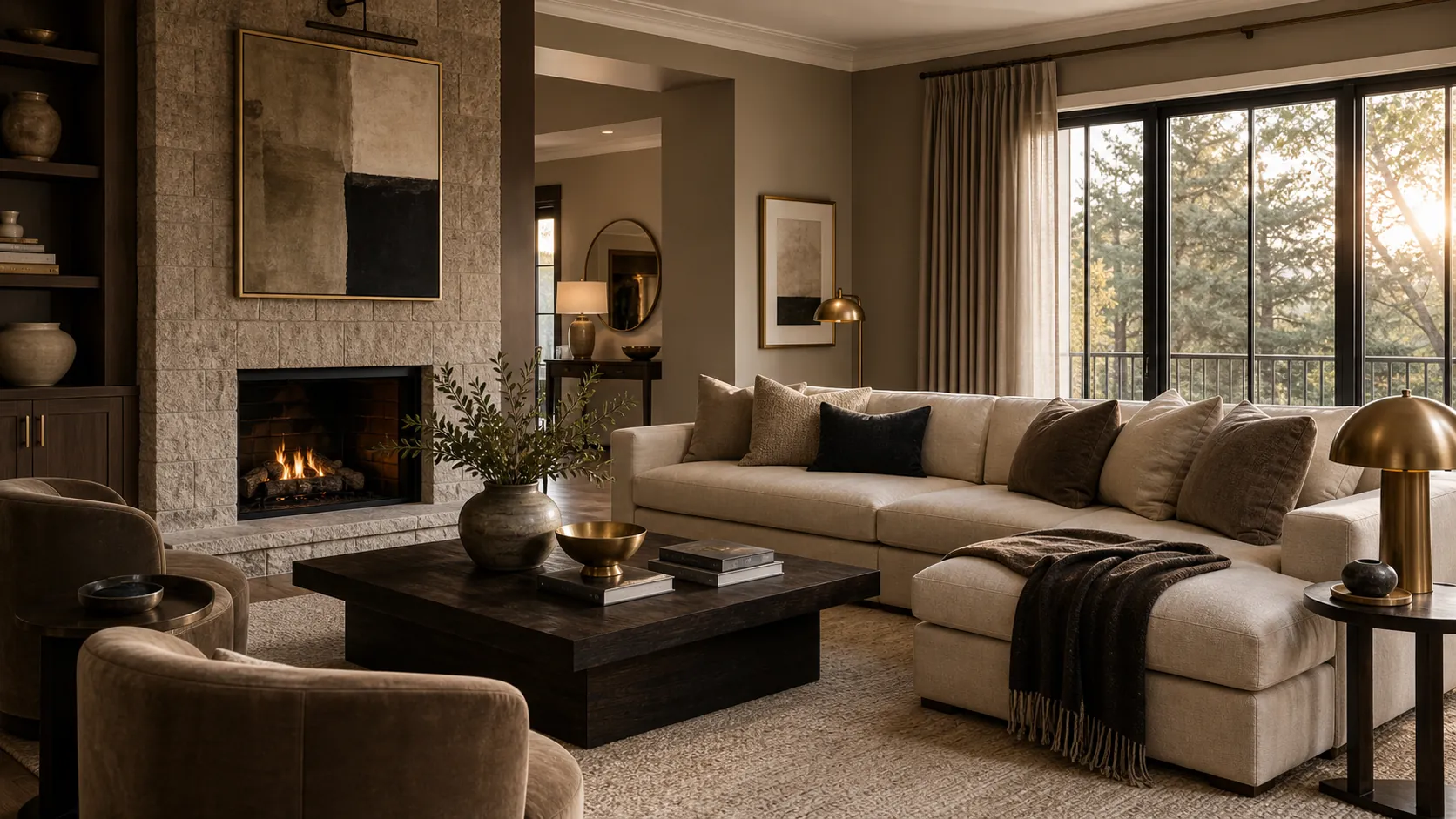
Mushroom, Soft Black, Brass, and Cream
Mushroom is a useful luxury neutral because it has more depth than plain beige and more warmth than gray. Pair it with cream upholstery, soft black furniture lines, and brushed brass lighting for a palette that feels polished but still livable.
This works best when the black appears in slender repeats: picture frames, a coffee table base, curtain hardware, or a TV unit design modern enough to disappear into the wall. Brass should be warm and muted, not bright yellow. Cream keeps the scheme from becoming heavy.
Choose this palette if you want an expensive living room look that does not depend on bold color. It is quiet, tailored, and easy to refresh with art or seasonal flowers.
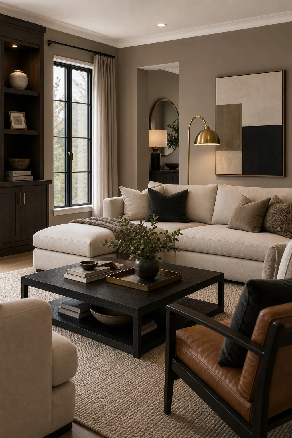
Ivory, Travertine, Taupe, and Warm Oak
Ivory and taupe can look ordinary until texture enters the palette. Travertine, plaster, warm oak, linen, wool, and ceramic surfaces make the color scheme feel architectural instead of bland. This is one of the best color combinations for living room spaces where the goal is calm luxury.
Keep the base light but not white. Use taupe on the sofa, drapery, or rug, then bring in travertine through a coffee table, side table, fireplace surround, or lamp base. Warm oak gives the room life and prevents the palette from feeling like a hotel lobby.
This scheme is strong for open living areas because it connects easily to kitchens with stone countertops, pale cabinets, and natural wood.
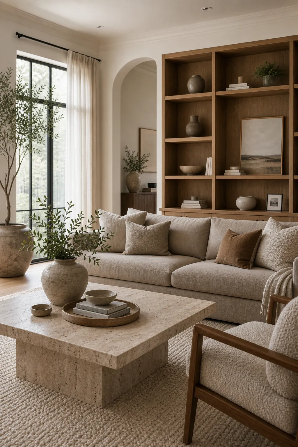
Chocolate Brown, Cream, Bronze, and Linen
Chocolate brown can look dated when it is paired only with tan and heavy furniture. It becomes luxurious when it is given contrast: cream walls or upholstery, bronze lighting, linen curtains, and a few smooth stone or ceramic pieces.
The key is to make brown the rich note, not the only note. Use it for a sofa, paneled wall, built-in cabinet, or large coffee table, then surround it with air. Cream and linen keep the palette soft. Bronze adds warmth without the flash of bright gold.
If you already have a brown sofa, this palette can turn it into the anchor of an elegant living room decor luxury modern look instead of something you are trying to hide.
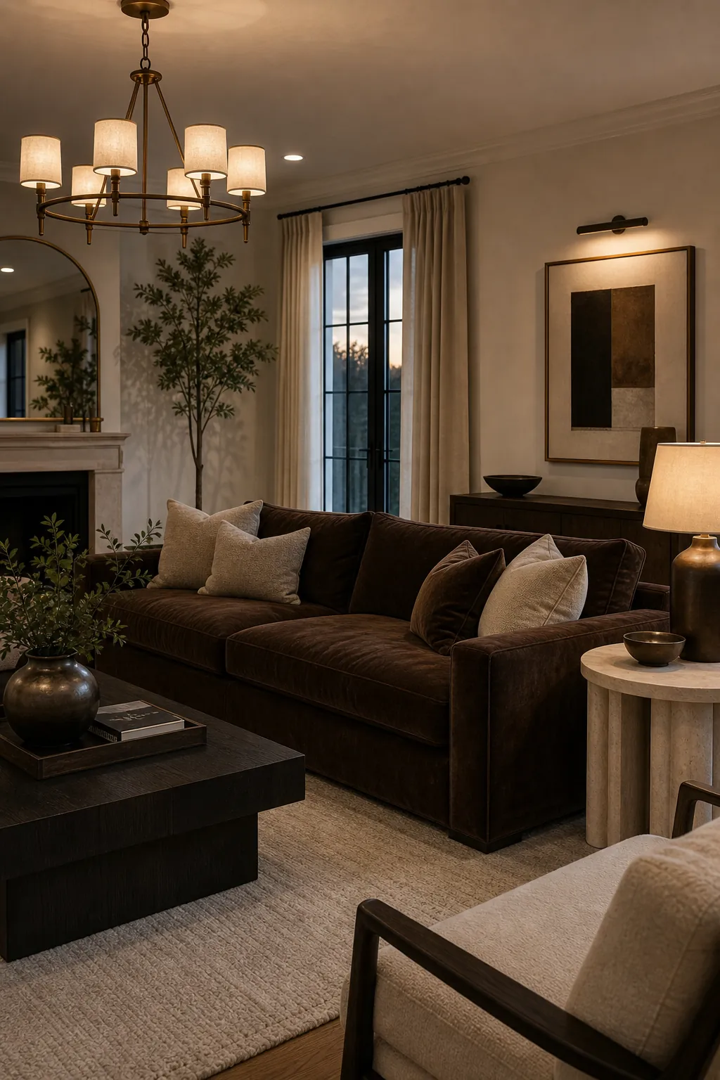
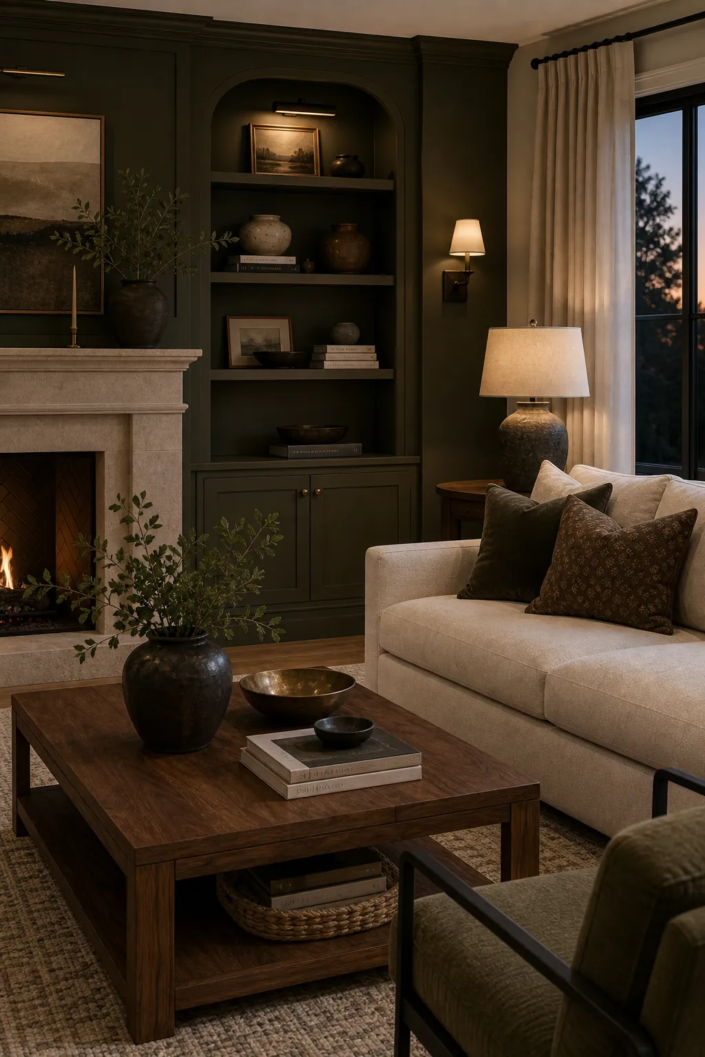
Deep Olive, Walnut, Stone, and Off-White
Deep olive feels luxurious because it has color, shadow, and a natural link to wood. It is softer than black, less expected than navy, and more grounded than pale sage. Pair it with walnut, off-white upholstery, stone, and a small amount of black metal.
Use olive on built-ins, a feature wall, or a velvet accent chair. Walnut keeps the palette warm. Off-white creates breathing room. Stone gives the room a collected, high end living room feeling without making it too glossy.
This palette works especially well with warm bulbs, layered lamps, and art that repeats olive in a subtle way. The room feels designed without looking themed.
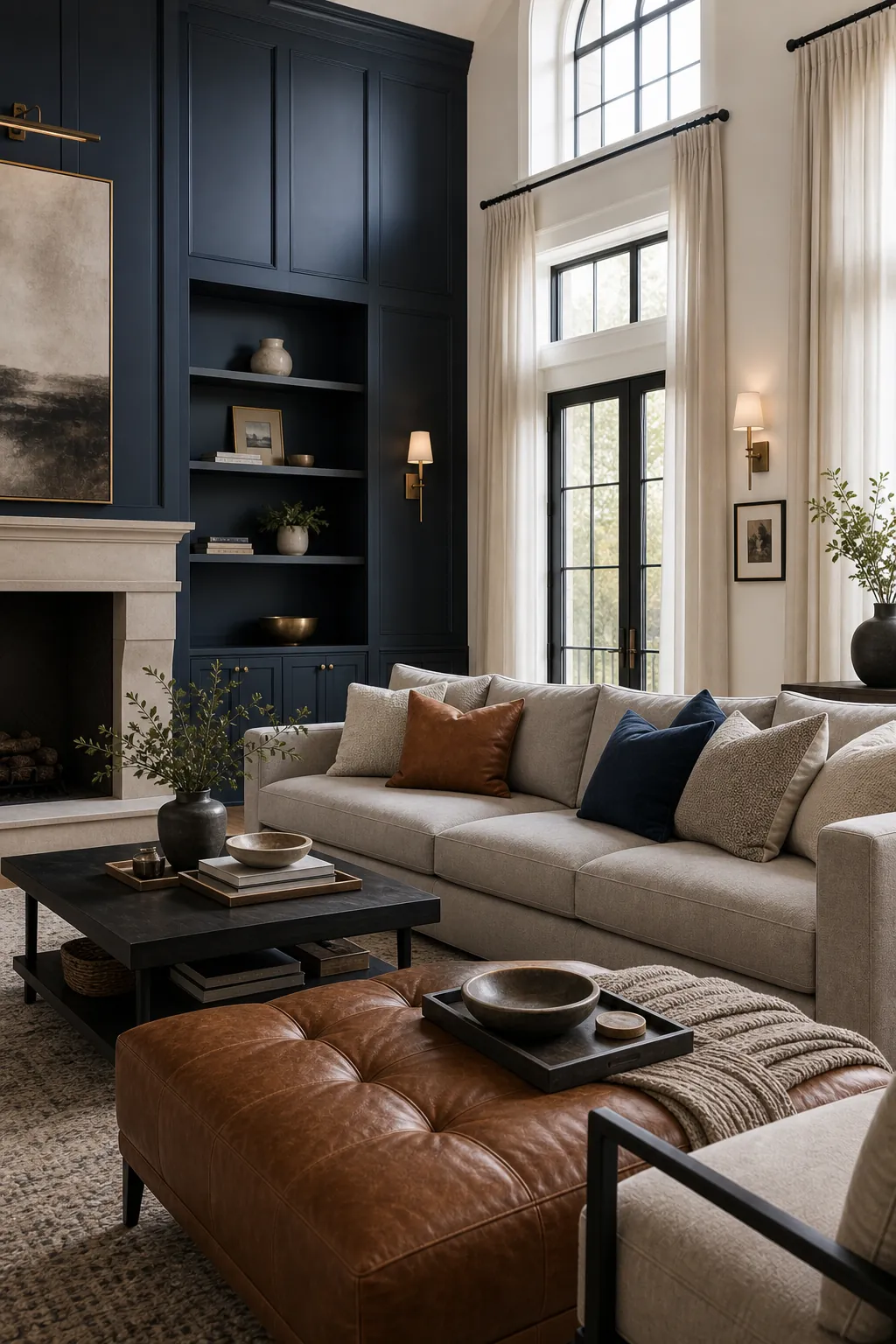
Navy, Stone Gray, Cognac, and Crisp White
Navy can make a living room feel formal, but the right supporting colors keep it fresh. Stone gray softens the contrast. Cognac leather adds warmth. Crisp white or warm white trim keeps the palette sharp.
This is a good luxury living room inspiration palette when the room already has a fireplace, tall curtains, built-in shelves, or a more traditional shell. Navy gives the architecture confidence, while cognac and stone prevent the room from feeling too corporate.
Keep the navy matte and repeat it carefully. A single navy wall with no other repeats can feel accidental. A navy wall, navy pillow, and navy art detail feel intentional.
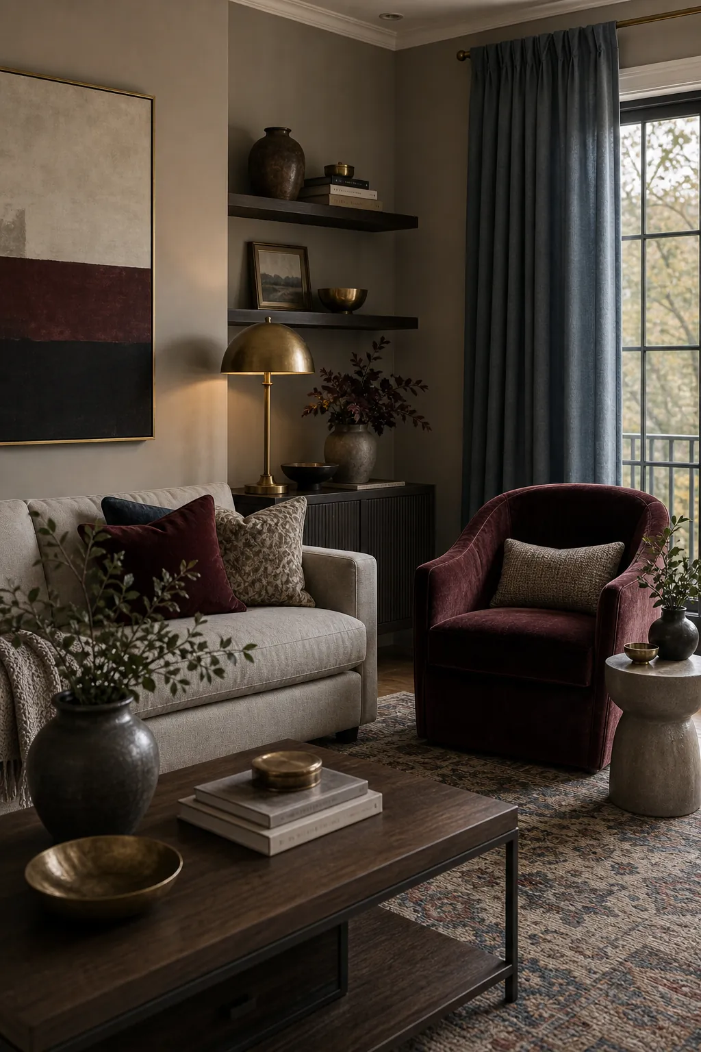
Burgundy, Greige, Antique Brass, and Smoke Blue
Burgundy is powerful, so it works best as a controlled accent rather than the whole room. Greige calms it down. Antique brass warms it. Smoke blue adds a cooler counterpoint that keeps the palette from becoming too heavy.
Use burgundy on a velvet chair, pillows, artwork, or a patterned rug. Let greige cover the larger surfaces. Bring in smoke blue through drapery, art, or a small ottoman. Antique brass should appear in lighting or hardware only, not everywhere.
This palette is useful when you want color in a luxury room but do not want the obvious black-and-gold formula. It feels layered, a little moody, and more personal.
What Makes a Living Room Palette Look Expensive
The most expensive-looking rooms usually have fewer colors than people expect. The difference is that each color has a job. The base color creates calm. The dark tone gives shape. The warm material adds comfort. The metal or stone finish adds polish. The accent color makes the room memorable.
Before you buy anything, check the balance. Is there enough light contrast? Is one color repeated at least three times? Are the metals consistent? Does the rug connect the sofa, wall color, and accent pieces? Does the palette still look good at night under lamps?
A luxury palette should not feel loud just to prove it is luxurious. The best high end living room color schemes feel composed, tactile, and deliberate. Start with restraint, add depth, and let the materials carry as much of the richness as the color itself.