
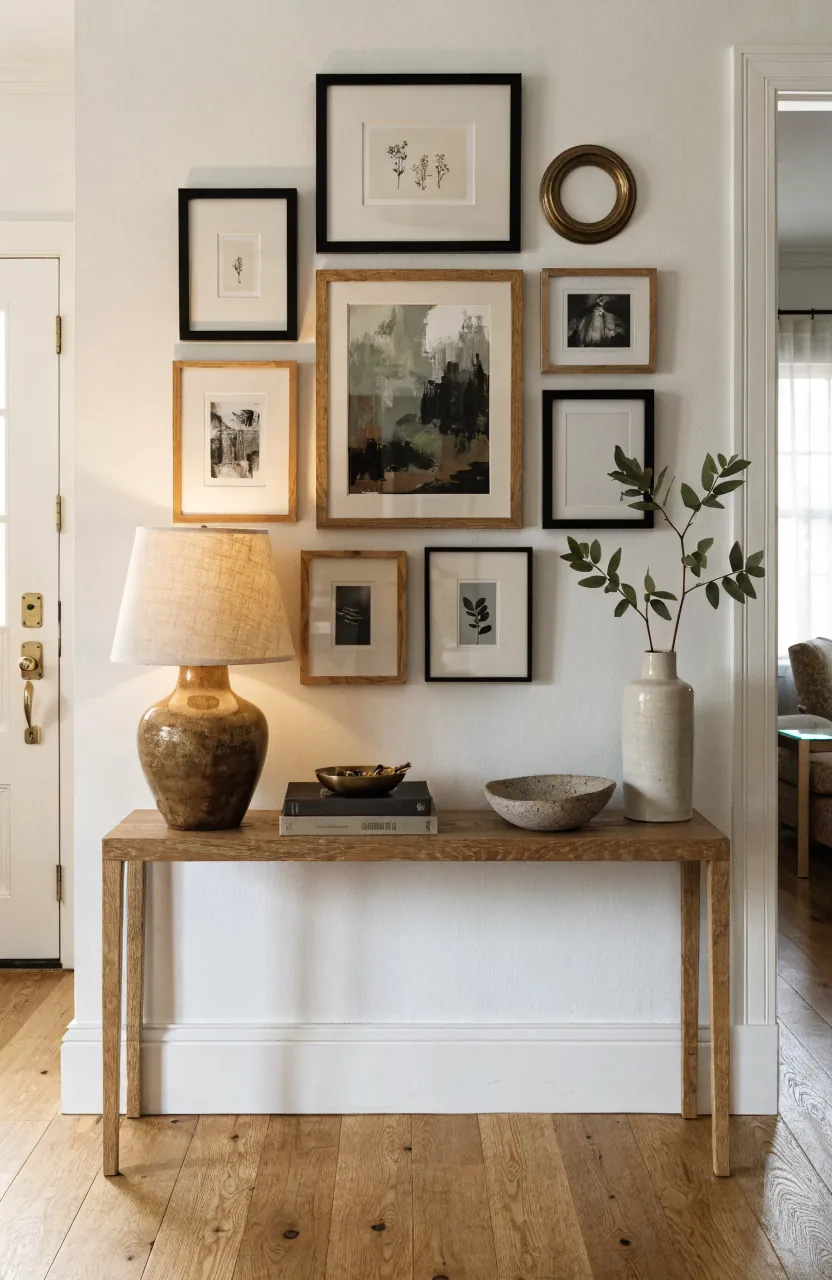
A gallery wall above a console table works best when the wall and the tabletop read as one vignette, not two separate decorating projects. The frames give the entryway height and personality, while the console table gives the frame wall a visual base. When the scale is off, the whole area can feel scattered: a tiny cluster floating over a long table, a heavy wall of art crushing a narrow console, or tabletop decor that competes with every frame.
The fix is not buying more wall art. It is building a clear relationship between the console, the gallery wall, and the items sitting below it. Start with the width of the table, choose a layout shape that suits the wall, then repeat a few colors and materials between the frames and the tabletop. That simple order keeps your gallery wall, console table decor, and entryway decor from looking accidental.
Measure the Console Before You Pick the Frame Wall
The console table is the anchor, so let it set the boundaries. A polished gallery wall usually looks strongest when the full arrangement is about two-thirds to three-quarters of the console width. It can stretch a little wider in a large foyer, but it should not drift far past the table edges unless you are intentionally filling a long wall with zones.
For a 48-inch console, a frame wall around 32 to 38 inches wide is a reliable starting point. For a 60-inch console, aim closer to 40 to 48 inches. If the wall is huge and the table is narrow, the problem may be the furniture scale, not the art. In that case, a taller vase, lamp, branch arrangement, stool, basket, or plant beside the console can help the vignette hold more wall space.
- Small console: Use fewer, larger frames so the wall does not look busy.
- Long console: Use a wider grid or a balanced asymmetrical layout.
- Narrow entryway: Choose slim frames and avoid pieces that project too far from the wall.
- Open foyer: Add height with art, lamps, branches, or a mirror so the console does not feel short.
Choose One Visual Anchor First
A frame wall needs a starting point. Without one, every piece asks for equal attention and the display becomes hard to read. Choose one anchor piece before adding smaller frames: a large portrait, a landscape print, a mirror, a textile, a family photograph, or a piece with the strongest color in the room.
Place that anchor slightly off center for a relaxed collected look, or centered for a cleaner interior styling effect. Then build the remaining art around it. This makes the wall feel curated instead of random, especially above a console table where guests see the display up close in an entryway or foyer.
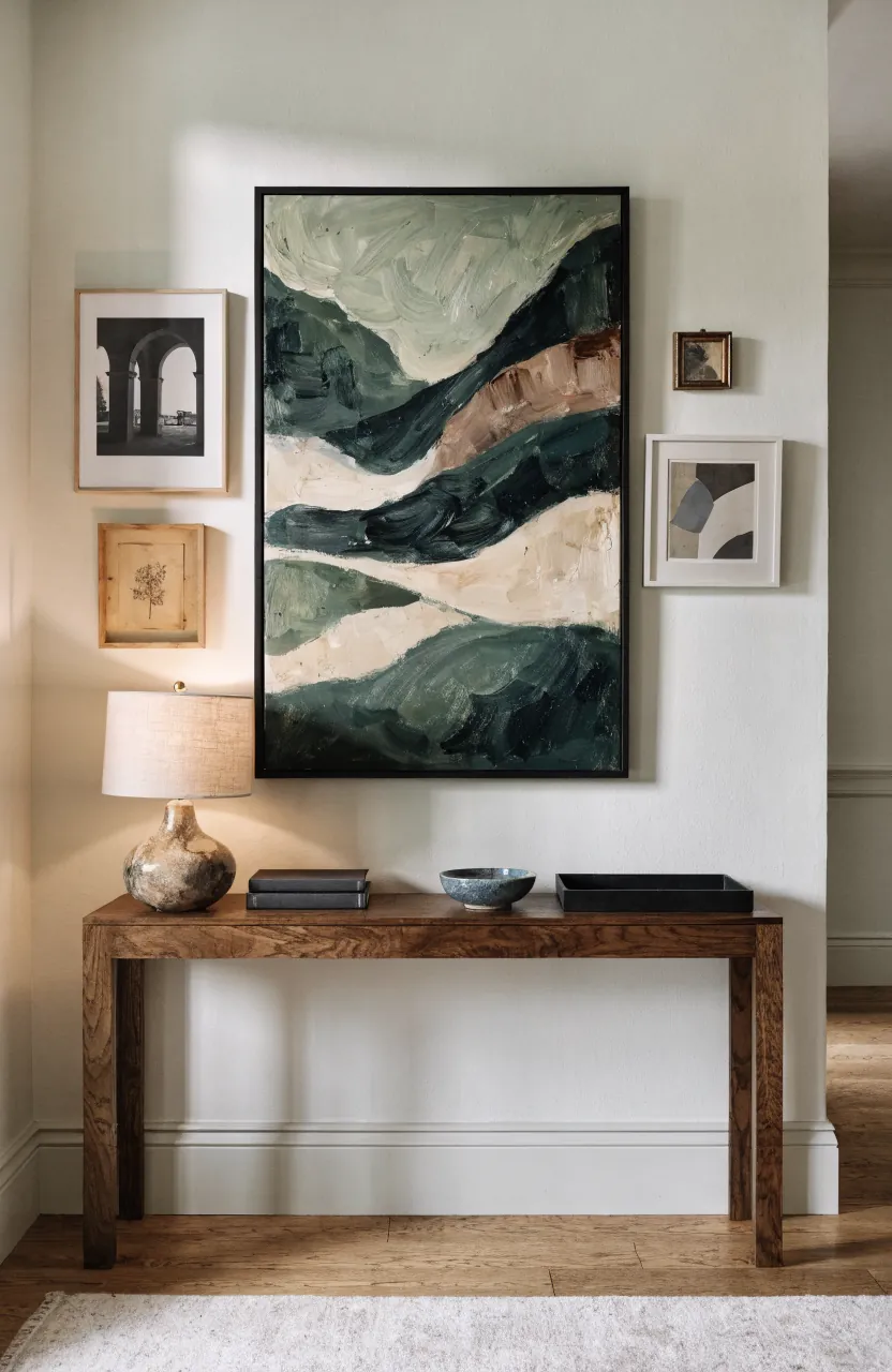
The anchor does not have to be the most expensive piece. It simply needs enough visual weight to organize the others. A large black-and-white photograph, a warm abstract print, or a framed vintage textile can do the job. If your art is mostly small, mat one favorite piece in a larger frame to give the layout a stronger center.
Pick a Layout That Matches the Room Mood
There are three layouts that work especially well above a console table. The best choice depends on whether you want the entry to feel calm, formal, casual, or layered.
- Grid layout: Best for a clean foyer, modern wall decor, matching family photos, or a narrow console. Keep every frame the same size and spacing.
- Centered cluster: Best for mixed wall art, collected prints, and a softer home styling look. Keep the outer shape balanced even if the frame sizes vary.
- Organic gallery: Best for eclectic spaces with art, small mirrors, objects, and personal pieces. Keep one color, mat style, or frame finish consistent so it still feels intentional.
If you are unsure, choose a centered cluster. It is forgiving, it works with different frame sizes, and it lets you add personal pieces over time. Keep the tightest part of the layout near the middle, then let smaller frames step outward. The console below will make the arrangement feel grounded even when the frame sizes vary.
Plan the Spacing Before You Make Holes
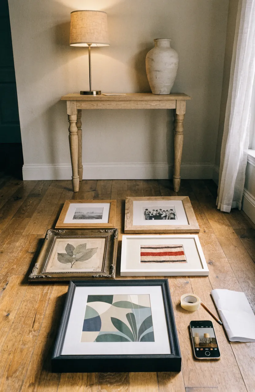
Spacing is where many gallery walls start to look nervous. If the frames are too far apart, the wall reads as separate pieces. If they are too close, the display can feel cramped. A good general range is 2 to 4 inches between frames. Use the smaller end for small frames and the wider end for large art.
Leave a comfortable gap between the tabletop and the lowest frame. Around 4 to 8 inches usually keeps the wall connected to the console without crowding lamps, branches, or decorative objects. If the console table decor is tall, raise only the pieces that need clearance rather than pushing the whole frame wall too high.
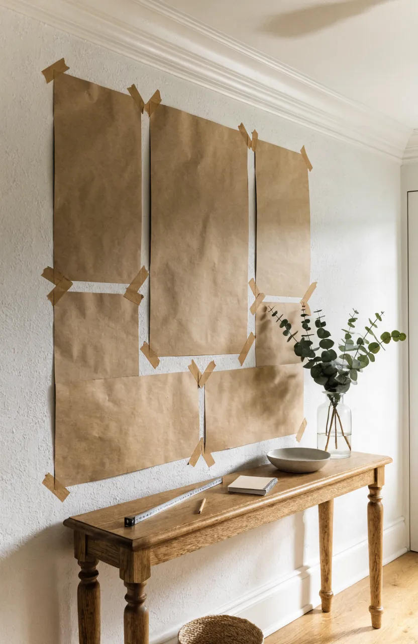
Use paper templates before you hang anything. Cut kraft paper, wrapping paper, or printer paper to the size of each frame, label each piece, and tape the full layout to the wall. Stand at the entry door, the hallway, and the adjoining room. The best layout should look balanced from the places where people actually see it.
Let the Table Styling Echo the Wall
The tabletop should support the gallery wall, not fight it. Think in three heights: a tall piece, a medium layer, and a low grounding object. A lamp, vase, or branch arrangement can pick up the height of the frame wall. Books, a bowl, or a box can create a middle layer. A tray, dish, or candle can keep keys and small objects from making the entryway feel cluttered.
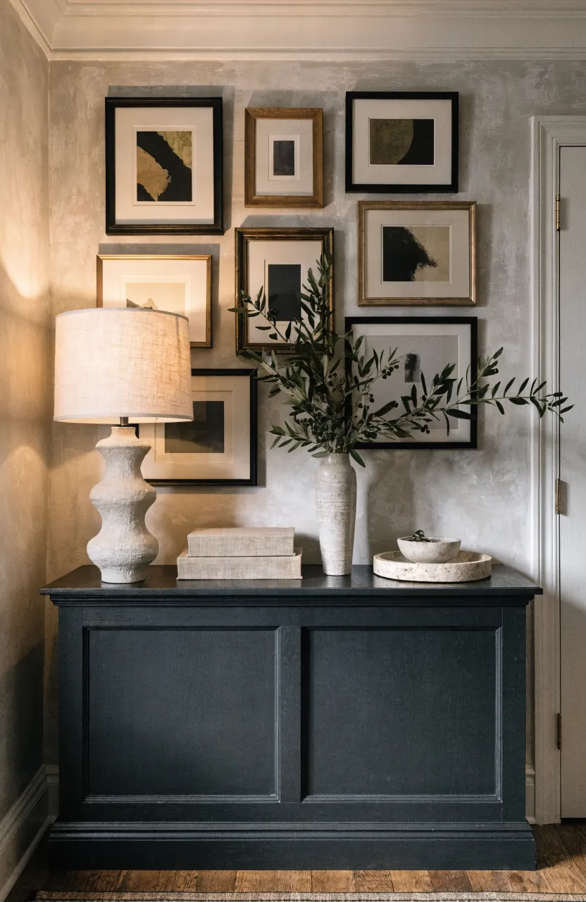
Repeat at least two details from the wall on the table. If the frames are black, use a black lamp base or tray. If the wall art has warm beige, rust, or olive tones, repeat one of those colors in a vase, book cover, or small object. If the gallery wall includes wood frames, a wooden bowl or picture light can make the whole vignette feel tied together.
Leave some empty surface. A console table is often a drop zone, so it needs breathing room. A full table below a full frame wall can look crowded fast. When in doubt, remove one small accessory and let the art carry more of the personality.
Mix Frames Without Making the Wall Look Messy
A mixed frame wall looks collected when there is a rule behind it. Limit the frame finishes to two main options plus one accent. For example, use thin black frames, natural wood frames, and one brass or antique piece. Or use all black frames with varied mat sizes. The goal is not perfect matching. The goal is enough repetition for the eye to relax.
Mats are the easiest way to calm a busy wall. White or off-white mats give different images a shared border, which is helpful when you are mixing family photos, landscapes, sketches, and abstract prints. If the art itself is colorful, keep the frames quieter. If the art is mostly neutral, the frames can carry more texture.
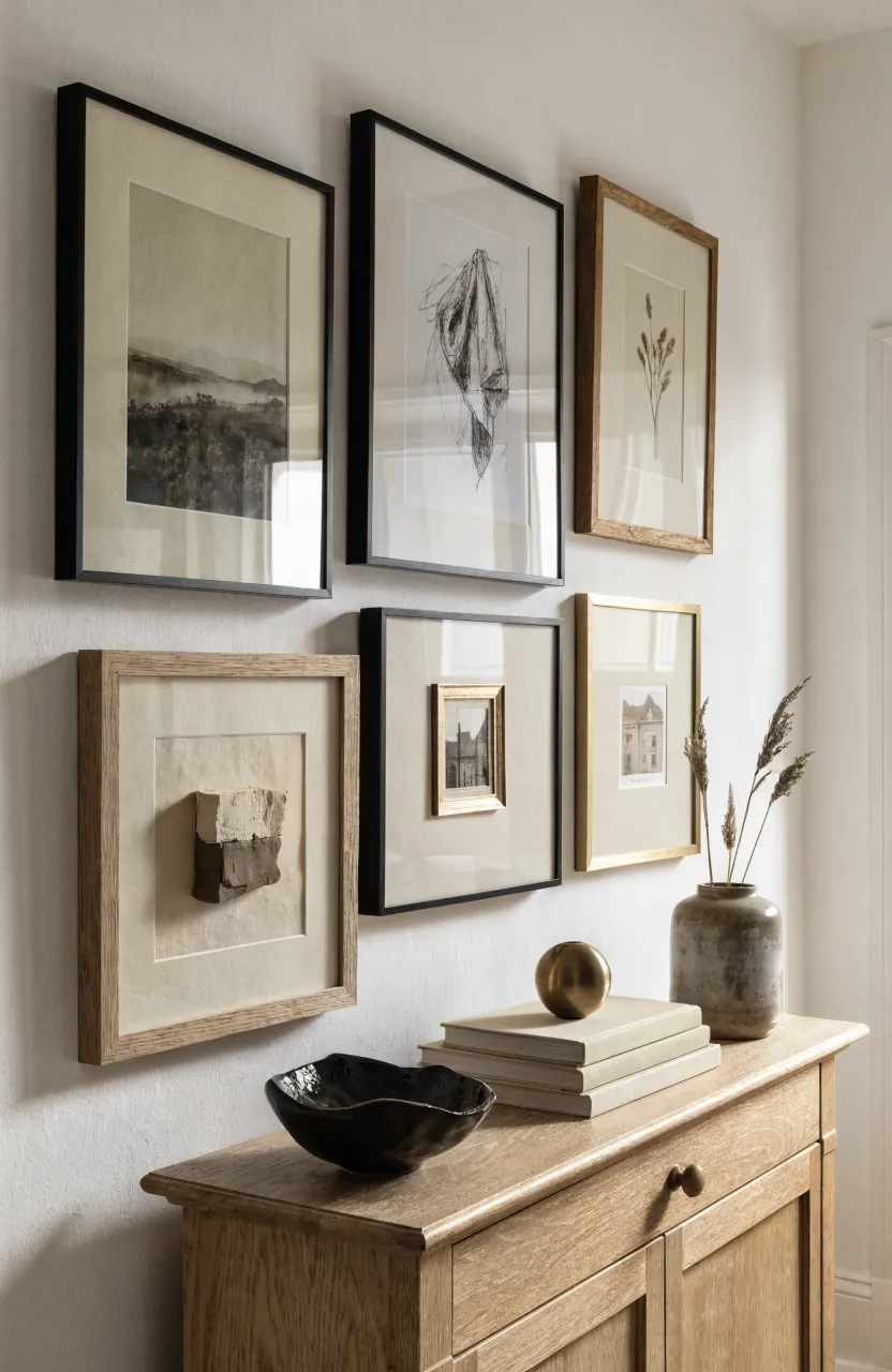
For family photographs, choose one editing style. All black and white, all warm color, or all similar matting will look more elevated than a wall of mismatched photo tones. For art prints, repeat a subject or color story: botanicals, landscapes, quiet abstracts, architecture, travel sketches, or earthy neutrals.
Check the View From the Doorway
A console table in an entryway is rarely seen straight on only. People approach it from a doorway, hallway, stair landing, or living room opening. Before you hang the final nails, look at the paper template layout from those angles. If the gallery wall feels like it is sliding away from the console, bring the outer frames closer. If it feels too heavy on one side, balance it with a lamp, tall vase, or larger frame on the lighter side.
This is also the moment to decide whether the gallery should be centered on the console, the wall, or the sightline. Most of the time, center it on the console. But if the table sits near a doorway or staircase, a slightly off-center arrangement can look more natural than forcing the art into a strict middle point that no one sees in real life.
Add Lighting So the Wall Feels Finished
Lighting turns a frame wall from decoration into a focal point. A small lamp on the console is the easiest option. A picture light above the arrangement feels more tailored. Sconces on either side can work if the wall is wide and the layout is symmetrical. In a narrow foyer, a single warm lamp may be enough to make the wall art glow without making the entry feel crowded.
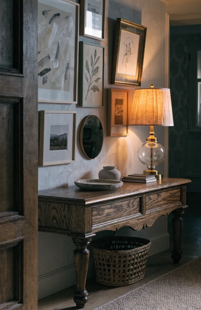
Use warm bulbs and avoid harsh glare on glass frames. If reflections are a problem, angle the lamp shade slightly, use non-glare glass, or move the shiniest frames away from direct light. The finished vignette should feel useful, personal, and calm enough to welcome you home.
Common Gallery Wall Mistakes Above a Console Table
- Hanging the art too high: The wall and console stop feeling connected.
- Using only tiny frames: The display can look busy instead of intentional.
- Centering on the wrong thing: Center on the console unless the room’s sightline clearly demands otherwise.
- Ignoring the tabletop: Table styling should repeat colors, finishes, or shapes from the frame wall.
- Filling every inch: Negative space makes both the wall decor and the console table decor look more expensive.
The strongest gallery wall above a console table has a simple structure: correct scale, one anchor, consistent spacing, and tabletop pieces that echo the wall. Once those pieces are in place, the personal details can shine. That is what makes a frame wall feel collected, not chaotic.