
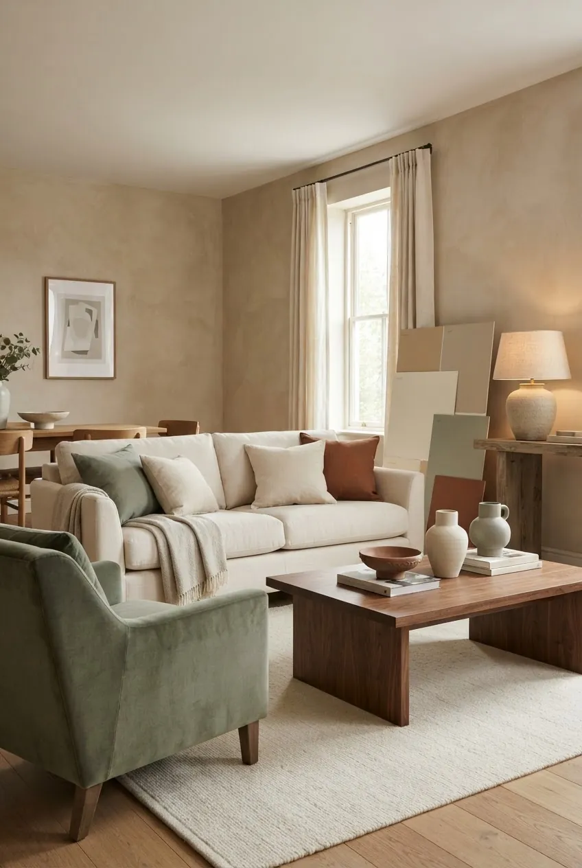
Home decor colors are easier to choose when you stop thinking room by room and start thinking in palettes. A good palette gives each space its own mood while keeping the whole home connected. That does not mean every room must match. It means the undertones, wood finishes, metals, and accent colors should feel like they belong to the same story.
The most flexible home color combinations usually include one light neutral, one warm natural material, one deeper grounding shade, one soft color, and one small contrast. For example, cream, walnut, sage, clay, and black can move from a living room to a bedroom, laundry room, and bathroom without feeling repetitive.
Build a Whole-Home Color Combination
Start with the colors that already exist: flooring, stone, tile, cabinets, large upholstery, and wood furniture. These fixed finishes are the anchor. If the floor is warm oak, a palette of cream, sage, clay, walnut, and brass will usually feel more natural than cool gray and chrome.
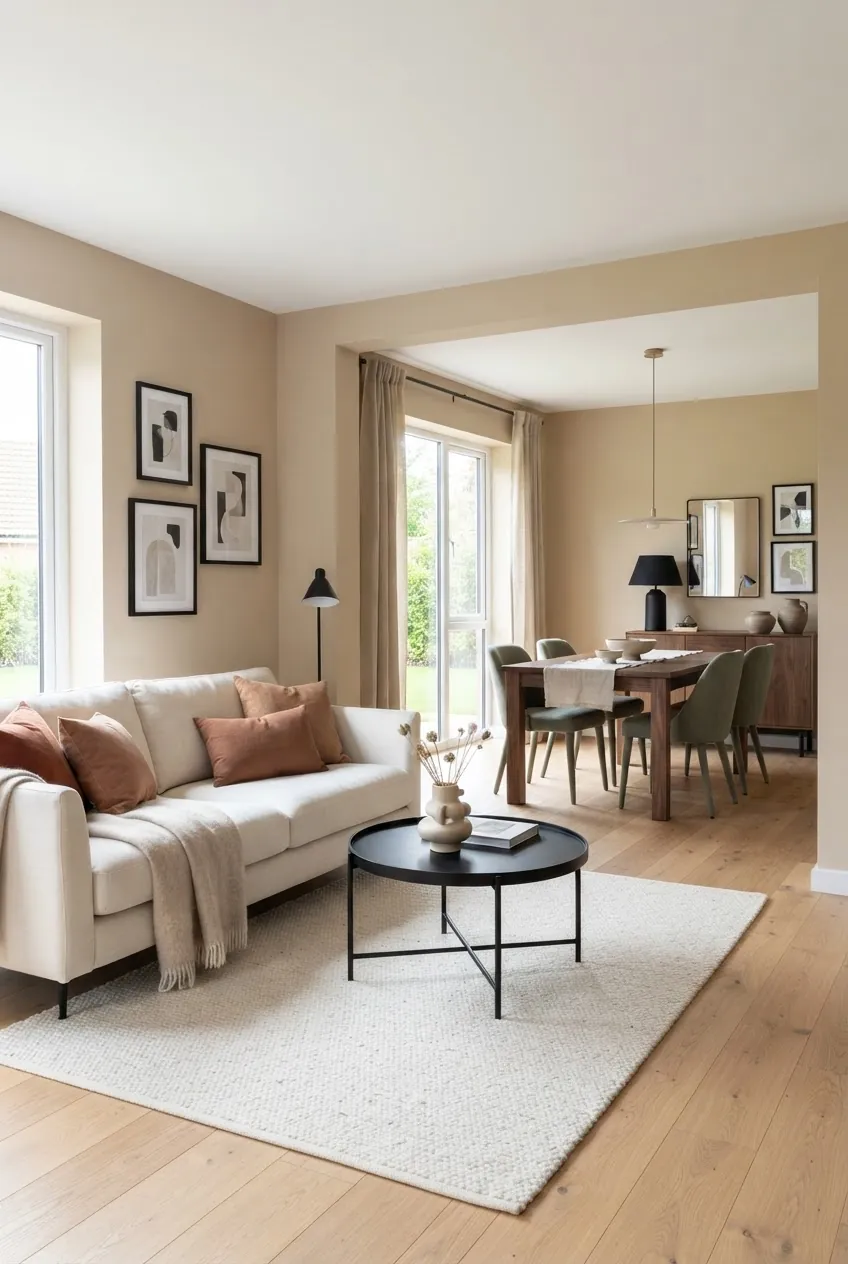
In open rooms, repeat colors across zones. A clay pillow in the living room can connect to a clay vase on the dining table. Sage dining chairs can relate to a green print near the sofa. Black picture frames can repeat in both areas as a clean outline. Small repeats make separate spaces feel intentional.
Use Softer Interior Colors in Bedrooms
Bedroom inspirations often look best when the color palette is quieter than the main living areas. Soft taupe, cream, muted blue, rust, and warm wood create a restful room with enough depth to avoid looking plain. The color can come from bedding, lamps, curtains, or a single painted wall.
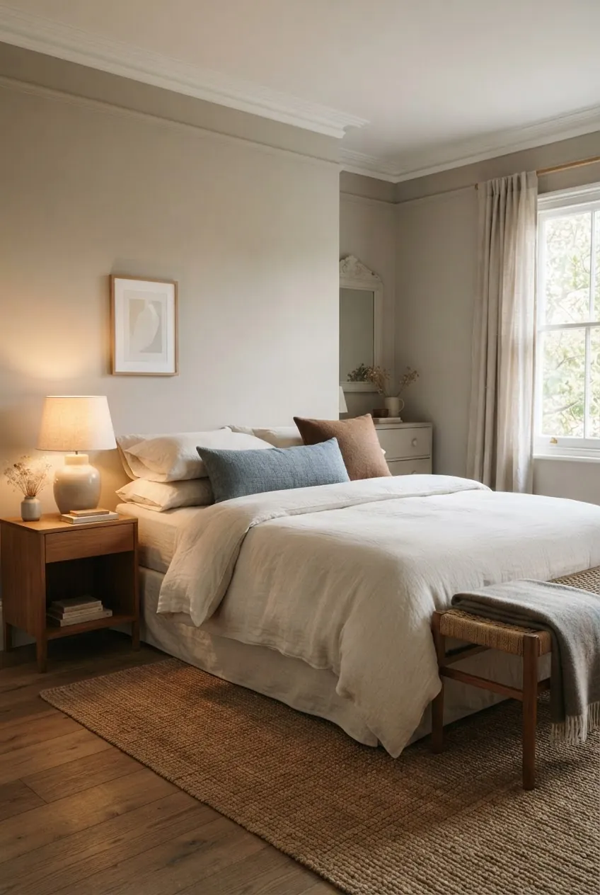
If the rest of the home uses warm neutrals and earthy accents, a bedroom can shift cooler with muted blue or green. Keep one warm element, such as wood, rust, brass, or taupe, so the bedroom still relates to the rest of the house.
Choose One Hero Color for the Living Room
Living room designs need a clear focal color because the room usually has the largest furniture and the most visual weight. One hero color can be a sofa, rug, wall, or oversized artwork. Once that choice is made, the supporting colors should be quieter.
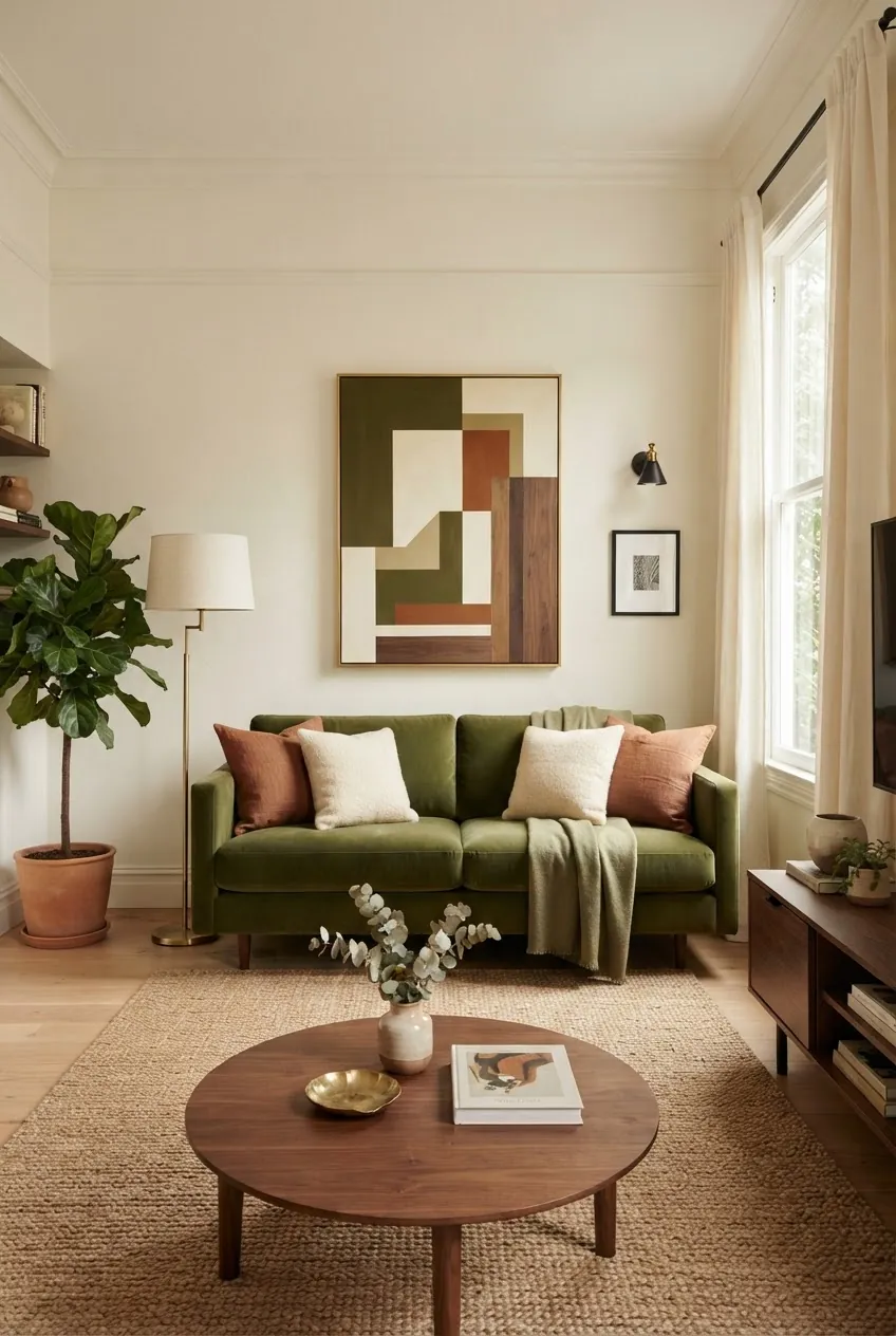
An olive sofa, for example, works well with creamy walls, a tan rug, walnut wood, rust pillows, and brass lighting. If the hero color is already strong, keep the paint and curtains gentle. If the room is mostly neutral, the hero color can come from a rug or large art piece instead.
Carry Color Into Utility Rooms
Laundry room ideas are a good place to use color because the space is smaller and practical. Sage cabinets, warm white walls, clay floor tile, brass hardware, and woven baskets can make a utility room feel connected to the rest of the home without requiring bold choices everywhere.
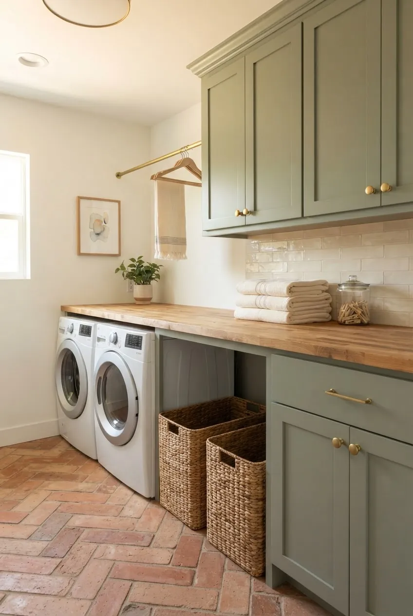
For small rooms, limit the palette to three main colors. A cabinet color, a wall color, and a floor or counter material are enough. Add texture through baskets, towels, and hardware rather than introducing too many new accent colors.
Keep Bathroom Decor Colors Warm but Clean
Bathroom decor can look warm without feeling dark. Warm white tile, a walnut vanity, brushed brass, stone, clay accessories, and muted green towels make the room feel natural and clean. The key is to keep the surfaces simple and let material color do most of the work.
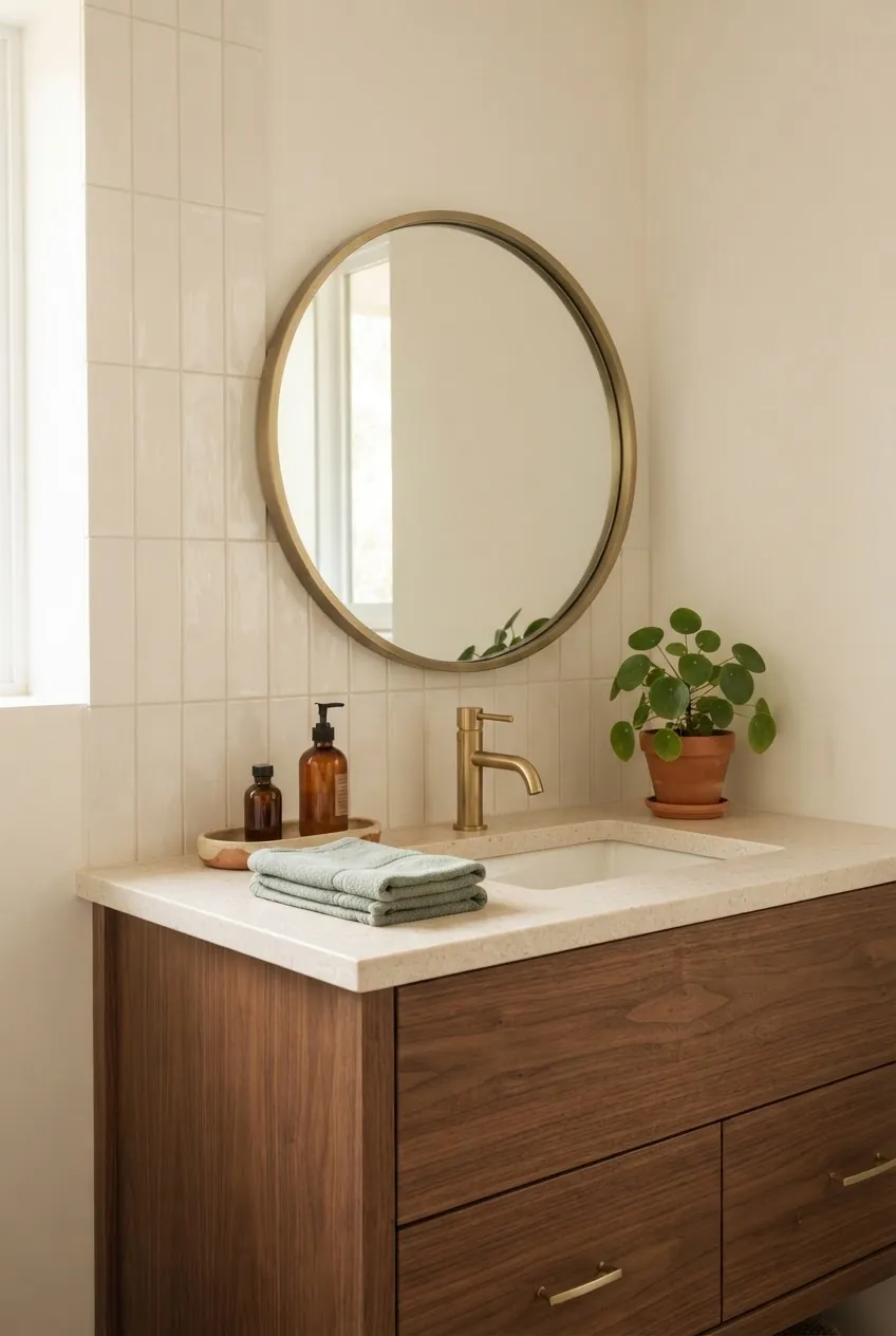
If the bathroom has cool tile that cannot be replaced, warm it with wood, woven storage, cream towels, a warmer metal finish, and art that uses the same accent color as nearby rooms. This helps the bathroom feel less separate from the rest of the home.
Test Painting Colors for Home Interior
Painting colors for home interior projects should be tested in large samples, not chosen from a tiny chip. Paint changes beside flooring, upholstery, daylight, and lamp light. A warm neutral can look pink, yellow, or gray depending on what surrounds it.
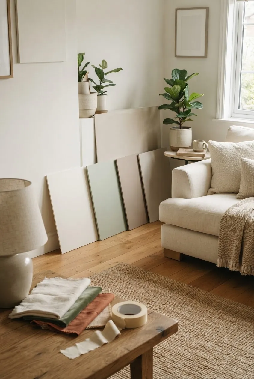
Place sample boards near the floor, sofa, curtains, and trim. Look at them in morning light, afternoon light, and at night with lamps on. If a color only looks good at one time of day, it may not be the right whole-home choice.
Easy Home Color Schemes Interior Designers Often Use
- Cream, walnut, sage, clay, and black for a warm natural home.
- Warm white, oak, tan, muted blue, and brass for a calm coastal-inspired palette.
- Taupe, ivory, rust, olive, and dark wood for a cozy layered interior.
- Greige, stone, walnut, moss green, and cream for a modern organic scheme.
- Soft beige, clay tile, sage cabinetry, woven texture, and brushed brass for utility rooms.
The best home decor colors are not just pretty in one room. They repeat, adapt, and support the way each space is used. Choose a small palette, test it beside your fixed finishes, then vary the strength from room to room. That is how a home feels cohesive without every space looking the same.