
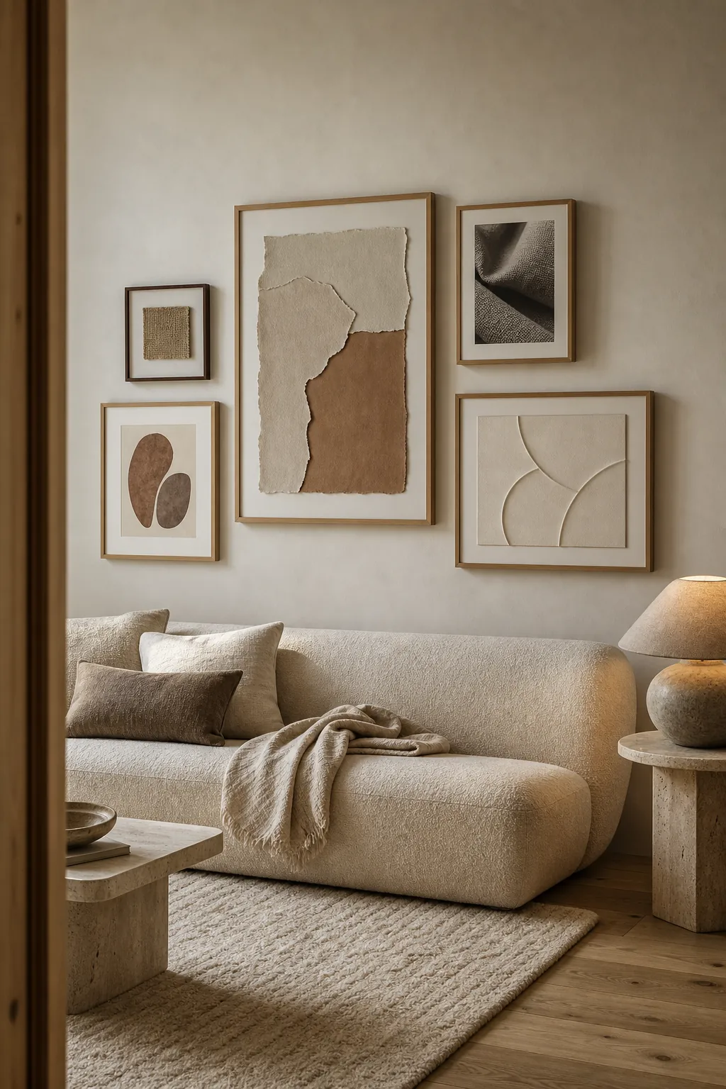
A minimalist gallery wall should feel quiet, but it should not feel vacant. The difference is texture. When color and frame count are restrained, the eye notices paper fibers, linen weave, wood grain, plaster relief, and the soft shadows between objects. Warm minimal wall decor depends on material depth more than decorative quantity.
The goal is not to fill a wall with neutral prints. It is to choose a few pieces that earn their space, then arrange them so the whole group connects to the room. These minimalist gallery wall ideas solve the problems that make neutral decor feel cold: undersized art, identical flat surfaces, cool whites, weak contrast, and spacing that looks accidental.
Choose Fewer Pieces at a Larger Scale
Minimalism is not a reason to make every frame small. Three substantial pieces often look calmer than nine tiny prints because the eye has fewer edges to process. Start by marking the intended outer boundary with painter’s tape. Above a sofa or sideboard, the grouping should be broad enough to relate to the furniture without stretching beyond it.
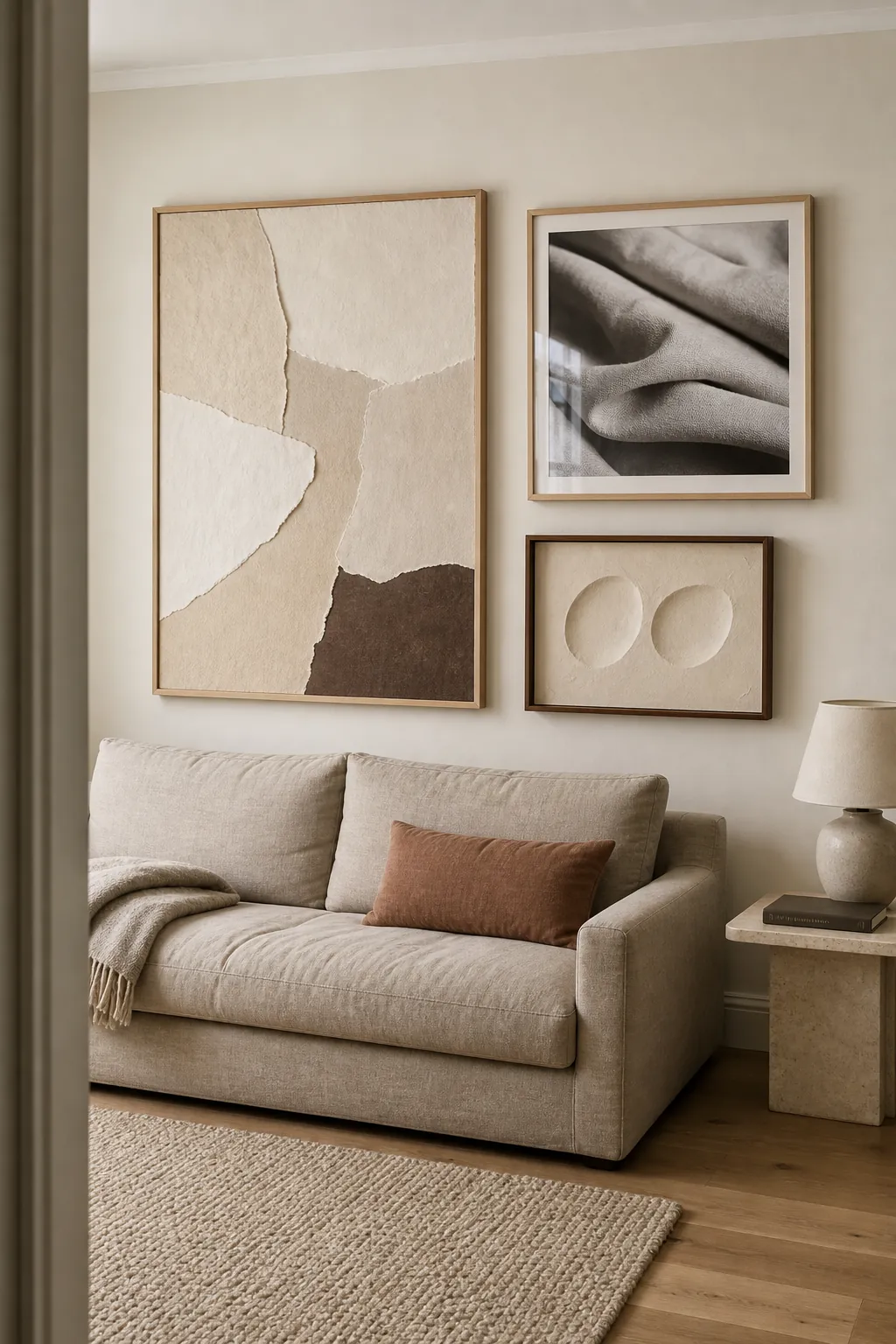
Give one work slightly more visual weight through size, a darker tone, or stronger texture. The other pieces should support it rather than compete. This small hierarchy keeps a three-piece arrangement from looking like a showroom set. It also lets you use meaningful originals or handmade work instead of buying a bundle of coordinated filler prints.
Build the Palette Around Warm Undertones
Pure white, blue-gray, chrome, and black can be beautiful, but using all four as the foundation often pushes a neutral room toward sterile. Begin with cream, putty, sand, mushroom, or pale clay. Then choose one deeper anchor such as cocoa, charcoal-brown, muted terracotta, or soft black. Repeat that anchor in two places so it becomes part of the composition.
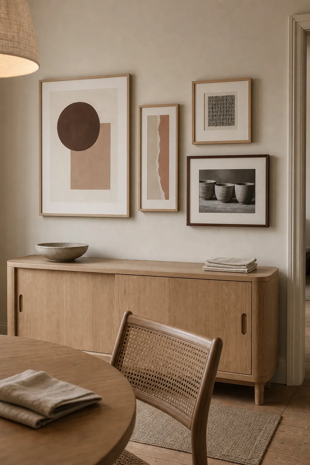
The artwork does not need to share one subject. A soft geometric print, a close photograph of handmade pottery, and a torn-paper composition can belong together when their whites and browns sit in the same temperature range. Color creates the first layer of cohesion; subject matter supplies the personality.
Let Texture Replace Busy Pattern
A warm minimalist gallery wall becomes more interesting as you approach it. Mix glass-fronted works with one tactile surface: a woven panel, shallow plaster relief, handmade paper collage, or pressed natural specimen. Limit dimensional pieces to one or two so the wall stays visually light. Their shadows will change through the day, adding movement without adding more color.
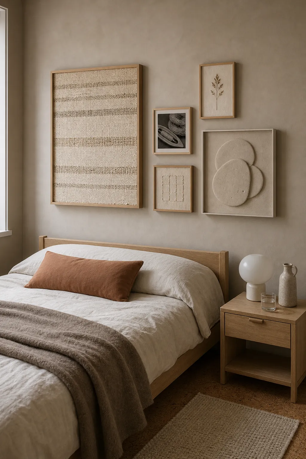
Choose materials that already appear in the room. Linen bedding can connect to a framed textile; an oak nightstand can connect to pale wood frames; a wool rug can echo deckled paper or boucle-like fiber. These quiet repetitions make neutral decor feel layered instead of flat, even when the room uses only a handful of colors.
Use Repeated Gaps to Create Rhythm
Wide spacing is part of minimalist design, but random wide spacing makes pieces look unrelated. Choose one gap—often three to four inches for larger frames—and repeat it. Align at least one edge or centerline across the group. In a hallway, a vertical sequence can make the narrow wall feel taller while still leaving clear space around each frame.
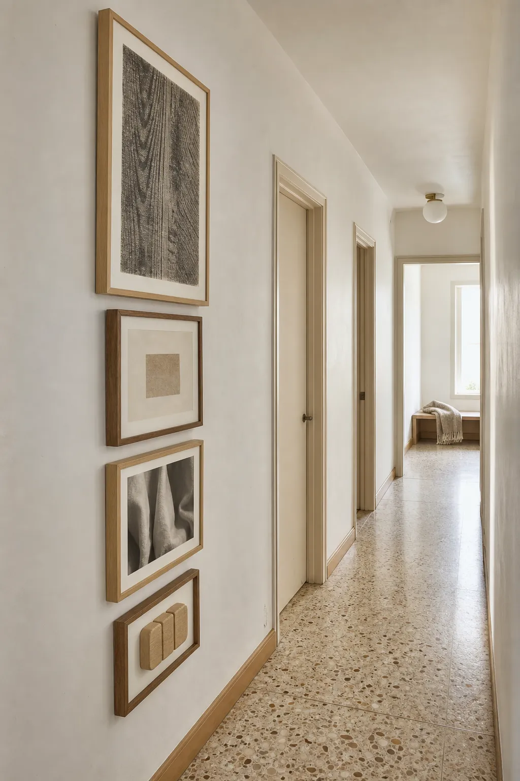
Cut paper templates to the exact frame sizes and tape them up before drilling. View the arrangement from the doorway and from the direction you normally walk. If the gaps disappear from one angle or one piece feels stranded, adjust the template. This small test is more reliable than judging a layout on the floor because it shows the real sightline.
Connect the Wall to One Useful Surface
Minimalist home styling works when decorative choices support the room instead of interrupting it. Above a slim console, desk, or bench, keep the gallery within the furniture’s visual width. Leave the surface mostly clear. One tray, lamp, or ceramic object is enough to create a bridge between wall art and daily life.
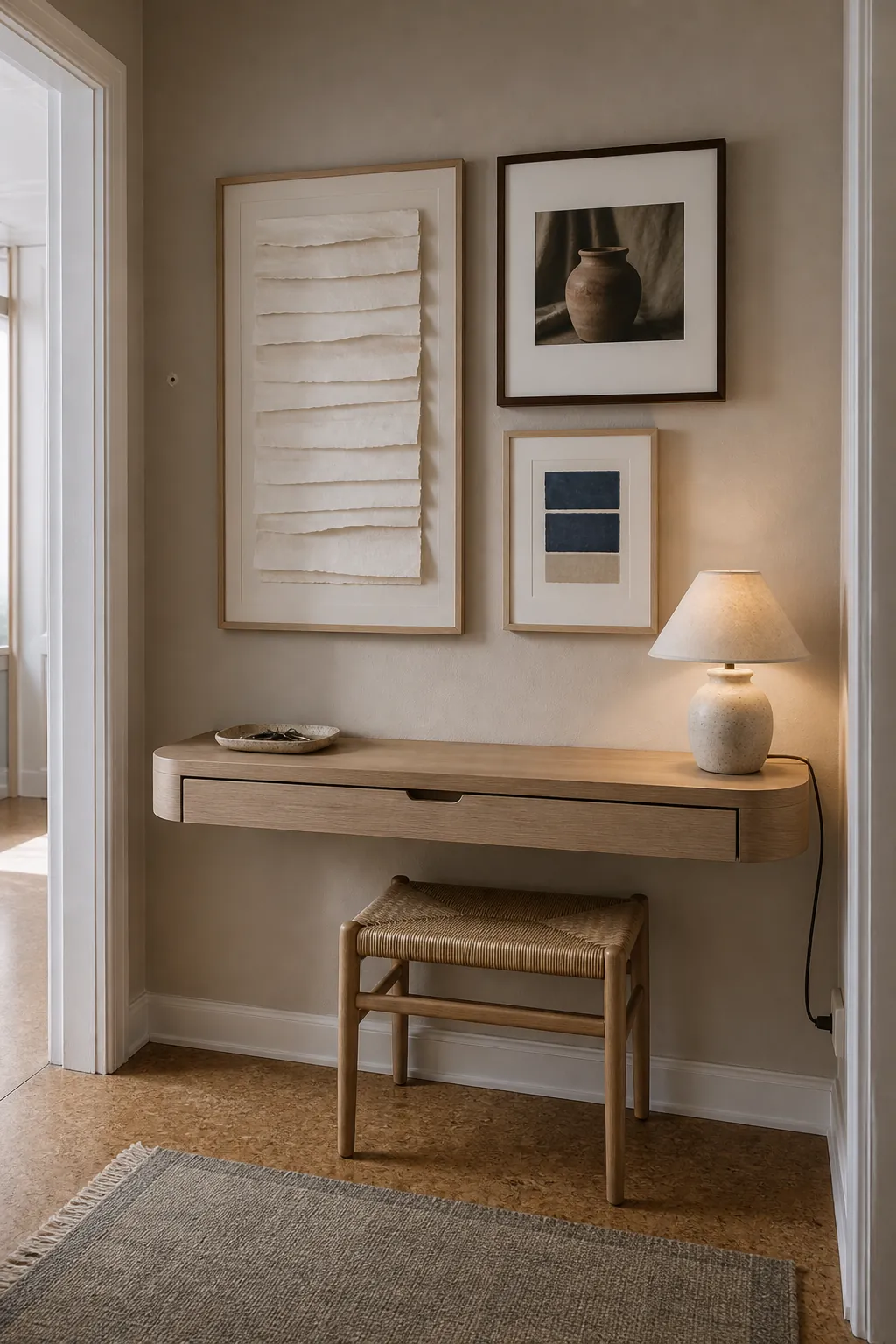
If the room is rented, a narrow picture ledge can reduce wall holes, but avoid stacking so many frames that the arrangement becomes a shelf display. Two or three leaning pieces with secure anti-tip support preserve the calm shape. The practical surface below should still have room to do its job.
Use Soft Light to Reveal Material Depth
Texture disappears under flat overhead light and becomes harsh under a narrow spotlight. Side light is more useful. A nearby window, shaded table lamp, or diffused wall light creates small shadows along deckled paper, wood edges, and plaster relief. Choose warm-neutral bulbs and keep glare off glass-fronted works.
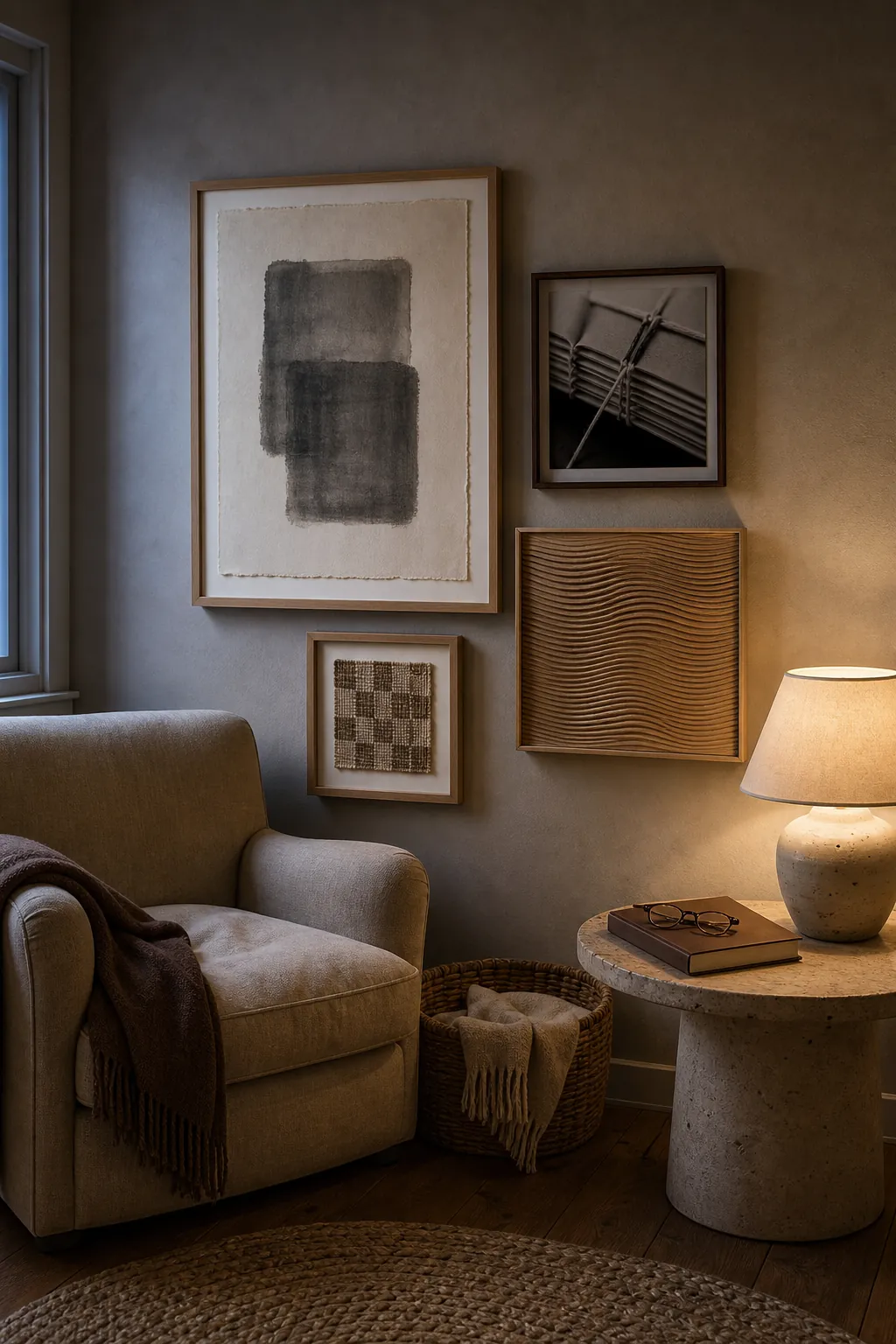
Finish by removing one element and living with the wall for a day. If the composition still feels complete, the edit was useful. If it suddenly feels weak, return the piece. Warm minimalism is not about owning the fewest things; it is about giving the right things enough space and light to be noticed.