
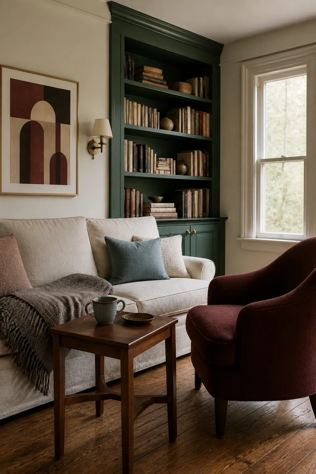
Hunter green has enough depth to expose every weak decision around it. A bright white can look abrupt, a gray can become lifeless, and several dark furnishings can merge into one heavy shape. The most reliable palette begins with the room itself: its daylight, fixed floor, largest fabric, and the way the green changes after sunset.
Before buying anything, place possible companion colors beside the hunter green surface for a full day. A useful match should improve the green in both natural and artificial light, not only in a carefully edited inspiration image.
Bone and Parchment Supply Soft Contrast
Bone, parchment, and creamy stone give hunter green breathing room while preserving its classic character. These shades contain enough warmth to avoid a sharp black and white effect. Use them across a large rug, curtain, ceiling, or upholstered bed so the relief is visually meaningful.
If the room has limited daylight, choose the palest version that still feels warm. In a bright room, a deeper parchment can look settled rather than dingy. Repeat the neutral on at least one vertical surface and one soft textile to connect the scheme.
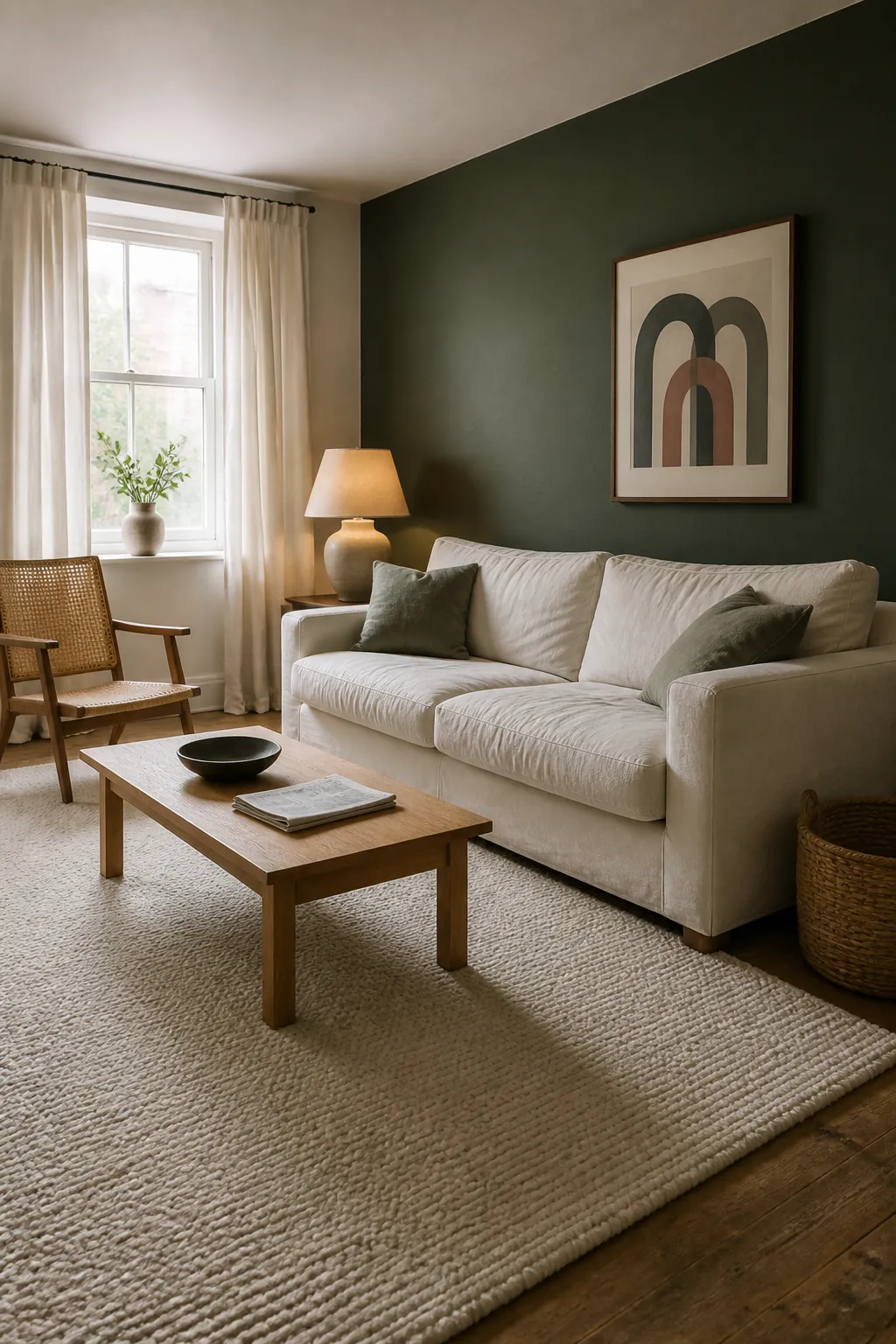
Walnut Makes Hunter Green Feel Established
Walnut suits hunter green when the goal is a richer, more traditional room. Its chocolate tone reinforces the depth of the paint, while the grain keeps the pairing from becoming a flat brown and green block. Add a pale floor covering or light upholstery if both the walls and furniture are substantial.
This combination is especially convincing in a dining room, study, or bedroom where evening atmosphere matters. Use light as the third color through shaded lamps, a window treatment, or a reflective metal detail. That brightness defines the edges of dark furniture after sunset.
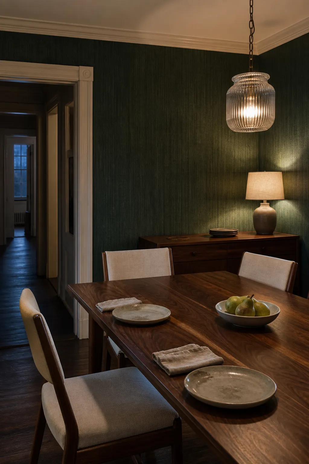
Burgundy Creates a Layered Heritage Palette
Burgundy brings red based contrast without the brightness that can make green feel seasonal. Look for wine, oxblood, or faded cranberry in woven patterns and small upholstery pieces. A rug that includes hunter green, burgundy, and cream can establish the relationship before either color is repeated elsewhere.
Keep the red dark and slightly brown, then give both colors a neutral boundary. Parchment walls, a flax sofa, or a pale wood floor stops the pairing from becoming visually dense. Avoid using equal amounts of green and burgundy, since one needs to lead.
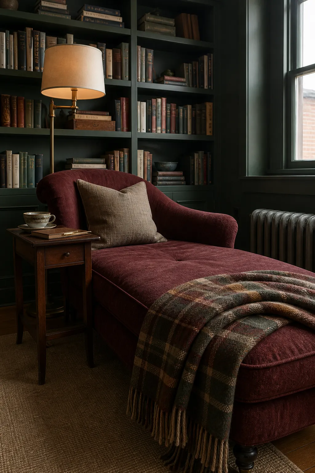
Saffron Adds a Small Point of Warmth
Saffron and muted ochre can wake up hunter green, but they are strongest in limited doses. One woven throw, shaded lamp, or patterned cushion is often enough. The color should feel earthy and slightly browned rather than lemon yellow.
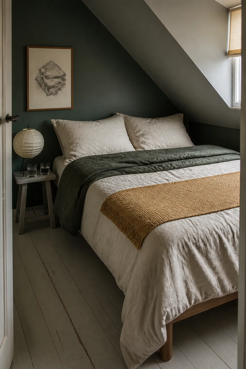
Pair this accent with natural fiber, off white, and medium wood so the room has quieter layers around it. In a hunter green bedroom color scheme, a narrow saffron coverlet can warm the bed without competing with the wall. Test it under the actual bulbs because warm lamps can intensify yellow quickly.
Powder Blue Introduces Freshness
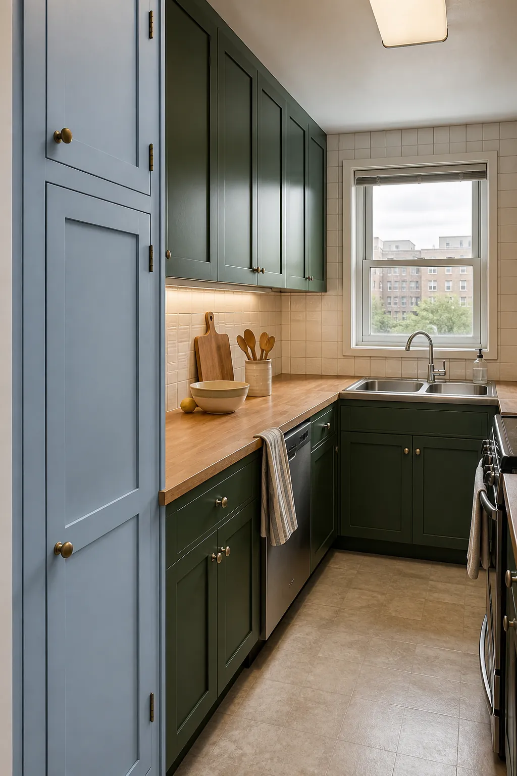
Powder blue makes hunter green feel less formal and can be particularly effective in rooms with clear daylight. Choose a gray blue with a quiet finish rather than a bright nursery blue. It can appear on cabinetry, a chair, curtains, or a patterned textile that also includes cream.
The colors share a cool foundation, so add one warm material to prevent the result from feeling remote. Oak, cane, unlacquered brass, or woven flax can supply that bridge. Vary the value clearly so the blue does not disappear into the green.
Black Adds Definition in Thin Lines
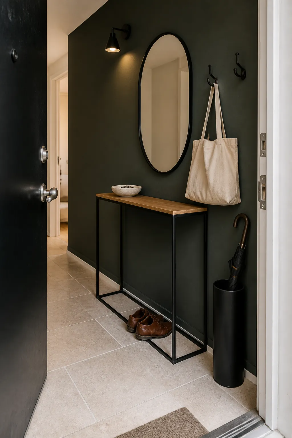
Black works with hunter green when it outlines rather than overwhelms. Window frames, chair legs, cabinet pulls, and a narrow lamp can sharpen the palette while leaving the main surfaces distinct. Large charcoal or black furniture needs strong daylight and broad pale areas nearby.
A small room can still use black if the shapes remain visually light. Choose open legs, slender frames, and matte finishes instead of bulky glossy pieces. Contrast is most effective when it reveals structure, not when it consumes another large part of the room.
Build the Palette Around Fixed Materials
A hunter green paint color combination is easier to control when the floor, countertop, and largest furniture piece are treated as colors. Cool gray flooring often benefits from parchment and walnut, while orange wood may need bone and powder blue for balance. Do not copy a palette that ignores the surfaces you cannot change.
Paint a large sample board and move it around the room. Hold fabric and wood samples against it during morning, afternoon, and evening light, then photograph the combinations without filters. The right palette will keep the hunter green recognizable while solving the room’s actual shortage of brightness, warmth, or separation.