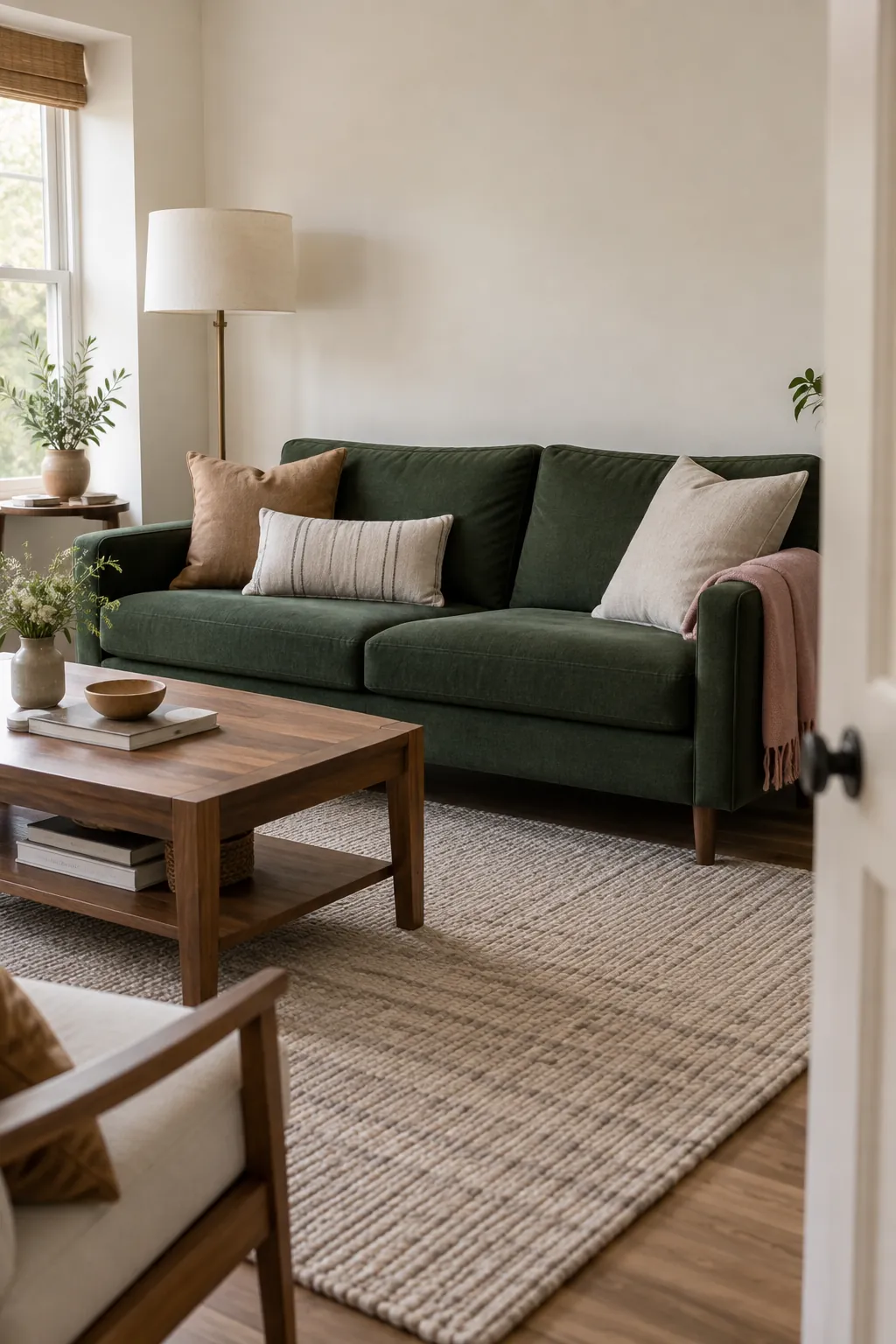
A dark green sofa can look rich in the shop and unexpectedly heavy at home. The missing piece is often a lighter companion colour, not more decoration. Ivory and warm neutrals are dependable starting points; camel, dusty pink, terracotta and soft blue offer different moods once the room’s fixed finishes are accounted for.
Start with ivory when the room needs light
Ivory, oatmeal and soft stone are useful starting points because they give deep green a lighter neighbour without introducing another strong colour. Choose ivory when you want gentle contrast, oatmeal when you want a relaxed textile palette, and stone when a cream sample looks too yellow. None is automatically right: a pinkish beige beside a blue leaning green can feel quite different from a brownish oatmeal beside the same paint.
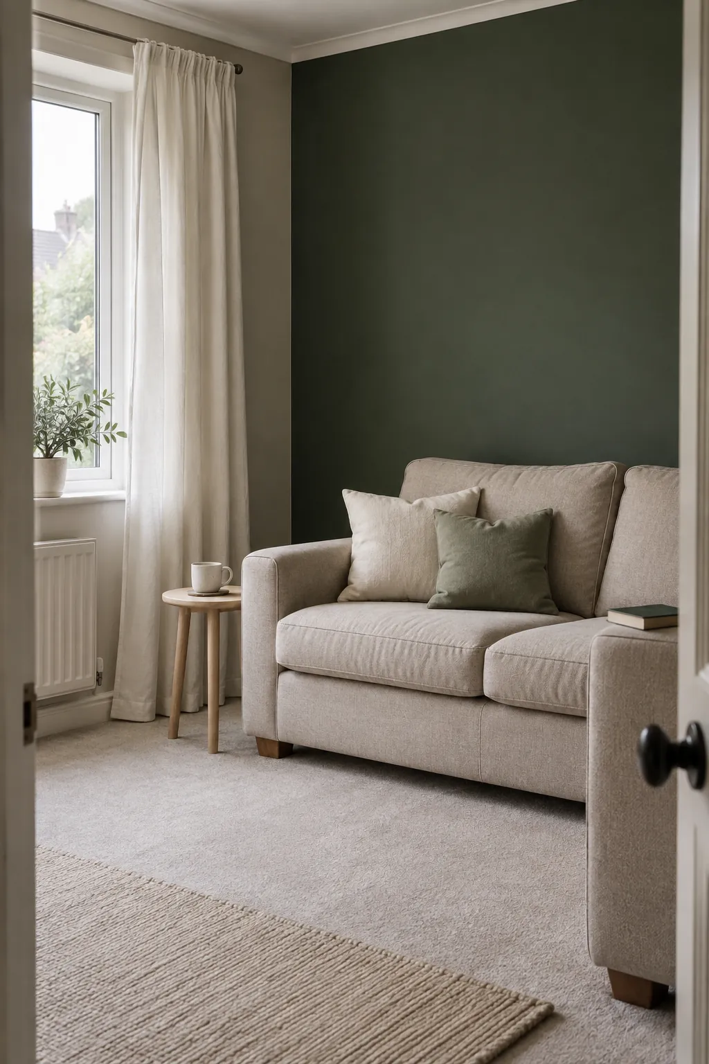
For forest green living room ideas, start with the biggest surface you already own. A green sofa can sit against ivory walls with an oatmeal rug, while green walls can surround a pale sofa and simple curtains. If the room feels heavy, increase the light area before buying more small accessories. A few pale cushions cannot change the overall balance of four dark walls, a dark floor and dark furniture.
Use wood and camel to warm the green
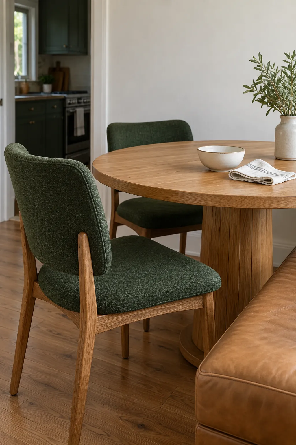
Forest green with natural wood works especially well when the wood is treated as a colour in the scheme. Honey oak brings yellow warmth, walnut introduces brown depth, and reddish timber creates a stronger contrast. Place a green sample beside the actual floor or cabinet, since a photograph rarely preserves the same undertone.
Camel leather is another way to add warmth without choosing a bright accent. In a dining area, green upholstery, a medium oak table and a cream shade can be enough. You do not need every timber finish to match, but repeating one wood tone in another visible detail helps the room feel intentional.
If existing orange toned flooring dominates the room, test a quieter green before adding rust cushions. Otherwise, the floor and accessories may compete for the same warm role.
Choose dusty pink for a softer bedroom
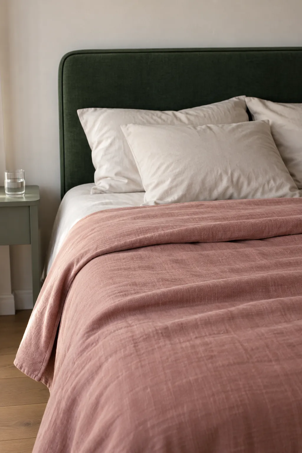
A muted pink introduces a warm contrast without the sharpness of a bright red. Think clay pink, faded rose or a subdued plaster shade, rather than a sugary pastel chosen from a screen. The result can feel calm when green remains the darker anchor and pink appears in a generous but simple textile.
A forest green bedroom color scheme might use green curtains, rose bedding and an off white wall. If the headboard is already green, try a pink coverlet before painting the entire room. Keep sheets comparatively pale so the bed retains a clear light area, and test the pink beside the green at bedtime as well as in daylight.
Bring in terracotta without doubling the intensity
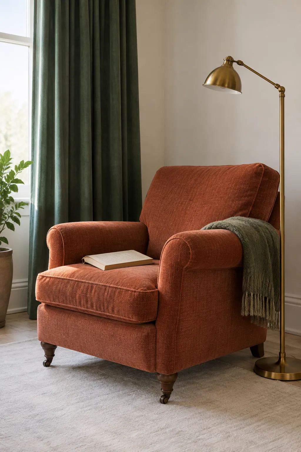
Terracotta and rust add earthy warmth, particularly beside a deep green that looks slightly cool. Their success depends on saturation as much as colour family. A faded clay pot or brick coloured cushion is easier to combine than a vivid orange rug covering most of the floor.
Use this pairing where you want a lively focal point, such as a reading chair beside green curtains. Leave some quieter space around the combination with chalky walls or a plain rug. If the room already has exposed brick, let that be the warm accent and repeat it only lightly in another object.
Brass can sit within this palette, but it reads as another warm element. A single lamp or small handle may give enough sparkle without making the whole scene feel golden.
Pair blue and green with a clear difference in depth
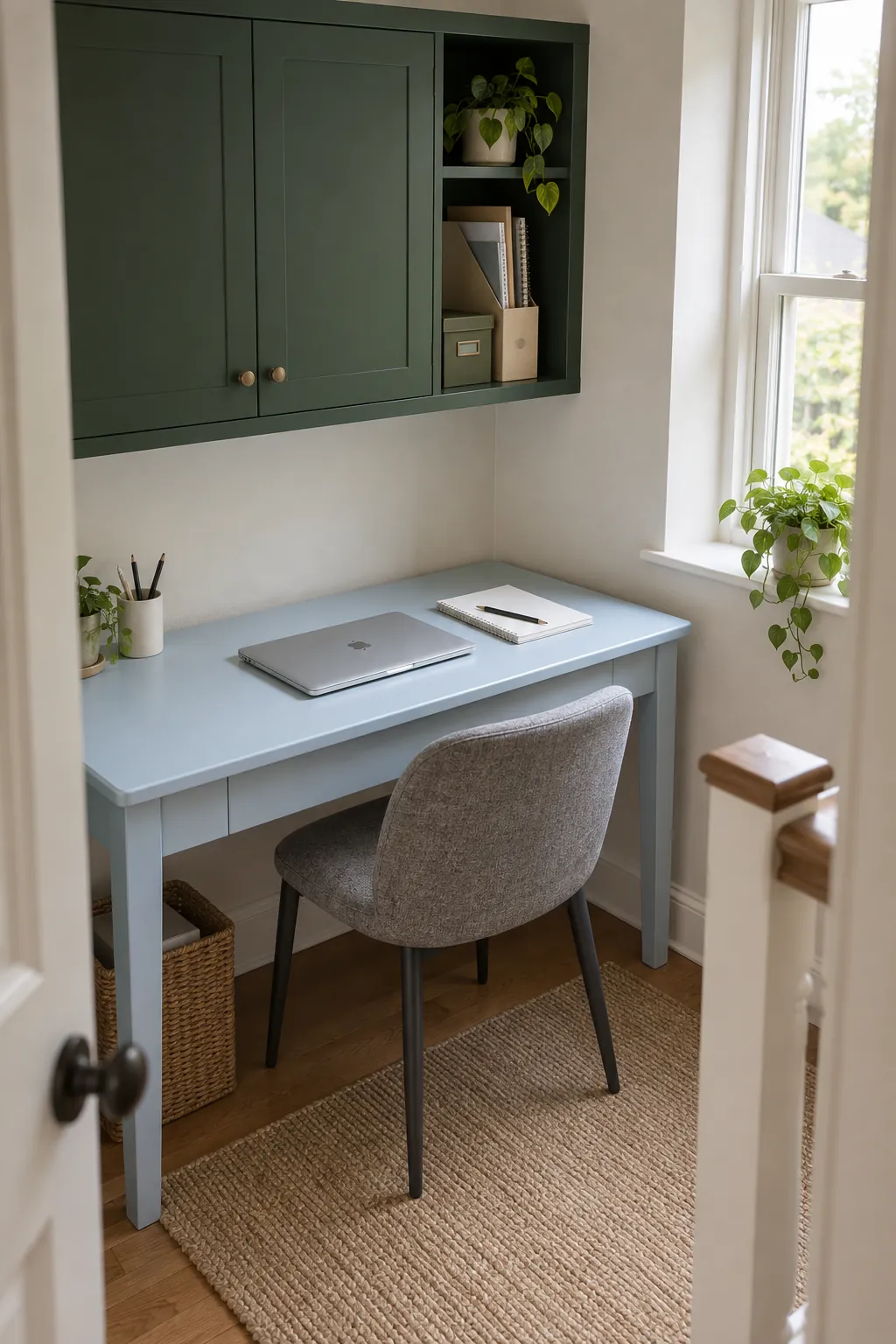
Blue can make forest green feel cooler and quieter, especially in rooms where you want less earthy warmth. A pale smoky blue beside dark green is usually easier to read than two equally dark colours. Navy and forest green can work together, but the combination needs a lighter surface or a noticeable texture difference so the shapes remain distinct.
Test the palette against the things you cannot change
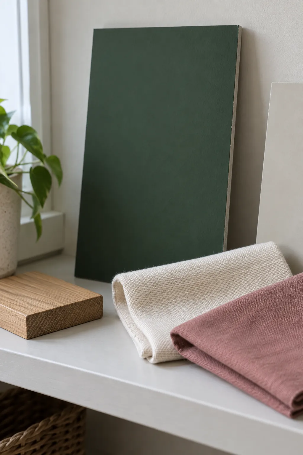
Before committing to forest green paint color combinations, gather the actual curtain fabric, rug sample and paint samples in the room. Include the floor, sofa and any fixed stone surface in your view. Choose one main companion colour first, then decide whether a small accent is still needed.
Paint a movable sample board using the product instructions and enough coats for proper coverage. Hold it upright beside the surfaces it will meet, then move it between the brightest wall and a darker corner. Check in morning light, later daylight and under the lamps you normally use. Forest green is a descriptive name, not a guarantee that every brand or fabric will look alike.
For a rental, use forest green curtains and textiles to trial the effect before making a costly purchase. Check curtain fullness, lining and the view from the doorway, since these affect how much dark colour the room actually contains. If the palette only works in one carefully lit photograph, keep testing before it becomes your everyday room.