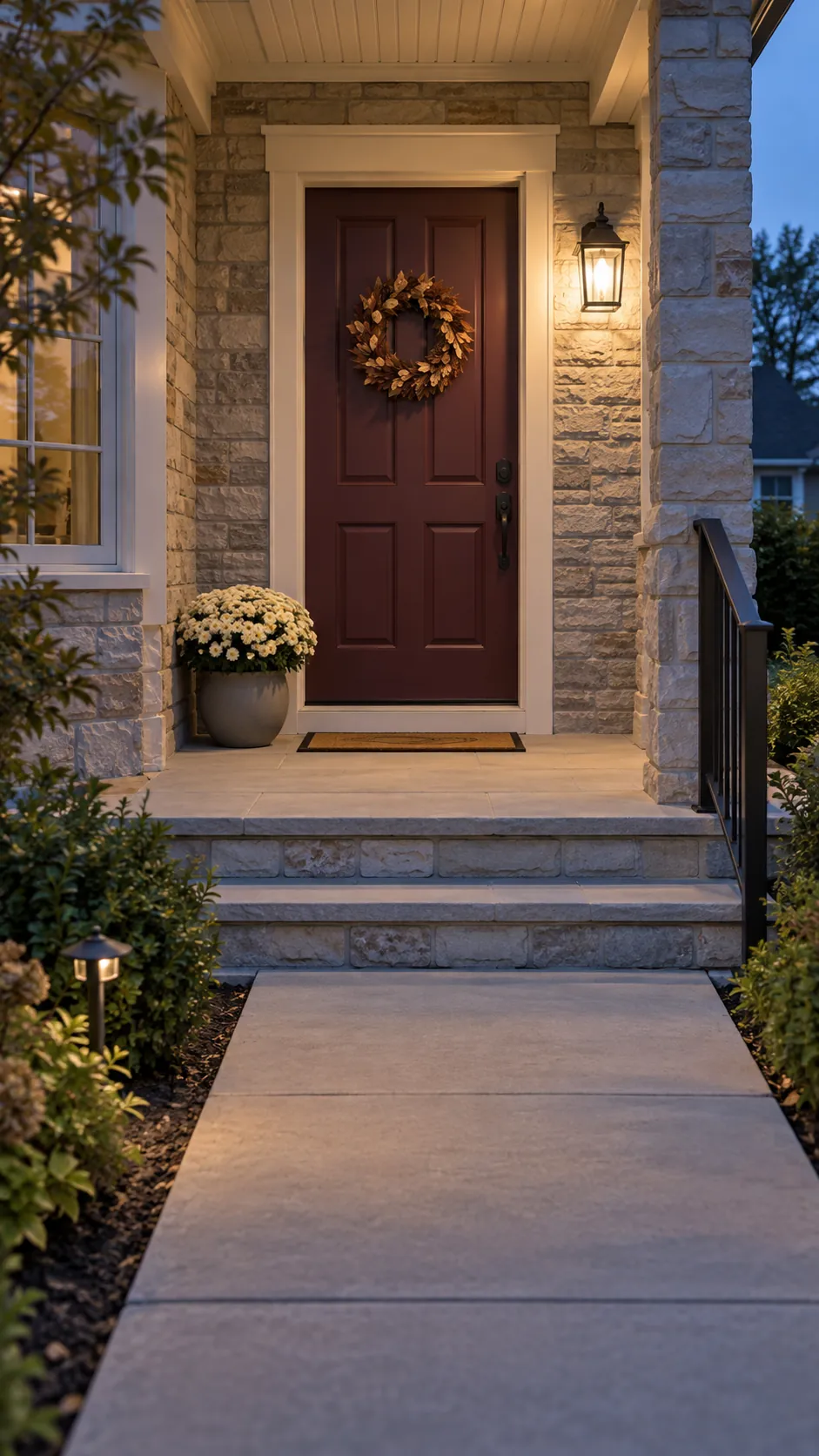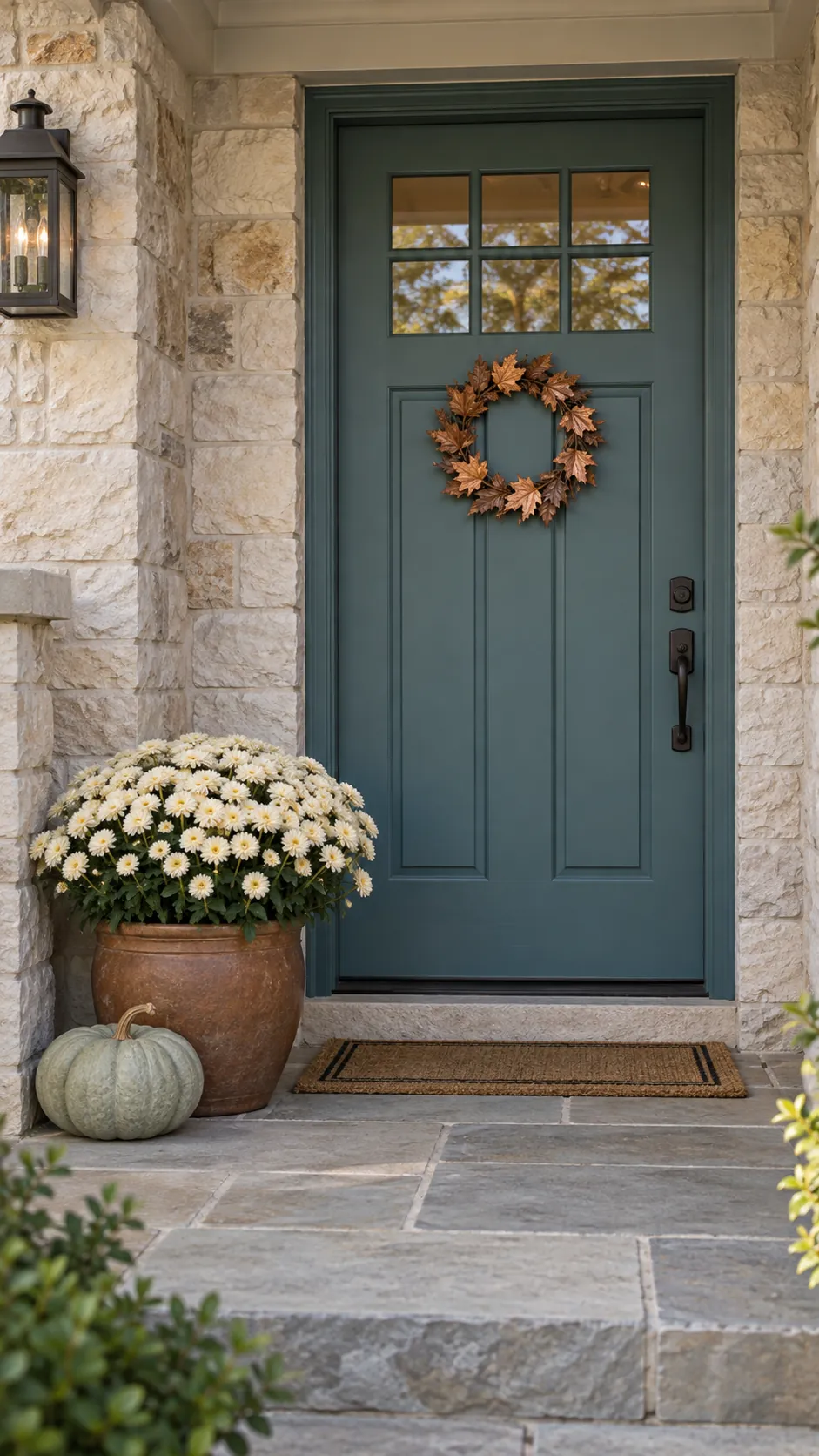
A pot of mums can look perfect at the nursery and strangely loud beside your own doorway. The difference is often the colors surrounding it: brick, trim, shade, and the door itself. Start with those fixed surfaces, then choose a few seasonal accents that have a clear job.
Read the Colors That Are Already There
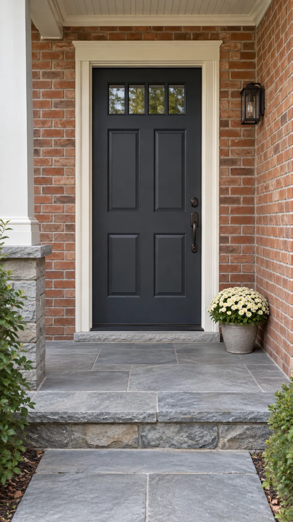
Your door is the starting point, but the brick, siding, floor, trim, and hardware are already part of the porch color scheme. Stand at the approach and notice which surfaces occupy the largest areas. A charcoal door surrounded by orange brick calls for a different balance than the same door surrounded by cool white siding. You do not need to repaint either one to make autumn decor combinations feel deliberate.
Look at the door in daylight without a strong phone filter, then describe it in ordinary terms: deep blue, muted green, warm wood, cool gray, or burgundy. Notice whether the trim looks creamy or crisp white beside it. These observations are more useful than trying to match a paint name from memory. Keep a simple photograph for shopping, but treat the actual materials at home as the final reference because screens and store lighting can shift color.
Give Each Added Color a Job
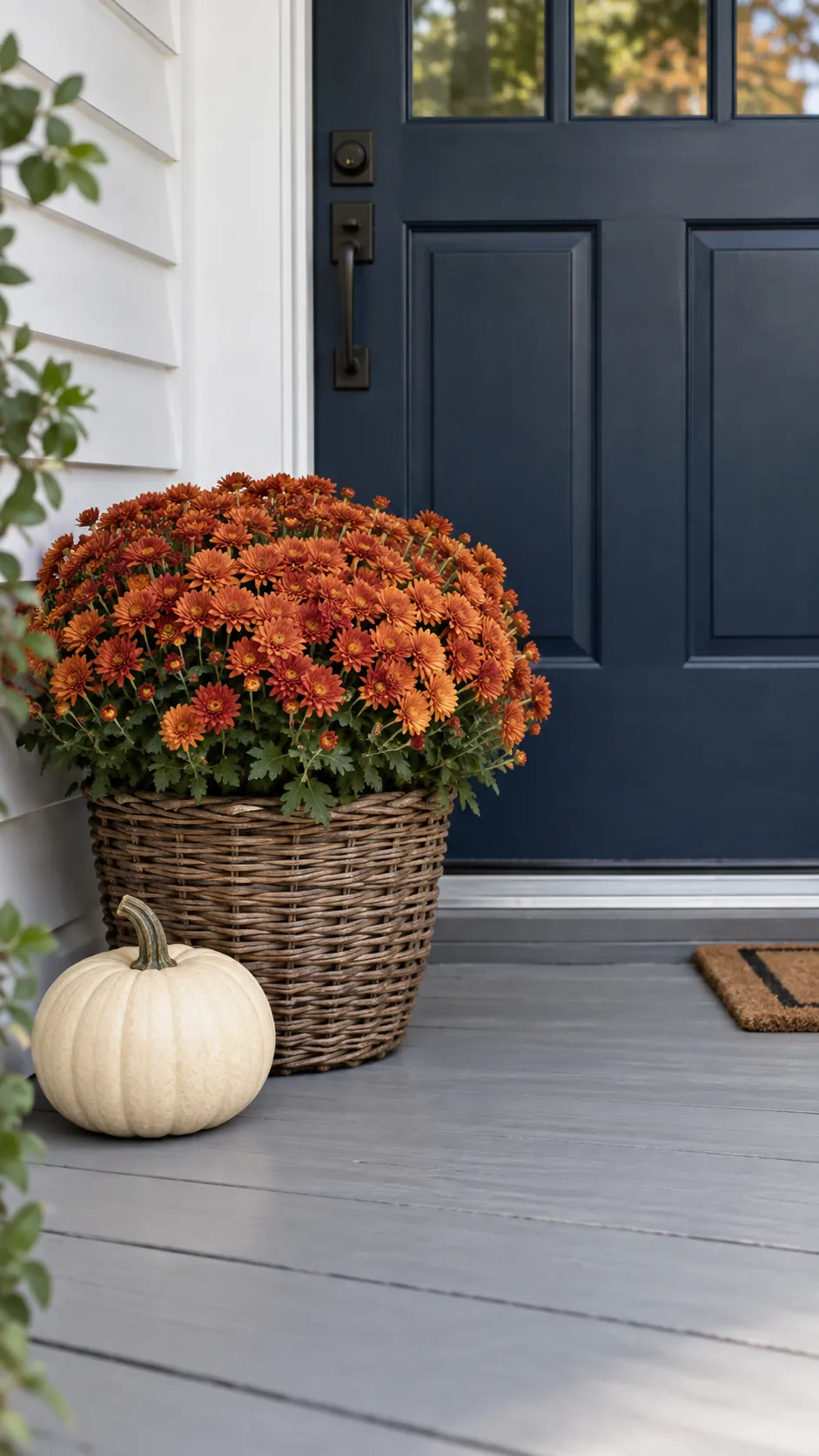
Choose one main seasonal color, one quieter supporting color, and a neutral material you already like. For a navy door, that might mean rust mums, cream pumpkins, and a weathered brown basket; for a sage door, plum flowers and pale pumpkins may feel calmer. Let one added color appear in the largest decorative object, then repeat a smaller amount elsewhere if the space allows. You are creating a clear relationship, not dividing the porch into exact percentages. A pot, wreath, and pumpkin do not all need equal visual weight, and the existing door can remain the strongest color in the view.
Choose Contrast for the Door You Have
With a dark navy or black door, pale pumpkins and cream flowers are easy to distinguish from the background. A rust accent adds a warmer note without needing every object to be orange. If the surrounding brick is already strongly red or orange, reduce the amount of extra warm color and let cream or muted green provide separation.
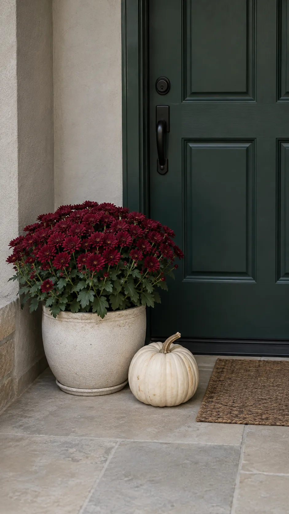
A green door can work with burgundy porch accents, dusty pink mums, or copper leaves, depending on how bright or muted the paint is. Hold the actual flower pot near the door before committing to the combination. A very dark burgundy flower can disappear against an equally dark green entrance in shade, so a pale container or neutral fall pumpkins may supply the missing contrast.
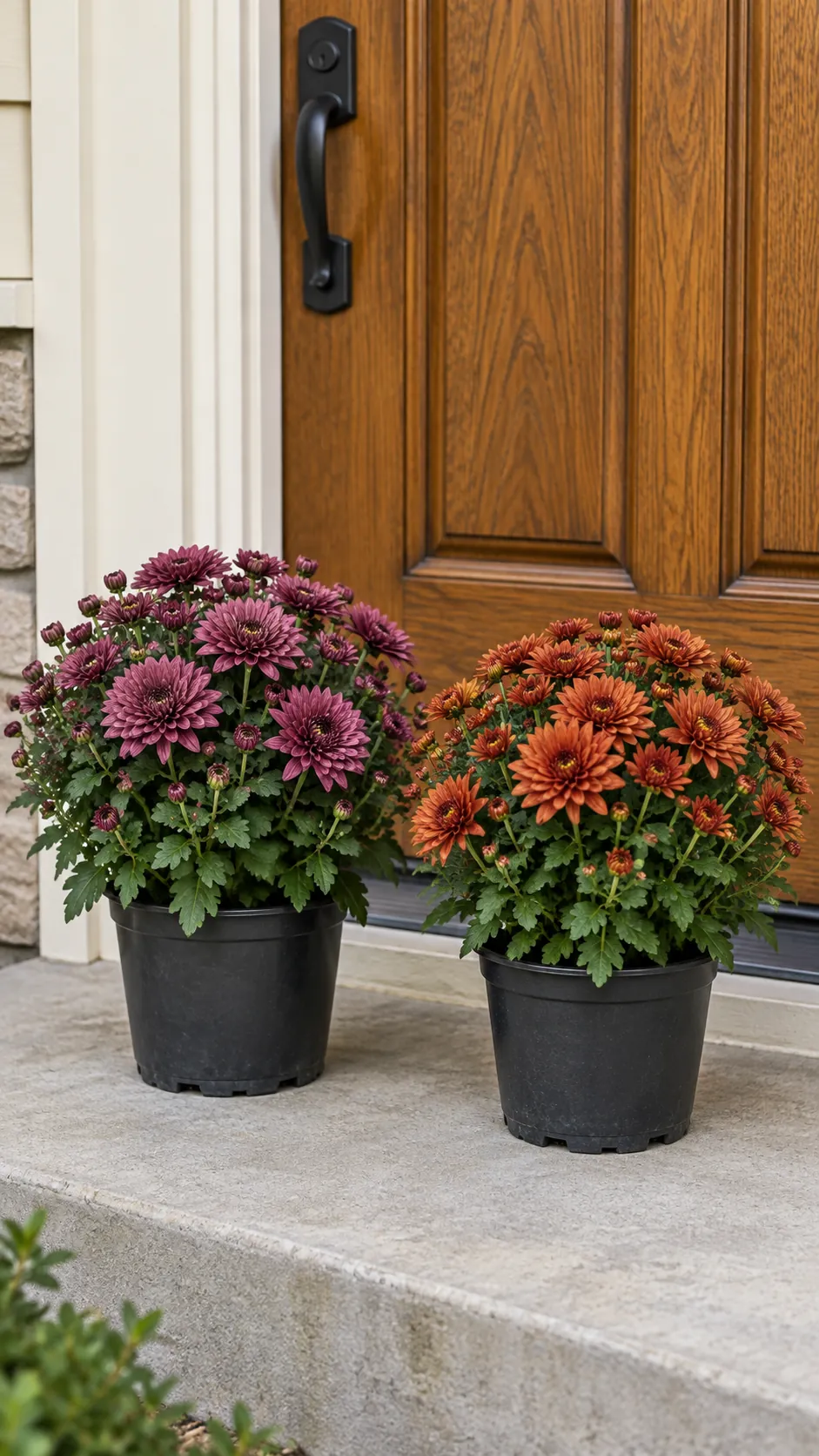
For red or burgundy doors, try cream, natural brown, and quiet green first, then add another strong hue only if it improves the whole view. A warm wood door often sits comfortably beside plum flowers and gray green pumpkins, while a pale gray or white door can carry a deeper flower color. These are starting combinations, not universal rules. The surrounding materials and available light can change which version looks clear and balanced.
Test Mum Colors Beside the Actual Surface
Coordinating mum colors is easier when you compare plants with open blooms rather than relying entirely on tight buds or a printed nursery label. Set the plant in its intended position and look from the path, then move closer to check the flower color against both the door and its container. If two colors compete, remove one object from the scene before buying a third color to solve the problem.
Plant health still matters more than a perfect shade. Check the light, watering, and temperature needs for the plant you are buying, and choose a location that can meet them. Keep nursery pots accessible for drainage and routine care. A container that looks right but traps water or makes the plant difficult to reach is not a useful part of the design.
Use Materials to Connect the Palette
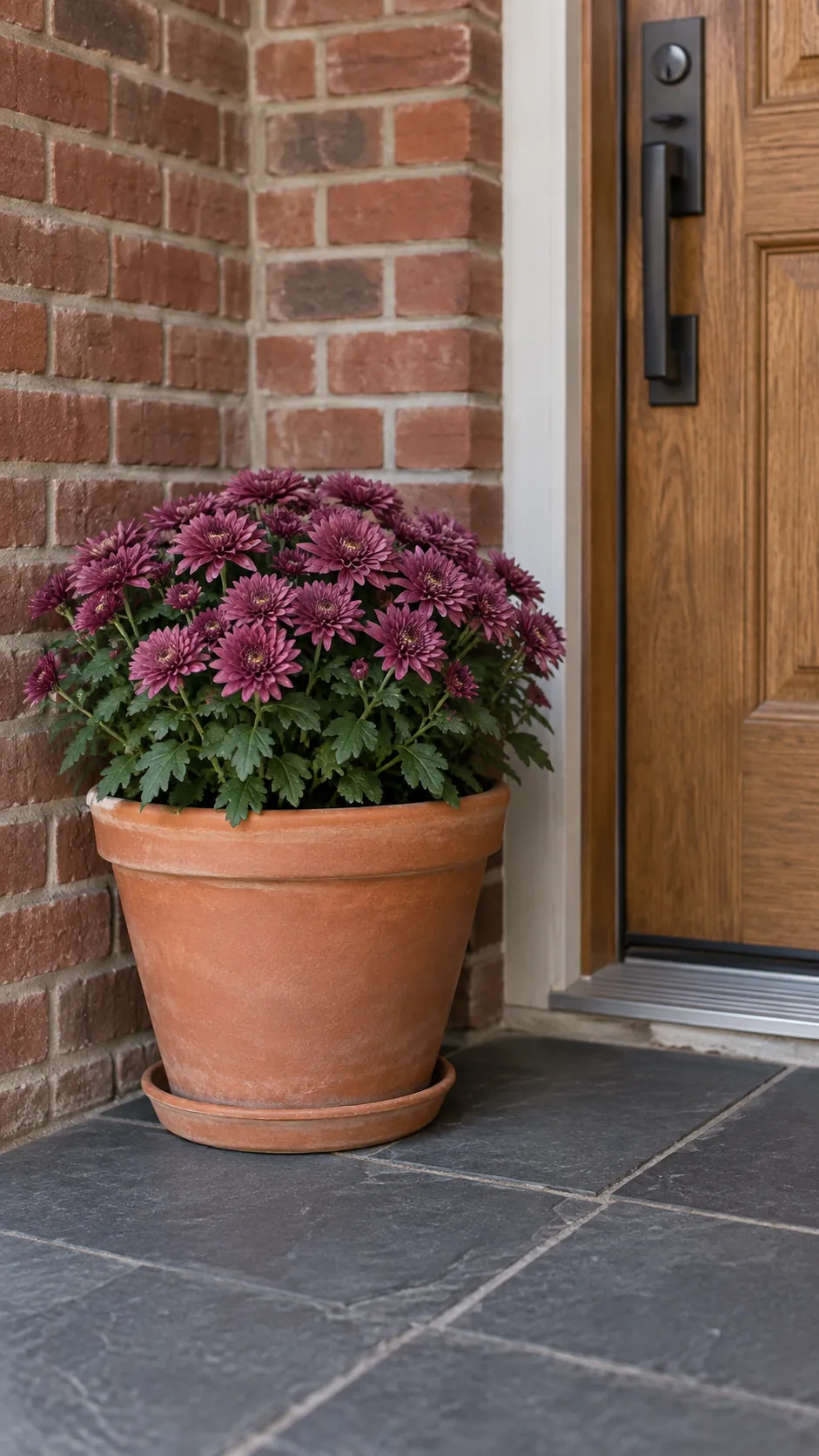
Natural materials can link colors without adding another bright accent. A clay pot can repeat the warmth of brick, a galvanized container can relate to cool gray hardware, and a brown woven basket can soften a dark painted door. Choose the connection that already exists on your porch, then avoid mixing several unrelated finishes in a tiny space. Texture also changes visual weight: rough wicker reads differently from smooth glazed ceramic even when both are brown. Let the container support the flowers rather than competing with them, and use pieces that can tolerate their actual weather exposure.
Check the Whole Entry Before Adding More
View the finished arrangement from the distance at which visitors first see the door. If every object attracts equal attention, simplify the smallest or brightest accent and look again. Check the same view in the light when you most often arrive home, since deep colors may merge under a covered porch or look different beneath the porch lamp.
Leave the handle, door swing, steps, and walking route clear while adjusting the display. A small entry may need only one planter and a quiet wreath, while a broader porch can repeat the accent farther away. Stop when the door, flowers, and surrounding materials feel connected and you can still use the entrance comfortably. The best final check is opening the door and carrying something through it.