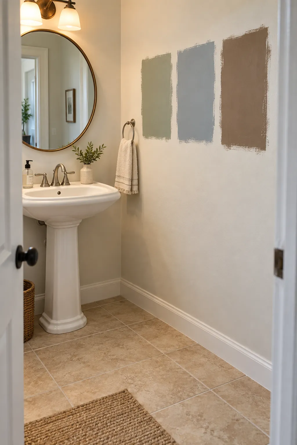
Beige tile can look pink beside one paint color and muddy beside another. The safest place to begin is the tile itself: compare a clean cream swatch, a muted green swatch, and a soft gray swatch against it under the room's actual light. Once you see whether the tile reads yellow, pink, or gray, you can build a palette that looks intentional instead of trying to hide the floor.
A powder room gives you room to use a stronger wall color than you might choose for a full bathroom. Keep the fixed tile visible while you test samples, and repeat one chosen accent in a towel or small accessory. These combinations show what each palette contributes and where it tends to work best.
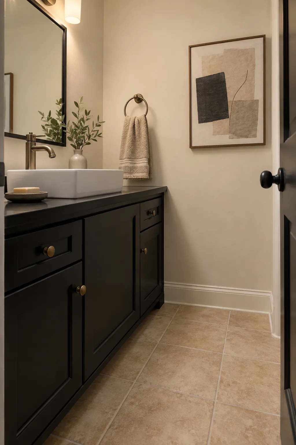
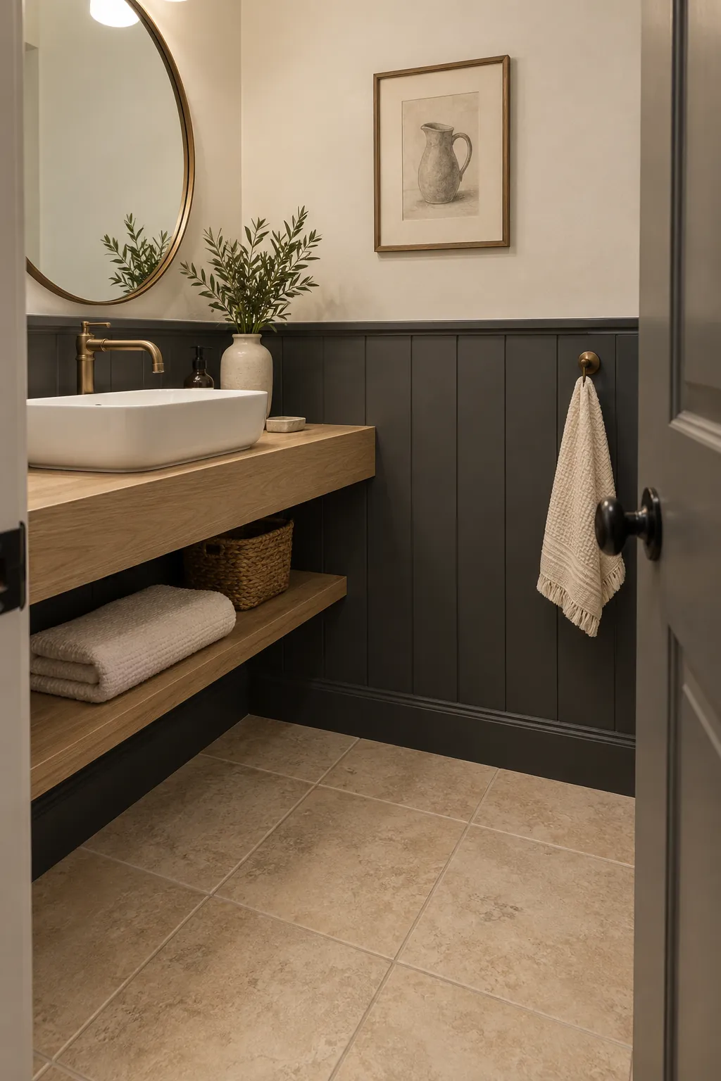
Cream, Mushroom, and Charcoal
Cream walls soften beige tile without making the room feel washed out. Choose a mushroom tone for the vanity if the tile has a gray or taupe cast, then use charcoal in a narrow mirror frame for definition. Check the cream sample beside both the tile and grout, since a bright white can make warm grout look dingy.
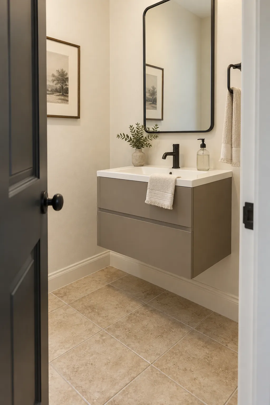
Warm White, Taupe, and Polished Nickel
A warm white wall lets the tile remain the quiet middle tone in the room. Taupe towels or a vanity painted a step deeper than the floor create separation, while polished nickel keeps the scheme crisp. This combination is especially useful when existing silver fixtures are staying and the tile has no strong orange undertone.
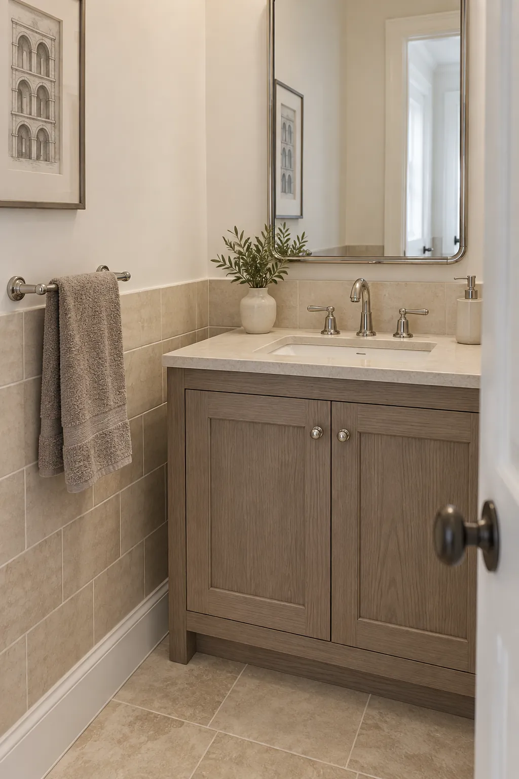
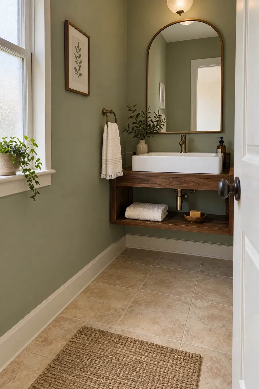
Soft Sage, Ivory, and Walnut
Sage gives beige tile a gentle contrast without introducing another warm brown surface. An ivory wall or ceiling keeps the small room open, and a walnut shelf adds a clear natural anchor. Test sage in the evening because some samples turn noticeably gray beneath cool bathroom bulbs.
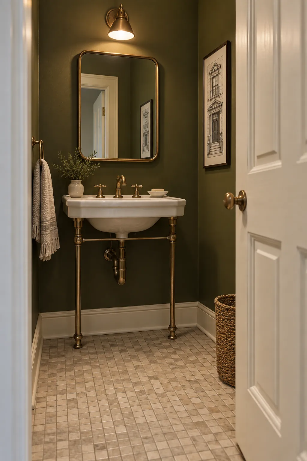
Olive, Cream, and Antique Brass
A muted olive wall can make yellow leaning beige tile feel deliberate rather than dated. Cream trim gives the dark green a clean edge, while antique brass brings warmth to a mirror or sconce. Keep the olive earthy and subdued so it does not compete with a busy tile pattern.
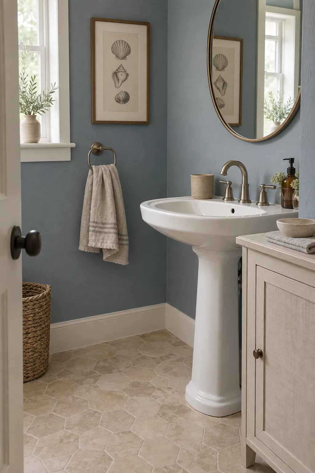
Dusty Blue, Linen, and Sand
Dusty blue is a calm partner for beige tile when the tile leans neutral or slightly pink. Linen colored towels bridge the cool wall and warm floor, while simple sand colored ceramics repeat the tile once at eye level. Hold the blue swatch beside the tile first; a very icy blue can exaggerate yellow in the floor.
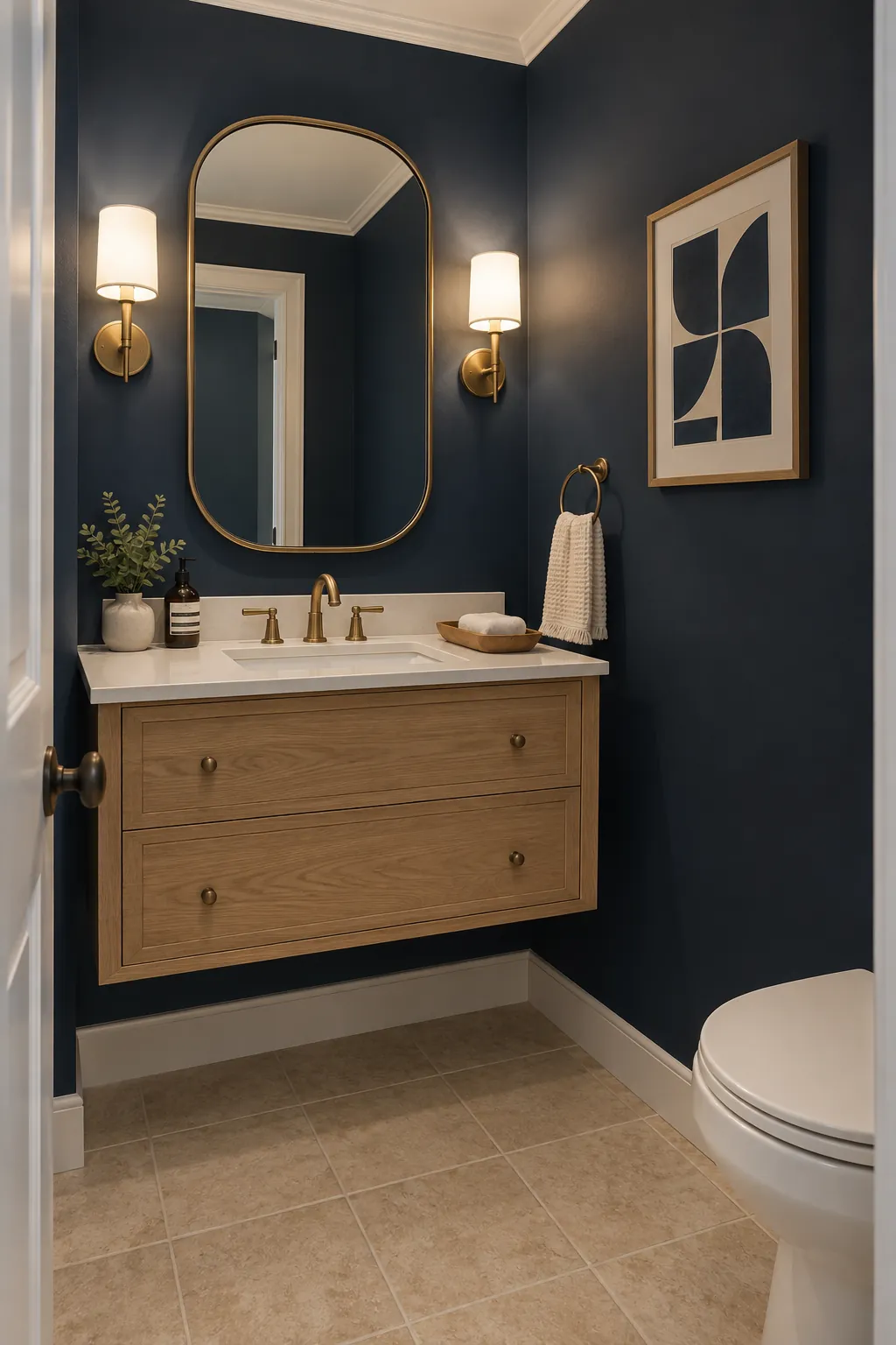
Deep Navy, Soft White, and Oak
Navy creates a strong wall backdrop that makes a small powder room feel composed. Soft white around the ceiling and sink stops the contrast from becoming heavy, and an oak vanity connects the dark wall to beige tile. Use a substantial mirror or good sconces so the face area remains bright.
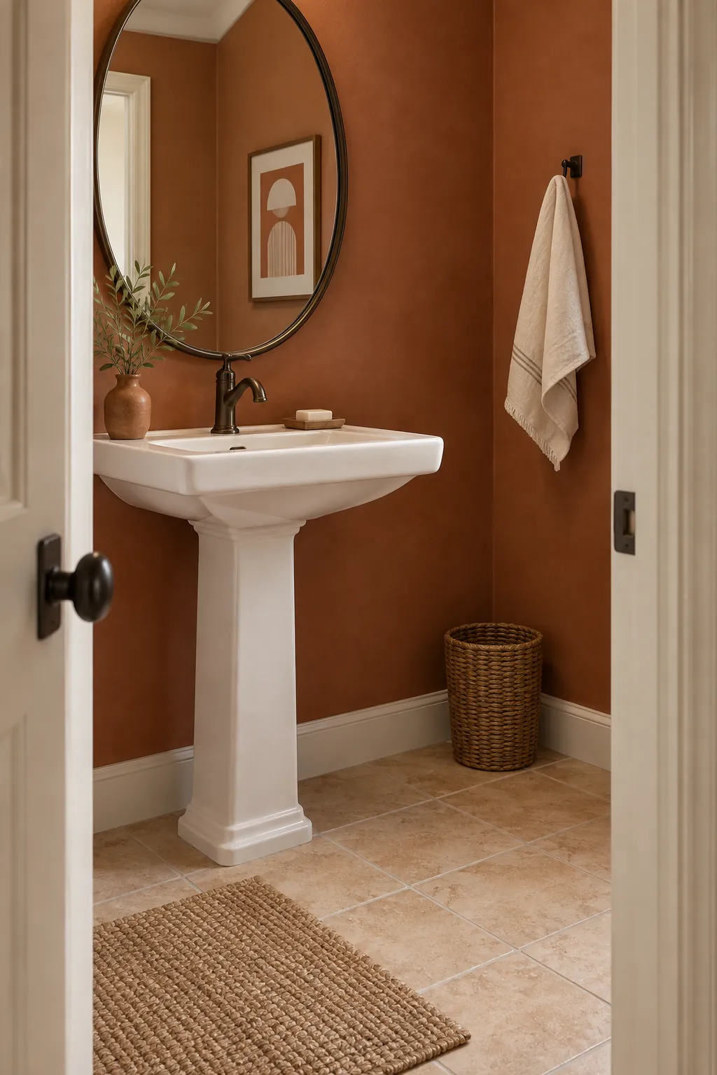
Terracotta, Chalk, and Dark Bronze
Terracotta works best when the beige tile has a peach or warm clay undertone. Chalk colored trim prevents the palette from becoming too orange, and dark bronze fixtures add a grounded outline. Compare a muted terracotta sample with the tile in daylight; two almost matching oranges can look accidental.
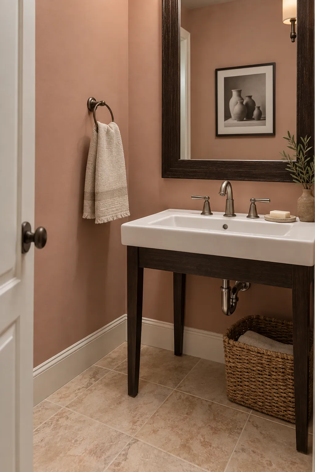
Blush Clay, Ecru, and Espresso
Blush clay picks up a pinkish cast in beige tile without turning the room sweet. Ecru towels keep the center of the palette restrained, and an espresso frame gives the mirror enough weight. Choose a dusty blush with brown in it rather than a clear pastel pink.
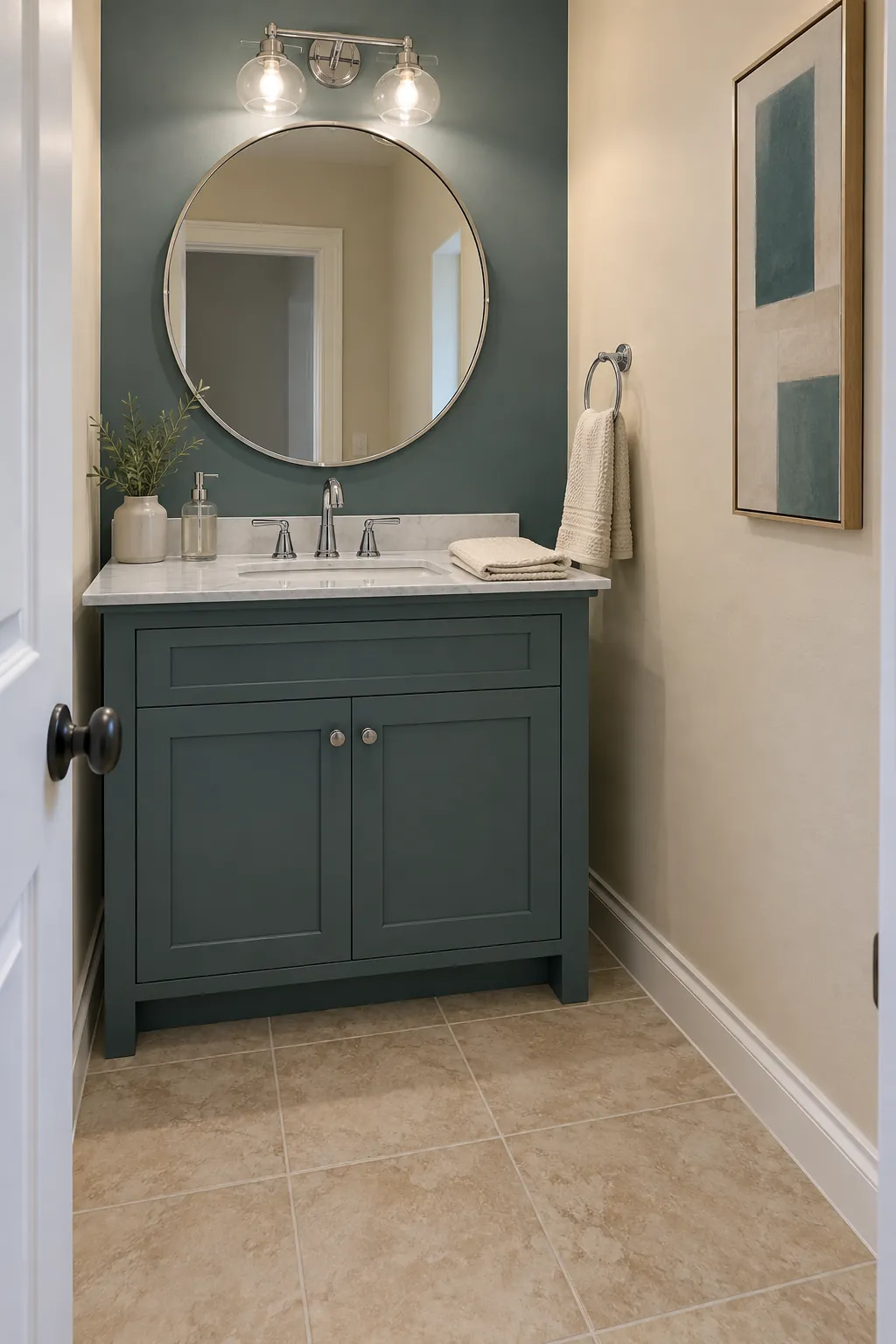
Smoky Teal, Parchment, and Chrome
Smoky teal provides color while parchment walls or trim keep beige tile in the same visual family. Chrome faucets and a chrome mirror edge add a clean reflective detail that suits a compact room. This palette is easiest to balance when teal stays on one wall or the vanity rather than every surface.
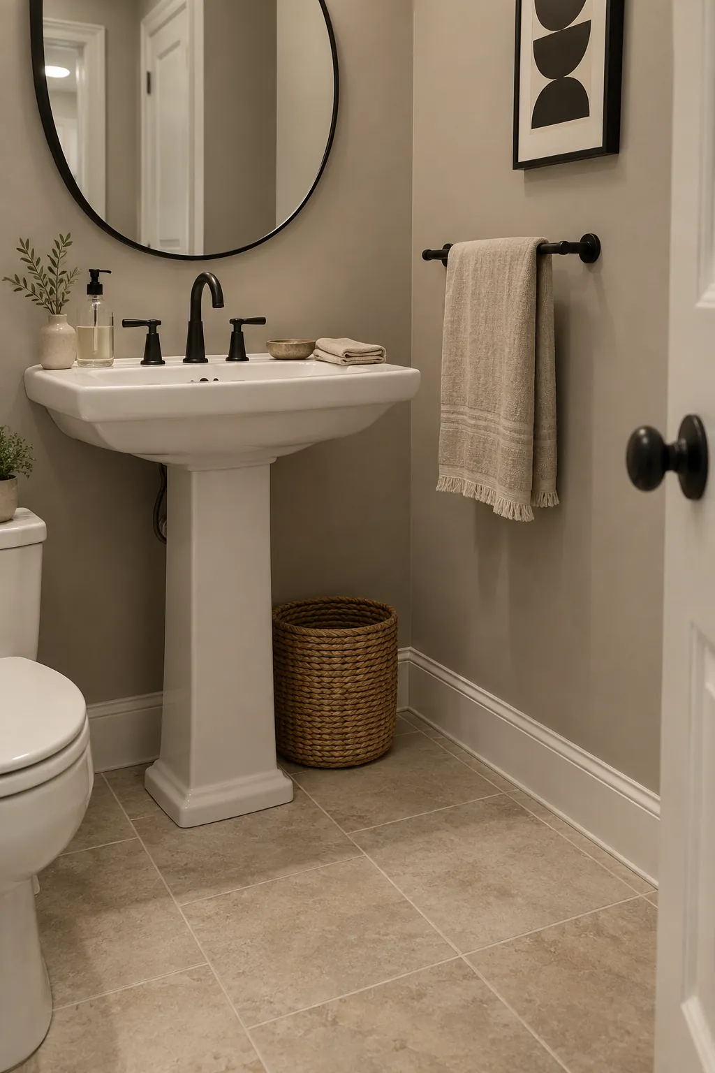
Greige, Black, and Natural Linen
Greige can unify a beige floor with existing cooler fixtures when it sits between gray and brown. Black hardware supplies the contrast that two similar neutrals lack, and natural linen adds texture without another paint color. Test the greige directly against the grout so the two do not blur into one flat field.
Graphite, Cream, and Pale Oak
A graphite vanity or lower wall makes beige tile look lighter by comparison. Cream above it keeps the face area bright, while pale oak accessories bring the floor tone upward in a controlled way. In a windowless room, use graphite as an accent before committing every wall to it.
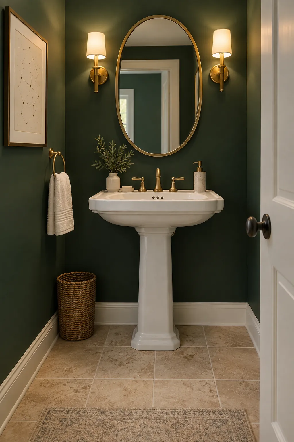
Forest Green, Warm White, and Brass
Forest green gives a plain beige tile floor a confident backdrop. Warm white on the ceiling and sink balances the saturated wall, and brass adds a small warm glint near the mirror. Pick a green with enough depth to contrast the tile rather than a yellow green that merges with it.
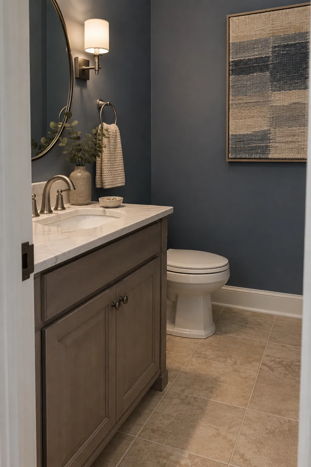
Slate Blue, Oat, and Pewter
Slate blue reads softer than navy yet still defines a powder room with beige tile. Oat colored fabric or paint links the cool wall to the floor, while pewter hardware avoids a stark silver flash. Check the slate sample under the bathroom light because its gray component may become dominant at night.
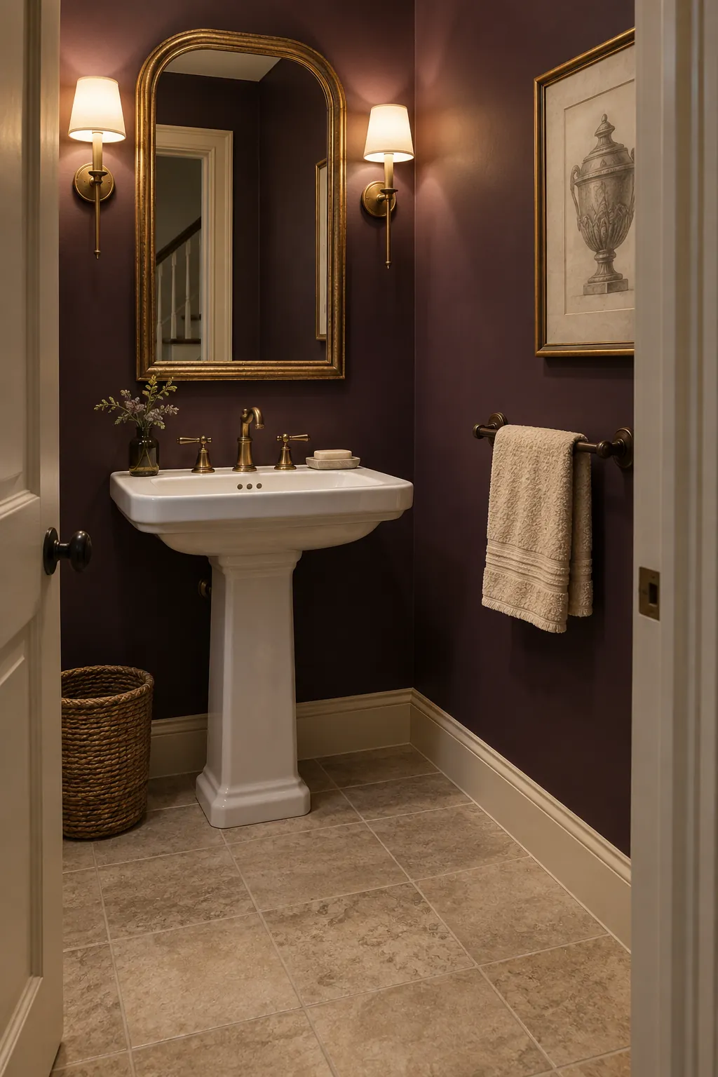
Aubergine, Almond, and Aged Gold
Aubergine creates a rich backdrop for tile that leans pink or taupe. Almond trim softens the join between wall and floor, and aged gold provides a restrained highlight. Use this deeper palette where the mirror and lighting can keep the sink area clear enough for guests.
Lavender Gray, Vanilla, and Nickel
Lavender gray can calm beige tile that reads slightly rosy without repeating pink directly. Vanilla white keeps the palette warmer than pure white, and nickel fixtures add a quiet finish. Select a gray with only a trace of violet; a strong purple can make the tile look more yellow.
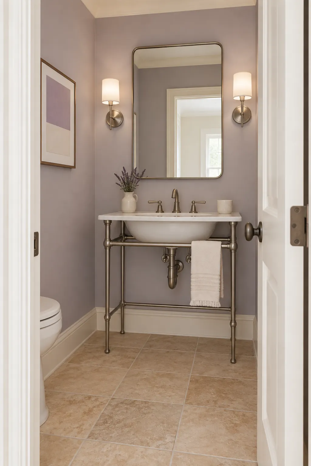
Ochre, Porcelain White, and Brown
Muted ochre echoes the warmth of honey beige tile while porcelain white creates a necessary pause. Deep brown in the mirror or vanity prevents the scheme from looking like one continuous yellow surface. Try ochre first on a small wall because warm artificial light can intensify it.
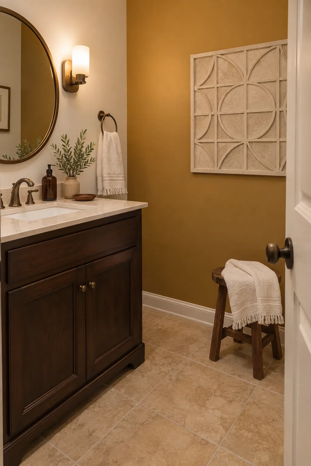
Cocoa, Ivory, and Brushed Brass
Cocoa on a vanity gives a pale beige tile floor a darker partner from the same family. Ivory walls preserve brightness, and brushed brass adds warmth without a glossy showroom effect. Let the cocoa be distinctly deeper than the tile so it reads as a deliberate contrast.
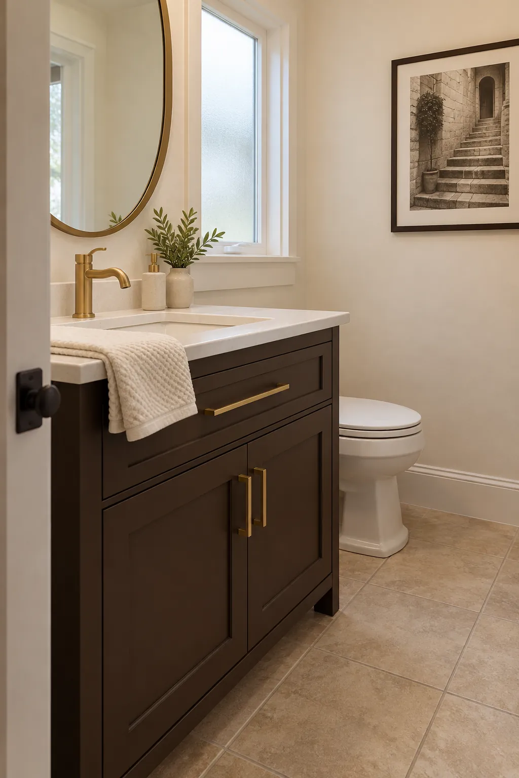
Sea Glass, Warm White, and Rattan
A muted sea glass green brings freshness to beige tile without the sharpness of mint. Warm white paint stops the room feeling cool, and a small rattan basket adds tactile color near the sink. Keep woven accessories away from splash zones and let the paint provide the main color.
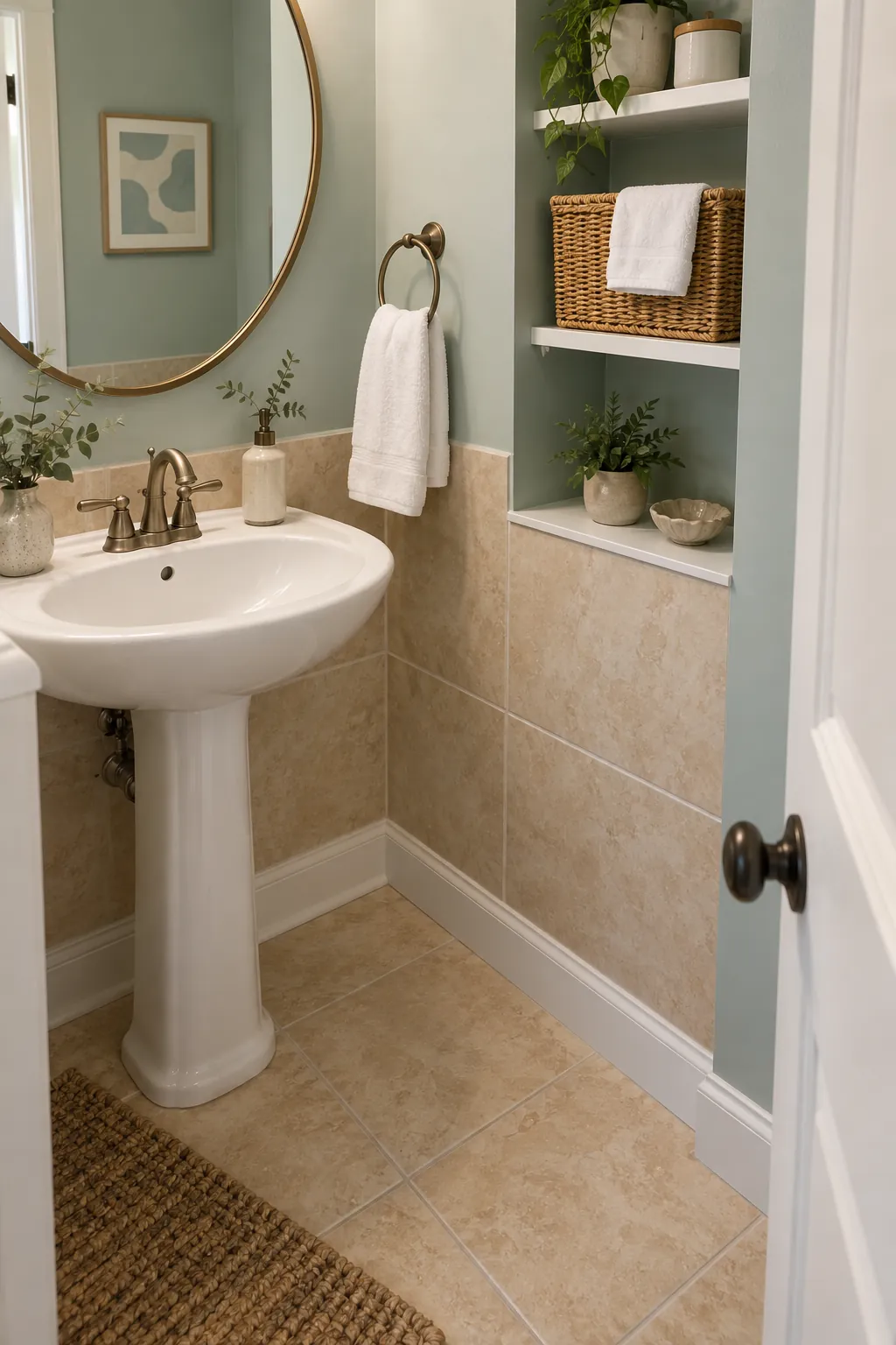
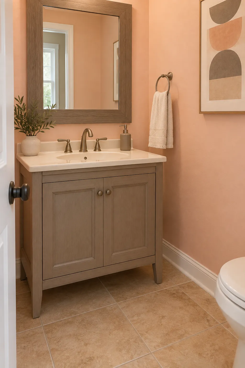
Peach, Taupe, and Cream
Soft peach can flatter tile with an orange or pink undertone if it is noticeably lighter than the floor. Taupe in a towel or mirror frame tempers the warmth, while cream keeps the edges quiet. Avoid a peach that matches the tile exactly, since the floor and wall will lose definition.
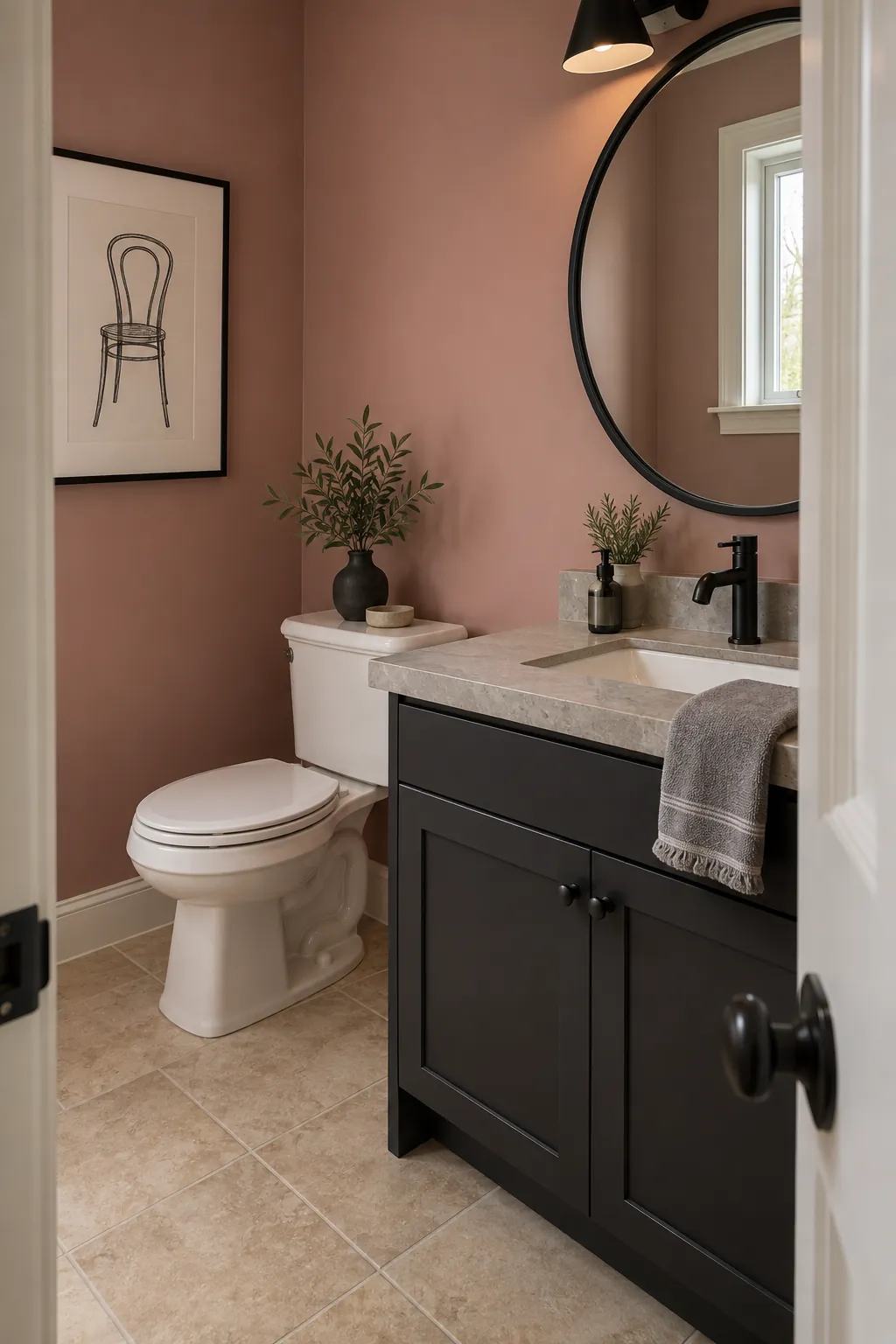
Dusty Rose, Stone Gray, and Black
Dusty rose introduces warmth to gray beige tile without leaning into yellow. Stone gray connects the wall accent to cooler grout, and a little black metal gives the room a clean outline. Keep the rose muted enough that it feels like a background color rather than a bright cosmetic shade.
Soft Black, Parchment, and Beige
Soft black on the vanity or one wall makes even ordinary beige tile appear intentional. Parchment on the remaining walls prevents the contrast from becoming severe, while beige towels repeat the floor in a useful place. Choose a black with a brown or charcoal softness and check it beside the tile before painting.