
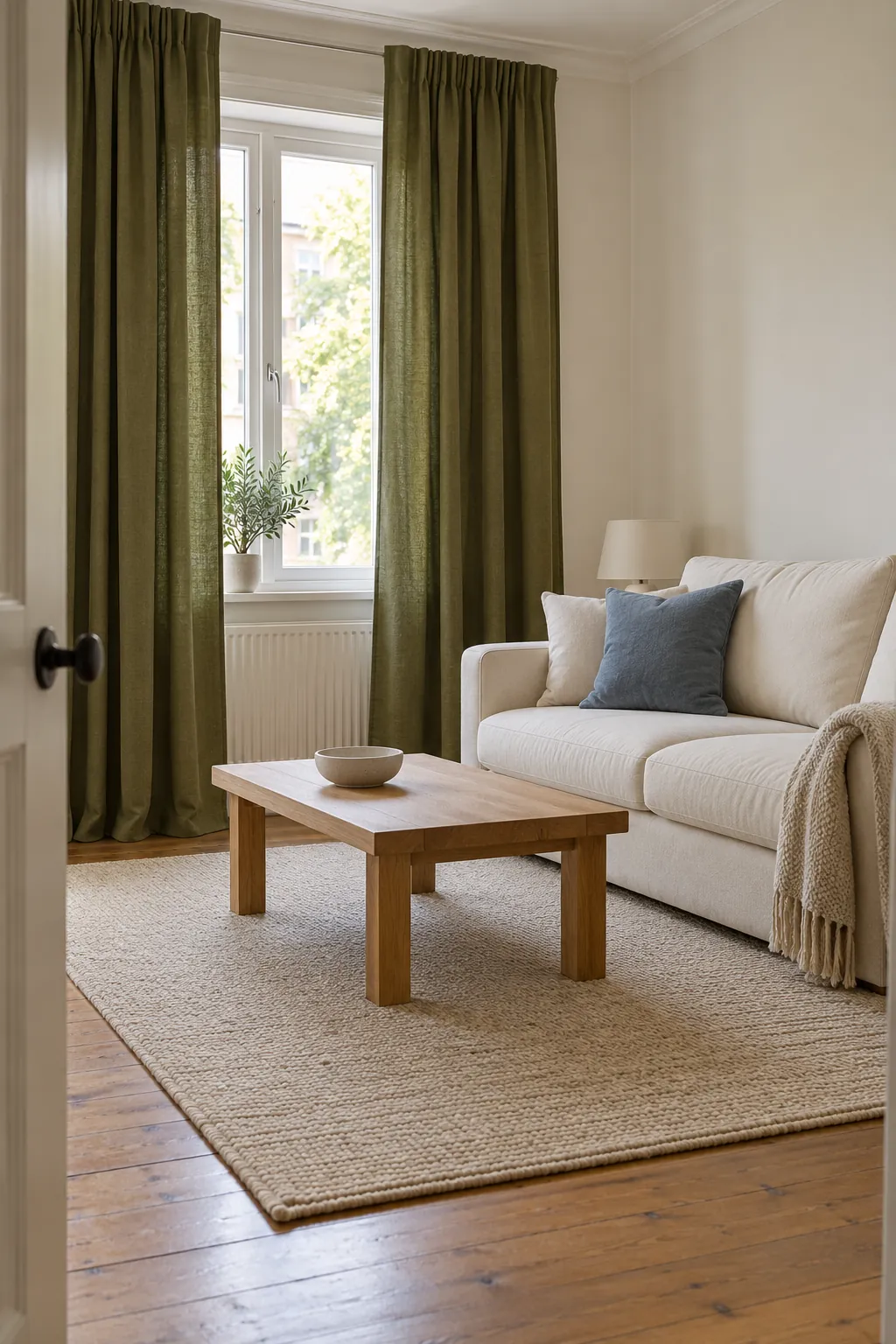
The curtain fabric may be the color you love, while the room around it still feels unfinished. Treat that green as your starting point and decide which surfaces should stay quiet. Cream, beige, and natural timber make a forgiving base; clay, dusty blue, muted pink, and a few dark accents give you more specific directions.
Give olive a light neutral background
Warm white, cream, and pale oatmeal are useful wall colors with olive curtains because they let the fabric remain the main color. A softer white often feels more comfortable beside yellow leaning olive than a sharply blue white. Check the actual curtain sample against the paint, since olive can range from light gray green to a deep brown green.
In an olive and cream living room, spread the cream across one substantial surface such as the sofa or rug. This keeps the pairing clear without making every cushion match the walls. If the trim is already crisp white, compare a warm white paint sample with it before buying paint so the two whites do not look accidentally mismatched.
Build an earthy palette with beige and wood
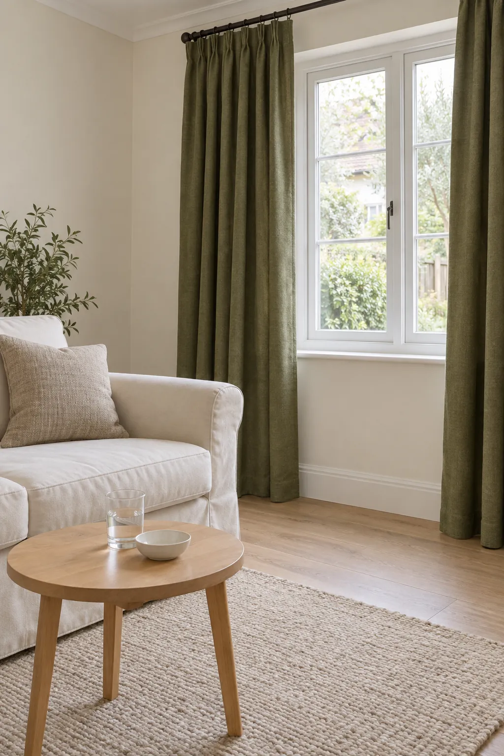
Beige, tan, and natural wood with olive curtains form a gentle earthy combination. The safest connection is not a perfect color match but a similar level of warmth. Pale oak makes a lighter room, while walnut adds a stronger dark element.
Look at your floor first, because it is usually harder to change than a cushion. Strongly orange timber may make a yellow olive fabric appear more golden, so keep the nearby rug or upholstery quieter. A beige rug with a low contrast texture can connect the two surfaces without adding a competing pattern.
Add clay through smaller surfaces
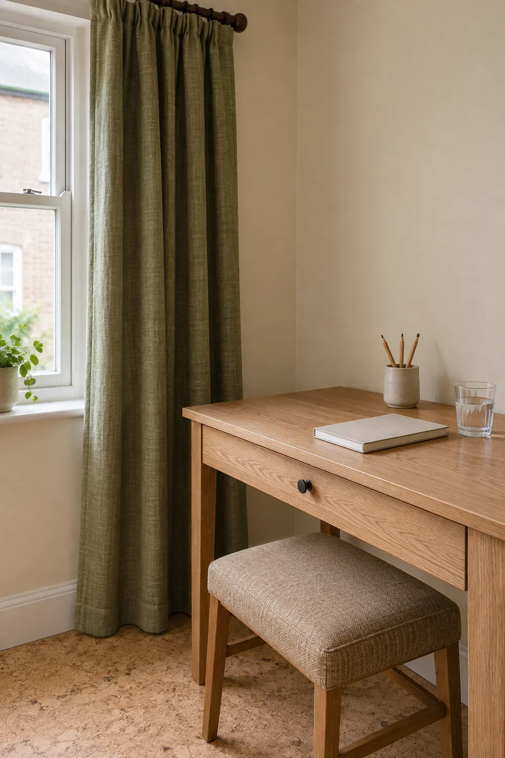
Clay, muted rust, and terracotta bring a warm accent to olive green window treatments. Use them on a cushion, bed throw, or ceramic object when the curtains already cover a large part of the room. Repeating the accent in one other small place can make the combination feel intentional without spreading orange everywhere.
Use dusty blue when the room needs a cooler note
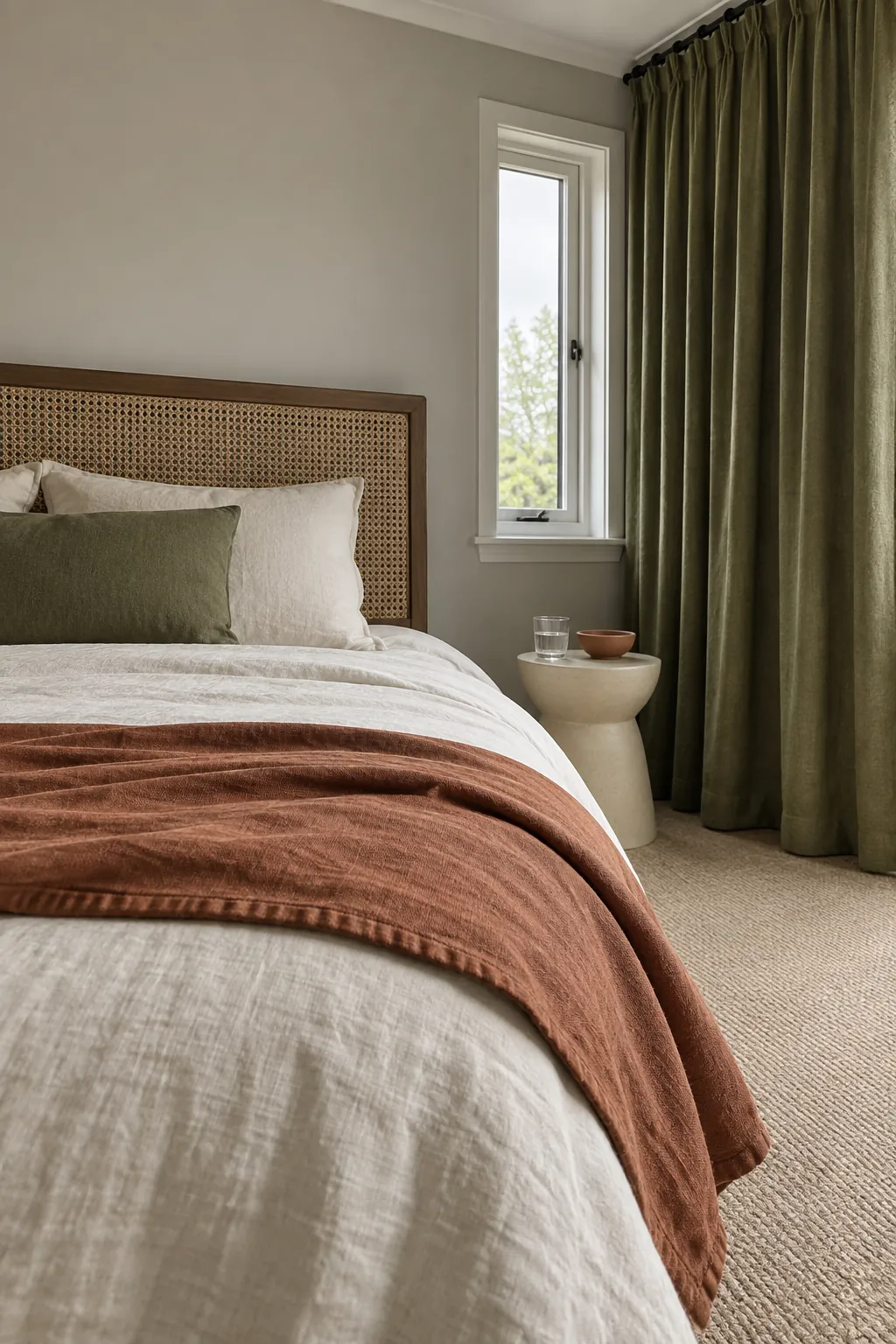
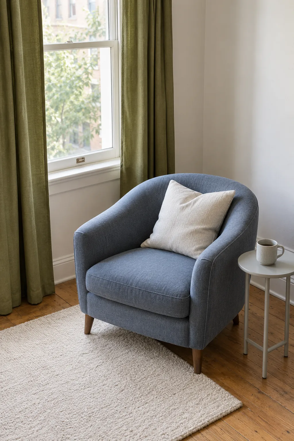
A softened blue can balance olive’s warmth, especially when the room already has blue in a rug or upholstered chair. Try denim, slate blue, or a muted blue gray rather than a vivid royal blue. Keep a neutral surface between the colors if a direct pairing feels busy.
The two fabrics do not need identical saturation, but their strength should feel balanced at room scale. A dark navy sofa with dark olive curtains creates a much heavier scheme than pale blue upholstery with the same curtains. Add a lighter rug or wall color when you want the pairing to retain some brightness.
Bring in pink through textiles
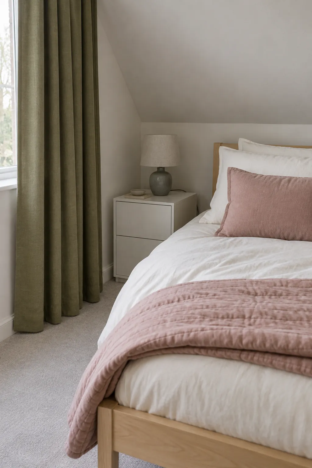
Dusty pink and olive green bedroom textiles can make a room feel softer without using a full pastel scheme. Choose a rose with a muted brown or gray base, then use white or cream bedding as the large neutral area. A small pink cushion or quilt edge is often enough to show the relationship.
Photographs can make both pink and green look more saturated than the real cloth. Put the samples side by side under the bedroom lamps as well as daylight, particularly if one fabric has a sheen. If the pink looks peach and the olive looks mustard at night, try a cooler pink or change the sample pairing before buying.
Anchor the room with restrained dark accents
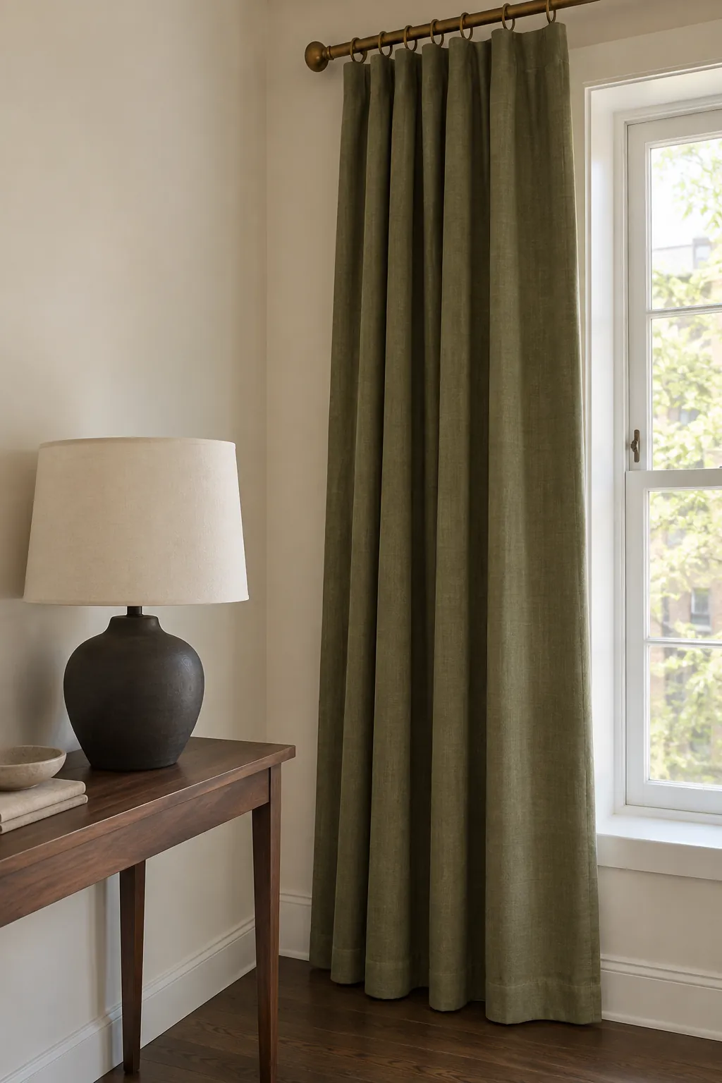
Charcoal and black can give olive curtains a clear outline through a rod, side table, or lamp base. Small accents are useful when the room already contains a black fireplace or window hardware. A large charcoal rug or sofa makes a stronger commitment and needs enough light neutral space around it.
Brass accents with olive green offer a warmer alternative, but the finish matters. Brushed or aged brass gives a quieter effect than a broad polished gold surface. Choose the metal that connects to existing fittings, and avoid adding several unrelated finishes just to make the room look decorated.
Choose the rug as part of the whole palette
Rugs with olive green curtains can stay neutral or introduce one of the supporting colors. An ivory, beige, or warm gray base is useful when the curtain is already a strong visual feature. For a patterned rug, look for a small olive detail plus a color that connects with the sofa or chair.
You do not need to find an exact olive match in every object. A rug with cream and dusty blue can work when a blue cushion or chair makes that connection visible. Judge the rug’s overall lightness from across the room, because a dense dark pattern can read much heavier than its individual cream threads.
Make a sample arrangement before adding more
Lay out the curtain sample, the main upholstery color, and your rug choice together, then compare that group against the wall. Keep the floor visible beside them because its undertone affects the entire scheme. View the group in the room where it will be used instead of relying on a phone image.
Start with a neutral background and one supporting accent if the choices feel confusing. Add another color only when it solves a clear problem, such as a room feeling too warm or a fixed blue sofa looking disconnected. A coherent room can use several shades without asking every object to match the curtains.