
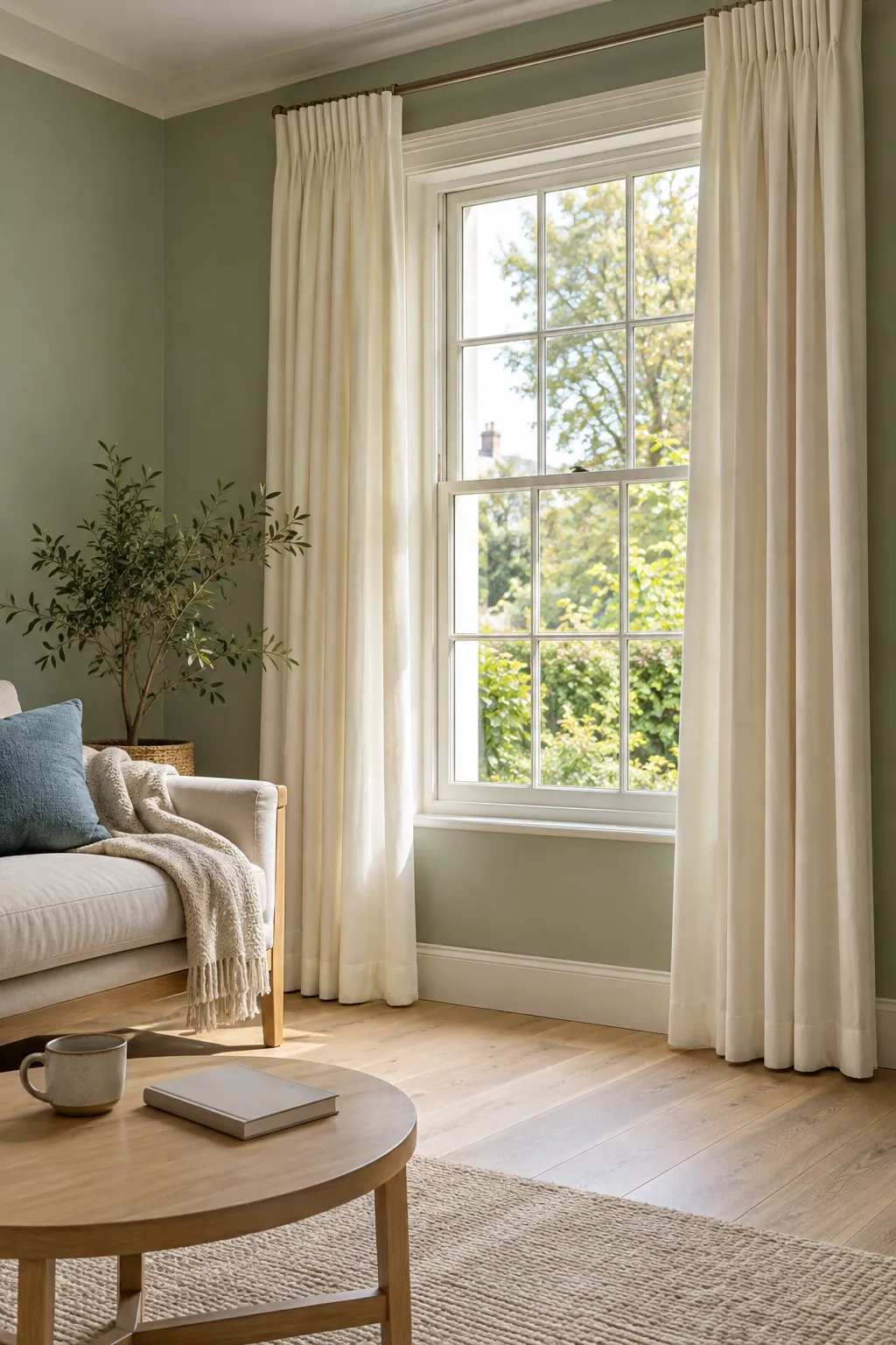
Two fabrics can both look green and still look awkward together. The wall’s undertone, the curtain’s texture and the colours already on the floor all affect the result. A useful choice starts with those relationships, then adds the amount of contrast you want at the window.
Read the green before choosing the curtain
Soft white, cream and oatmeal are reliable starting points for green walls, but the best neutral depends on the shade of green. Warm olive often sits comfortably with flax, tan and muted clay. Cooler sage, mint and blue green can suit soft white, mushroom, dusty rose or navy, provided the other finishes support the choice.
Look at your paint beside a plain white sheet of paper in daylight. Decide whether it seems more yellow, blue or grey, without trying to assign an exact technical label. That simple comparison helps you spot why a yellow olive curtain might feel wrong beside a cool sage wall, even when the two colours share a name.
Soft white gives pale sage a clean frame
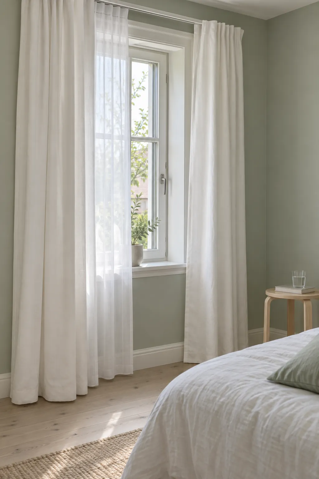
With pale sage walls, soft white curtains keep the window light and let the paint remain visible. This pairing is useful when the room already has white trim or pale bedding. Choose a white with a similar warmth to those existing whites, because a very creamy curtain can stand out unexpectedly beside a cool ceiling.
A sheer white panel gives a different result from an opaque white curtain. The sheer changes colour as light passes through it and offers limited privacy when the room is illuminated at night. For green bedroom decor, decide whether you need a second layer before choosing the face fabric.
Cream and flax suit warmer olive greens
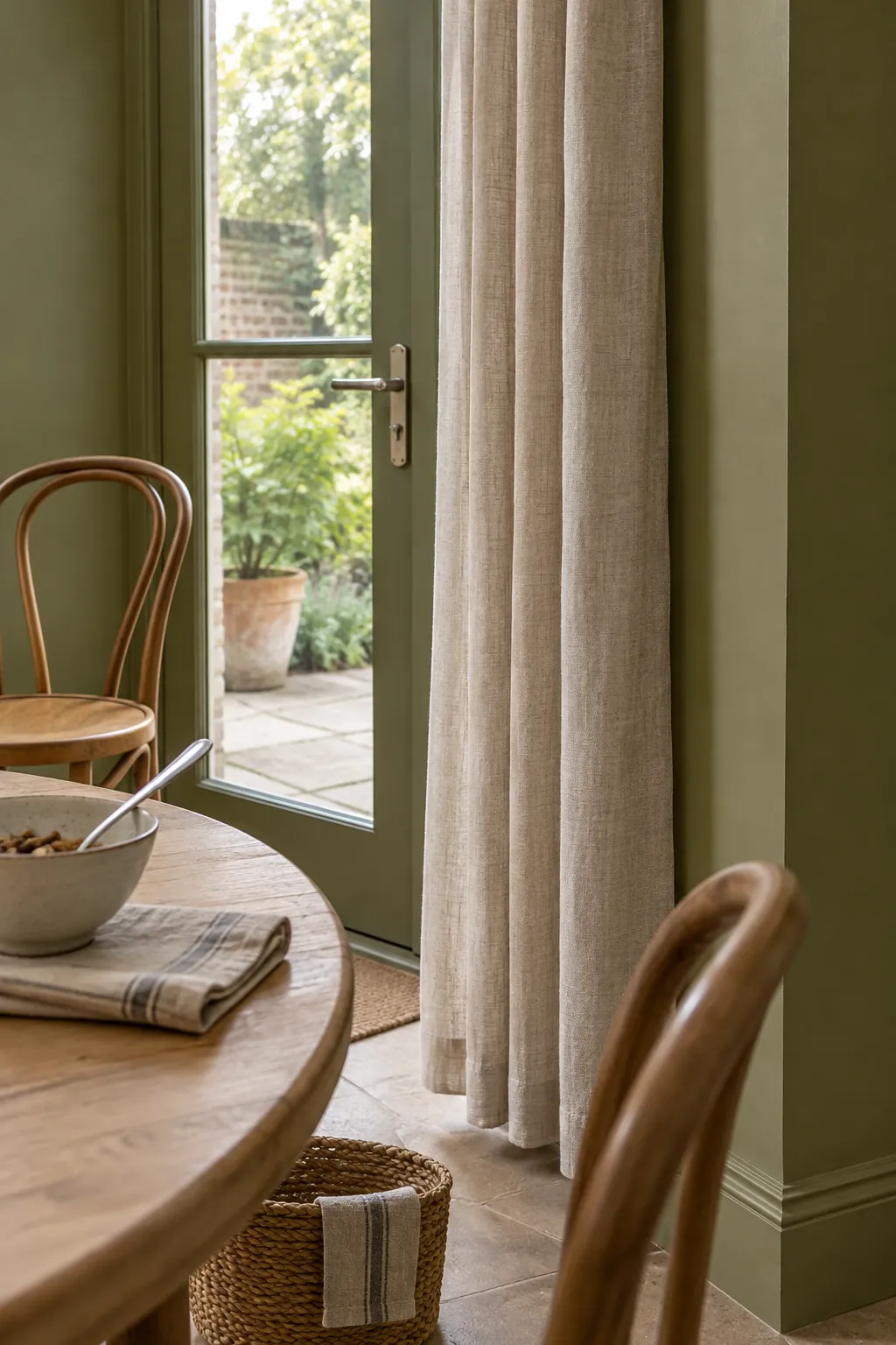
Cream curtains with green walls work particularly well when the paint has an olive or earthy undertone. Flax and light oatmeal connect that green to timber furniture and natural woven surfaces. Keep the cloth closer to a quiet neutral than a strong buttery yellow if you want the combination to feel calm.
Texture can do the work that another colour would otherwise do. A visible linen weave adds interest beside flat paint, even when both the curtains and the sofa are neutral. Check the fabric care label and lining options, since linen curtains for green rooms can range from light decorative panels to substantial lined treatments.
Mushroom and warm grey can settle a cool palette
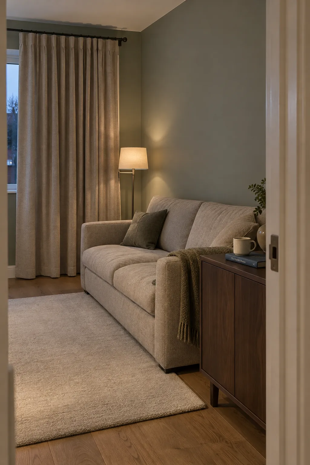
Mushroom, stone and carefully chosen grey curtains can sit quietly beside a greyed green wall. Relate the curtain to the sofa, carpet or stone surface so it has another reason to belong. If the room has warm wood and tan leather, compare a mushroom sample before choosing a blue grey.
Grey is not a universal solution for every green. In a room with cool daylight, a blue leaning grey can make a yellow green wall seem sharper by contrast. Hang the sample beside the paint and judge the pair together, rather than selecting each one from a separate colour chart.
Dusty pink and clay create a warmer accent
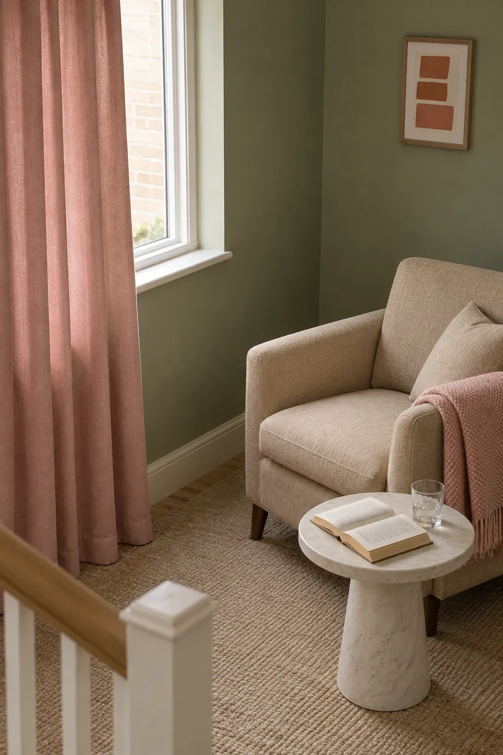
Dusty pink offers gentle colour beside sage and deeper green, while muted clay often suits olive. Use the rug or a cushion as a bridge if it already contains one of those tones. A small connection is enough; every accessory does not need to match the curtain.
The strength of the fabric matters as much as its colour family. A subdued rose can feel restful, but vivid pink will become a much stronger feature across a wide window. If you are uncertain about a large colour purchase, try a generous sample at the window and keep the surrounding bedding or upholstery simple during the test.
Navy creates a defined edge beside lighter green
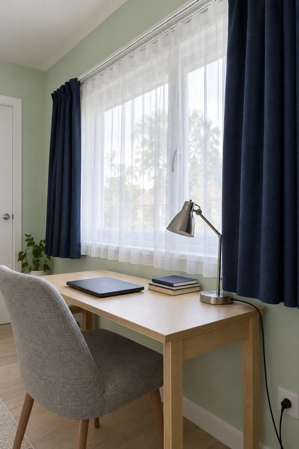
Navy curtains give pale sage or mint walls a stronger outline. They can work well with a navy detail in a rug, dark furniture or a patterned cushion. Leave some pale surfaces in the room so the window does not become an isolated dark block.
Dark fabric is not automatically better at blocking light. For a bedroom, compare the stated blackout construction and consider the gaps around the track as well as the cloth itself. In a living room, navy panels can sit outside a lighter sheer layer so you retain a softer daytime window.
A patterned curtain can connect several finishes
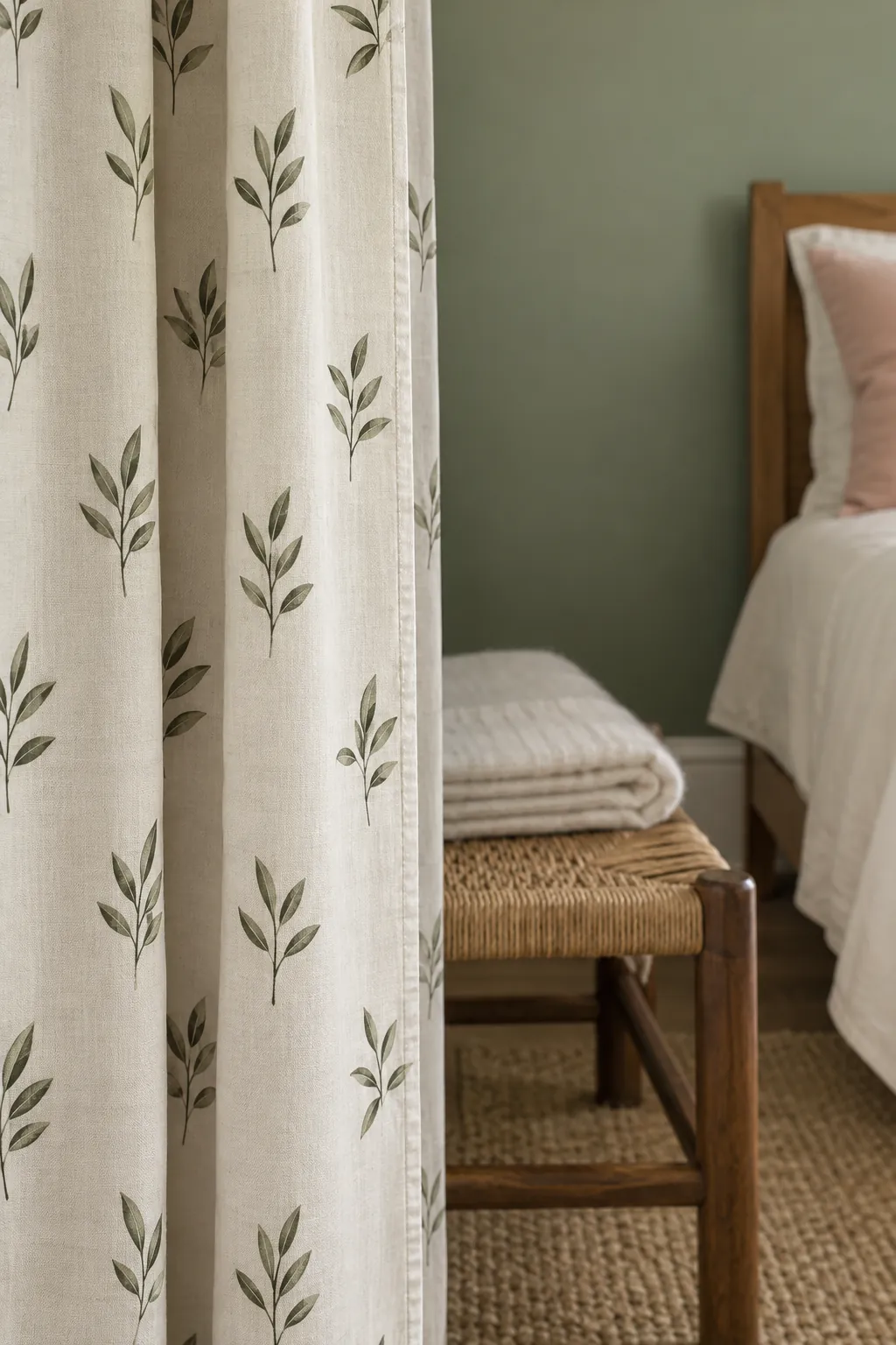
A small botanical print or a simple woven stripe can join green walls to cream, pink or blue details already in the room. Choose a pattern with a background colour that suits the paint, then check the scale from the doorway. A tiny print may read as a texture from that distance, while a broad motif becomes a feature.
If the rug is already busy, use a quieter curtain or a plain colour drawn from one of its smaller details. Two competing patterns are harder to judge from individual samples. With green on green schemes, favour a clear lightness difference and related undertones rather than chasing an exact match between paint and fabric.
Use a sample test that includes the whole room
Bring together the wall colour, the main upholstery and the floor when comparing curtain colours for green walls. View a sample vertically, because folded cloth in your hand does not show the same shadows as a hanging panel. Look at it beside the window with daylight behind it and again with your usual evening lamps on.
Next, measure the pole or track and consult the curtain maker’s width and heading guidance. Allow for the space the panels take up when open, and choose a length that suits nearby furniture and heating appliances. Practical window treatments for green rooms should let you use the window safely as well as complete the palette.
If two samples remain equally convincing, choose the one that fits the room’s daily use. An easily cared for neutral can support future changes to cushions and bedding, while a coloured curtain commits more of the room to that palette. The best sample is the one that still looks right when the room is lit for an ordinary evening.