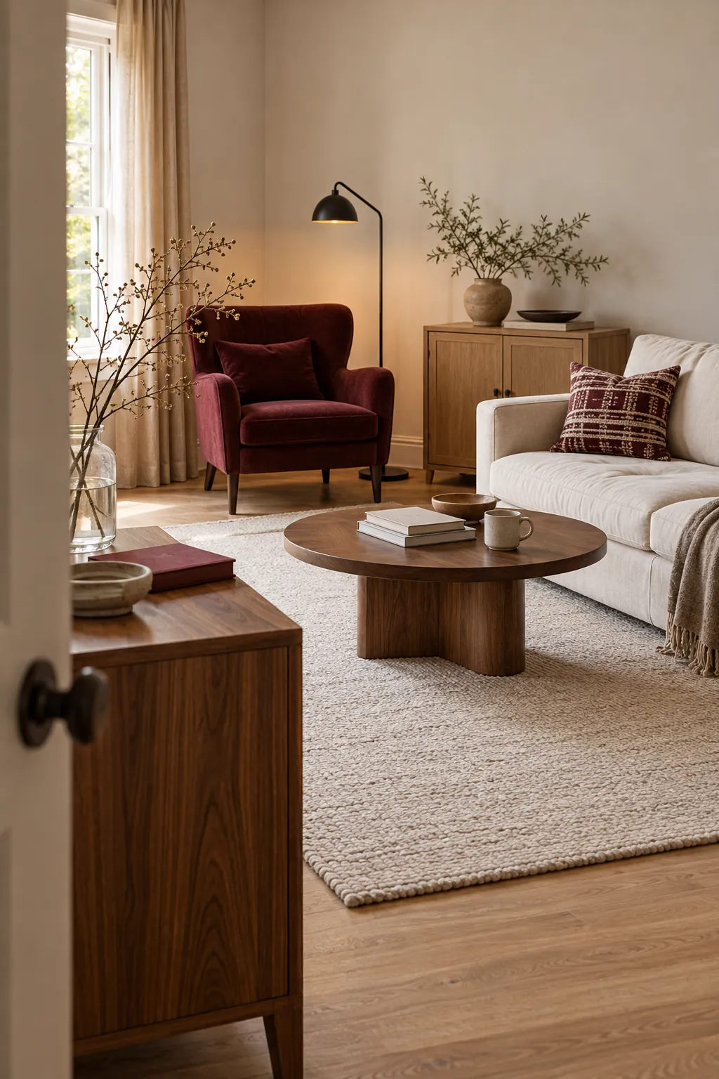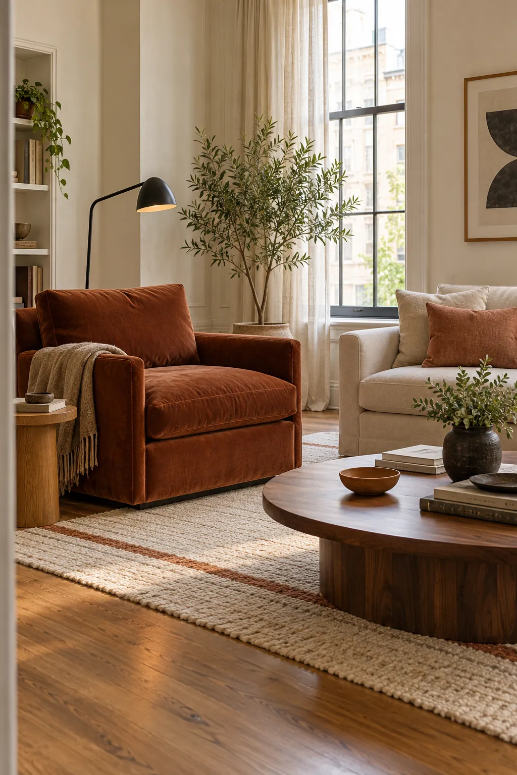
A room often feels disconnected because one strong color appears once and nowhere else. The common correction is to buy several accessories in the same shade, which can make the space look more forced than before. A better result comes from repeating a color relationship while changing its scale, surface, and intensity.
Choose a Color Family Instead of One Exact Shade
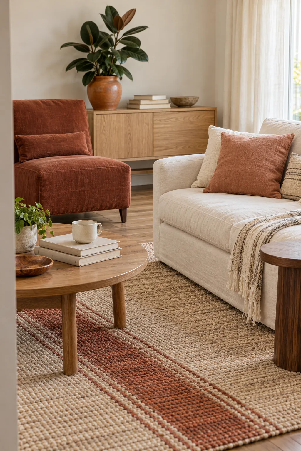
Start with a color family that allows light, dark, muted, and clear versions to coexist. A rust cushion can relate to terracotta pottery and a softer clay stripe even when none of them match. This variation makes non matching home decor feel collected because the eye recognizes a shared undertone rather than an identical dye lot. Check the pieces together in the room during daylight, since warm and cool versions of the same named color may not connect.
Give the Color Three Different Visual Weights
Choose one larger color moment, one medium repeat, and one or two small notes. The largest area might be a chair, curtain, or rug pattern, while the medium area could be a cushion and the smallest repeat could be a book spine or bowl. Different visual weights prevent the color from turning into a dotted trail of equal accessories. They also create a natural focal point, which improves living room color balance.
Change the Material at Every Repeat
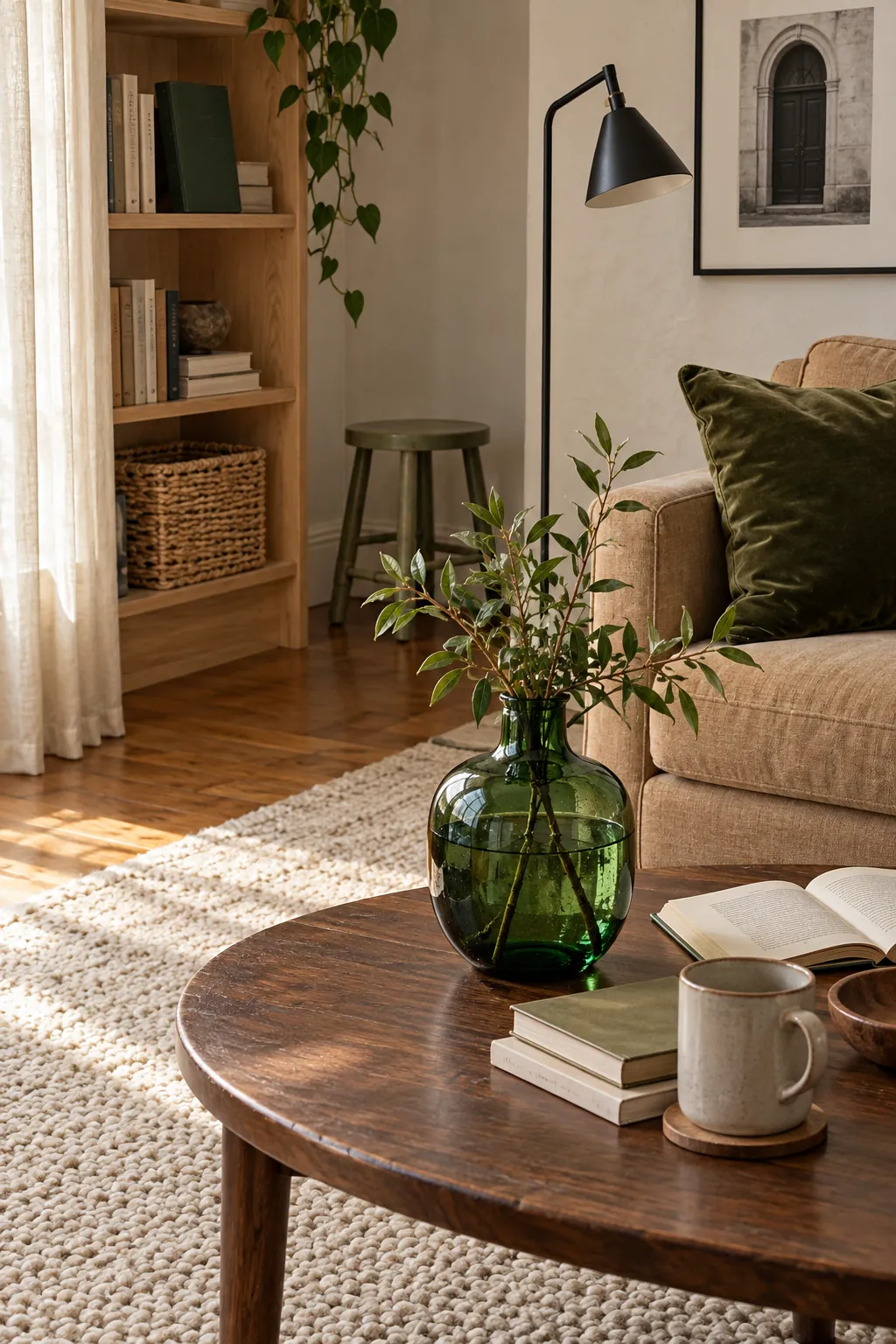
A color becomes flat when every repeat has the same fabric and finish. Move it through velvet, glazed ceramic, printed paper, painted wood, or a woven textile so light changes the color at each stop. A deep green cushion absorbs light, a green glass vase reflects it, and a botanical book cover holds a quieter matte version. Mixing decorative accessories this way adds depth while keeping the cohesive home color palette easy to read. The room will feel layered rather than purchased as a set.
Spread Repeats Across Real Sight Lines
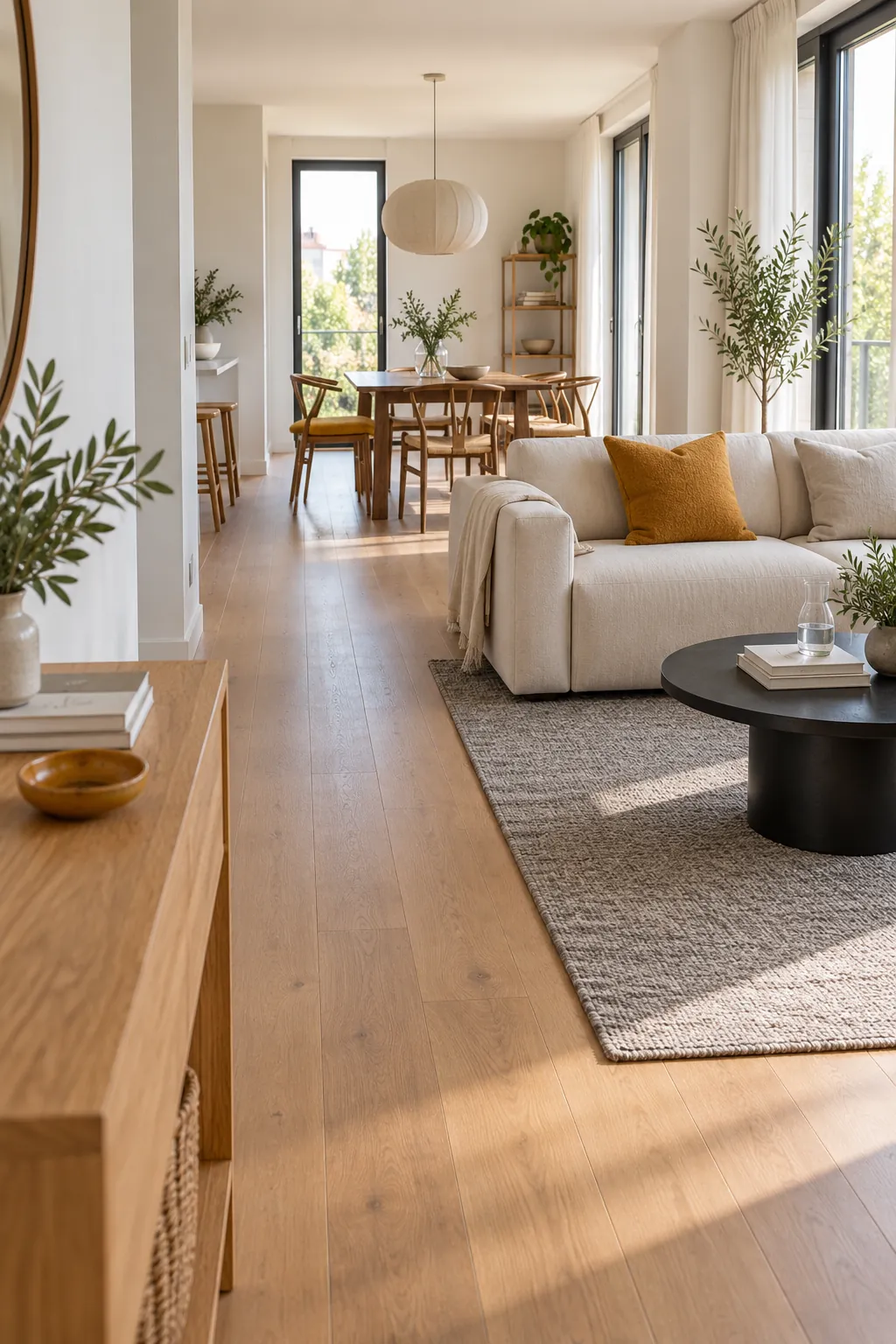
Place color where the eye naturally travels instead of measuring equal distances around the room. One repeat can sit near the entry view, another at the seating focal point, and a third in the background. This accent color distribution connects the full space without creating a ring of matching objects along every wall. In an open plan room, repeat the color once in each visible zone and let neutral areas separate the moments. The pauses are part of the rhythm.
Let Neighboring Colors Shift the Mood
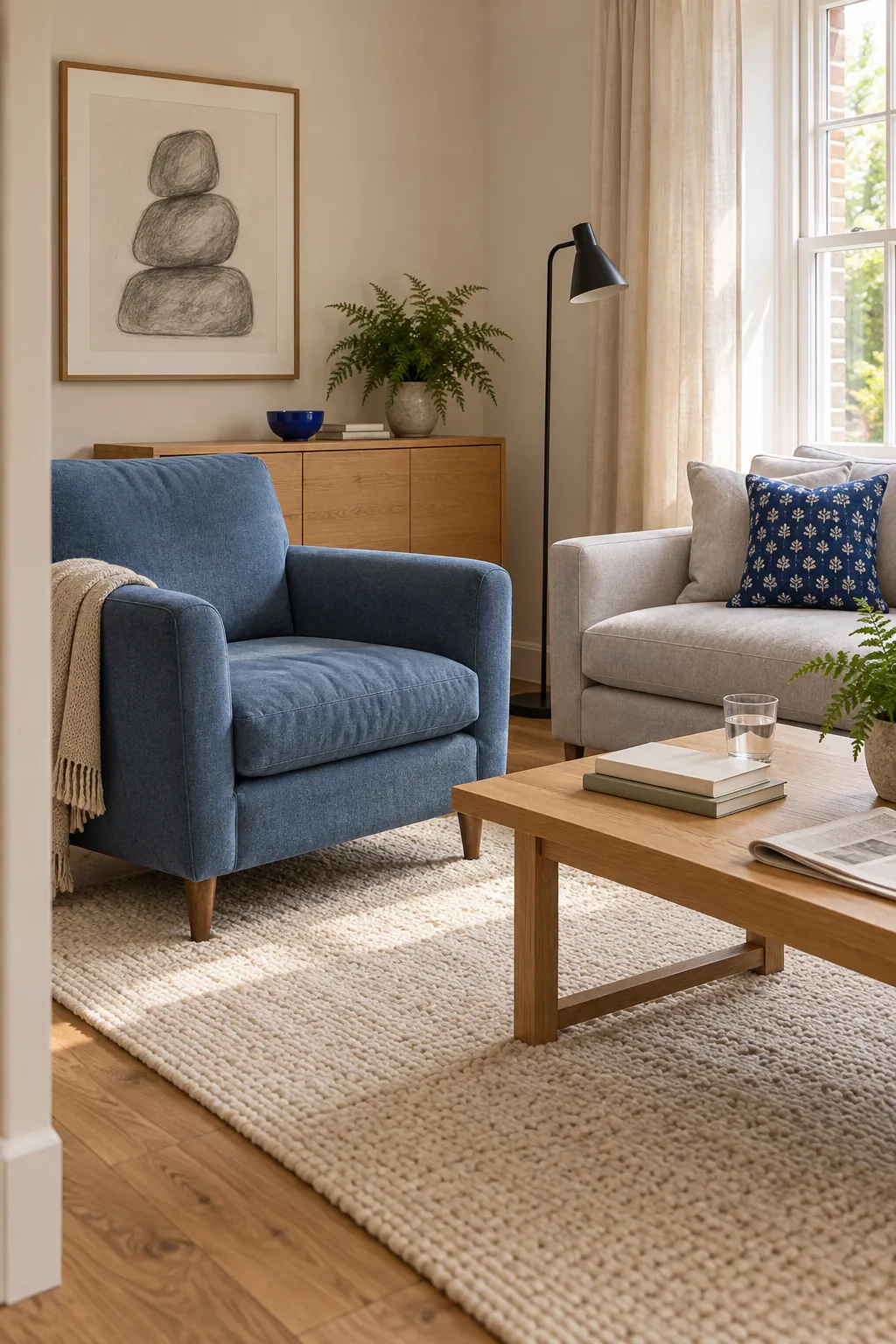
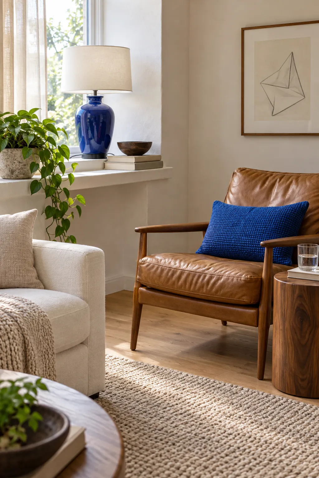
The colors beside an accent determine whether each repeat feels lively, quiet, warm, or cool. Cobalt beside crisp white looks brighter, while the same cobalt beside walnut and camel feels deeper and calmer. Use related neutrals and one supporting color to create layered interior colors instead of isolating the accent against the same background each time. This approach expands home decor color combinations without losing the main thread.
Stop When the Color Can Be Found Without Searching
Stand at the main doorway and notice where the accent appears first, second, and third. If those moments form a clear path, additional repeats will probably weaken the effect. Remove any accessory that exists only to carry the color and keep pieces that also add function, texture, or meaning. A successful room feels coordinated before the viewer starts counting, and that quiet recognition is the goal of color repetition in decor.