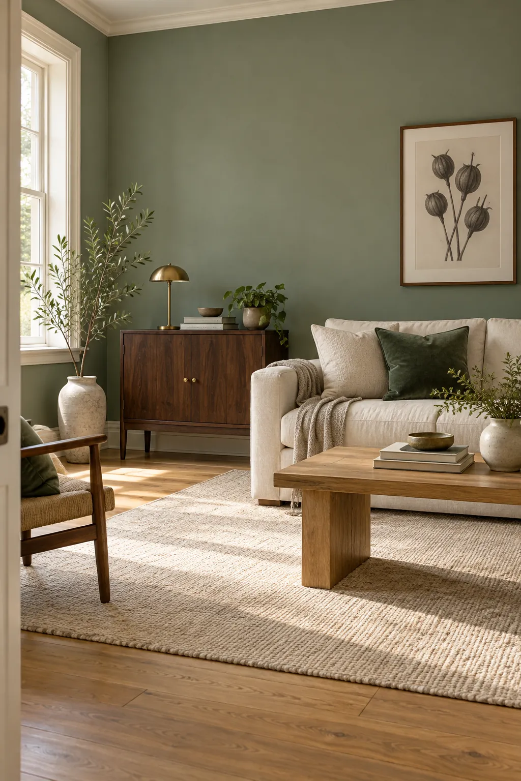
For most homes, the best all purpose green is a muted middle value sage. It has enough gray to stay calm, enough color to feel intentional, and enough lightness to work across living rooms, bedrooms, and kitchens. It also pairs easily with warm white, natural wood, stone, black, and brass.
That answer changes when a room has weak daylight or fixed finishes with strong undertones. The best green is not the prettiest chip in isolation. It is the shade that stays balanced beside your flooring, counters, furniture, and evening lamps.
Choose a muted middle value for flexibility
A middle value green is neither pale enough to disappear nor dark enough to dominate every surface. Muting the color with gray or brown makes it easier to live with because it changes more gently as the light shifts. Sage, eucalyptus, and softened olive all fit this useful range.
This type of green is especially forgiving in an open living area. It can support cream upholstery, oak furniture, black accents, and warm metal without demanding that every object match. Keep the trim warm white so the green reads as color rather than a dull neutral.
Use a lighter green in a dark room
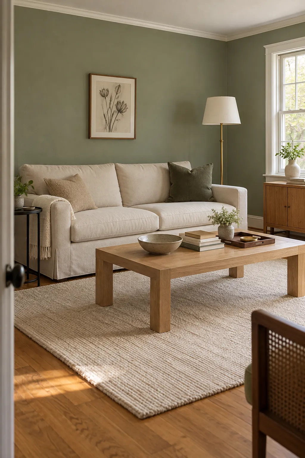
A shaded room can make a paint chip look deeper and grayer than it did in the store. If the room has few windows, trees outside, or north facing light, begin one or two steps lighter than your first instinct. Soft sage and pale eucalyptus usually retain color without becoming a dark block.
Do not expect pale paint to create sunlight that is not there. Instead, use light ceilings, curtains, rugs, and bedding to preserve contrast. A slightly warm lamp can keep the green from appearing cold at night, but avoid bulbs so yellow that they turn it muddy.
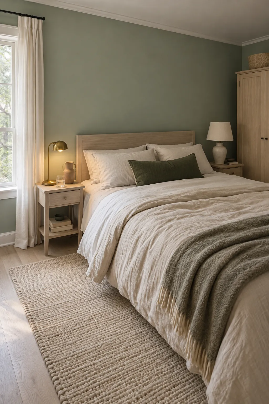
Bedrooms benefit from this softer range because textiles add many shadows of their own. Pair a light green wall with cream linen, pale wood, and one darker green accent. The darker object gives the wall enough comparison to look fresh.
Match warm green to warm finishes
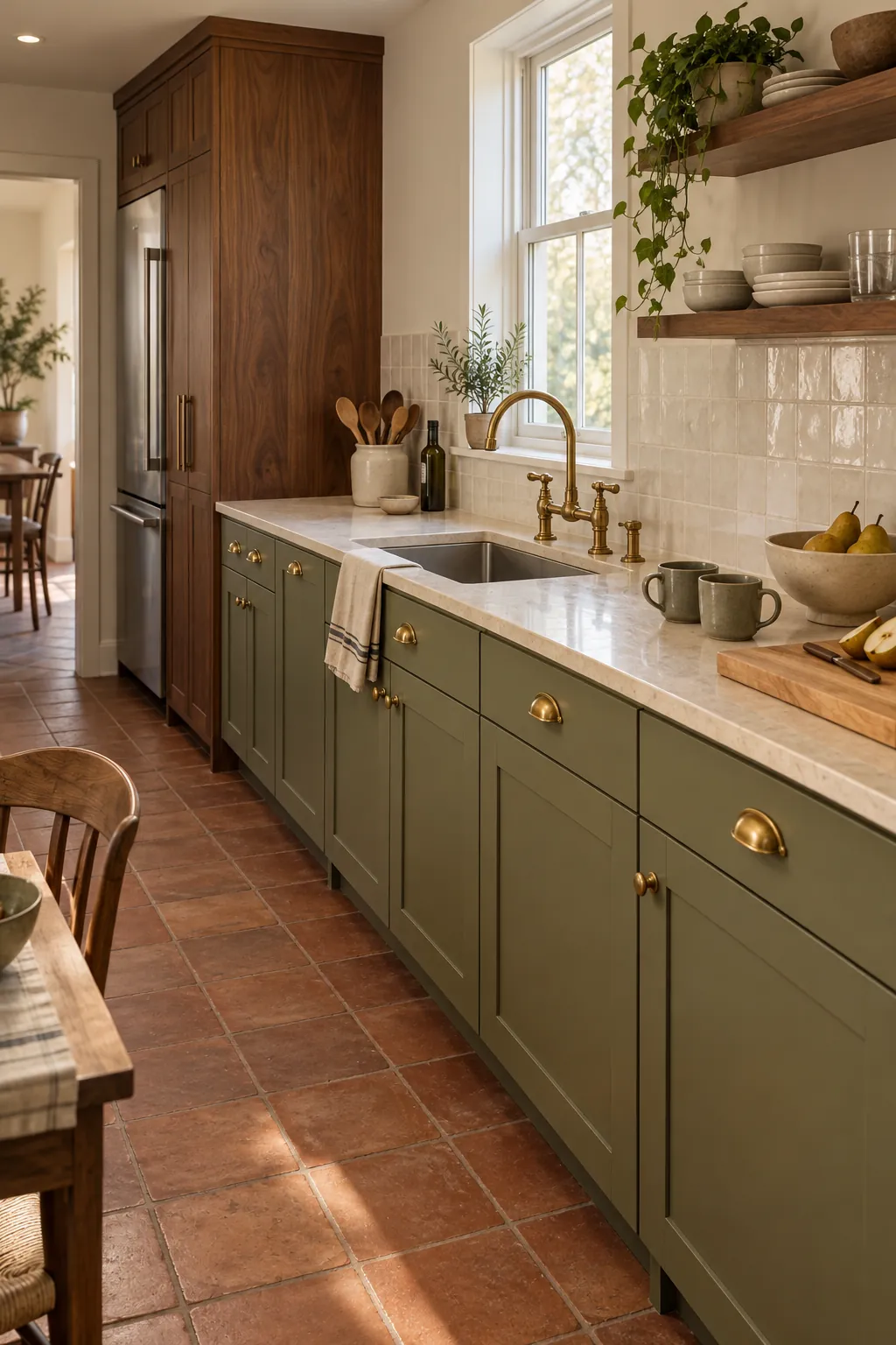
Olive and moss contain more yellow or brown, so they sit naturally beside walnut, honey oak, terracotta, cream stone, and aged brass. These greens feel grounded and can make a kitchen or dining room more welcoming. They are less successful beside icy gray stone or strongly blue white counters.
Compare the green directly against the largest fixed finish. A cabinet sample should sit upright next to the counter and backsplash, not flat on a table. If the green suddenly looks mustard or dirty, choose a cooler version with more blue and less yellow.
Choose blue green beside cool stone
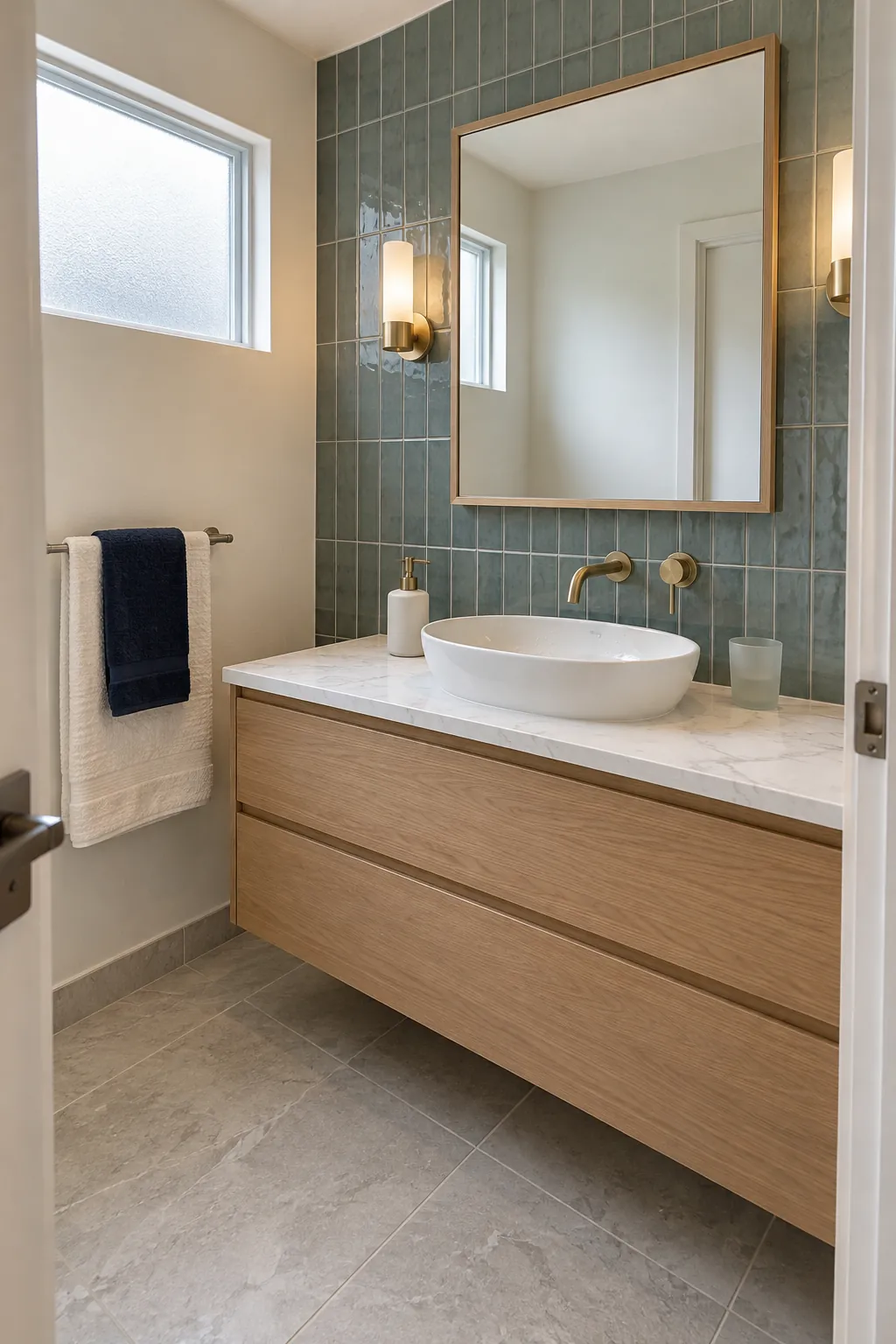
Eucalyptus, celadon, and quiet blue green shades suit marble, cool quartz, stainless steel, and blue gray tile. Their cooler undertones connect with the finish instead of fighting it. Keep the green muted so a bathroom or kitchen does not shift toward bright aqua.
Warm wood can still appear in this palette. Light oak or ash prevents cool green and stone from feeling clinical, while brushed brass adds a controlled warm highlight. The goal is not to remove temperature contrast, but to make every undertone look deliberate.
Observe the sample next to the stone veining and grout. A shade that works beside the main slab can still clash with a warmer grout line. Check all three together before committing to paint or cabinetry.
Reserve forest green for focused depth
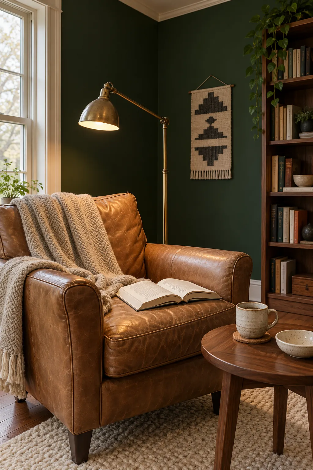
Forest and bottle green can create beautiful depth, but they need enough light contrast and a clear purpose. They work well in a study, reading nook, dining room, or on lower cabinets where a darker surface feels grounded. Using the same deep green on every wall can shrink a room if the ceiling, trim, and furnishings are also dark.
Let deep green surround one functional zone, then add warm wood, cream, leather, or brass where the eye needs definition. Matte paint usually looks softer than a glossy finish across a large wall. For cabinetry, a modest sheen can be practical, but it may make the color appear stronger.
Test a large sample through a full day
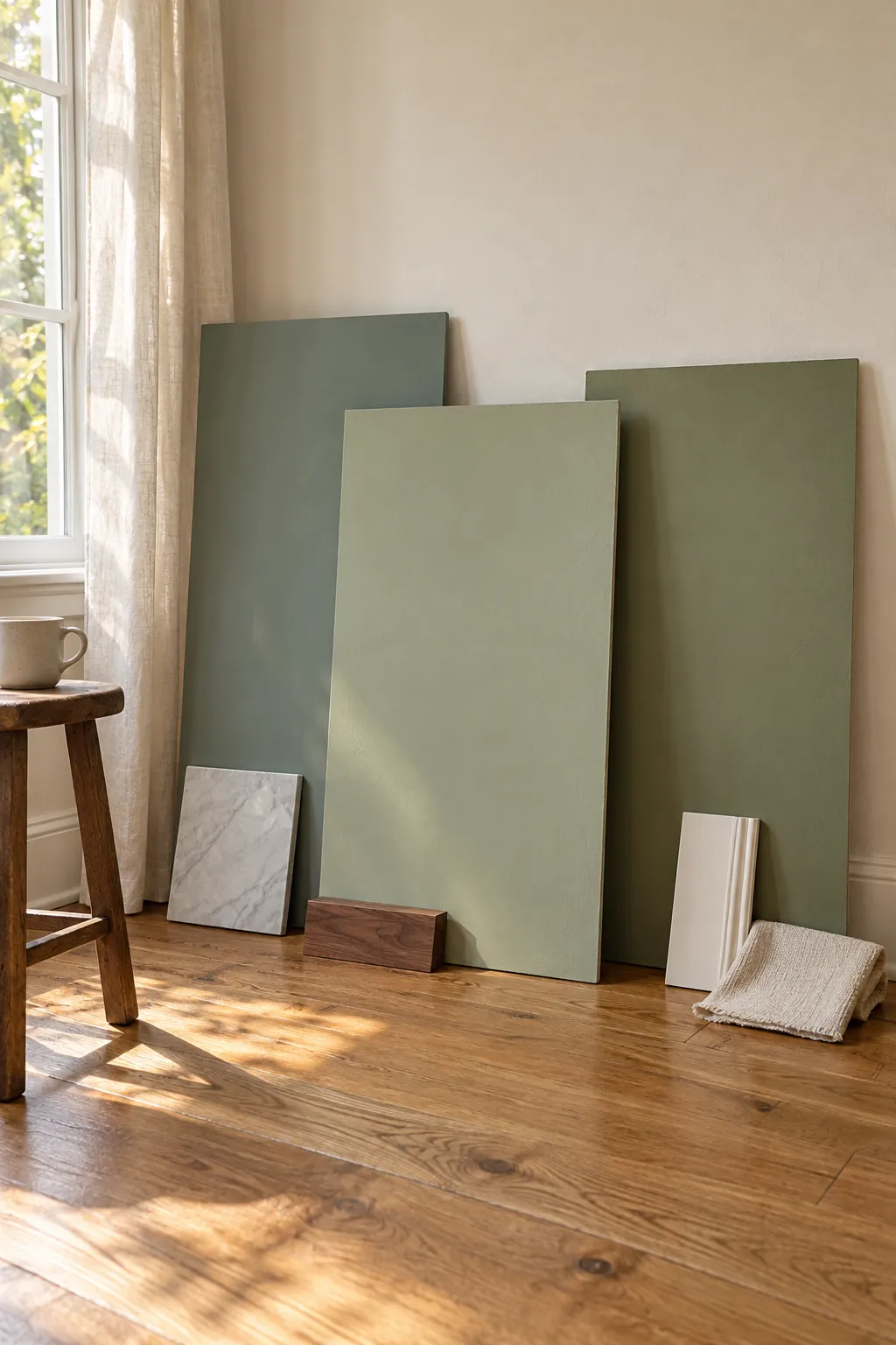
Paint a large movable sample rather than placing several tiny chips on the wall. Move it beside the window, into the darkest corner, and next to the flooring and furniture. Check it in morning light, afternoon light, and under the lamps you use at night.
View the sample vertically because light hits a wall differently from a table. Leave a strip of the planned trim color beside it. If the sample looks too dark, too yellow, or too blue for several hours of the day, adjust the value or undertone before buying more paint.
The most reliable green is the one that supports the room you already have. Start with muted sage as the general answer, then let daylight and fixed finishes guide the final choice. A careful sample test is more useful than any universal color name.