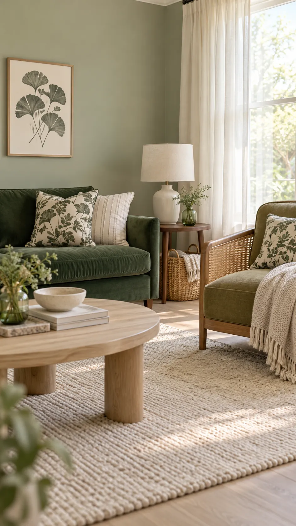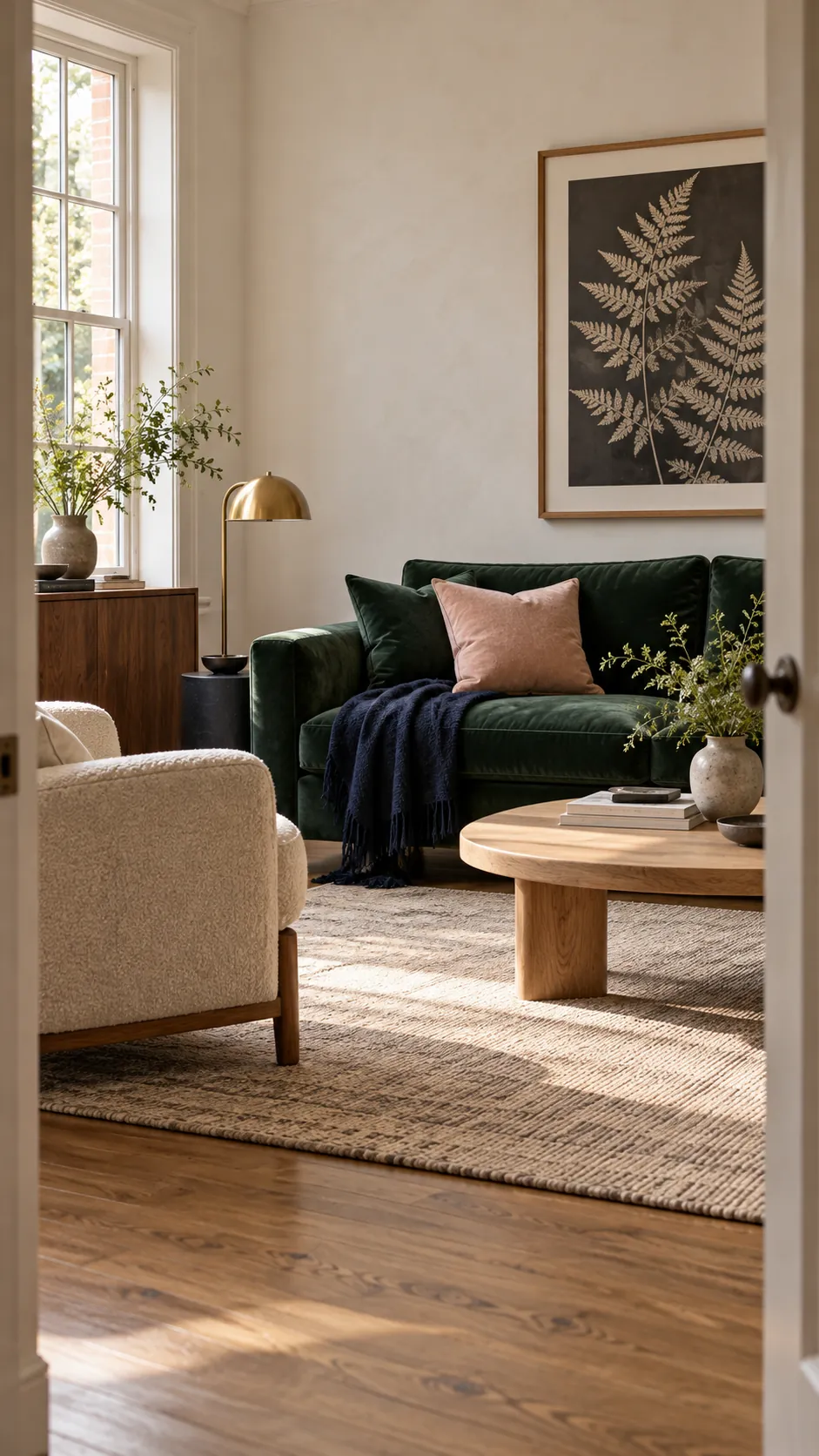
Green matches with warm white, cream, natural wood, blush, terracotta, navy, soft blue, charcoal, black, and brass. The easiest palette starts with one green, one light neutral, and one warm natural material. Add a stronger contrast only after those three feel balanced.
The exact match depends on the green undertone. Yellow based olive prefers warm companions, while blue based emerald and eucalyptus sit more naturally with navy, cool stone, and blue gray. Place real samples together under the room light before buying paint or textiles.
Warm white and cream create breathing room
Warm white is the most useful partner because it lifts both pale and dark green without creating a harsh edge. Cream has enough warmth to support olive, sage, and forest green, while still giving a room visible contrast. Use it across the largest remaining surfaces, such as curtains, rugs, bedding, or upholstery.
A blue white can make yellow green look dull and can exaggerate the cold side of emerald. Compare the white directly against the green in daylight. If the white looks stark or the green looks muddy, choose a softer white with a quiet red or yellow undertone.
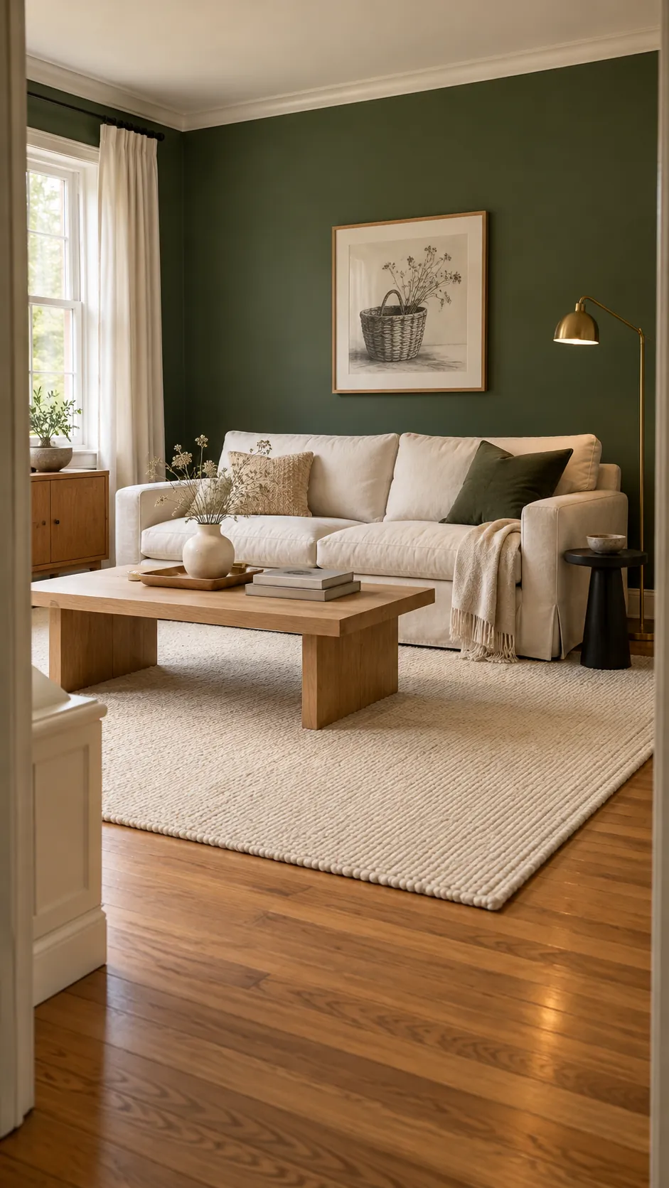
Natural wood and caramel add warmth
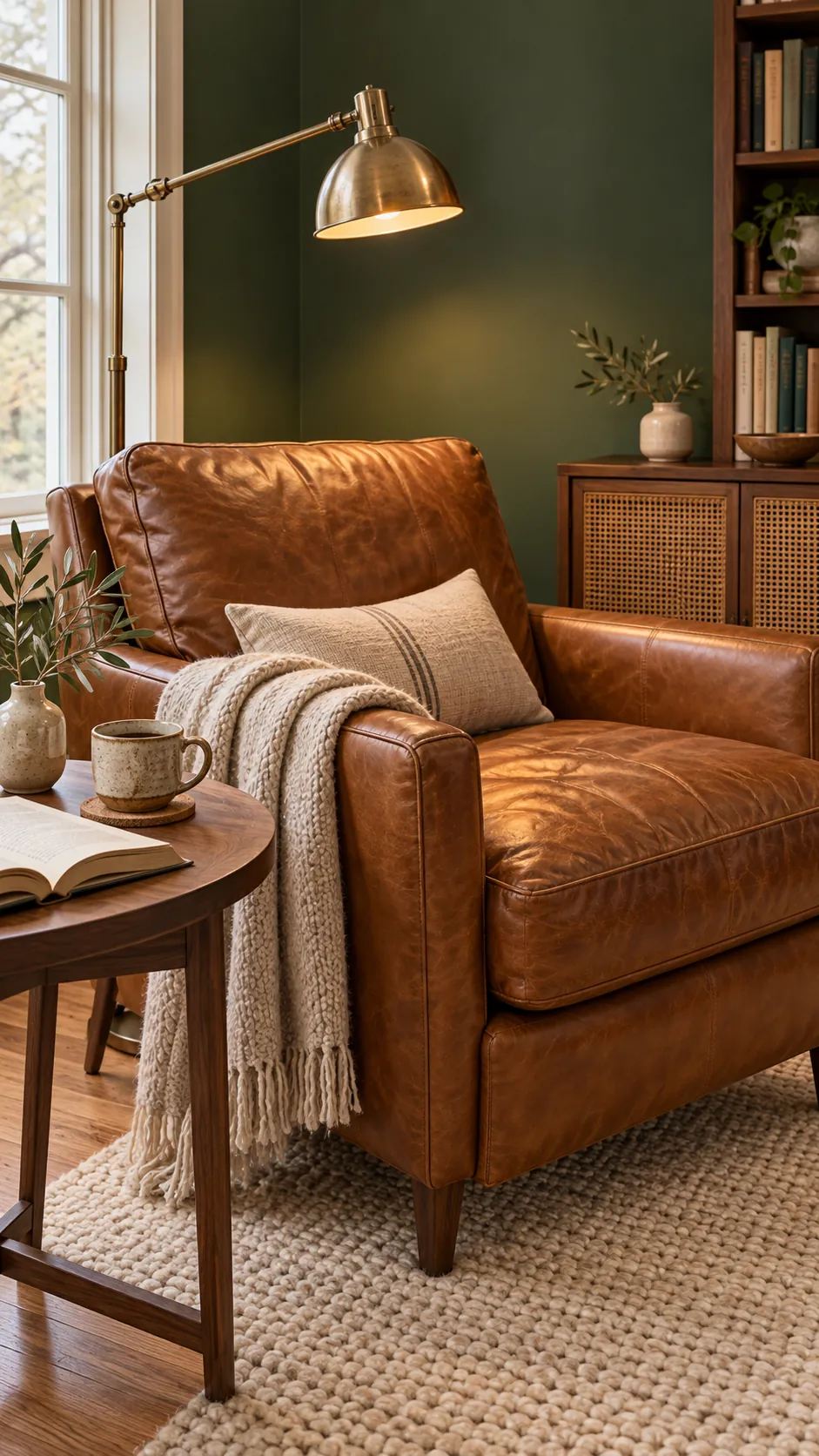
Oak, walnut, cane, rattan, and caramel leather make green feel grounded. Pale oak suits sage and eucalyptus, while walnut can hold its own beside forest or emerald green. Caramel leather adds warmth and age variation that prevents the palette from looking too coordinated.
Repeat the wood tone in at least two places so it reads as part of the room. A table and picture frame can be enough. Avoid mixing several unrelated orange woods, since that can make the green appear colder by comparison.
Woven materials also add a useful middle value between green and white. A cane chair or jute rug introduces texture without another dominant colour. This is especially helpful when a green sofa is the largest object in the room.
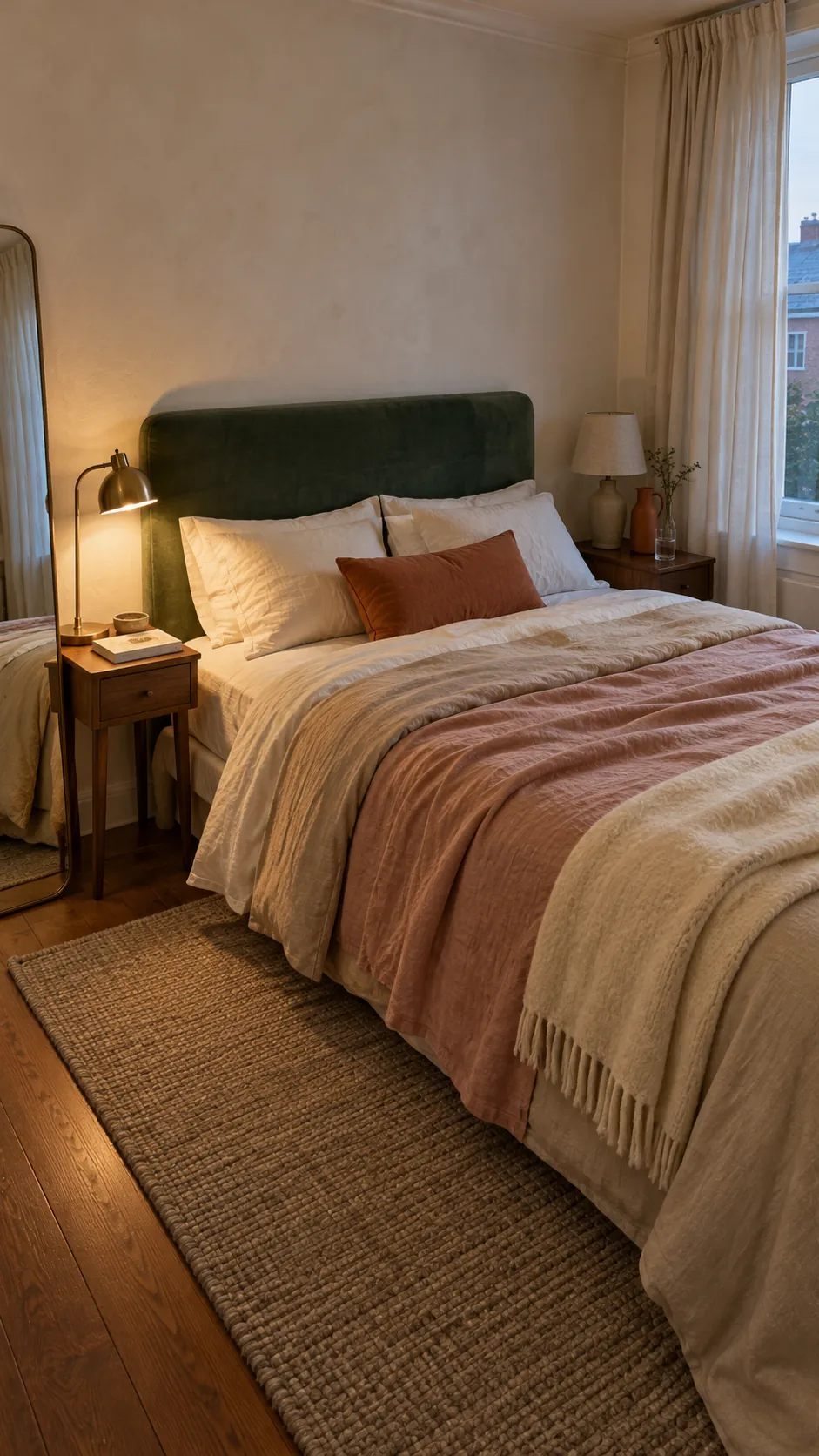
Blush and terracotta soften green
Muted pink creates a gentle contrast because it sits across from green without the intensity of bright red. Dusty blush works well with emerald and sage, while terracotta feels stronger and earthier beside olive or forest green. Keep either colour slightly muted so the combination remains calm.
Textiles are the safest place to use these warm accents. Try blush bedding, a clay cushion, or a terracotta rug detail before committing to paint. One repeated warm note is usually enough to connect the room.
Navy and soft blue create depth
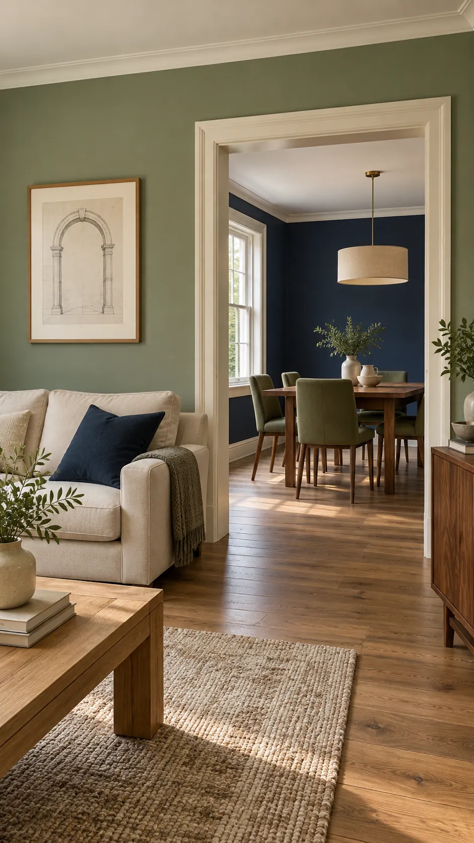
Navy and green share a natural coolness, which can feel composed and quiet. Use one as the dominant colour and the other through furniture, textiles, or a rug. A lighter neutral between them keeps two deep surfaces from merging into one dark block.
Soft blue is easier in a bright room and can freshen sage or sea green. Choose a gray blue instead of a vivid primary blue. Warm wood, cream, and brass stop the palette from becoming cold.
For adjacent rooms, repeat one neutral or wood tone through both spaces. The green and blue do not need to match in value when the flooring, trim, or curtains create a clear visual connection.
Black and charcoal give a crisp anchor
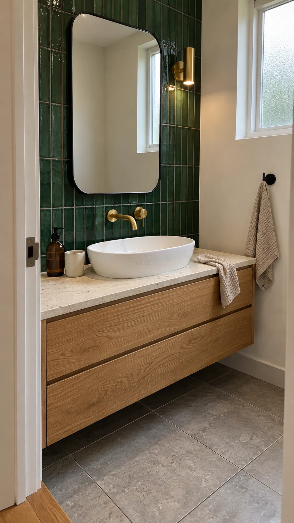
Black can sharpen a green palette when it appears in narrow lines, hardware, or practical fixtures. Charcoal is softer and works well in rugs, stone, and upholstery. Both colours help brass, wood, and pale stone look deliberate rather than scattered.
Use dark anchors sparingly in a room with forest green walls. Black window frames, a charcoal mirror, or one dark table may be enough. When every object is dark, the green loses its identity and the room can feel visually heavy.
Layer several greens with one shared neutral
Different greens can work together when they have clear differences in value and material. A sage wall, olive chair, and forest cushion are easier to read than three similar middle greens. Give each shade a separate role rather than scattering them evenly.
One repeated neutral ties the layers together. Cream across the rug, curtains, and lampshades can connect several greens, while a consistent wood tone keeps the room warm. Pattern is useful when it includes two greens and the same neutral.
Start with the fixed green surface and choose the support colour that solves a real need. Use cream for light, wood for warmth, pink or terracotta for contrast, blue for depth, and charcoal for definition. A simple hierarchy prevents the palette from becoming cluttered.