
Have you ever brought a 'perfect' beige paint home only to find it looks pink or yellow once it's on the walls? Choosing a neutral color seems easy until you see how many versions of white and gray actually exist. The right neutral can make your living room feel open and calm, while the wrong one can feel muddy or cold.
This guide will help you navigate the world of neutrals. We will look at how to identify tricky undertones, how to use light to your advantage, and how to build a cohesive indoor color schemes house layout that feels both fresh and timeless.
How to tell the difference between warm and cool undertones

Every neutral paint has a hidden color beneath the surface called an undertone. Warm neutrals have hints of yellow, red, or orange. They make a room feel cozy and inviting. Cool neutrals have bases of blue, green, or purple, which create a crisp and airy vibe. To see the undertone, hold a paint swatch against a sheet of pure white printer paper. Against the true white, the hidden colors will pop out immediately. If the gray looks a bit blue, it's cool. If the beige looks a bit peachy, it's warm. Matching these undertones to your existing flooring and furniture is the key to a successful interior design color palette.
Classic off-whites that work in any light

Pure white can often feel too sterile, like a doctor's office. Off-whites are a better choice for a home color palette interior because they have just enough pigment to soften the room. Look for 'gallery whites' that have a tiny bit of gray or ochre. These shades provide a clean backdrop without feeling harsh. They are particularly useful if you have a lot of colorful artwork or rugs, as they let the decor be the star of the show while keeping the walls looking fresh.
Using greige to bridge the gap between gray and beige
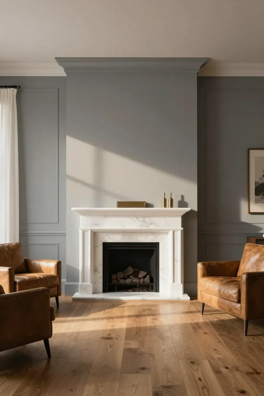
Greige has become a staple in the modern interior color palette for a good reason. It combines the coolness of gray with the warmth of beige. This makes it incredibly versatile. If you have cool-toned marble but warm oak floors, a greige paint can tie those two elements together. It changes throughout the day, looking more gray in the morning and warmer at night, which keeps the room from feeling flat.
Soft grays for a clean and modern interior color palette
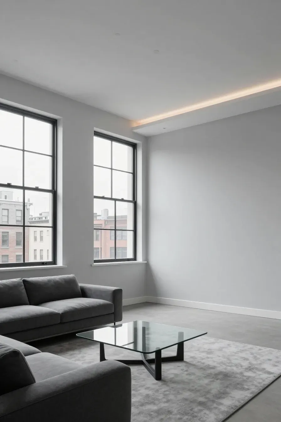
If you want a modern colour palette, soft grays are the way to go. Avoid grays that are too dark or 'heavy' for a living room. Instead, look for pale, misty grays. These colors make the walls recede, which can make a small living room feel much larger. When using gray, pay attention to your light bulbs. LED bulbs with a high Kelvin rating can make gray look blue, while warmer bulbs can make it look more neutral.
Warm sandy tones for a cozy living space

For those who prefer a traditional or Mediterranean feel, sandy tones are a great choice for a house color palette interior. These aren't the dated yellows of the past. Modern sands are muted and earthy. They pair well with linen fabrics and woven rugs. These tones work best in rooms where you want to relax and unwind, as they naturally feel more grounded and 'quiet' than brighter whites.
How natural light changes your home color palette interior

Light is the most important factor in how paint looks. North-facing rooms get a cool, bluish light, which can make cool grays look chilly. In these rooms, you might want a warmer neutral to balance it out. South-facing rooms get strong, warm sunlight all day, which can make warm beiges look too yellow. East and west light changes drastically from morning to afternoon. Always check your contemporary color palette at different times of the day before committing to a gallon of paint.
Pairing neutral walls with wood furniture and natural textures
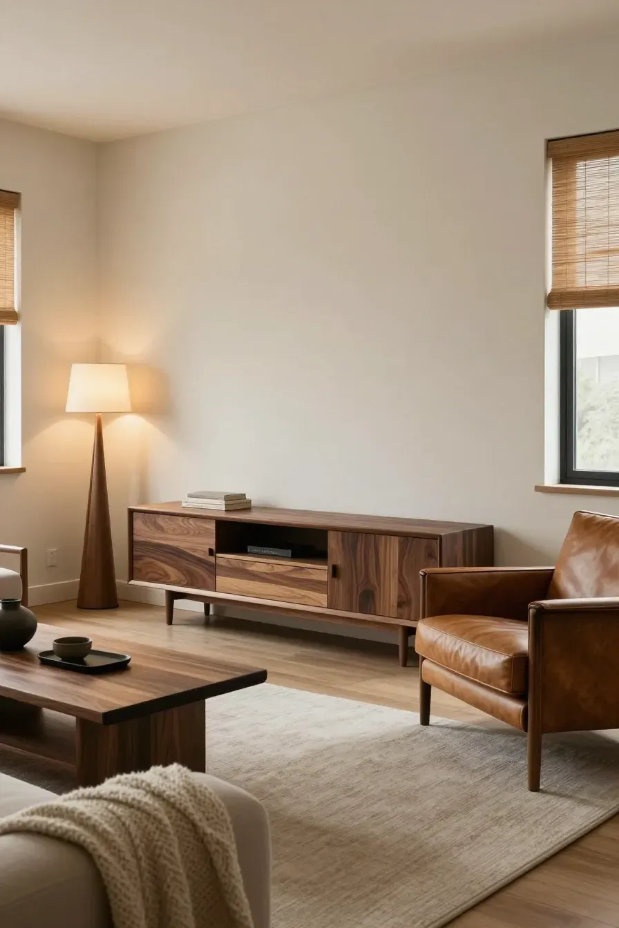
Neutral walls can sometimes feel boring if you don't add texture. To make your interior design color schemes work, bring in natural elements. Light oak furniture looks great against cool grays, while dark walnut or cherry wood pops against warm off-whites. Adding bamboo shades, wool throws, or leather chairs adds the 'visual weight' needed to keep a neutral room from looking empty. It’s about creating contrast through materials rather than just bright colors.
Creating depth with a monochromatic interior design color palette

You don't need many colors to make a room interesting. A monochromatic home decor color palettes approach uses different shades of the same color. For example, you could use a medium greige on the walls, a lighter version on the ceiling, and a darker version on the trim. This creates a sophisticated, layered look that feels intentional and calm. It’s a simple way to get a high-end look without needing a professional designer.
Tips for testing paint samples on your own walls

Never pick a color based on the small chip at the store. Buy a small sample pot or a peel-and-stick swatch. Paint a large square on at least two different walls—one that gets direct light and one that stays in the shade. Look at the samples for at least 24 hours. You might love a color at noon but realize it looks green at 8 PM. This extra step saves you the time and money of repainting a room you aren't happy with.
Choosing the right neutral is about understanding the light in your home and the feeling you want to create. Whether you go with a crisp off-white or a deep greige, the right shade will act as the perfect foundation for your life. Take your time, test your samples, and don't be afraid to try a few options before making your final choice. Ready to start? Grab a few swatches this weekend and see how they look in your space.