
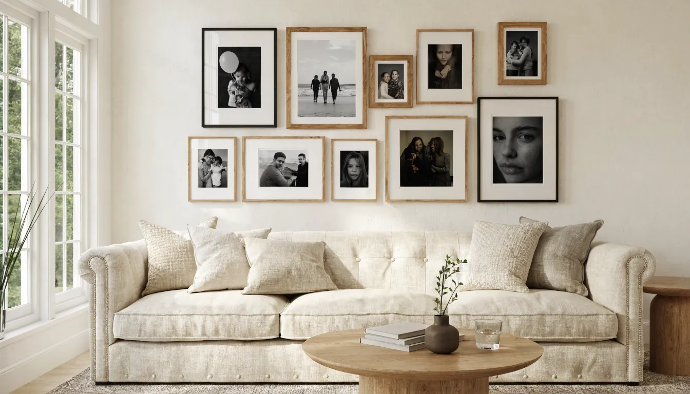
Family photos are easy to love and surprisingly easy to hang badly. The wall can have beautiful people, meaningful moments, and expensive frames, yet still feel busy because the eye cannot tell what rule is holding everything together.
The best family photo wall ideas do not start with more frames. They start with one design decision: will this be a calm grid, a collected gallery wall, or a growing frame wall that can accept new memories over time? Once that choice is clear, the photos stop looking like separate objects and begin reading as one piece of personal decor.
Use this as a practical styling guide for a living room, hallway, stair landing, entry, or family room. The goal is not a perfect showroom wall. The goal is a photo wall that feels personal, edited, and intentional.
Start With One Visible Organizing Rule
A designed gallery wall usually has one rule you can sense immediately, even if you cannot name it. It might be all black frames, all white mats, a strict grid, one strong center line, or a repeated mix of oak, brass, and black. Without that rule, family photos can look scattered because every image has a different color, crop, mood, and memory attached to it.
Choose the rule before you choose the exact frames. If you want a quiet wall, repeat the same frame and mat size. If you want a collected wall, repeat the spacing and keep the frame finishes limited. If you want the wall to grow, build around one anchor frame and leave intentional open edges.
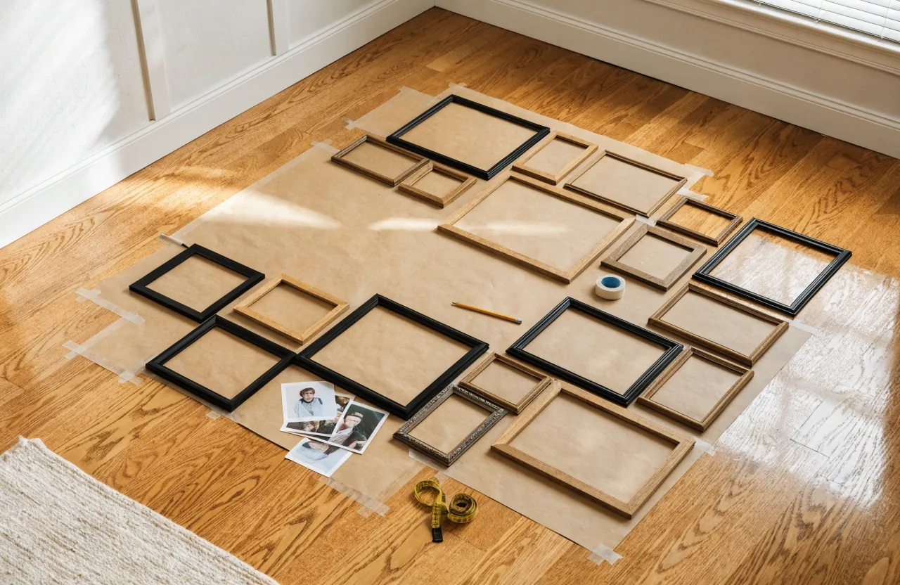
The simple test: cover the photos with your hand and look only at the outside shape of the arrangement. If the shape feels balanced, the wall has a foundation. If the shape feels random, better photos will not fix it.
Pick a Grid When You Want Calm
A grid is the safest choice when your photos are emotionally important but visually different. Wedding photos, baby pictures, school portraits, travel snapshots, and extended-family moments can all sit together when the outer frame size, mat color, and spacing stay consistent.
For a refined grid, use identical frames and give every photo the same mat treatment. Black frames with white mats create a crisp hallway decor look. Oak frames feel warmer and softer. Slim brass frames look polished when the surrounding room already has warm metals in the lighting or hardware.
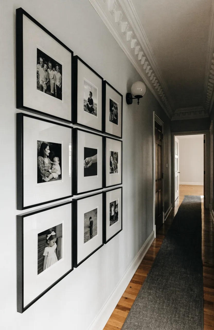
Keep the gaps equal. Two to three inches between frames is a useful starting point for most family photo grids. Smaller frames can sit a little tighter; larger frames need more breathing room. What matters most is that the gap repeats so the wall feels deliberate.
Use an Anchor for a Mixed Frame Wall
A mixed frame wall works best when one piece is clearly in charge. That anchor might be the largest family portrait, a landscape photo from a meaningful trip, a framed handwritten note, or a black-and-white wedding image. Place it slightly off center or near the middle, then build outward with smaller frames.
This keeps the wall from turning into a cloud of small rectangles. A mixed wall can use different orientations and sizes, but the spacing should still feel consistent. Treat the entire group like one large artwork. Above a sofa, console, or bench, the total arrangement usually looks best when it spans roughly two-thirds to three-quarters of the furniture width.

If the wall still feels messy, the issue is often scale. Too many tiny photos make the room work hard. Swap a few small prints into larger mats, or let one portrait become the main moment. Bigger does not mean louder; it often makes the wall calmer.
Edit the Photos Before You Edit the Wall
Family photos come from different years, phones, lighting conditions, and seasons. That variety is part of their charm, but it can fight the room. Before printing, decide whether the collection will be mostly color, mostly black and white, or a controlled mix.
Black and white is the fastest way to make unrelated photos feel like one collection. It is especially useful when the photos include bright clothing, sports uniforms, party backgrounds, or old snapshots. If you prefer color, repeat a mood instead: warm outdoor photos, soft neutrals, beach tones, autumn colors, or muted indoor portraits.
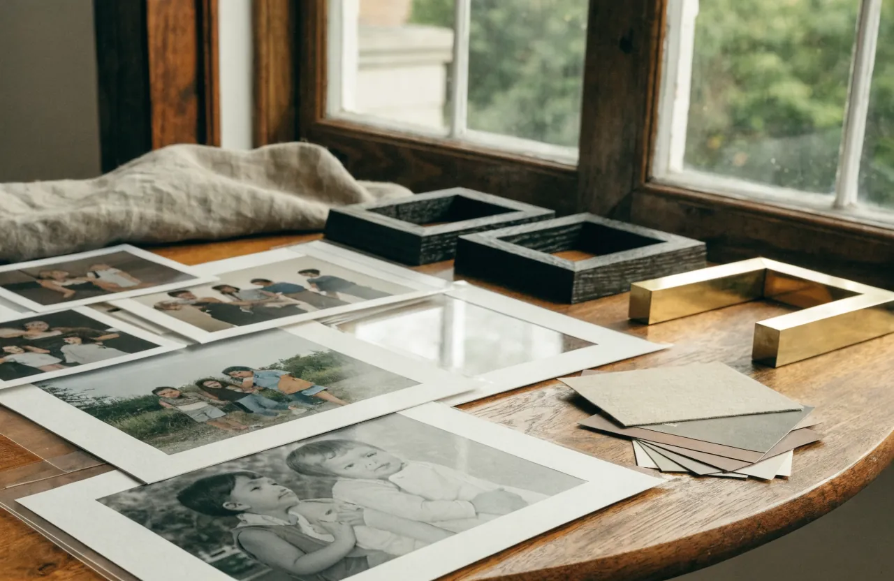
Cropping matters as much as color. Avoid making every face the same size. Let some photos be close portraits, some be wider scenes, and some be quiet detail shots. A wall with only close-up faces can feel intense; a wall with a mix of distance gives the eye places to rest.
Let the Room Decide the Layout
The right wall decor layout depends on the room around it. A living room wall above a sofa needs a strong horizontal shape. A hallway can handle a clean row, a vertical column, or a long grid. A staircase needs the arrangement to follow the slope while still keeping the spacing steady. An entryway often looks best with fewer, larger pieces so it does not feel crowded the moment you walk in.
Do not hang the photos first and hope the furniture catches up. Stand back and look at doorways, light switches, lamps, trim, benches, and consoles. The photo wall should relate to those features instead of floating by itself.
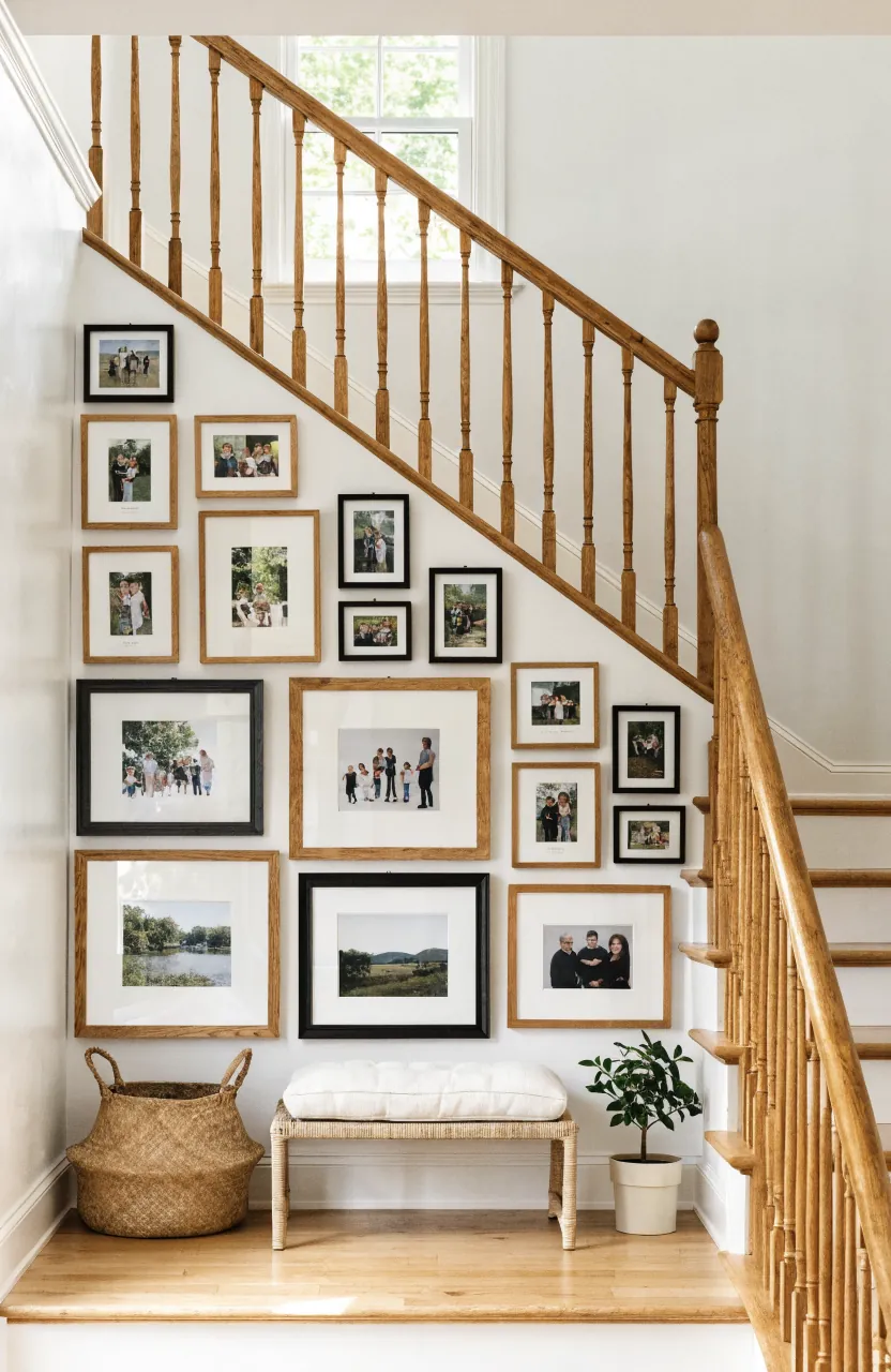
For living room wall decor, keep the lowest frame close enough to the sofa or console to feel connected. Six to eight inches above the furniture is usually better than a high floating arrangement. For a hallway, center the full group at comfortable eye level, not each individual frame.
Mix Frames Without Making Them Fight
Mixed frames can look more personal than a matching set, but they need limits. Use two main finishes and one small accent at most. A practical combination is matte black plus natural oak, with a little brass or antique gold if the room already uses warm metal. Avoid adding every frame finish you own just because each one is pretty alone.
Mats are the quiet unifier. If your frames vary, keep the mats similar. If your photos vary, keep the frames similar. If both photos and frames vary, the wall usually needs stricter spacing and a cleaner outside shape.
- Modern look: thin black frames, white mats, mostly black-and-white photography.
- Warm natural look: oak frames, cream mats, family photos with soft neutral color.
- Collected look: black, oak, and brass frames with one repeated spacing rule.
- Classic look: matching frames in a grid with deep mats and generous margins.
Leave a Path for New Memories
The hardest part of a family photo wall is that families keep changing. New babies arrive, kids grow, trips happen, grandparents visit, and the wall that felt finished starts asking for updates. Plan for that from the beginning.
If you want flexibility, use a collected layout with open edges, or install picture ledges where frames can overlap and rotate without new nail holes. Another option is to keep the wall structure fixed but update the photos inside the frames once or twice a year. The interior styling stays calm while the memories keep moving.
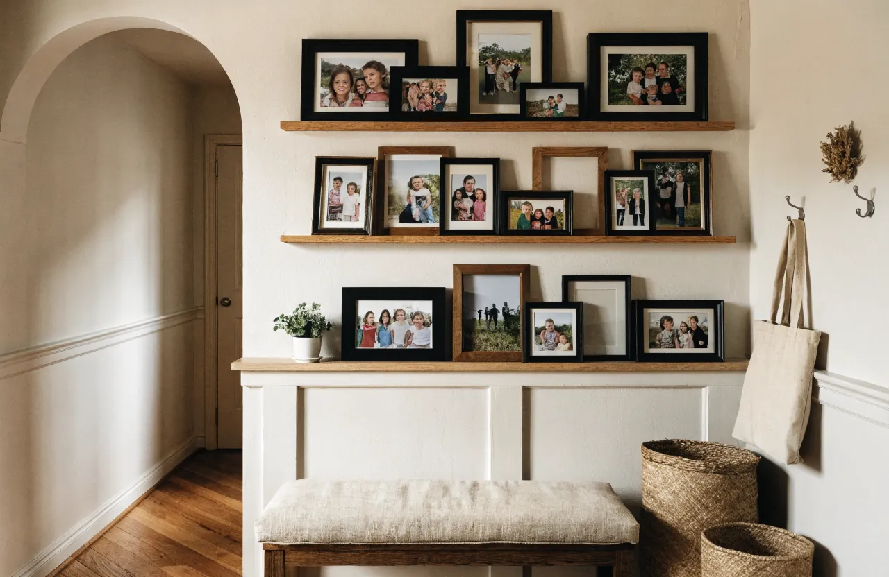
That is what makes a family wall feel designed instead of frozen. It has a rule, but it also has room for life.
Common Mistakes That Make Family Photos Look Random
If your wall feels off, check these issues before buying anything new.
- The frames are too far apart. Wide gaps make each photo feel isolated instead of part of one gallery wall.
- Every photo is small. A wall of small prints can look nervous. Add at least one larger anchor.
- The wall is hung too high. Family photos should connect to nearby furniture, trim, and eye level.
- There is no repeated element. Repeat frame finish, mat color, spacing, photo color, or outside shape.
- The photos have not been edited as a set. Crop and color-correct them before printing so the collection feels cohesive.
The most designed family photo walls still feel personal. They simply give the eye enough structure to enjoy the people, places, and stories without having to solve the layout first.