
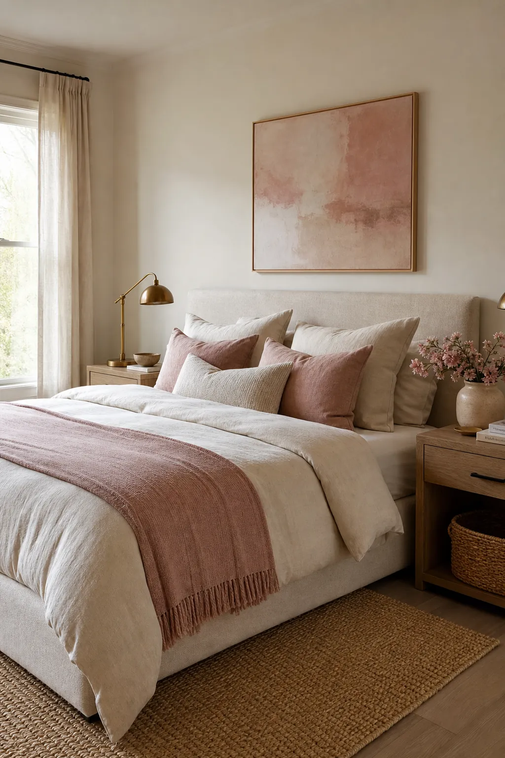
Pink decor works best in a neutral bedroom when it behaves like warmth, not decoration shouting for attention. The mistake most people make is buying every blush item they see, then wondering why the room suddenly feels sweet, busy, or disconnected from the calm base they liked in the first place. A better approach is simple: keep the room neutral, choose one pink undertone, and repeat it in a few deliberate places.
The goal is not to make a pink bedroom. The goal is to make a neutral bedroom feel softer, more personal, and more finished. That difference matters because it decides what you buy, what you skip, and where the color should live.
Start With the Neutral You Already Have
Before adding pink decor, look at the bedroom in daylight and name the neutral base. Is it warm ivory, beige, oatmeal, taupe, greige, cool gray, or bright white? Pink is not one universal color. A peachy blush that looks beautiful with cream can look slightly orange beside cool gray. A dusty rose that feels elegant with greige can look muted and tired beside yellow beige.
Match the pink to the undertone of the room. Warm neutrals usually like peach blush, muted coral pink, rose beige, and dusty terracotta pink. Cool neutrals usually like ballet pink, mauve blush, soft rose, and gray-pink. If the room mixes warm wood with white bedding, dusty rose is often the easiest bridge because it has enough softness to sit between both sides.
Use Pink in Three Places, Not Everywhere
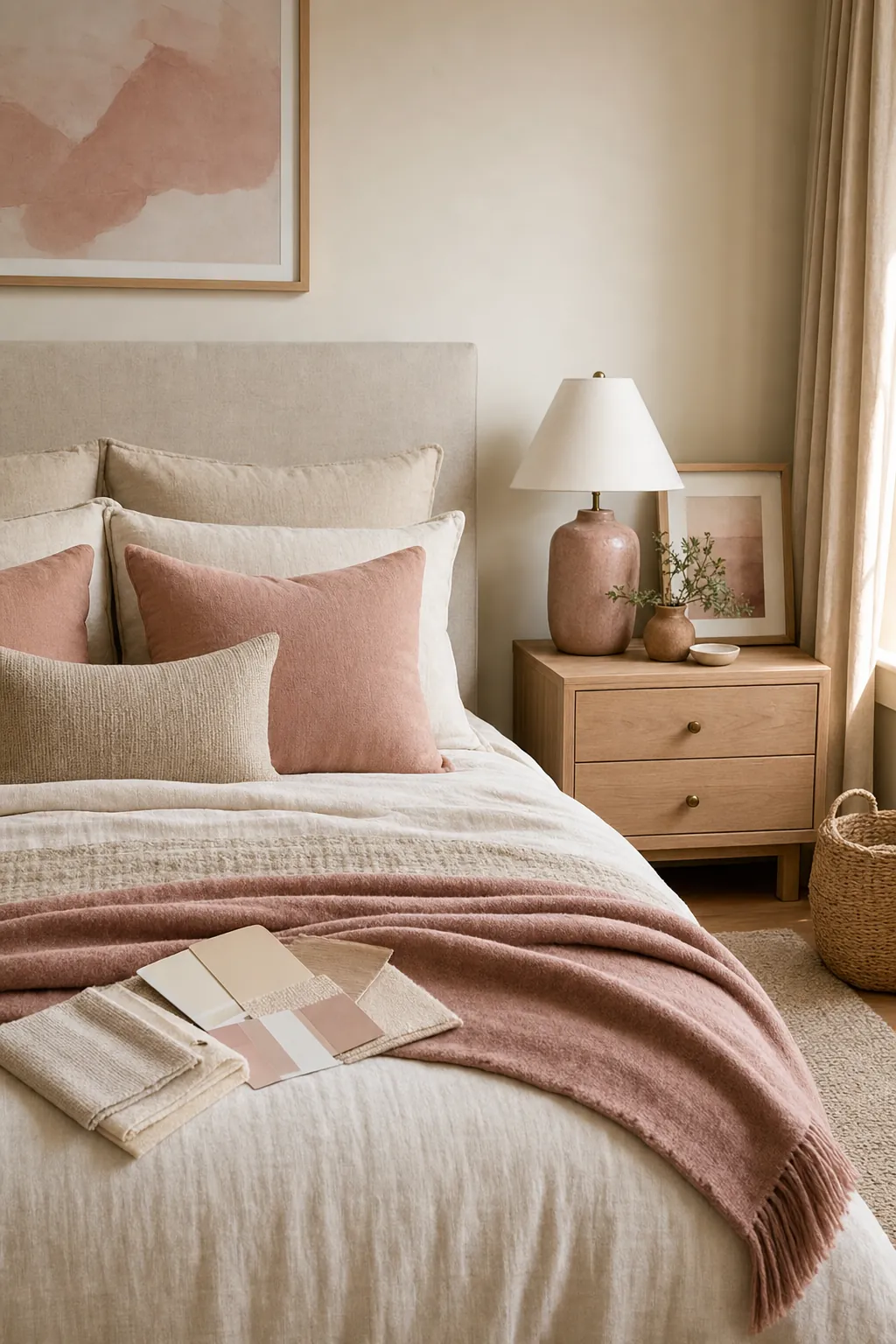
Fresh user discussions around pink rooms often circle the same worry: when does pink become too much? The practical answer is that pink starts to feel overwhelming when it loses contrast. If the bedding, rug, art, lamps, flowers, and storage are all pink, the eye has nowhere to rest. In a neutral bedroom, pink needs white space around it.
Choose three accent zones and let everything else stay quiet. A strong combination is bed textiles, one vertical moment, and one small bedside detail. That might mean blush throw pillows, a pink-toned print above the bed, and a ceramic lamp or small vase on the nightstand. The repetition makes the color look intentional, while the limited placement keeps the room calm.
Let Bedding Do the First Layer of Work
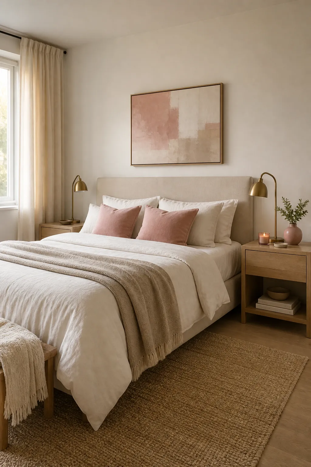
Bedding is the safest place to test pink decor because it is easy to change. Start with neutral sheets and a neutral duvet, then add blush accents through throw pillows, pillow shams, or a folded blanket at the foot of the bed. This gives you color without locking the whole room into a theme.
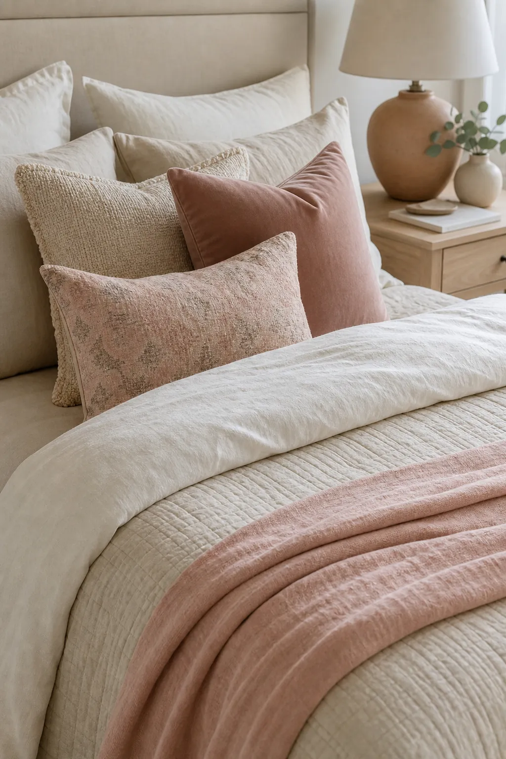
A balanced bed usually needs more texture than color. Try linen sheets, a cotton duvet, a nubby throw, and one velvet or boucle pillow. Keep the pink pieces varied but related: one pale blush, one dusty rose, and one patterned pillow that includes beige, cream, or taupe. The neutral pieces should still do most of the visual work. Pink is the lift, not the foundation.
Make Pink Feel Grown Up With Texture and Contrast
The fear that pink will look childish is usually not about the color. It is about the supporting materials. Shiny plastic, overly fluffy textiles, too many novelty shapes, and matching sets can push pink into a young or themed direction. Natural texture pulls it back into a softer interior styling language.
Pair blush accents with rattan, oak, linen, plaster, aged brass, matte ceramic, travertine, woven baskets, or a wool rug. Add one grounding color too: charcoal, walnut, olive, rust, chocolate brown, or black metal. Even a slim black picture frame or dark wood nightstand can make pink decor feel more considered. Pink looks more sophisticated when it has something earthy or structured beside it.
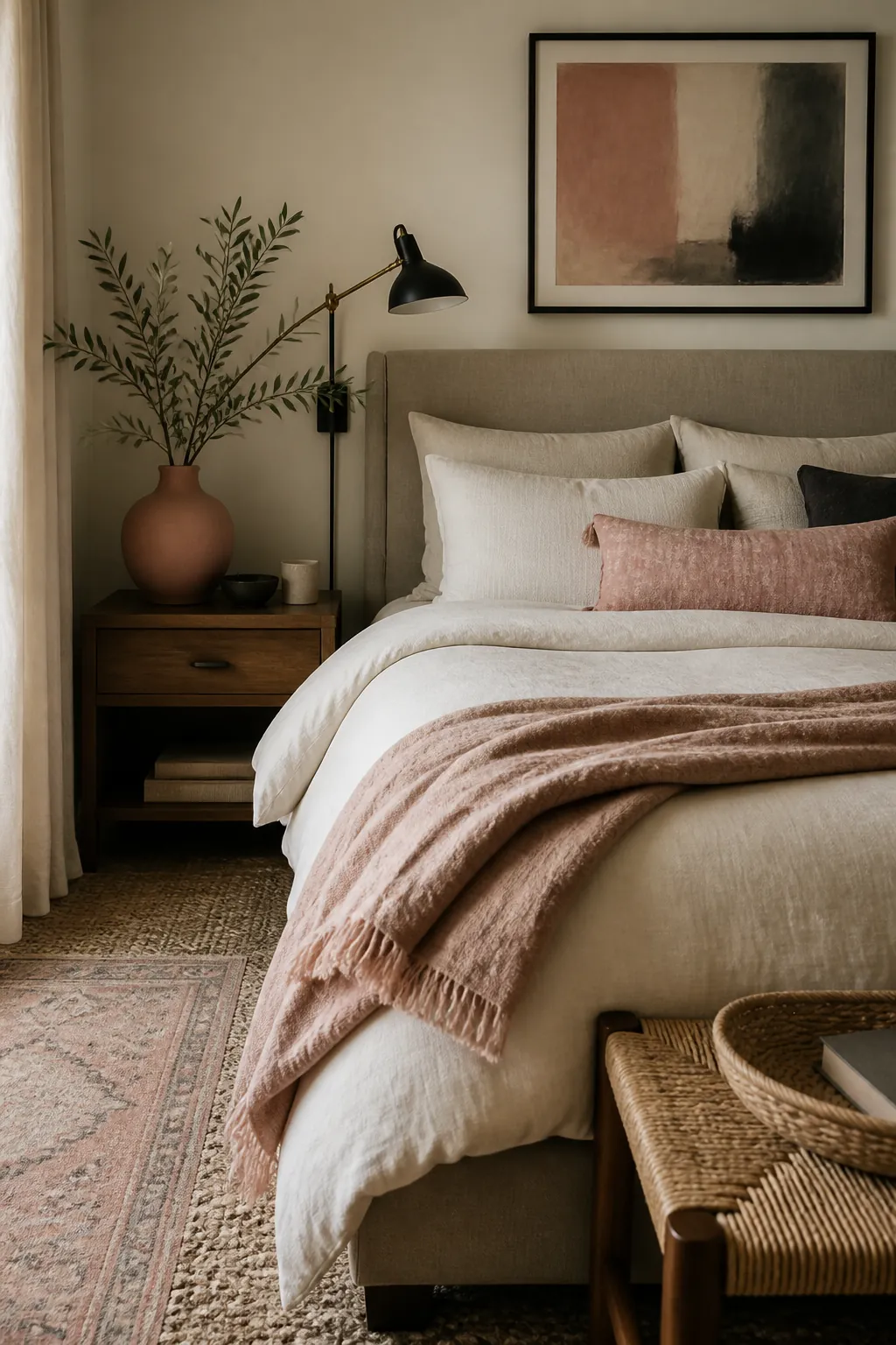
Choose Art and Lighting Before Buying More Small Decor
Small decor can make a bedroom feel cluttered quickly, especially when the room already has nightstands, books, chargers, skincare, candles, and trays. If the bedroom feels unfinished, do not automatically buy more objects. Look at the wall and the light first.
A pink-toned art print can connect the bed, wall, and bedside table in one move. It does not need to be obviously pink; a landscape, abstract print, textile piece, or botanical photograph with rose, clay, or mauve tones can be enough. Lighting matters just as much. A warm bulb, pleated shade, or blush ceramic lamp can make neutral bedding feel softer at night. Cool white lighting can make pink look sharper and less restful, so keep bedroom bulbs warm and gentle.
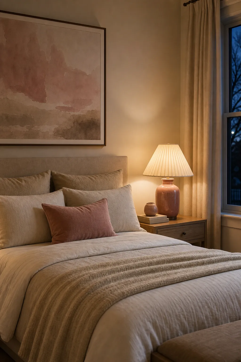
Keep the Room Flexible With One Seasonal Swap
A neutral bedroom should not feel trapped by one accent color. The easiest way to keep pink decor flexible is to make one piece seasonal. In spring and summer, that might be a pale blush linen throw. In fall, swap it for dusty rose or clay pink. In winter, use a deeper rose pillow with cream bedding and warm wood. The rest of the room can stay exactly the same.
This is also the best buying rule: spend more on neutral foundations and less on pink accents you may want to rotate. A quality cream duvet, simple headboard, good lamp, or natural rug will work through every color phase. Pink pillows, small art, candles, and vases can move in and out without making the room feel wasteful or overdesigned.
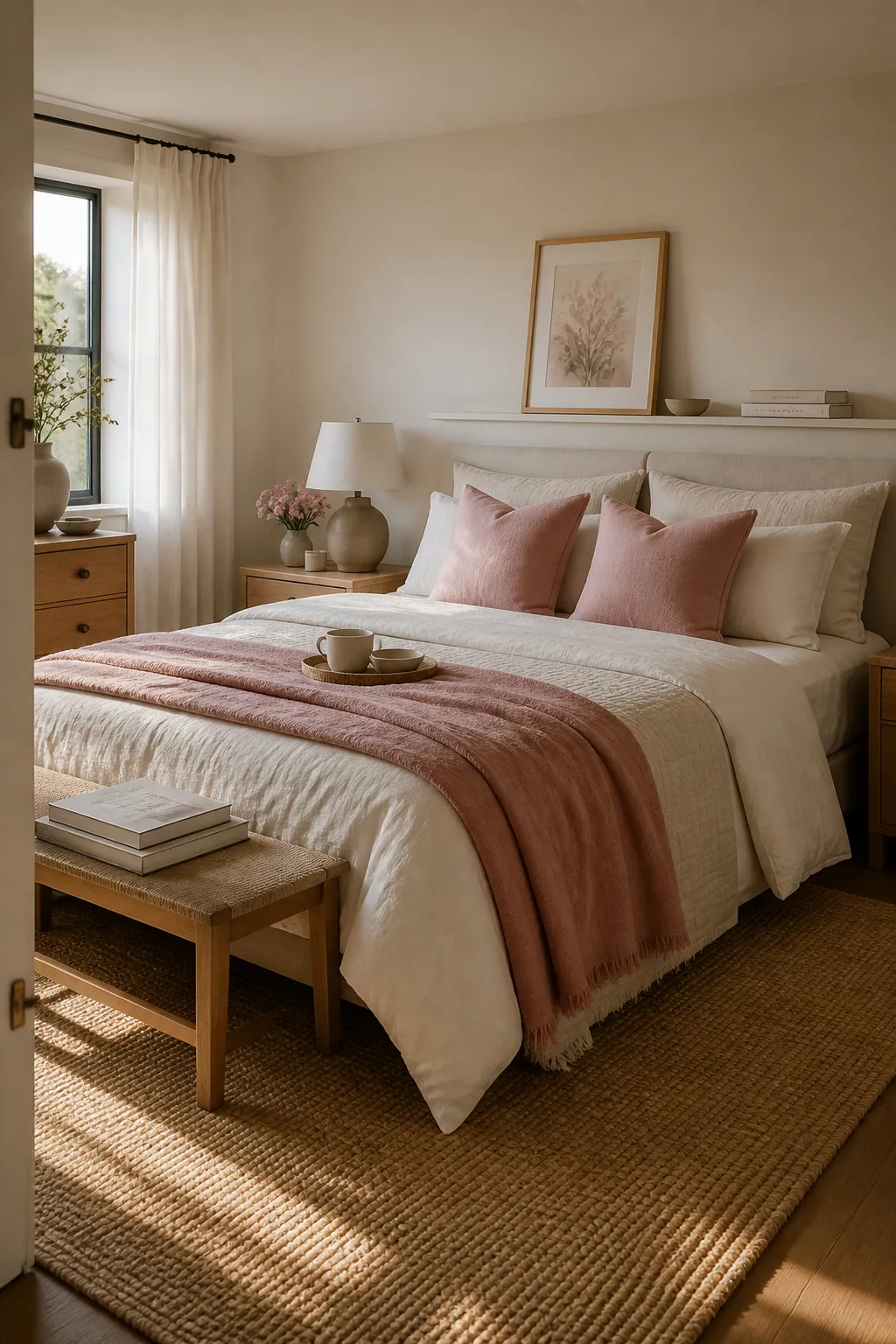
A Simple Formula for a Calm Pink and Neutral Bedroom
- Base: keep the main surfaces neutral, including walls, large bedding, rug, and major furniture.
- Pink shade: choose one blush family that fits the room’s undertone.
- Accent zones: repeat pink in three places so it looks intentional but not loud.
- Texture: use linen, wool, wood, ceramic, brass, or woven details to keep the room mature.
- Contrast: add one grounding color or darker material so the pink does not float away.
If you are unsure, start with a pillow pair and a throw before changing paint, furniture, or rugs. Live with the color for a week in morning light and evening lamplight. The right pink will make the neutral bedroom feel warmer and more relaxed without making you notice the color first.