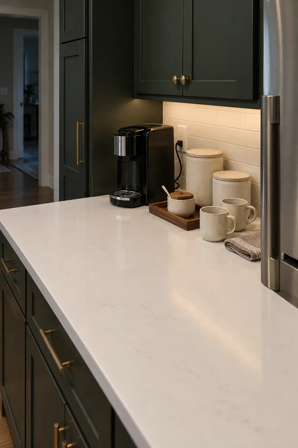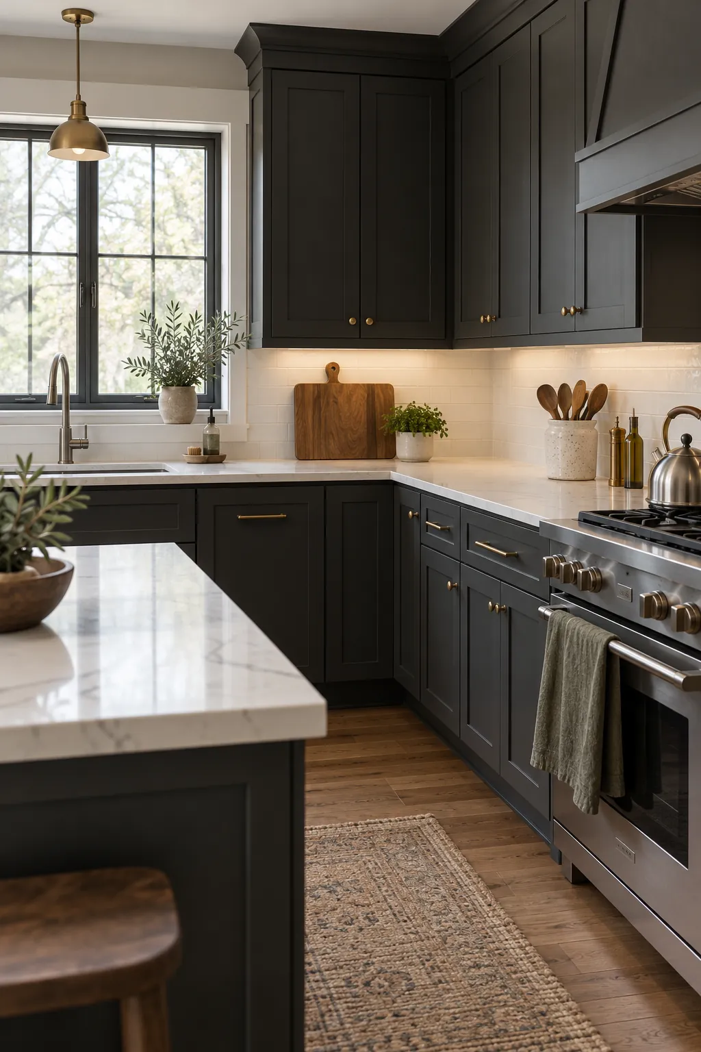
The sharp contrast between dark cabinetry and a pale work surface already gives a kitchen a strong visual structure. The usual mistake is to fill the white counters with many unrelated colors in an effort to soften that contrast. A calmer result comes from choosing a small material and color story, then repeating it only where the kitchen needs warmth, function, or rhythm.
Before buying anything, look at the cabinet undertone, the counter veining, the backsplash, the floor, and every fixed metal finish in daylight and after dark. Accessories should connect those existing surfaces rather than compete with them. This approach also keeps countertop decor useful, which matters in a room where every clear section supports daily cooking.
Read the Undertones Before Choosing Accent Colors
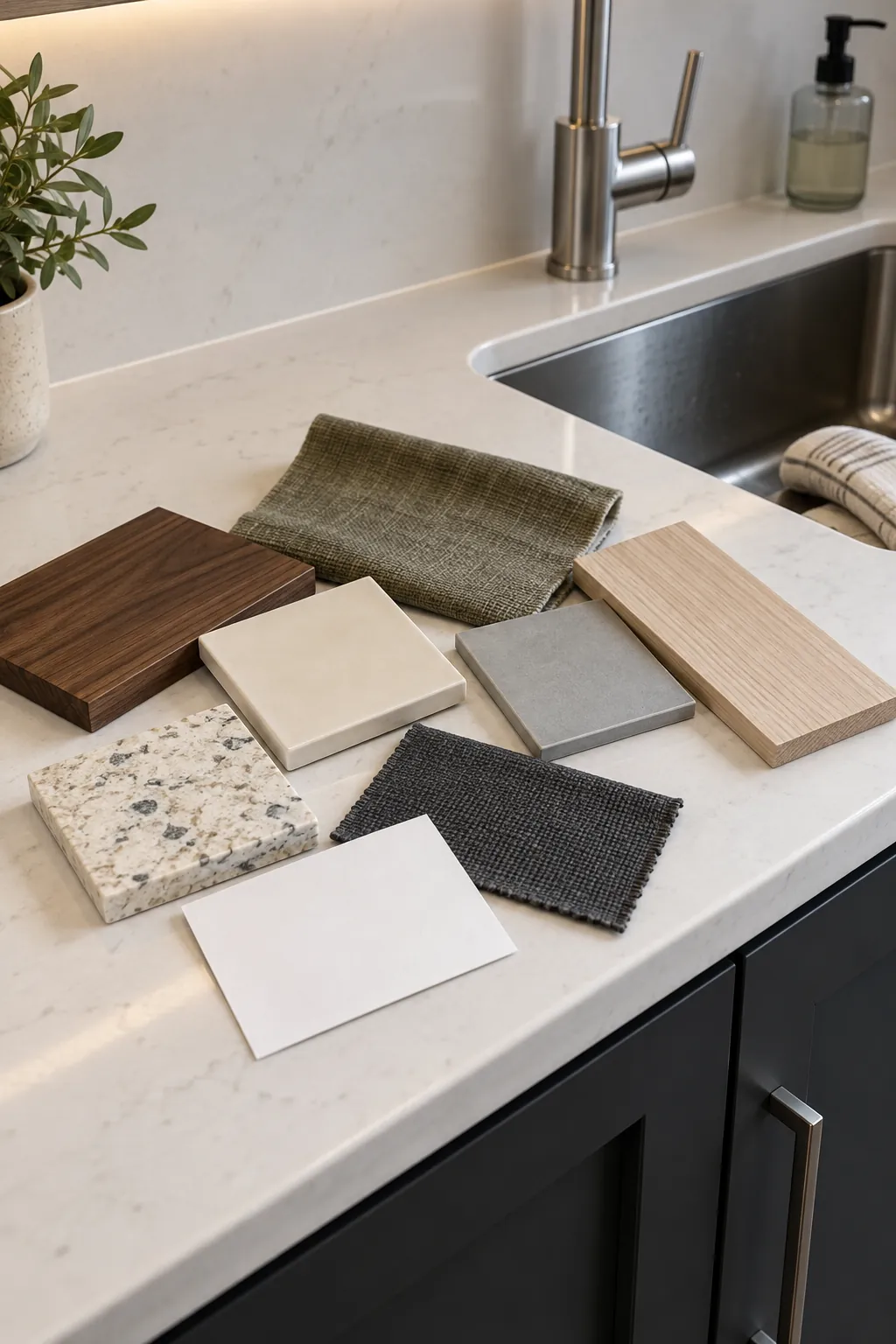
Dark cabinets can lean warm brown, smoky charcoal, blue black, or deep green, even when they appear almost black at first glance. White countertops can also lean creamy, gray, or crisp blue white. Place a kitchen towel, canister, or wood sample against both surfaces and check whether it makes either one look dingy. A warm walnut board may flatter espresso cabinetry and creamy quartz, while pale ash or cool gray ceramic may sit more naturally beside charcoal cabinets and gray veining.
Artificial light can change that judgment. Cool bulbs may make black and white kitchen accents look severe, while very warm bulbs can turn a clean counter yellow. Test accessory colors under the actual under cabinet lights before removing tags or ordering a full matching set.
Use One Natural Material as the Visual Bridge
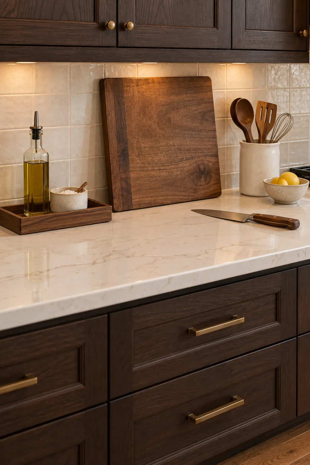
A natural material prevents the room from feeling like two flat color blocks. Wood is especially effective because its grain adds movement and its middle value sits between a dark cabinet and a white counter. Choose one dominant wood tone for visible cutting boards, a utensil crock detail, and perhaps a small tray. The pieces do not need to match exactly, but they should share a similar warmth.
Woven fibers, unglazed pottery, and honed stone can do the same job when wood is already prominent in the floor. A shallow rattan fruit basket or a speckled ceramic canister introduces texture without adding a loud new color. Keep these materials practical and washable near food preparation areas.
Limit the bridge material to a few visible pieces. Too many boards, baskets, and jars can make the counter look like storage rather than a deliberate composition.
Repeat One Accent Color in Separate Work Zones
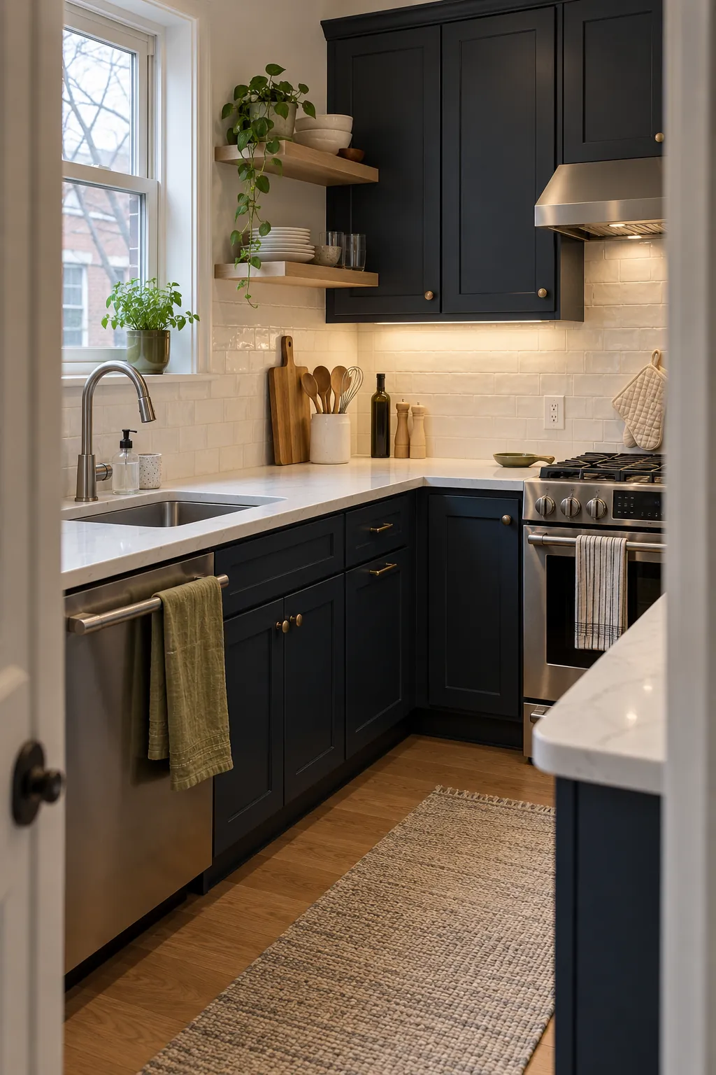
One accent color feels intentional when it appears in small doses across separate zones. For example, muted olive can show up in a hand towel near the sink, a glazed spoon rest beside the range, and a small planter near a window. The repeated color guides the eye through the room without turning every accessory into a set.
Choose a color with enough depth to hold its own beside dark kitchen styling. Dusty terracotta, muted olive, aged blue, and warm taupe often provide contrast without becoming harsh. Bright white accessories can disappear against the countertop, while pure black pieces can merge into the cabinetry, so use either one as support rather than the only accent.
Coordinate Metals With the Fixtures That Already Exist
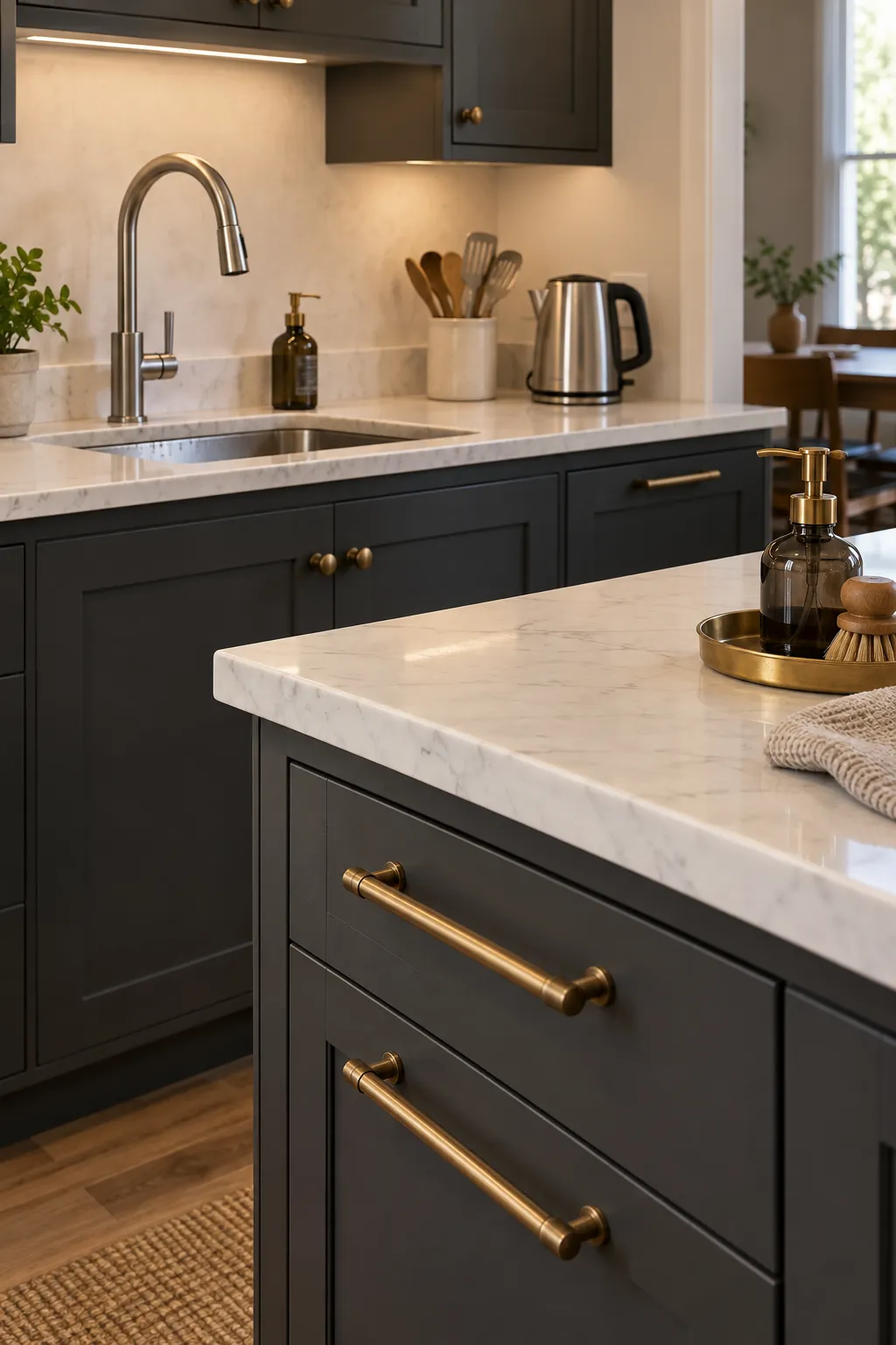
The faucet, cabinet pulls, appliance faces, and pendant lights carry more visual weight than a soap pump or fruit bowl. Start with those fixed elements. If the kitchen already combines stainless appliances with brass pulls, accessories can repeat one finish in each zone rather than introducing a third shiny metal.
Mixed metals look controlled when each finish has a clear role. Stainless steel can remain the functional finish for appliances and tools, while aged brass appears in smaller decorative details. Matte black often recedes against dark cabinetry, which can be useful for a paper towel holder or rail that should not attract attention. A finish becomes distracting when it appears once with no visual partner.
Pay attention to sheen as well as color. Two brushed finishes usually relate more quietly than one mirrored chrome piece beside several softly aged metals. Samples viewed in the whole room are more reliable than a close photograph because nearby lighting and appliances change how metal reads.
Let Towels and Small Textiles Carry Flexible Color
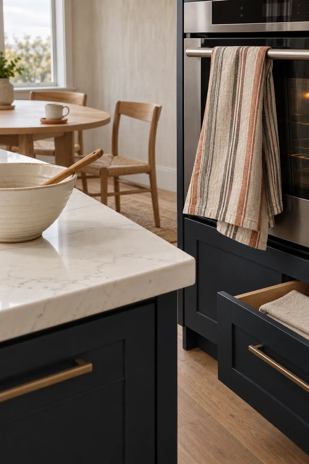
Kitchen towel colors are the easiest part of the scheme to change, so textiles are a good place to test a richer accent. A striped linen towel can connect a dark cabinet tone, a warm neutral, and the counter white in one useful item. A washable runner or a small window shade can repeat one of those colors when the room needs more softness.
Keep patterns modest when the stone has obvious veining or the backsplash is busy. A solid towel with a visible weave gives the eye a resting place, while a narrow stripe works well with quiet quartz and plain tile. Avoid placing many folded display towels on the worktop. One towel in active use looks natural and preserves valuable preparation space.
Edit Each Counter Zone Around Its Daily Job
Good kitchen color coordination is easier to see when the counter is not crowded. Give every visible zone one job. A coffee area might hold the machine, two matching canisters, and a tray that catches grounds. The range area may need only a utensil vessel, oil bottle, and spoon rest. Leave a clear section beside the sink and another near the refrigerator for unloading groceries and preparing food.
Countertop canister styling works best when the containers hold ingredients that are actually used in that location. Varying heights can create a pleasing group, but the pieces should remain easy to lift and clean. Hide duplicates, rarely used appliances, and excess packaging inside cabinets. The white surface then becomes intentional negative space, and the dark cabinetry provides the frame.
Stand at the main entrance to the kitchen and check the balance from a distance. If one side carries every wood piece, colored textile, and metal accent, move a single related item to the quieter side. Stop when the room feels connected, because adding one more decorative object often weakens the clear contrast that made the kitchen appealing in the first place.