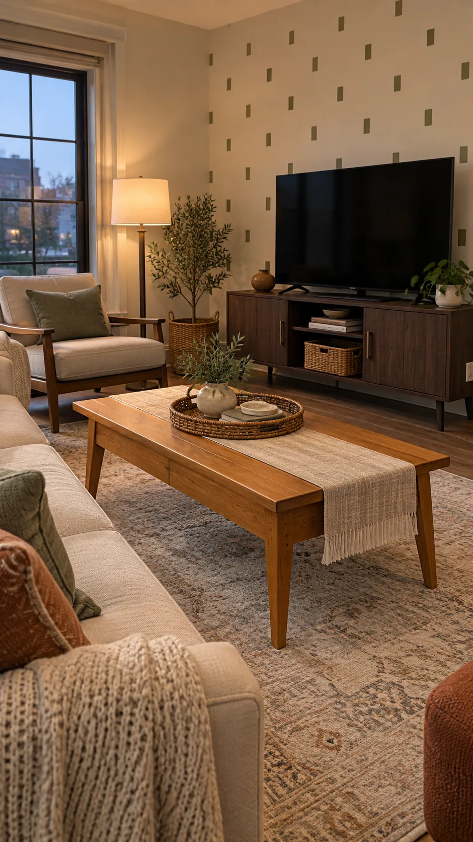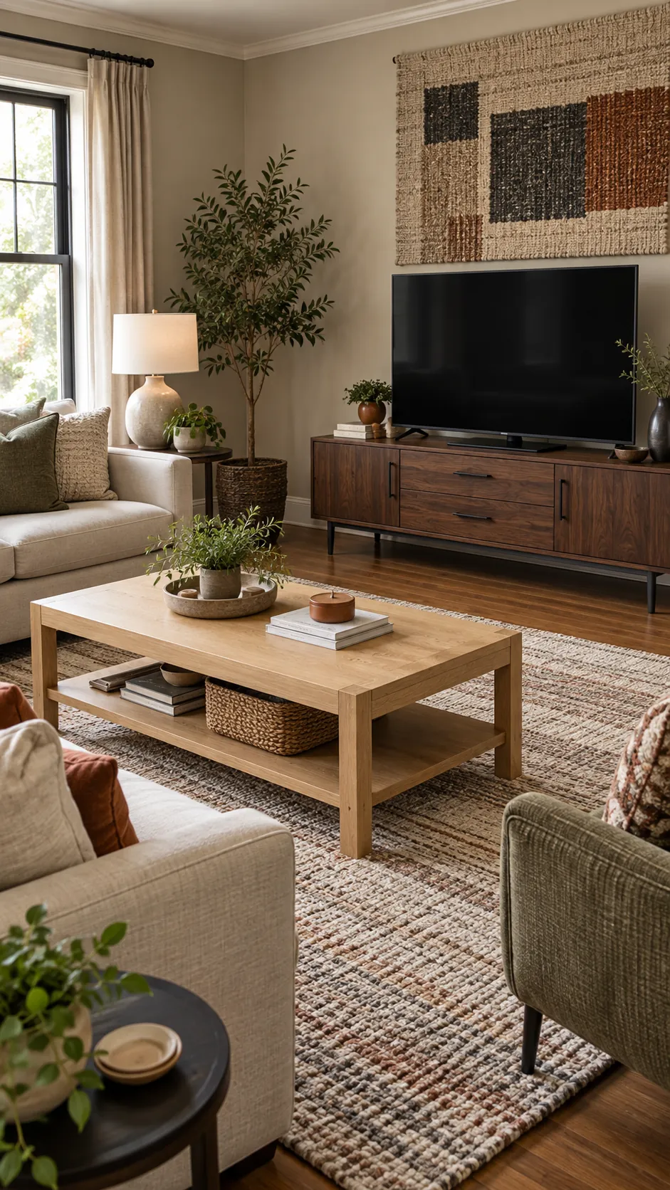
Different wood finishes do not automatically make a living room look wrong. The real problems are usually an unclear dominant tone, no repeated connection, or furniture that speaks two different design languages. Before replacing either piece, use the room around them to create a visible relationship.
Compare Undertones Before Color Depth
Start by deciding whether each wood reads warm, cool, or neutral in your room. A pale oak table and dark walnut stand can work together when both have warm brown undertones, while two medium browns can clash if one looks red and the other gray. Compare them in the same daylight and beside the rug, because phone photos and shop lighting often distort the finish. You do not need an exact species match; you need a relationship that looks intentional.
Let One Wood Tone Lead
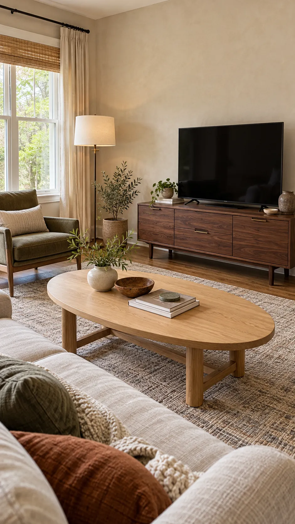
Choose the finish that covers more visual area as the dominant wood tone. A broad television stand may lead from the wall, while an open legged coffee table has less visual weight even when it is closer to the sofa. Repeat the dominant tone once in a smaller object and allow the second finish to act as contrast. This hierarchy keeps the room from looking like two furniture sets competing for control.
Repeat Both Finishes Across the Room
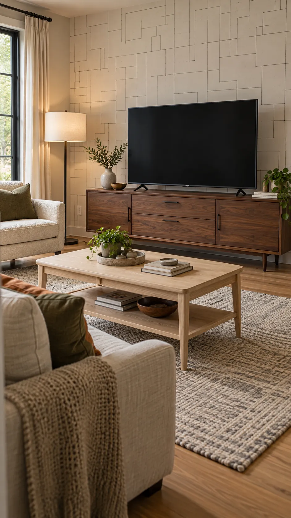
A mismatched pair looks accidental when each finish appears only once. Place a tray, bowl, frame, or lamp base near the opposite piece to carry each wood color across the seating area. The repeat does not need to be exact, but it should share the same warm or cool direction. Two or three small echoes are enough to connect the furniture without creating a matched suite.
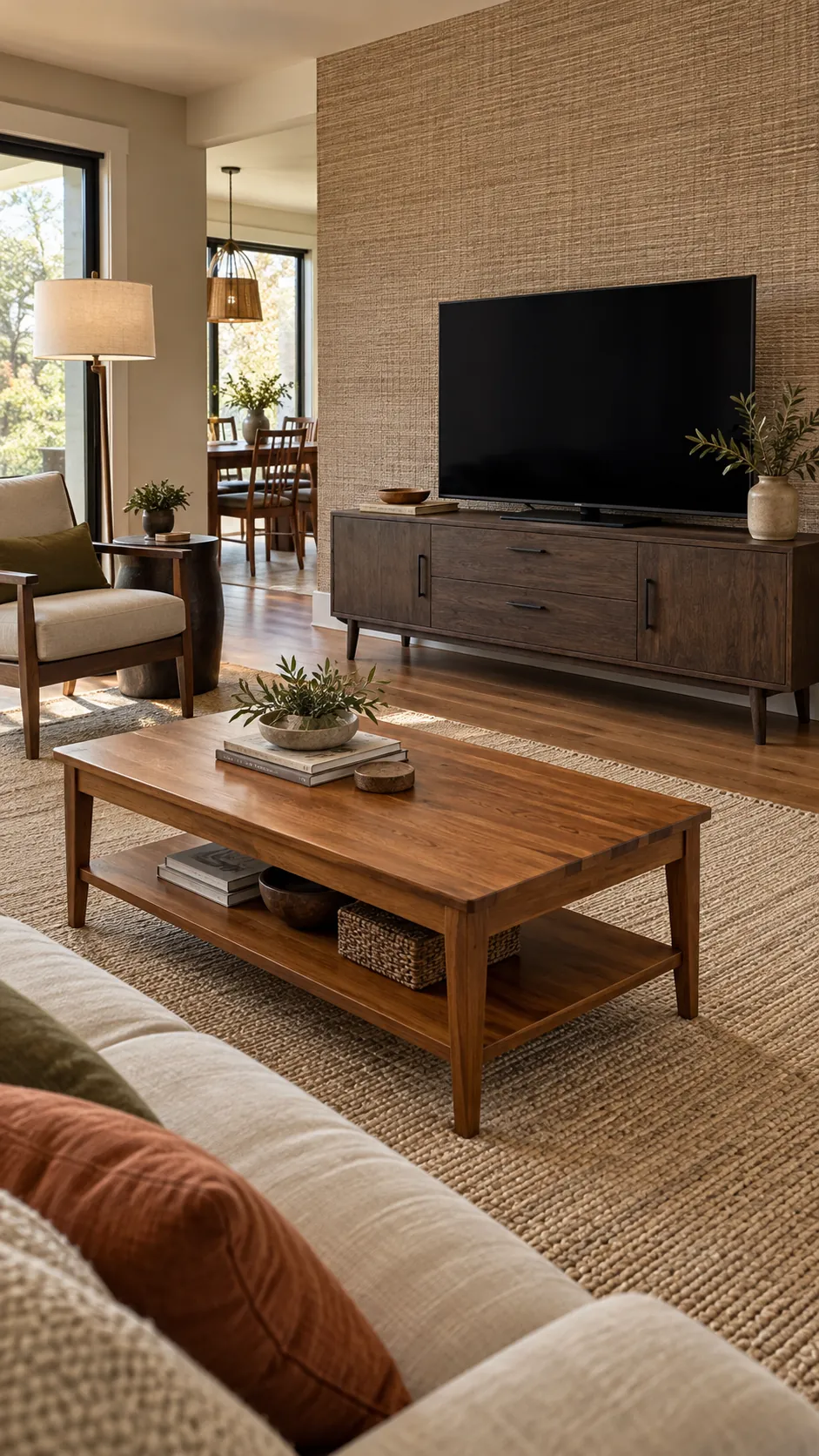
Use a Rug and Textiles as a Bridge
A rug can hold light and dark wood in one palette while physically separating both pieces from the floor. Look for oatmeal, taupe, rust, olive, or charcoal threads that relate to the woods and upholstery. Cushions and curtains can repeat those bridge colors without adding more timber. This works especially well when the floor introduces a third wood tone that cannot be changed.
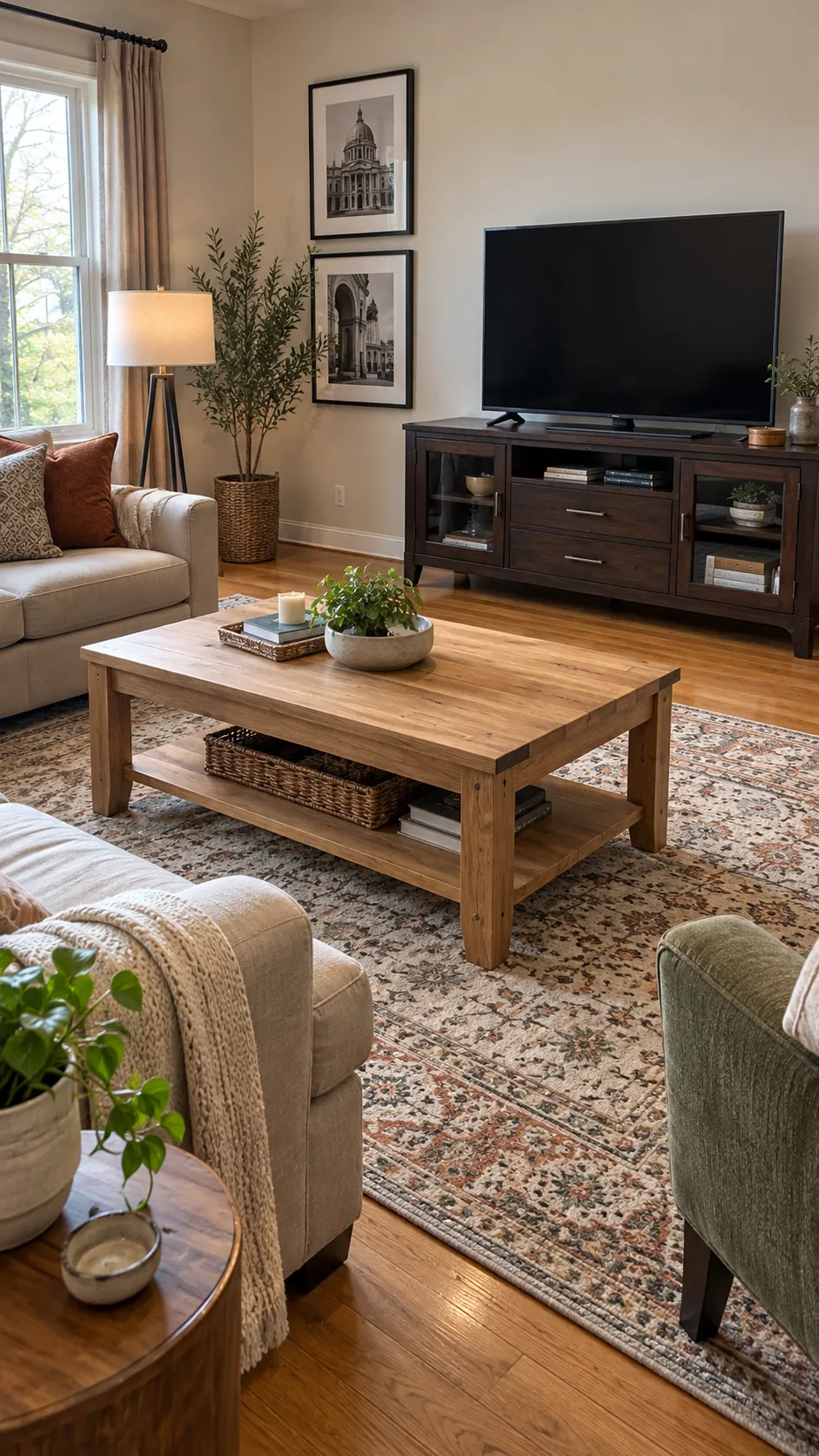
Match the Design Language, Not the Stain
Proportion and style can matter more than finish. A rustic block coffee table may fight a slim modern television stand even when their stain colors are close, while different woods can cooperate when both pieces use clean lines and similar leg shapes. Check height, visual weight, hardware, and edge profile before blaming color alone. Repeating matte black or aged brass details can strengthen the shared design language.
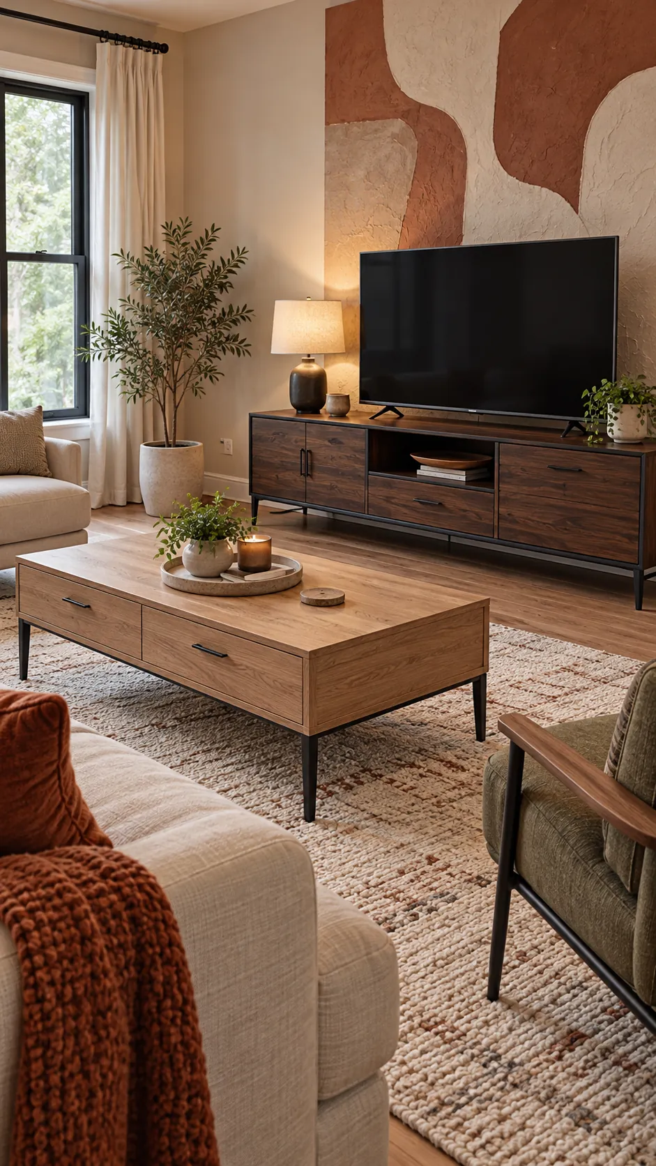
Edit the Strongest Conflict
If the room still feels off, change or soften the one feature that creates the largest break. A tray can cover a jarring tabletop, baskets can warm an industrial stand, and a runner can reduce the visible area of a very orange coffee table. Remove nearby wood accessories that introduce extra unrelated finishes. Replace a major piece only after these lower cost tests show that tone, scale, and style cannot be reconciled.