
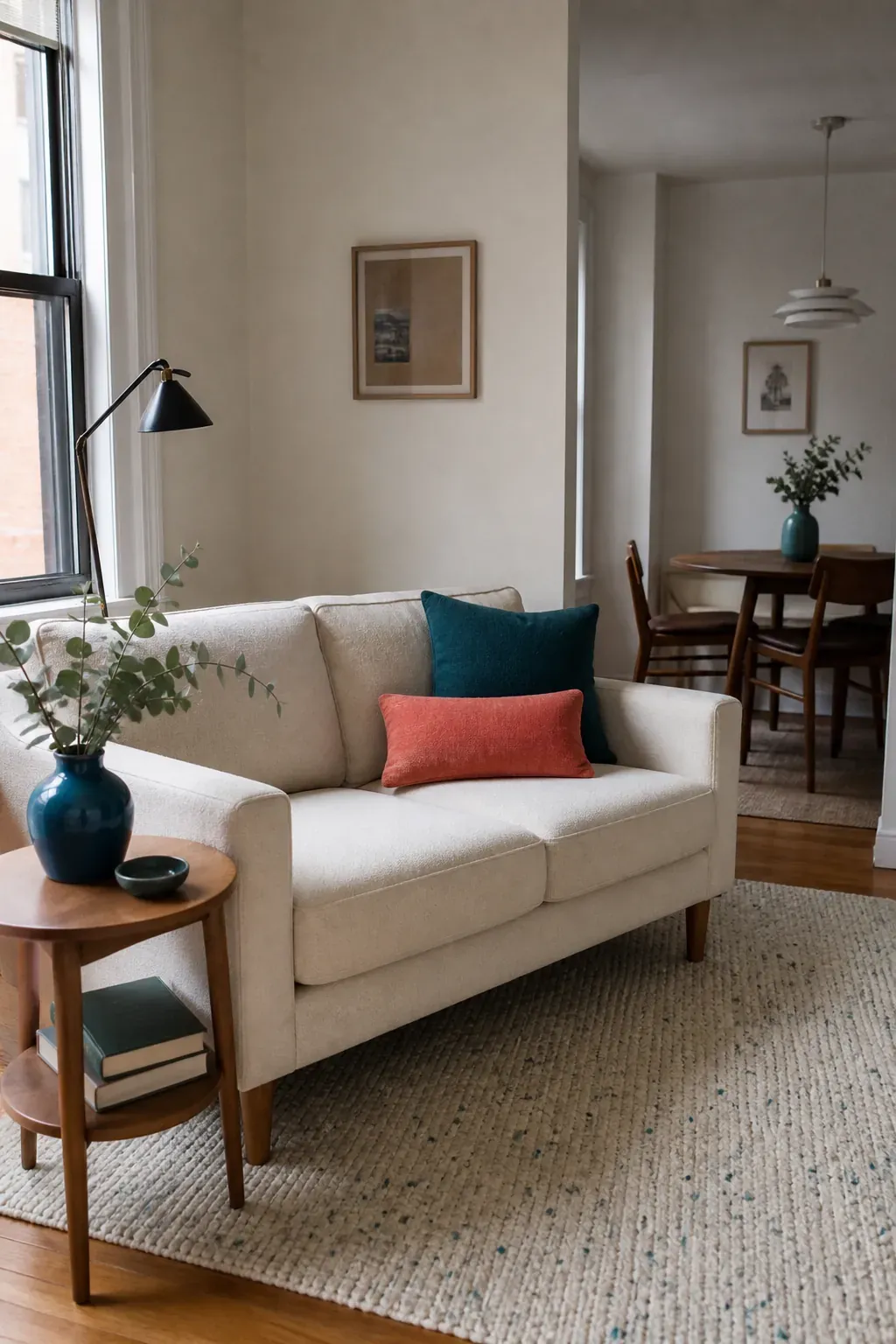
A small home does not need less personality. It needs clearer color decisions. When every bright object competes for attention, a compact room can feel restless; when one accent color appears in a few deliberate places, the eye travels through the space and the room feels connected.
The useful question is not “How much color am I allowed?” It is “Which color deserves to lead, where should it repeat, and what can stay quiet?” This guide gives you a practical way to answer those questions with paint, textiles, rugs, lighting, and small decor—without buying an entirely new room.
Start With the Color That Is Already Hardest to Change
Before choosing throw pillows or paint swatches, identify the room’s fixed color. In a rental, that might be beige carpet, gray flooring, warm-white walls, dark cabinets, or a sofa you plan to keep. Treat that surface as part of the palette rather than an inconvenience to disguise.
Next, look at its undertone. A gray floor may lean blue, green, or brown. A cream wall may look yellow beside a cool white curtain. Your accent color should either echo that undertone or create an intentional contrast with it. Muted blue works easily with cool gray; terracotta gives the same gray a warmer, livelier counterpoint. Olive, rust, and ochre tend to cooperate with warm woods, while plum or deep teal can sharpen them.
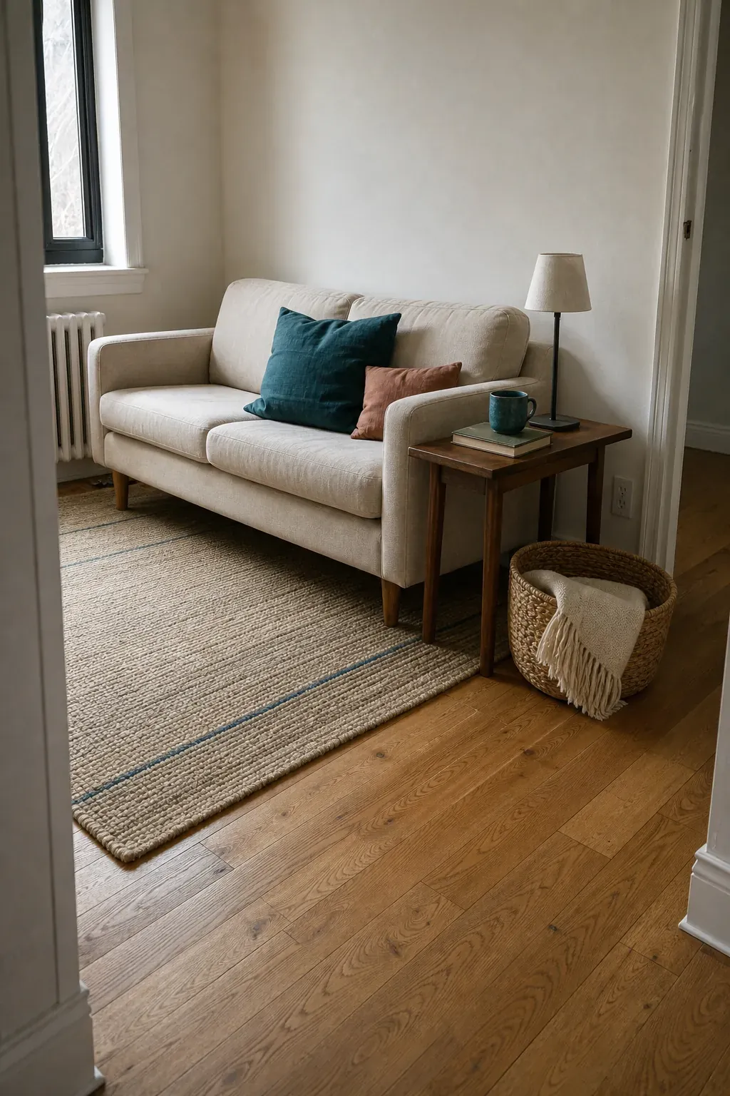
Take a phone photo in daylight and reduce the room to three labels: fixed neutral, supporting neutral, and possible accent. This simple edit prevents the common mistake of shopping for a color in isolation.
Choose One Lead Accent and One Supporting Note
A tiny room rarely benefits from five colors demanding equal attention. Choose one lead accent and, if the room needs more depth, one quieter supporting color. The lead might be cobalt, moss, paprika, or berry. The supporting note could be a softened neighbor such as dusty blue beside cobalt, or a restrained contrast such as blush beside moss.
A familiar 60-30-10 ratio can be a useful starting point, but do not turn it into arithmetic. In a small home, think in visual weight: the background should feel calm, the furniture should stabilize the room, and the accent should be noticeable without becoming continuous. A saturated lamp can carry more weight than three pale cushions.
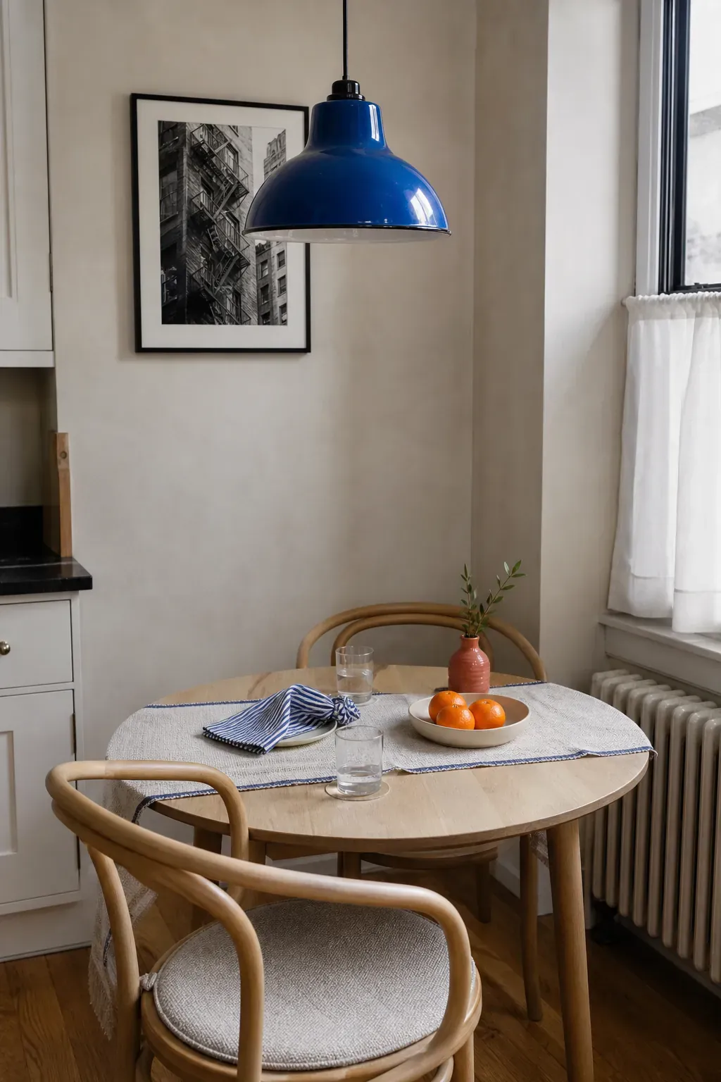
If your room already contains a patterned rug or curtain, let it make the decision. Pull the lead accent from its most appealing medium-strength color and the supporting note from a smaller detail. This produces a color palette that feels discovered rather than imposed.
Repeat the Accent Across Three Different Heights
One bright object can look accidental. Ten matching objects look themed. The sweet spot is often three or four appearances spread around the room. Place them at different heights so the color guides the eye: perhaps a rug detail near the floor, a throw pillow at seated height, and a lampshade or framed print higher up.
Do not make every repeat identical. A deep green velvet cushion, a softer green ceramic bowl, and a botanical print with a narrow green detail feel related without looking like a boxed set. Repeat the hue family, not necessarily the exact shade or material.
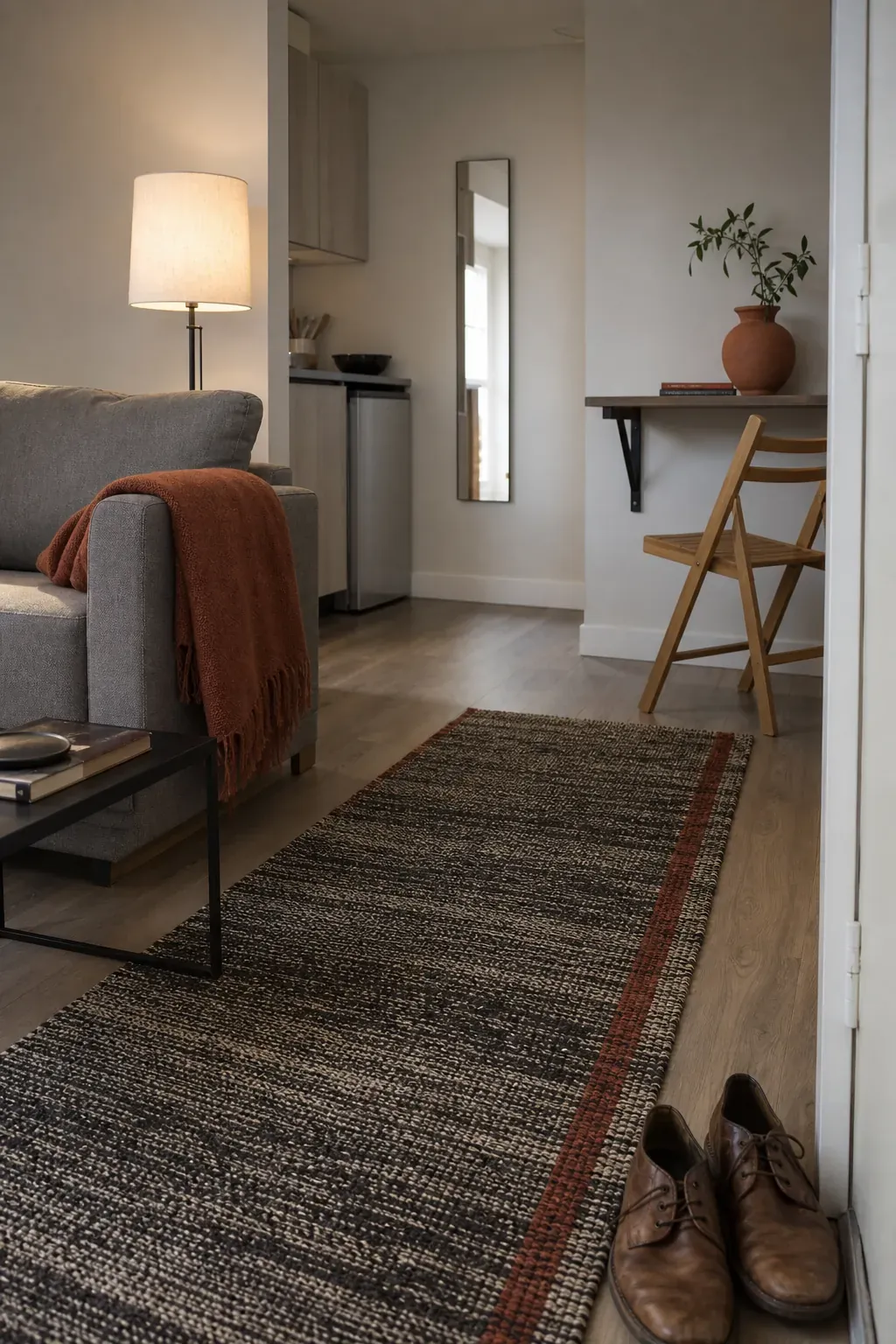
This principle also solves a frequent open-plan problem. If the living area and dining nook are visible together, carry one small version of the accent into the second zone. A blue sofa pillow can answer a blue vase on the dining table without forcing both spaces to use the same rug or furniture style.
Let Textiles Do the Flexible Work
For renters, cautious decorators, and anyone working with a limited budget, textiles are the most forgiving color tool. Pillow covers, throws, curtains, bedding, and small rugs can be tested, moved, and changed seasonally. They also introduce texture, which keeps a restrained palette from feeling flat.
Start with the largest textile that you genuinely need. If the room needs a rug, choose it before the throw pillows; a rug occupies more visual area and is harder to coordinate afterward. Pull one accent from the rug, then use pillows in different textures rather than buying a perfectly matched set. Linen, woven wool, washed cotton, and velvet reflect light differently, so the same color family gains depth.
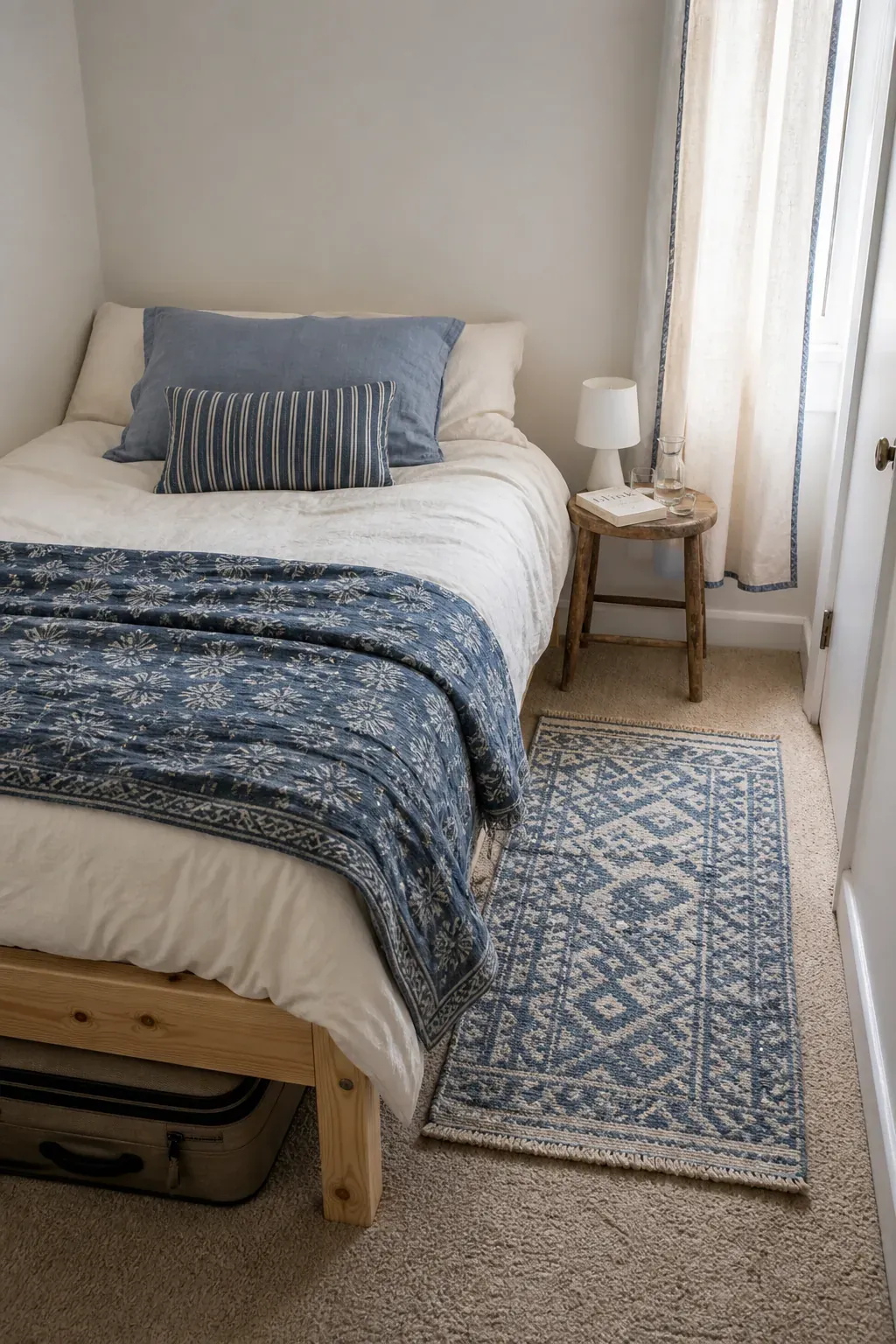
Keep at least one textile quiet. If the rug is strongly patterned, use mostly solid pillows. If the curtains carry the pattern, let the bedding provide broad areas of calm. Contrast needs empty space around it to register.
Use Paint Where It Clarifies the Architecture
An accent wall is not automatically the best use of interior paint. A random contrasting wall can chop up a small room, especially when it has no architectural reason to be emphasized. Paint works better when it explains a zone or highlights a feature: the back of a bookcase, a shallow entry recess, the wall behind a bed, or a compact desk corner.
For a subtle effect, choose an accent with a similar lightness to the surrounding wall. For a dramatic effect, use a deeper tone on a clearly bounded plane and support it with adequate lighting. Another option is color drenching—carrying one color across walls, trim, and sometimes the ceiling—which can reduce visual breaks and create a cocooning effect.
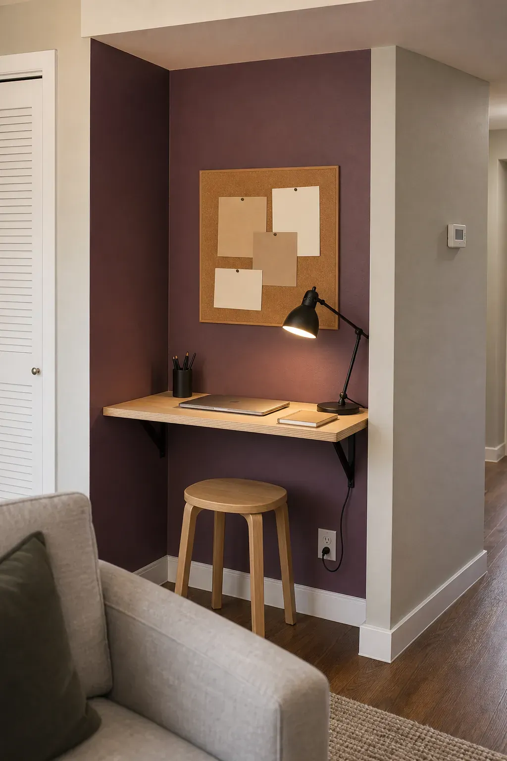
Always test a large sample on more than one wall. Check it in morning light, late afternoon, and under the lamps you actually use. A tiny paint chip viewed in a store cannot show how surrounding surfaces will change the color.
Balance Saturated Color With Breathing Room
Small-space decor feels crowded when every surface holds an object, regardless of color. Before deciding that an accent is too bold, remove a few competing items. Leave visible stretches of wall, floor, and tabletop around the most colorful piece. This breathing room turns it into a focal point.
Pay attention to shape as well as hue. Three red objects with similar size and round silhouettes will feel more repetitive than a slim red lamp, a folded rust throw, and a tiny burgundy book spine. Varying scale and form makes repeated color feel natural.
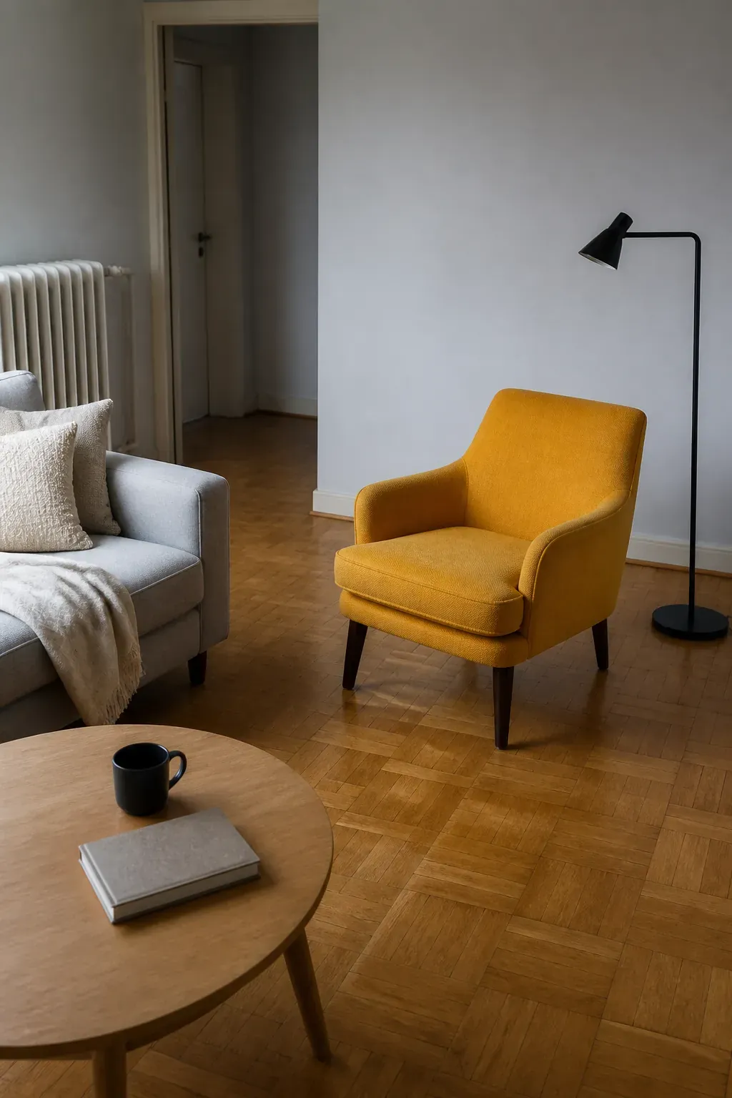
If the room still feels busy, take another phone photo and view it in grayscale. Objects that create too many strong light-dark jumps are often the source of visual noise. You can keep the accent color while replacing one high-contrast pattern with a quieter texture.
Check the Palette in Daylight and at Night
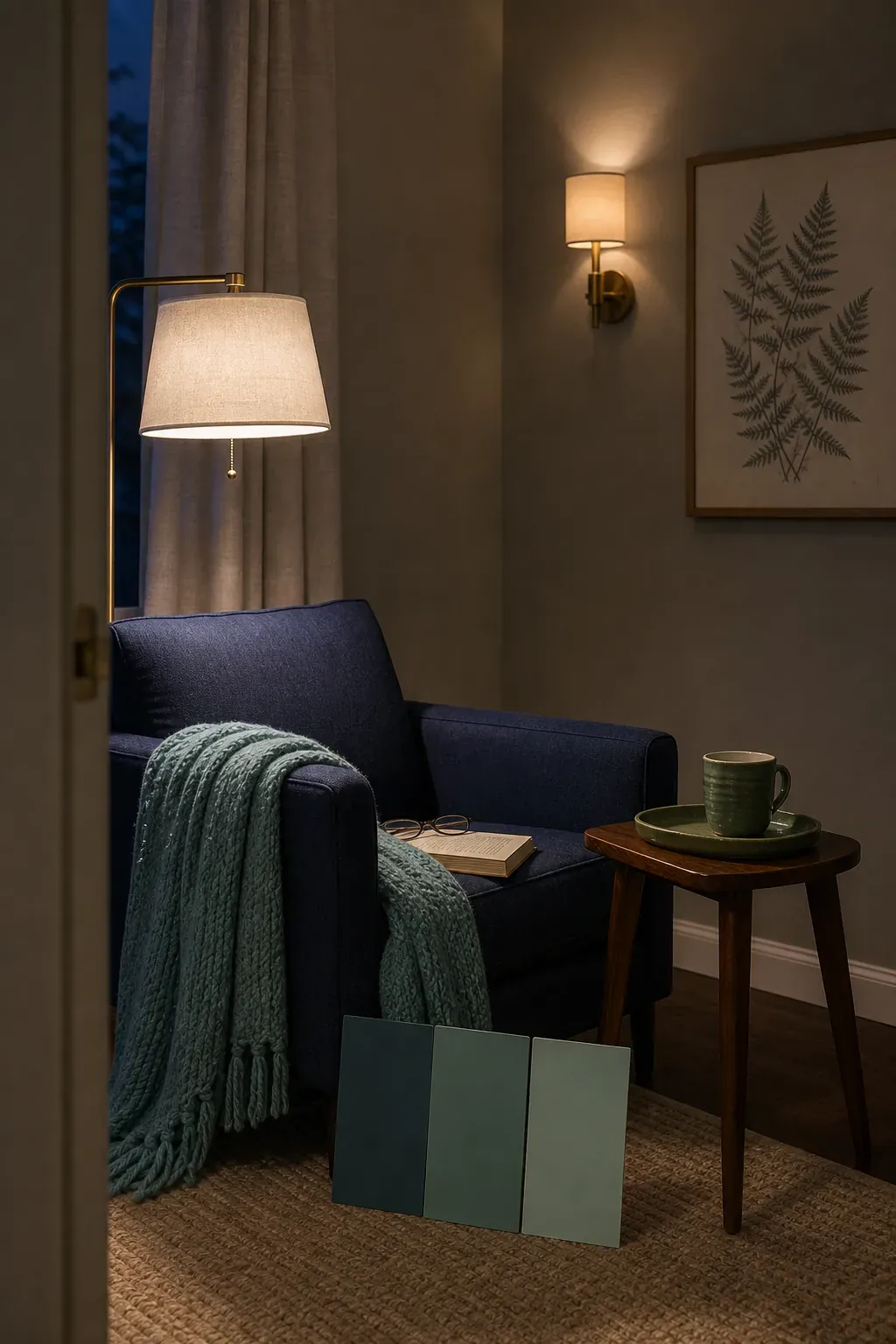
Color is never independent of light. Cool daylight may make blue and green accents look crisp, while a warm bulb can mute blue and intensify rust, coral, or ochre. Before committing, place your samples and movable decor in the room for at least one full day.
Turn on every lamp you normally use after sunset. If the accent turns muddy, first check the bulb rather than replacing the decor. A bulb with good color rendering can reveal fabric, paint, and wood tones more faithfully. Layering a floor lamp, bedside lamp, or wall sconce also prevents one harsh ceiling light from flattening the palette.
Finally, stand at the doorway and identify the first color your eye finds, the second place it lands, and where it rests. If the sequence feels balanced, stop adding. A successful accent palette is not the one with the most coordinated objects; it is the one that makes the room feel intentional while leaving enough quiet space to live in.