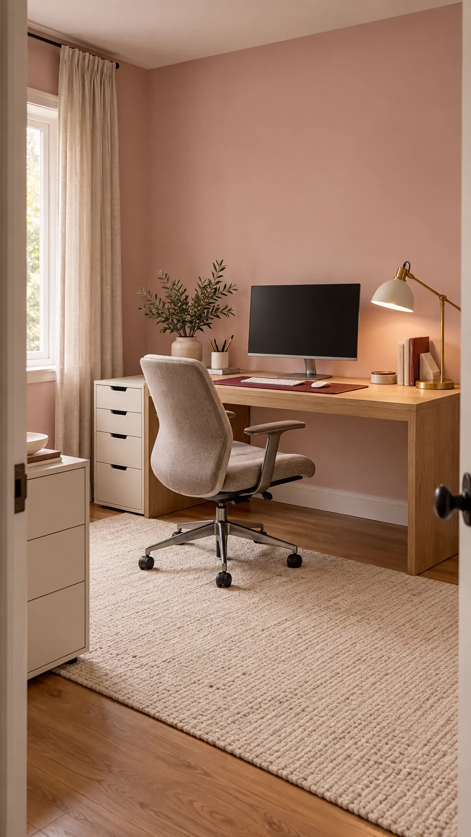
A pink office can feel calm and grown up, or it can turn harsh when every surface uses a different pink. The difference comes from color temperature, natural light, and the amount of neutral space around the accent color.
Build the room around comfortable work first. Then use one main pink, one supporting neutral, and a small contrasting accent to create character without sacrificing focus.
Test the pink in the actual room light
Paint or place a large movable sample beside the desk and observe it from morning through evening. A coral that looks soft in a shop can become vivid under warm bulbs, while a gray blush may turn dull in a dark room. Compare the sample beside the floor, desk, and curtain rather than against a blank white card.
If the room receives little daylight, use neutral lamps with good color rendering before judging the paint. Keep colored decorative light off during the decision. The goal is a pink that remains pleasant during real work hours, not only during one perfect photo.
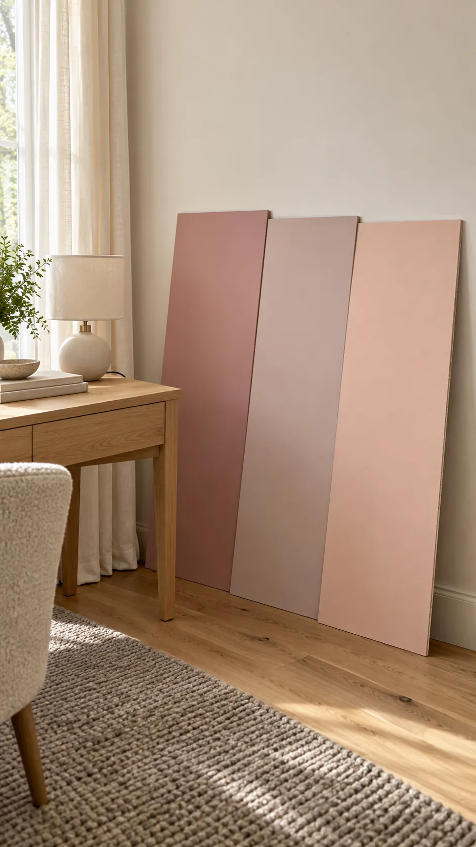
Choose one main pink family
Decide whether the room should lean toward dusty rose, muted mauve, warm blush, or a clearer shell pink. Repeat that family across only a few meaningful elements such as the wall, chair fabric, desk mat, or storage labels. Do not buy every object simply because it is pink.
Natural wood, cream, white, charcoal, or soft taupe can give the eye a place to rest. A small amount of olive, burgundy, or navy adds depth without making the room look themed. Keep metal finishes consistent so the palette feels intentional.
Select the chair for support before color
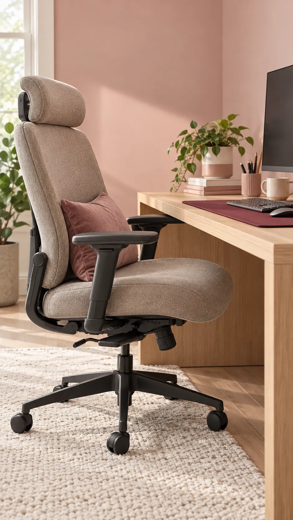
A narrow pink chair is not a good choice if it restricts the hips or cannot support the upper back. Test seat depth, width, arm height, recline, and lumbar support before considering upholstery. A comfortable neutral chair can join the palette through a blush cushion or nearby rug.
Set the desk and screen to the chosen chair instead of forcing the body to fit a decorative arrangement. Keep the feet supported and the shoulders relaxed. The office will look better when its main furniture works well enough to stay in place for years.
Use storage to calm the visual field
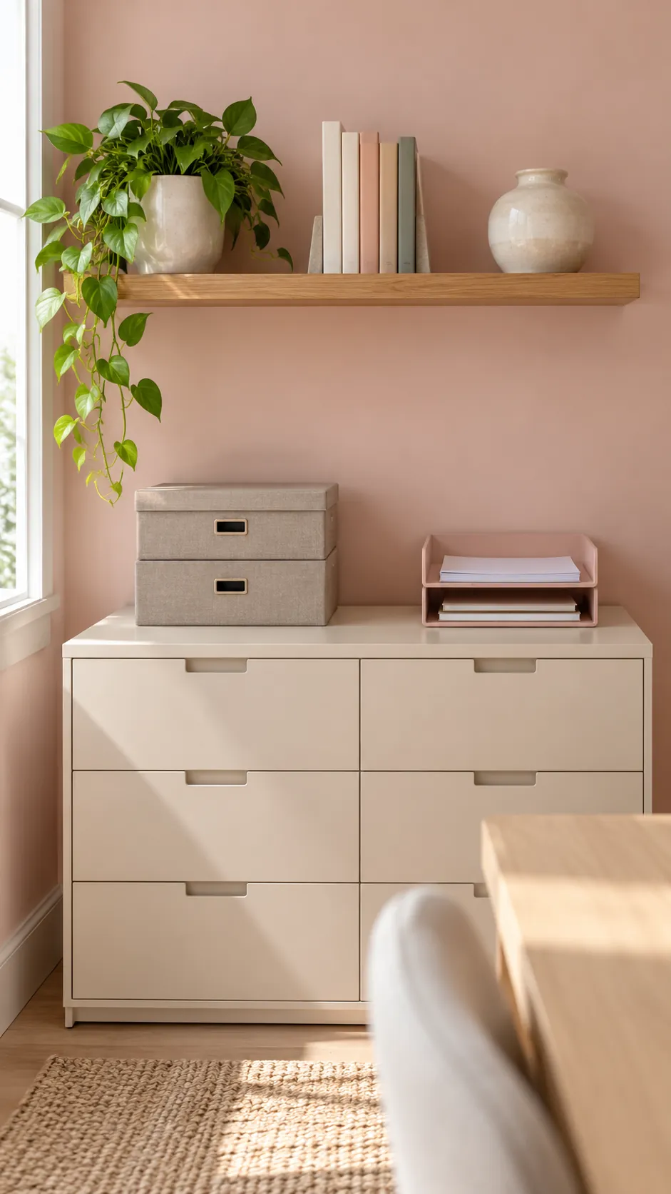
Closed drawers hide cables, paper, tools, and charging accessories that can make a small room feel busy. Open shelves work best for a limited group of books, one plant, and a few useful objects. Repeat container shapes instead of mixing many novelty organizers.
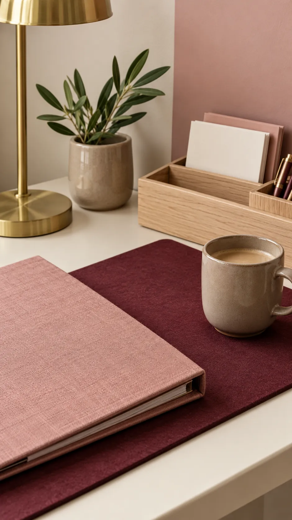
Keep the work surface mostly clear, with an inbox for active paper and one easy return place for pens and small devices. Matching storage does not need to be pink. Cream, pale wood, and taupe boxes can make the pink elements more visible without adding noise.
Layer task and ambient light
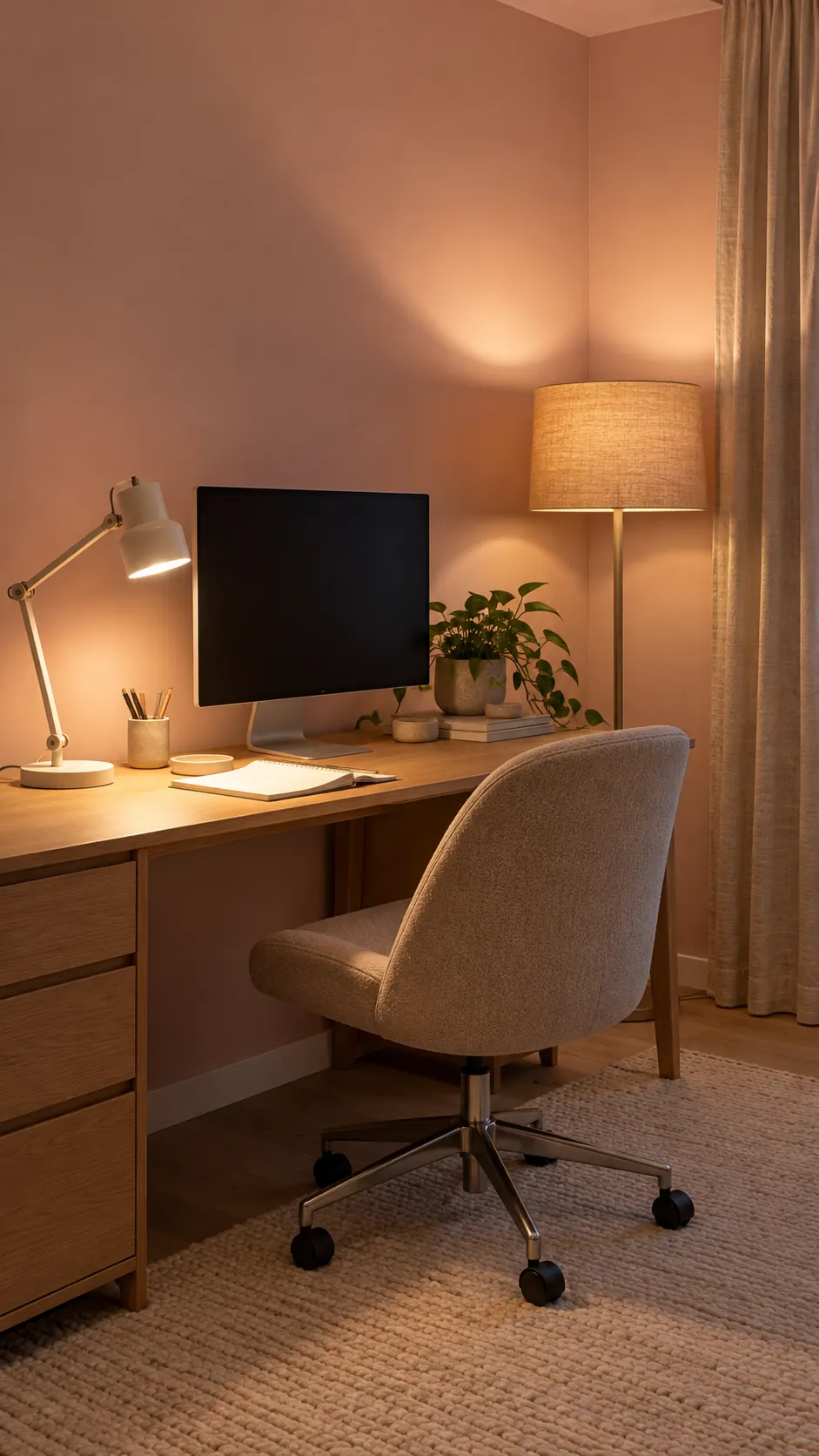
A focused desk lamp should light paper and controls without reflecting in the screen. Add a shaded floor lamp or soft wall wash so the room does not depend on one bright ceiling fixture. Neutral light preserves the real blush color and keeps video calls more natural.
Warm bulbs can make pink walls appear peach, while cool bulbs may push them toward lavender. Use dimmable sources with similar color temperature, then add decorative light only as a small accent. Check the room from the chair and camera position before finalizing placement.
Add personality in a controlled final pass
Choose one textile, one plant, and one small display group that support the palette. Vary texture through wool, linen, wood, ceramic, and matte metal rather than adding more shades of pink. Leave open wall and desk space so every chosen object has room to register.
Work in the room for a week before adding more. Remove anything that blocks a drawer, distracts the camera, or makes cleaning difficult. A successful pink home office feels personal because its color supports the work, not because every item matches.