

Small rooms rarely need a louder color. They need a color that handles light, softens edges, and lets the eye keep moving. That is why the best small home colors are not always pure white, and they are not always timid. A room can feel bigger with a warm off-white, a misty green, a muted blue-gray, or even one carefully placed dark wall if the palette is doing the right job.
The common mistake is choosing paint from a tiny chip and asking, “Will this make the room look bigger?” A better question is, “What does this color do to the light, the trim, the floor, and the rooms I can see from here?” In a small home, wall colors do not live alone. They borrow from the sofa, the cabinets, the hallway, the curtains, and the lamp light at night.
Use these color ideas as a decision guide, not a rulebook. The goal is not to erase every bit of personality. The goal is to create a color palette that makes the home feel open, intentional, and easy to live in.
Start With Light, Not Stark White
White gets recommended for every small room because it reflects light. That part is true. The problem is that bright white can also turn harsh in a room with weak natural light, gray flooring, or cool LED bulbs. Instead of making the room feel bigger, it can make every shadow look dirty and every corner feel sharper.
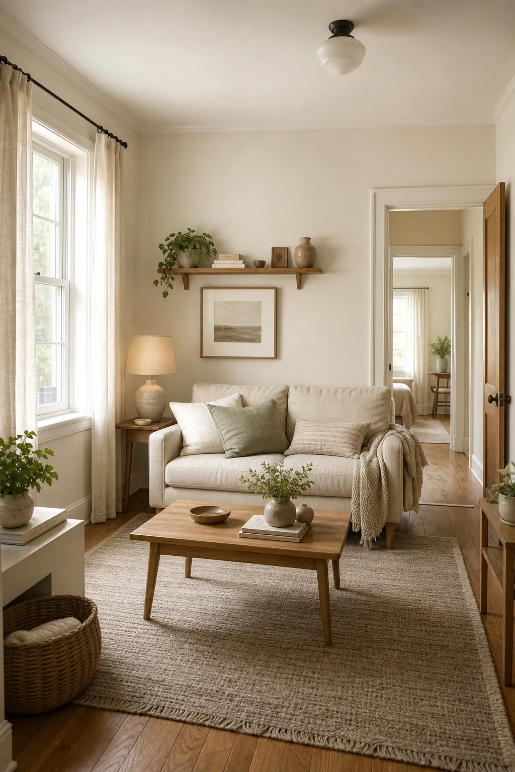
A warm off-white is usually more forgiving. Look for tones that sit between cream, ivory, and soft oatmeal rather than a blue-white gallery shade. These light colors still bounce daylight around the room, but they add enough warmth to keep the space from feeling flat. In a small living room, warm off-white walls with ivory trim and pale wood can make the walls recede without turning the room into a blank box.
The real test is the corner test. Paint a large sample near the darkest corner, not just beside the window. If the corner still looks clean in the afternoon and calm under lamps at night, the color is doing useful work.
Carry One Quiet Color Through Connected Rooms
Small homes often feel smaller when every visible room changes color. A beige living room, gray hall, green kitchen, and white entry may all be pretty on their own, but together they create visual stops. The eye keeps hitting new edges.
One of the simplest small space decor moves is to carry a single soft neutral through the rooms you see at the same time. That could be warm white, soft greige, pale mushroom, or a very light taupe. The exact shade matters less than the continuity. When the hall and living room share a wall color, the home reads as one longer space instead of several chopped-up boxes.
This does not mean every room has to be identical. You can shift the mood with rugs, art, plants, lamp shades, and textiles. Keep the largest wall planes quiet, then let smaller pieces carry the color story.

Choose Undertones From Fixed Finishes
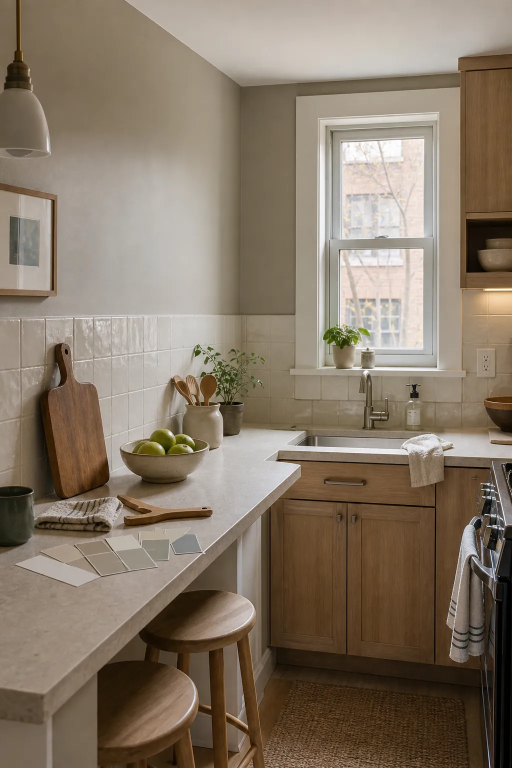
A neutral color is only neutral if it cooperates with what you already own. In small homes, fixed finishes have a bigger voice because there is less space between them. Flooring, countertops, tile, cabinets, and trim can make a paint color look warmer, cooler, cleaner, or muddier than it looked on the card.
If your floors are golden wood, a cold gray wall may turn the room tense. If your counters are creamy, a blue-white wall may make them look yellow. If your sofa is beige, a pink undertone in the paint can suddenly feel too rosy. Before choosing interior paint, place samples next to the fixed materials and look for harmony rather than contrast.
Soft greige is popular in small homes because it can bridge warm and cool finishes. The trick is avoiding the lifeless gray box effect. Pick a greige with enough warmth to flatter wood, textiles, and evening light. Pair it with clean trim and textured materials so the room feels layered instead of muddy.
Use Pale Color When White Feels Too Plain
Some rooms need color to feel alive. A tiny entry, a reading corner, or a small bedroom can look unfinished when every wall is white. The answer is usually not a saturated wall color. It is a pale tint that behaves like a neutral.
Light sage, misty blue, pale clay, dusty blush, and soft buttercream can all work as wall colors for a small room. The key is choosing a version with gray, cream, or brown in it, not a candy-bright version. These softened colors add personality while keeping the wall visually light.
Light sage is especially useful because it reads fresh without being loud. It works with oak, rattan, linen, black metal, warm white trim, and plenty of plant colors. In a small entryway, it can make a tight pass-through feel designed rather than forgotten.

Balance Cool Colors With Warm Texture
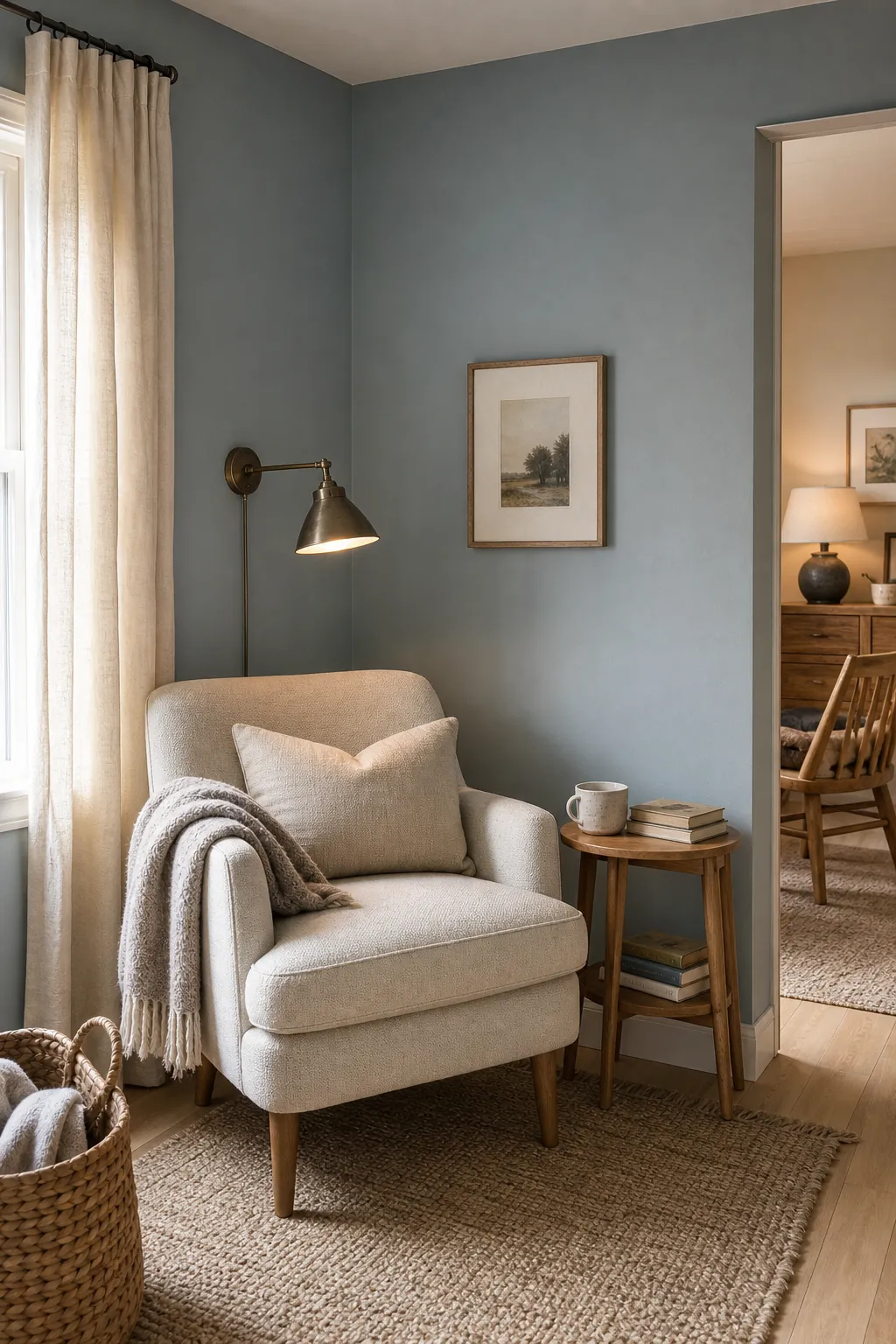
Cool colors can make a room feel calmer and more open, but they can also go cold fast. This is why some small bedrooms and apartments look airy in photos but uncomfortable in real life. The paint may be fine; the room just needs warmth around it.
If you choose a muted blue-gray, pale blue, or soft green, balance it with warm wood, cream textiles, woven rugs, brass, warm bulbs, and natural fibers. The wall can stay quiet while the room gains comfort. This is a better small-home strategy than pushing the paint warmer and warmer until it turns beige against everything.
Think of cool paint as the air in the room and warm texture as the furniture’s handshake. One opens the space. The other makes it feel like home.
Use Dark Color as Depth, Not Decoration
Dark colors do not automatically make a small room smaller. They make a room smaller when they are used randomly, with poor lighting, glossy sheen, or heavy furniture. Used carefully, a dark matte color can make one wall recede and give the room more depth.
The safest place for a deeper shade is a wall that already has a natural stopping point: behind a dining nook, behind a headboard, at the end of a hall, or inside a small powder room. Charcoal green, deep olive, muted navy, and soft black-brown can work when the adjacent walls stay light and the furniture does not block the floor.
Keep the finish matte or eggshell. High shine reflects every flaw and can make the wall feel busy. A flat, deep color absorbs visual noise and lets lighter trim, wood, and lamps stand out. This is not the first move for every small room, but it is a useful option when all-light walls feel shapeless.

Test the Palette in Real Light
The smallest rooms are the least forgiving. A color that looks perfect at noon can turn green at night, dull on a rainy day, or too yellow beside a lamp. Do not judge small room ideas from a phone screen or a two-inch paint chip.
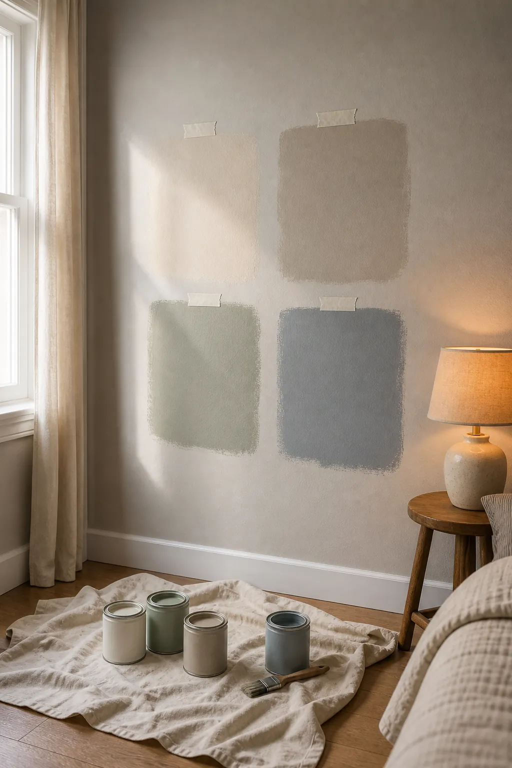
Paint large samples on at least two walls. Check them in morning light, afternoon light, and after sunset with the lamps you actually use. Put the sample beside trim, flooring, cabinets, curtains, and the biggest piece of furniture. If the color still looks calm in every condition, it is much more likely to make the room feel bigger after the whole wall is painted.
Also test the ceiling and trim relationship. A small room often feels taller when the trim is clean and the ceiling is not fighting the wall color. Warm white trim with a soft neutral wall is a reliable combination. In very low-contrast spaces, painting the trim only a touch lighter than the walls can blur boundaries in a good way.
A Small-Home Palette That Usually Works
If you want a simple starting point, build the home around four layers: a warm light wall color, a clean trim color, one softened accent color, and one deeper grounding shade. For example, warm off-white walls, ivory trim, pale sage or muted blue-gray accents, and a charcoal green or deep taupe detail.
That kind of palette gives a small home enough variety without chopping it into pieces. It works with natural wood, woven textures, cream fabrics, black metal, brass, and most renter-friendly decor. More importantly, it gives every color a job. The light wall color expands, the trim clarifies, the soft accent adds life, and the dark shade creates depth where the room needs it.
The best small home design colors are not magic. They are disciplined. They respect the light, repeat from room to room, and leave enough quiet space for the home to breathe.