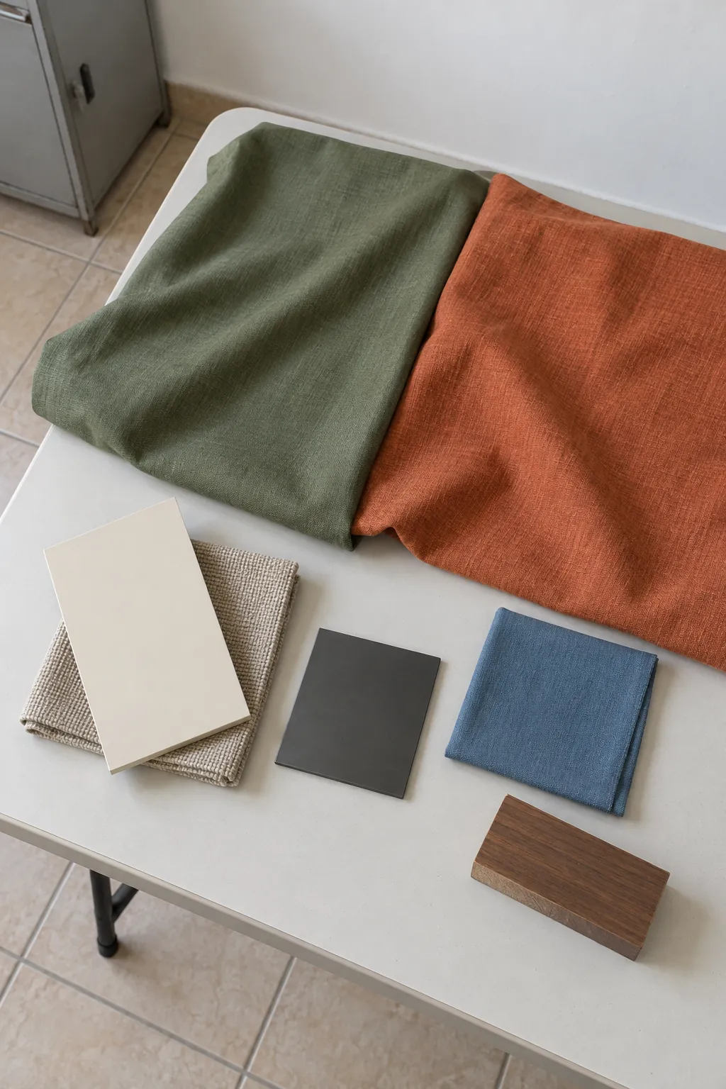
Cream is the most useful starting point when two strong colors already compete for attention. Oatmeal and beige keep an earthy scheme soft, wood brown adds depth, charcoal defines edges, and muted blue brings a cooler contrast. Choose the supporting color beside the finishes that will stay in your room.
Cream gives the pair a quiet background
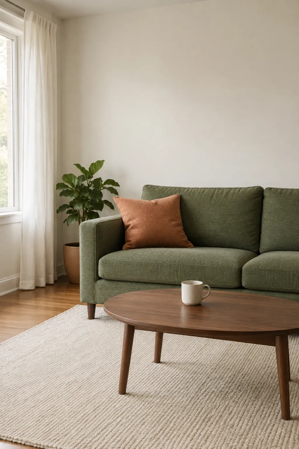
Cream is a useful first choice when you want the two stronger colors to stay visible without filling every surface. It can work on walls, curtains, a rug, or large bedding areas. Choose a cream that sits comfortably beside your floor rather than assuming the warmest sample will always look best.
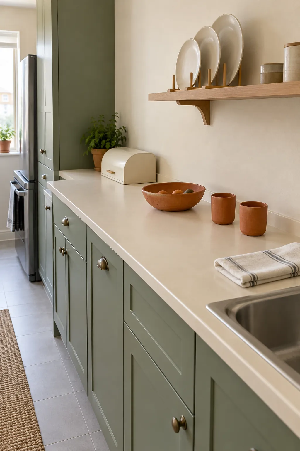
In a green and orange living room, pale walls and a cream rug can give a green sofa with terracotta pillows a clear outline. In a kitchen, cream walls or counters can separate green cabinets from a few clay colored ceramics. The neutral has a job: it creates space between the stronger colors.
Compare cream with a cleaner soft white in the actual light. If the cream becomes too yellow beside olive or warm timber, move toward a less yellow neutral. Keep your existing trim sample beside the new wall sample so the two whites do not clash unexpectedly.
Oatmeal and beige soften earthy versions
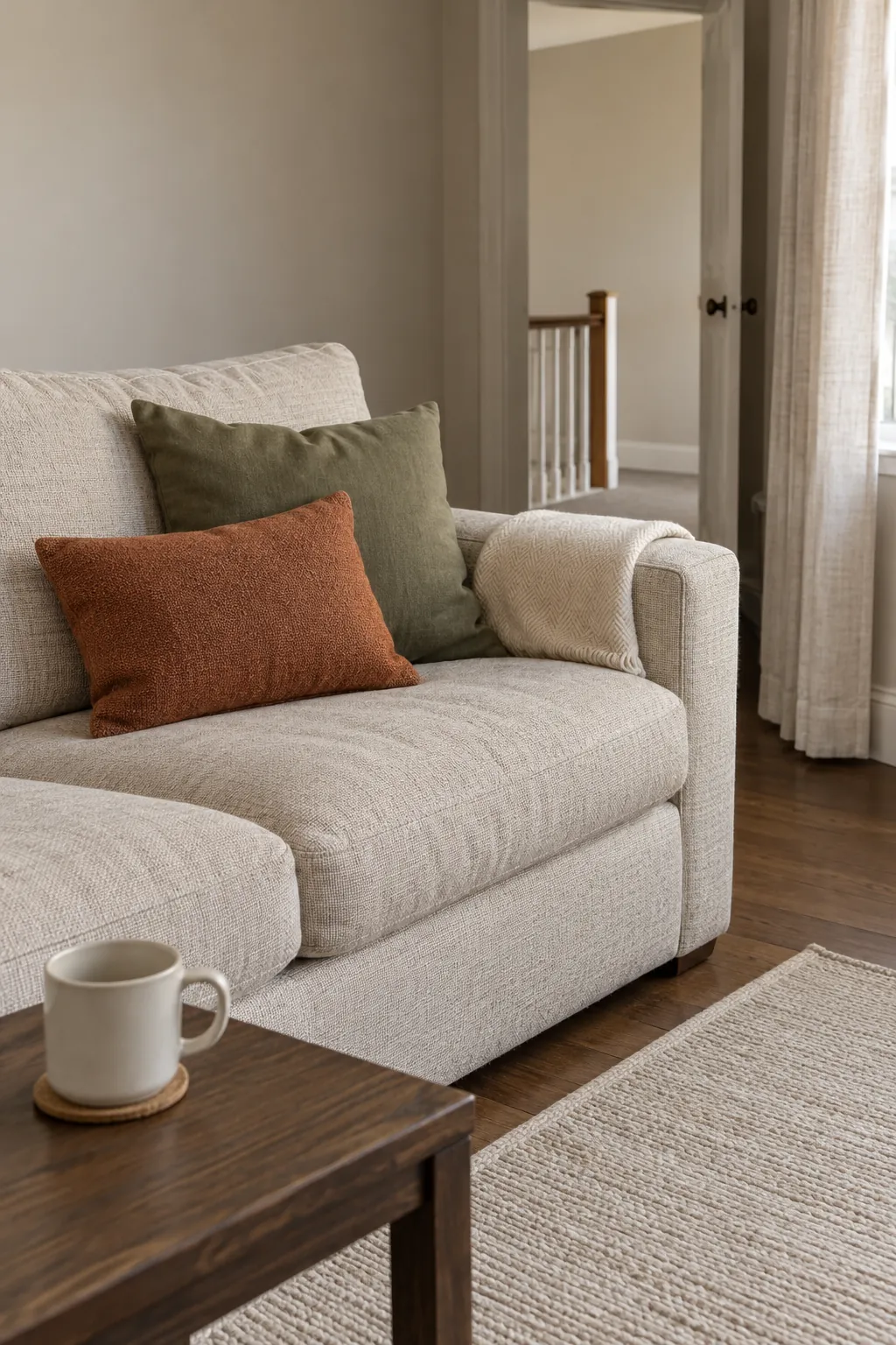
Olive green and terracotta decor often sits well with oatmeal, flax, and sandy beige. These colors continue the muted character of the pair without adding another strong hue. They are especially useful on a large sofa or curtain where you want texture to be more noticeable than color.
Choose beige carefully if the room already contains pink toned stone or very yellow wood. A sample that looks neutral on its own can reveal a pink, green, or yellow cast beside those materials. Put the proposed beige between the green and orange samples and check whether it calms the group or makes one color look muddy.
For a sage green and rust palette, try an oatmeal woven fabric rather than a shiny tan surface. The matte texture can make the transition gentler, while a lighter cushion or sheet keeps the arrangement from becoming uniformly brown. Keep rust as a defined accent if the room already has a warm floor.
Wood brown adds depth without a new bright hue
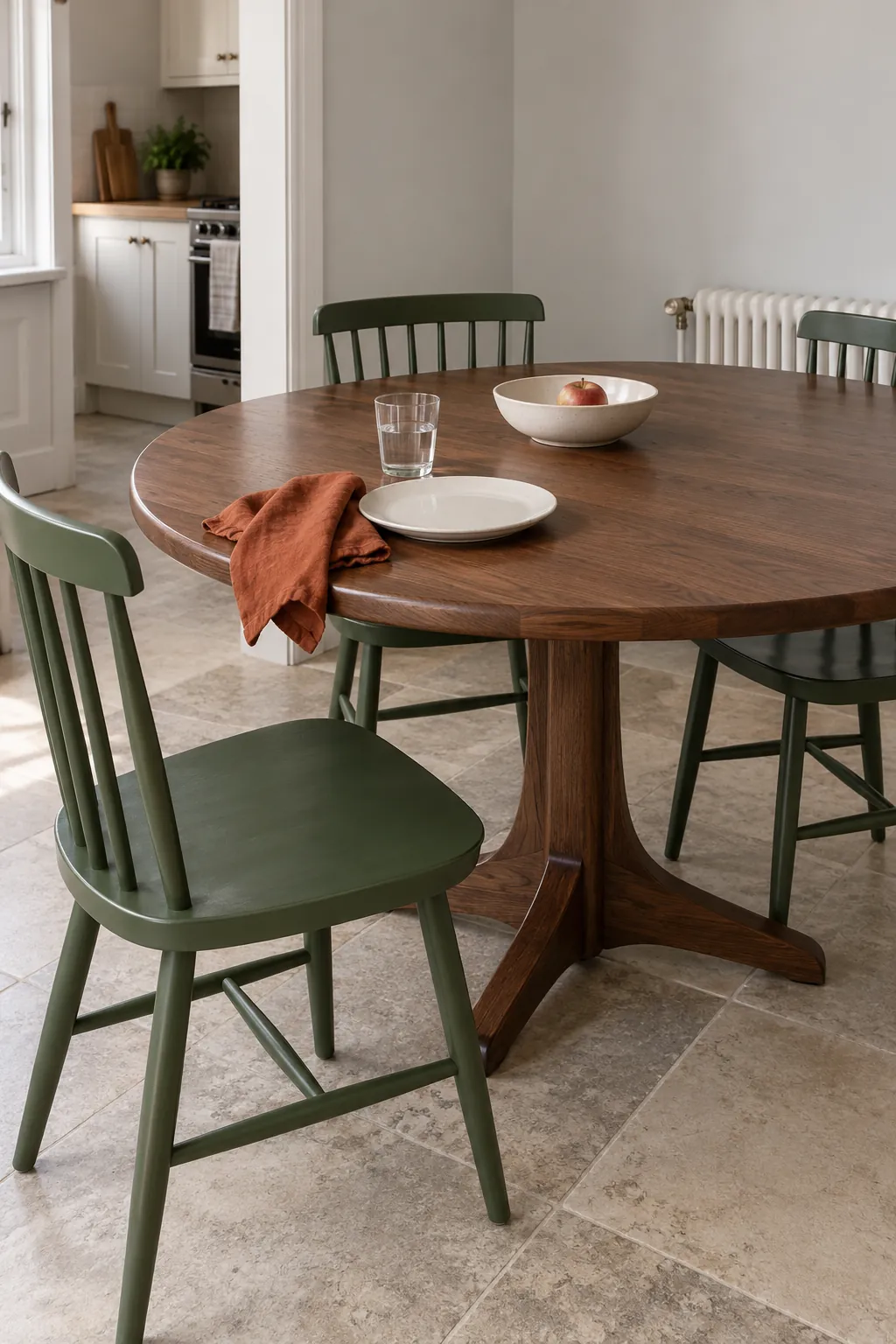
Brown can enter through real timber rather than another painted surface. A walnut table or dark oak cabinet gives emerald green with burnt orange a grounded edge. Because wood has grain and natural variation, it can connect several tones without looking like a third flat color block.
Check which wood tones are already visible before adding another. A reddish timber may echo the orange, while a very yellow finish can push an earthy scheme warmer than you intended. Bring a sample or a small existing object to compare with the proposed furniture finish.
Deep brown also makes the room darker where it covers a large area. Keep a lighter wall, tabletop setting, or floor textile nearby so the furniture silhouette stays clear. You can retain a useful wooden piece and adjust smaller textiles before replacing the furniture.
Charcoal sharpens the edges in small amounts
Charcoal and soft black create definition when an earthy green orange interior feels too blended. A slim curtain rod, lamp base, furniture leg, or tray can make the softer colors look more deliberate. Start with narrow details rather than painting a large wall dark.
Green walls with orange accents can carry black hardware if the other surfaces provide enough light contrast. Choose a quiet matte or satin finish so the hardware does not add bright reflections at every edge. Repeat a small dark detail elsewhere only when it has a useful function.
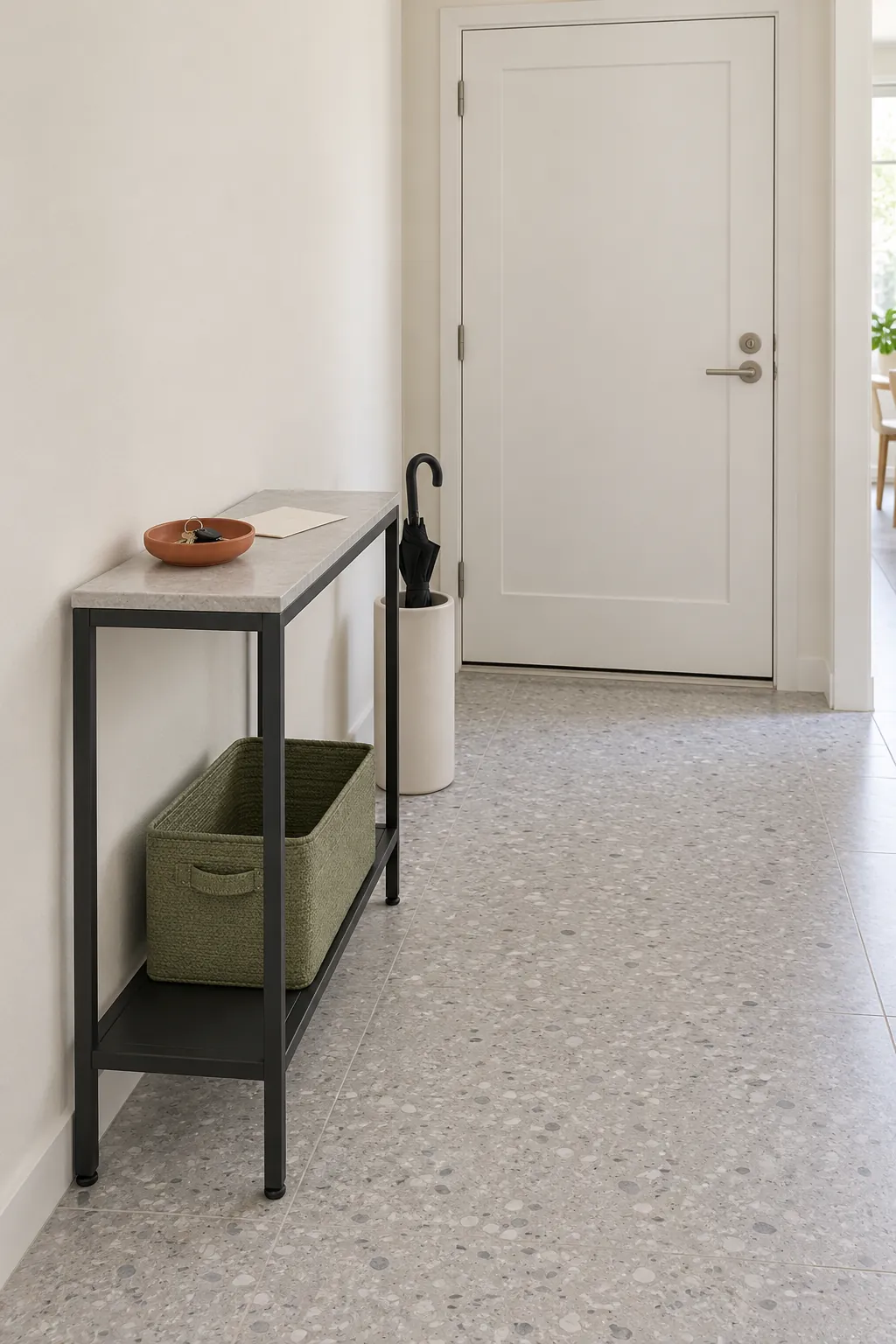
If a dark frame or cabinet disappears against a deep green wall, lighten the neighboring surface instead of adding more black. In a narrow entry, a pale wall behind a charcoal console makes the outline easier to read. The goal is a clear boundary, not a room full of dark lines.
Muted blue adds a cooler counterpoint
A dusty blue or restrained navy can add a cooler note when green and orange already feel very warm. Try blue first in one removable textile or ceramic piece. Pale blue can keep the room lighter, while navy creates a deeper contrast and needs more surrounding light.
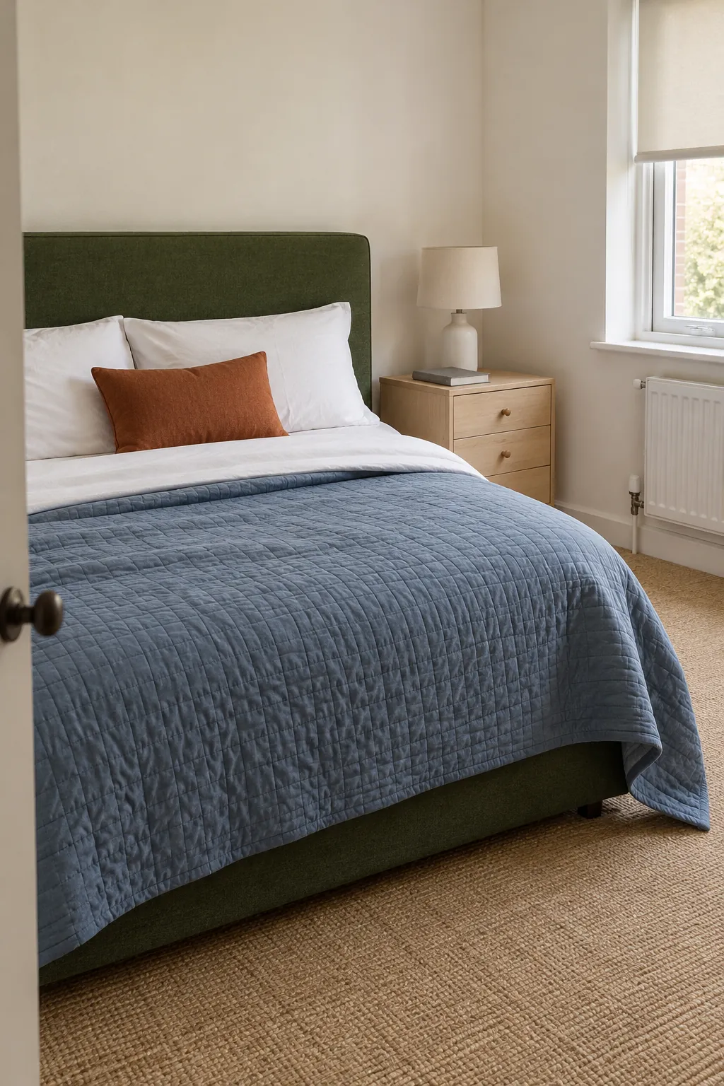
For green and orange bedroom ideas, a muted blue quilt can sit between a green headboard and a small rust cushion. Keep the sheets light and other patterns simple so you can judge the relationship clearly. If the blue becomes the strongest color, reduce its area or choose a grayer version.
This approach is more colorful than using cream or beige, so test it before making a large purchase. Green and orange are not a simple complementary pair on a traditional artist color wheel; their success does not require a fixed color theory label. Actual shade, intensity, surface area, and light matter more than the name of the scheme.
Choose the third color beside your permanent finishes
Start with the surface you cannot easily change, such as a tile floor or a large sofa. Put the green and orange samples beside it, then introduce one possible supporting color at a time. Cream is the practical first trial when you want quiet space; beige continues an earthy mood, brown adds material depth, charcoal defines edges, and muted blue adds contrast.
Look at each trial in daylight and under your normal evening lamps. A small sample cannot predict every effect of an entire painted wall, so use a larger movable board before committing to paint. Photograph the grouping to compare placement, but judge the final color with your own samples because the camera may shift it.
Choose the option that makes the existing finishes and the two main colors easier to live with. Buy one reversible piece before ordering the room around it. If a supporting color needs several other purchases to make sense, keep testing a simpler option.