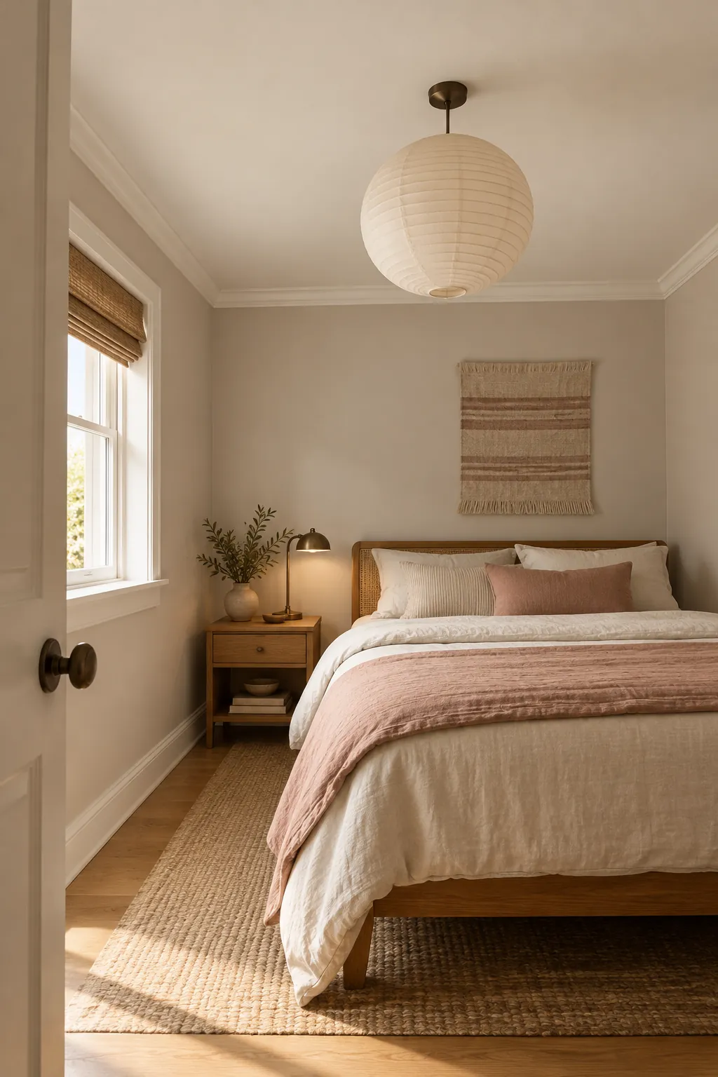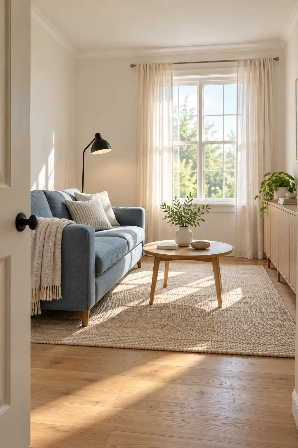
Paint can change how a room reads, but no color adds real square footage. The best choice reduces hard visual boundaries, works with the available light, and keeps the walls from competing with the furniture. That is why the same white can feel open in one room and dull in another.
For most small rooms, a light neutral or a quiet cool color is the safest starting point. Warm white, pale blue, soft blue green, and light mushroom can reflect useful light while giving the eye a continuous background. The final result depends on undertone, finish, ceiling color, trim contrast, and the colors already in the room.
Start With a Warm White That Matches the Light
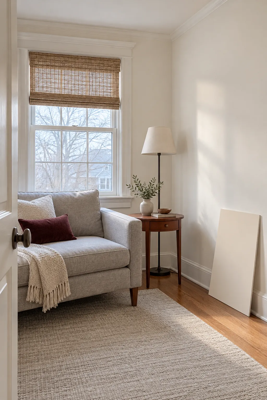
A warm white wall color can make a small room feel brighter without creating a cold blue cast. In a north facing room, choose a white with a gentle cream or red undertone rather than a stark gray white. In a sunny room, a more neutral white can balance the stronger natural warmth.
Test large painted samples on more than one wall and observe them in morning, afternoon, and lamplight. Small chips hide undertone shifts. Keep the sample beside the flooring, sofa, bedding, or cabinets, since those fixed colors will change how the paint appears.
Use Soft Blue to Make the Walls Recede
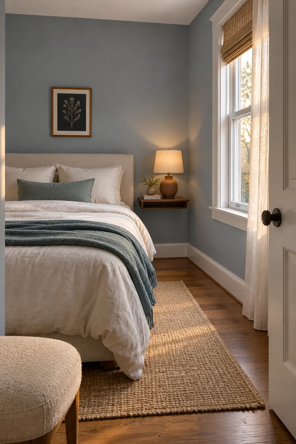
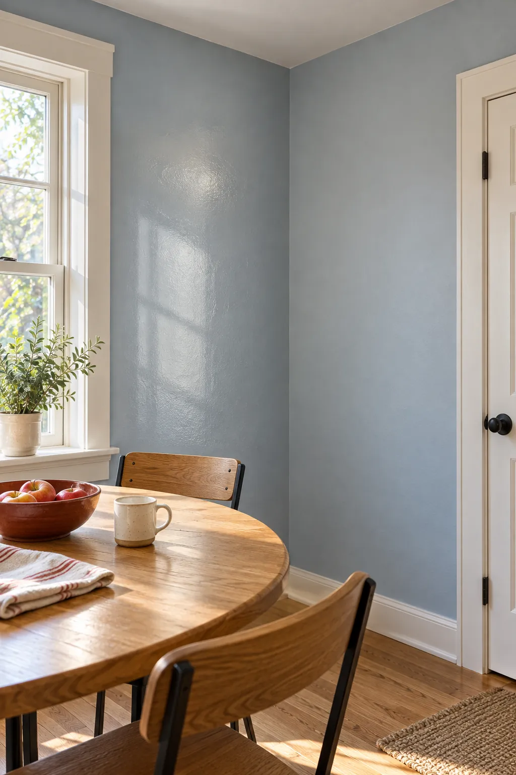
Soft blue can make a small room look more expansive because cool colors often appear to recede. Choose a gray blue or blue green with enough color to feel intentional. A nearly white blue can turn icy under cool bulbs, while a highly saturated blue can define every boundary more strongly.
Repeat the wall color softly in a cushion, rug, or curtain so the palette feels connected. Then add a small amount of warm wood or clay to prevent the room from feeling clinical. This controlled balance gives depth without dividing the room into many competing color zones.
Try a Monochromatic Room Palette
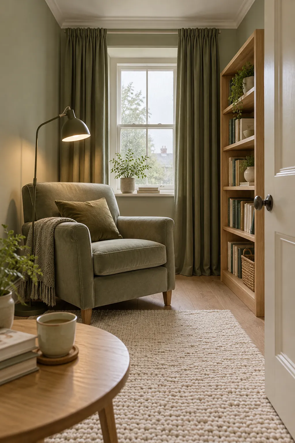
A monochromatic room palette uses several values of one color family. Similar wall, curtain, and upholstery colors reduce abrupt stops, so the eye moves around the room with less interruption. The room still needs contrast, but the contrast can come from texture and a few darker anchors.
Choose one light main color, one medium variation, and one deeper accent. Keep large pieces close to the wall tone when possible. Use the darkest value on a lamp, frame, table, or small textile rather than spreading it evenly across every surface.
Continue the Wall Color Across Trim and Doors
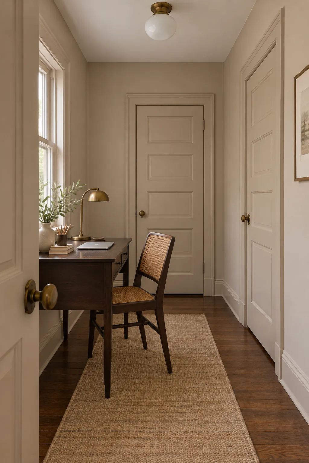
Strong trim contrast outlines every edge of a compact room. Painting baseboards, doors, and window trim in the wall color can soften those boundaries and create a more continuous envelope. Use the same color in a slightly different sheen if you need a tougher surface on woodwork.
This approach is especially useful when a room has many doors or chopped wall sections. It is not mandatory in a historic room where detailed trim is an important feature. In that case, keep the trim color related to the wall undertone so the contrast feels deliberate rather than accidental.
Choose a Reflective Paint Finish Carefully
A reflective paint finish can move more light around a room, but a glossy wall also reveals dents, patches, and uneven plaster. Eggshell or soft satin is often a practical middle ground. It offers a mild lift in reflected light without turning every wall flaw into a highlight.
Use higher sheen selectively on trim, doors, or a well prepared ceiling if the surface and style support it. Matte paint can still work in a small room when it has good light and a rich, even color. Sheen should support the architecture, not become the main visual event.
Treat the Ceiling as Part of the Color Scheme
A bright ceiling can lift a dim room, especially when the ceiling receives reflected window light. Choose a white that shares the wall undertone instead of using an unrelated brilliant white. The connection keeps the upper edge from looking like a sharp stripe.
Painting the ceiling the same light color as the walls can also blur the boundary and create a calm envelope. A darker ceiling can feel intimate and beautiful, but it emphasizes shape and height. Test the intended effect in the actual light, then support it with clear floor space, controlled contrast, and enough layered lighting.