
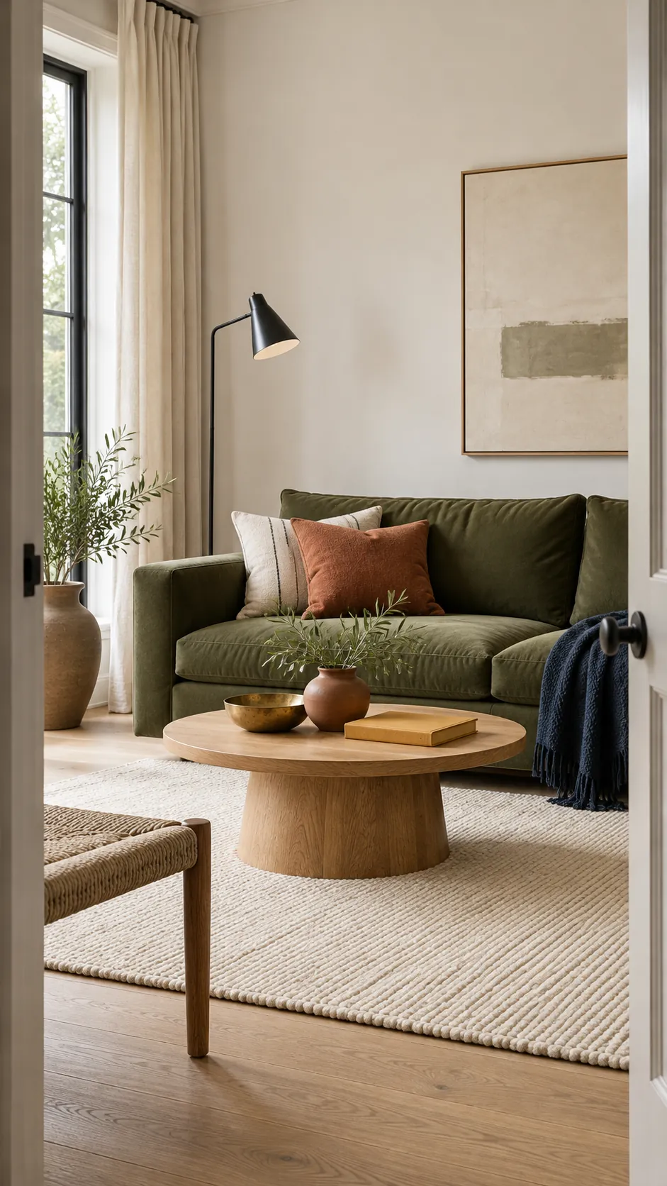
Green looks good with warm white, natural wood, dusty pink, terracotta, navy, and aged brass. The best choice depends on the undertone and depth of your green. Yellow based greens usually prefer warm companions. Blue based greens feel more settled beside cool white, navy, and charcoal.
You do not need to use every colour at once. Start with one broad neutral, one natural material, and one smaller accent. This gives green enough support without making the room feel busy or heavy.
Warm White Makes Green Feel Clear and Calm
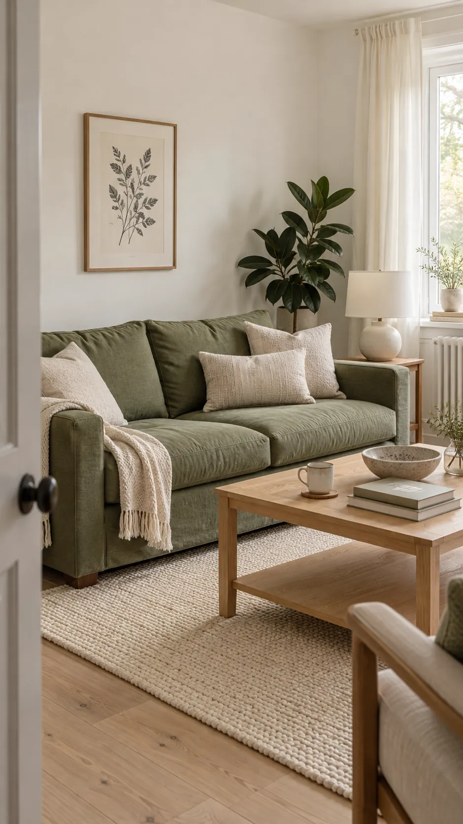
Warm white is the most forgiving partner for sage, olive, and medium forest green. It gives the eye a quiet place to rest and keeps green from taking over every surface. Choose ivory, cream, or soft chalk white rather than a sharp blue white when the green has a yellow or earthy undertone.
Use white on the largest surfaces first. Walls, curtains, rugs, and upholstery can form the light background. Then repeat green on one substantial item, such as a sofa, cabinet, or painted wall. A small amount of oatmeal or beige can soften the boundary between the two colours.
Test the white beside the actual green in morning and evening light. Some whites reveal an unwanted green cast after dark. A large sample is more reliable than a small paint chip because it shows how the undertones behave across the day.
Natural Wood Grounds Almost Every Shade of Green
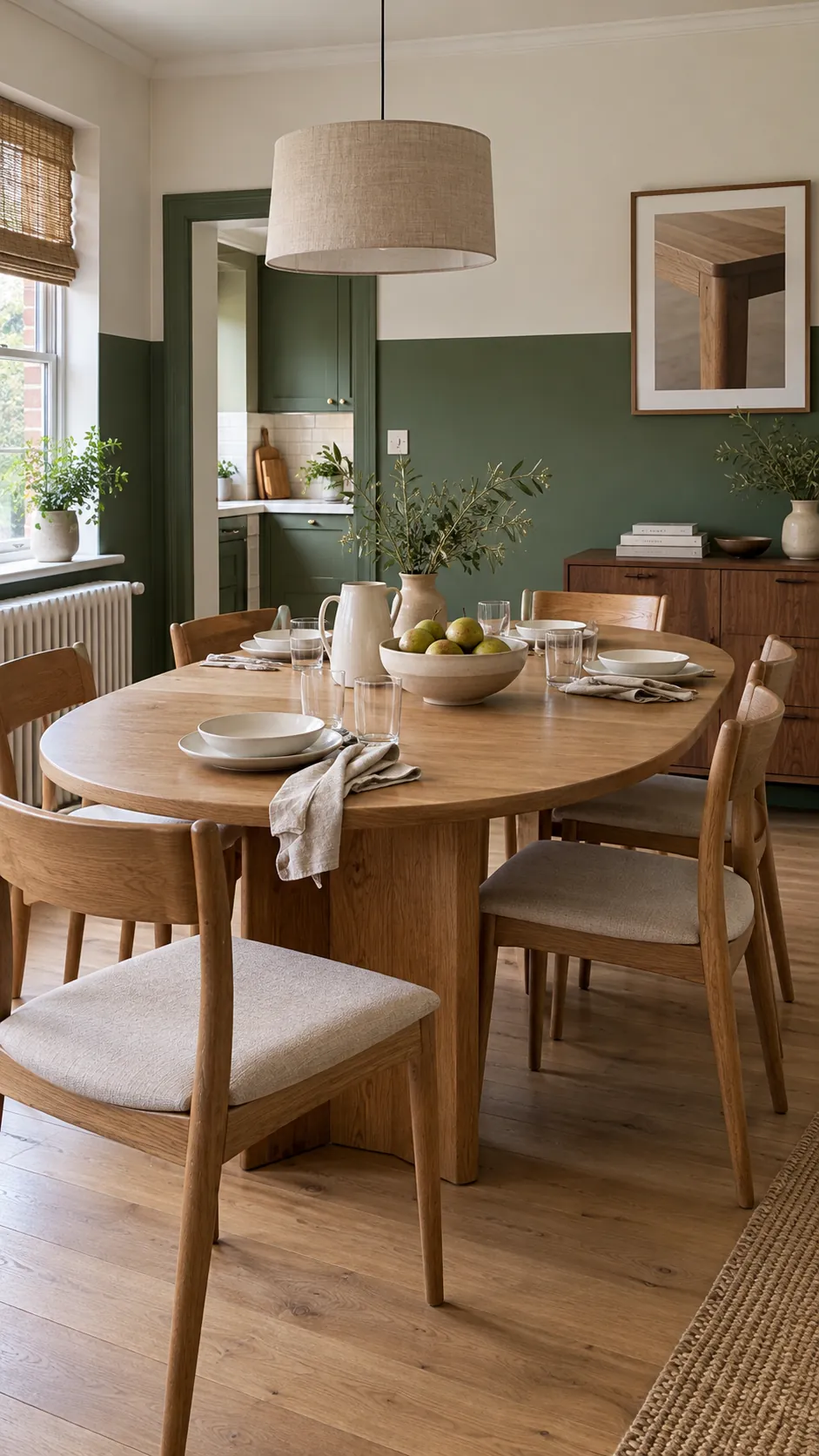
Wood works with green because both already feel connected to nature. Pale oak keeps sage and eucalyptus fresh. Walnut gives emerald and bottle green more depth. Medium honey toned timber adds warmth to olive without pushing the room toward orange.
Repeat one main wood family instead of mixing many unrelated finishes. A dining table, chair frames, shelves, and picture frames can share a similar undertone. Use cream fabric or pale stone between green and wood if both colours are dark. That lighter break prevents the room from feeling dense.
Existing wood trim is often an advantage rather than a problem. Deep green can make original timber look richer, while the timber stops the paint from feeling flat. Keep the remaining accessories simple so the material contrast stays visible.
Dusty Pink Softens Deep and Moody Green
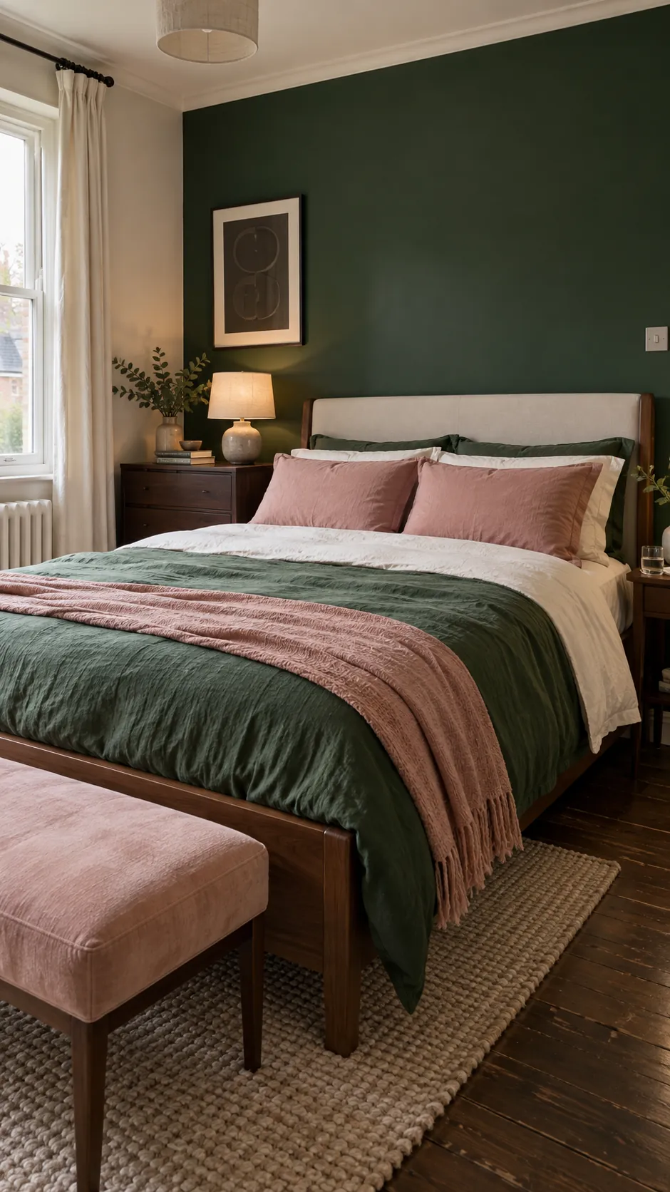
Muted pink sits opposite green on the colour wheel, so the pairing has natural contrast. The key is to choose a softened pink rather than a bright candy shade. Dusty rose, plaster pink, and faded blush feel mature beside bottle green, forest green, and dark sage.
Keep pink to textiles and small objects if you want a restful result. Pillowcases, a throw, a bench, or one ceramic lamp can be enough. Cream bedding and dark brown wood create a buffer, which helps the complementary colours feel balanced rather than competitive.
This combination is effective in bedrooms and reading corners because it mixes depth with softness. Avoid repeating pink on every surface. Two or three separated accents usually create a more convincing room than a full matching set.
Terracotta Brings Warmth to Olive and Sage
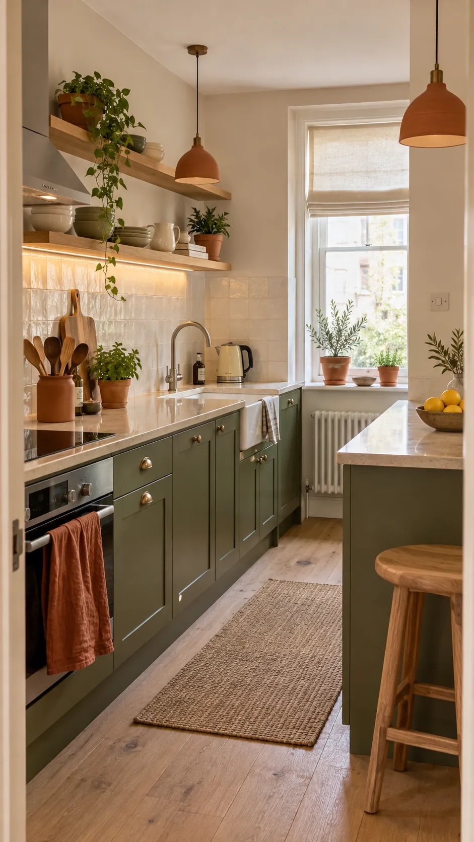
Terracotta and rust bring out the warm side of olive, moss, and sage. They work best as concentrated accents because both colours have strong earthy character. Clay planters, a linen towel, pendant shades, or one cushion can warm a green room without changing its calm mood.
Balance the pairing with plenty of cream, oatmeal, or pale wood. In a kitchen, a light worktop and white tile keep olive cabinets and clay details from becoming visually heavy. In a living room, use a cream rug beneath green seating and repeat terracotta at two different heights.
Choose earthy red brown clay rather than bright pumpkin orange. The quieter tone looks more natural beside green and is easier to live with over time. Matte surfaces also suit this combination better than high gloss finishes.
Navy Adds Structure to Cool Green
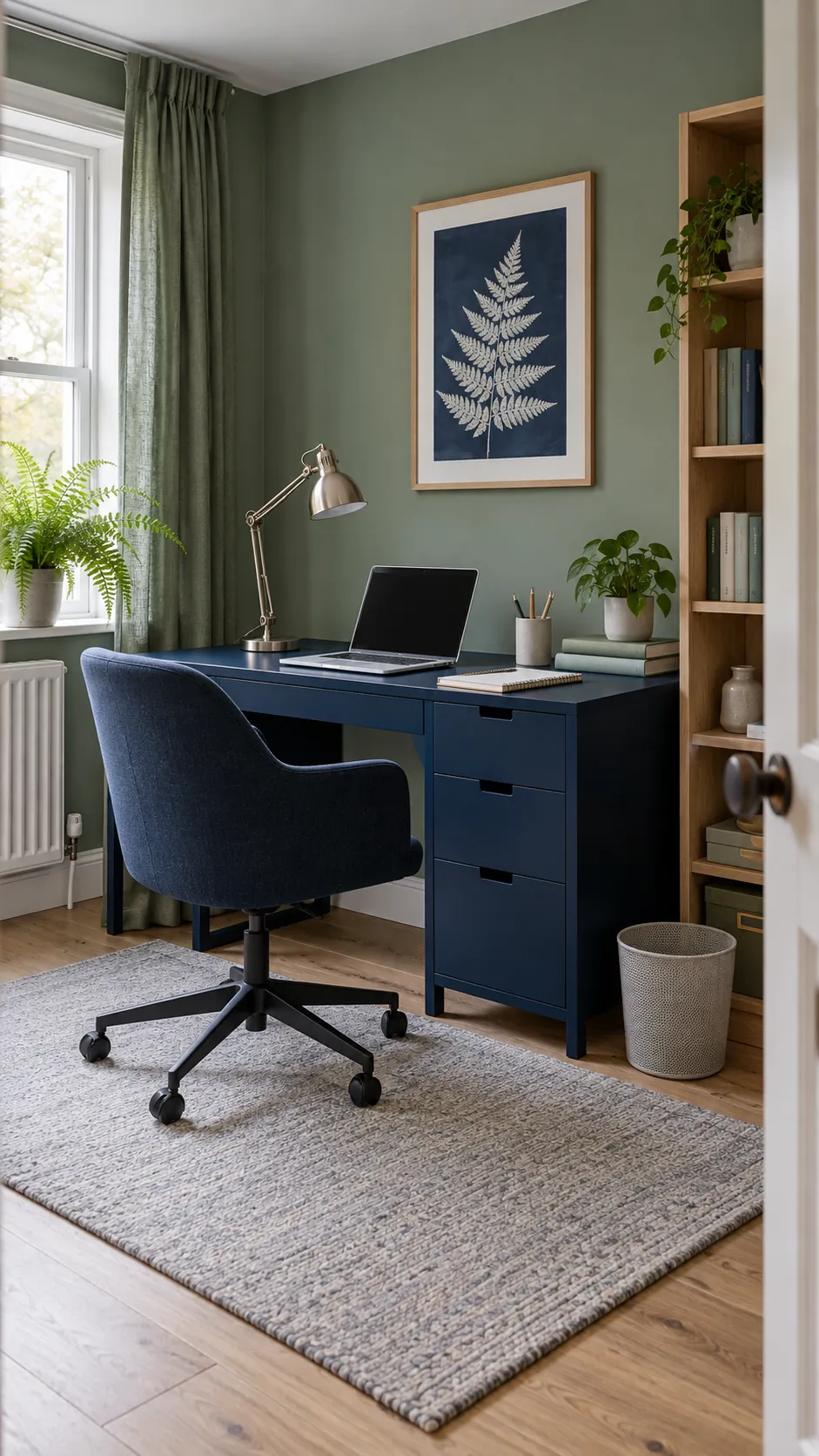
Navy is a useful partner for eucalyptus, pine, and blue based sage. The shared cool undertone makes the colours feel related, while the darker navy gives furniture and architectural edges more definition. Add pale gray, white, or light oak so the scheme does not become too shadowy.
A navy desk, upholstered chair, throw, or cabinet can provide enough weight. You do not need a second dark wall. In a work area, brushed nickel and pale stone reinforce the cool palette without adding another strong colour.
Check the navy in daylight before buying large pieces. Very dark navy can read as black in a dim room. A clearly blue navy gives more useful separation from deep green and keeps the combination intentional.
Aged Brass Gives Green a Warm Highlight
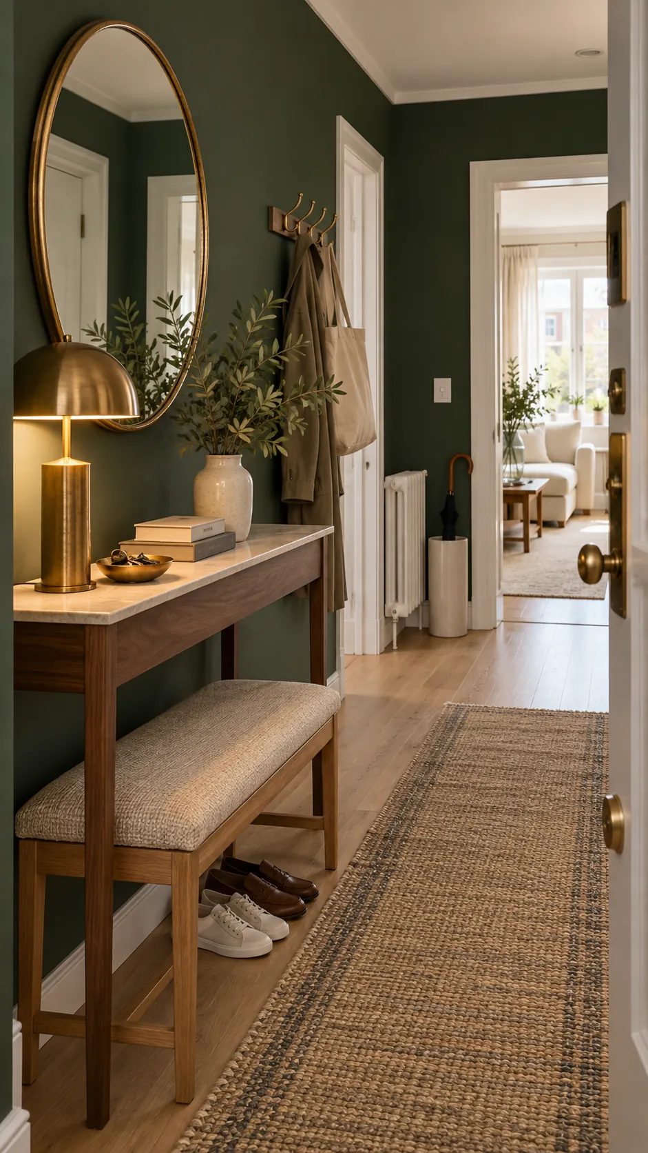
Aged brass looks especially good with emerald, bottle green, and dark olive. Its warm reflection adds life to the paint, but it should remain a highlight. A lamp, mirror frame, cabinet pulls, and a small bowl are usually enough to repeat the finish around a room.
Choose brushed or gently aged brass rather than mirror bright gold. The softer finish feels grounded beside matte green paint, natural wood, and cream textiles. Black can appear in very thin lines, such as a lamp stem or frame edge, to stop the warm metals from feeling overly decorative.
The simplest rule is to match the supporting colour to the green undertone, then repeat it with restraint. Warm green welcomes wood, clay, pink, and brass. Cool green prefers navy, charcoal, cool white, and silver. Leave enough neutral space between accents, and green will remain the colour that holds the room together.