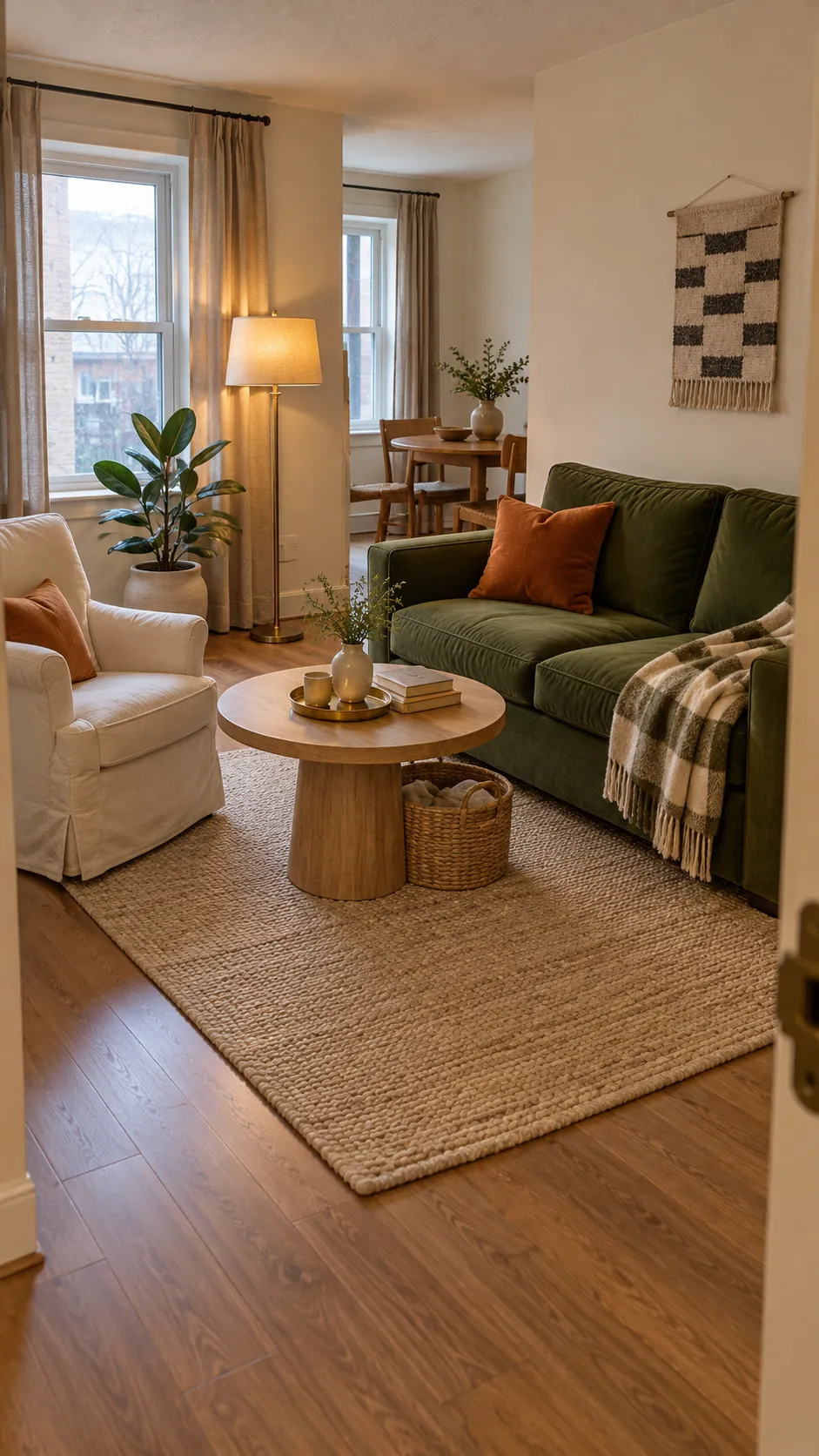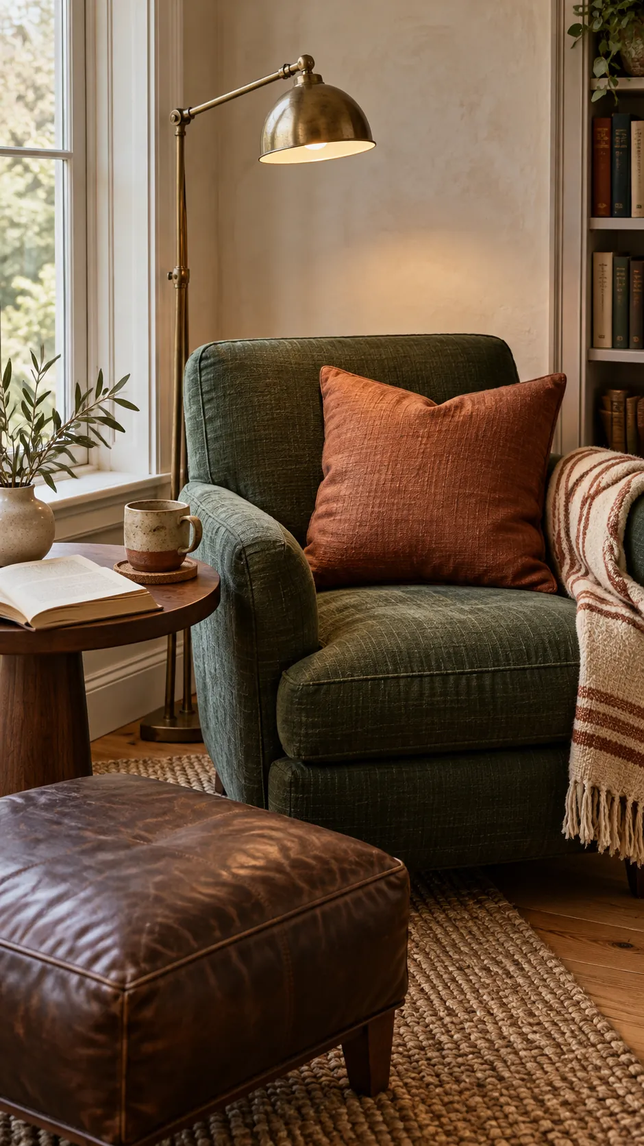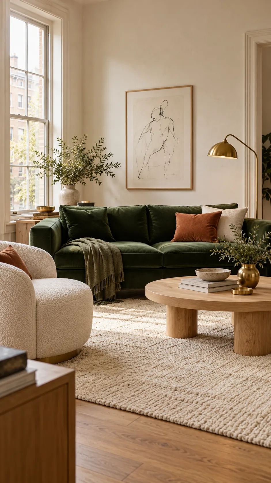
Green and gold can feel calm and polished, but the same pair can become heavy when every surface competes for attention. The safest approach is to let green carry most of the color while gold appears in smaller reflections. A supporting neutral then gives both colors enough space to look intentional.
The best companion colors are warm white, cream, natural wood, soft pink, navy, charcoal, and earthy terracotta. Your choice depends on the green undertone, the metal finish, and the amount of daylight in the room. Start with the largest fixed surface, then test every smaller choice beside it.
Start with warm white and natural wood
Warm white is the easiest third color because it lifts dark green without making brass look harsh. Choose a creamy white with a quiet yellow or red undertone rather than a blue white. The slight warmth links painted walls, linen upholstery, and gold details into one palette.
Natural oak, walnut, and woven fibers prevent a green and gold living room from feeling too formal. Pale oak suits sage and olive, while walnut has enough depth to stand beside emerald or forest green. Repeat the wood in at least two visible places, such as a table and a picture frame, so it reads as part of the plan.
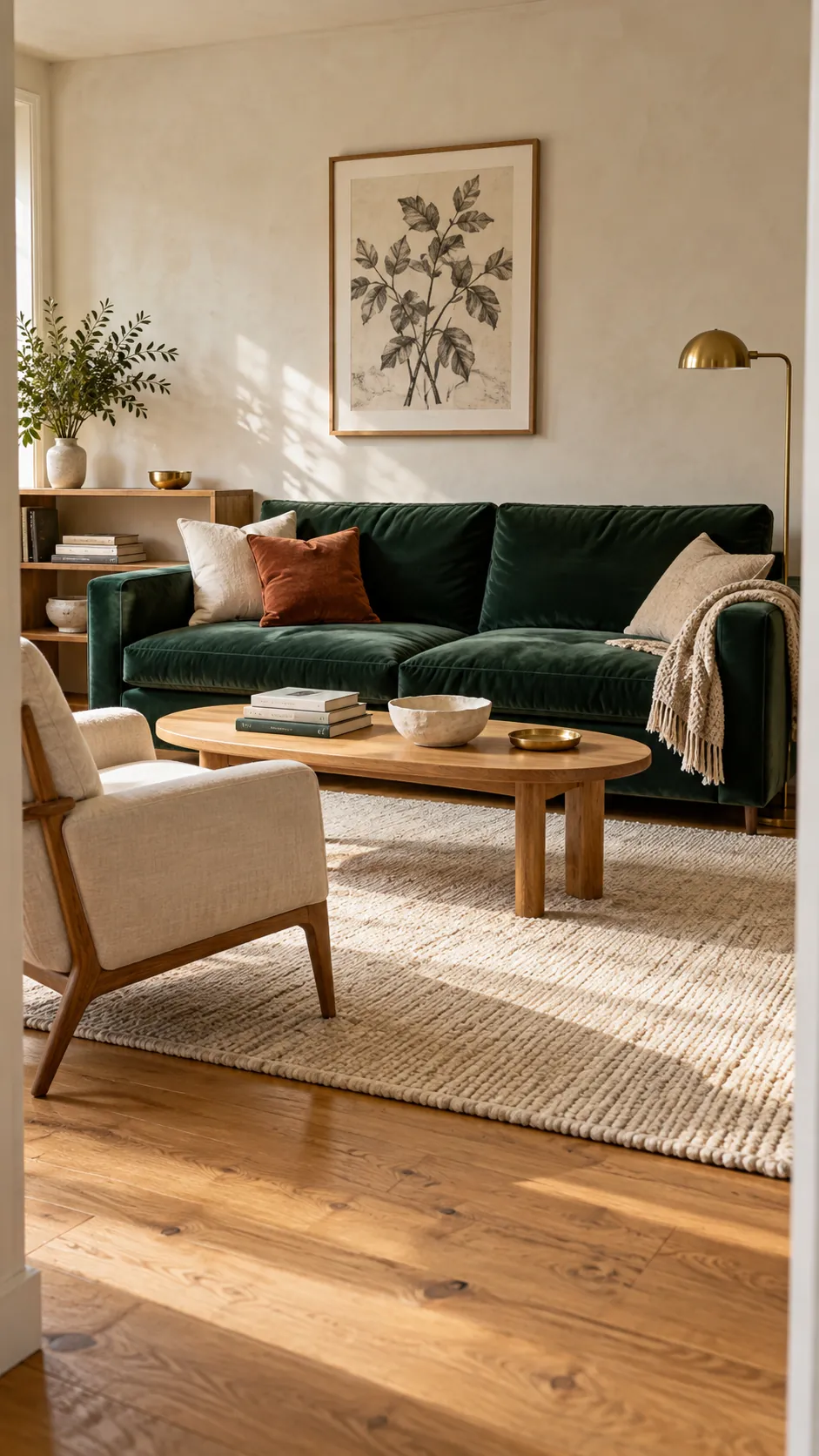
Soften emerald with blush and dusty rose
Muted pink sits opposite green in a way that creates contrast without the visual shock of bright red. Dusty rose, clay pink, and faded blush work especially well with emerald green and brass decor. Keep the pink slightly gray so it feels grown up beside polished or aged metal.
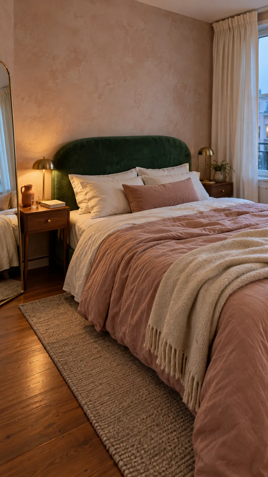
A bedroom is a good place for this pairing because textiles can carry the softer color. Try an emerald headboard, blush bedding, cream curtains, and two small brass lamps. If the room has limited daylight, use more cream than green and choose brushed brass, which reflects light gently.
Terracotta can replace pink when you want a warmer, earthier result. Its orange base supports gold and gives dark green a grounded counterpoint. Use it through one throw, a ceramic lamp, or a rug detail rather than matching every accessory.
Add navy for depth and structure
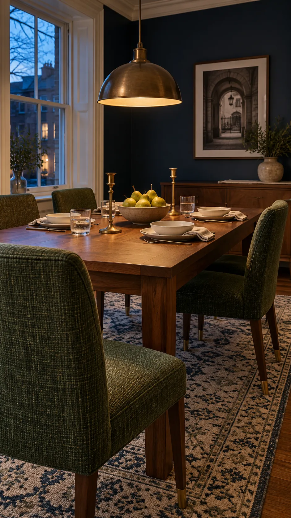
Navy and green share a cool, natural character, while gold keeps the combination from feeling flat. This trio suits dining rooms, libraries, and formal living areas where deeper color can create intimacy. Choose one dominant dark color and let the other appear in upholstery, art, or a rug.
Undertones decide whether the mix feels connected. A blue based emerald works easily with ink navy, while yellow based olive is better beside a softened blue with a little gray. Place physical samples together under daylight and evening lamps because artificial light can make green appear browner and brass appear brighter.
Use black or charcoal as a small anchor
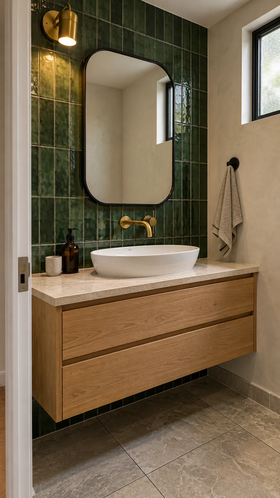
Black gives a green and gold palette a crisp edge, but it works best in narrow lines and practical details. A black mirror frame, charcoal grout, or dark door handle can define the room without competing with brass. This is useful in bathrooms, where many reflective finishes can otherwise look scattered.
Keep metal finishes consistent by choosing one main gold tone. Brushed brass feels quiet and forgiving, aged brass adds character, and polished gold creates the strongest contrast. You can include black metal as a secondary finish when its role is clearly different, such as black framing with brass taps.
White stone or pale tile gives this darker combination breathing room. Look at the veining before you commit, since cool blue gray veins may fight a warm olive green. Cream limestone, warm white quartz, and softly veined marble usually connect more naturally with brass.
Match the green to the wood undertone
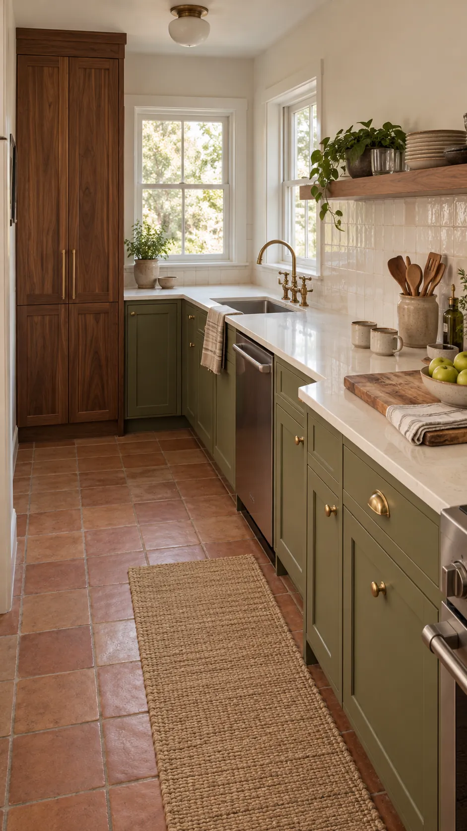
Wood is not a neutral blank. Honey oak contains yellow, walnut often carries red or purple, and pale ash can look cooler. Sage and muted olive usually suit warm oak, while deep forest green has enough strength for walnut. Brass hardware bridges the cabinet color and wood because it repeats their warmth.
In a kitchen, let counters and the backsplash reduce visual noise. Warm white stone, handmade cream tile, or quiet beige terrazzo can support green cabinets without adding another dominant pattern. If the counter has bold veining, keep the backsplash simple and repeat only one vein color elsewhere.
Control the balance in a small or dark room
A small room does not forbid dark green, but it needs clear contrast and enough light. Use green on one meaningful surface or one substantial piece, then keep the ceiling, window area, and largest upholstery light. Place gold near light sources so it catches a glow instead of becoming a dense band around the room.
For a simple proportion, use a light neutral across most of the room, green across a smaller but obvious area, and gold only as the final accent. The exact percentage matters less than the hierarchy. A green sofa, two brass lamps, and cream walls will usually feel calmer than many tiny green and gold objects scattered everywhere.
Finish by viewing the room from the doorway and removing one repeated metallic accessory at a time. Stop when the remaining gold details form a loose visual path rather than a cluster. The strongest green and gold interiors look collected because every supporting color has a practical job.