
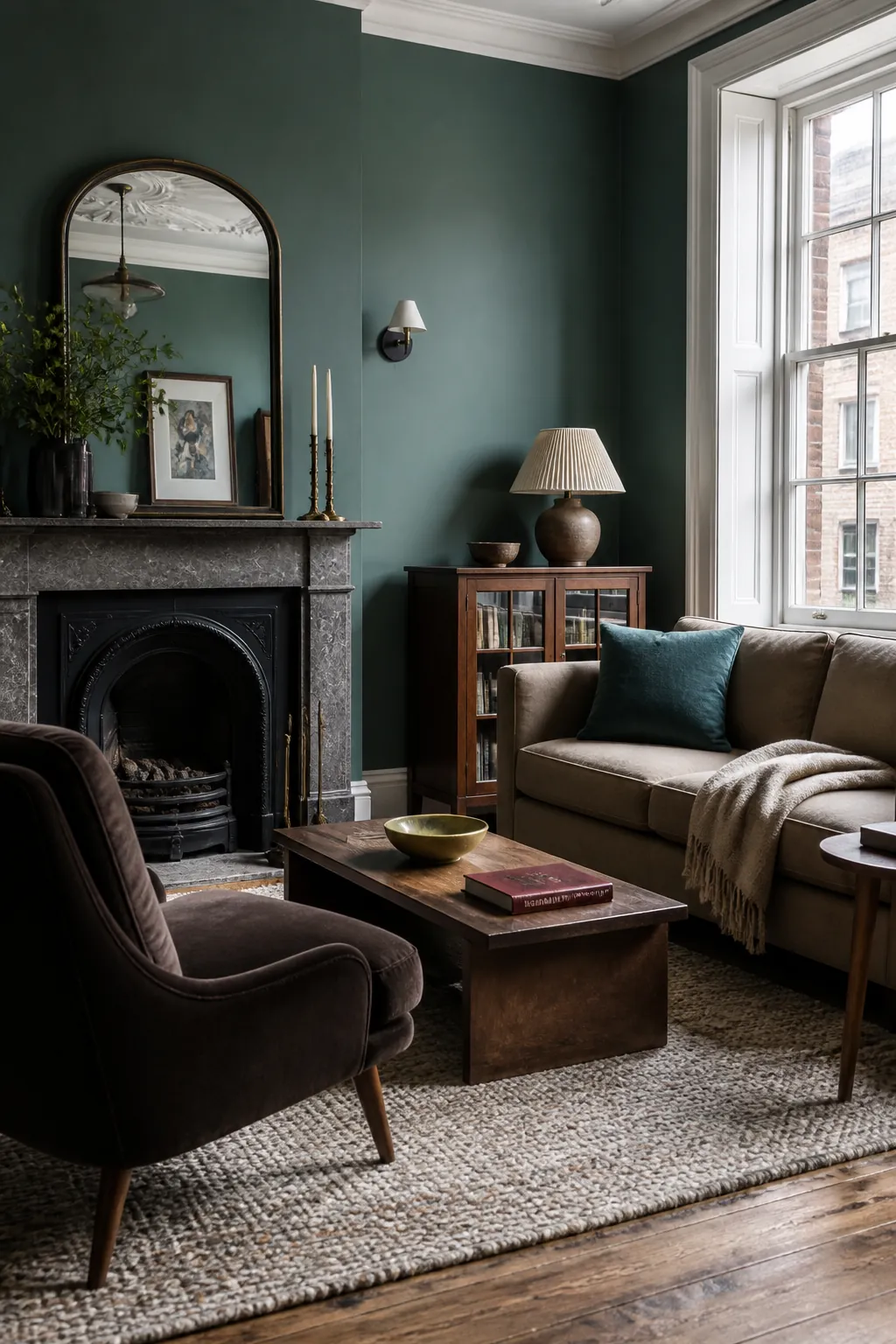
The living-room colors gaining ground now are not simply louder than last year’s neutrals. They are more specific, more atmospheric, and easier to connect to the materials people already own. Warm wood, stone, linen, aged brass, and patterned upholstery are steering rooms toward grounded greens, softened blues, edible browns, and sun-washed pastels.
The smartest way to use this list is to shortlist three shades, paint large movable sample boards, and watch them from morning through evening beside your sofa, flooring, trim, and lamps. A beautiful chip can turn muddy beside yellow-white trim or icy under a cool LED. The best color combinations for a living room are discovered in the room’s real light, not under store lighting.
Smoky Jade
Smoky jade has enough gray to feel settled and enough blue-green pigment to make a room memorable. It suits living rooms with oak, walnut, cognac leather, cream boucle, or pale stone because those warmer materials keep the green from feeling clinical.
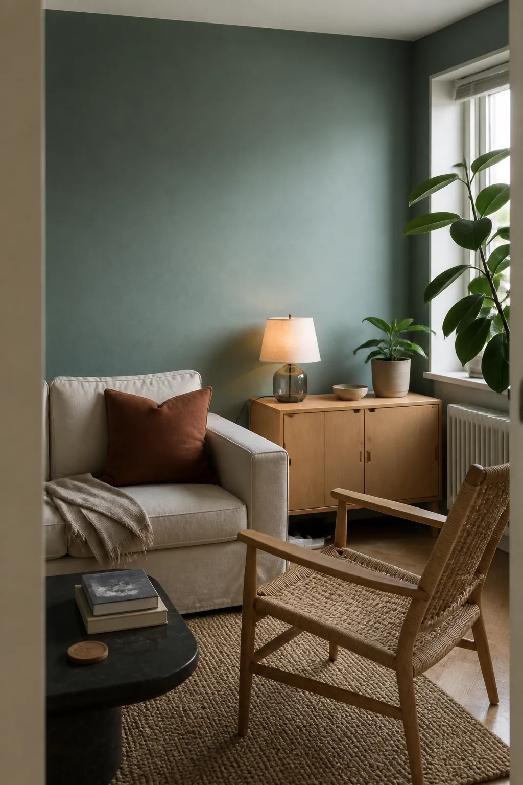
Try it first in a north-facing room where a brighter mint might look chilly. Use warm-white bulbs and repeat the color once in a small textile rather than matching every accessory. The result feels intentional, not themed.
Rich Espresso
Deep espresso is replacing flat charcoal when a room needs drama. Benjamin Moore’s 2026 selection, Silhouette, reflects this shift toward brown-black colors with warmth underneath. Espresso works especially well on millwork, a fireplace wall, or every surface in a well-lit cocooning room.
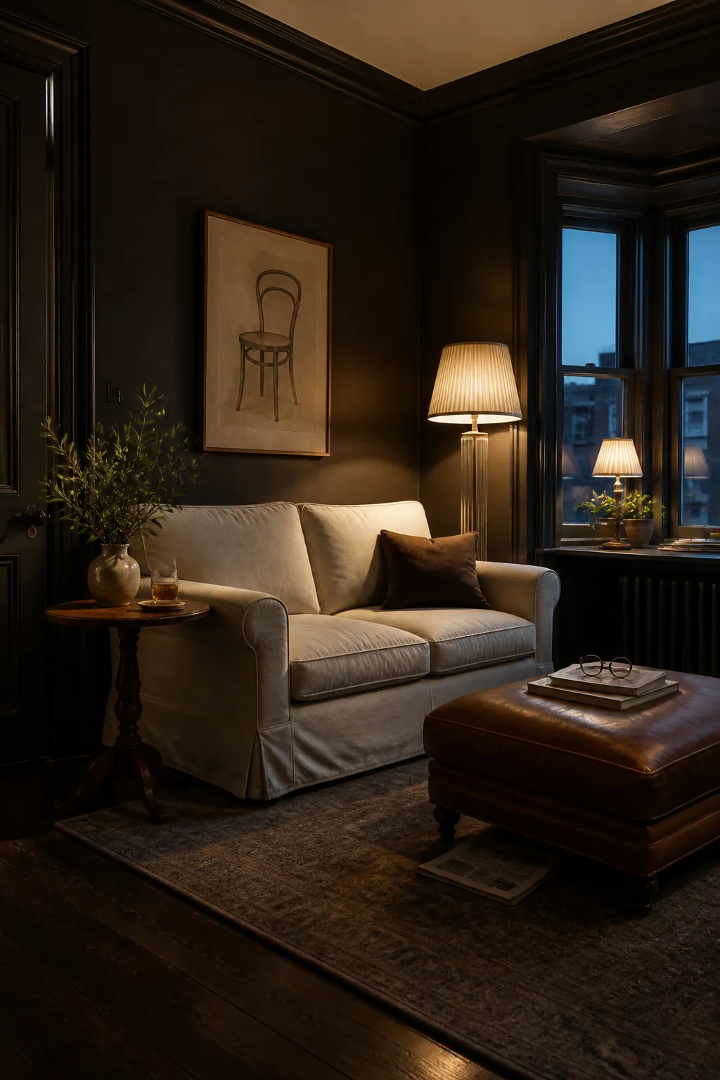
Dark paint needs deliberate contrast. Add pale upholstery, reflective glass, and several pools of light instead of relying on one ceiling fixture. Test the shade beside the floor; some dark browns reveal unwanted purple or red undertones after sunset.
Universal Khaki
Khaki is the useful middle ground between beige and olive. Sherwin-Williams chose Universal Khaki for 2026, and its appeal is practical: it gives pale rooms more substance while remaining calm enough for an open-plan main floor.
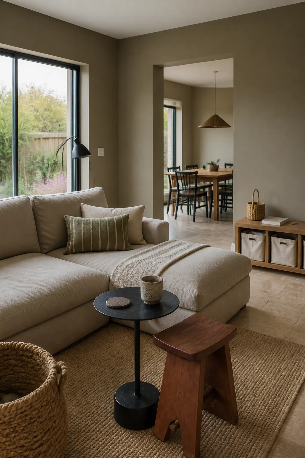
Pair it with chalky white, blackened bronze, olive textiles, or red-brown wood. Avoid combining it with several nearly identical beiges; varied value and texture keep a khaki colour palette for a living room from looking like a rental default.
Muted Teal
Muted teal brings color without the visual sharpness of jewel-tone turquoise. It is especially persuasive in rooms with vintage rugs, burl wood, rust, dusty pink, or aged brass. The gray component makes it easier to live with across changing daylight.
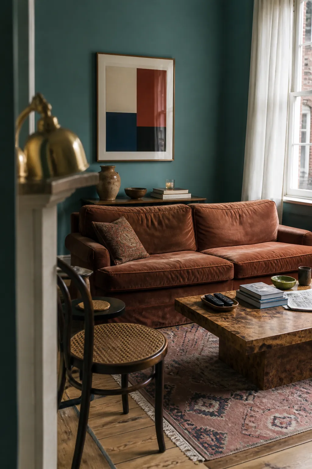
Use it wall to wall for a confident scheme, or on built-ins when you want a smaller commitment. A cream ceiling and medium-tone wood prevent the room from becoming too aquatic.
Sun-Faded Sky Blue
This is sky blue after the brightness has been weathered away: powdery, quiet, and slightly gray. It makes a strong small living room color idea because it keeps visual freshness without the glare of stark white.
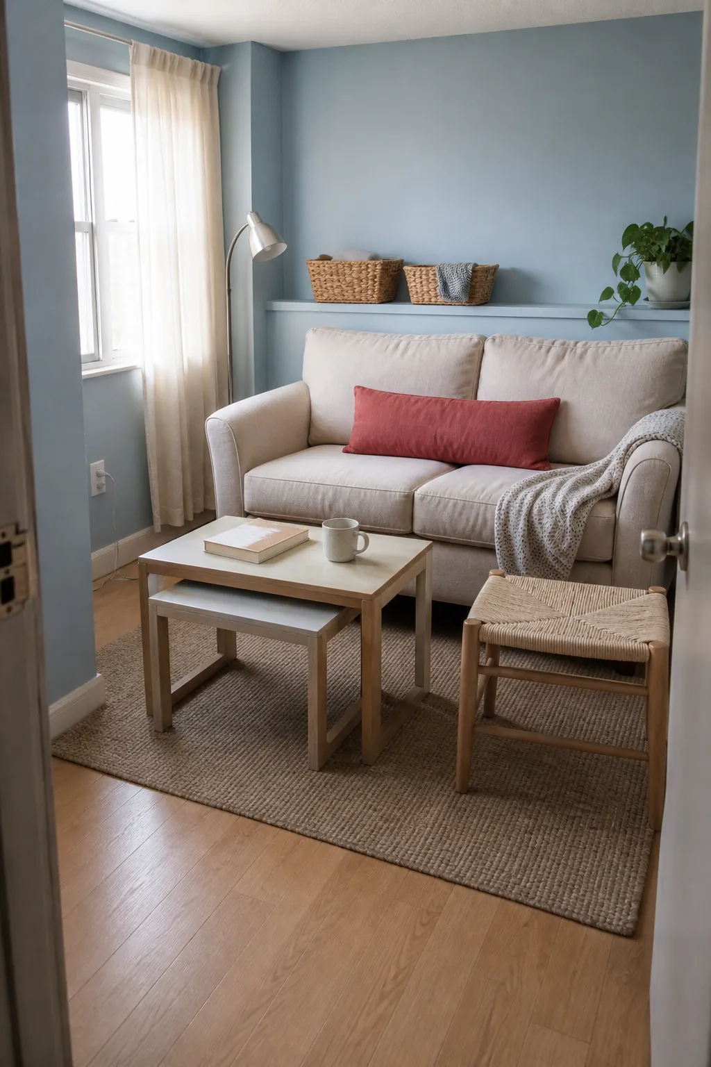
Combine it with bleached oak, warm white, faded red, and woven natural fibers. If your window light is strongly cool, choose a sample with a faint green rather than violet undertone so the walls stay relaxed.
Buttercream Yellow
Buttercream is softer than lemon and more cheerful than beige. It gives weak daylight a gentle glow, particularly in traditional rooms with painted trim, gingham, floral textiles, or honey-toned wood.
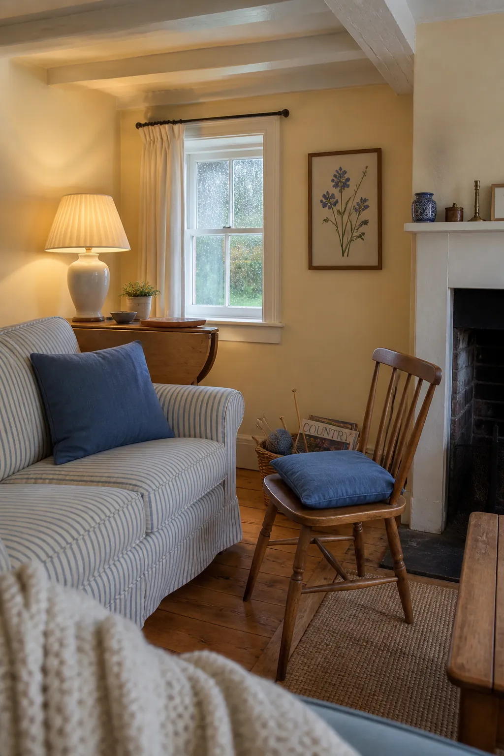
Its best partners are cornflower blue, tobacco brown, chalk white, and muted green. Keep large upholstery quieter and let the walls supply the warmth. Under very warm bulbs, test carefully so the shade does not tip orange.
Dusty Rose
Dusty rose now reads as an earthy neutral rather than a sugary pink. A brown or clay undertone gives it maturity, making it a convincing backdrop for olive, oxblood, dark wood, brushed nickel, and graphic black details.
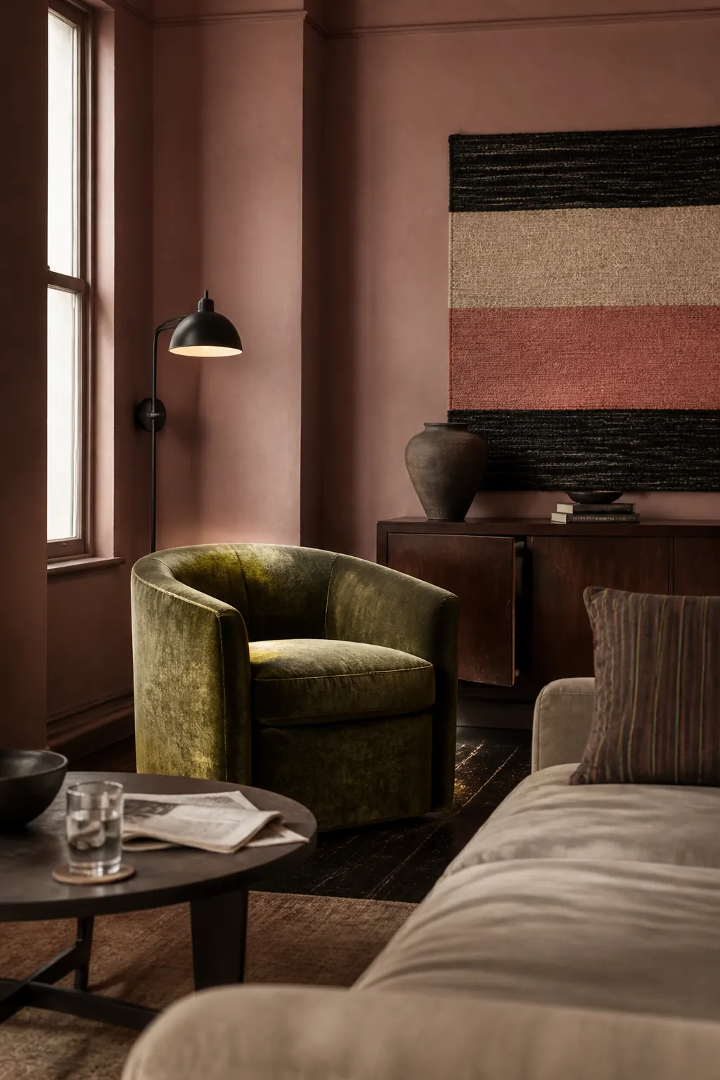
Choose a restrained version for whole-room coverage and save clearer pink for cushions or flowers. In evening light, dusty rose becomes warmer and more intimate, which makes it useful in living rooms used mainly after work.
Oxidized Terracotta
Terracotta is moving away from bright desert orange toward weathered brick, dried clay, and plaster. This oxidized version gives a living room architectural warmth, even when the actual room has few period details.
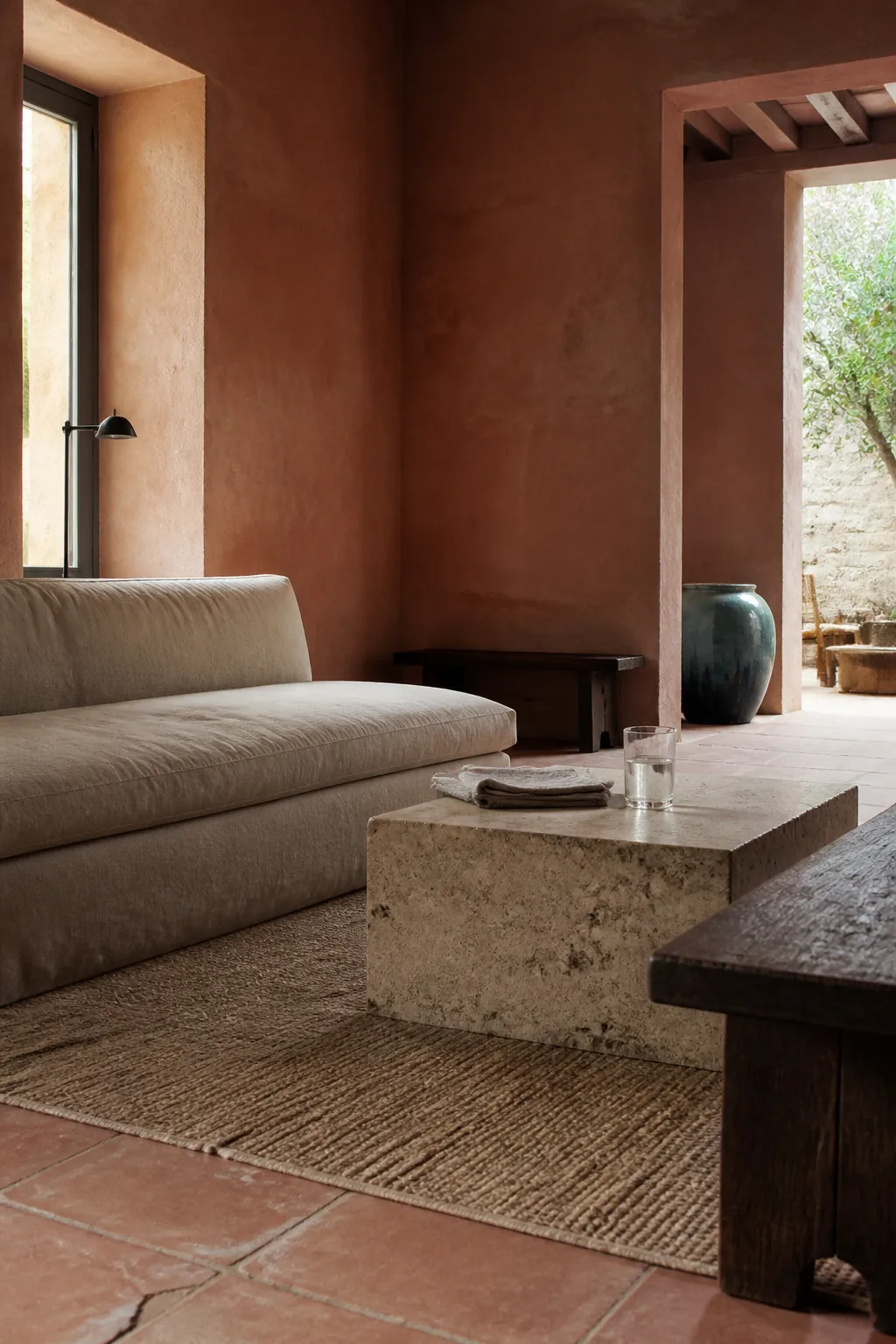
Balance it with limestone, flax linen, dark timber, and a small touch of blue-green. If full walls feel too energetic, use it below a chair rail or on a fireplace breast, then repeat it in pottery.
Olive Leaf
Olive leaf behaves like a neutral because it echoes plants, aged wood, and outdoor views. It is warmer and browner than sage, which makes it particularly good with cream upholstery and floors that contain gold or red tones.
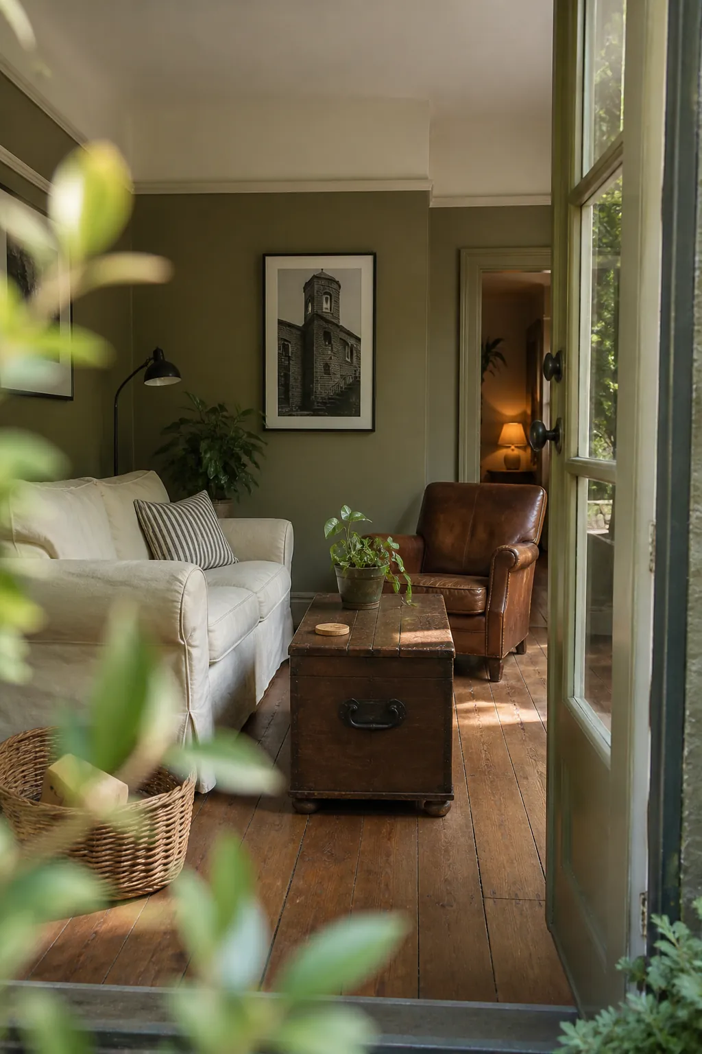
Add black, tobacco leather, and off-white for definition. If the room already has many leafy houseplants, vary the greens rather than forcing an exact match; tonal contrast makes both paint and foliage look richer.
Plum Brown
Plum brown sits between aubergine and chocolate. In daylight it can read earthy; at night it becomes enveloping and quietly glamorous. It is a strong choice for a snug, TV room, or formal living room with substantial trim.
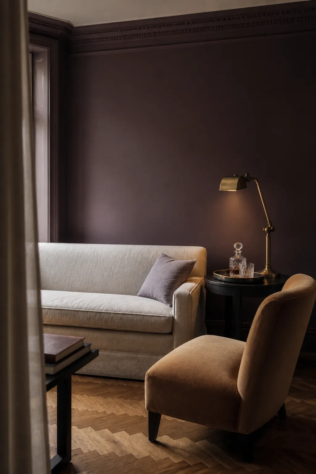
Use warm white, pale lilac-gray, aged brass, or camel to open it up. Large samples matter here: too much red can look theatrical, while too much gray can flatten the intended depth.
Clay Beige
Clay beige is the answer for anyone tired of cool greige but unwilling to commit to obvious color. Its pink-brown undertone feels warmer beside oak and terracotta while remaining light enough for an open, everyday family room.
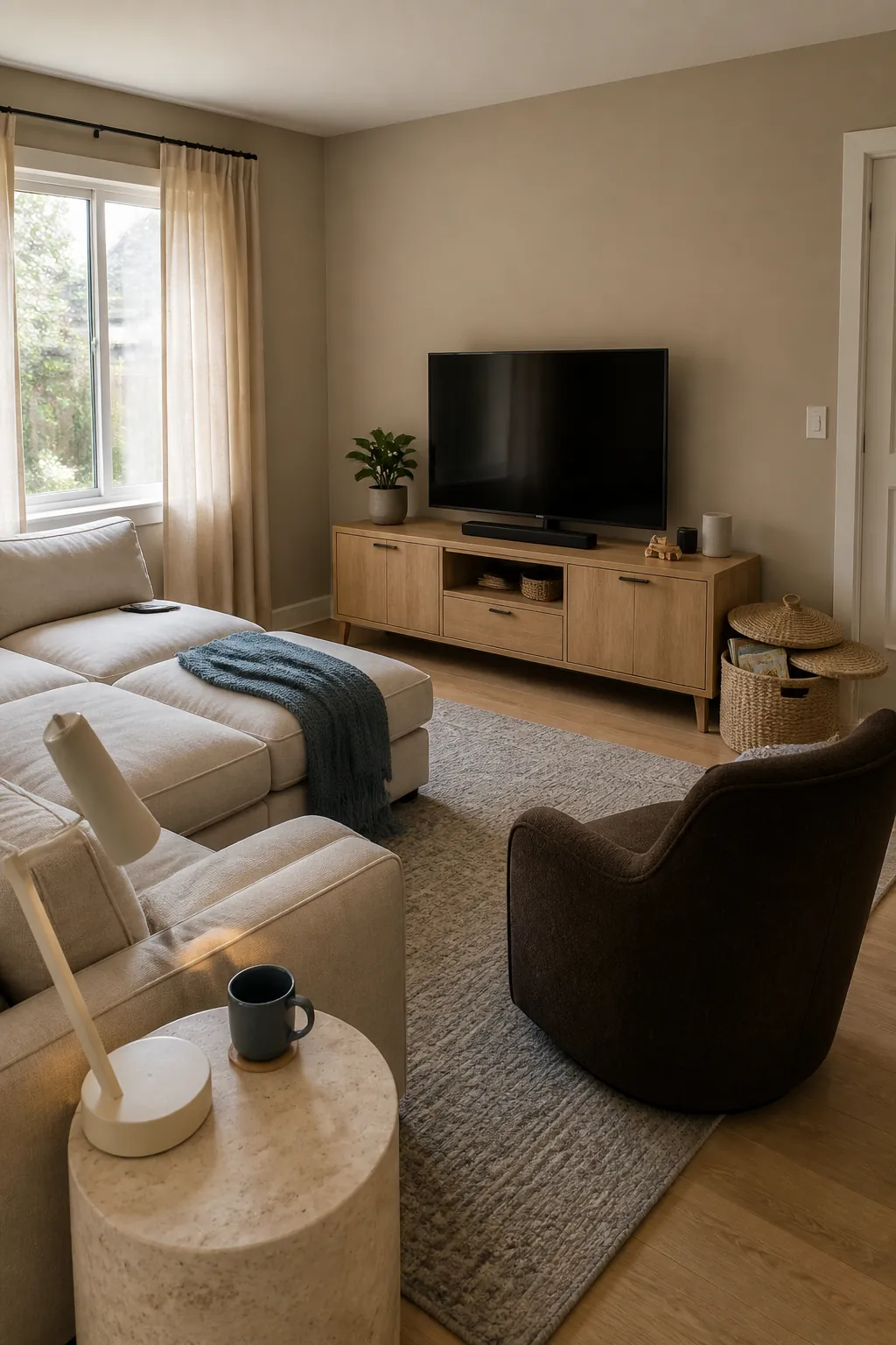
Build contrast through chocolate, chalk white, and muted blue rather than adding more beige. Texture is essential: linen, wool, cane, and honed stone make this quiet color feel layered instead of unfinished.
Parchment White
Parchment white is creamy without turning visibly yellow. It softens hard daylight and provides a forgiving bridge between bright white trim, aged plaster, pale wood, and collected furniture.
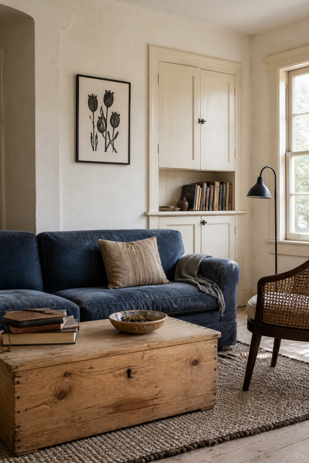
Compare it directly with the trim. A wall white that is cleaner than old cream trim can make the woodwork look dirty. If repainting trim is not part of the plan, select a wall shade that shares its undertone.
Mineral Blue
Mineral blue is deeper than powder blue but less formal than navy. It evokes faded pigment and natural stone, so it feels at home with limewashed texture, walnut, tobacco leather, and woven rugs.
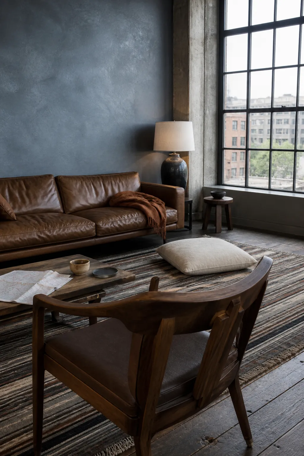
It is one of the most flexible modern living room colour ideas for mixing old and new furniture. Warm it with brown and rust, or sharpen it with ivory and black. Avoid blue-white lighting, which can strip away its softness.
Oxblood Red
Oxblood is a serious red with brown and wine underneath. Used on shelving, doors, or a compact room, it brings depth without the visual noise of a clear primary red.
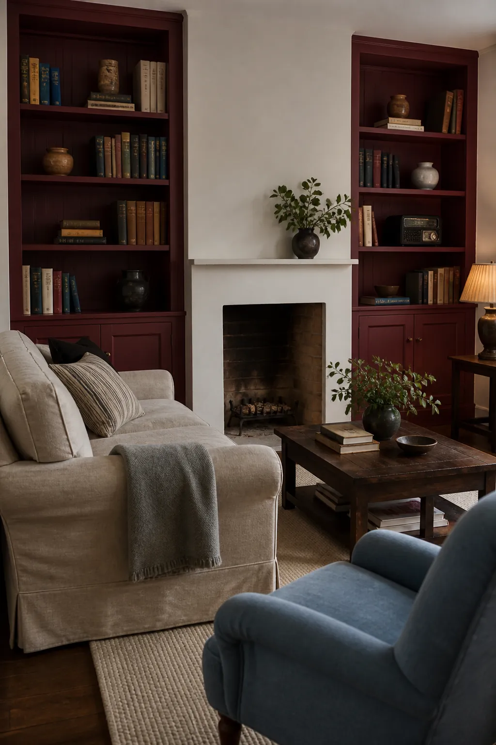
Pair it with putty, parchment, dark oak, and a small amount of dusty blue. For a low-risk trial, paint the back of built-ins first. The color should appear wine-rich in daylight, not candy red.
Celadon Green
Celadon is an airy green with a watery gray cast. It offers more life than off-white while preserving the lightness that renters, small-space owners, and lovers of quiet interiors often want.
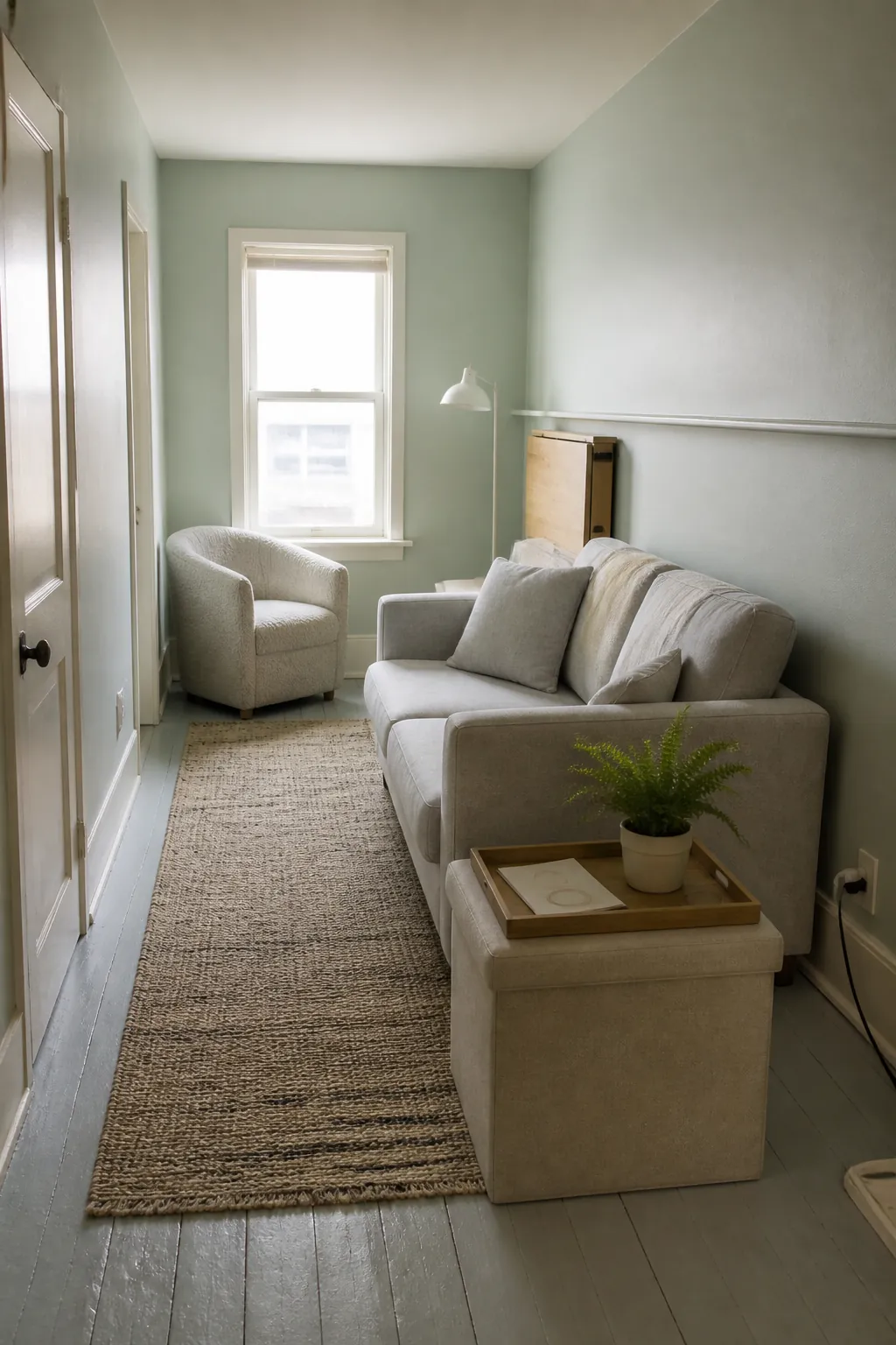
Keep the palette clean with pale ash, linen, putty, and one dark grounding note. Because celadon can shift blue, green, or gray, move the sample to every wall before choosing it.
Cinnamon Bark
Cinnamon bark is a red-brown that makes a living room feel instantly hospitable. Unlike bright orange, it has enough depth to support substantial furniture and enough warmth to flatter evening lamplight.
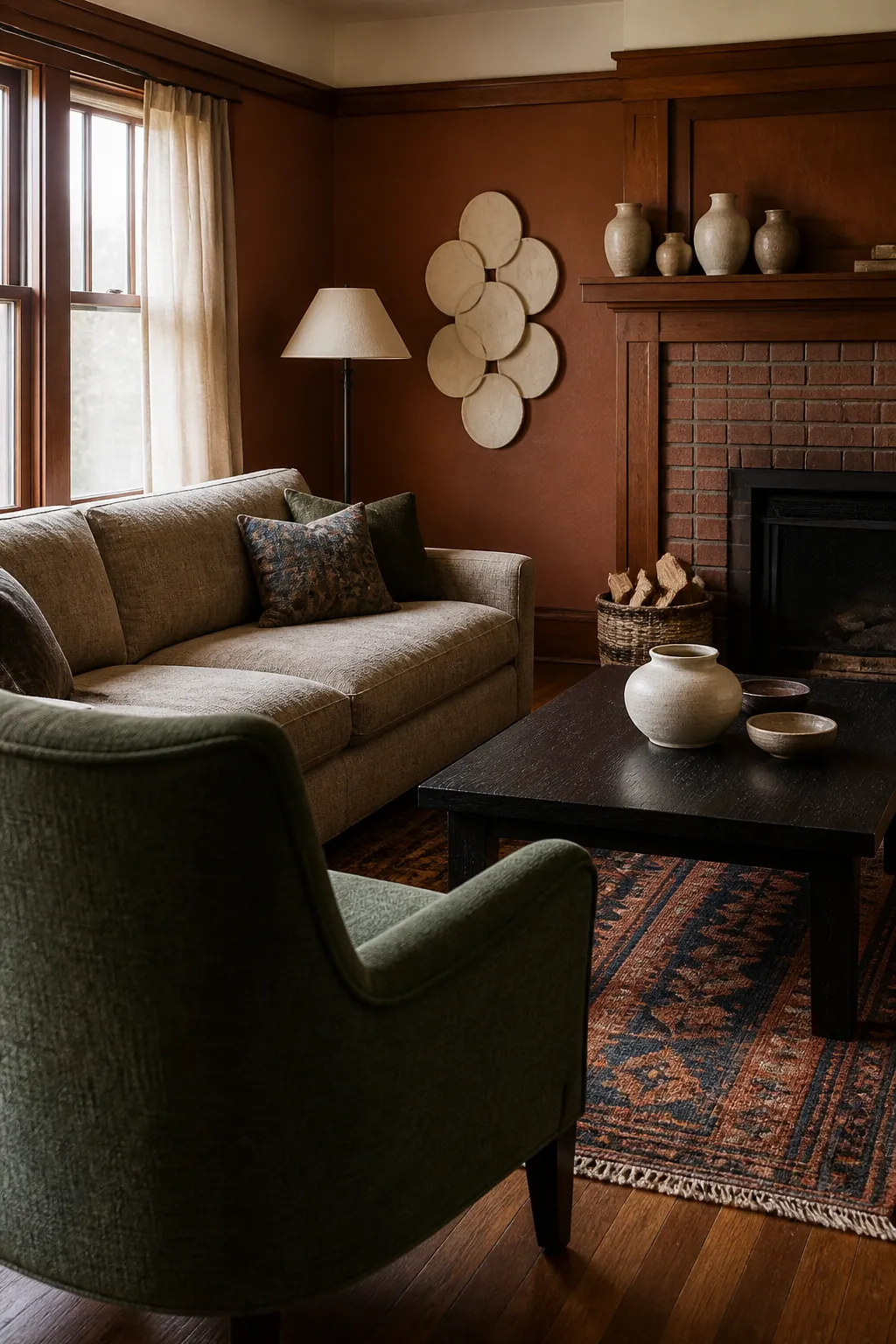
Use flax, cream, deep green, and blackened metal alongside it. A matte finish emphasizes the earthy effect; higher sheen can make saturated brown-red walls feel busier than intended.
Lavender Gray
Lavender gray brings a subtle violet note to the cool-neutral category. It is especially effective with silvery daylight, pale woods, mauve textiles, and warm metal accents, where ordinary gray might look lifeless.
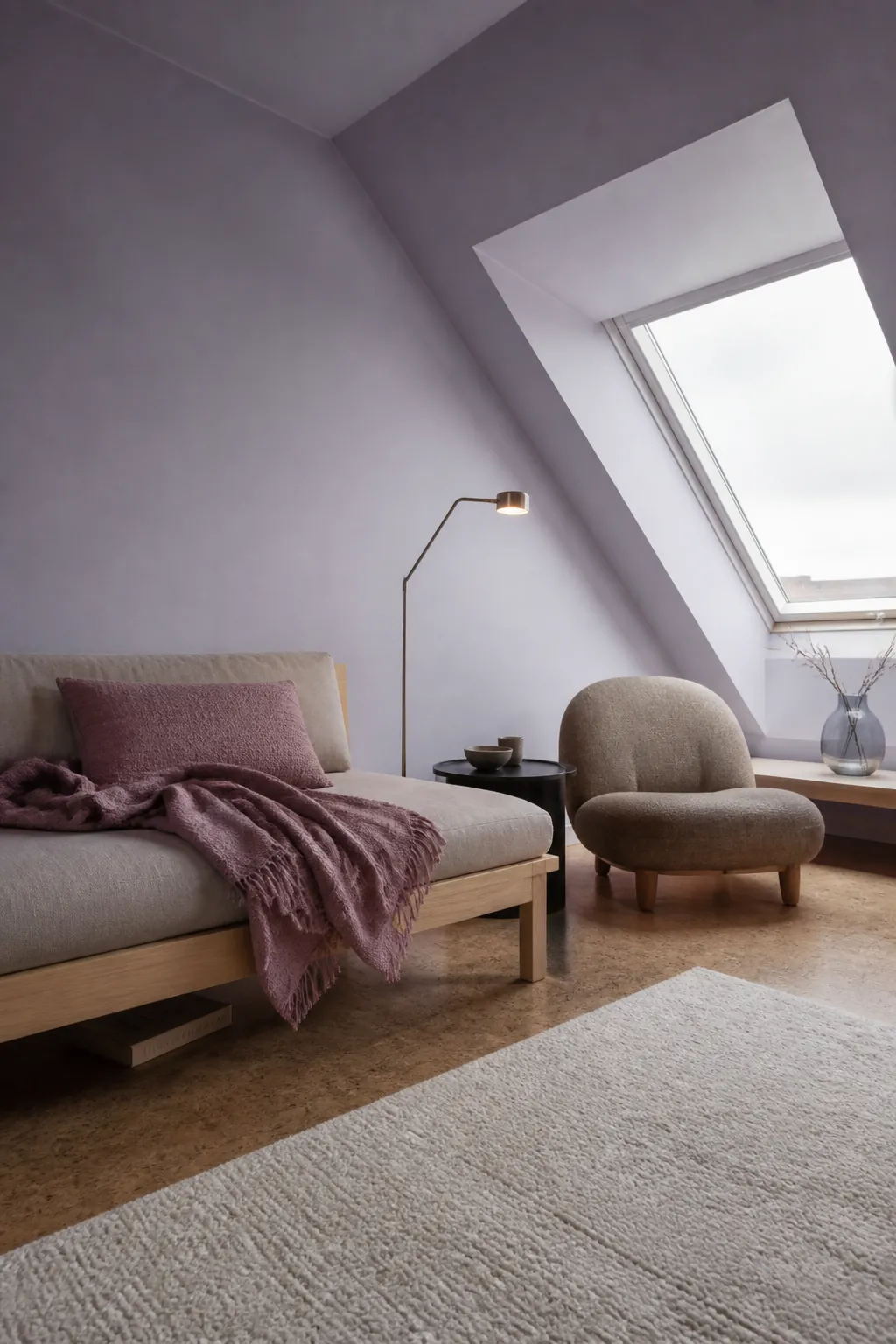
Keep its partners muted: mushroom, dusty plum, cream, and charcoal all work. Sample it beside flooring and stone, because violet undertones become far more obvious next to yellow beige.
Petrol Blue
Petrol blue is teal’s darker, moodier relative. It creates a strong background for books, art objects, oak, and brass, and can make a television recede more gracefully than a pale wall.
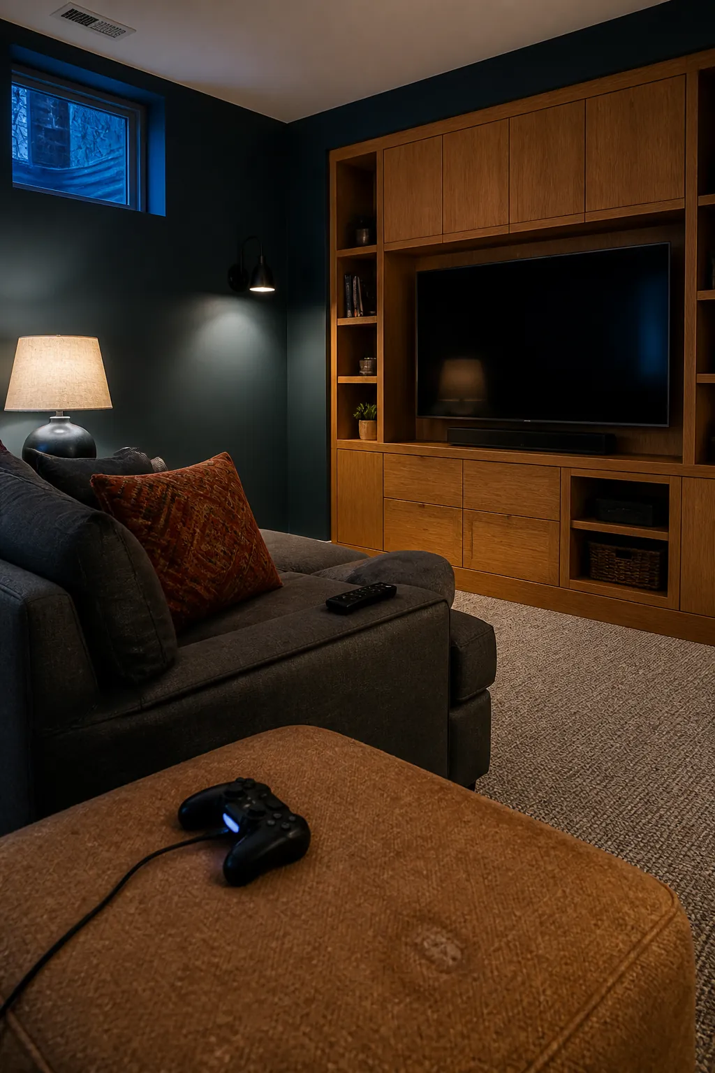
Plan the lighting before committing: a floor lamp, table lamp, and wall light create more comfortable depth than a single overhead source. Repeat the blue in one patterned textile, then introduce rust or camel for warmth.
Mushroom Taupe
Mushroom taupe has a quiet violet-brown undertone that reads more polished than builder beige. It supports colorful furniture without competing and gives white architectural trim a softer, clearer outline.
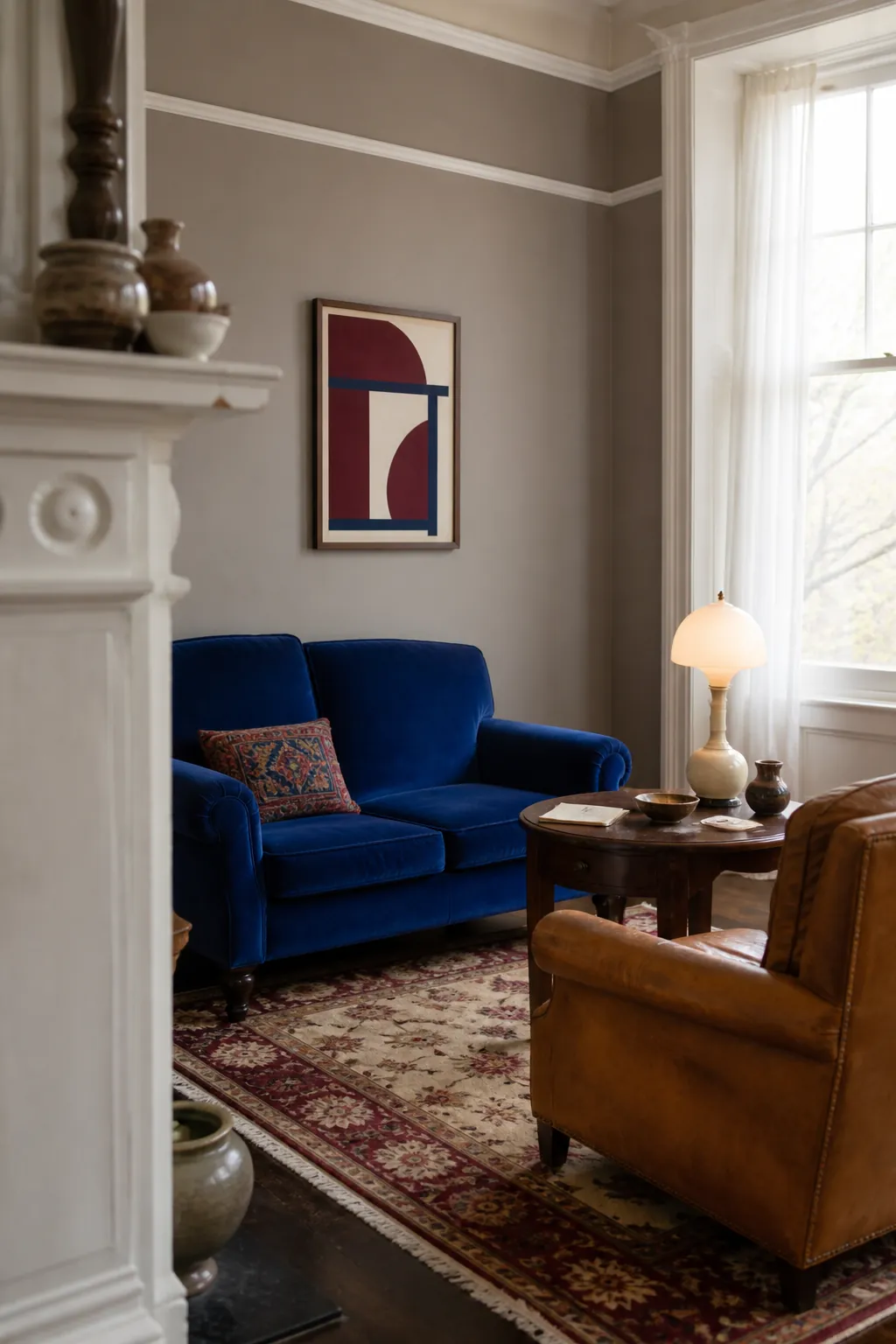
It works best when the room includes clear contrast—dark wood, creamy upholstery, or a saturated rug. Without those anchors, a whole collection of mid-tone taupes can blur together.
Inky Navy
Inky navy remains relevant because it behaves almost like black while retaining visible color. It can unify walls, shelving, and trim in a library-like living room, or provide a disciplined background for brighter textiles.
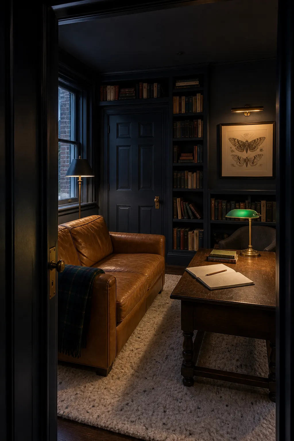
Give it camel leather, warm walnut, aged gold, and ivory to prevent a nautical cliché. In a compact room, painting the trim the same navy can reduce visual chopping; the room may feel calmer even though the color is dark.
Warm Aubergine
Warm aubergine closes the list because it captures the larger shift perfectly: living-room color is becoming richer, browner, and more personal. This purple-red shade is bold, but it connects naturally to walnut, rust, rose, tobacco, and antique brass.
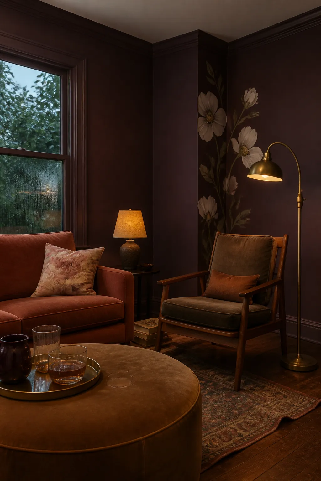
Use it where the room’s purpose supports intimacy—conversation, reading, or evening entertaining—and test it against every fixed finish. Trends are useful for discovering possibilities, but the winning living room color palette is the one that makes your existing floor, trim, furniture, and daylight look more coherent. If the sample improves all four, it has earned the wall.