A paint sample can look calm in the shop and turn pink, blue or muddy beside your sofa. Start with the surfaces you are keeping, then judge colour in the light you actually live with. These options move from quiet neutrals to deeper shades, with practical pairings to help you narrow the choice before opening a full tin.
Soft White That Respects Existing Trim
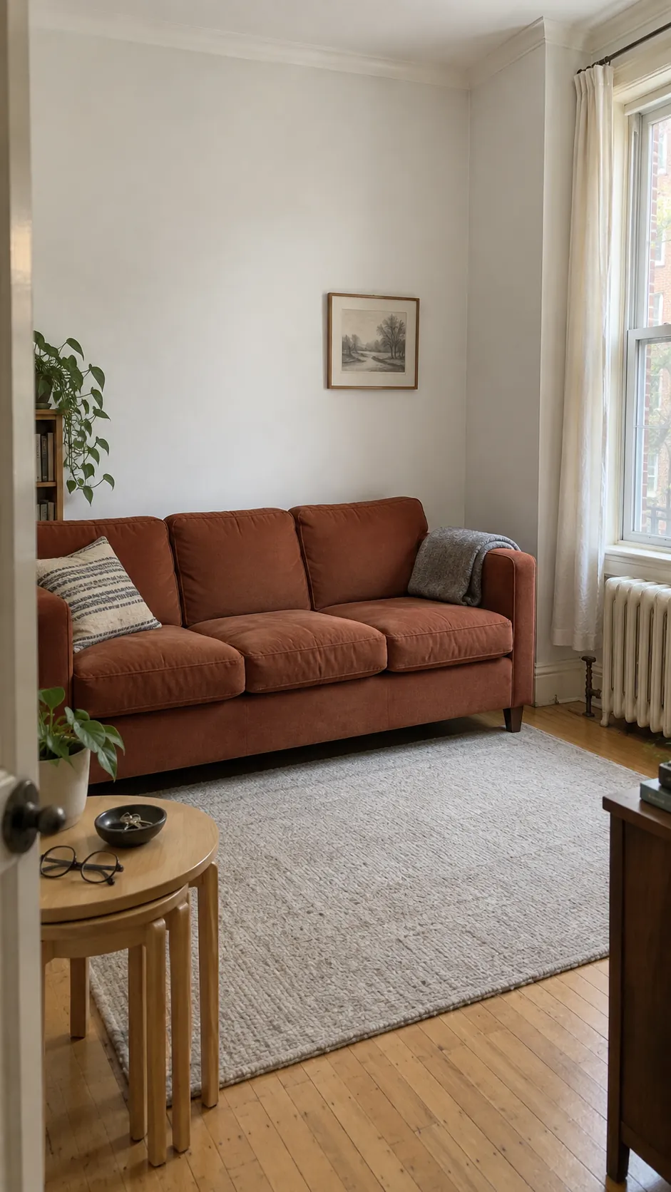
A soft white gives a small room breathing space without making every edge look stark. Hold a large sample beside your existing skirting and window frames, because a creamy trim can make a cooler wall white look blue. Choose a washable finish where hands brush past the sofa, and keep the ceiling slightly lighter if you want a clear boundary. This is a useful starting point when your furniture already supplies most of the colour.
Warm Ivory for a Shaded Sitting Room
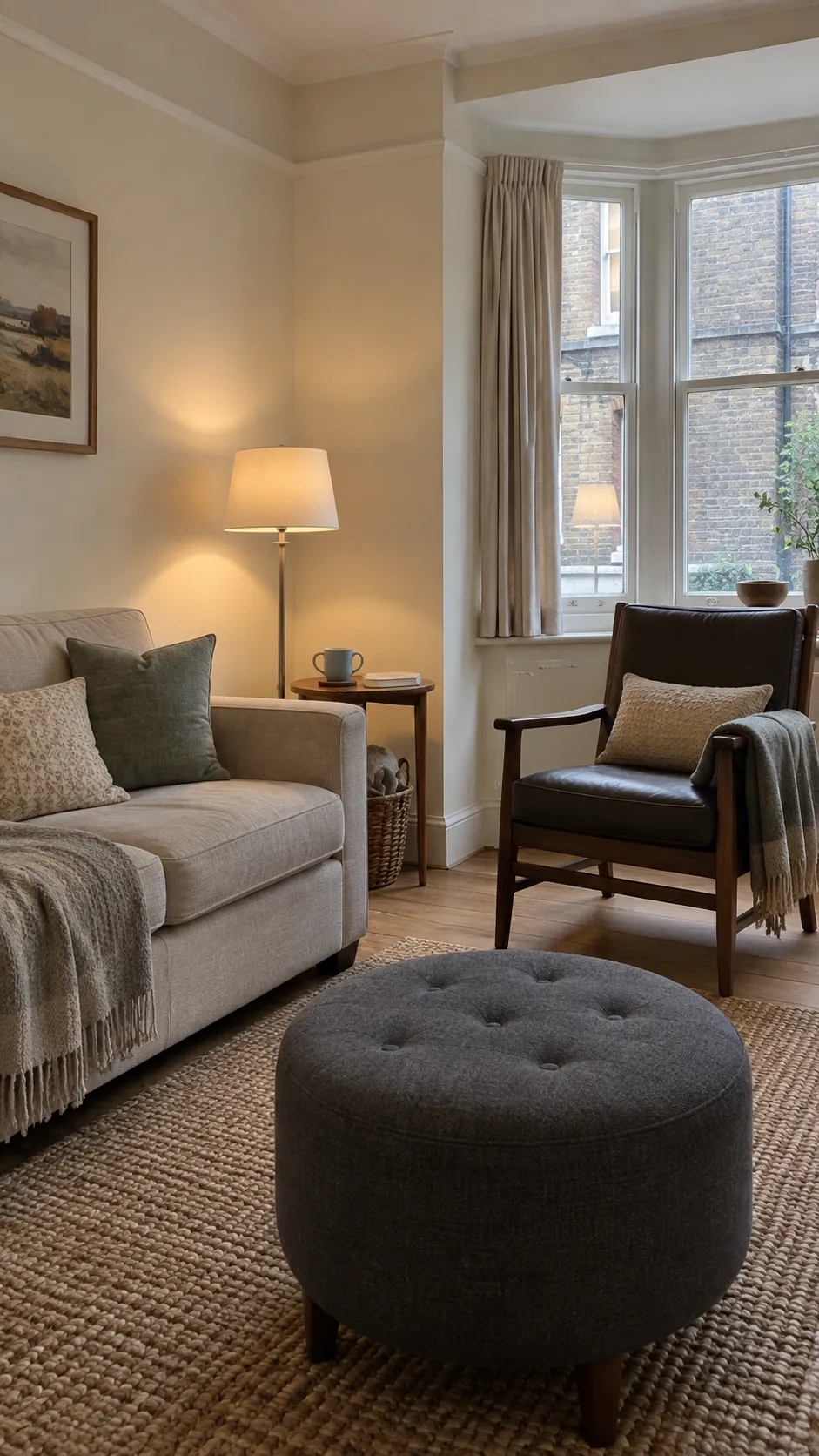
A shaded room can make a blue based grey feel colder than the sample suggests. Warm ivory introduces a little softness, especially beside oatmeal upholstery and dark timber. It cannot create daylight, so pair it with lamps that light both the seating and the surrounding walls. Check the sample after sunset with your usual bulbs switched on. If it turns buttery, move toward a less yellow version rather than covering the entire room and hoping it settles.
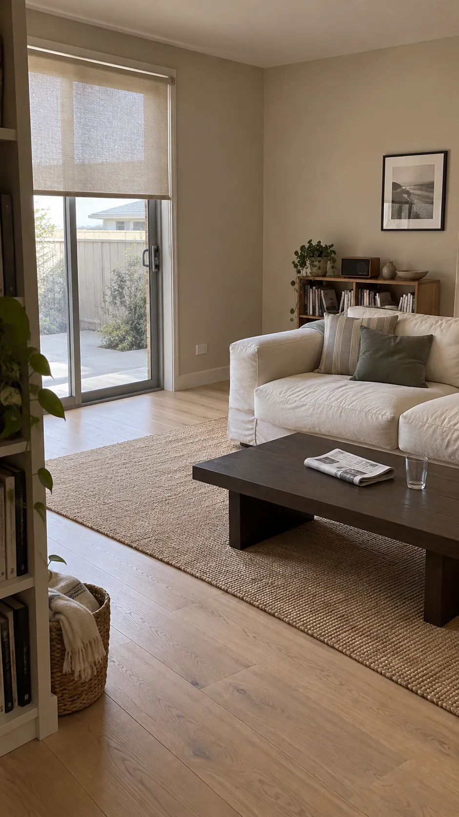
Oatmeal Beige with Natural Fibres
Oatmeal beige works well when you want a neutral color palette with more body than white. Its quiet brown base connects woven rugs, pale oak and linen without demanding matching furniture. Place samples directly above the floor, since orange toned timber can change how the wall reads. A chalky matt appearance softens the combination, while a darker coffee table gives the room enough definition.
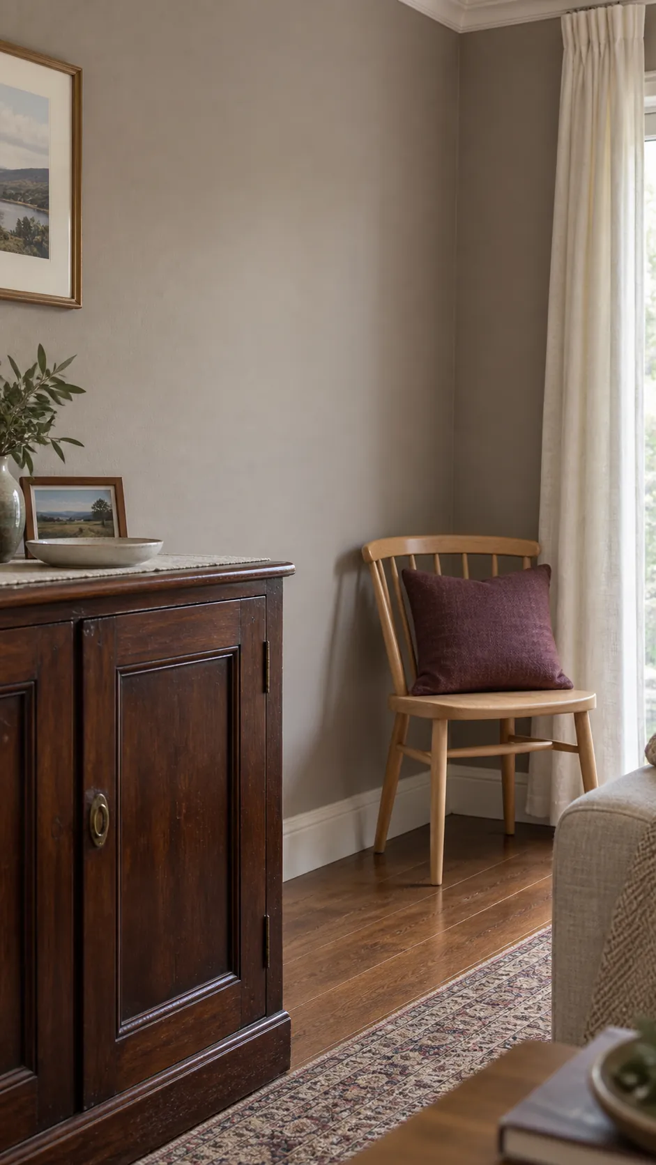
Mushroom for a Room with Mixed Woods
Mushroom sits between grey and brown, making it a useful bridge between different timber finishes. Try it in a living room that combines an inherited dark cabinet with newer pale wood pieces. The shade should relate to the furniture without matching any one object exactly. A cream curtain and a muted plum cushion can stop the scheme feeling uniformly brown. Reject a sample that looks violet beside your flooring unless that undertone is part of the room you want.
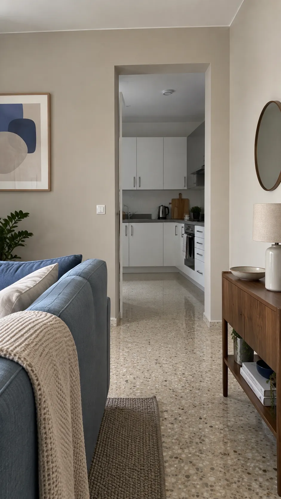
Pale Greige Across an Open Living Area
Connected rooms make paint decisions harder because one wall colour must answer to several fixed surfaces. Pale greige can link a living area with a kitchen when its undertone works with both the worktop and the flooring. View the sample from the adjoining room as well as beside the sofa. Carrying one colour through a shared space reduces abrupt boundaries, but you can still use textiles to give the seating area its own identity. The kitchen cabinet finish should be part of the test from the beginning.
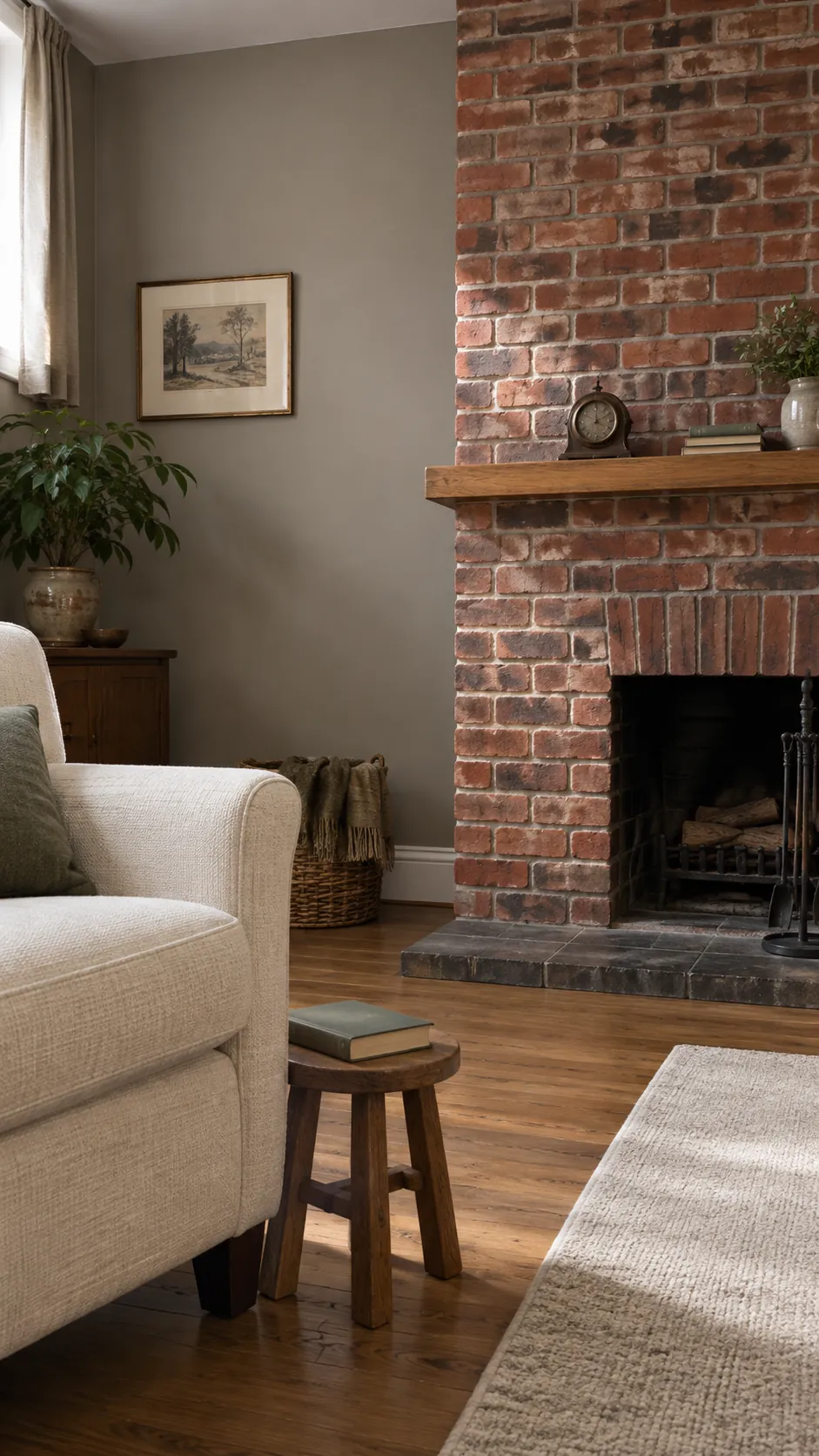
Stone Grey Beside Warm Brick
A stone grey with a restrained warm undertone can quiet the colour variation in an existing brick fireplace. Keep the brick visible while testing, because a grey that looks neutral alone may turn blue alongside red masonry. Choose substantial cream upholstery or a pale rug to separate the seating from the darker focal point. Avoid assuming that every grey needs cool metal accents; worn bronze and oak often fit the brick more naturally.
Muted Sage for Everyday Calm
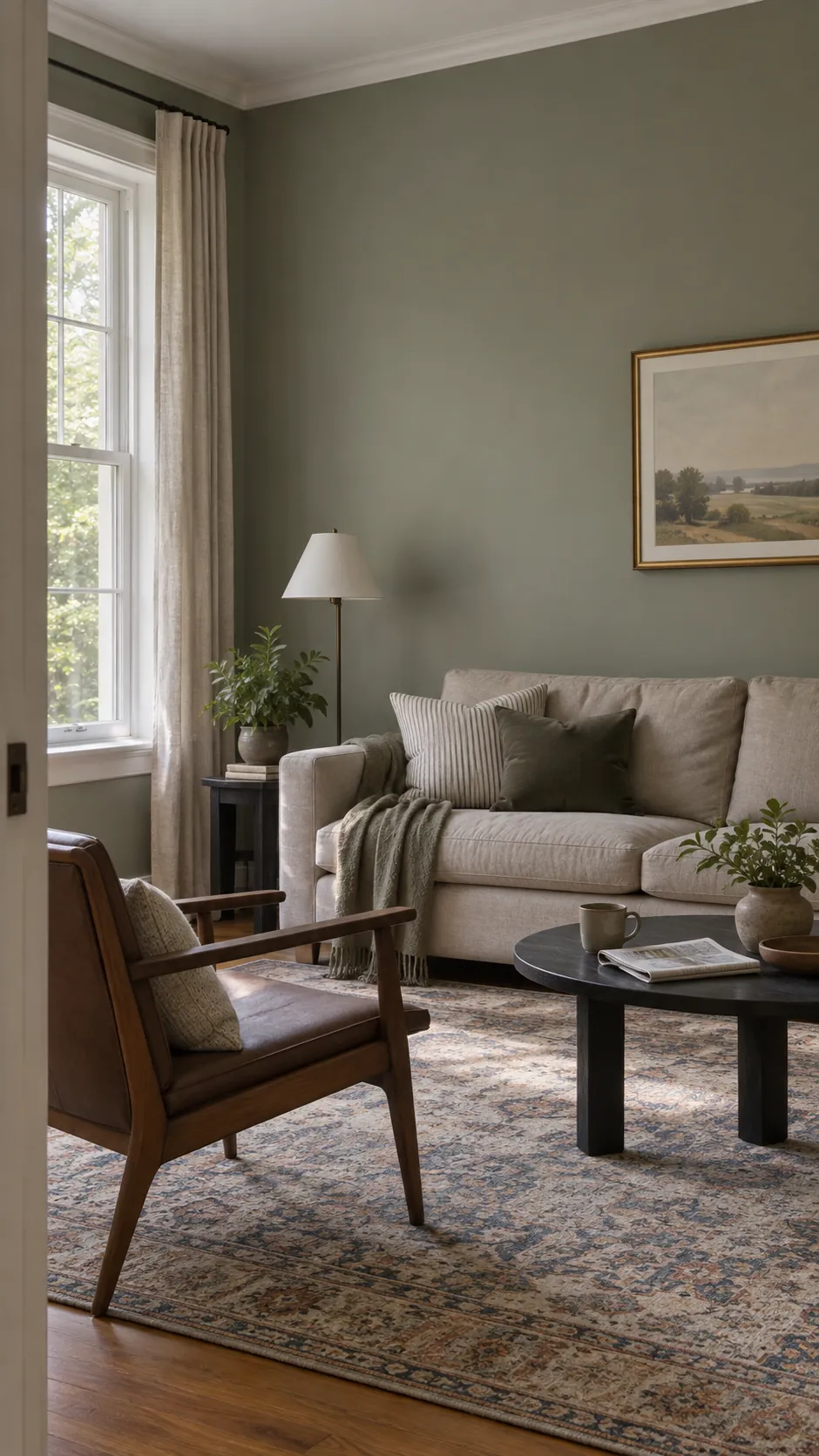
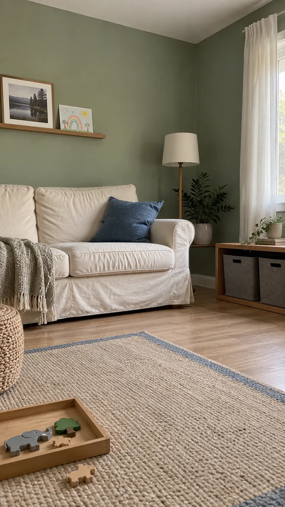
Sage brings colour into a family living room without demanding a bright palette. Look for a muted green that still reads green in the shadowed corner behind the sofa. Cream, faded denim and medium oak make easy companions, especially when toys and everyday objects already add visual variety. A durable paint product matters more than selecting a sheen by name alone. Check the manufacturer’s cleaning and curing guidance before treating a freshly painted wall as washable.
Olive Green Around a Leather Sofa
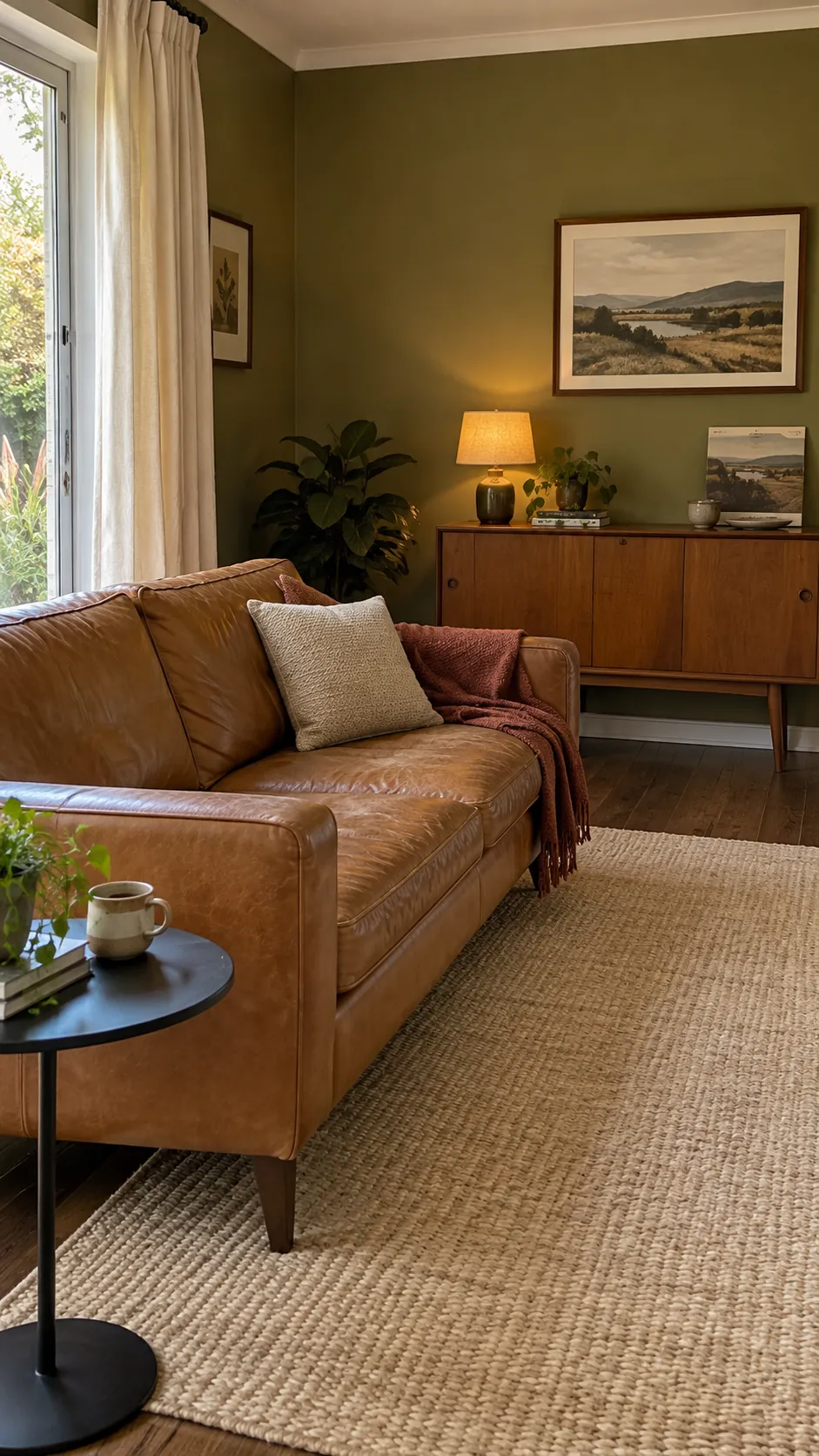
Olive offers a grounded backdrop for tan leather and darker vintage furniture. Its yellow component can intensify in warm evening light, so evaluate it with the lamps you actually use. A pale curtain and a light woven rug create separation around the seating. Keep smaller accessories simple if the leather already has strong grain and patina. This colour is especially effective when you want the room to feel settled rather than newly coordinated.
Forest Green for an Evening Snug
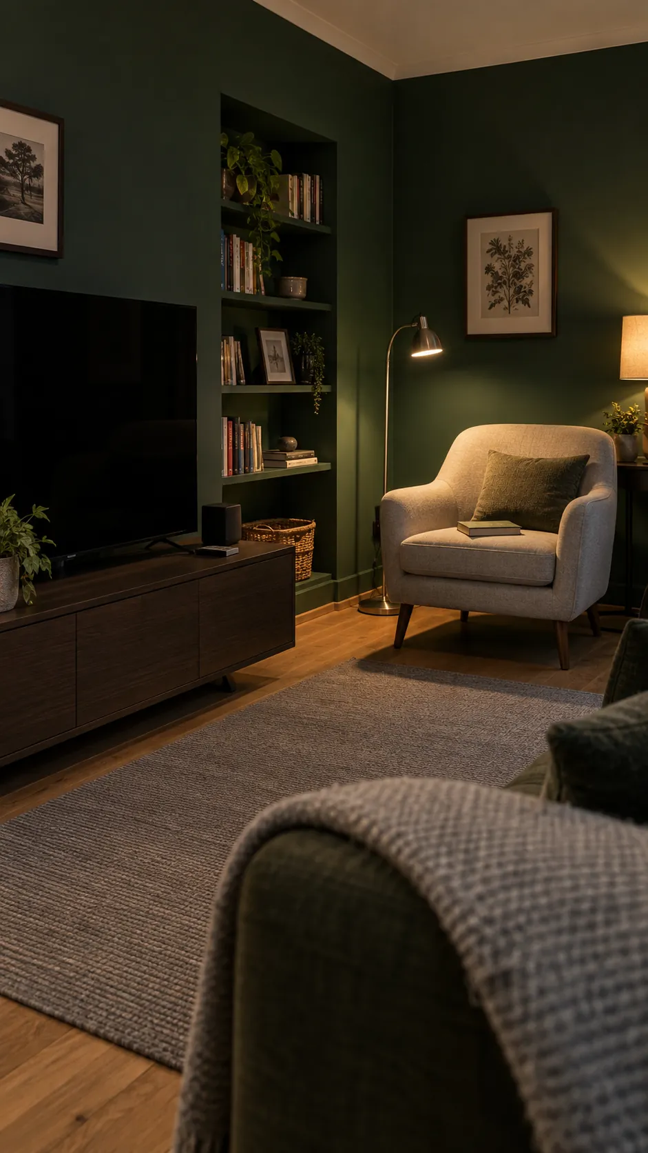
An evening snug does not have to imitate a bright daytime room. Forest green can make a compact television or reading space feel deliberate when the lighting is layered and the seats remain easy to see. Use a lamp near the chair and another source that reaches the back wall, rather than relying on one ceiling fitting. A dark wall can reduce the contrast around a black screen, though reflections still depend on the screen and light positions. Test a broad area before deciding whether the ceiling should stay pale.
Eucalyptus for a Light Garden Room
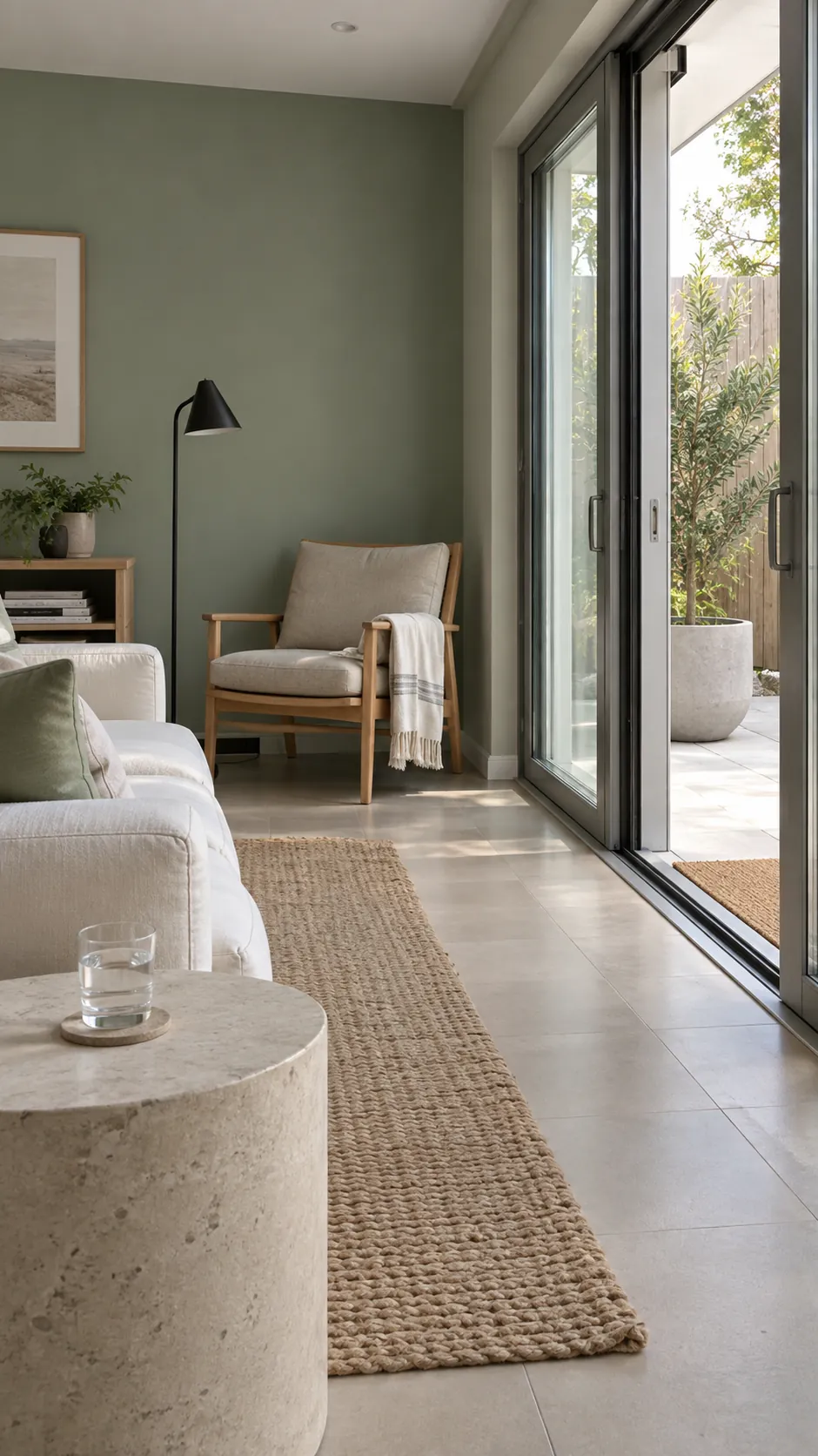
Eucalyptus has a cooler, softer character than olive, making it a gentle partner for views of planting. A living area with glass doors can carry this colour without requiring botanical prints on every surface. Choose a sample that looks distinct from the greenery outside rather than trying to match a leaf exactly. Pale stone, simple cotton covers and a small black accent keep the result clear. Reflected green light from the garden may shift the paint through the day.
Powder Blue with Cream Upholstery
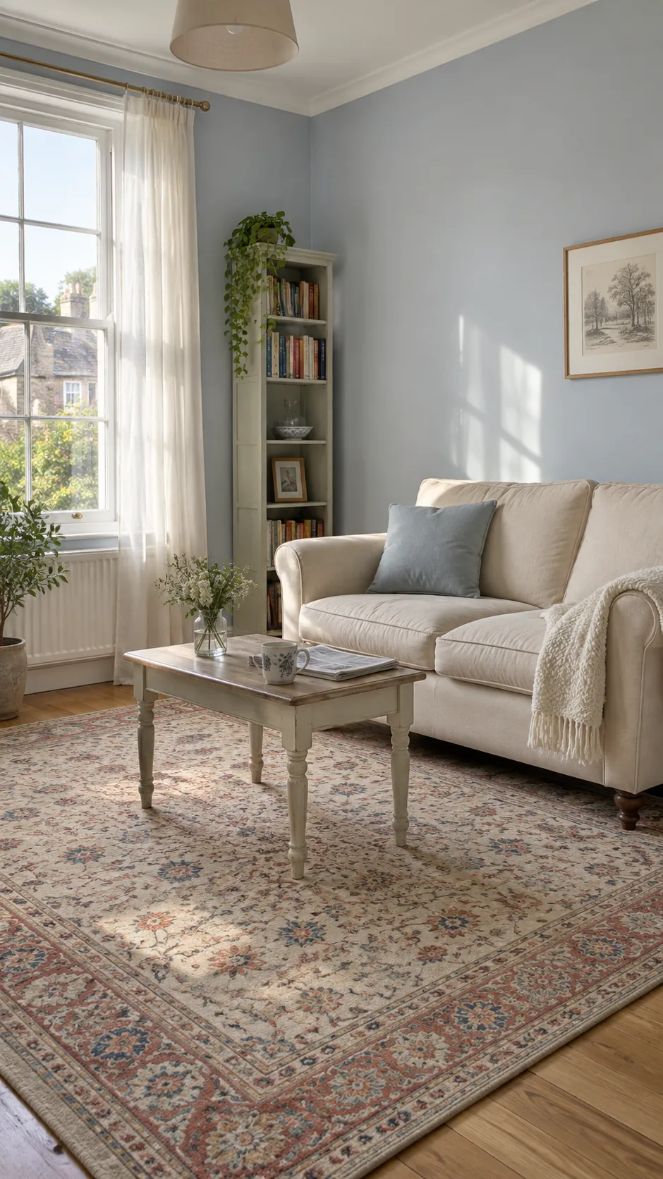
Powder blue gives a sunny room a cooler visual balance while cream upholstery keeps it approachable. The trick is choosing a softened blue rather than a bright nursery shade. Try it with a faded patterned rug to introduce depth without adding another large block of colour. If the room receives very little daylight, inspect the blue carefully in the darkest corner. The same sample can feel airy near a window and flat behind a tall cabinet.
Slate Blue for a Working Living Room
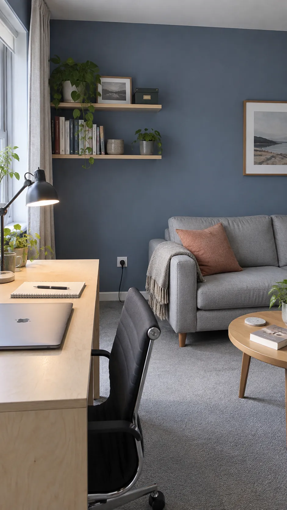
Slate blue has enough grey to sit comfortably around books, a desk and everyday technology. It can help a small work corner belong to the living room without building a separate office scheme. Use a desk surface that contrasts clearly with the wall, and position task lighting for the work itself. One warm textile near the sofa keeps the space from becoming overly cool. Judge the colour from the seat where you spend the longest part of the day.
Deep Navy with Pale Architectural Details
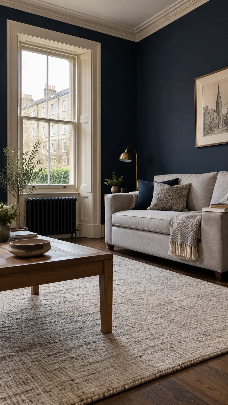
Navy makes pale window frames and mouldings read as deliberate features. It suits a room where you want the architecture to remain visible rather than disappear into one colour. Strong contrast will also draw attention to uneven edges, so preparation and careful cutting in matter. Let a pale rug occupy enough floor area to balance the dark walls. Brass can add warmth in small doses without turning every fitting into a statement.
Dusty Teal with Walnut Furniture
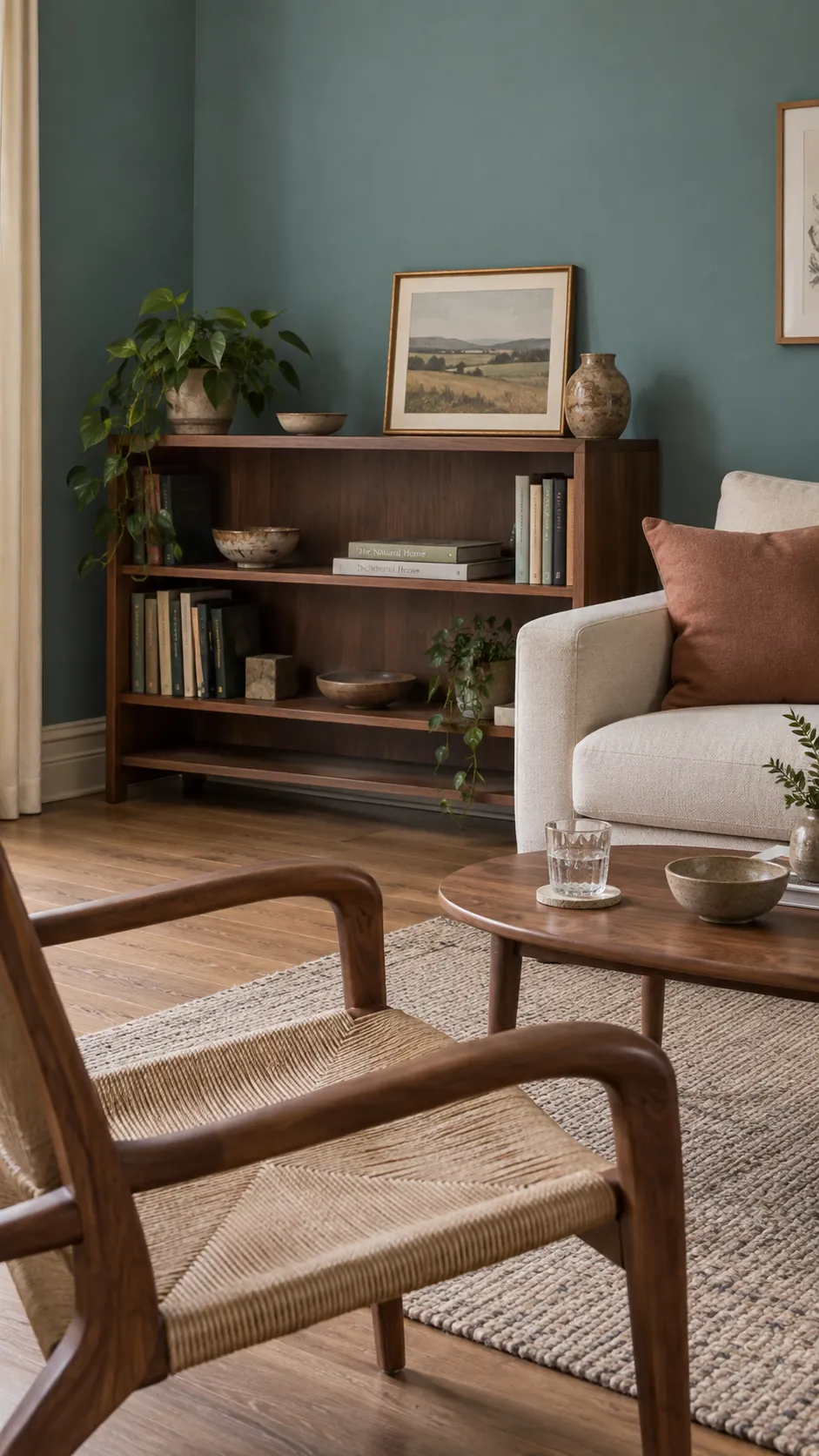
Dusty teal combines blue and green in a way that gives walnut furniture a richer setting. Select a muted version if your living room already includes patterned textiles or several timber pieces. A clay cushion can provide a small complementary note without becoming a second dominant colour. Keep sample boards away from coloured lampshades when comparing undertones. These wall colour combinations for living rooms work best when one large surface leads and the others support it.
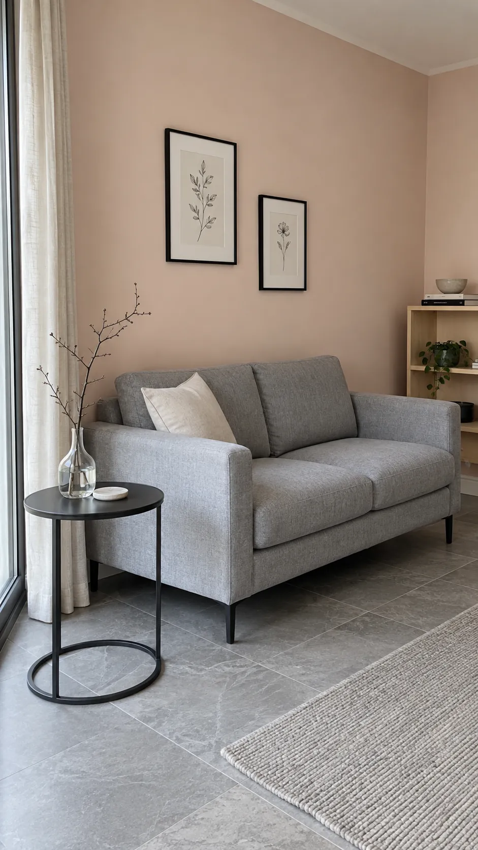
Pale Blush That Behaves Like a Neutral
Pale blush can read as a warm neutral when the pink is softened with beige. It is useful beside cool stone or grey upholstery that needs a little warmth. Compare it with the largest fabric in the room, because a pink wall can make some greys appear greener. Black picture frames or a dark side table give this gentle colour a firm edge. Choose the sample for the room itself, not for how flattering it looks on a phone screen.
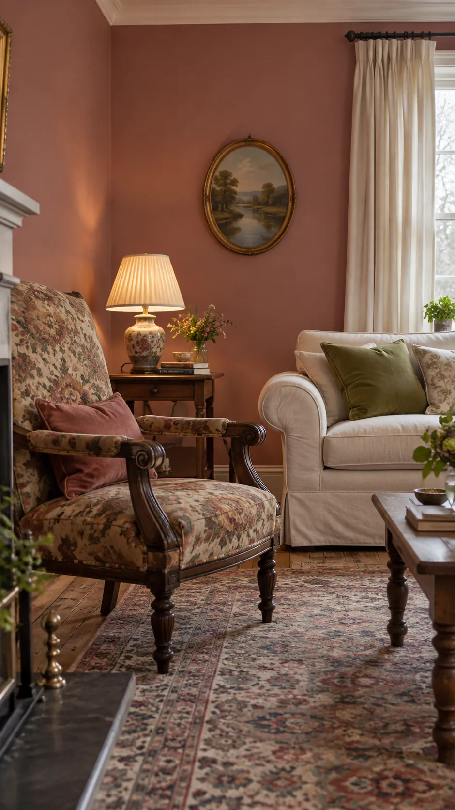
Dusty Rose with Traditional Furniture
Dusty rose has more depth than blush and can sit comfortably with carved wood or an inherited patterned chair. Pull a quiet rose note from an existing rug if you want the scheme to feel connected. Keep the ceiling and curtains restrained so that the furniture retains its shape against the wall. A small amount of moss green creates an interesting pairing without making the room look themed.
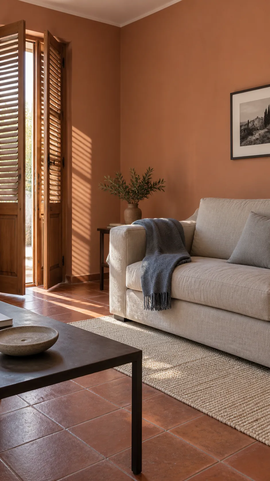
Terracotta with a Cooler Counterbalance
Terracotta adds warmth quickly, which makes the precise shade especially important in a room with strong afternoon sun. Choose a muted clay rather than a saturated orange if the floor is already warm. A stone coloured sofa or a blue grey textile can balance the wall without cancelling its character. Wall colour texture will also change the effect, since a highly uneven decorative finish creates shadows that plain paint does not. Sample the actual finish you intend to use.
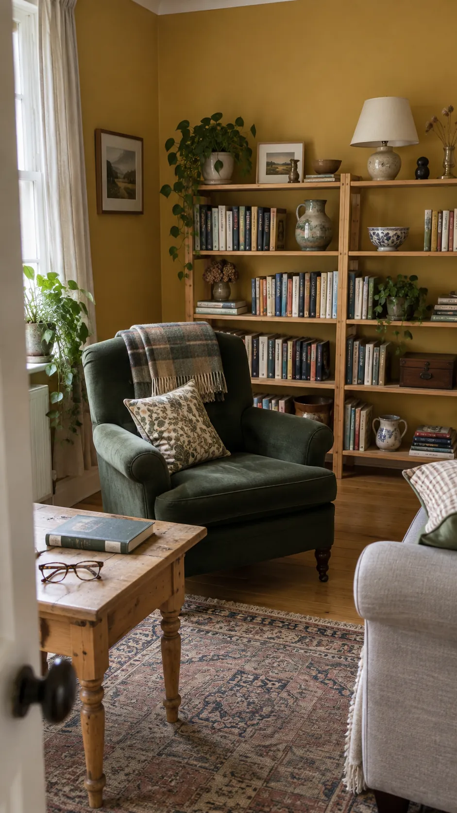
Muted Ochre for a Collected Room
Ochre brings a golden note that feels more grounded than a clear bright yellow. It works around books, ceramics and furniture gathered over time, where a pristine white wall might sharpen every difference. Use cooler natural daylight to judge whether the sample still feels warm without looking muddy. A dark green chair and cream lampshade give the colour useful companions. Limit additional yellow accessories so the wall remains the main source of warmth.
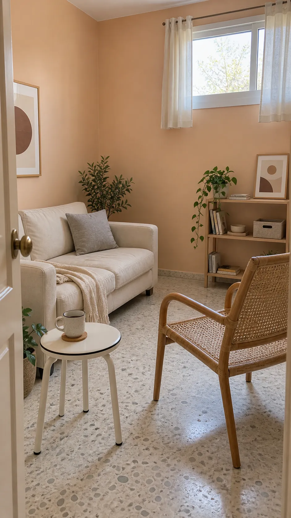
Soft Peach for a Small Conversation Corner
Soft peach can warm a compact living corner without the visual weight of terracotta. A restrained version with a little beige suits pale terrazzo, light curtains and simple cane furniture. Test it against the ceiling white because the contrast may make the peach look stronger than expected. For a rental where painting is permitted, ask about the required return colour before choosing a whole room scheme. Keep the surrounding fabrics quiet enough for the gentle wall colour to register.
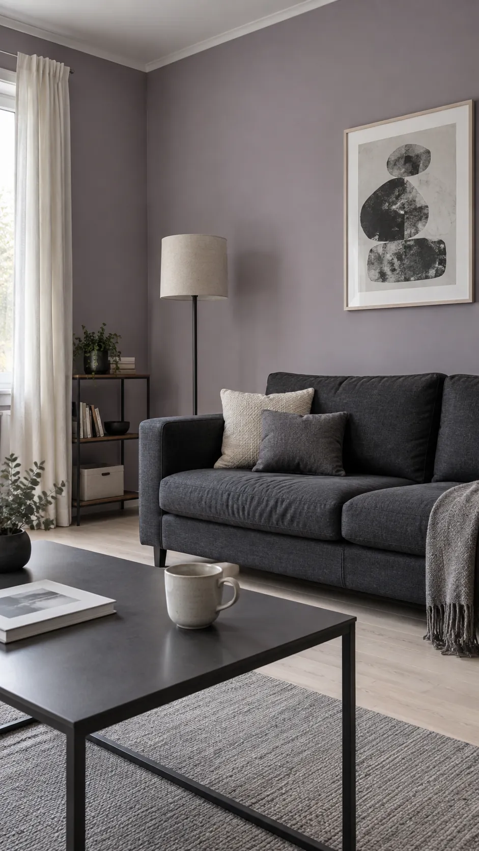
Smoky Lilac with Charcoal Accents
Smoky lilac offers an alternative to familiar blue and green living rooms. The grey component keeps it subdued, while charcoal upholstery or a dark metal table anchors the softer colour. Check it under both daylight and evening bulbs, since a purple undertone can become much more obvious at night. Choose art with a limited palette so the wall does not compete with several unrelated colours. This is a good candidate for a large movable sample before committing.
Warm Charcoal for a Deliberate Dark Room
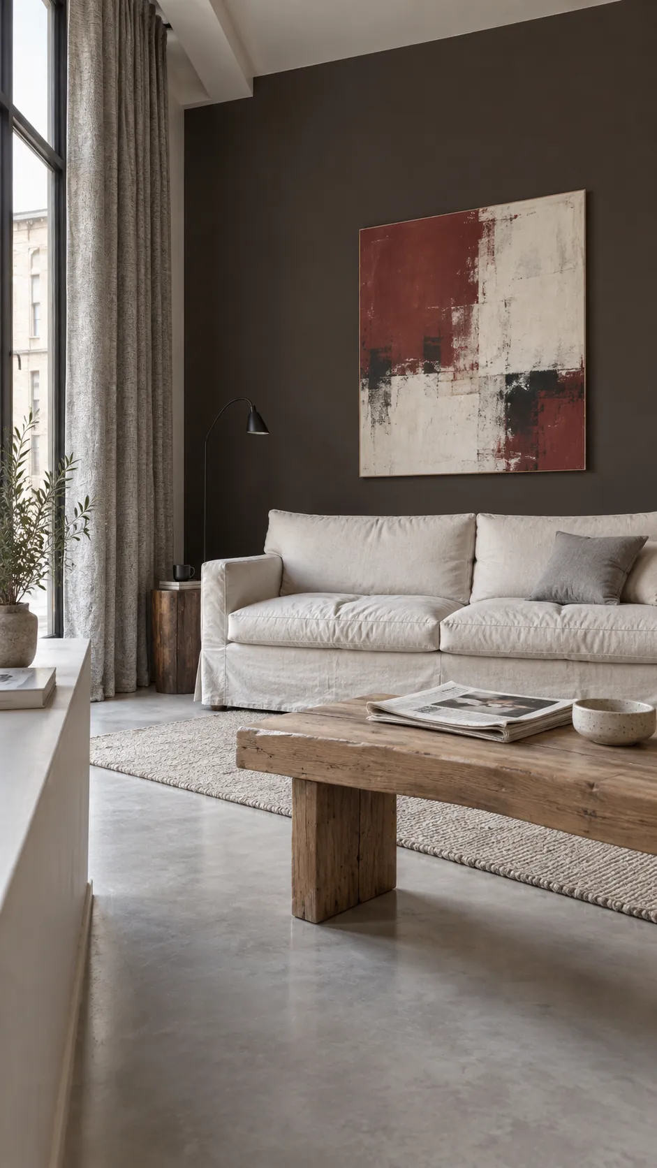
Warm charcoal can make a bright artwork, pale sofa or textured curtain stand out with very little extra decoration. Select a brown leaning charcoal if cooler samples look harsh against your flooring. Paint a large sample board and move it between the fireplace, window and seating wall before deciding. If you are comparing Benjamin Moore paint colors or another brand’s range, test the actual product and finish rather than relying on a similar name. Leave the sample up through the times you use the room most. The colour that works beside your real furniture at those hours is the one worth buying.