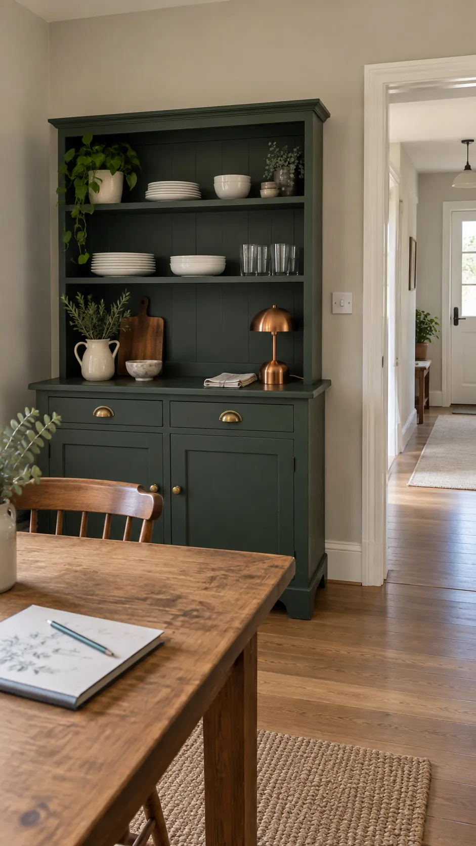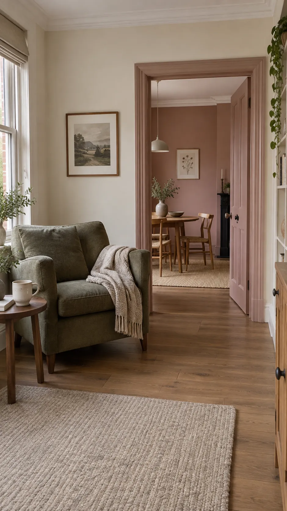
A paint color can look right in one room and wrong through the next doorway. Start with the floors, trim and large furniture you already own, then choose where you want continuity and where you want contrast. Physical samples viewed in daylight and under your own lamps tell you more than a screen swatch.
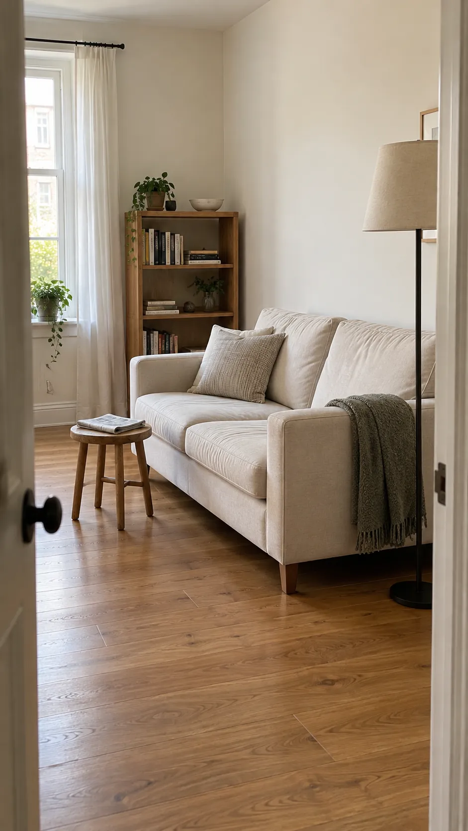
Ivory, oak and soft black
Ivory gives oak floors a quieter partner than a stark blue white. Keep the largest upholstery piece pale, then use soft black on a lamp or slender table legs to establish definition. This combination works particularly well when your flooring already carries plenty of golden color. Compare the ivory sample against both the floor and existing trim before committing.
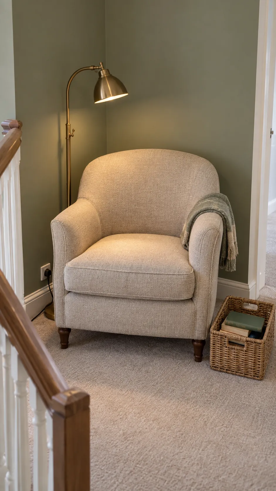
Sage, oatmeal and aged brass
Sage can introduce color without making every doorway feel like a new chapter. Pair it with oatmeal fabric rather than brilliant white if you want softer transitions into nearby neutral rooms. Aged brass contributes a small warm highlight on cabinet pulls or a reading lamp. Choose a gray leaning sage when your textiles are already strongly yellow, and judge the sample in evening lamplight as well as daylight.
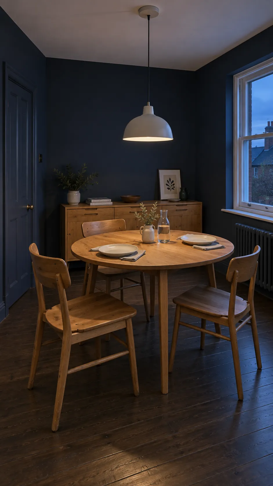
Navy, chalk and caramel
A navy dining room can connect to a chalk colored hall through repeated caramel wood. Let the blue occupy the walls and keep the ceiling lighter when the room has modest height. Caramel leather or a wood sideboard prevents the scheme from feeling overly formal. If the adjoining space has a cool gray floor, carry one blue textile across the threshold to make the transition deliberate.
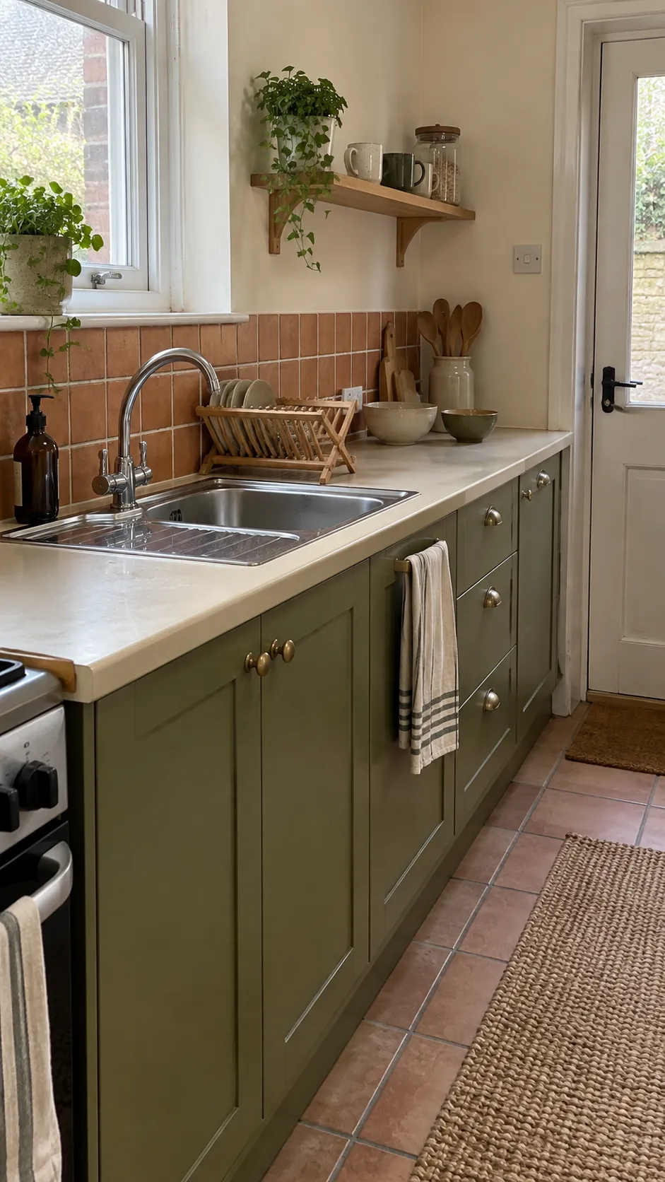
Terracotta, cream and olive
Terracotta belongs comfortably beside cream and olive because all three can carry an earthy softness. Use the clay tone on a washable accent surface or textiles if a whole painted room feels too permanent. Olive cabinetry or a chair gives the warmer color something deeper to rest against. Avoid choosing every element at maximum saturation, since a muted cream needs visual breathing room.
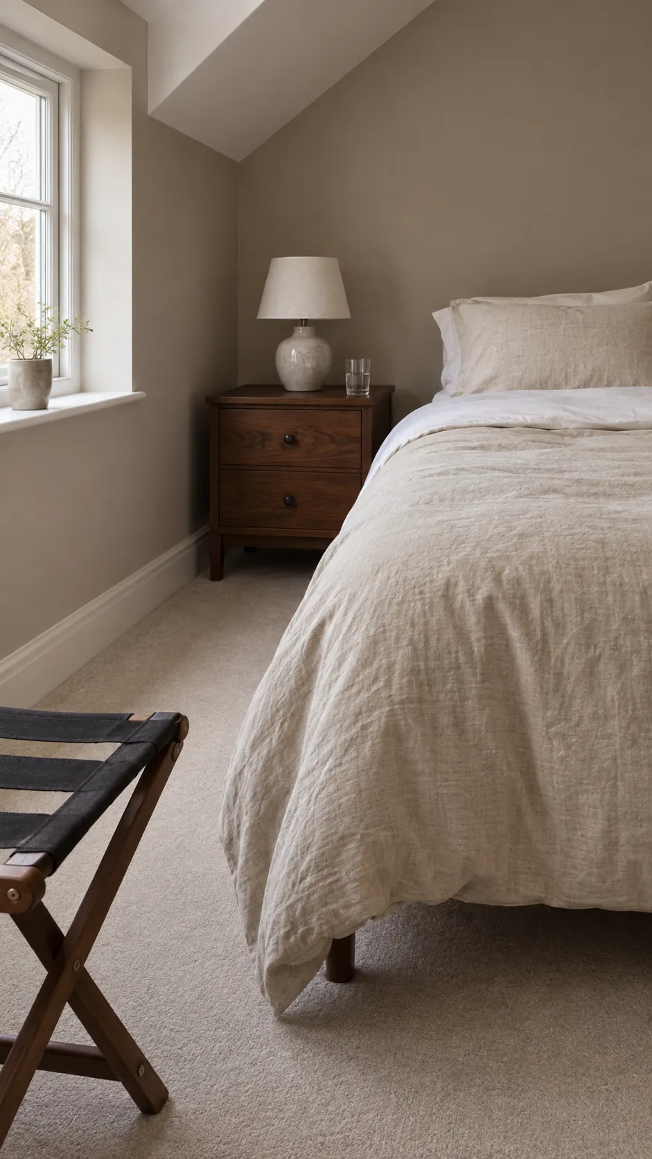
Mushroom, linen and walnut
Mushroom bridges beige and gray, which makes it useful around mixed inherited furniture. Linen curtains lift the room while walnut adds depth without another paint color. The risk is a muddy result when all three occupy the same middle value. Keep either the wall or the largest textile noticeably lighter than the wood so the shapes remain legible.
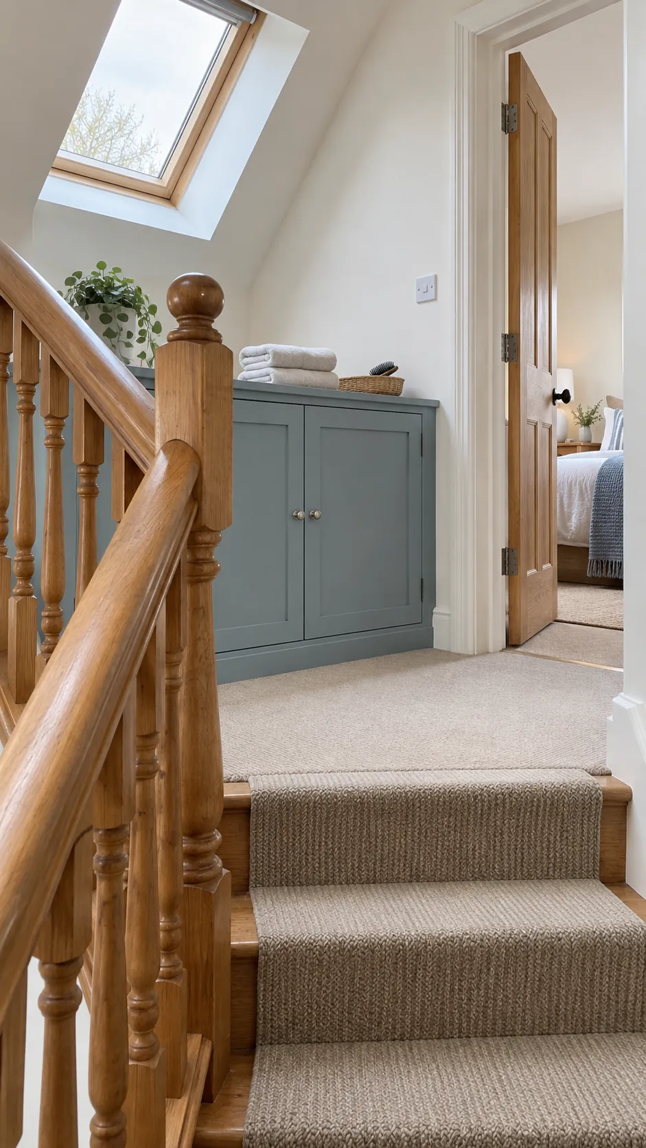
Dusty blue, warm white and honey wood
Dusty blue is a gentler partner for honey colored wood than a bright icy blue. Warm white on connecting walls lets the wood remain a consistent thread through the house. In a room with strong afternoon sun, sample a quieter blue before choosing a more saturated version. Use a little of that blue in the next room through a cushion or ceramic bowl rather than repainting every wall.
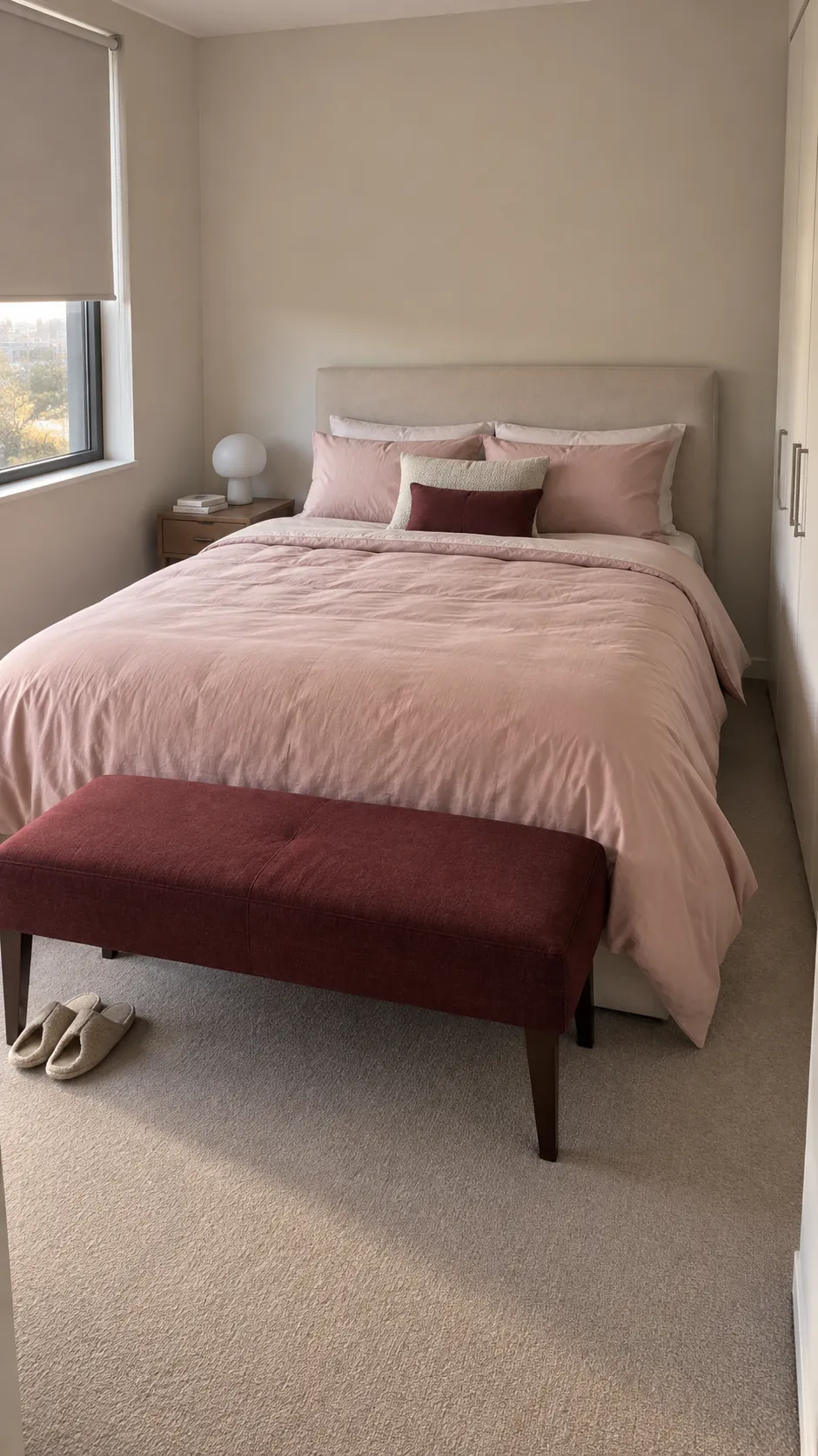
Blush, burgundy and pale stone
Blush gains substance when burgundy appears in a smaller supporting role. Pale stone on the walls or floor keeps the pairing from turning into a single sweet note. Try burgundy on a compact chair, lampshade or bed throw where its depth can be controlled. A peach leaning blush and a purple leaning burgundy may pull apart, so assess fabric and paint samples together.
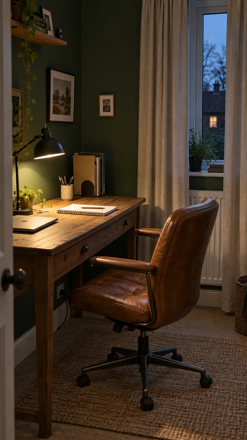
Forest green, putty and cognac
Forest green creates a comfortable backdrop for a room used mostly at night. Putty curtains provide relief without the sharp outline of pure white, while cognac leather adds a warmer middle tone. Keep the green away from tiny isolated patches if you want the room to feel settled. A single substantial wall or a complete small study usually reads more convincingly than scattered dark accents.
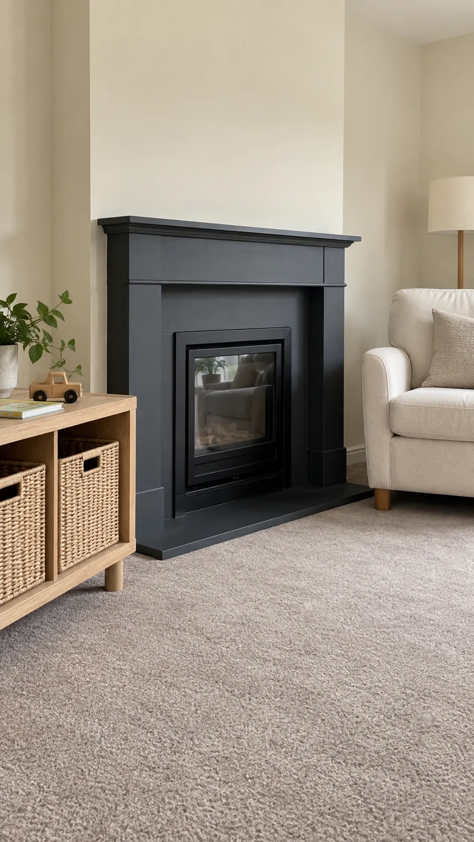
Charcoal, ivory and natural ash
Charcoal can sharpen a scheme without requiring black walls throughout the house. Use it on a fireplace surround or built in cabinet, then repeat a smaller dark detail in the adjacent space. Ivory upholstery softens the contrast and ash wood keeps the room visually lighter than walnut would. Dust and fingerprints show differently on dark finishes, so consider daily maintenance when choosing the sheen.
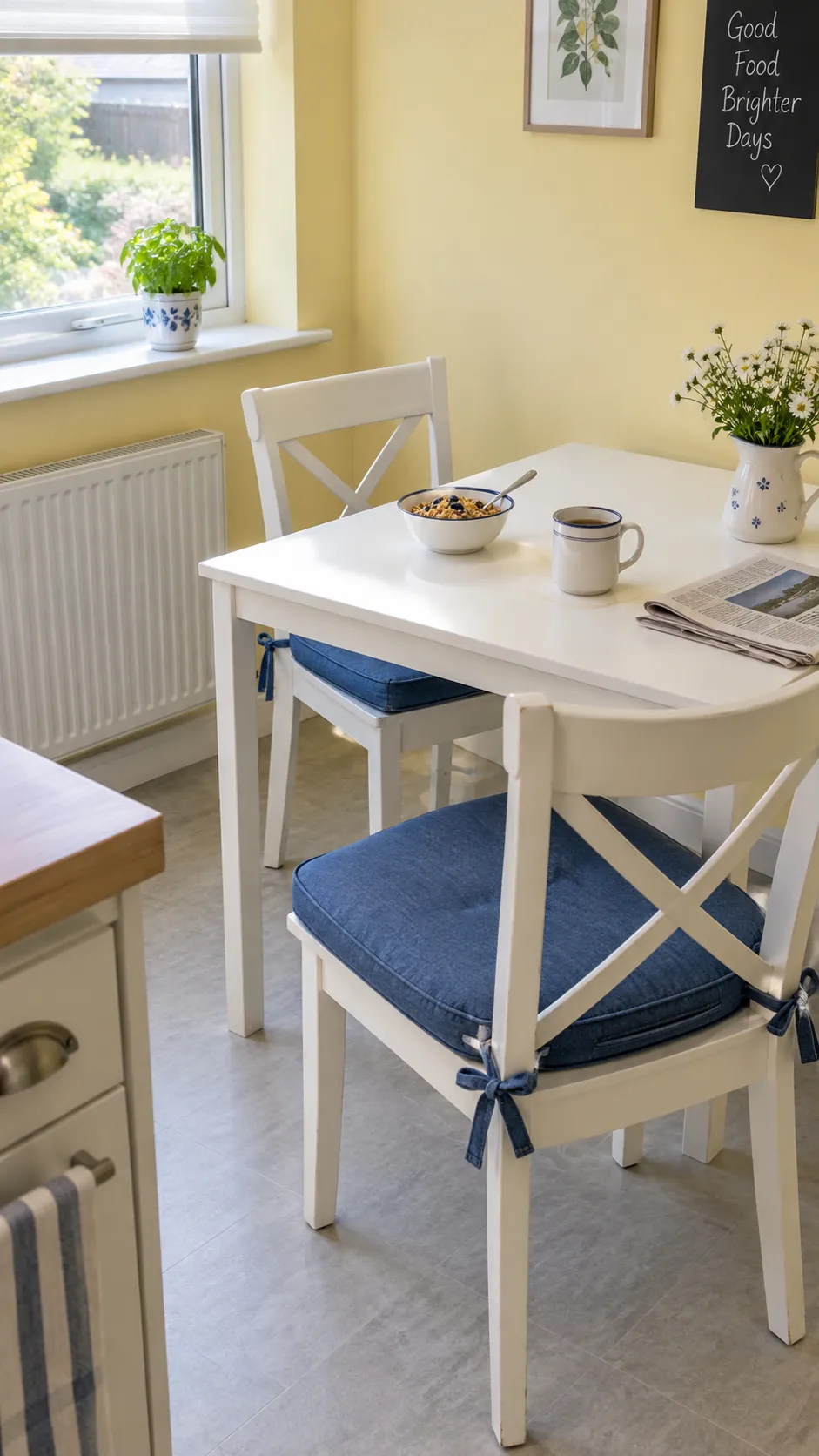
Butter yellow, porcelain white and denim
A restrained butter yellow makes a breakfast corner feel cheerful without needing bright accessories. Porcelain white keeps the yellow crisp, while denim blue gives it a cooler counterweight. Start with the fabric if you already own blue upholstered chairs because denim shades range from gray to violet. The yellow should still look pleasant under your actual bulbs, not only beside a sunny window.
Greige, rust and ink blue
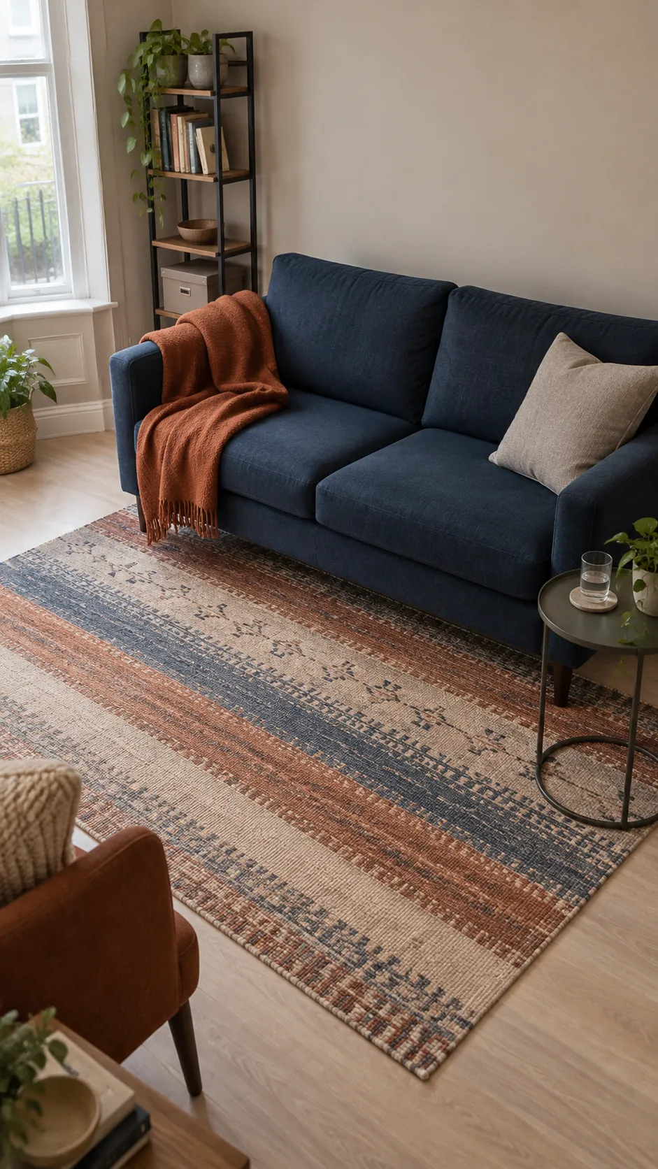
Greige is useful when you want expressive textiles to carry the personality. Rust provides warmth and ink blue supplies depth, leaving the wall color as a steady background. Pull both accent colors from one rug if coordinating separate purchases feels difficult. Choose a greige that agrees with the rug's pale areas rather than relying on its name on a paint card.
Sea glass, sand and weathered oak
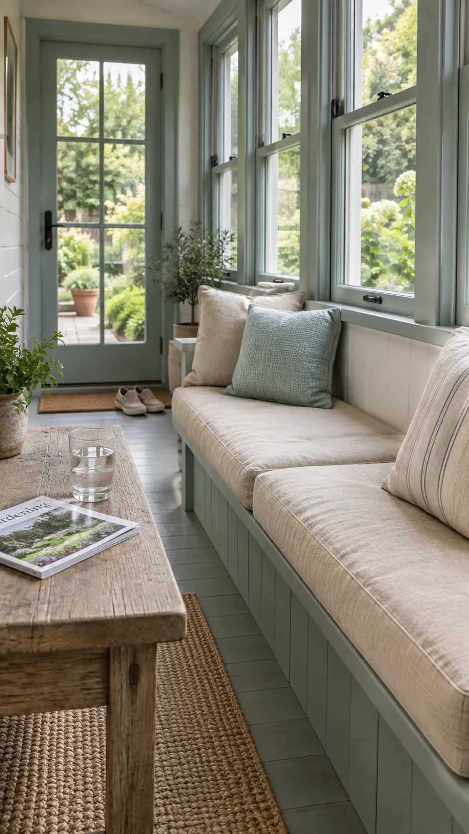
Sea glass works best as a subdued green blue instead of a saturated tropical turquoise. Sand colored upholstery and weathered oak create an easy connection to neutral hallways. This is a useful route for coastal color combinations at home without shells or nautical props. Keep the wood's grayness in balance with warmer fabric so the space does not feel washed out.
Plum, pale gray and pewter
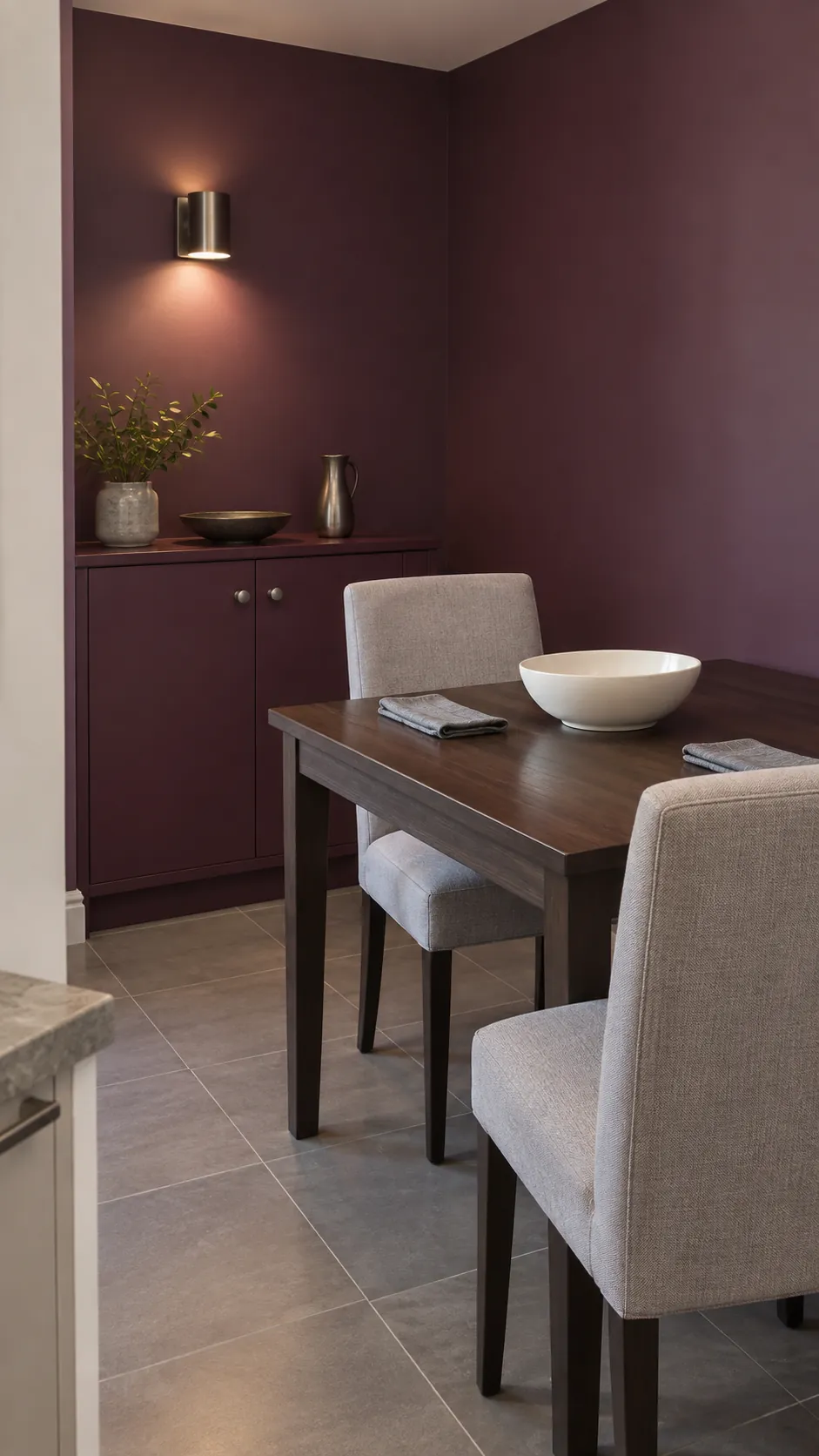
Plum gives a small dining space a richer mood than another gray wall. Pale gray fabric makes the purple easier to live with, and pewter hardware stays quiet beside both colors. Look for a gray with a compatible violet or neutral undertone rather than a strong green cast. Bring the plum into an adjoining room through a book cover or fabric detail if the doorway remains open most of the day.
Chocolate, cream and faded pink
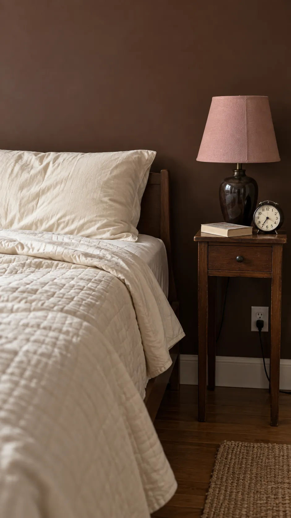
Chocolate brown can make a bedroom feel sheltered while cream bedding keeps the bed from disappearing. Faded pink adds a softer temperature shift than a bright accent would. Repeat the brown in a small piece of furniture elsewhere to connect the darker bedroom with the house. Test a large sample behind the headboard because the color will occupy your view differently when you are lying down.
Pale peach, clay and espresso
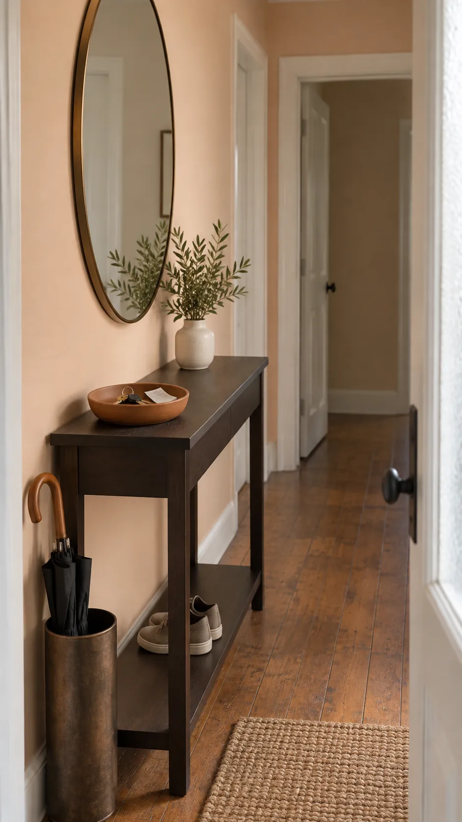
Pale peach can serve as a warm neutral when its saturation is low. Clay accessories reinforce that warmth, while espresso furniture prevents the room from floating into pastel. This palette is particularly useful when you want home interior color ideas that work with existing dark wood. Leave enough difference between the peach wall and clay objects that each still has a clear outline.
White, cobalt and pale birch
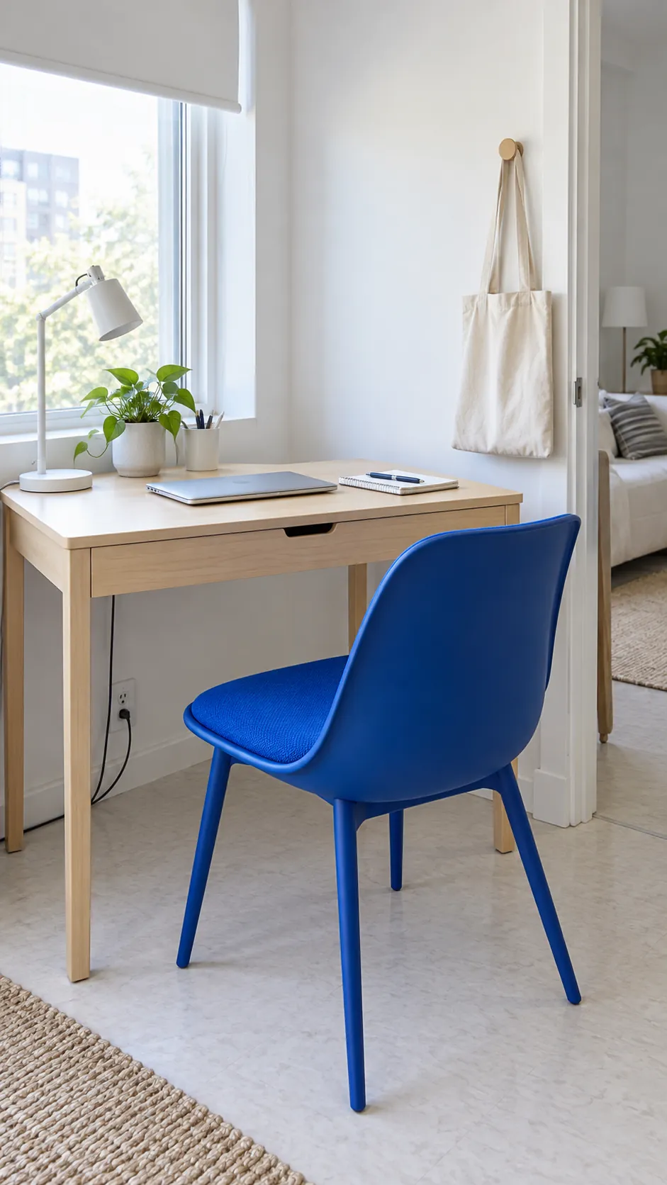
Cobalt needs little space to change the character of a white room. Put it on a chair or cabinet door and keep birch furniture simple so the accent remains easy to read. Renters can achieve the same effect with a removable textile and a portable lamp. Choose one substantial blue element before buying several small accessories, which can make a modest room feel busy.
Olive, aubergine and warm limestone
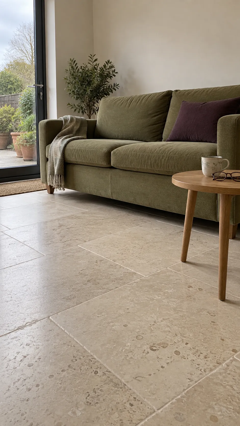
Olive and aubergine are a good choice when you want depth without a conventional blue palette. Warm limestone provides a lighter resting point between the two stronger colors. Let one of the dark tones dominate rather than dividing them equally across the room. An olive sofa with a single aubergine cushion is easier to balance than alternating large furniture pieces.
Pewter blue, white and reddish oak
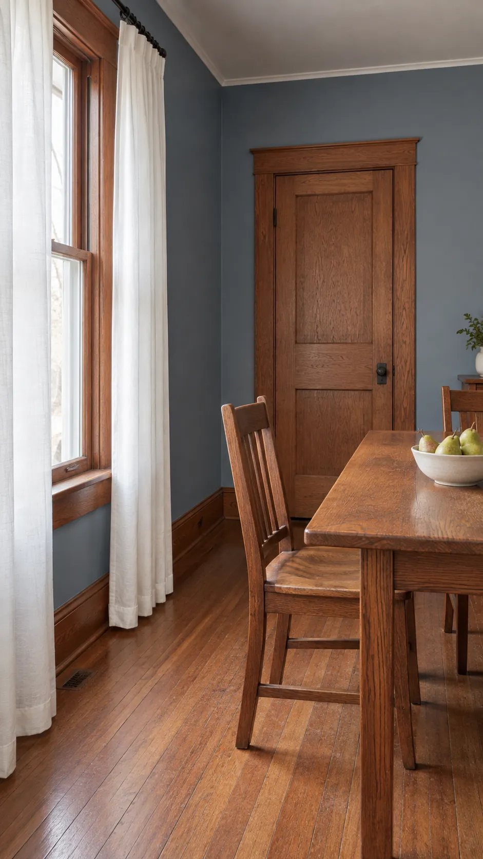
Reddish oak often looks more intentional beside pewter blue than beside a nearly matching beige. The cool wall color creates contrast while white keeps the overall room clear. Keep new wood purchases limited if the floor and trim already have a strong red tone. Compare the blue with the actual oak at different times of day because reflected light can change how warm the wood appears.
Warm gray, marigold and black
Marigold gives warm gray a purposeful accent instead of another layer of beige. Black on a narrow frame or table base helps contain the brighter color. Keep the marigold to a movable item if you are unsure how much intensity you enjoy daily. In an open plan space, repeat a small yellow detail beyond the seating area so it feels connected to the rest of the room.
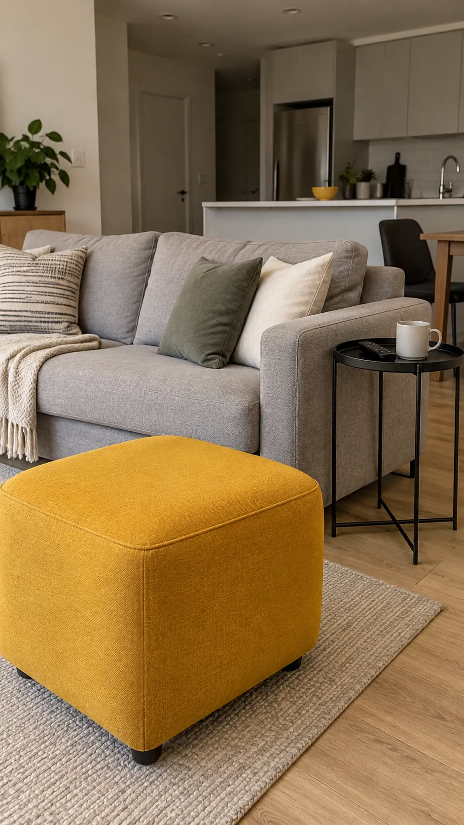
Lavender gray, cream and light maple
Lavender gray can be a quiet bedroom color when the purple stays subtle. Cream softens it and light maple brings warmth without a heavy orange contrast. Use actual bedding samples when testing the paint because a cool white duvet can make the walls look more purple. This scheme suits a gentle mood, but it still needs differences in texture to keep the pale colors distinct.
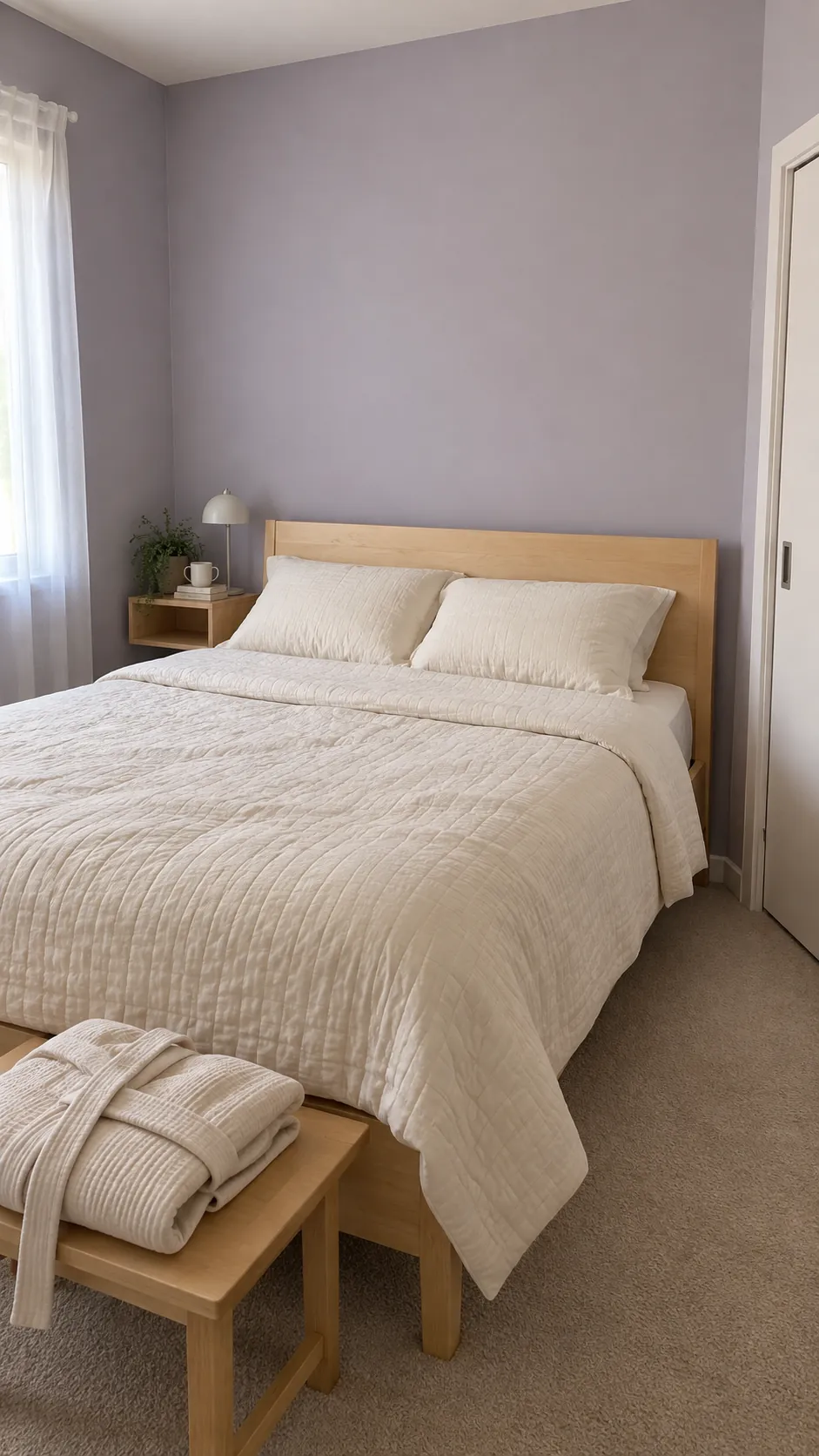
Brick red, flax and dark bronze
Brick red has enough earthiness to sit comfortably beside flax curtains and dark bronze details. A dining room or entry can carry this depth while neighboring rooms remain lighter. Match the red to fixed brick or terracotta only after viewing them together, since similar colors can disagree sharply. If repainting a whole room is impractical, a large cabinet can provide the same strong anchor.
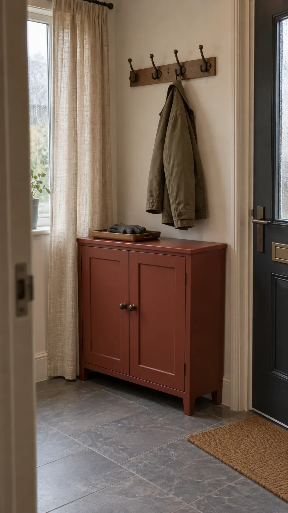
Teal, camel and ivory
Teal becomes easier to coordinate when camel provides a warm bridge to timber furniture. Ivory on the largest surrounding surface stops the two richer tones from feeling dense. Use this combination for a sitting room that needs a stronger identity than its adjoining hallway. A muted teal usually makes the transition gentler than a jewel bright version, especially in compact homes.
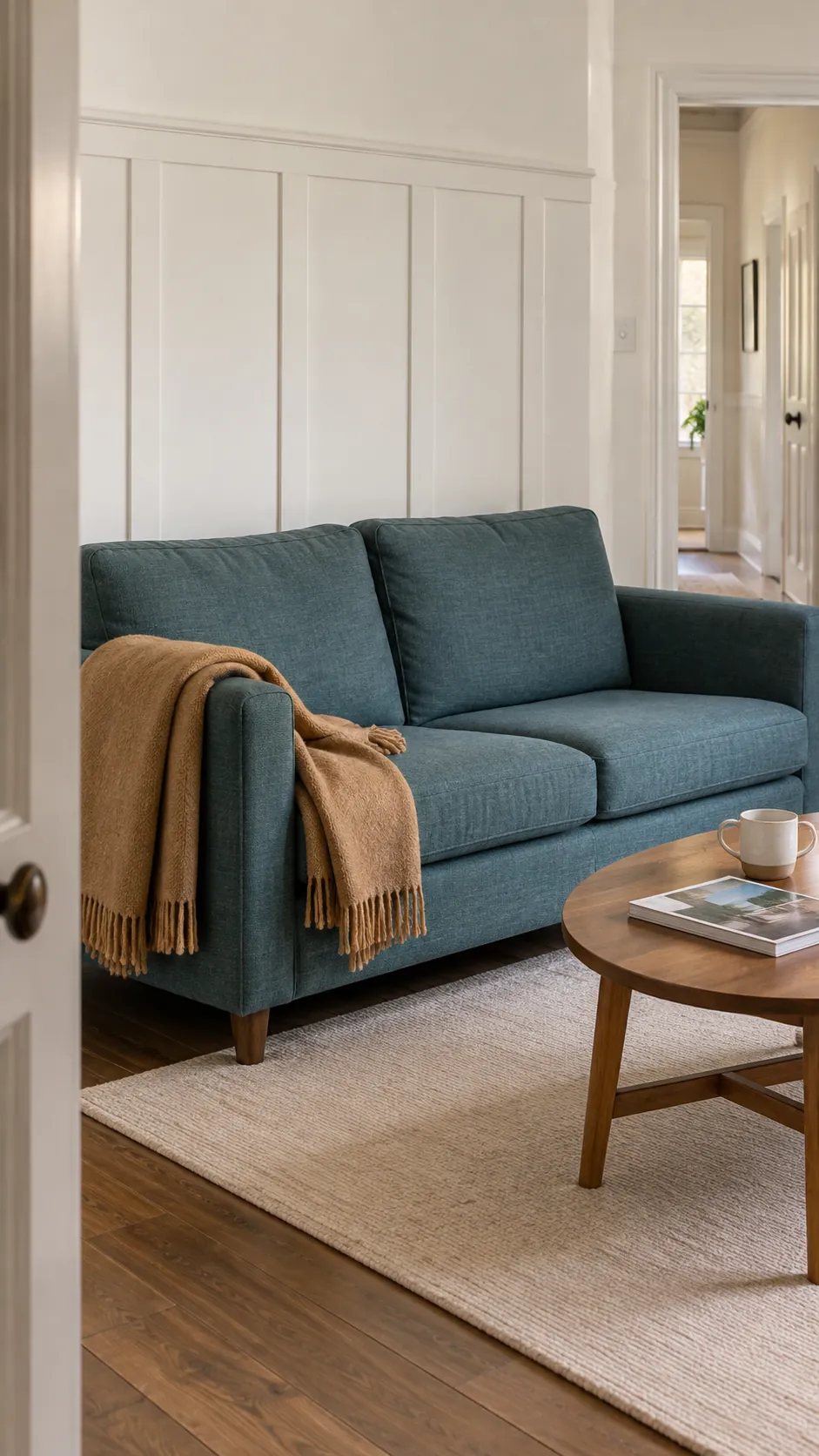
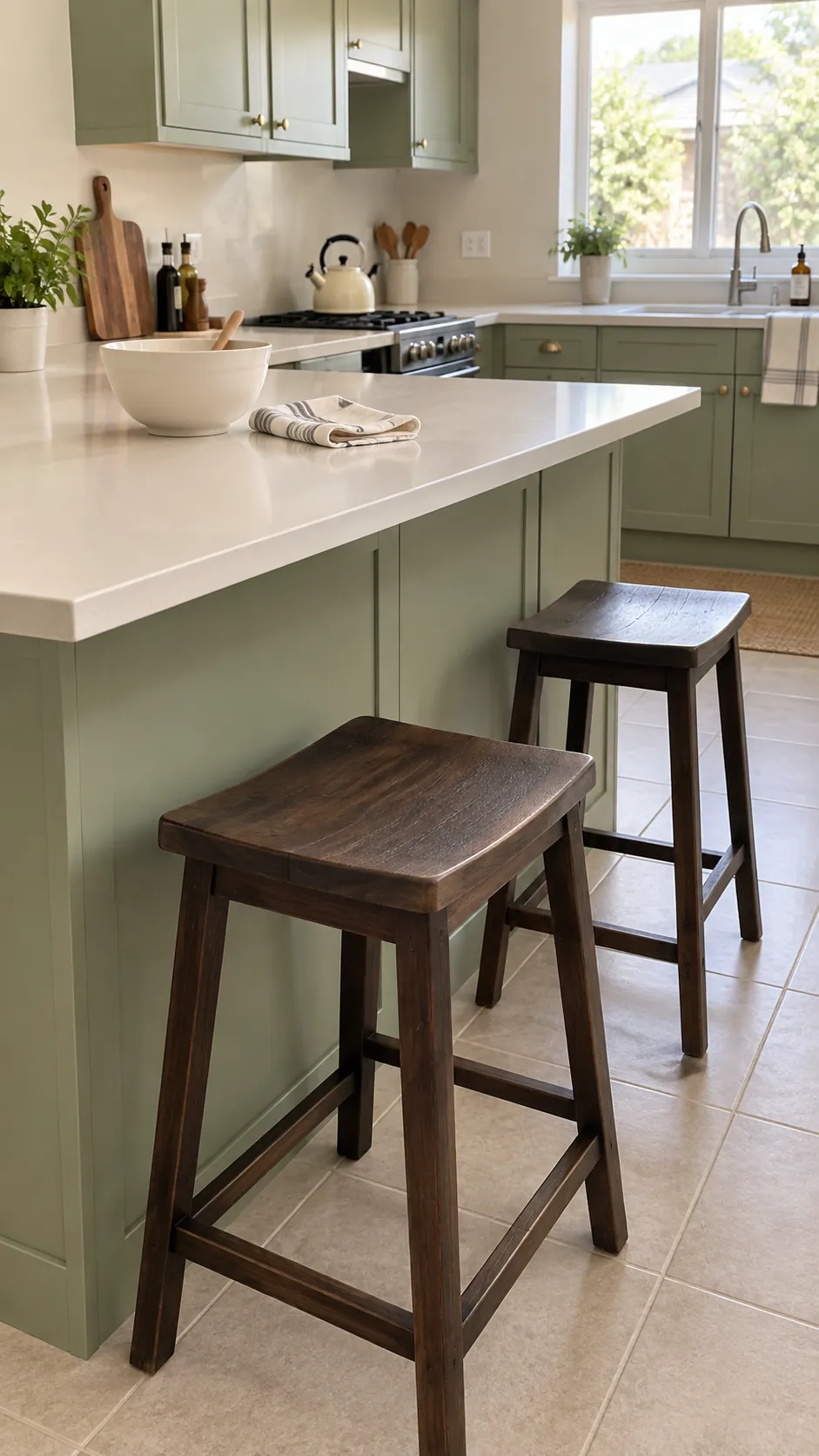
Pistachio, warm white and cocoa
Pistachio can give a kitchen freshness without the coolness of mint. Warm white counters and cocoa stools keep the color grounded. Check the green beside any existing cream appliances before ordering paint because the two may emphasize each other's yellow undertones. Carry the cocoa into nearby furniture if you want the kitchen to feel part of a broader house color palette interior.
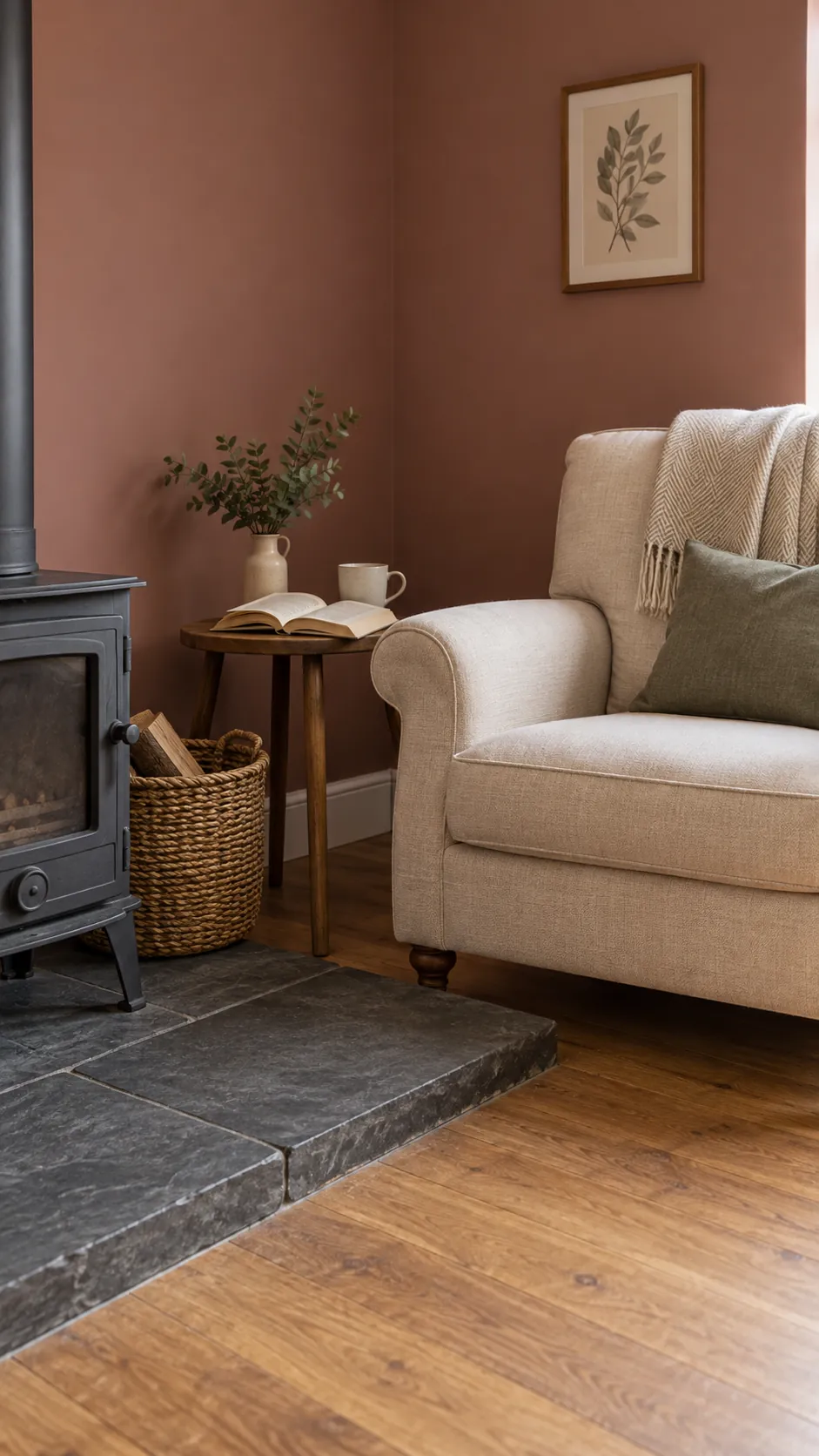
Rose brown, ecru and slate
Rose brown offers warmth with more restraint than terracotta. Ecru textiles support its softness, while slate adds a cool dark edge on a hearth or occasional table. This is helpful when you want a cozy room but already have a gray stone feature you cannot replace. Let the stone guide the slate accent instead of introducing another unrelated gray.
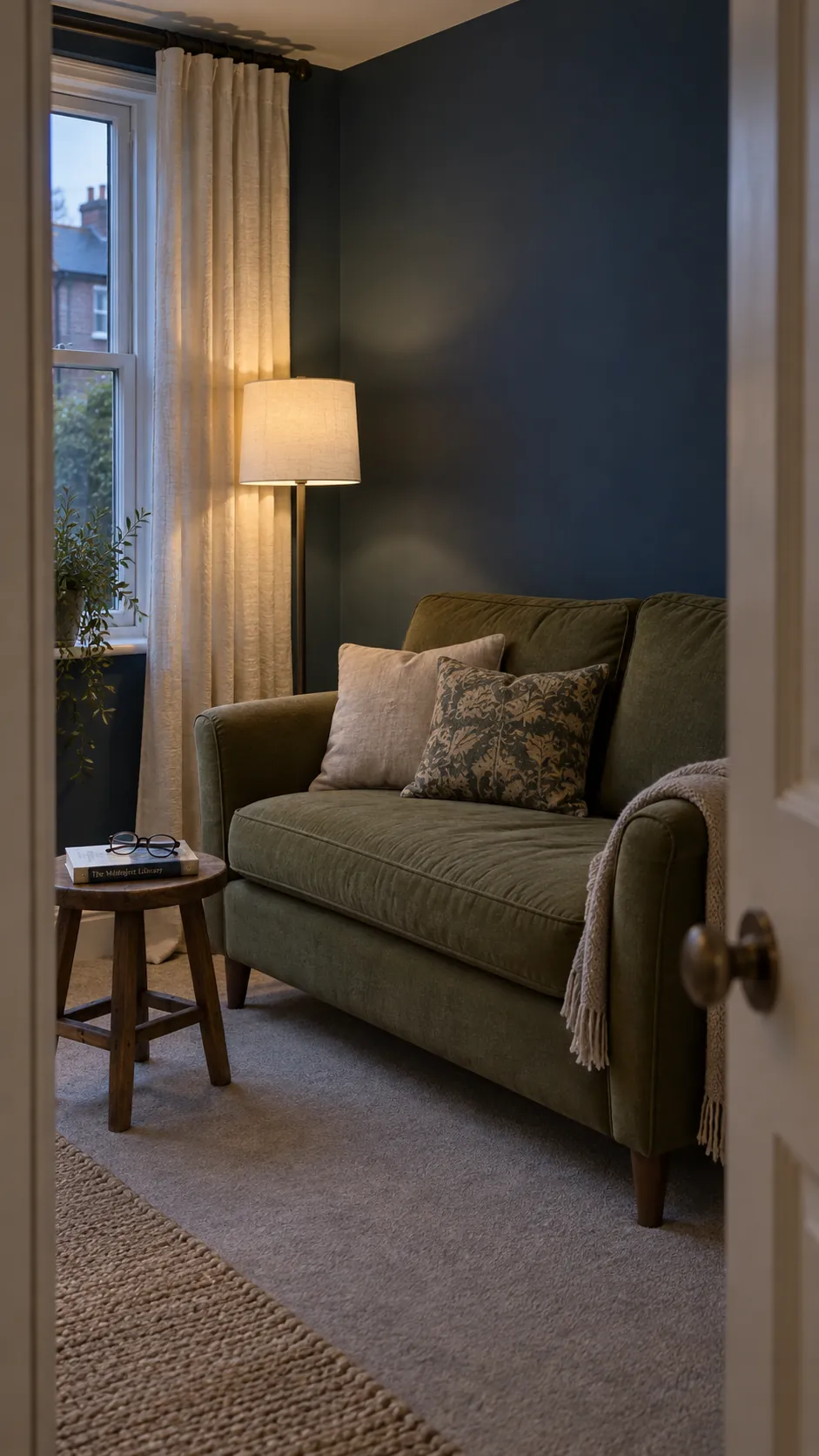
Deep blue, moss and parchment
Deep blue and moss can share a room when parchment gives the eye a lighter surface. Start with blue walls and moss fabric, then keep lampshades and curtains pale. For interior design color schemes spanning several rooms, reverse those roles in a neighboring space rather than matching every wall. The repeated colors create continuity while the different proportions preserve each room's character.
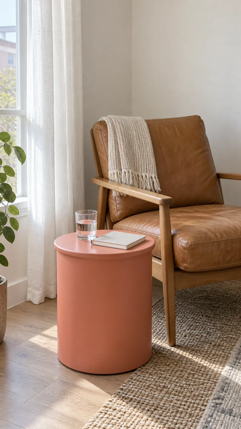
Soft white, tan and muted coral
Muted coral works well as a small warm interruption in a mostly white and tan home. A cushion, woven seat or painted side table can be enough to establish the color. Keep coral separate from strongly orange timber if the combination starts to look too hot. This is also a practical way to test a more colorful direction before choosing permanent paint finishes.
Stone, evergreen and warm copper
Stone offers a flexible common wall color while evergreen creates focus in one room. Warm copper is best treated as a small material accent, such as a lamp base, rather than a third large painted area. If you are comparing Benjamin Moore paint colors or another brand's range, judge physical samples beside your flooring instead of trusting screen swatches. Move your shortlist between connected rooms and check it under the lights you actually use before buying full tins.