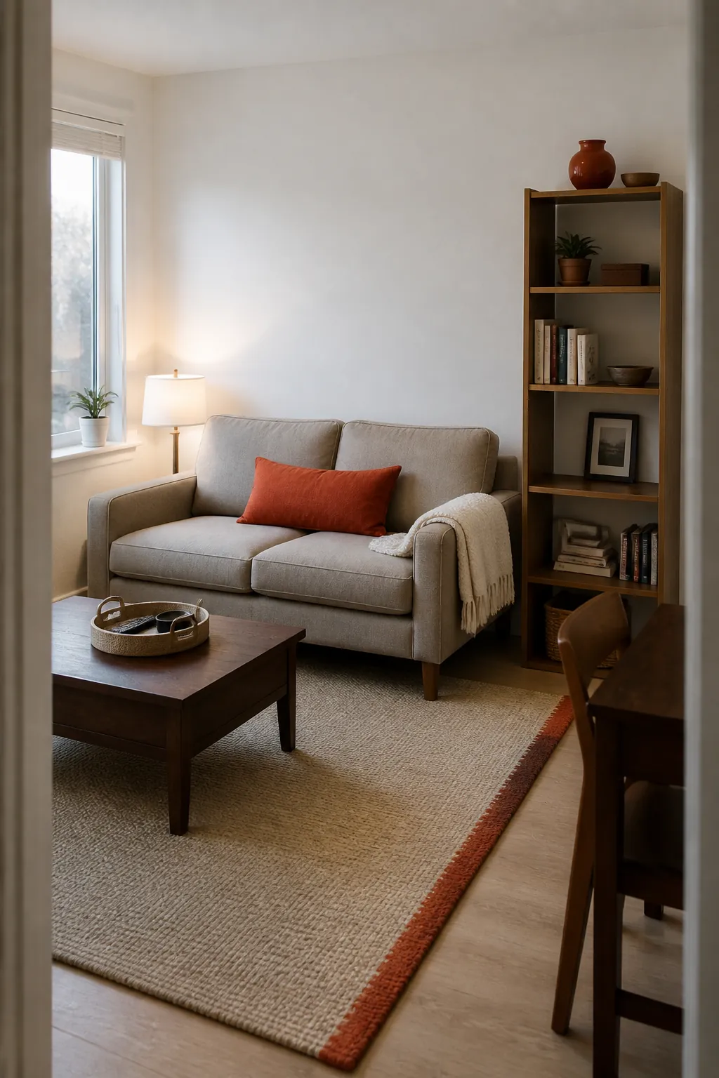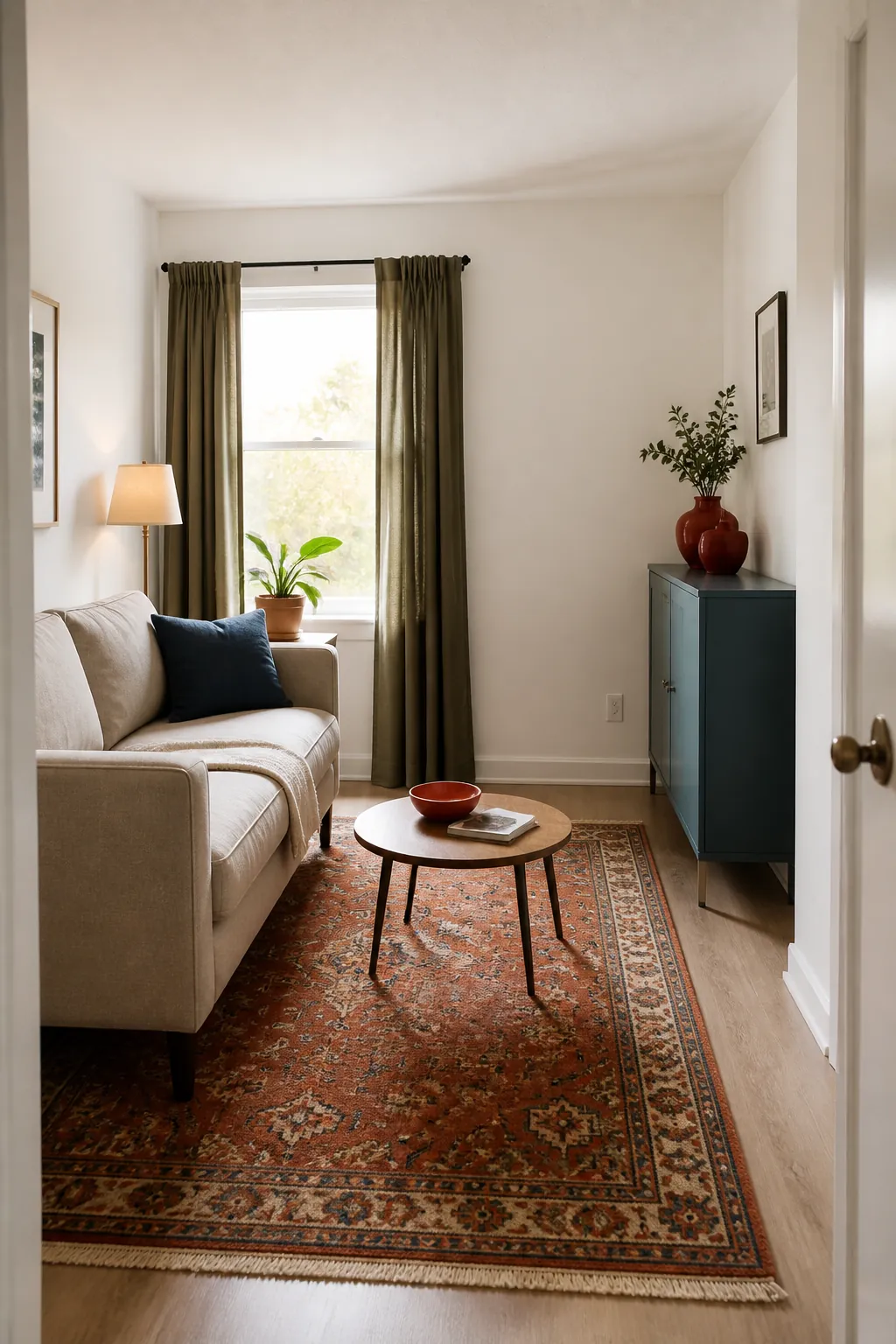
White rental walls are not the problem; the problem is asking a handful of tiny accessories to give an entire room personality. In a small home, scattered color can quickly read as clutter, while one or two substantial color fields make the same white background feel deliberate. Start with pieces you can move—rugs, curtains, bedding, furniture, lamps, and art—then repeat one accent in two or three quieter places. These 29 renter color ideas add character without assuming you can paint, drill, or make permanent changes.
Anchor the Room With a Rust-Colored Rug
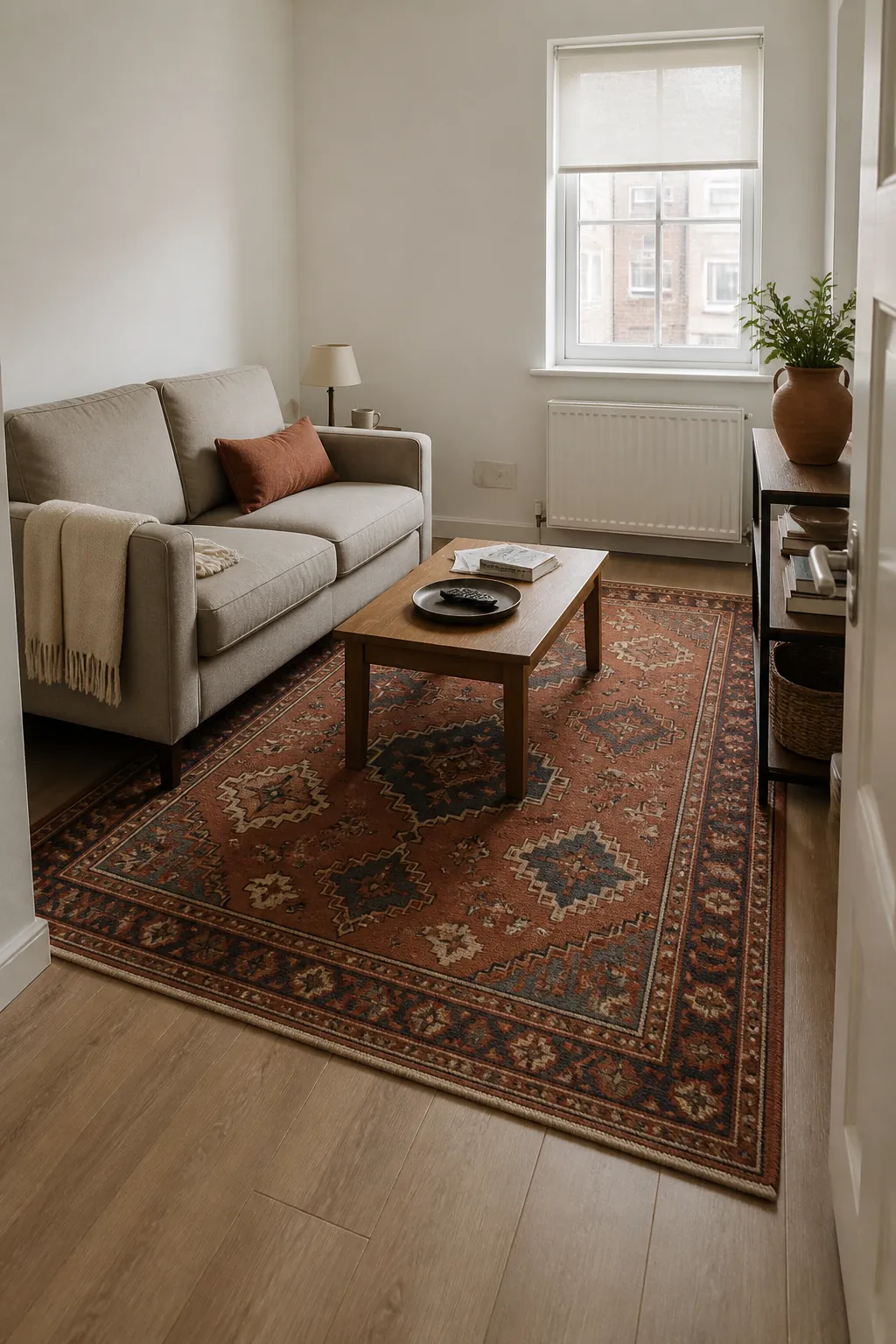
A rug is the fastest way to introduce a large area of color without touching white walls. Rust works especially well because it warms gray flooring, beige carpet, pale wood, and black furniture without feeling neon. Choose a size that reaches beneath the front legs of the main seating so the color unifies the room rather than floating in the middle.
In a very small living room, a low-contrast pattern hides wear while keeping the floor calm. Repeat the rust once in a cushion or ceramic pot, then let the remaining pieces stay neutral.
Frame the Window With Olive Curtains
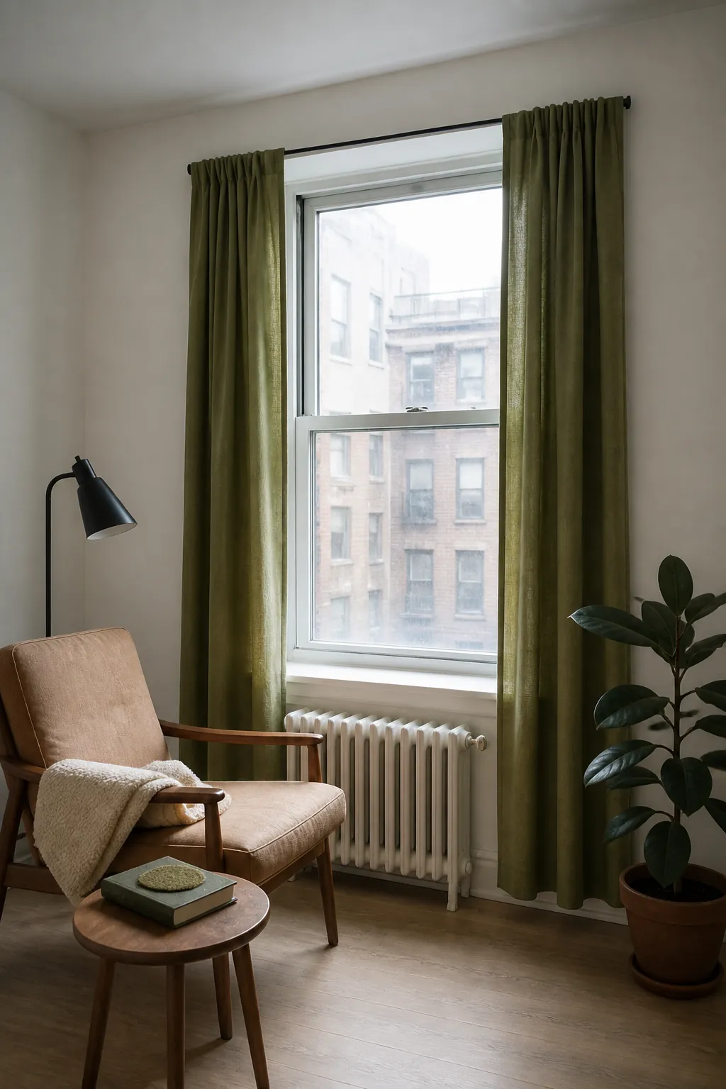
Curtains create a vertical band of color that makes tall white walls feel finished. Muted olive brings in a natural note and pairs easily with oak, walnut, tan leather, cream upholstery, and leafy plants. Use a tension rod where the opening allows it, or install hardware only with the landlord’s approval.
Hang panels close to the window edges so they do not steal scarce daylight. A plain linen-look fabric gives you color and texture without adding a busy pattern beside a small view.
Cover a Neutral Sofa in Deep Blue
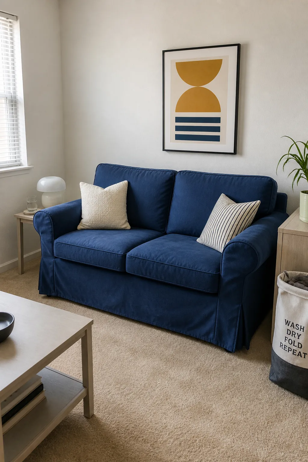
A fitted washable slipcover can turn a tired beige or gray sofa into the main color statement. Deep blue has enough visual weight to stand up to bright white walls, yet it behaves almost like a neutral. Check the cover measurements carefully because loose excess fabric makes a compact room look untidy.
Add one cream cushion and one patterned cushion that includes a small amount of the same blue. The result feels coordinated without requiring a matching furniture set.
Make Bedding the Bedroom Palette
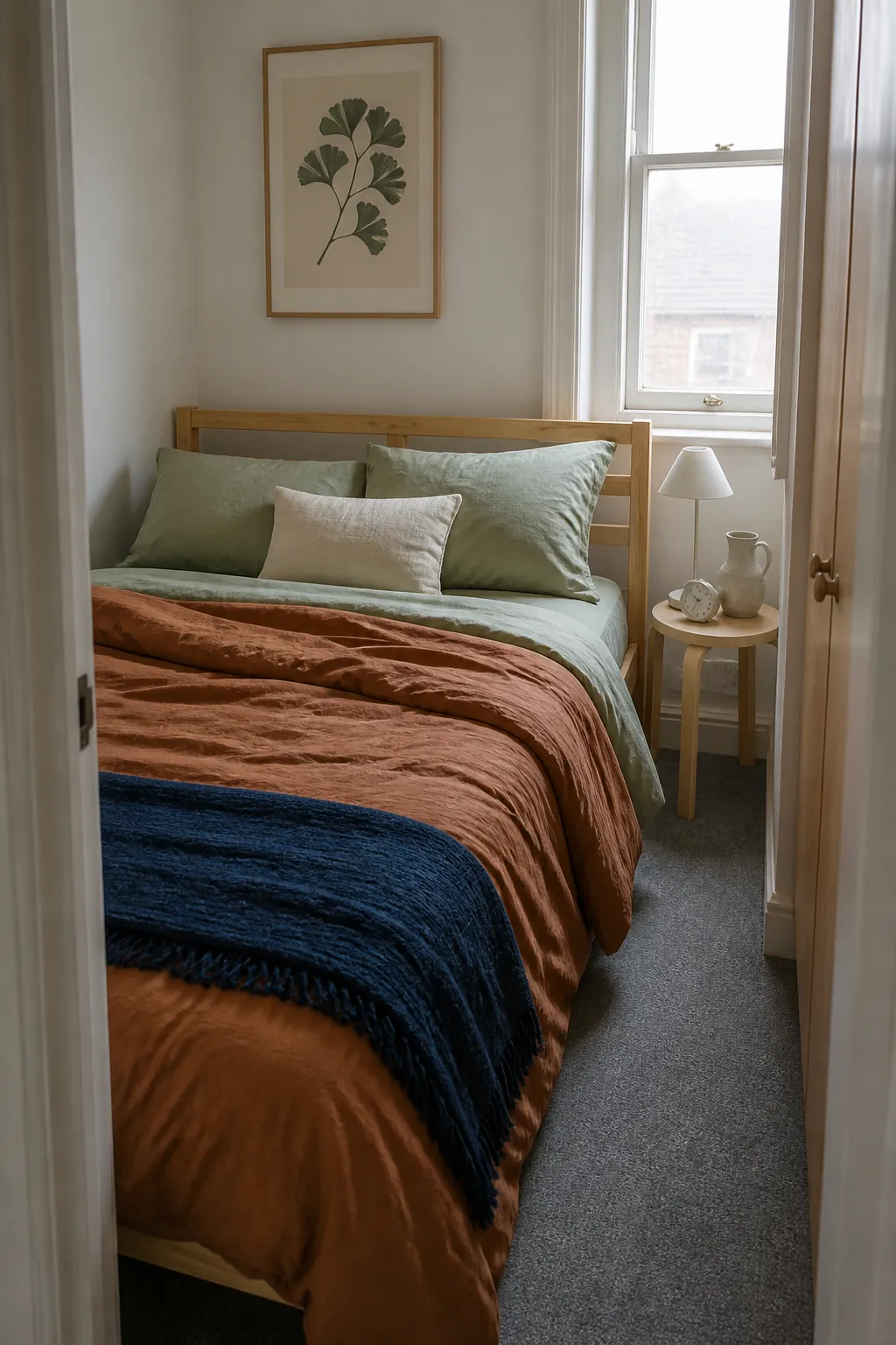
In a tiny bedroom, the bed is already the largest visible surface, so its color should do real design work. A clay duvet, dusty blue quilt, or sage coverlet can transform the room more effectively than several small decorations. Keep sheets and pillowcases one step lighter to create depth instead of a solid block.
Choose washable fabrics that still look good slightly rumpled, since pristine styling is difficult to maintain daily. Pull one bedding color into a bedside lamp or storage basket to connect the rest of the room.
Lean One Oversized Print Instead of Hanging Many
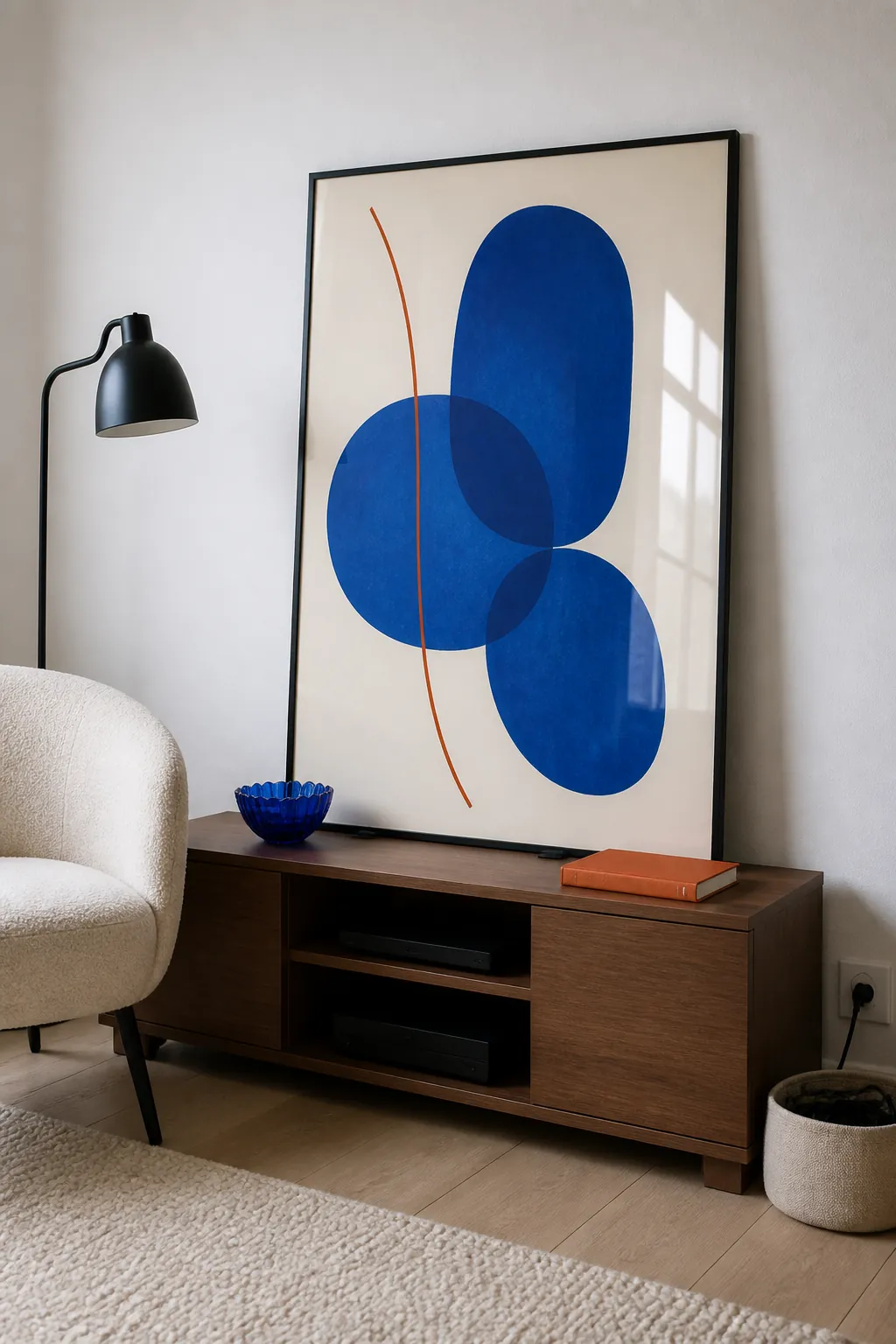
A single large print can supply more color with less visual noise than a grid of small frames. Lean it on a low cabinet or secure it on a picture ledge so you can avoid unnecessary wall holes. Choose an image with a clear palette, such as cobalt shapes on a warm cream ground, rather than a design containing every color.
The print should be wide enough to relate to the furniture beneath it. Let the artwork set two accent colors, then resist adding unrelated hues around it.
Build a Small Gallery on a Picture Ledge
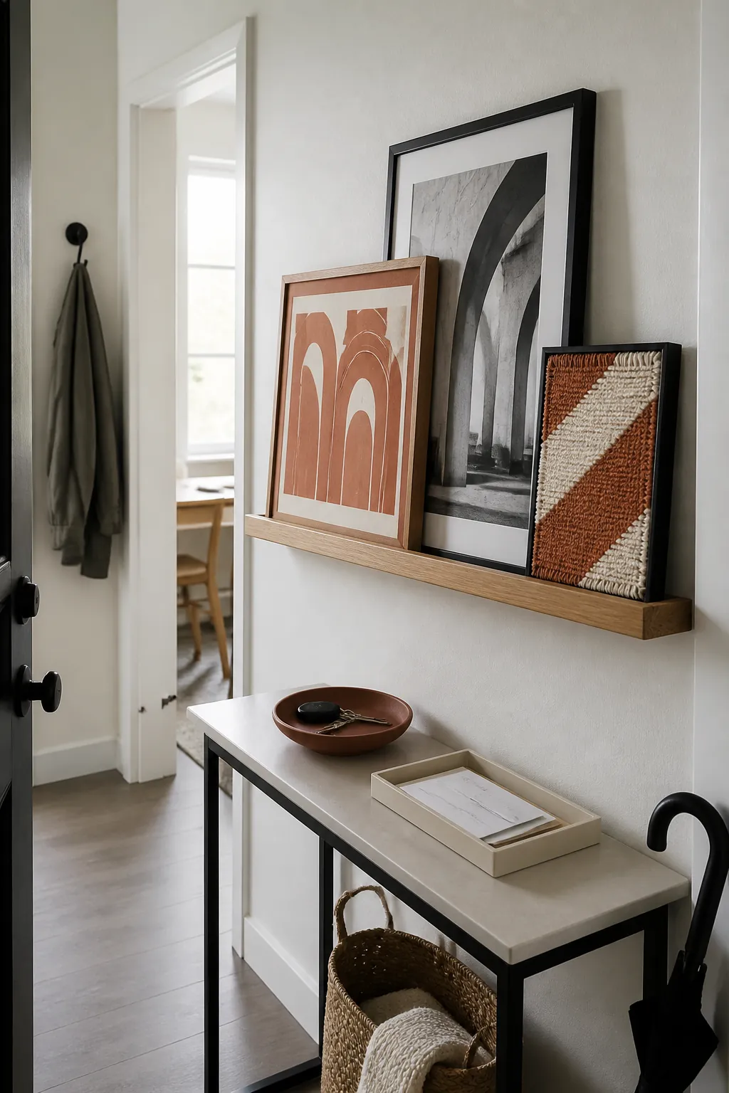
A narrow ledge lets several artworks overlap, which looks intentional and uses less wall area than widely spaced frames. Select three pieces with one shared color, then vary their scale and medium. A terracotta block print, a black-and-white photograph, and a small textile sample can coexist if terracotta appears twice.
Keep the frames slim so the display does not project heavily into a narrow passage. Follow the ledge manufacturer’s mounting guidance and confirm whether holes are permitted before installation.
Hang a Woven Textile as Soft Wall Color
A woven panel creates a large color field while adding warmth and sound-softening texture. Look for a simple geometric design in two or three tones rather than a detailed tapestry that overwhelms a short wall. A lightweight piece may work with appropriately rated removable hooks, but test the product on an inconspicuous area first.
Leave visible white space around the textile so its edges remain crisp. The surrounding wall then acts like a mat, making the colors appear more deliberate.
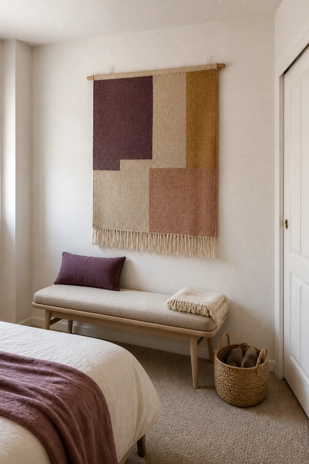
Arrange Books by a Loose Color Rhythm
Book spines can contribute color without buying purely decorative objects. Instead of forming a strict rainbow, group a few related tones and break them with horizontal stacks or neutral covers. This approach keeps the shelf personal while preventing dozens of bright spines from becoming visual static.
Repeat one shelf color in a nearby lamp base or chair cushion. Keep frequently used books accessible so the styling still supports everyday life.
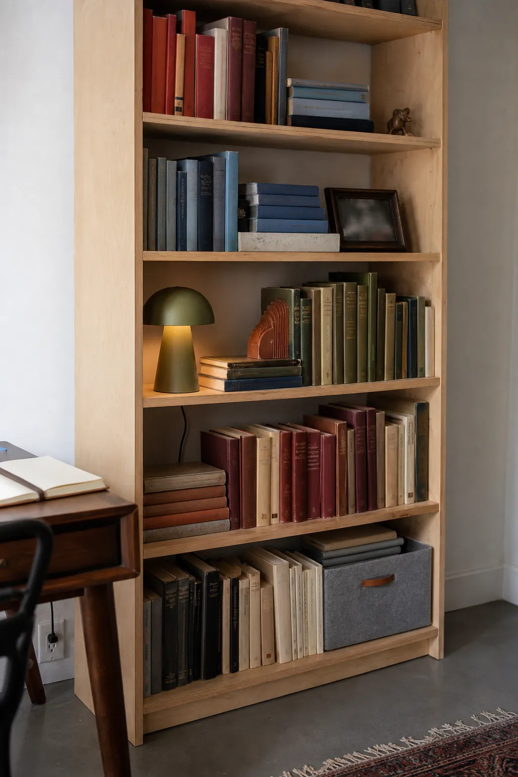
Paint a Piece of Furniture You Own
Your landlord controls the walls, but you control a thrifted stool, side table, or freestanding cabinet. Painting one owned piece in aubergine, smoky teal, or brick red creates a confident focal point that can move with you. Prepare and finish the surface according to the material so the color does not chip immediately.
Choose a small item first, because a strong hue on every piece can make a tight room feel crowded. One painted cabinet against white walls usually has more impact than five bright accessories.
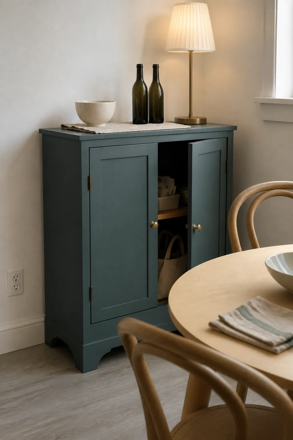
Wrap Removable Cabinet Doors in Wood-Tone Vinyl
Removable vinyl can introduce warm walnut or colored laminate on smooth cabinet fronts without changing the whole kitchen. Test a hidden patch for adhesion and clean removal before covering a prominent door. Apply it slowly to avoid trapped air, and never place it on damaged, peeling, or heat-exposed surfaces.
Cover only a controlled set of doors so the original white still provides contrast. A small walnut section paired with sage towels feels warmer than wrapping every surface in a fake grain.
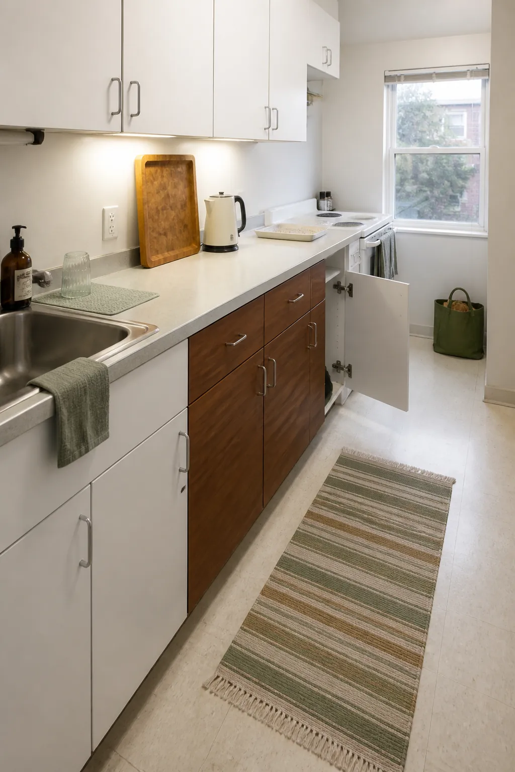
Use Removable Wallpaper Inside a Niche
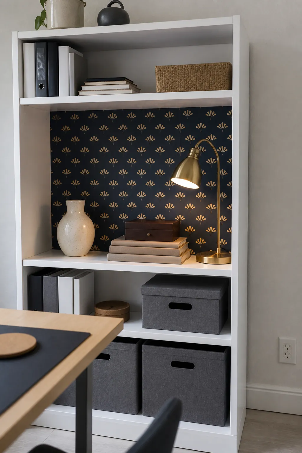
A small niche or the back of a bookcase gives removable wallpaper a defined boundary. That edge makes a pattern look intentional and reduces the amount of adhesive material you need to manage. Try a small-scale block print in navy and ochre where the shelf contents will still be visible.
Always follow the manufacturer’s surface and removal instructions, because products behave differently on matte, textured, or freshly painted walls. If the lease is strict, line a removable backing board instead of applying paper directly to the property.
Add a Colorful Folding Screen
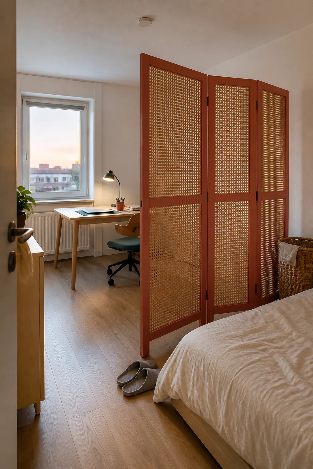
A folding screen is essentially a moveable wall, which makes it useful in a studio or work-from-home corner. Choose a fabric or painted-panel design with enough color to define the zone from across the room. Position it where it will not block daylight, ventilation, a heater, or the main path.
A coral-and-tan screen can separate a desk from a bed while giving white walls a strong vertical counterpoint. Fold it flatter when you need more floor area or pack it for the next home.
Swap Plain Lampshades for Muted Color
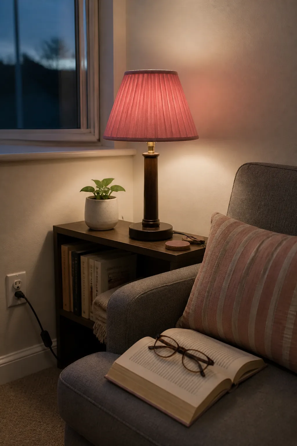
A lampshade adds color twice: once as an object in daylight and again as a glow after dark. Muted rose, moss, or indigo shades are easier to integrate than a highly saturated primary color. Check the fitter type, dimensions, and bulb clearance before replacing an existing shade.
The shade changes how much light reaches the room, so compensate with appropriate bulb output rather than accepting a gloomy corner. Place the colored shade near one matching textile to make the choice feel connected.
Give Mismatched Dining Chairs One Shared Hue
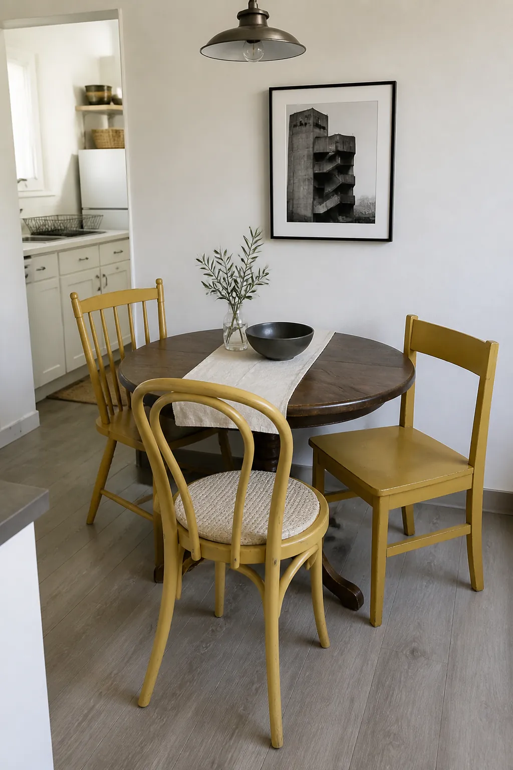
Mismatched chairs are practical in small rentals because they can be collected gradually, but a common color helps them read as a set. Paint only chairs you own, or use fitted seat pads if the furniture belongs to the property. A softened mustard works well with white walls and most wood tables.
Keep the table and surrounding storage quiet so the chair color remains the clear idea. The repeated hue creates rhythm around a small round table without requiring bulky matching furniture.
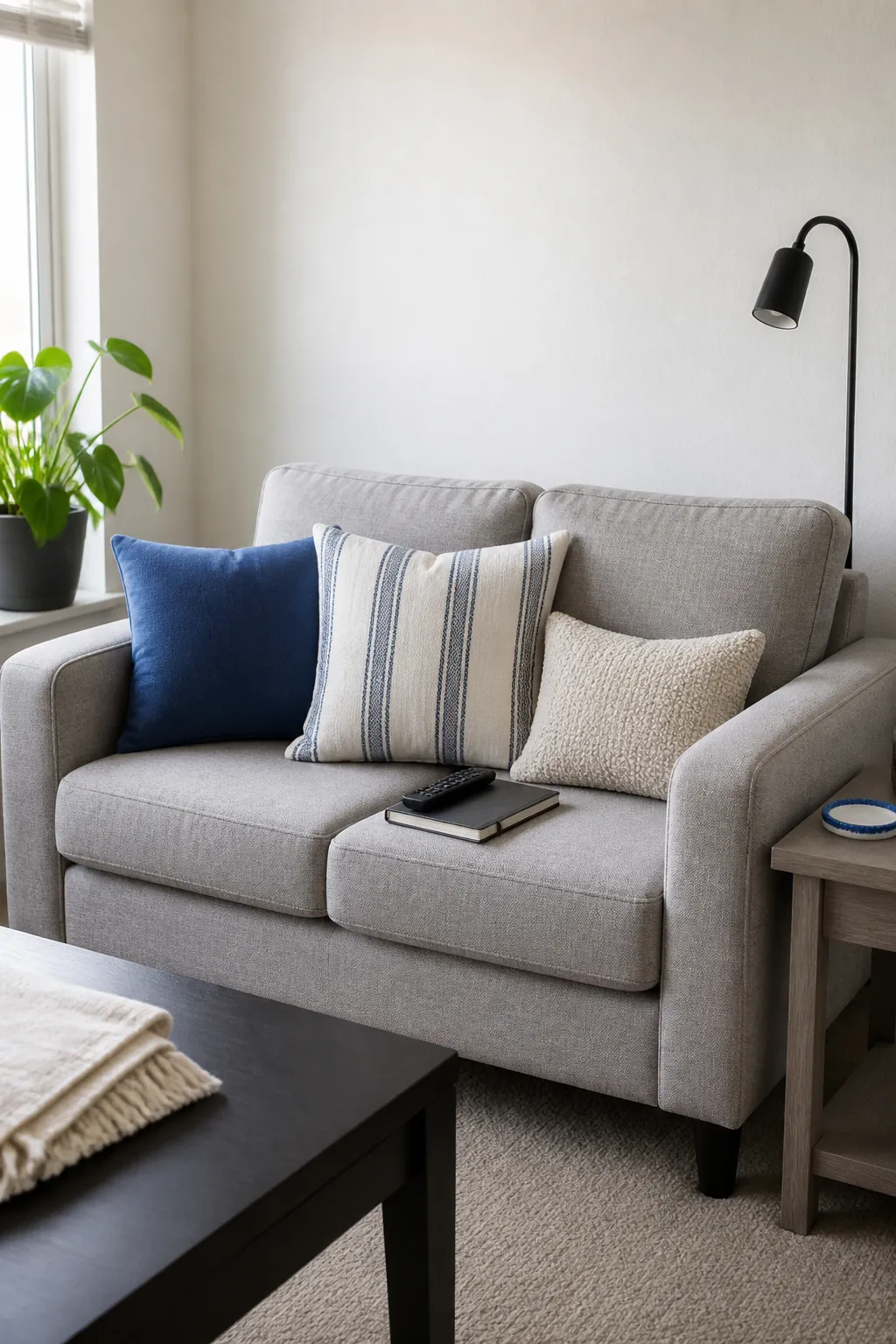
Use a Three-Cushion Color Formula
Three cushions are often enough for a small sofa: one solid, one subtle pattern, and one textured neutral. Let the patterned cushion contain the solid color so the set feels related. For example, pair a cobalt cushion with a cream-and-cobalt stripe and a natural boucle cushion.
Vary the sizes slightly instead of buying three identical squares. This controlled formula adds color without turning the sofa into storage for pillows.
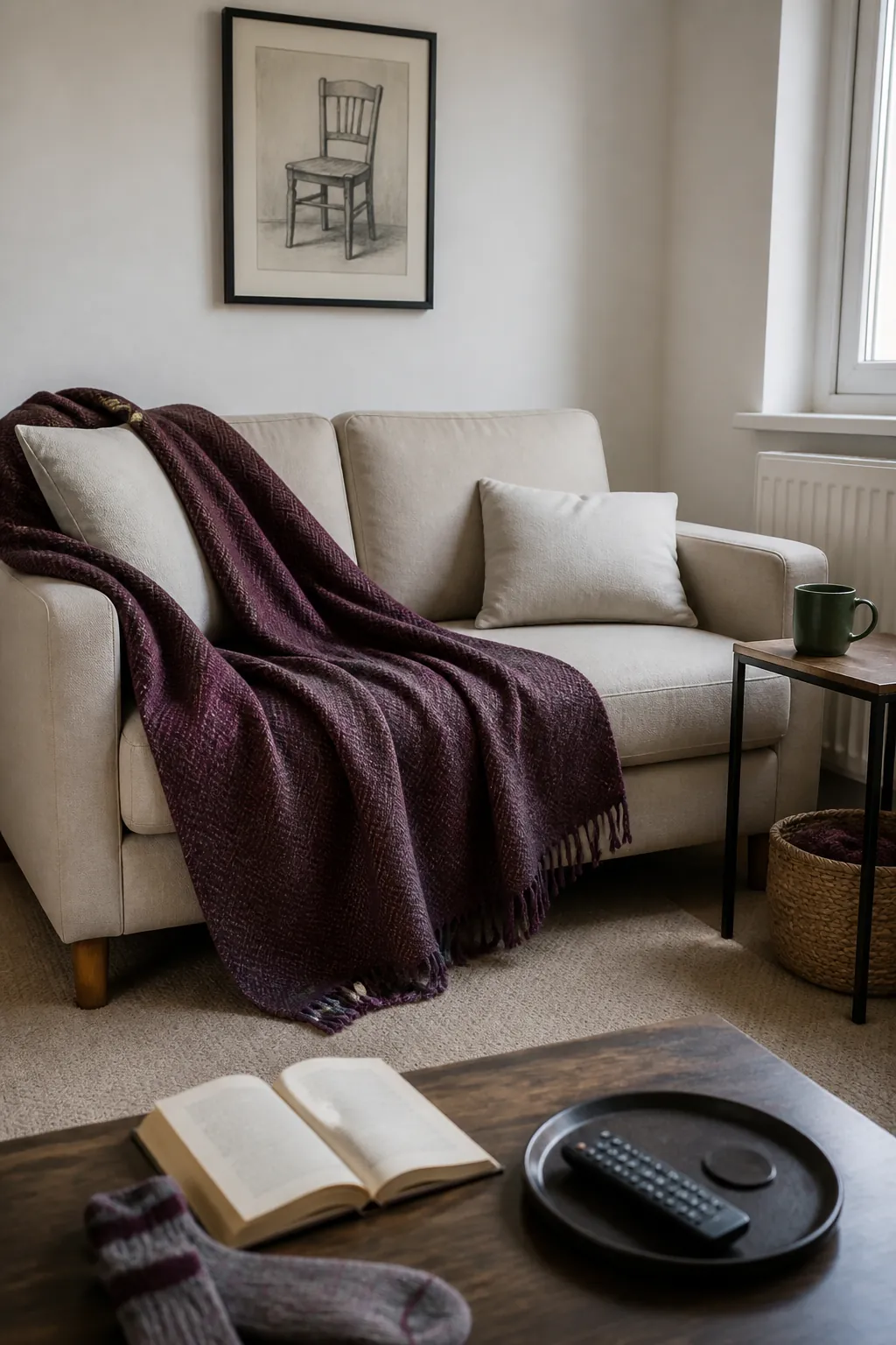
Drape One Generous Throw
A throw can soften a dark sofa, break up white bedding, or cover a worn chair while contributing a useful area of color. Choose one generous blanket rather than several little ones that constantly slide to the floor. A plum or forest-green throw has enough depth to look grounded against white walls.
Fold it over an arm or across the lower third of the bed so the furniture shape remains visible. Natural wool, cotton, or a washable blend adds texture that helps the color feel richer.
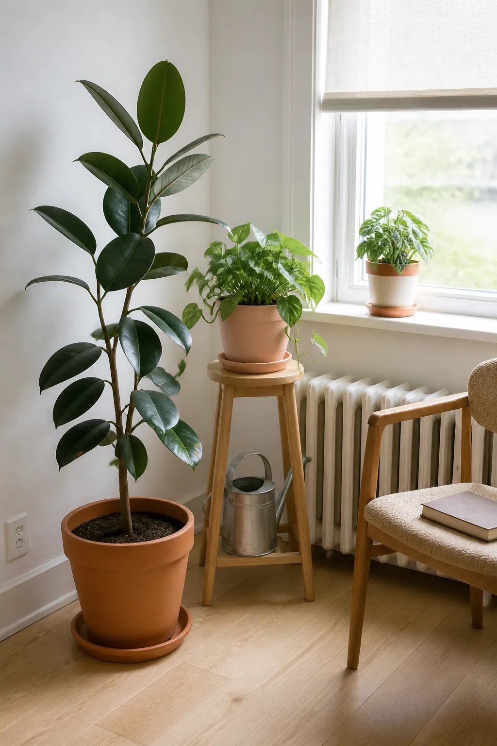
Choose Planters as a Coordinated Color Set
Plants already add green, but their pots can carry a second accent through the room. Use two or three planters in related shades such as terracotta, dusty peach, and warm cream rather than a dozen unrelated finishes. Vary the plant heights so the repeated pot color appears at different levels.
Protect rental surfaces with saucers and avoid placing wet pots directly on floors or window ledges. Healthy plants and restrained containers look more intentional than filling every corner with greenery.
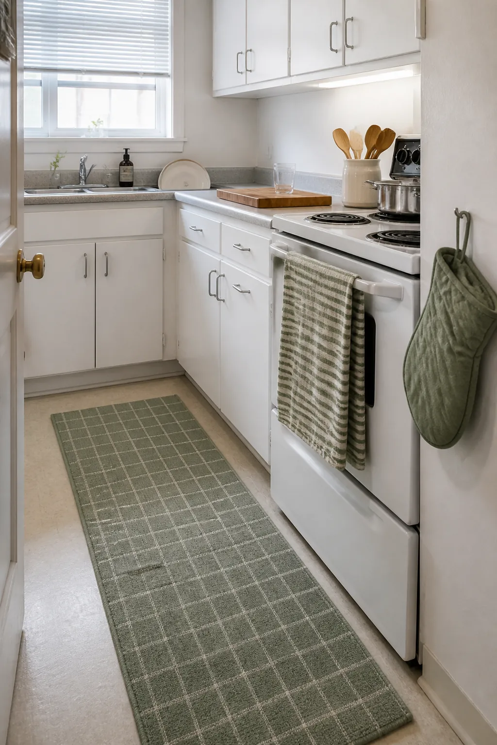
Repeat Color Through Kitchen Textiles
Tea towels, an oven mitt, and a narrow runner can add color to a rental kitchen without competing with fixed cabinets. Choose textiles that share one hue but use different scales of pattern. A sage stripe on the towel and a small sage check on the runner feel coordinated without looking like a packaged set.
Keep towels away from burners and choose washable materials suited to heavy use. Because these items wear out, they are also an inexpensive place to test a new palette.
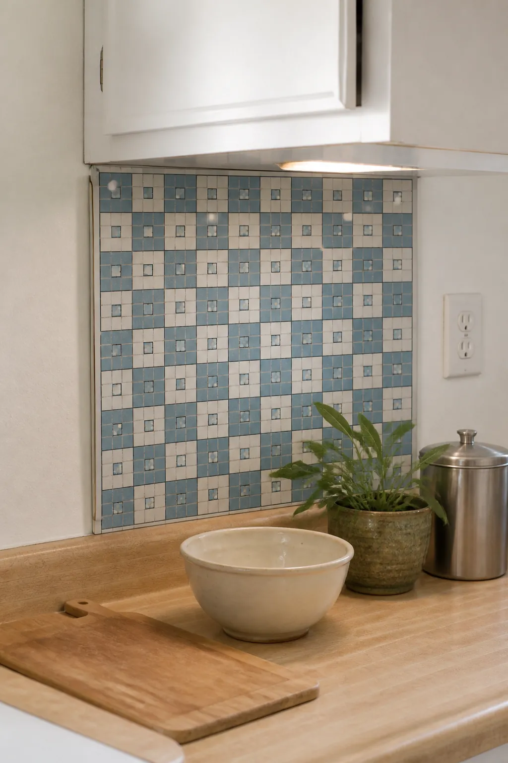
Try a Removable Backsplash on a Test Panel
A removable backsplash can create a concentrated band of color between white cabinets and a plain counter. Before covering the wall, apply the product to a removable rigid panel cut to the space when practical. This reduces direct adhesive contact and makes move-out removal more predictable.
A dusty-blue small-format pattern adds interest without making the narrow kitchen feel chopped up. Keep it away from prohibited heat or wet zones and follow all material safety instructions.
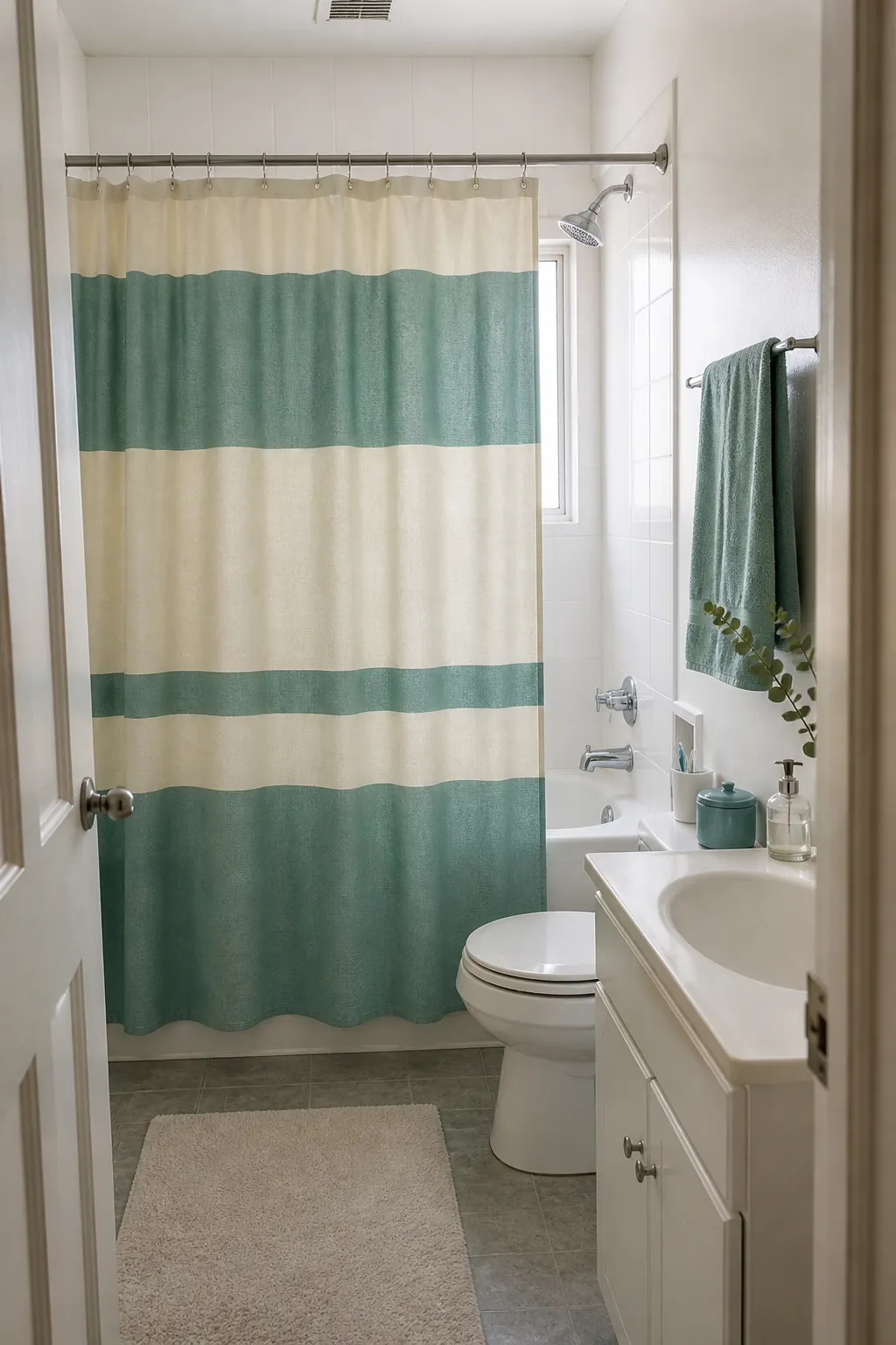
Let the Shower Curtain Lead the Bathroom
A shower curtain is often the bathroom’s largest soft surface, so choose it before matching small accessories. A cream curtain with broad sea-green stripes introduces color while keeping a narrow room visually open. Hang it at the correct height so it clears the floor and closes fully.
Repeat the sea green in one hand towel or lidded container, not every object on the sink. The white tile and walls will then frame the pattern rather than make the room look unfinished.
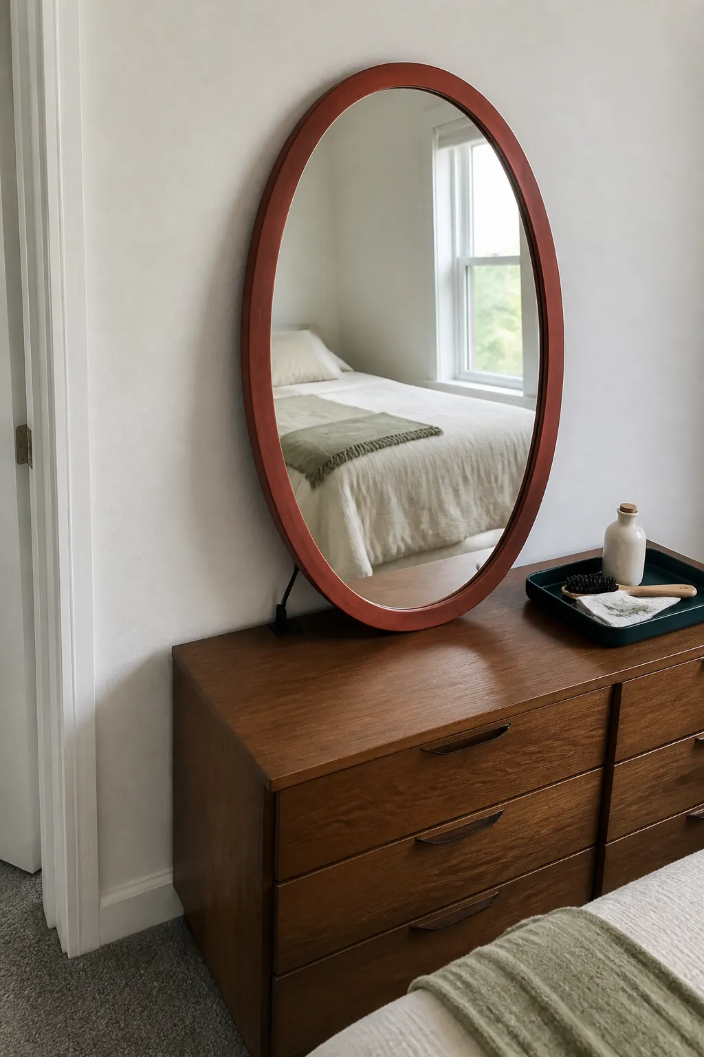
Use a Painted Mirror Frame as an Accent
A mirror already earns its space by reflecting light, and a colored frame lets it become part of the palette. Paint only a mirror you own, or buy one with a finished frame that can lean safely on a dresser. Brick red or dark teal outlines the reflection clearly against a white wall.
Keep the reflected view tidy because the mirror doubles whatever faces it. One framed mirror is usually enough in a very small room, especially near other glossy surfaces.
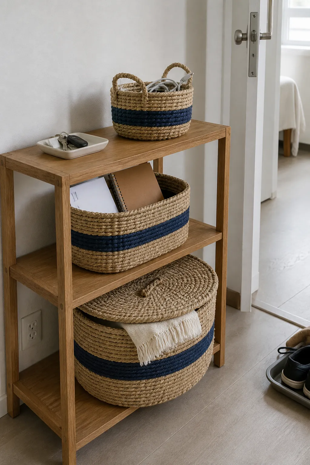
Turn Storage Baskets Into a Palette
Visible storage can add color while solving the clutter that makes small rooms feel busy. Choose baskets in natural fiber plus one repeated colored band, such as navy or paprika. Matching the band across two sizes creates order without requiring identical shapes.
Assign each basket a real category so it does not become a hiding place for random objects. The combination of function and color gives open shelving a finished appearance.
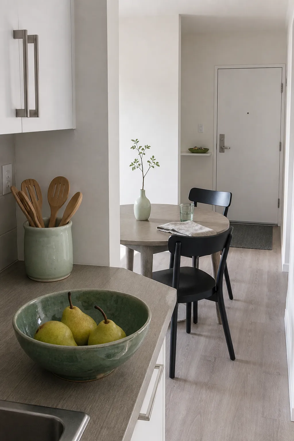
Collect Everyday Ceramics in One Color Family
A fruit bowl, utensil crock, vase, and catchall tray can introduce color without becoming useless decor. Choose related glazes such as celadon, deep jade, and pale mint, then spread the pieces between kitchen, entry, and table. Their shared family creates a thread through an open-plan apartment.
Leave space around each ceramic so its form and glaze remain visible. A few functional pieces look richer than a crowded collection of tiny ornaments.
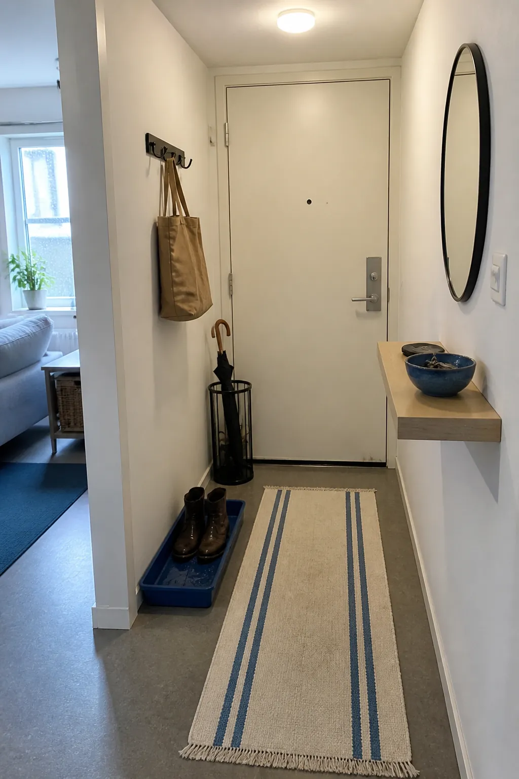
Mark the Entry With One Strong Color
A tiny entry feels intentional when its practical objects share a visible accent. Try a cobalt shoe tray, matching key bowl, and one narrow striped mat while leaving the walls and larger furniture neutral. The repetition defines the zone without adding a divider.
Keep the route clear and choose a tray that contains wet footwear rather than staining rental floors. Color works best here when it improves the routine as well as the view.
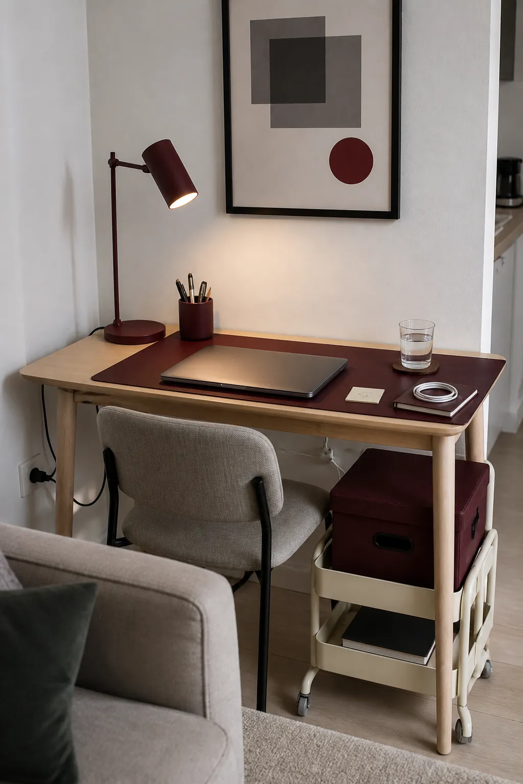
Color-Code a Compact Home Office
A home office corner can use color to separate work visually from the rest of the room. Choose one muted tone for the desk mat, file box, pen cup, and task lamp. Burgundy or deep green gives small practical objects enough unity to read as one zone.
Keep cables, screens, and frequently used papers neutral so the desk does not become a patchwork. Pack the colored tools into a box at the end of the day if the desk shares the living room.
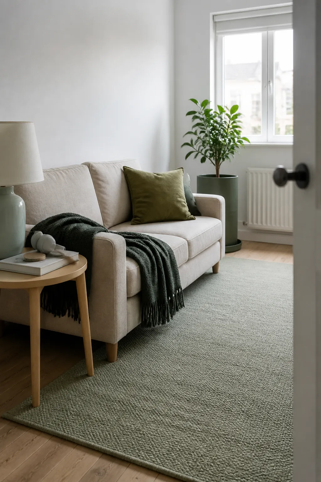
Layer Several Shades of One Color
A tonal scheme is forgiving when you are nervous about combining colors. Mix pale sage, olive, and deep forest across a rug, cushion, throw, and planter while the white walls remain unchanged. The differences in value create depth even though every accent belongs to the same family.
Vary materials as well as shades so the room does not feel flat. Matte wool, glazed ceramic, woven cotton, and living leaves each reflect light differently.
Pair Two Opposing Accents in Unequal Amounts
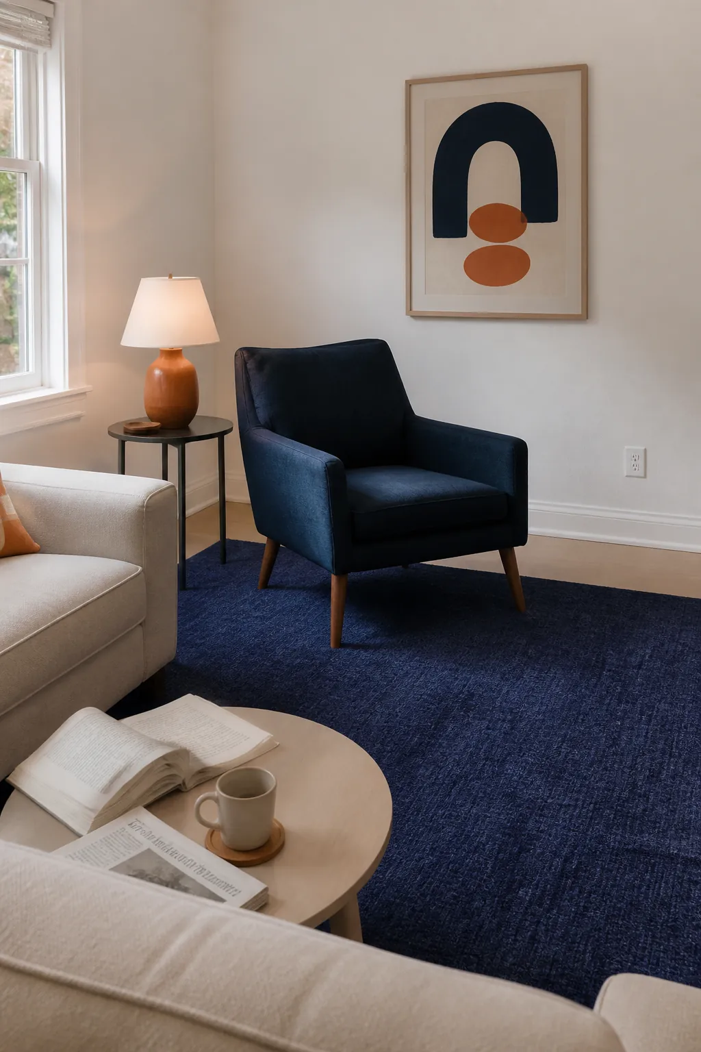
Two contrasting colors can energize white walls, but they should not occupy equal areas. Let indigo cover a rug or chair, then use apricot only in a lamp base, cushion detail, and small artwork. The unequal ratio makes one color the anchor and the other the spark.
Repeat both hues in a single patterned textile to prove they belong together. Keep large furniture neutral if the room already contains several fixed finishes.
Ground Pastels With Small Black Details
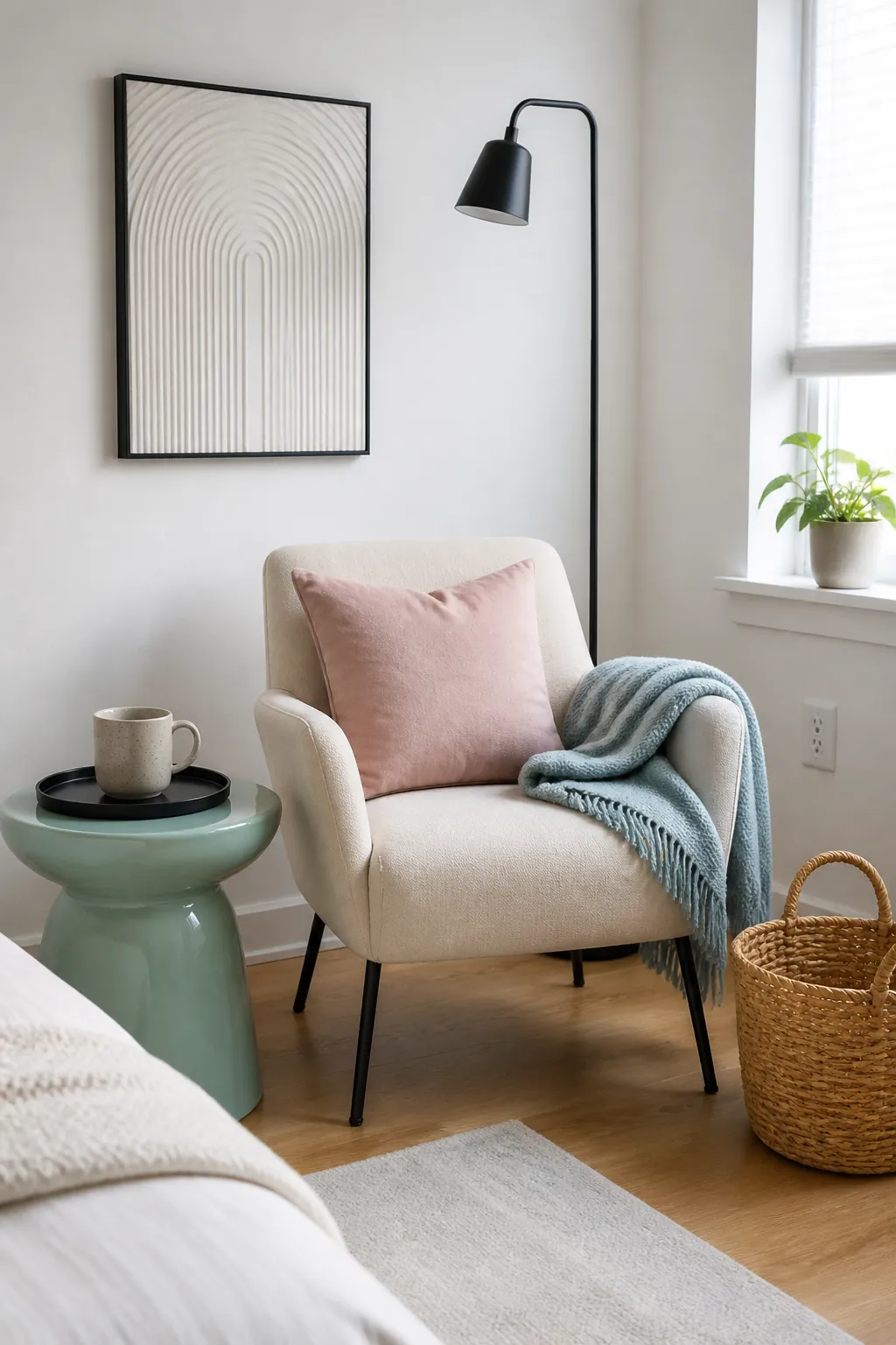
Pastel color can disappear against bright white walls unless the room includes a few darker edges. A black lamp stem, thin frame, chair leg, or tray gives blush, mint, and powder blue clearer definition. These dark notes need not be large; their job is to outline, not dominate.
Spread the black details across the room so one corner does not feel visually heavy. Warm wood or woven fiber can keep the contrast from becoming severe.
Repeat One Accent Three Times
The easiest way to make a rental palette feel intentional is to repeat one accent at three different heights. A paprika rug detail near the floor, a paprika cushion at seated height, and a paprika ceramic on a high shelf guide the eye through the room. The objects do not need to match exactly, but the hue should be close enough to register as a rhythm.
Stop after those repetitions and evaluate the space before buying more. White walls provide contrast and breathing room, so covering every blank area would weaken the very color you worked to establish. When one larger field anchors the room and a smaller accent returns with restraint, a temporary home can feel personal without becoming difficult to move, maintain, or restore.