
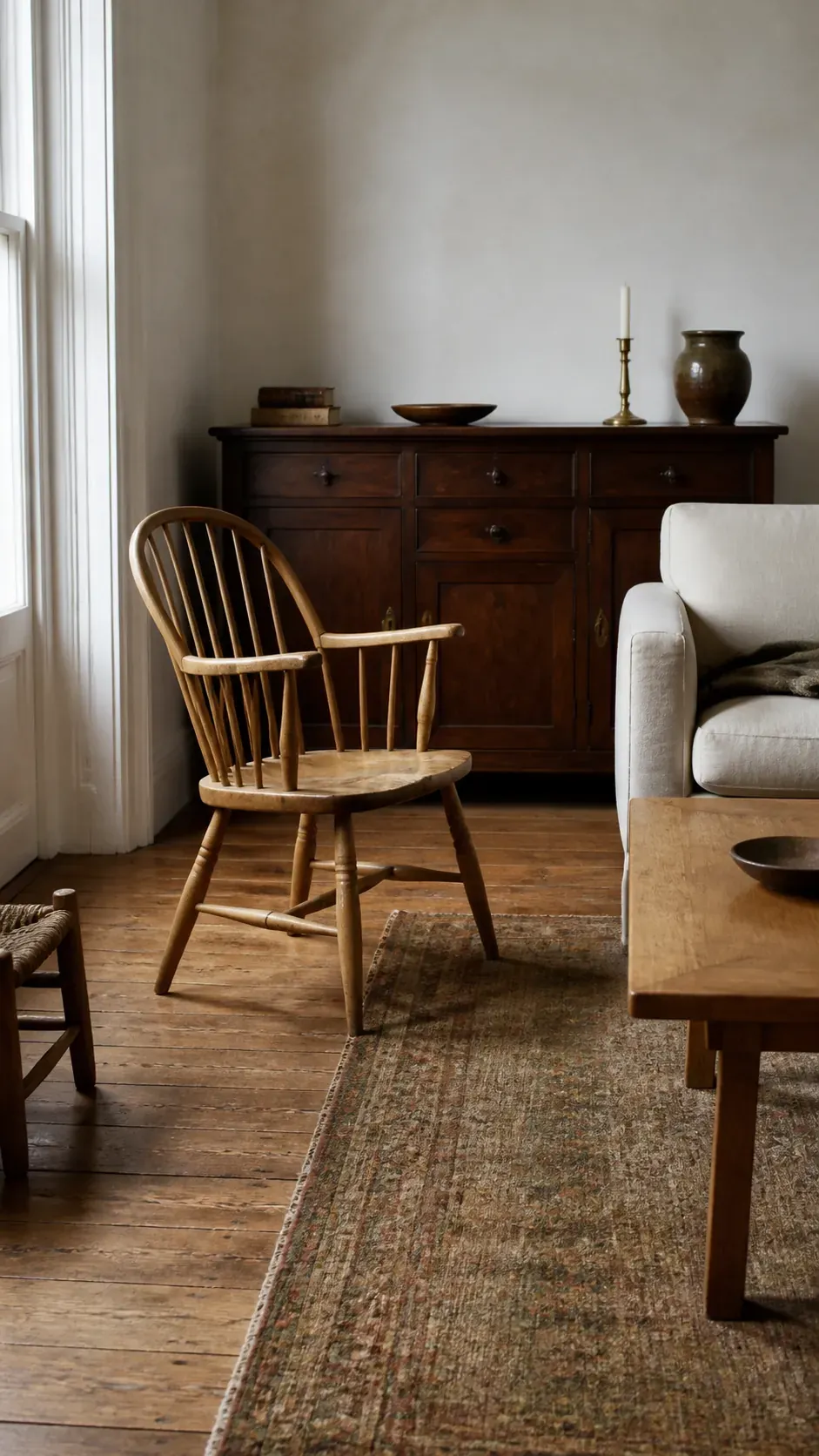
A vintage-inspired room should look collected over time, which means the wood furniture usually will not match. That is a strength until one red cabinet, one gray-brown table, and a honey floor start arguing across the room. The solution is not to chase an exact stain. It is to create a clear relationship between undertone, contrast, repetition, and furniture style.
People furnishing with antiques and thrifted decor often worry that a new piece will “clash,” especially when online photos distort color. The most useful rule is simple: choose one dominant wood, keep the supporting undertones related, and make differences look deliberate. That produces the old-house charm of a collected home without making the room feel random.
Start With the Wood You Cannot Easily Change
The floor, exposed beams, built-in cabinetry, or a large inherited piece should establish the room’s dominant wood direction. Do not count every small frame or tray yet. Stand at the doorway and identify which wood occupies the most visual area, then decide whether it reads warm, cool, or balanced. That fixed element becomes the reference point for every secondhand piece you consider.

A medium oak floor does not require medium oak furniture. It simply sets the family resemblance. You can layer lighter pine and darker walnut over it when their undertones feel compatible. Giving the fixed wood priority also prevents the common mistake of buying a nearly matching table that makes the floor look accidentally wrong.
Read Undertone Before You Compare Light and Dark
Wood can be pale and warm, dark and cool, red, golden, ashy, or fairly neutral. Two pieces at opposite ends of the light-dark scale can cooperate beautifully if both lean warm. Two medium-brown pieces can clash when one is orange and the other violet-gray. Compare samples in the room instead of trusting retailer names such as walnut, espresso, or natural oak.
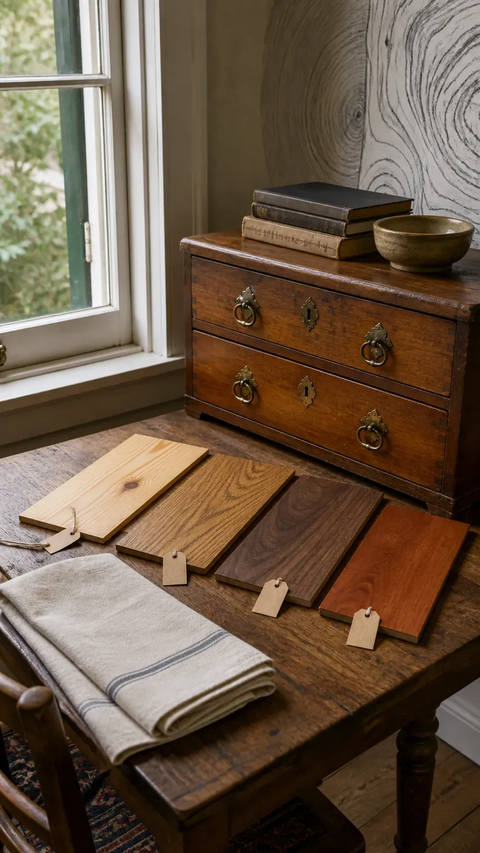
Place the candidate finish beside the floor and main furniture at several times of day. Warm bulbs can make a neutral sample appear orange, while cool daylight can flatten red tones. If you cannot bring the furniture home, carry a drawer, loose shelf, or returnable wood object with a similar finish into the room. In-person comparison is more reliable than a digital mood board.
Choose Clear Contrast Instead of an Almost Match
An almost match often looks more accidental than a confident contrast. If your floor is medium honey oak, a deep warm walnut table or pale scrubbed pine chest can look intentional; another medium golden-brown piece may look like a failed attempt to copy it. Contrast lets the grain, age, and construction of each vintage item remain visible.
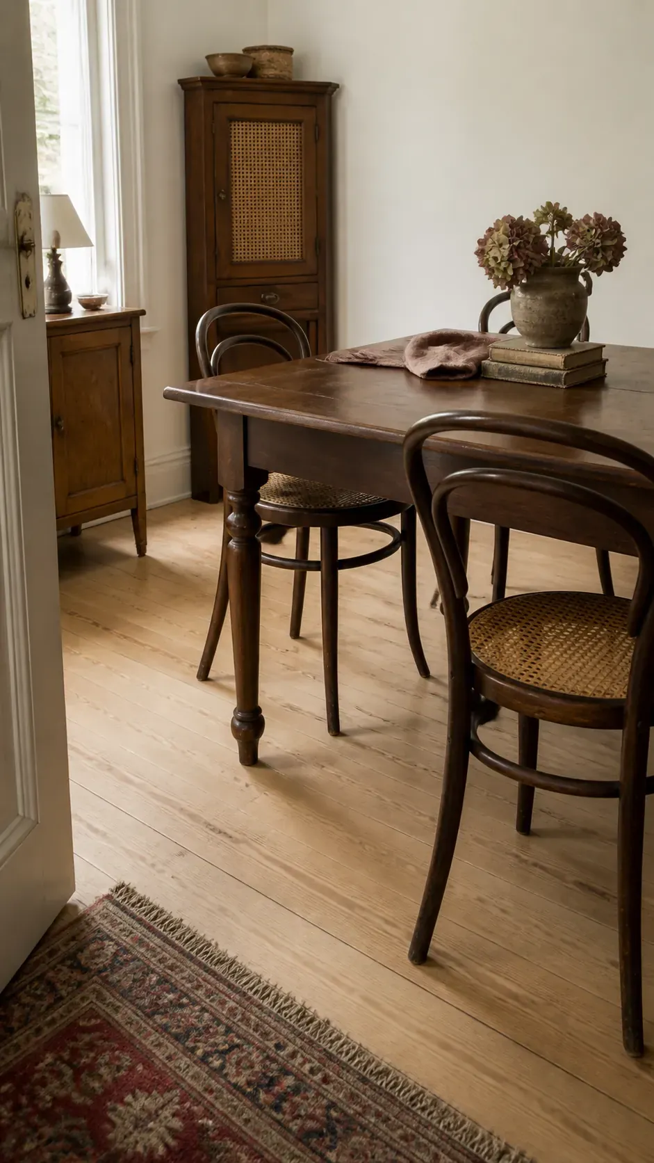
Use the room’s size and daylight to set the amount of contrast. A dark case piece can anchor a bright room, while several bulky dark pieces may crowd a small one. Leggy furniture exposes more floor and feels lighter than a solid trunk or cabinet. The goal is not a formula of one light and one dark wood, but a readable hierarchy.
Repeat Every Important Wood Tone
A single different wood can look like a mistake because the eye has no reason to connect it to the room. Repeat its tone at least once in a smaller, separate location. A walnut sideboard might echo in a lamp base, picture frame, or chair arm; pale pine shelves might relate to a stool or woven basket. The repeated note should be visible without becoming a matching suite.
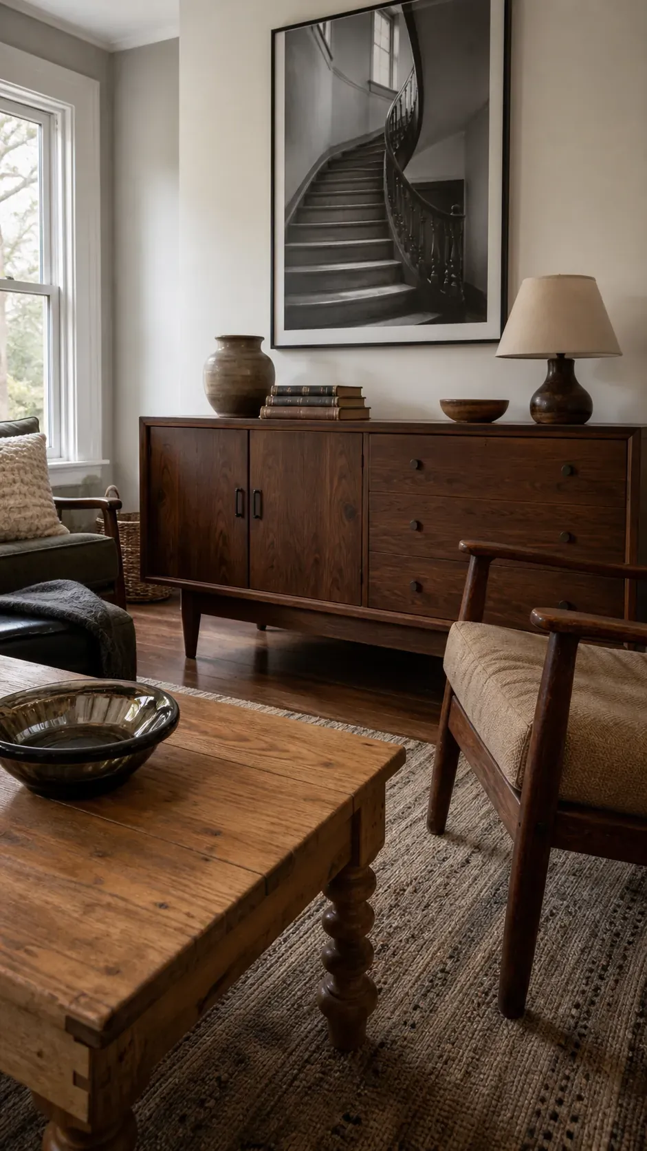
Spread those repetitions around the room rather than clustering them on one wall. This creates a visual path and makes the collection feel planned. You do not need exact stain matches; a shared dark brown or warm gold impression is enough. Real wood changes with age and light, so slight variation usually adds depth.
Use Textiles and Painted Surfaces as Breathing Room
When wood touches wood directly, differences become more obvious. A rug between a table and floor, upholstery against a wood frame, or a painted wall behind shelving gives each tone a clean boundary. This is especially helpful when two inherited pieces have undertones that are close but not harmonious enough to sit side by side.
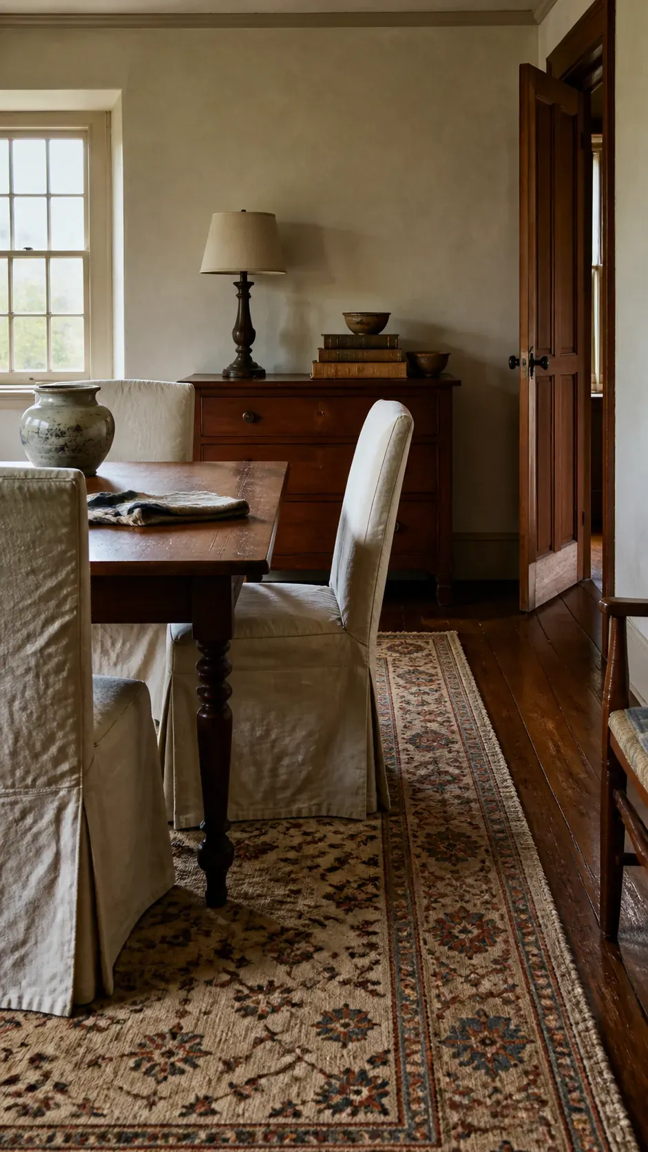
Metal, glass, stone, cane, and fabric also stop the room from becoming a brown box. A marble-topped table or upholstered chair contributes vintage character without introducing another large wood plane. Choose textiles that contain two of the room’s wood colors—perhaps camel, rust, cream, and dark brown—to bridge the palette naturally.
Let Furniture Style Create the Family Resemblance
Wood color is only one part of compatibility. A refined mid-century teak credenza and a primitive farmhouse trunk may conflict more through silhouette and scale than through finish. Curved legs, simple lines, visible joinery, or similar proportions can connect pieces made from different species. When styles differ, repeat each style elsewhere so neither looks stranded.
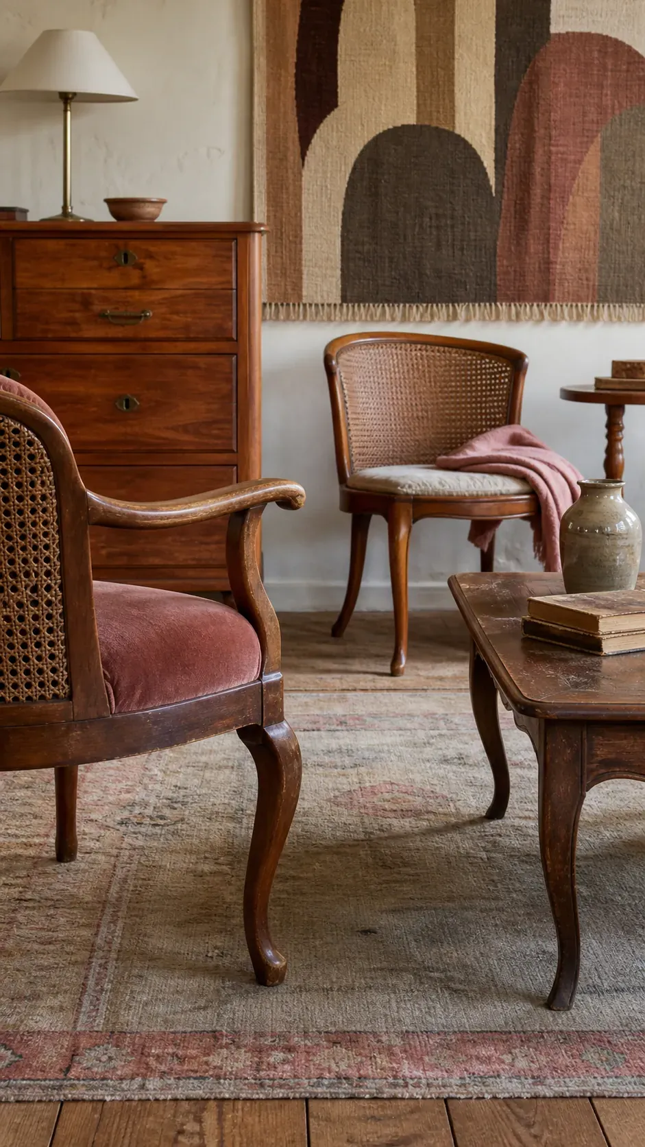
Pay attention to visual weight. A heavy trunk beneath a delicate console can make both pieces seem misplaced, even if their undertones match. Move the trunk to a bedroom where its mass suits the bed, or pair the console with a lighter-legged coffee table. Editing placement often solves what appears to be a color problem.
Preserve Patina Instead of Making Every Finish New
Vintage wood decor gains credibility from rubbed edges, sun fading, old repairs, and finish variation. Stripping or painting every piece to make the tones uniform can erase the history that made it appealing. Clean and stabilize the furniture first, then live with it in the room before deciding whether refinishing is necessary.
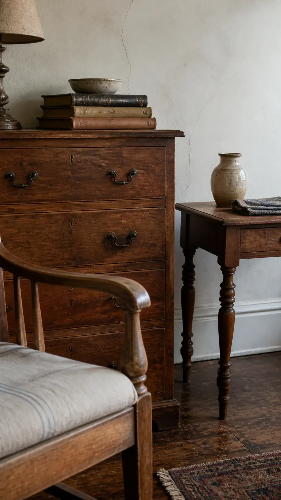
Condition, construction, and material quality matter more than whether a piece is pale or dark. A well-made table with honest age usually integrates more gracefully than a flat-pack imitation with a printed finish. If a surface truly needs work, test the least invasive treatment in a hidden area and respect veneer thickness. Patina should read as use, not neglect.
Test the Whole Room Before You Buy Another Piece
Photograph the room from its main entrance, then reduce the image until individual details disappear. You should still see one dominant wood, a few supporting tones, and clear breaks created by textiles or painted surfaces. If every brown has equal weight, remove or relocate one piece before shopping for a solution.
When considering a thrifted find, check its undertone, silhouette, scale, and where its color will repeat. Bring home a sample when possible and view it in morning and evening light. A vintage-inspired home does not need matching furniture; it needs relationships strong enough that every difference looks chosen. The room should tell a story of discovery, not a story of stain matching.