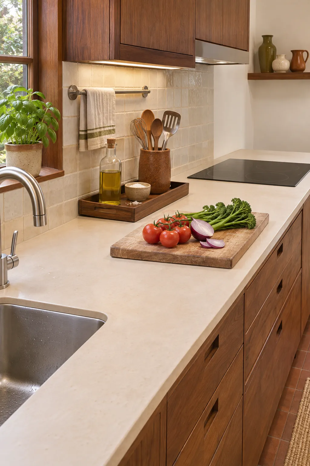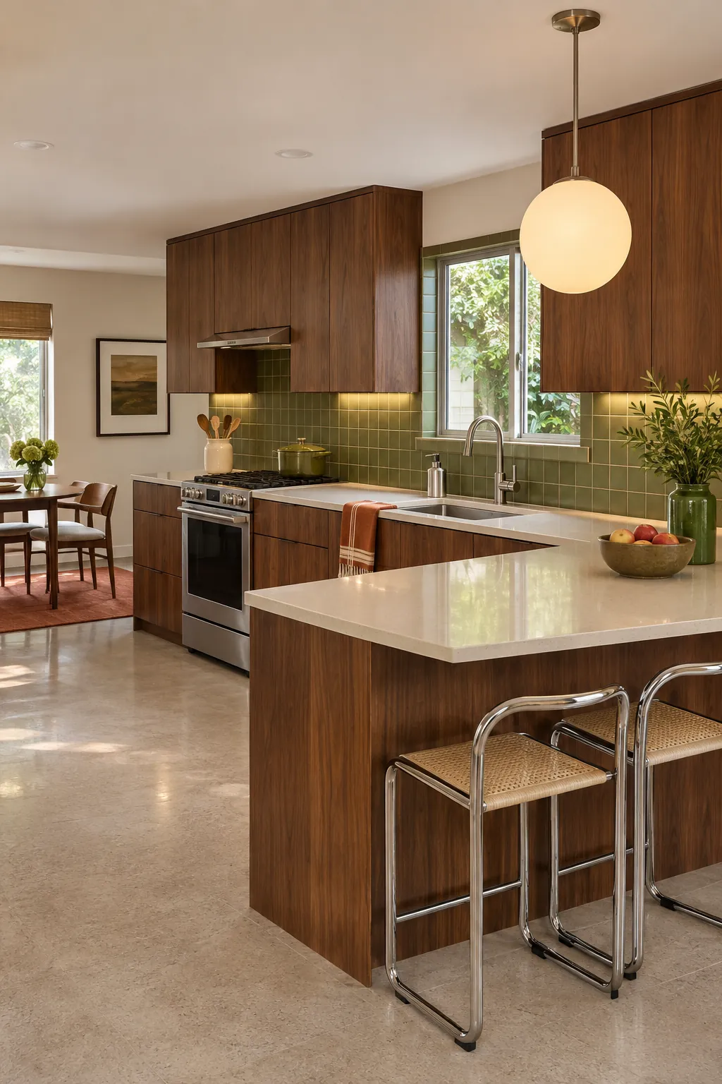
A kitchen can carry bold nineteen seventies character without becoming dark, crowded, or difficult to cook in. The strongest result starts with function, then uses a few period shapes, colors, and materials as a clear design language.
People planning this look often face the same tradeoff: original cabinets may be solid and useful, while the color, lighting, or surrounding surfaces make the room feel tired. A measured update protects the parts that work and spends money where it improves daily cooking.
Start with one authentic anchor
Choose one feature that establishes the era before selecting finishes. Walnut cabinet fronts, an amber glass pendant, a rounded dining table, or a graphic tile pattern can do that job. Let the anchor guide the palette, but avoid repeating every possible period reference in the same room.
An existing feature deserves a condition check before removal. Solid cabinet boxes can often support new internal fittings, while damaged particleboard may not justify cosmetic work. The decision should follow structure and function, not a quick reaction to the current color.
Balance warm wood with clear light surfaces
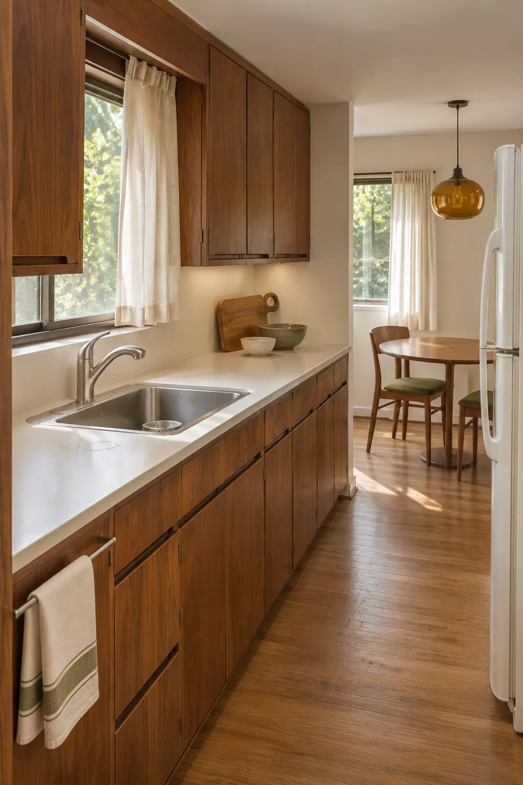
Dark timber looks rich when it has enough visual relief. Pair walnut or teak tones with a cream counter, pale wall, or softly reflective backsplash so cabinet grain remains visible. A small amount of white can sharpen the room, but an all white envelope may erase the warmth that makes the style distinctive.
Repeat the wood tone in two or three places, such as cabinet fronts, stools, and a serving board. Keep other timber species quiet and close in temperature. This creates an eclectic kitchen design that still feels connected.
Use color in controlled blocks
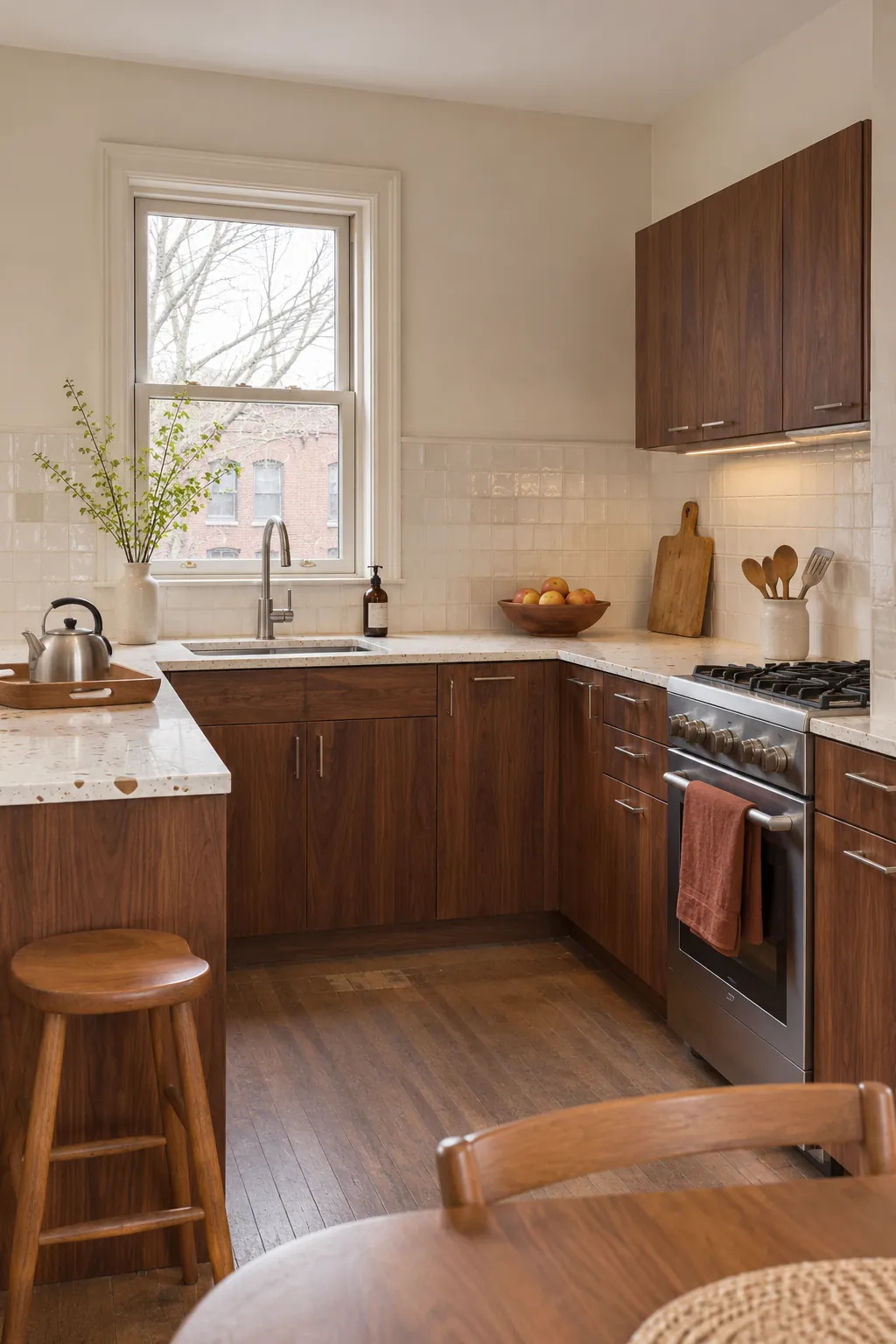
Avocado, rust, mustard, and brown can work beautifully, but they need different visual weights. Give one color the largest role, one a supporting role, and one a small accent. A rust banquette with olive ceramics and a mustard lamp is easier to live with than equal amounts of every shade.
Test colors beside the actual cabinet finish at morning, afternoon, and night. Warm bulbs and wood reflections can shift a sample more than expected. Confirm the combination before ordering a large surface such as tile, flooring, or a worktop.
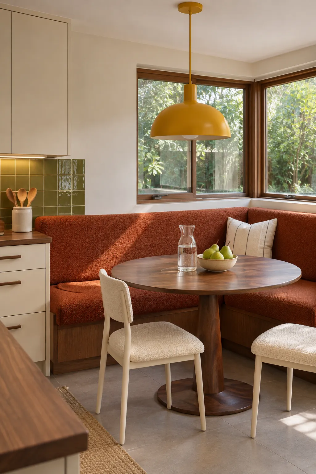
Bring in curves without losing counter space
Rounded forms soften a room full of rectangular cabinets. Use them where they do not reduce useful preparation area, such as pendant shades, stool backs, cabinet pulls, a dining table, or the edge of an open shelf. A curved island can be attractive, but it should never narrow a major walkway or complicate storage.
Measure door swings, appliance openings, and chair pullout space on the floor with removable tape. Walk the route while another person opens a drawer. This simple check exposes conflicts that a beautiful elevation drawing may hide.
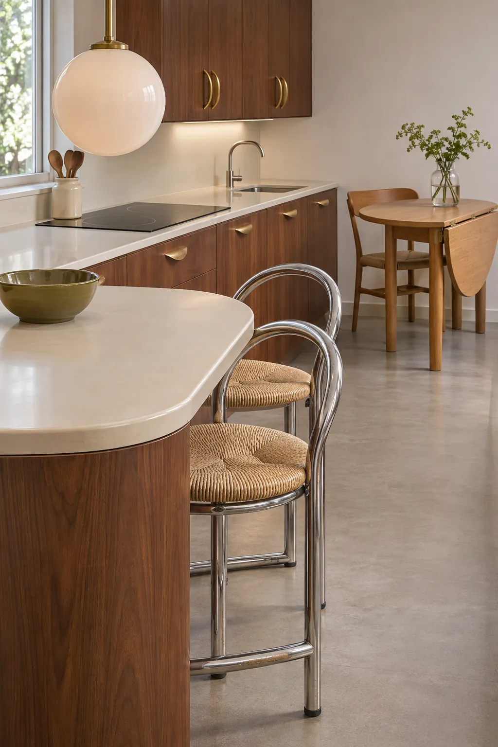
Layer task light with a warm decorative glow
A vintage kitchen aesthetic still needs clear light at the sink, cooktop, and main preparation area. Use concealed task lights to remove shadows, then add one expressive pendant or globe fixture for atmosphere. Decorative light should support the work light, not replace it.
Choose bulbs that render food and timber naturally. Very warm light can turn cream surfaces yellow and make olive paint look muddy. Put decorative and task fixtures on separate controls so the room can shift from cooking to dining without wasting light.
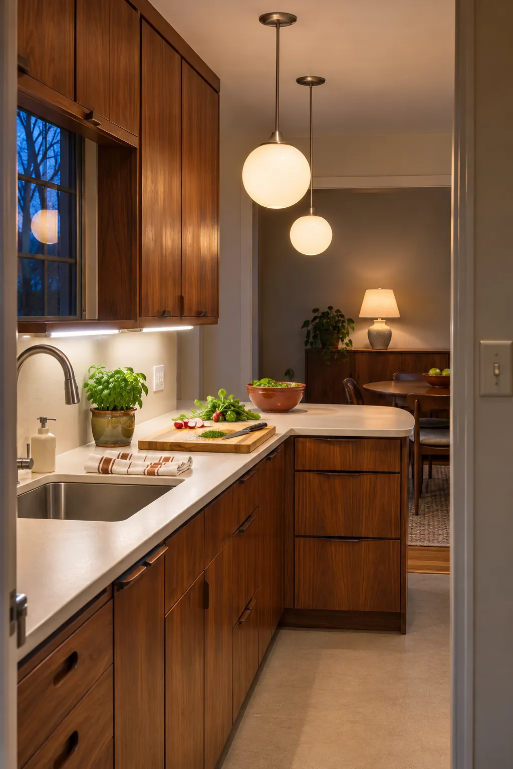
Protect the work zone from decorative clutter
Open shelves, pottery, cookbooks, and vintage appliances can make the kitchen personal, but clear preparation space is more valuable. Keep the main counter between sink and cooktop open. Group display objects away from steam, grease, and frequent splashes.
Use drawers near the work zone for the tools used every day and store occasional pieces higher or farther away. A tray can hold oil, salt, and one utensil pot so the group moves as a unit during cleaning. The final test is simple: the room should still work smoothly when more than one person is cooking.