
Walking into a home where every room feels connected is a refreshing experience. It doesn't mean every wall is the same color, but it does mean there is a common thread that pulls the space together. Many homeowners struggle to bridge the gap between a single room they love and a whole-house design that feels intentional.
This guide will show you how to build a modern interior color palette that works for your lifestyle. We will cover how to select base neutrals, how to use the 60-30-10 rule for balance, and how to ensure your colors look just as good at sunset as they do at noon.
How to pick a primary neutral for your modern interior color palette
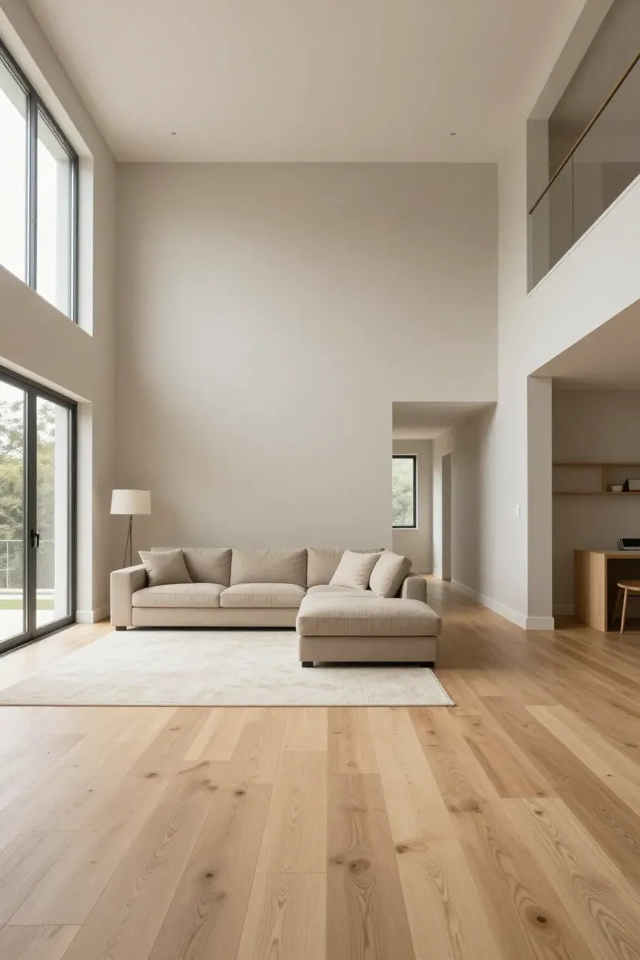
Your primary neutral is the backbone of your home. This color usually covers about 60% of your space, including hallways and open-plan living areas. When choosing a modern interior color palette, look for neutrals with subtle undertones. Cool grays were popular for years, but many are now moving toward 'greige' or warm whites to make spaces feel more inviting.
To pick the right one, look at your flooring. If you have warm oak floors, a crisp cool blue-white might clash. Instead, try a creamy white. If you have dark slate or polished concrete, a cooler light gray can look sharp and clean. This primary color acts as the canvas for everything else.
Using the 60-30-10 rule for a balanced interior design colour palette
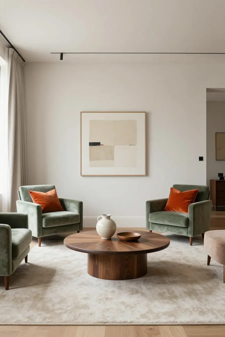
The 60-30-10 rule is a simple trick to keep your interior design colour palette from feeling cluttered. Use your primary neutral for 60% of the space (walls and large rugs). Use a secondary color for 30% of the room (upholstery, curtains, or an accent wall). The final 10% is for your boldest accent color, found in pillows, artwork, or small decor items.
This ratio ensures that no single color overwhelms the others. It provides enough variety to keep the eye moving without making the room feel chaotic. In a modern setting, the 30% is often a deeper version of the neutral or a muted earth tone.
Creating flow between rooms with a consistent house color palette interior
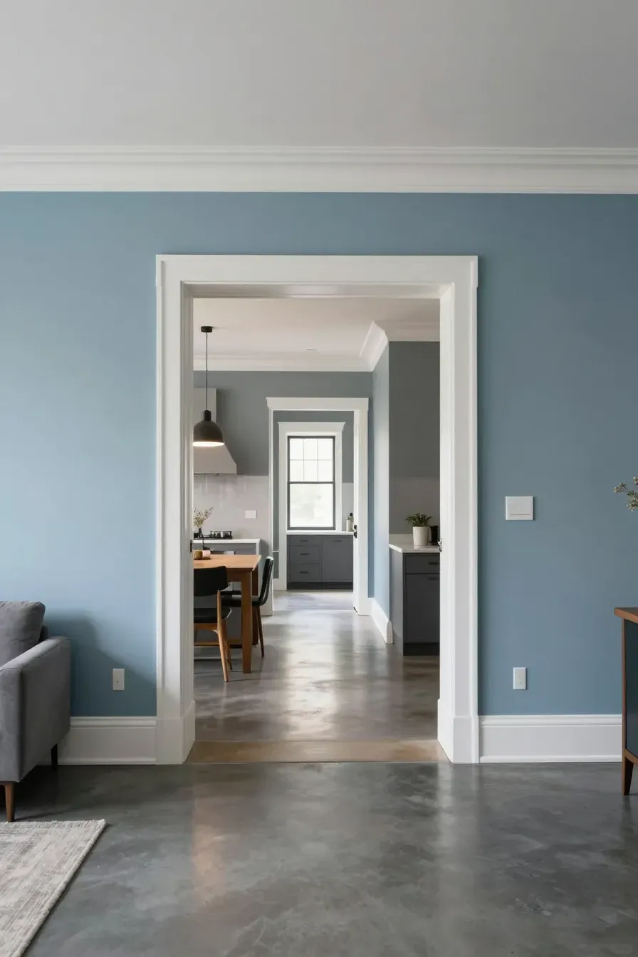
To get a cohesive house color palette interior, you need to think about sightlines. Stand in your living room and look into the kitchen or the hallway. If you see three different bright colors, the house will feel small and disjointed.
A pro tip is to use the same trim and ceiling color throughout the entire house. This creates a 'frame' for every room. If you want a different vibe in the bedroom, you can change the wall color, but keep it within the same saturation level as the rest of the house so the transition feels natural.
Choosing accent colors for a contemporary color palette
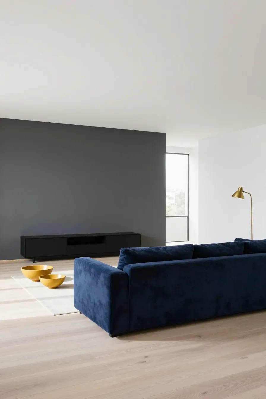
A contemporary color palette often relies on high contrast or tonal layers. If your base is light and airy, consider accents like charcoal, navy, or forest green. If you prefer a more monochromatic look, your accents can simply be different shades of your main color.
When picking accents for home decor color palettes, think about the mood. Blues and greens tend to be calming for bedrooms, while a pop of terracotta or mustard yellow can add energy to a dining area or home office.
How lighting changes your home color palette interior throughout the day
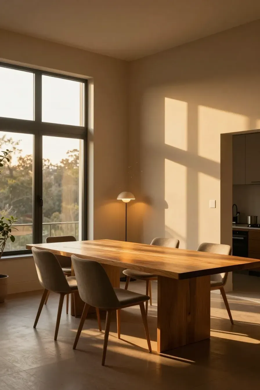
Light is the most important factor in how paint actually looks. A color that looks like a soft beige in the store might look yellow in a north-facing room with little sun. South-facing rooms get intense light that can wash out pale colors, so you can often go a bit darker there.
Always check your home color palette interior at different times. Look at the swatches at 10 AM, 3 PM, and at night under your artificial lamps. LED bulbs come in different 'temperatures' (warm vs. cool), and these will drastically change how your interior design color schemes appear in the evening.
Selecting paint finishes for different indoor color schemes house by house
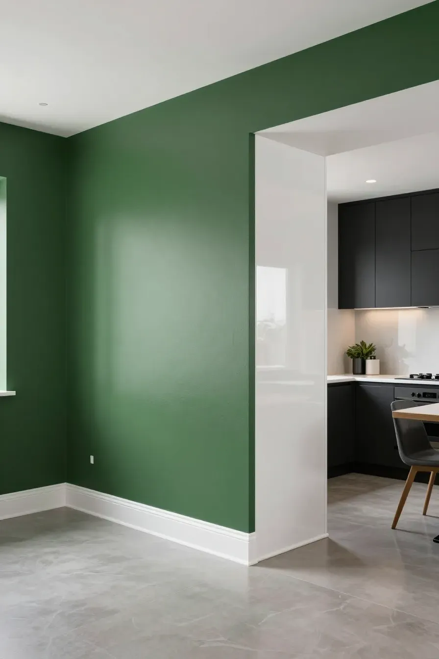
The finish of your paint is just as important as the color. For most indoor color schemes house projects, a flat or matte finish is best for walls because it hides imperfections. However, in high-traffic areas like kitchens or bathrooms, a satin or eggshell finish is easier to wipe down.
Use semi-gloss for baseboards and doors. This creates a slight texture contrast that makes your interior design color palette look more professional. The glossier the finish, the more it reflects light, which can make colors appear slightly lighter and more intense.
Adding texture and natural materials to your modern colour palette

A modern colour palette can sometimes feel 'flat' if it’s just paint. You need to bring in natural materials to add depth. Wood grain, stone, and woven fabrics act as 'colors' in your palette.
For example, if you have a very neutral white and gray palette, adding a light oak coffee table or a jute rug adds a warm tan element that doesn't require more paint. These textures break up the solid blocks of color and make the room feel layered and finished.
Testing your interior design color schemes before you buy paint
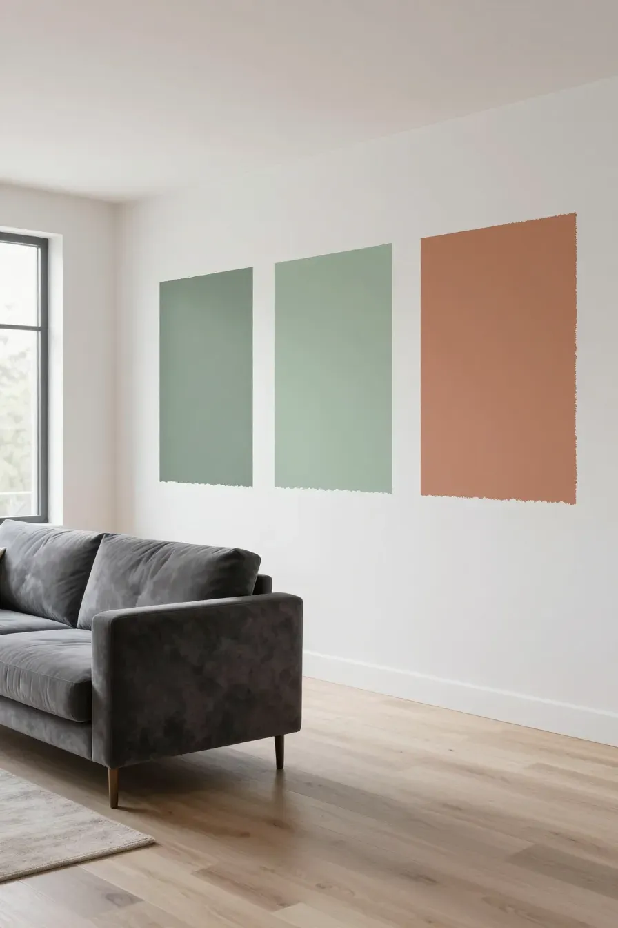
Never buy five gallons of paint based on a small paper swatch. Buy sample pots or large peel-and-stick samples. Place them on different walls in the same room.
When testing your interior design color schemes, leave the samples up for at least two days. You need to see how they look when it's raining versus when it's sunny. Also, place the sample next to your flooring and your largest piece of furniture to make sure they don't fight each other.
Common mistakes to avoid when planning your home decor color palettes
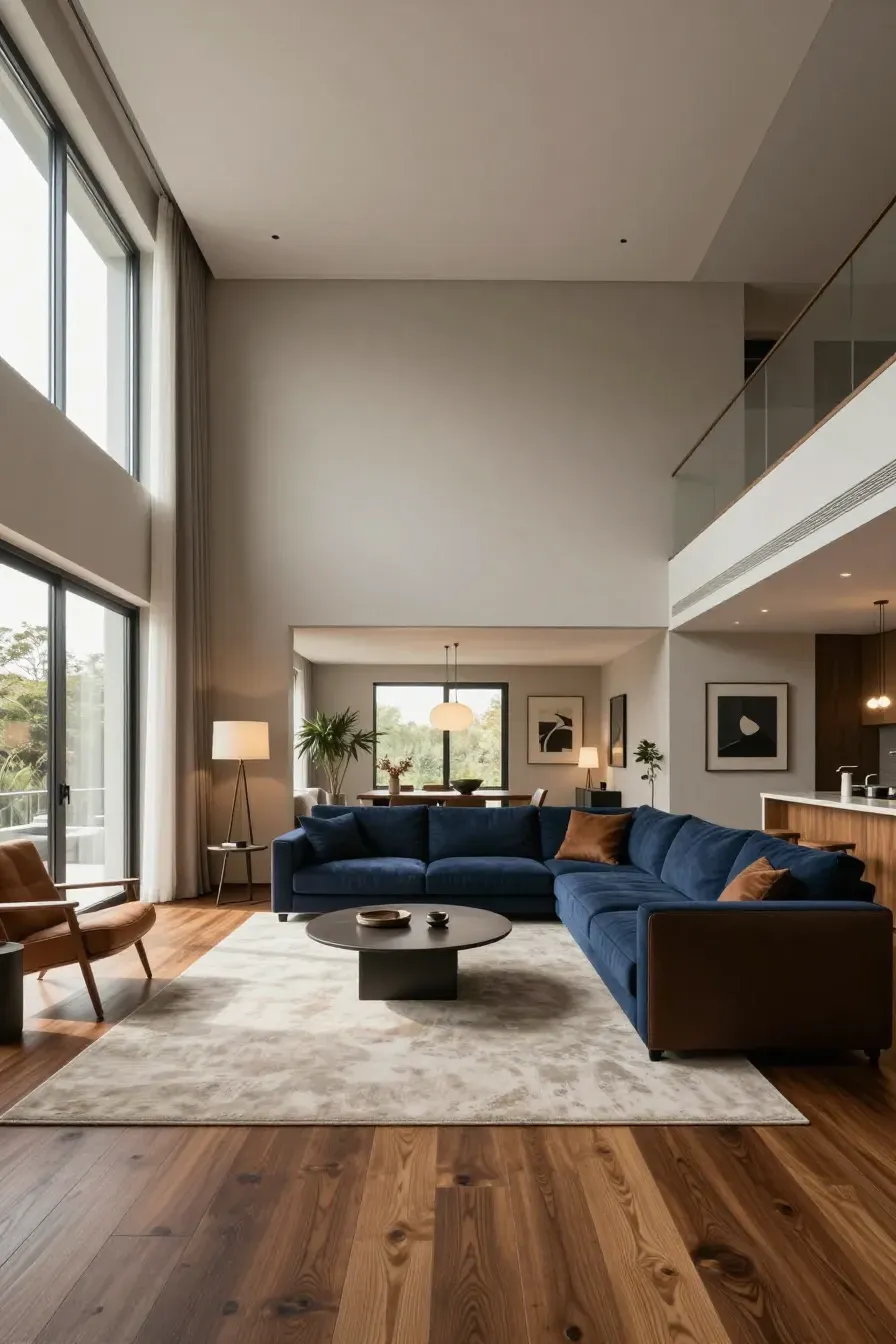
One big mistake is picking the wall color first. It is much easier to match paint to a sofa than it is to find a sofa that matches a very specific shade of green paint. Start with the items you can't change easily, like floors and large furniture.
Another mistake is ignoring the 'weight' of a color. Dark colors feel heavy and can make a ceiling feel low if you aren't careful. Lastly, avoid using too many 'hero' colors. If every room has a bright accent wall, the house will feel like a collection of separate boxes rather than a single, flowing home.
Building a cohesive home doesn't require a degree in design, but it does require a bit of planning. By starting with a solid neutral and following the 60-30-10 rule, you can create a space that feels both modern and comfortable. Take your time testing samples in different lighting to ensure you love the result. Now that you have the tools, grab some samples and start narrowing down the colors that feel like home.