
Have you ever walked into a room that felt instantly calming, even though there wasn't a single bright color in sight? That is the power of a well-executed neutral palette. Many people think neutrals are just "safe" or boring, but they actually provide the most versatile foundation for any home. A thoughtful neutral scheme allows your furniture and art to stand out while creating a sense of flow between different living spaces.
In this guide, we will look at how to select the right shades for your home and how to layer them so your rooms feel deep and inviting rather than flat. We'll cover everything from undertones and lighting to choosing the right white for a contemporary look.
The difference between warm and cool neutral tones

Every neutral paint has an undertone. Warm neutrals have hints of yellow, orange, or red. They make a room feel cozy and intimate, which is why they are popular in bedrooms and living areas. Cool neutrals have blue, green, or purple undertones. These feel crisp, clean, and modern. If you want a space to feel expansive and airy, cool tones are usually the way to go. It is important to look at your fixed elements—like stone fireplaces or wood trim—to see if they lean warm or cool before you pick a wall color.
How to use greige for a modern interior color palette

Greige is a mix of gray and beige, and it has become a staple in the modern interior color palette. It solves the problem of gray feeling too cold or beige feeling too dated. Greige works well because it adapts to its surroundings. In a room with lots of sunlight, it might look like a soft gray. In the evening under warm lamps, it feels more like a cozy tan. It is a great bridge color if you are trying to modernize an older home without making it feel clinical.
Matching your interior design colour palette with floor materials

Your floors are the largest "color" in the room after the walls. When building an interior design colour palette, always start from the ground up. If you have honey-toned oak floors, a cool blue-gray might clash. Instead, look for neutrals with a slight warmth. For dark slate or cool-toned laminate, a crisp white or a cool gray will feel more cohesive. Bring your paint swatches down to the floor level to see how they interact; never choose a wall color while looking at it at eye level in a vacuum.
Using white and off-white in a contemporary color palette
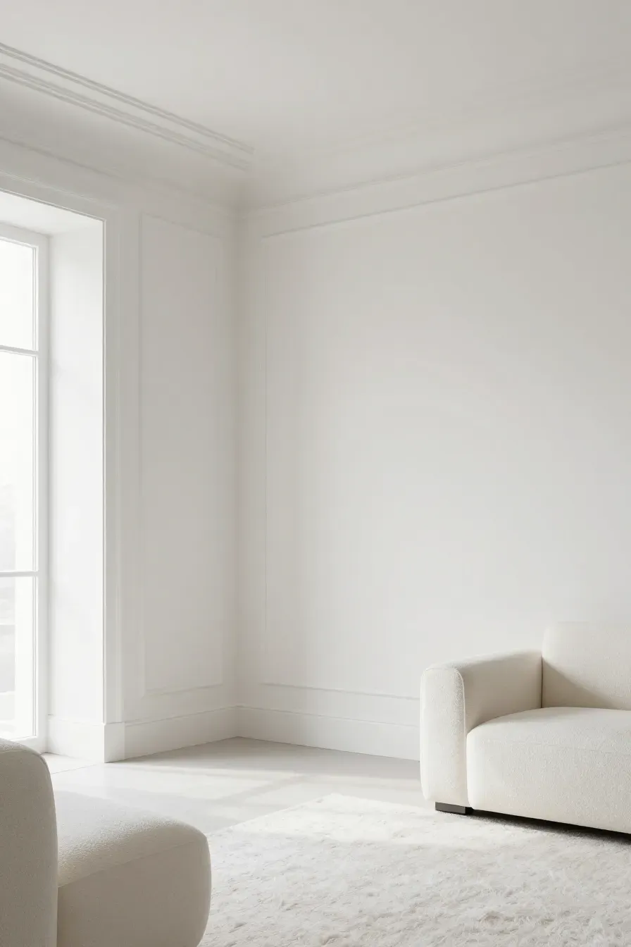
White isn't just one color. In a contemporary color palette, the right white can make a room look high-end. Pure whites are great for a minimalist look, but they can feel harsh in rooms with little natural light. Off-whites with a tiny bit of gray or cream are often easier to live with. They provide a soft background that doesn't compete with your decor. If you want a modern look, try painting the walls and the trim the same shade of white but in different finishes, like flat for walls and semi-gloss for trim.
Why natural light changes a modern colour palette throughout the day

Light is the most important factor in how paint looks. A modern colour palette that looks great in the store might look totally different in your living room. North-facing rooms get cool, bluish light, which can make grays look chilly. South-facing rooms get strong, warm light that can make yellows or creams look too intense. Always observe your paint samples in the morning, afternoon, and at night under artificial light to ensure you like the color at all times of day.
Creating depth with home decor color palettes and textures
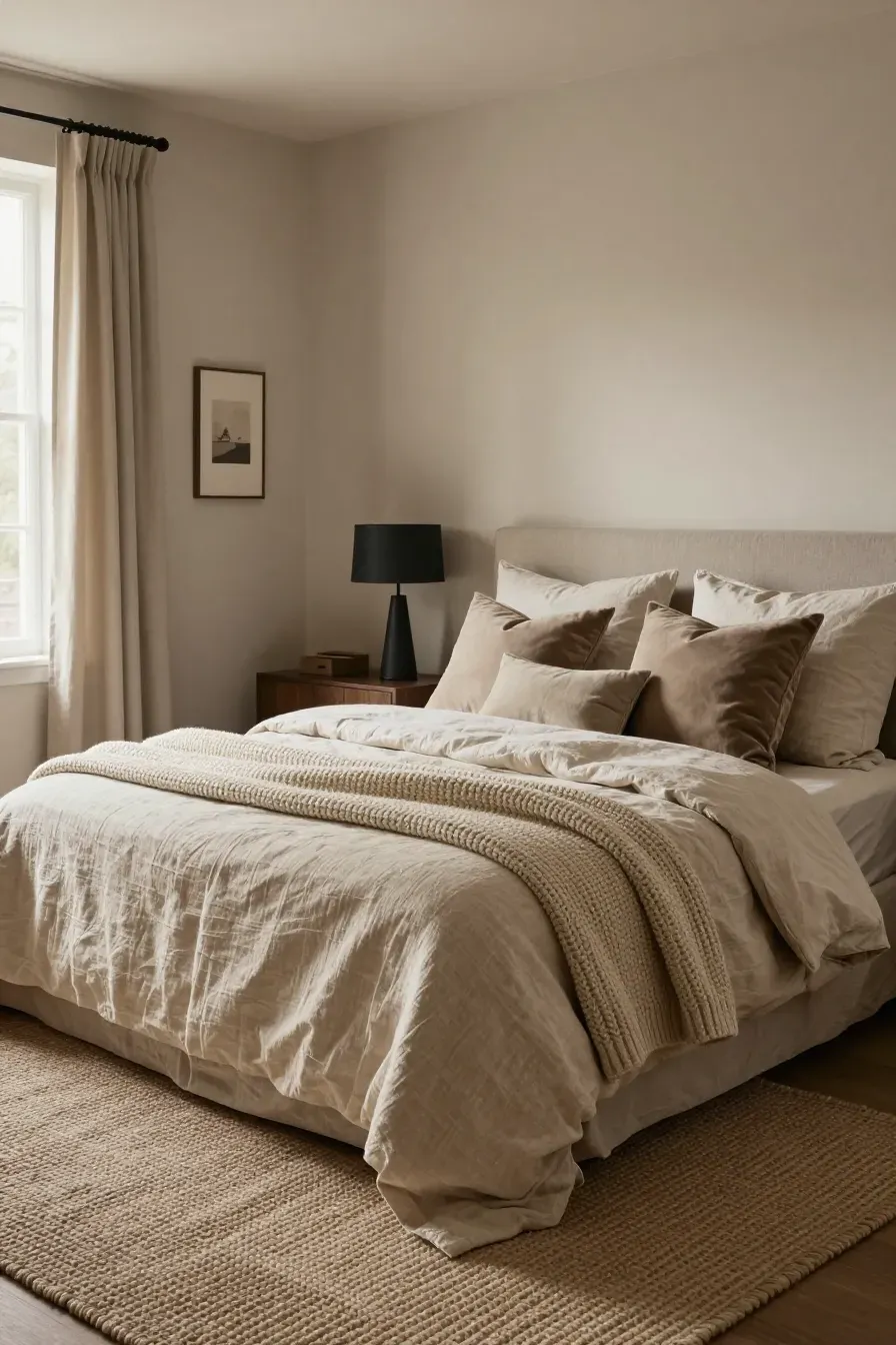
A neutral room can look flat if everything is the same tone. To make home decor color palettes work, you need texture. Think about layering a chunky wool rug, linen curtains, and velvet pillows. Even if they are all shades of oatmeal or sand, the different textures create shadows and highlights. This gives the room depth and makes it feel finished. Use darker shades of your neutral base for smaller items like picture frames or lamp bases to anchor the space.
Coordinating an interior design color palette across different rooms
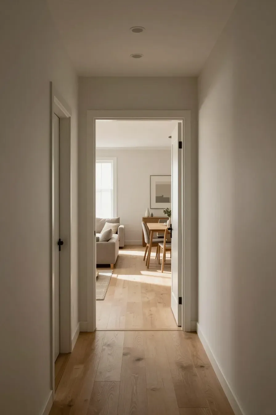
To get a professional look, your interior design color palette should flow from one room to the next. You don't have to paint every room the same color, but they should share the same "temperature." If your hallway is a warm greige, don't suddenly switch to a cool, icy blue in the next room. You can use different strengths of the same color—for example, 100% strength in the living room and 50% strength in a dark hallway—to maintain a cohesive feel throughout the house.
The role of earth tones in a home color palette interior
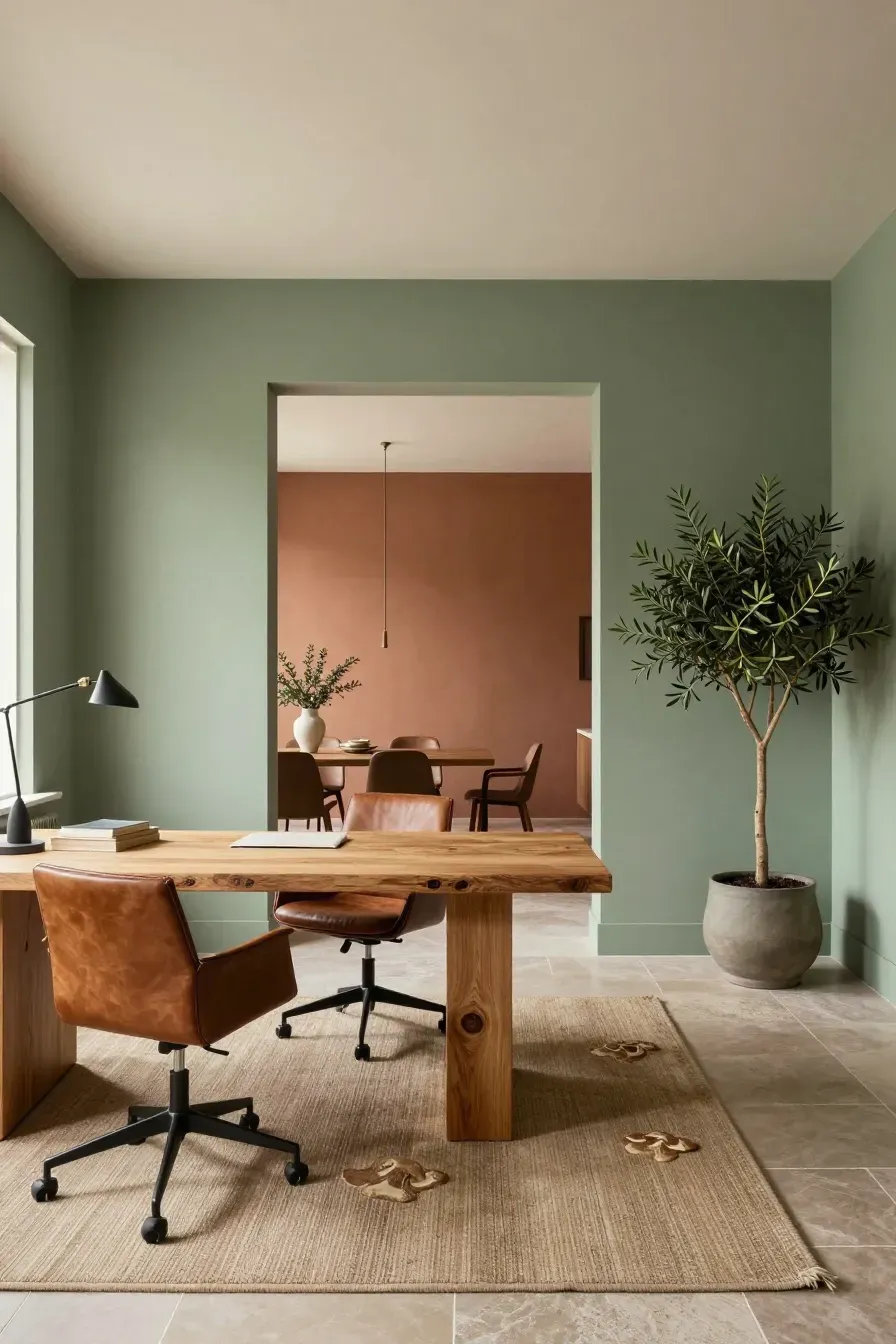
Earth tones like terracotta, sage green, and mushroom are excellent additions to a home color palette interior. These colors act as neutrals because they are found in nature. They add a bit of personality without being overwhelming. Using an earthy green in a home office or a soft clay color in a dining room can make the house feel grounded. These tones pair perfectly with natural materials like wood, leather, and stone.
Common mistakes when picking interior design color schemes
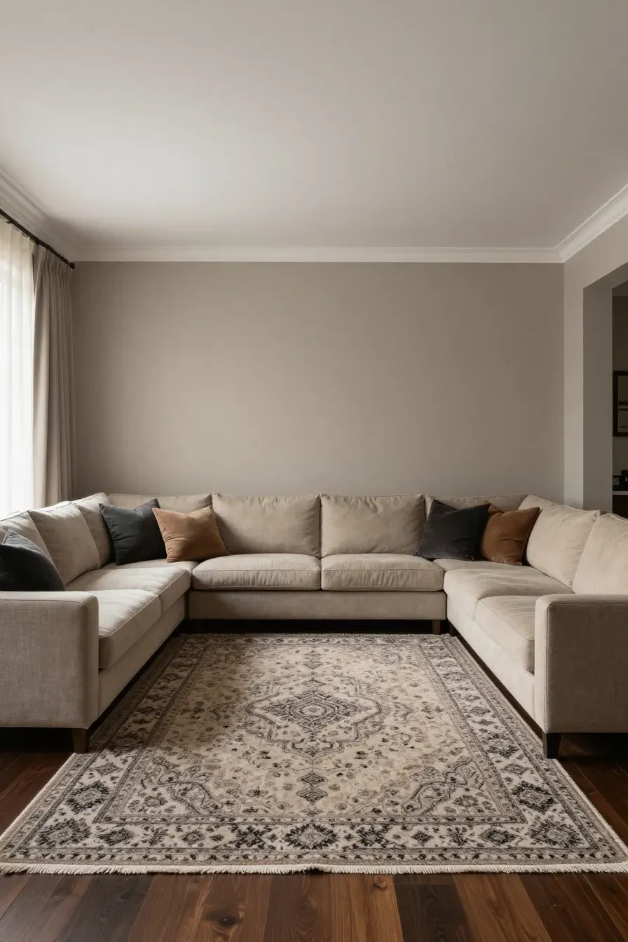
One of the biggest mistakes in interior design color schemes is picking the paint color first. It is much easier to match paint to a rug or a sofa than it is to find a rug that matches a specific paint. Another mistake is choosing a color based on a small 2-inch swatch. Paint can look much more intense when it covers four walls. Also, don't forget about the ceiling; a stark white ceiling can sometimes look like a lid on a room if the walls are a deep, warm neutral.
How to test indoor color schemes house wide before painting
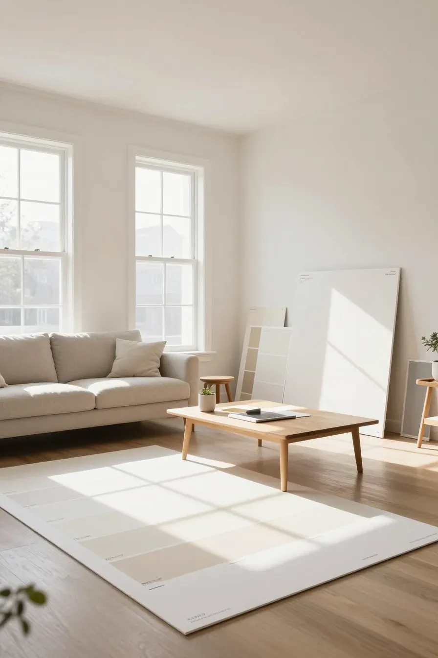
Before you commit, test your indoor color schemes house wide. Instead of painting squares directly on the wall, paint large pieces of poster board. This allows you to move the samples around the room and see how they look in dark corners versus next to windows. It also lets you see how the color looks against your furniture. Leave the samples up for a few days to see how you feel about them as the weather and lighting change.
Adding contrast to a house color palette interior with trim and accents

Contrast is what keeps a house color palette interior from looking washed out. If your walls are a light neutral, consider a slightly darker shade for the doors or the kitchen island. Black or dark charcoal accents—like door handles, faucet fixtures, or light fittings—provide a sharp "pop" that defines the space. Even in a neutral home, having one or two dark elements helps the lighter colors look brighter and more intentional.
Choosing a neutral palette is about more than just picking a shade of beige. It is about understanding light, undertones, and how different textures work together. By layering shades and paying attention to your home's natural light, you can create a space that feels both modern and timeless. Ready to start? Pick up a few large sample boards today and see how your favorite neutrals look in your own unique space.