
Walking into a living room that feels 'just right' usually has nothing to do with luck and everything to do with the color choices. A well-thought-out indoor color schemes house creates a sense of flow and comfort, making your space feel like a sanctuary rather than just a collection of furniture. Whether you are starting from scratch or refreshing a tired room, the right colors set the mood for everything from quiet movie nights to hosting friends.
This guide breaks down how to build a contemporary color palette that works for your specific space. We will cover how to use neutrals to create space, how to balance light and dark tones, and how to avoid the common pitfalls that leave rooms feeling flat or cluttered.
Neutral bases that make a room feel larger

A modern interior color palette often starts with a neutral base. Lighter shades like soft whites, cool greys, and warm beiges reflect more light, which tricks the eye into thinking walls are further away. This is a staple in any interior design colour palette for smaller homes. Instead of plain stark white, look for neutrals with subtle undertones. A grey with a hint of blue can feel crisp, while a beige with a touch of pink feels cozy. Using the same neutral on the walls, trim, and ceiling can also blur the boundaries of the room, making it feel more expansive.
Adding depth with moody and dark interior design color schemes

Don't be afraid of the dark. While light colors open things up, dark interior design color schemes add a sense of luxury and intimacy. Deep charcoal, navy, or forest green can make a large living room feel more grounded. If you aren't ready to paint every wall a dark shade, try a single accent wall or dark cabinetry. The key is to ensure you have enough lighting—both natural and artificial—so the space feels moody rather than cave-like.
Using warm earth tones for a grounded feel

Many people are moving away from cold, clinical greys toward a more modern colour palette rooted in nature. Earth tones like terracotta, sage green, and ochre bring warmth to a living room. These colors are easy on the eyes and pair well with natural materials. A house color palette interior that uses earth tones feels timeless and organic. You can bring these in through wall paint, or more subtly through rugs and throw pillows.
How to pick accent colors for a contemporary color palette

Accent colors are the 'pop' in your home decor color palettes. A good rule of thumb is the 60-30-10 rule: 60% is your primary color (usually walls), 30% is your secondary color (upholstery), and 10% is your accent color (decor). For a contemporary look, choose accents that contrast with your base. If your room is mostly neutral, a bold mustard yellow or a deep burgundy can add visual interest without being overwhelming.
The role of natural wood and stone in your home decor color palettes
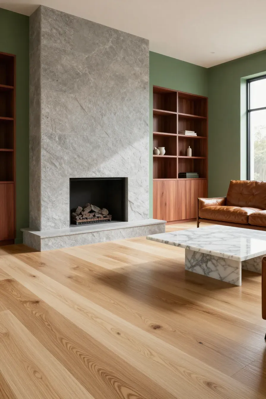
Color isn't just about paint; it's about materials. Natural wood grains and stone textures are vital parts of a home color palette interior. Oak or bamboo flooring adds a golden warmth, while marble or slate adds coolness. When picking your interior design color palette, hold your paint swatches up against your flooring and fireplace. If the wood has a red undertone, a cool green wall will make that red stand out more. Aim for materials that complement your paint choices to keep the room cohesive.
Balancing light and dark in an indoor color schemes house
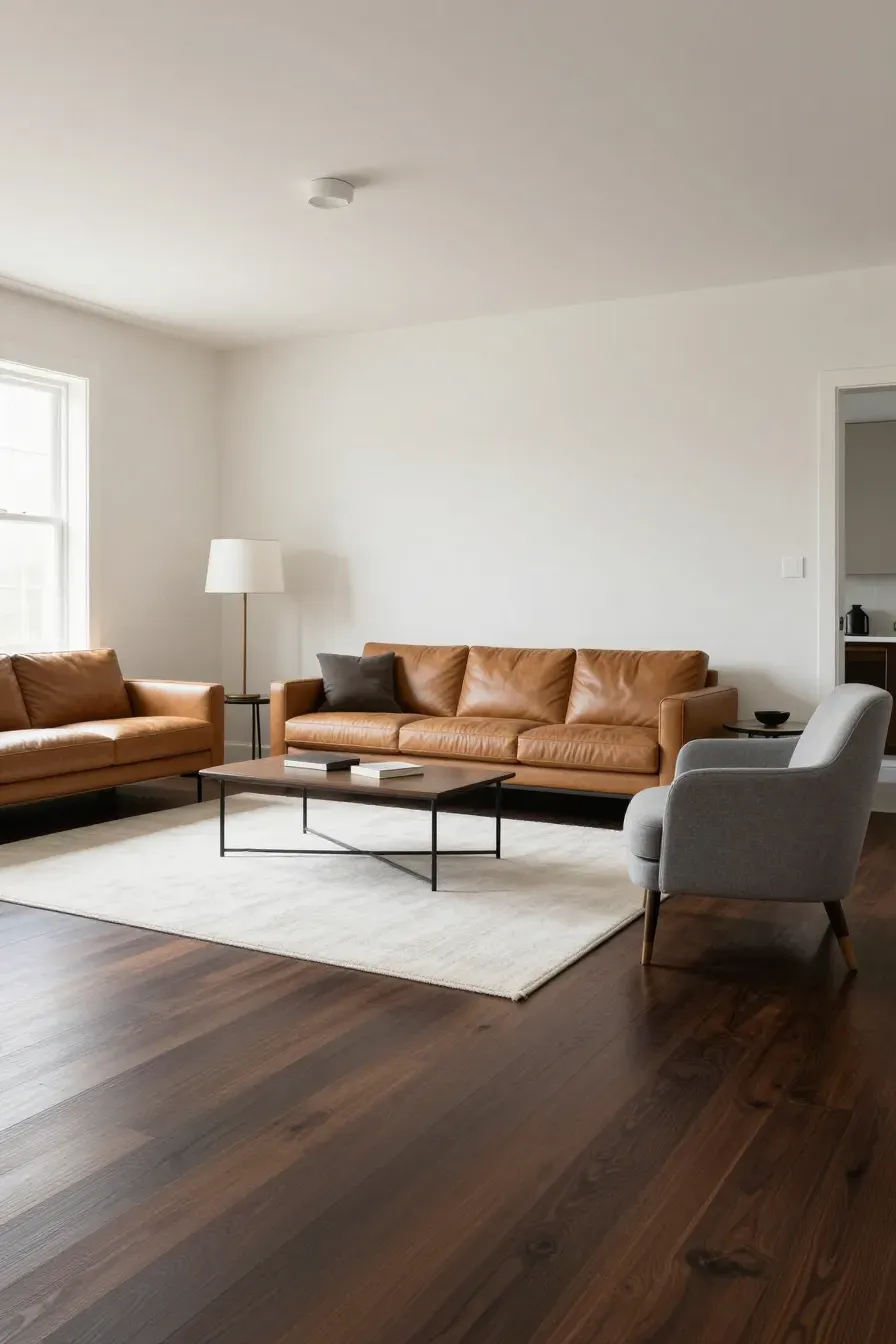
Balance is what makes a room feel professional. If you have dark floors, light walls can keep the room from feeling heavy. If you have light furniture, a medium-toned wall provides the contrast needed to make the furniture stand out. A successful interior design color palette uses a mix of 'values'—the lightness or darkness of a color. Without this variety, a room can look two-dimensional and boring.
Testing your modern interior color palette in different lighting
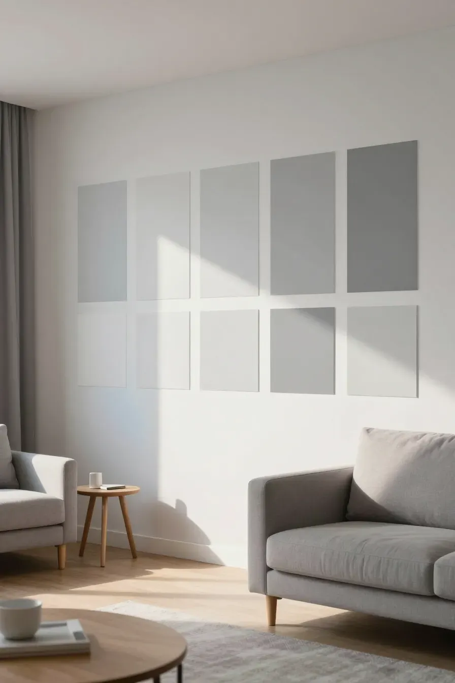
The biggest mistake you can make is picking a color in the store and buying five gallons immediately. Colors change drastically depending on the light. A grey that looks silver in the morning might look purple under LED light at night. Paint large samples on different walls and watch them throughout the day. Check how they look on a sunny afternoon versus a rainy morning. This is the only way to be sure your interior design color schemes will work in your specific environment.
Ways to coordinate furniture with your house color palette interior

Your furniture should talk to your walls. If you have a bold, colorful sofa, keep the wall color more subdued. If your furniture is neutral, you have more freedom to experiment with wall colors or patterned wallpaper. When building your house color palette interior, think about the large pieces first. It is much easier to find a paint color that matches a sofa than it is to find a sofa that matches a very specific paint color.
Common mistakes to avoid when picking an interior design colour palette
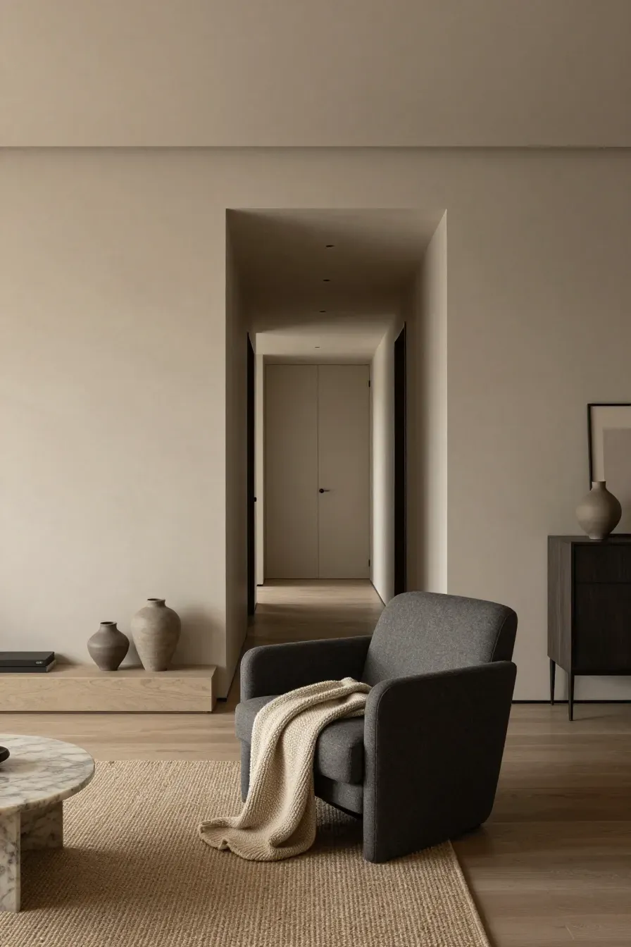
One common error is trying to match everything perfectly. A room where the walls, rug, and sofa are the exact same shade of beige feels flat. Instead, aim for coordination through varying textures and shades. Another mistake is ignoring the 'flow' of the house. Your living room color should feel like it belongs with the hallway and kitchen. You don't need to use the same color everywhere, but the tones should share a similar mood or temperature.
Choosing a color palette for your living room is about finding a balance between your personal style and the practical needs of the space. Start with a base you love, add depth with darker tones or earth-inspired shades, and don't forget to test everything in your home's unique light. Once you have your colors set, you can start layering in furniture and decor that bring the whole vision together. Grab a few sample pots this weekend and see how a new shade can change the feel of your home.