
A gallery wall doesn't have to be a loud, cluttered mess of frames. In fact, some of the most striking displays are those that embrace simplicity and restraint. By focusing on a few key pieces and plenty of breathing room, you can create a focal point that feels calm and intentional rather than overwhelming. This approach works especially well in modern homes where you want to add personality without sacrificing a sense of order.
In this guide, we will look at how to choose a cohesive look for your art, how to handle spacing, and the best way to get your frames level on the wall. You will learn how to turn a blank space into a curated display that feels like a natural part of your room. The goal is to let the art speak for itself through careful placement and a limited palette.
Choosing a Cohesive Color Palette
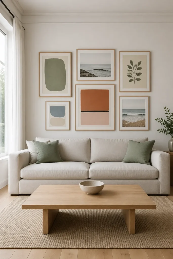
Minimalism relies on a sense of unity. When picking art for your wall, look for pieces that share a similar color story. You don't need every piece to be identical, but they should feel like they belong together. Black and white photography is a classic choice that always looks clean. If you prefer color, try sticking to muted tones like sage green, soft blues, or warm terracotta. Using a limited palette prevents the wall from feeling chaotic and helps the eye move smoothly from one piece to the next.
Selecting Simple and Consistent Frames
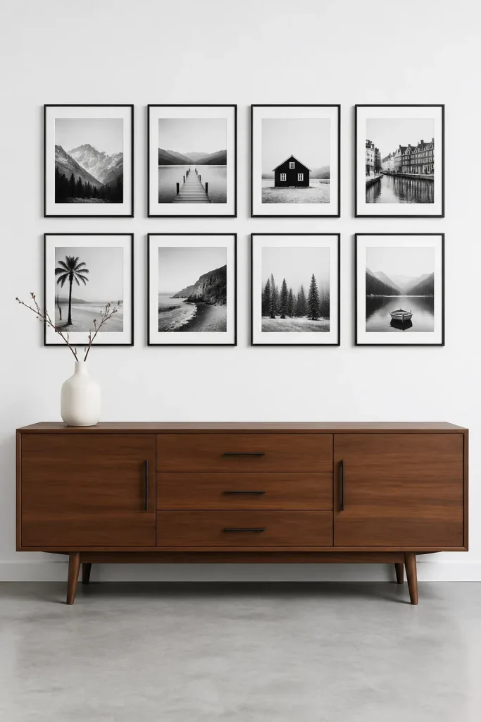
Frames are just as important as the art they hold. For a minimalist look, stay away from ornate or heavy moldings. Thin, flat-profile frames in wood, black, or white are usually the best bet. To keep things looking organized, use the same frame style and color for every piece in the group. This creates a rhythmic pattern on the wall. If you want a bit of variety, you can mix sizes, but keeping the frame material consistent provides the visual 'glue' that holds the arrangement together.
Balancing Art Pieces with Negative Space
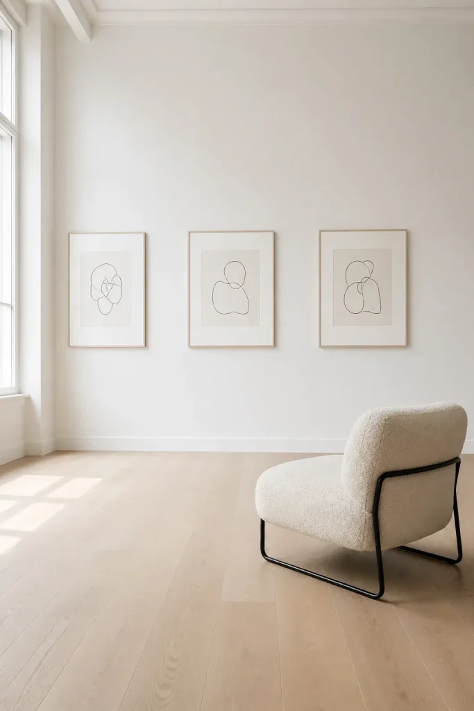
Negative space—the empty area around and between your frames—is your best friend. In a traditional gallery wall, frames are often packed tightly together. In a minimalist version, you want to increase the gap between them. Aim for at least three to five inches of space between frames. This extra room gives each piece of art its own identity and prevents the wall from looking crowded. Large white mats inside the frames can also add more negative space, making even small prints feel more significant and airy.
Mapping Out Your Layout on the Floor
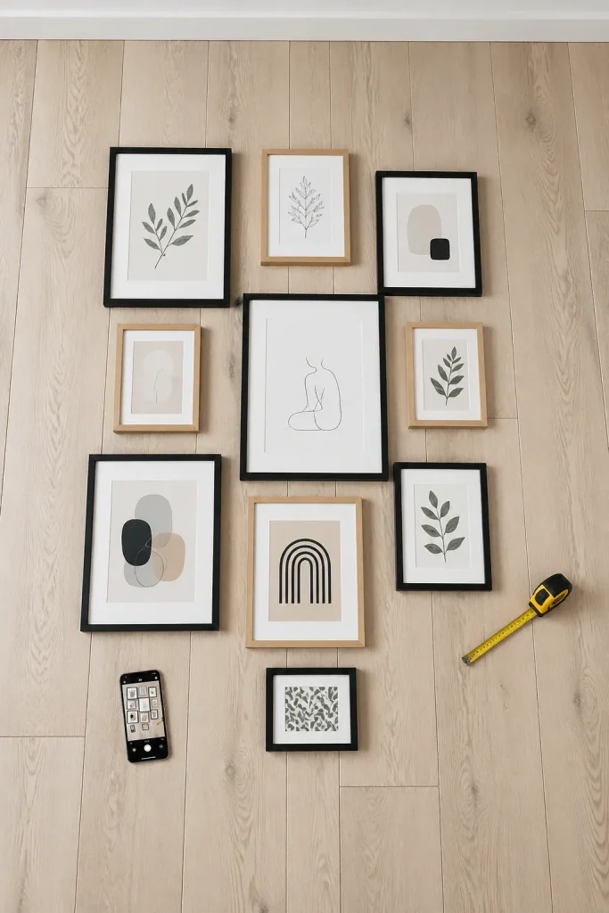
Never start by hammering nails into the wall. Instead, clear a space on the floor that matches the dimensions of your wall area. Lay your framed art out and move the pieces around until the balance feels right. Try a grid layout for a very structured look, or an offset arrangement for something more relaxed. Take a photo of the final floor layout from above. This photo will be your reference point and saves you from making unnecessary holes in your drywall.
Measuring and Hanging for Clean Alignment
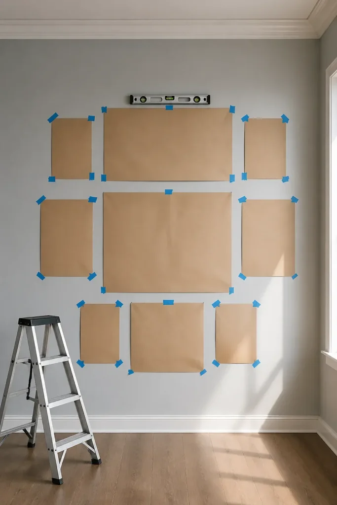
Precision is what makes a minimalist wall look professional. Use a level and a measuring tape to ensure your lines are straight. A common trick is to use painter's tape to mark the top edge of your entire arrangement. You can also cut out paper templates of each frame and tape them to the wall. This lets you see the scale in real-time. Once the paper templates are perfectly spaced and leveled, you can drive your nails directly through the paper, then tear the paper away.
Maintaining Visual Order with Minimalist Subject Matter
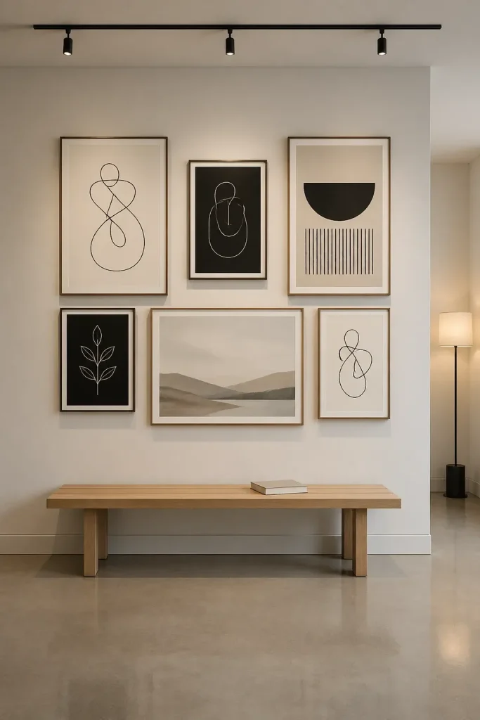
The content of the art should match the vibe of the layout. Line drawings, abstract shapes, or simple landscapes work better than busy, detailed oil paintings. Think about the 'weight' of each image. If one piece has a very dark, heavy subject, balance it with a lighter piece on the opposite side of the arrangement. The goal is to create a visual equilibrium where no single frame pulls too much attention away from the others. Keep the subjects simple so the overall wall feels like one single, peaceful installation.
Creating a minimalist gallery wall is about making deliberate choices. By sticking to a simple palette, consistent framing, and generous spacing, you can turn any wall into a sophisticated display. Take your time with the planning phase and don't be afraid to leave some space empty. Now that you have the steps, pick a wall in your home and start laying out your favorite pieces to see how they look together.