
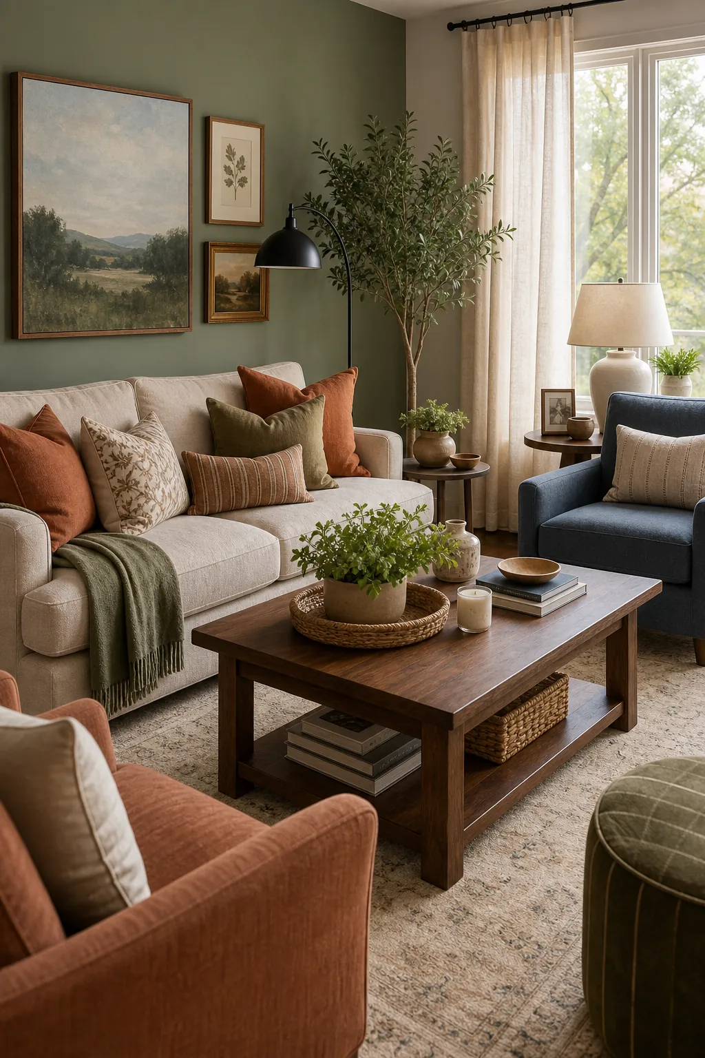
Choosing living room color schemes is less about finding one perfect paint chip and more about deciding what the room should feel like at 7 p.m. A palette has to work with your sofa, floors, daylight, lamps, and the pieces you are not replacing.
These 25 living room color schemes focus on real color combinations home decorators can actually use: warm neutrals, earthy living room palettes, soft blues, muted greens, cozy paint colors, and a few deeper combinations that still feel livable.
How to Use These Living Room Color Palette Ideas
Pick one dominant color, one support color, and one accent. Let the dominant color cover the walls, sofa, rug, or curtains. Use the support color for wood, upholstery, or large textiles. Save the accent for pillows, lamps, art, and small decor. That simple split keeps colour schemes for living room spaces from becoming busy.
1. Warm White, Oak, and Sage
Warm white walls, oak tables, and sage textiles make a room feel calm without going beige.
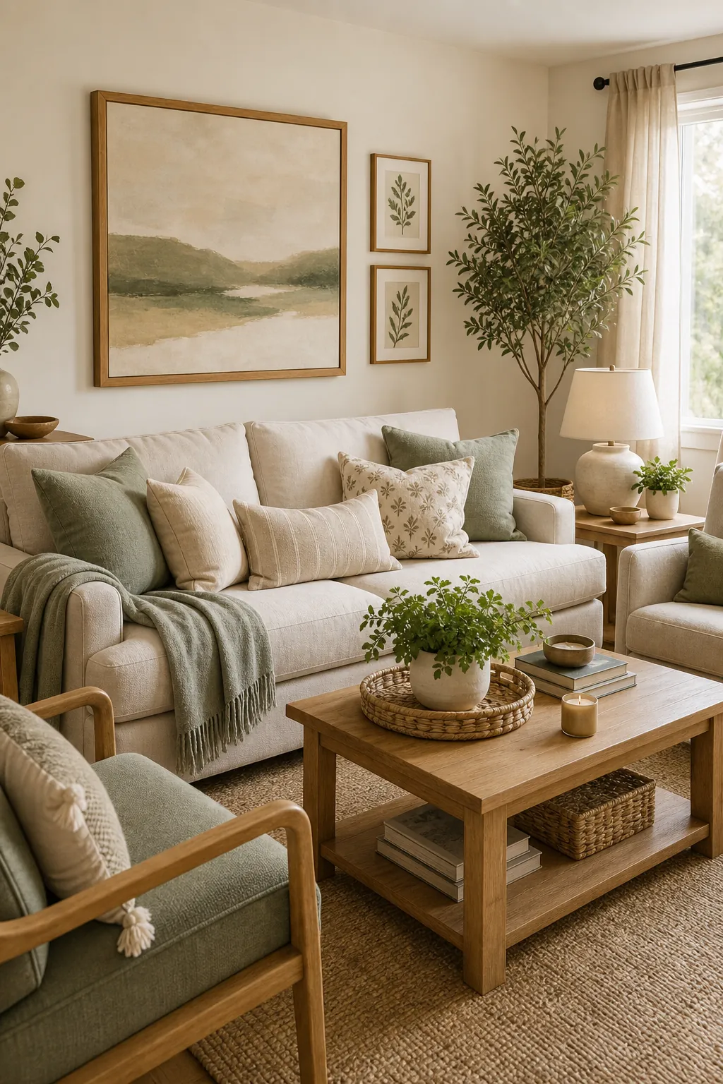
2. Greige, Charcoal, and Linen
Greige walls soften charcoal accents, while linen keeps the palette from feeling heavy.
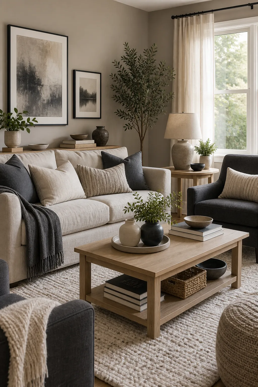
3. Cream, Terracotta, and Olive
Cream gives terracotta and olive room to feel earthy instead of loud.
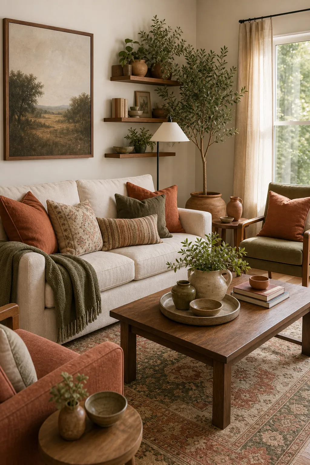
4. Soft Taupe, Black, and Brass
Taupe becomes sharper when you add small black lines and a little brass warmth.
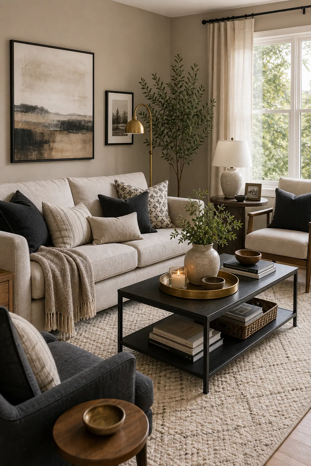
5. Mushroom, Clay, and Ivory
Mushroom is a forgiving neutral that makes clay accents feel grown-up.

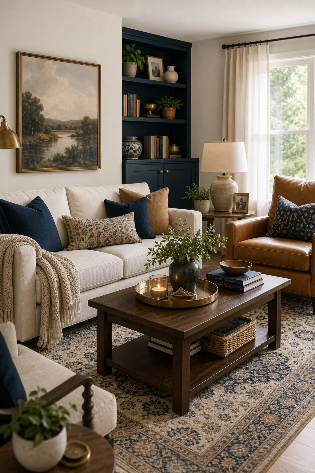
6. Navy, Camel, and Warm White
Navy feels more relaxed when camel leather and warm white walls soften it.
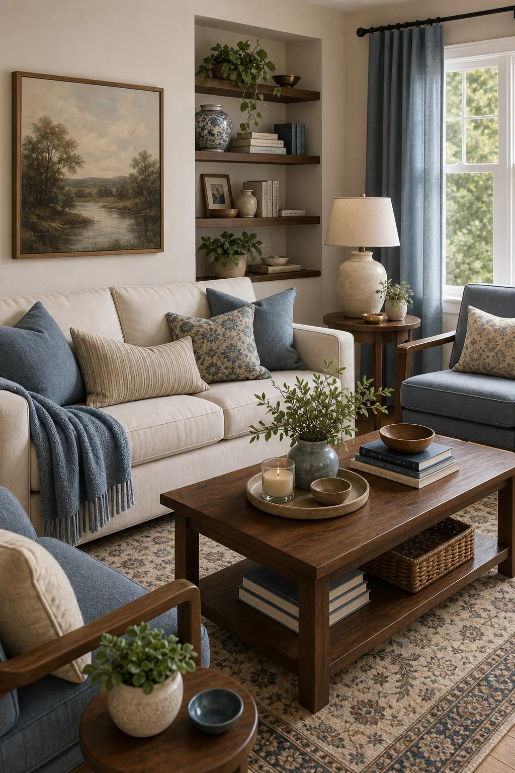
7. Dusty Blue, Walnut, and Cream
Dusty blue adds color while walnut keeps the room grounded.
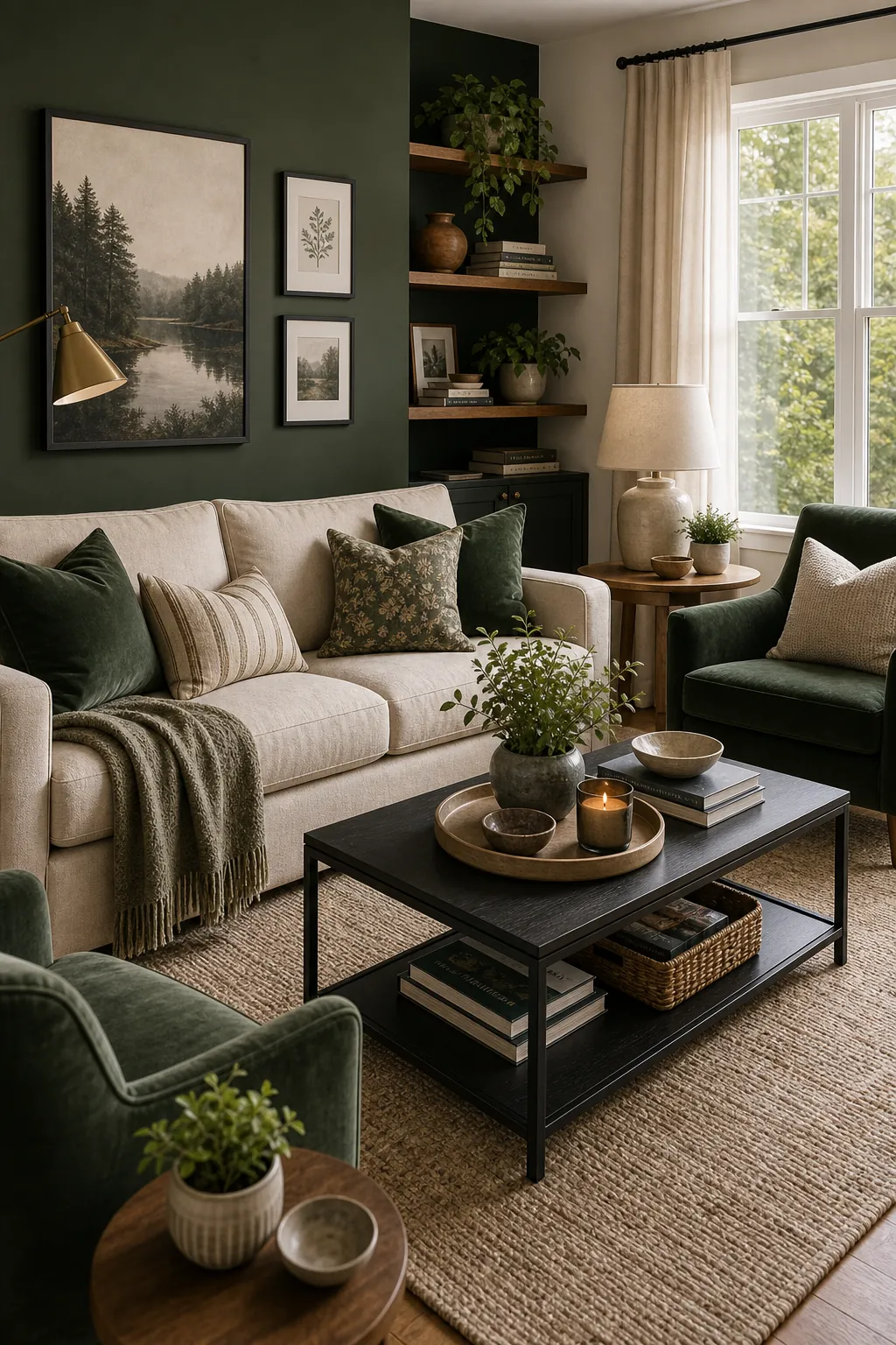
8. Forest Green, Oatmeal, and Black
Forest green adds depth, oatmeal keeps it soft, and black gives the palette shape.
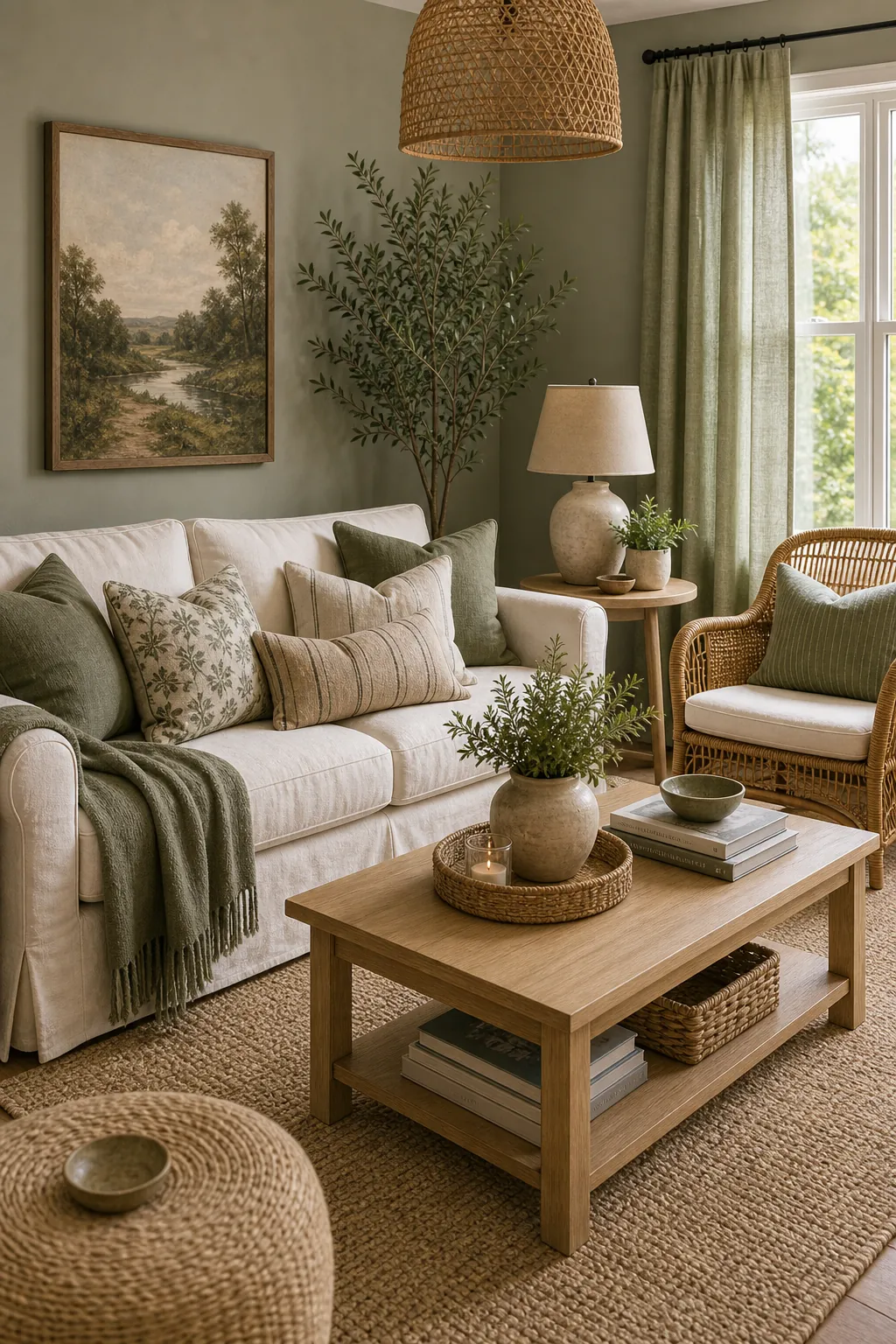
9. Sage, Cream, and Rattan
Sage and cream can look flat until rattan brings texture and shadow.
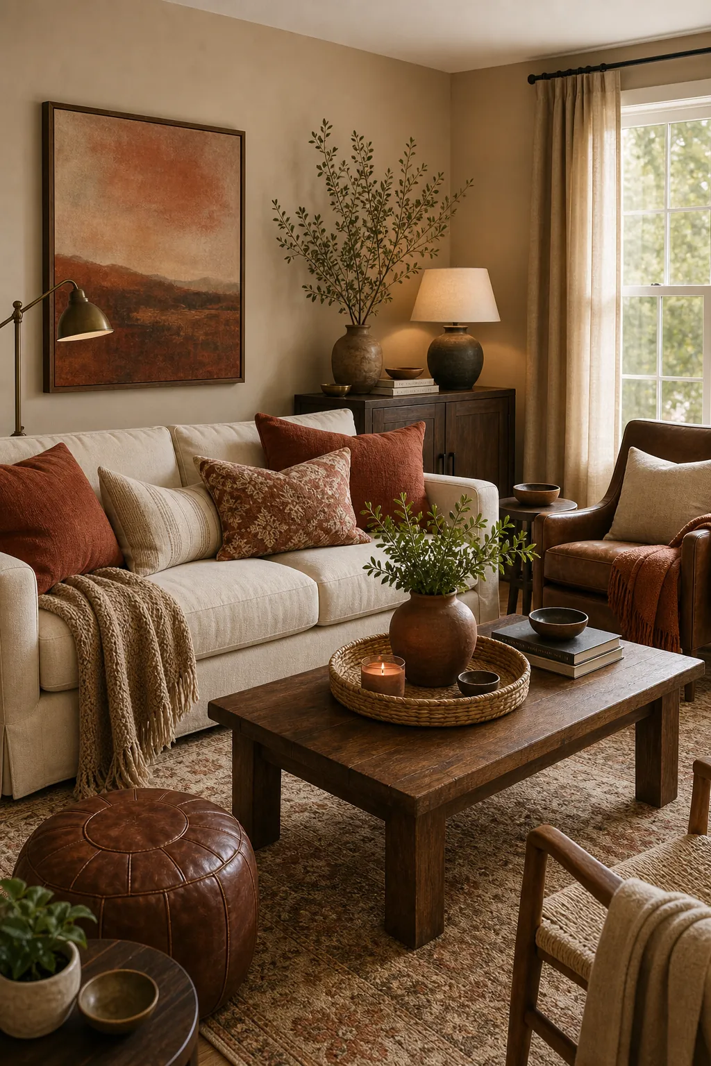
10. Rust, Sand, and Deep Brown
Rust works best when sand and deep brown keep it grounded.
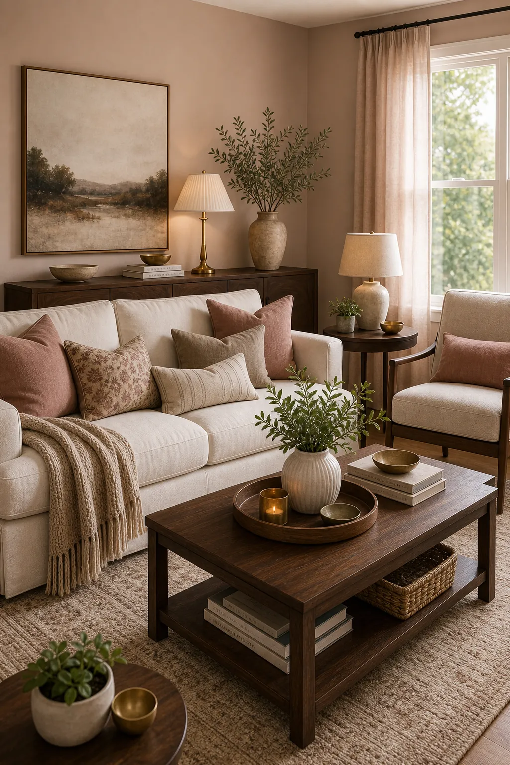
11. Blush Beige, Walnut, and Ivory
Blush beige gives warmth without turning the room pink.
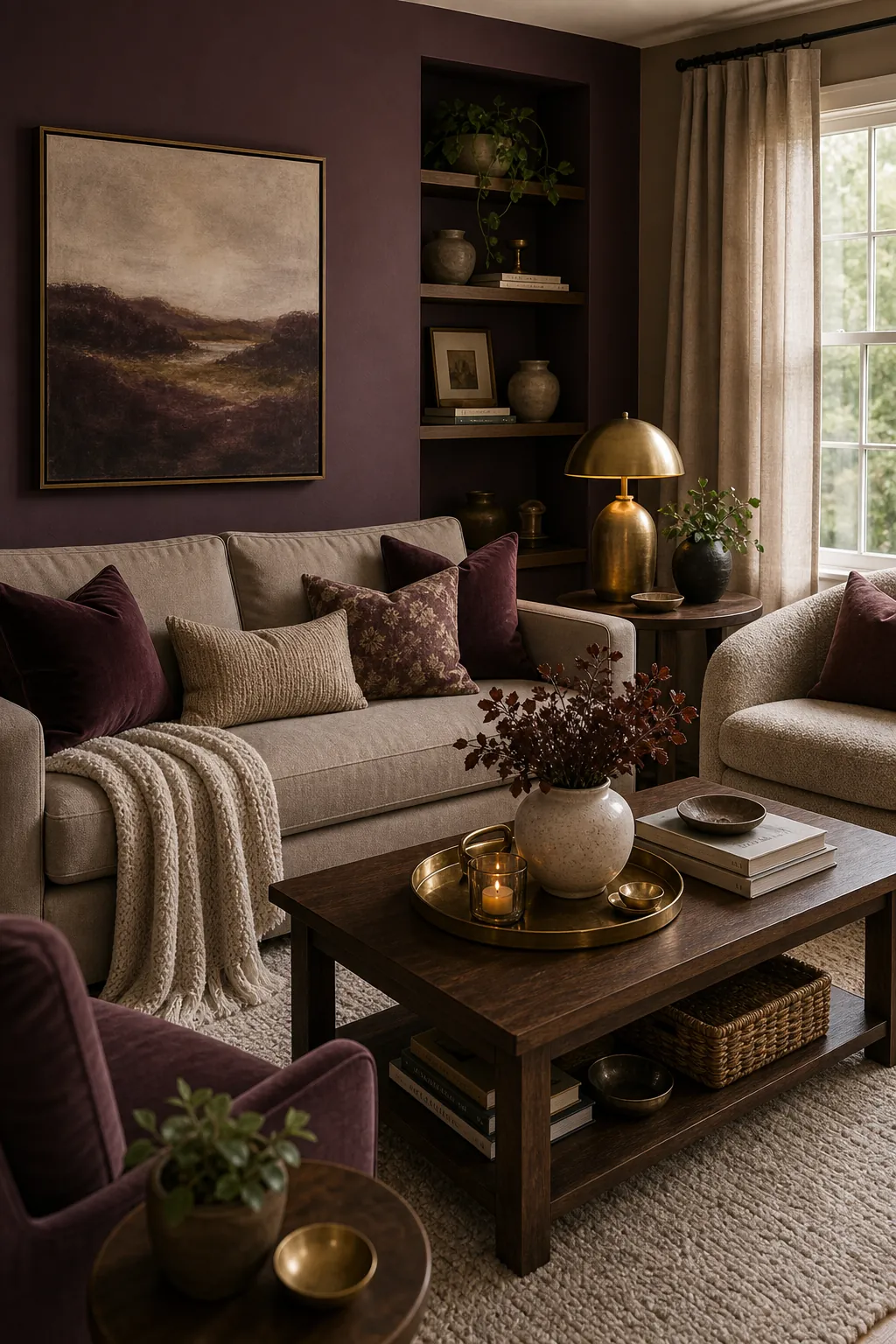
12. Moody Plum, Taupe, and Brass
Plum can be elegant in a living room when taupe and brass keep it balanced.
13. Light Gray, Cognac, and White
Light gray becomes warmer when cognac leather and creamy white balance it.
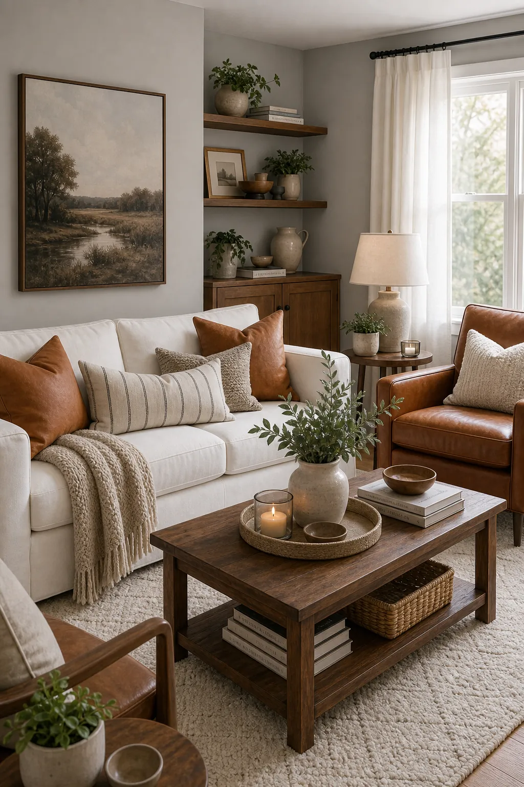
14. Olive, Chocolate, and Natural Linen
Olive and chocolate feel rich, while linen stops the room from becoming too dark.
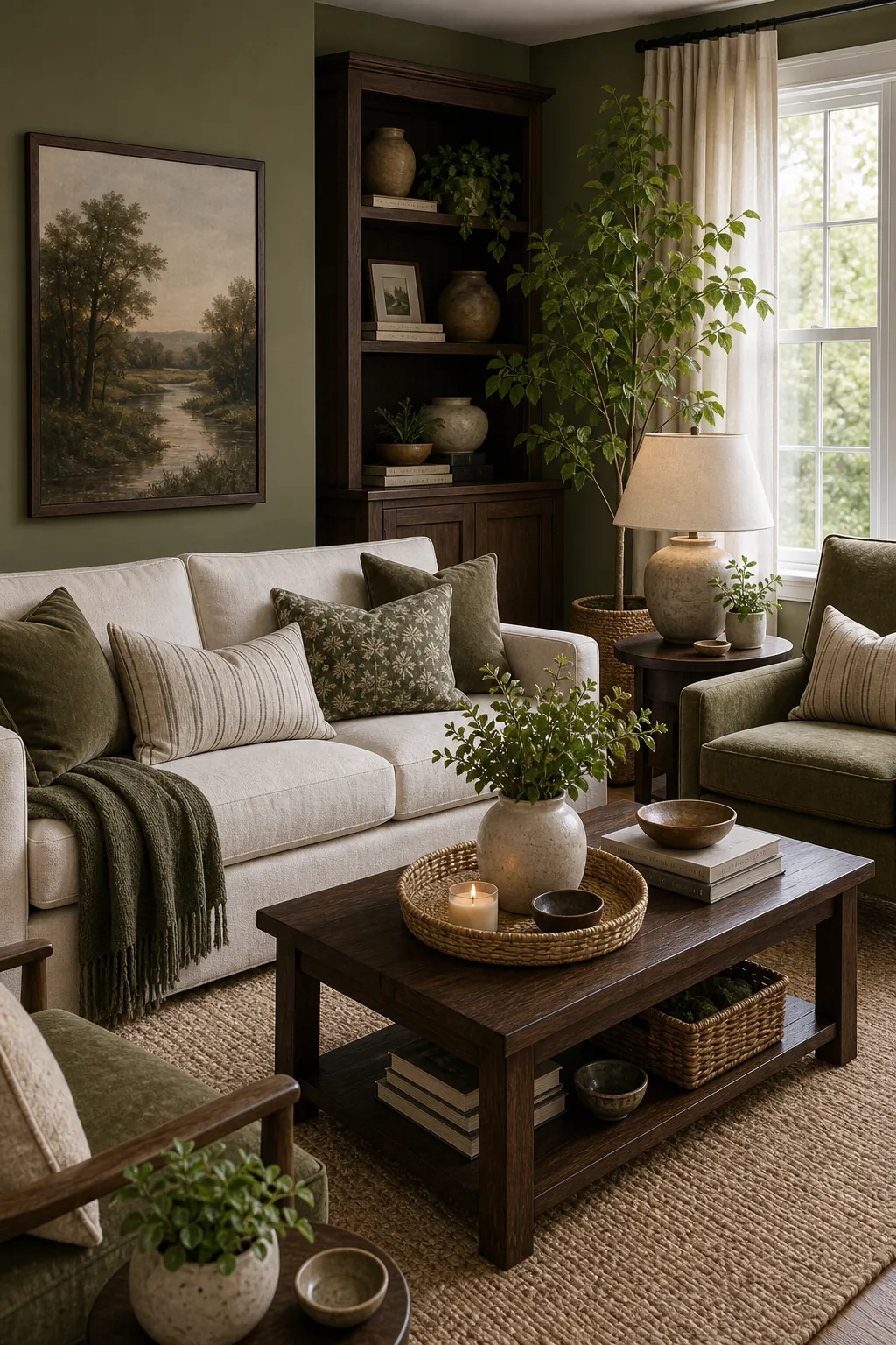
15. Warm White, Black, and Natural Wood
This high-contrast palette works when black is used as structure, not decoration everywhere.
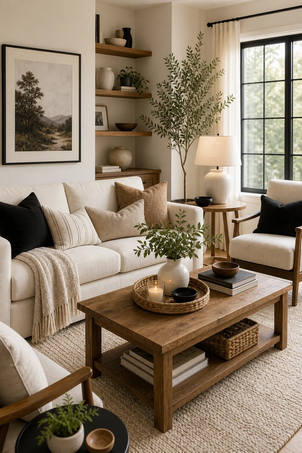
16. Charcoal, Camel, and Stone
Charcoal can feel cozy when camel and stone soften the edges.
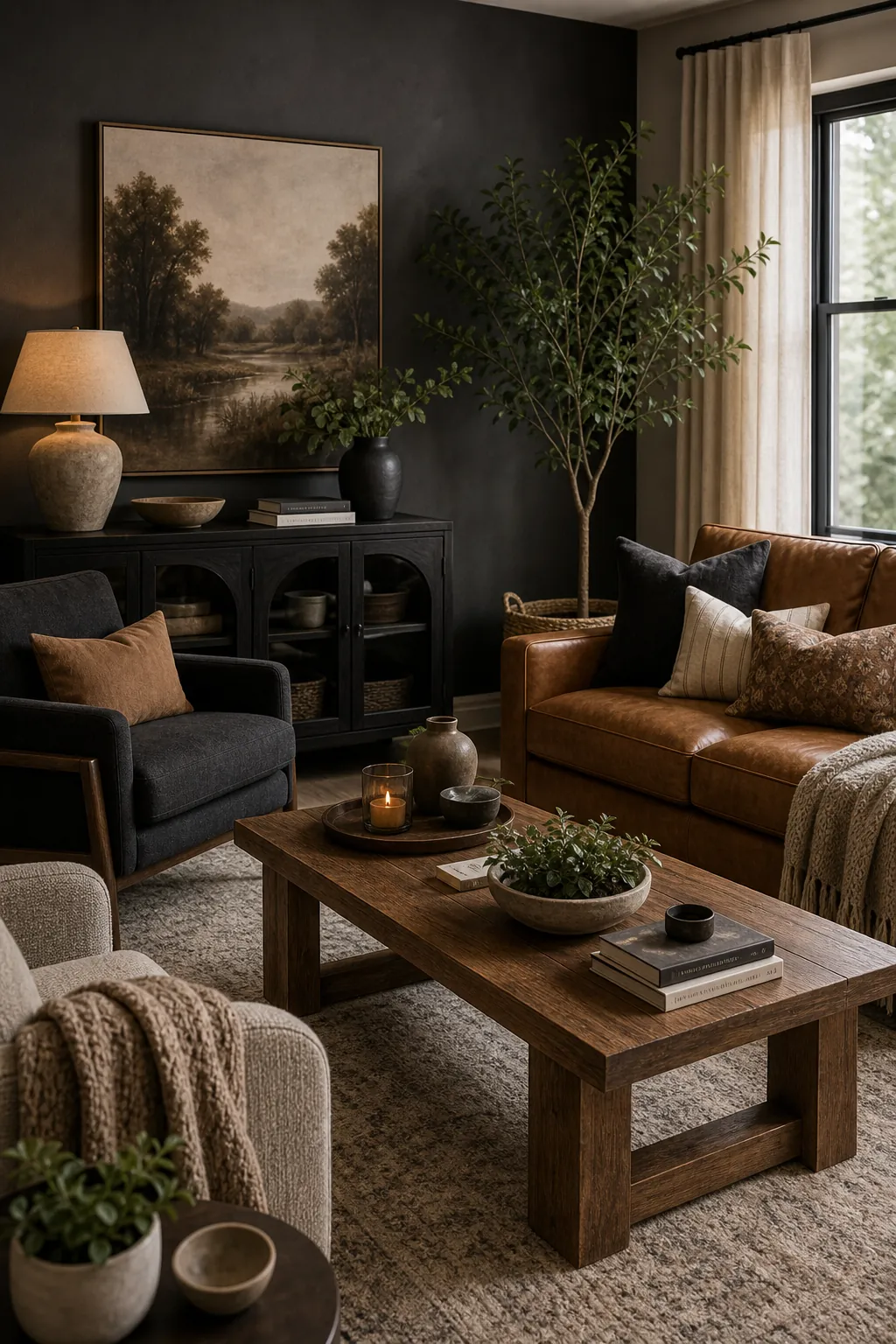
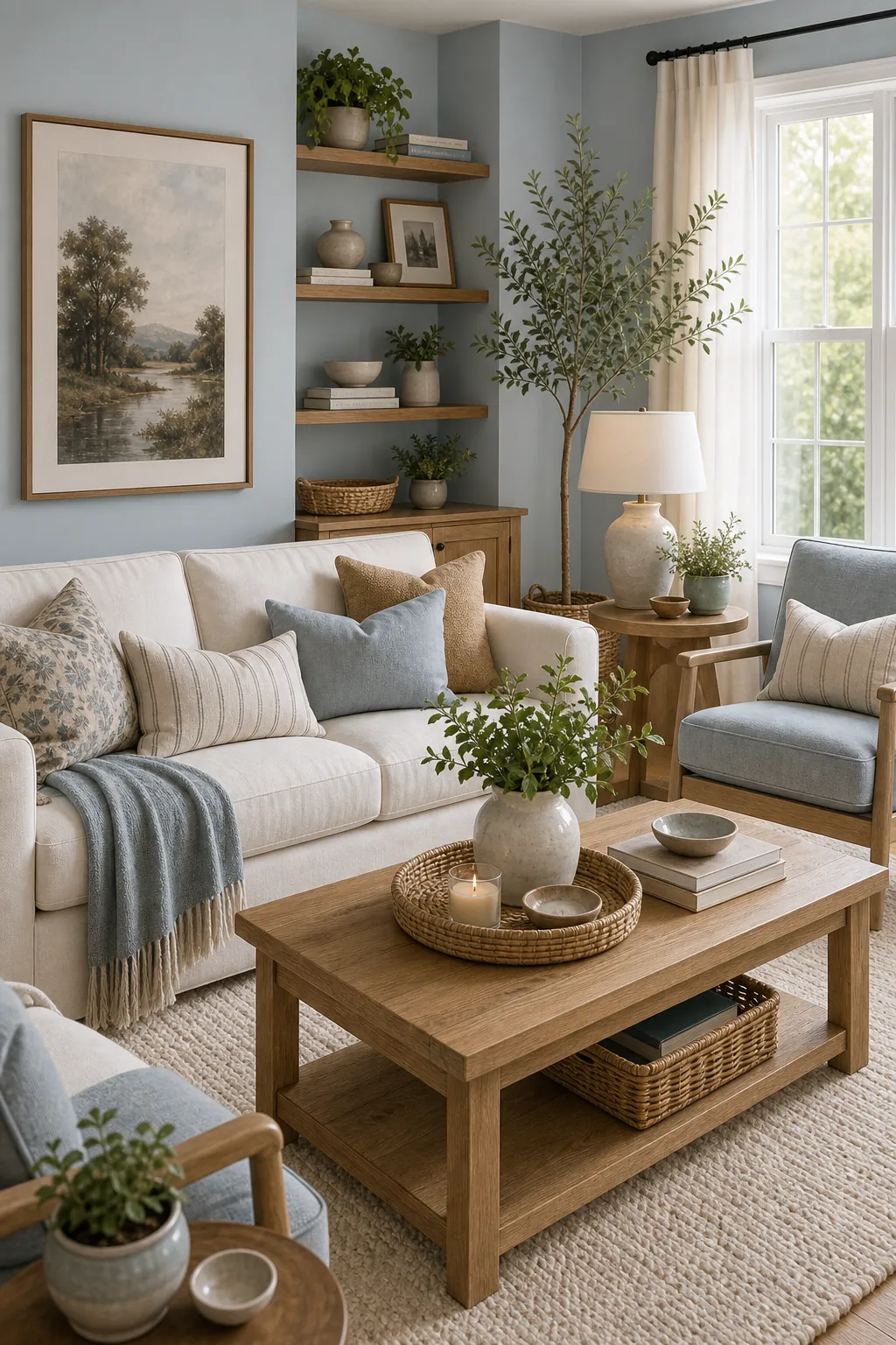
17. Pale Blue, Cream, and Oak
Pale blue adds airiness, while cream and oak keep it from feeling chilly.
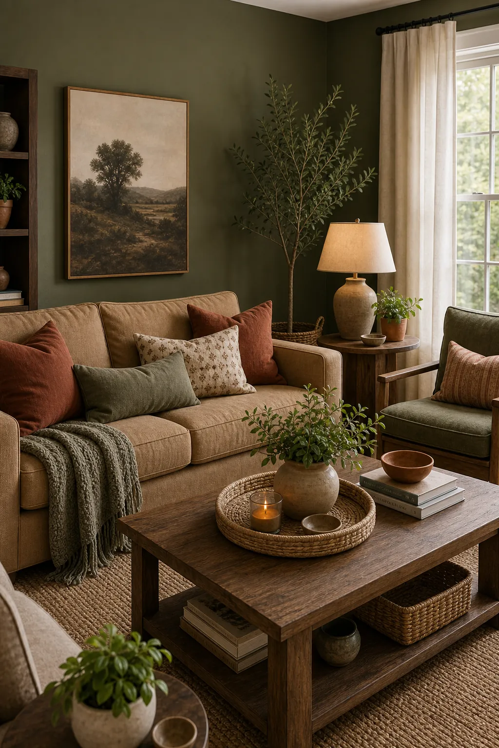
18. Earthy Green, Tan, and Rust
Earthy green and tan are steady, while rust adds a small spark.
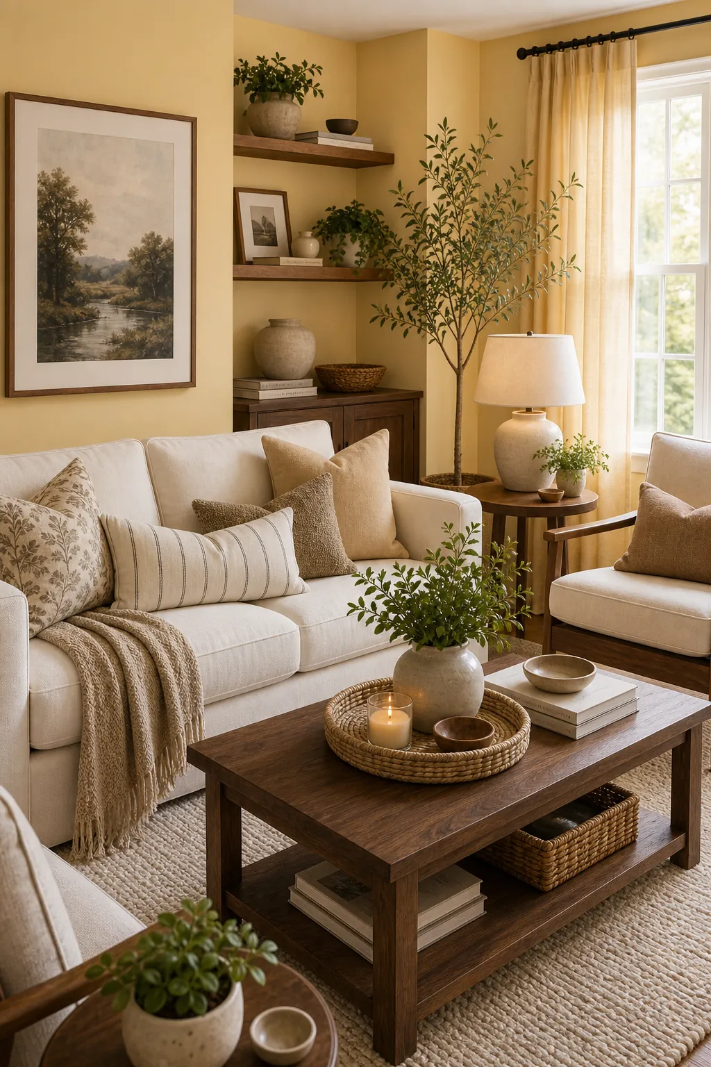
19. Soft Yellow, Ivory, and Walnut
A muted yellow can make a living room sunny without becoming childish.
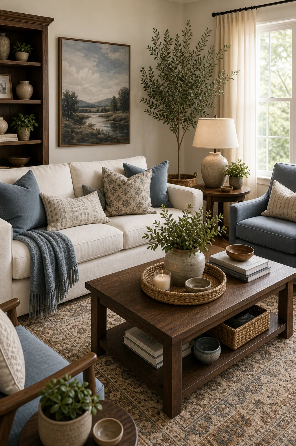
20. Brown, Cream, and Muted Blue
Muted blue cools down brown without fighting the warmth.
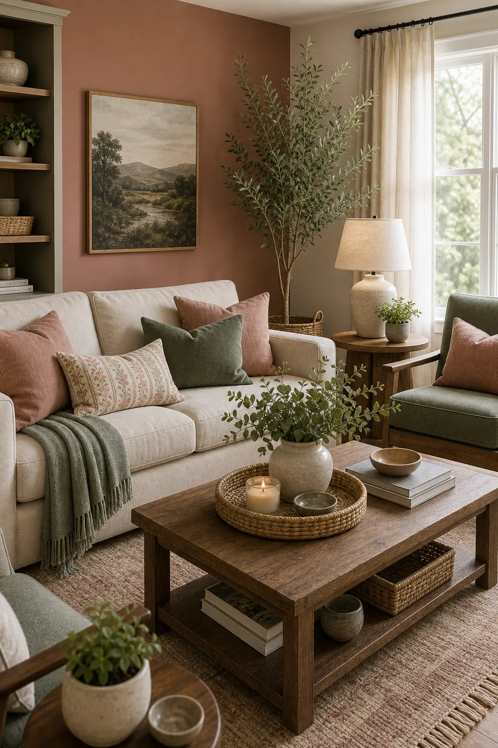
21. Clay Pink, Sage, and Oatmeal
Clay pink feels more natural when paired with sage and oatmeal textures.
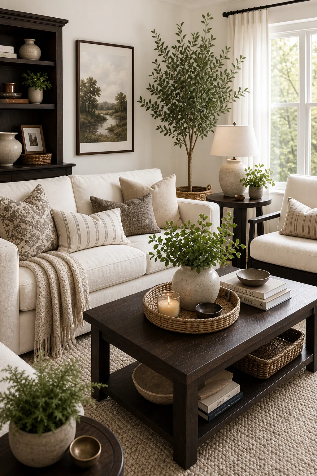
22. Espresso, Ivory, and Greenery
Espresso wood looks intentional when ivory surfaces and plants lift the palette.
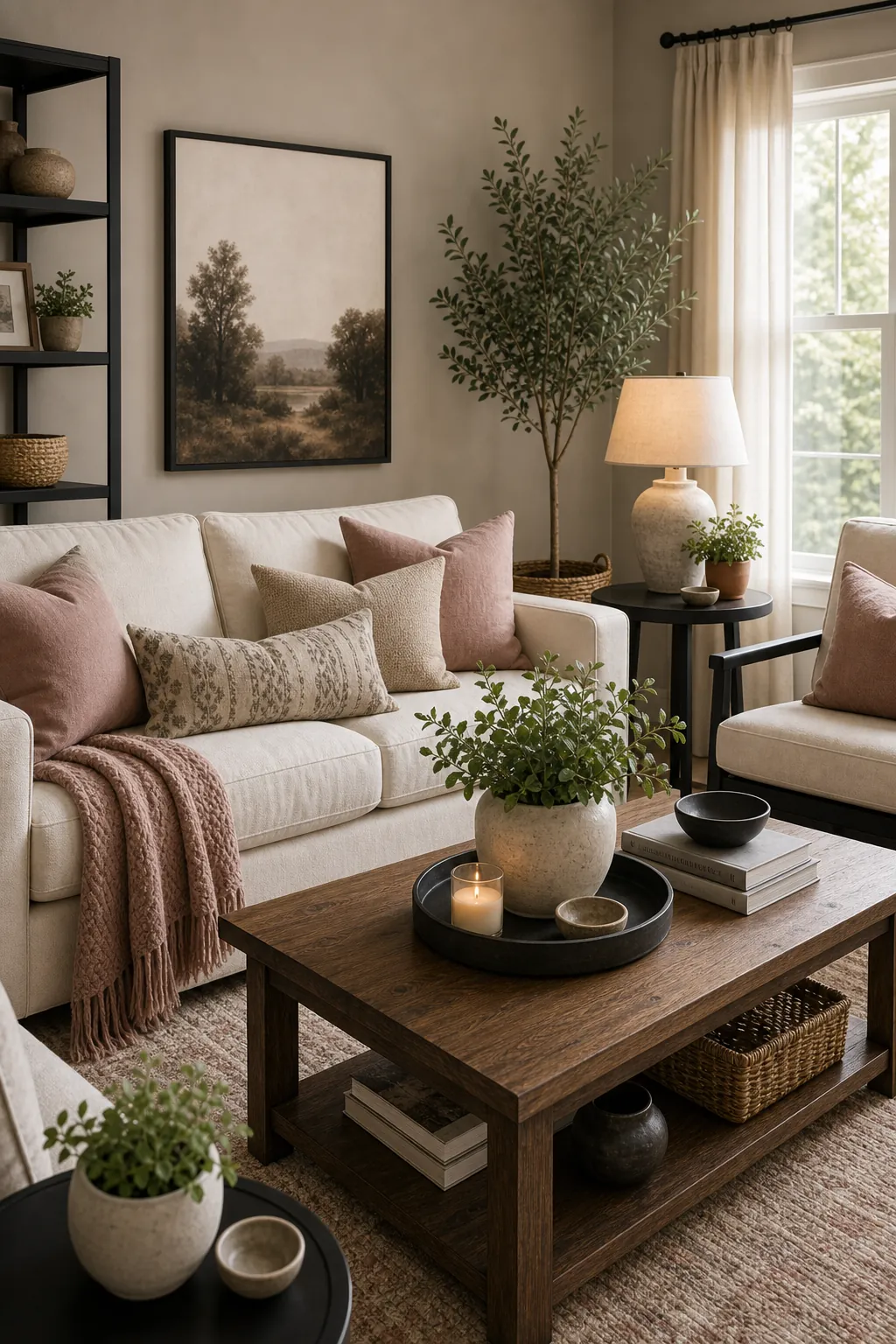
23. Greige, Dusty Rose, and Black
Dusty rose warms greige, while black prevents the palette from getting too sweet.
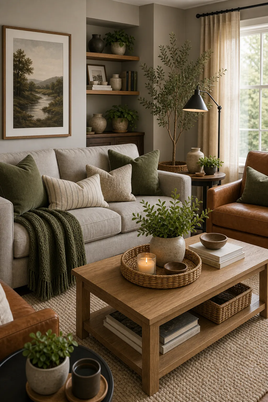
24. Warm Gray, Moss, and Leather
Warm gray is easier to love when moss green and leather add depth.
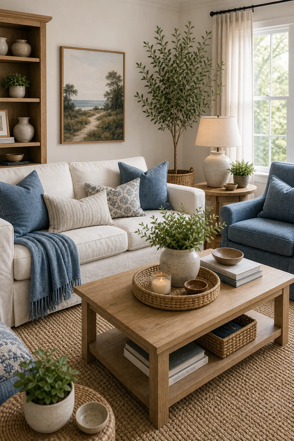
25. Cream, Denim Blue, and Natural Fibers
Denim blue is casual and forgiving, especially with cream and woven texture.
The Safest Way to Test a Living Room Color Combination
Before painting, bring the palette into the room with a pillow, throw, rug sample, or large poster board painted in the wall color. Check it in morning light, afternoon light, and lamp light. A color that looks perfect online can turn too cold, too yellow, or too dark once it meets your real flooring and furniture.
If you are stuck, borrow softness from bedroom inspirations but add more contrast for the living room. Living rooms usually need stronger structure because they hold more furniture, more people, and more visual activity.