

Choosing living room paint colors is harder than it looks because the wall color is not working alone. It is reacting to daylight, flooring, trim, the sofa, the rug, the view into the hallway, and every lamp you turn on after dinner. That is why a color that looked perfect on a phone screen can look cold, flat, muddy, or strangely yellow once it covers four walls.
The most reliable approach is not to start with the trendiest paint name. Start with the room. Look at the light, the fixed finishes, and the mood you want from the space. Then choose a living room color palette that gives every major element a job.
Start With the Light Before You Pick the Paint
Natural light changes paint more than almost anything else. A north-facing living room often turns cool whites and pale grays blue. A west-facing room can make beige look peachy in late afternoon. A shaded apartment may need more warmth than the same color would need in a bright house.
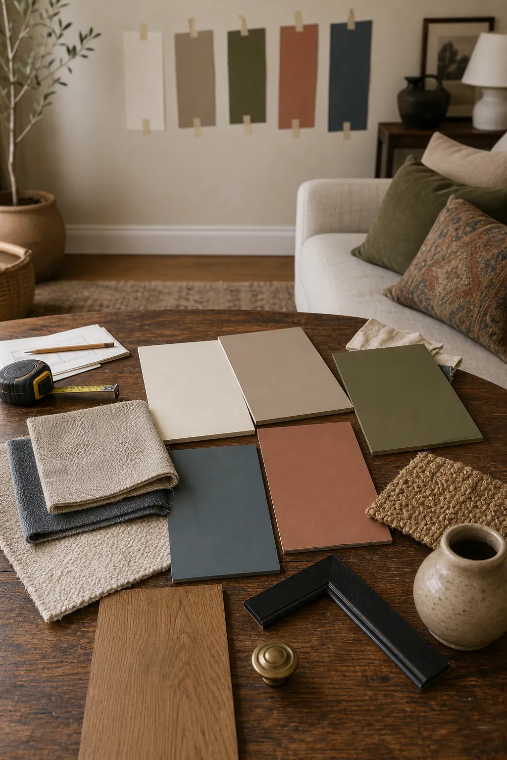
Before you commit, paint large sample boards and move them around the room. Check them beside the window, behind the sofa, near the TV wall, and under your evening lamps. A good color should still feel intentional in the worst light of the day, not only at noon.
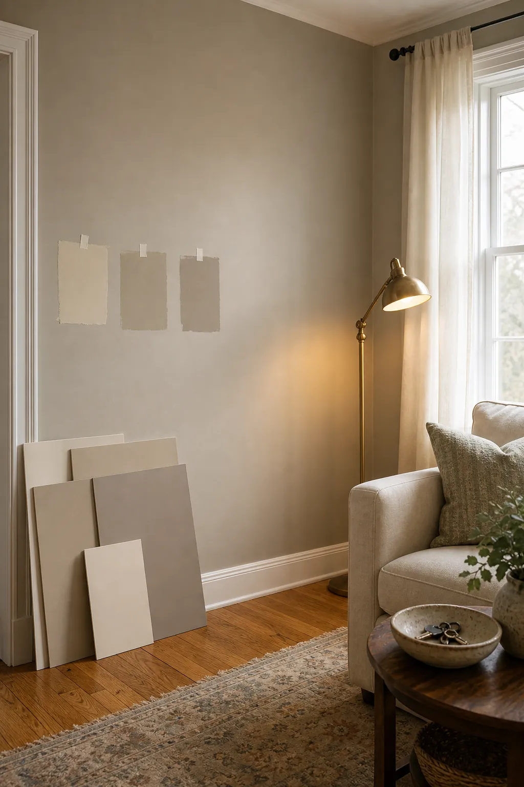
Use Warm Neutrals When the Room Feels Cold
If your living room has weak daylight, gray flooring, a gray sofa, or a lot of black electronics, a cool wall color can make the whole room feel tired. In that situation, warm living room colors usually work better: cream, mushroom, soft sand, muted taupe, pale clay, and greige with a slight yellow or red undertone.
Warm does not have to mean orange. The goal is a wall color that balances the cold parts of the room. If you want a neutral that still feels fresh, look for a shade that sits between cream, beige, and gray, then test it against your floor and sofa instead of judging it by the paint chip alone.
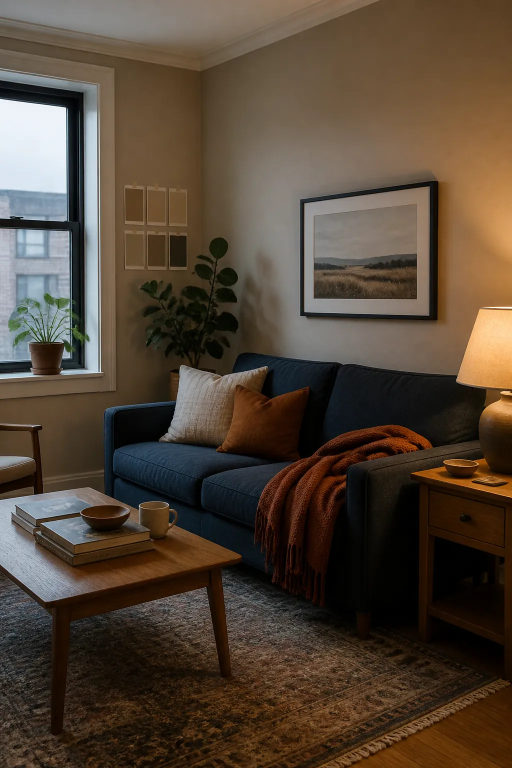
Try Muted Greens and Blues for Calm Depth
Not every living room needs a neutral wall. Muted green, blue-green, smoky blue, olive, and gray-green can be excellent paint ideas for living room spaces that need personality but still need to feel restful. These colors often look especially good with warm wood, cream upholstery, black frames, brass lamps, and plants.
The trick is to choose a version with enough gray or brown in it. A clean bright blue can feel chilly. A saturated emerald can dominate the room. A softened green-blue or olive gives the eye somewhere to land while still acting almost like a neutral.
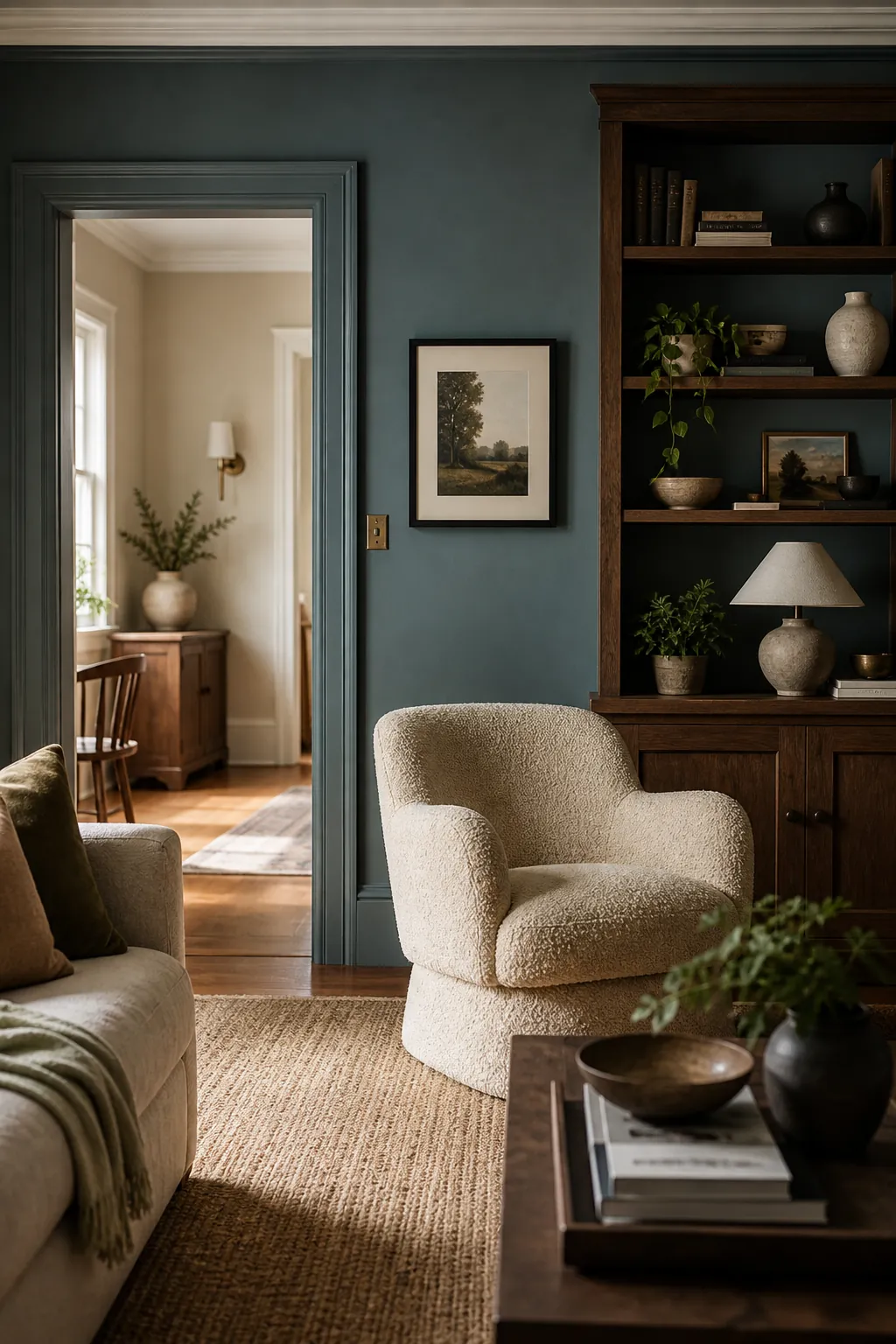
Make Dark Colors Feel Designed, Not Heavy
Deep brown, charcoal, olive, blue-green, and oxblood tones can make a living room feel cozy and expensive, especially in rooms used mostly at night. They fail when the dark wall is the only dark thing in the room. A strong color needs repetition through art, rugs, furniture legs, lamps, or trim.
If you are nervous, use the dark color on a fireplace wall, built-ins, or a media wall first. Keep the surrounding walls warm and soft, then repeat the dark shade in at least three smaller details. This makes the living room color combination feel deliberate instead of like an unfinished accent wall.
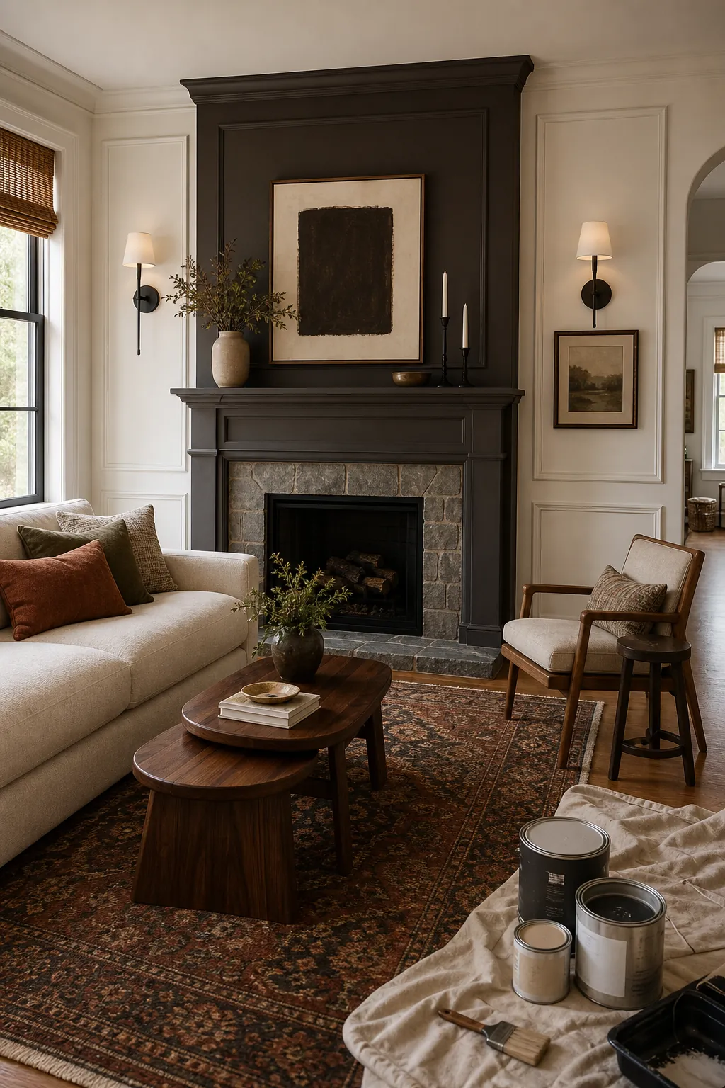
Build the Palette From What You Already Own
The best living room colour schemes usually come from fixed pieces: flooring, stone, wood tone, sofa fabric, large rugs, artwork, and adjoining rooms. Pull those materials together before choosing paint. If your oak floor is golden, your wall color needs to respect that warmth. If your sofa is cool gray, the wall may need a warmer undertone to stop the room from looking flat.
- Use the floor as an undertone clue. Yellow oak likes cream, warm greige, olive, and clay better than icy gray.
- Use the sofa as the anchor. A dark sofa may need lighter walls; a pale sofa can handle deeper paint.
- Use art and rugs for accent colors. Repeat one or two tones from them instead of inventing a separate palette.
- Use trim as the cleaner. Warm white trim can keep earthy walls from feeling muddy.
Plan the View Into the Next Room
Open layouts need more discipline than closed rooms. If your living room connects to a hallway, dining room, kitchen, or entry, stand where you can see both spaces at once. The colors do not have to match, but they should look related.
A simple formula works well: choose one main wall color for the largest connected area, one deeper or softer related shade for the secondary space, and one accent color repeated in art, pillows, or dining chairs. This keeps living room wall color ideas from fighting the rest of the home.

The Safest Test Is a Full-Day Sample
Paint a sample board at least poster size, not a tiny square on the wall. Move it around for a full day and look at it beside your sofa, rug, trim, and flooring. If the color looks good in morning light, afternoon light, and lamp light, it is probably a strong choice.
The right living room paint color should make your existing pieces look more connected. When the wall color, furniture, wood tones, and accents start helping each other, the room feels finished before you buy anything new.