
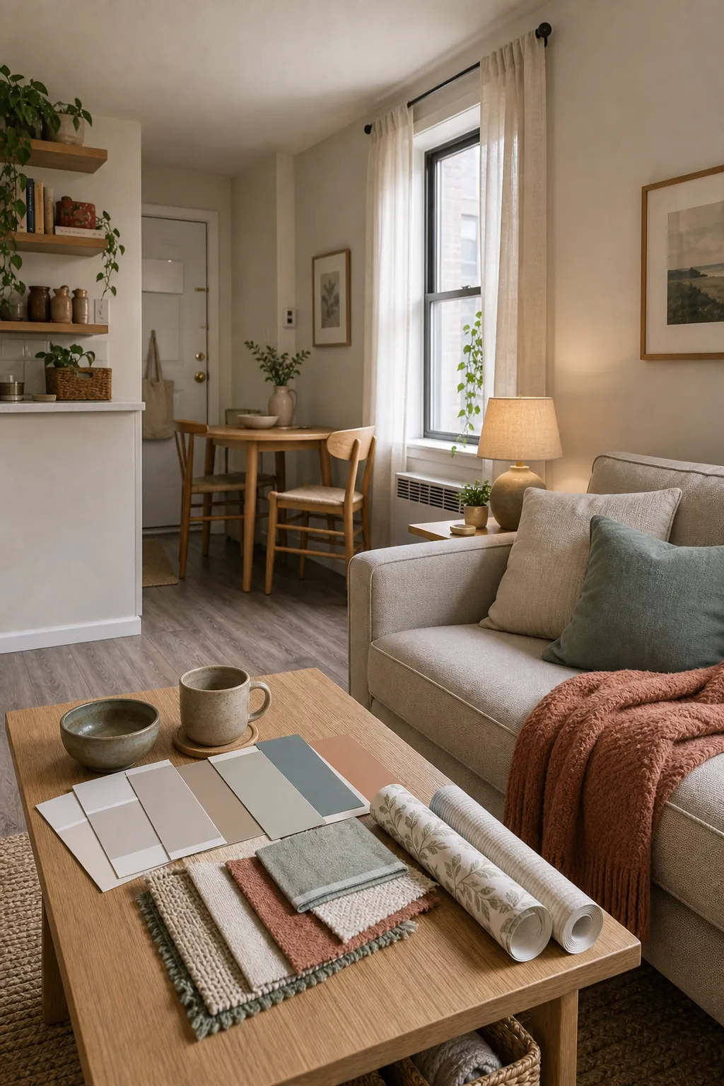
Choosing colors for a small apartment is harder than choosing colors for a house because the apartment gives you fewer chances to recover from a mistake. One wall can affect the whole room. One wrong undertone can make the floor look dingy. One strong accent can fight the sofa, the kitchen cabinets, and the only window you have.
The best small apartment colors are not chosen because they look pretty on a screen. They are chosen because they work with the apartment’s fixed finishes, its light, and the furniture you already own. A small apartment needs a palette that edits the room, not one that adds more noise.
Use this as a practical order of operations. Start with what cannot change, choose the base color, then add renter-friendly color layers that make the apartment feel personal without making it feel smaller.
Start With the Colors You Cannot Change
Before looking at paint names, look at the apartment itself. The flooring, trim, cabinets, countertop, tile, window frames, and built-in fixtures already create a color palette. In a small apartment, those fixed finishes sit close together, so they have more power than they would in a larger home.
If the floor is cool gray, a creamy yellow-white wall may look disconnected. If the cabinets are beige, a sharp blue-white may make them look old. If the trim is bright white, a muddy wall color can look tired beside it. Your first job is not to find a favorite color. It is to find a color family that makes the fixed finishes look intentional.
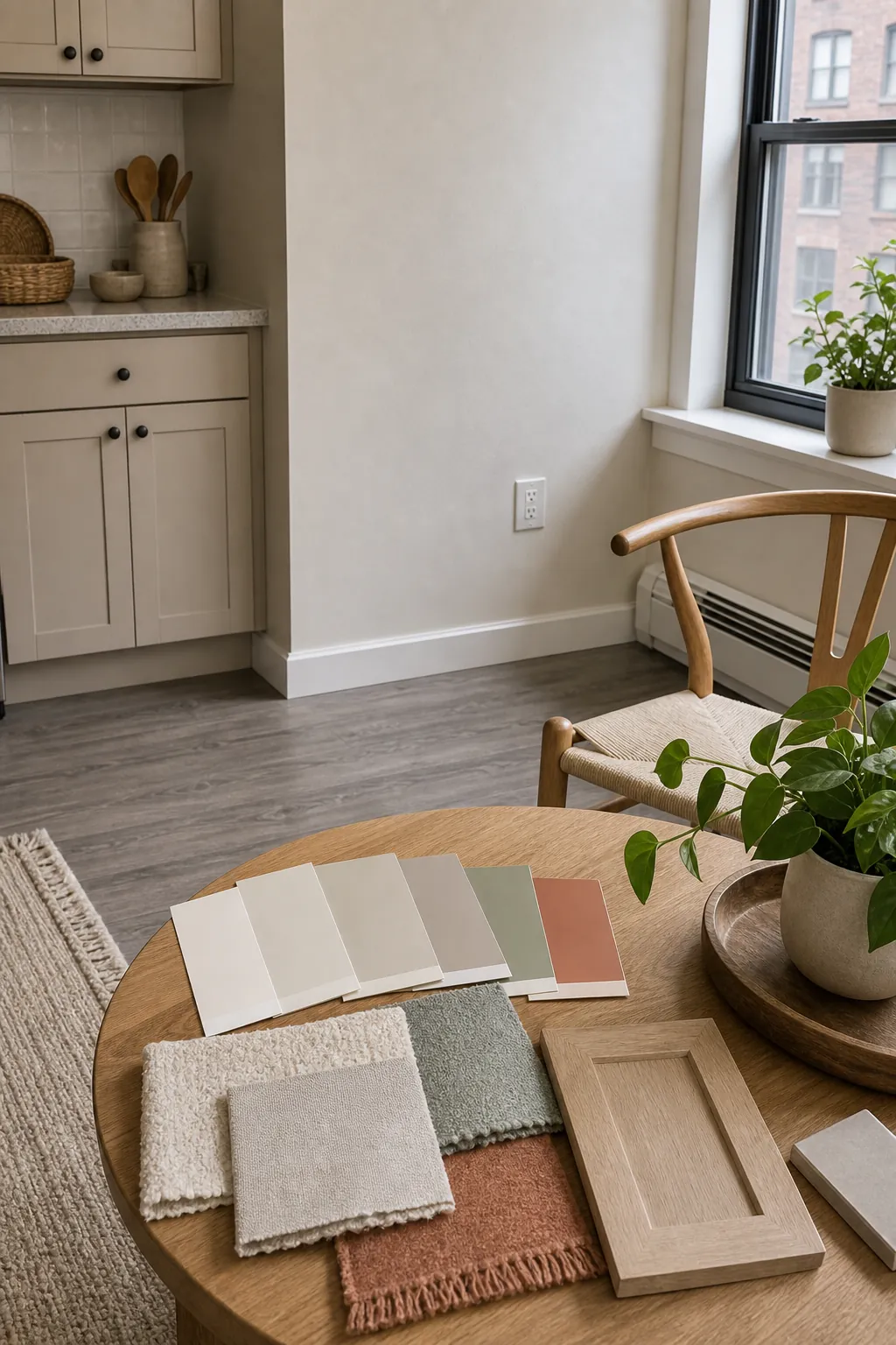
Lay samples beside the floor, cabinet, sofa, and curtains at the same time. If one sample makes three existing things look better, it is stronger than a color that looks exciting by itself.
Pick One Base Neutral for the Largest Surfaces
The largest color in a small apartment is usually not the accent pillow or the art. It is the wall plane you see from the sofa, bed, kitchen, and entry. That base color should be calm enough to repeat. For most apartments, that means warm white, soft greige, pale mushroom, light taupe, or a very quiet beige-gray.
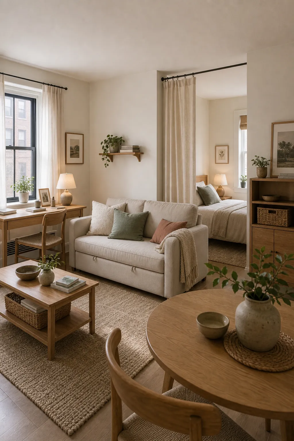
A good base neutral creates continuity. It lets a studio apartment feel like one composed space instead of a bed corner, sofa corner, desk corner, and eating corner all competing for attention. It also gives you more freedom with apartment decor, because the furniture and textiles do not have to fight the walls.
If you rent and cannot paint, treat the existing wall color as your base neutral. Build around it instead of resenting it. The right curtains, rug, lampshades, art, and bedding can make a plain rental white or beige feel deliberate.
Choose Warm or Cool by the Window Light
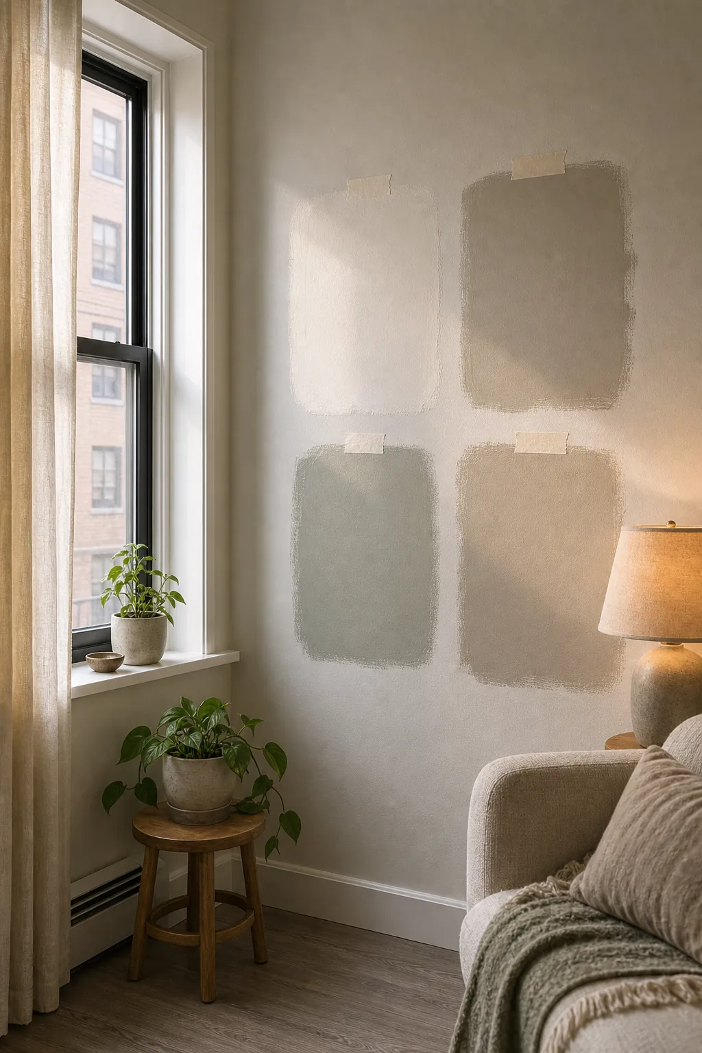
Apartment light is rarely even. One room may have north-facing light, one narrow window, a shaded courtyard, or strong afternoon sun. That light changes every wall color. A color that looks clean in a bright paint store can turn gray in a dim rental living room or too yellow under a warm bulb.
If the apartment gets cool, weak light, slightly warm neutrals usually feel better than crisp whites or cool grays. If the apartment gets strong warm sun, a balanced greige, mushroom, or pale green-gray can calm the glare. The goal is not to memorize undertones. The goal is to watch what the light does to the sample in your actual room.
Paint or tape large samples beside the window and across the room from the window. Check them in the morning, at your brightest time of day, and after sunset. If the color only works for one hour, it is not the right apartment color.
Add Color in Layers if Painting Is Limited
Many renters cannot paint, or they can paint only if they return the walls to the original color. That does not mean the apartment has to stay colorless. It means the color has to arrive through movable layers.
Renter friendly colors work best when they are repeated in soft materials: curtains, pillows, rugs, throws, art, lampshades, bedding, and removable panels. Terracotta curtains can warm up a white room. A sage pillow and a blue-gray throw can make beige walls look more intentional. A rug with two or three muted colors can organize the whole living area.
The trick is restraint. Do not bring in every color you like. Choose one main accent and one supporting accent, then repeat them. In a small apartment, repetition feels designed. Random color feels like clutter.
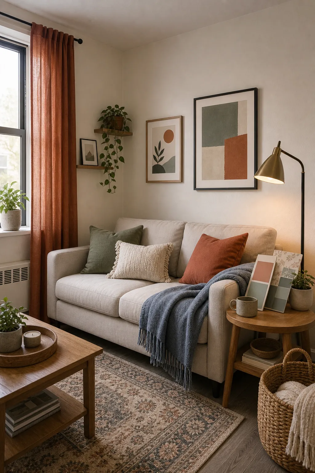
Use a Three-Layer Apartment Color Palette
A small apartment does not need a complicated palette. It usually needs three layers: a base neutral, a soft accent, and a grounding detail. The base neutral is the wall, sofa, rug, or largest background color. The soft accent adds personality. The grounding detail gives the room enough contrast.
For example, you could use warm white as the base, muted blue-gray as the soft accent, and clay or black-brown as the grounding detail. Or you could use greige as the base, sage as the soft accent, and oak or brass as the grounding detail. This kind of apartment color palette keeps the room from feeling flat without making it feel busy.
Repeat each color at least twice. If the blue-gray only appears on one pillow, it looks accidental. If it appears on a pillow, art, and a small tray, it becomes part of the room’s language.
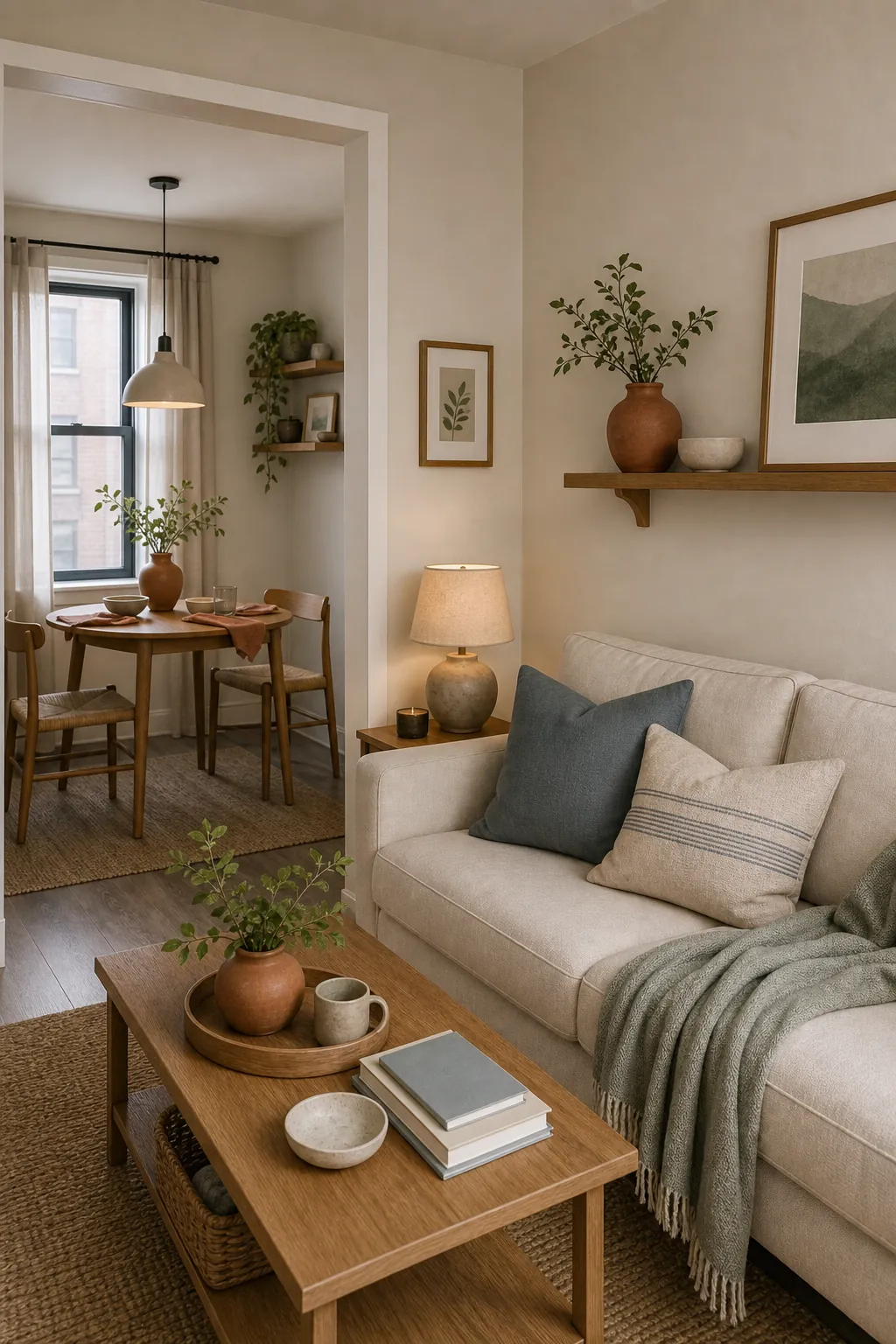
Check the Color at Night Before You Commit
Apartment colors often fail after sunset. The daylight disappears, the overhead light turns everything yellow, and the wall that looked soft at noon suddenly looks dull or dirty. This is why light colors still need testing. A pale color can go cold, green, pink, or muddy under the wrong bulbs.
Turn on the lamps you actually use. If the apartment relies on one ceiling fixture, test the color under that too. Warm bulbs can make beige and cream feel cozy, but they can also push some whites too yellow. Cool bulbs can clean up a gray room, but they can make blue and green accents feel sterile.
If a color works in daylight and under evening lamps, it is much safer. If it only works in photos, leave it in the photo.
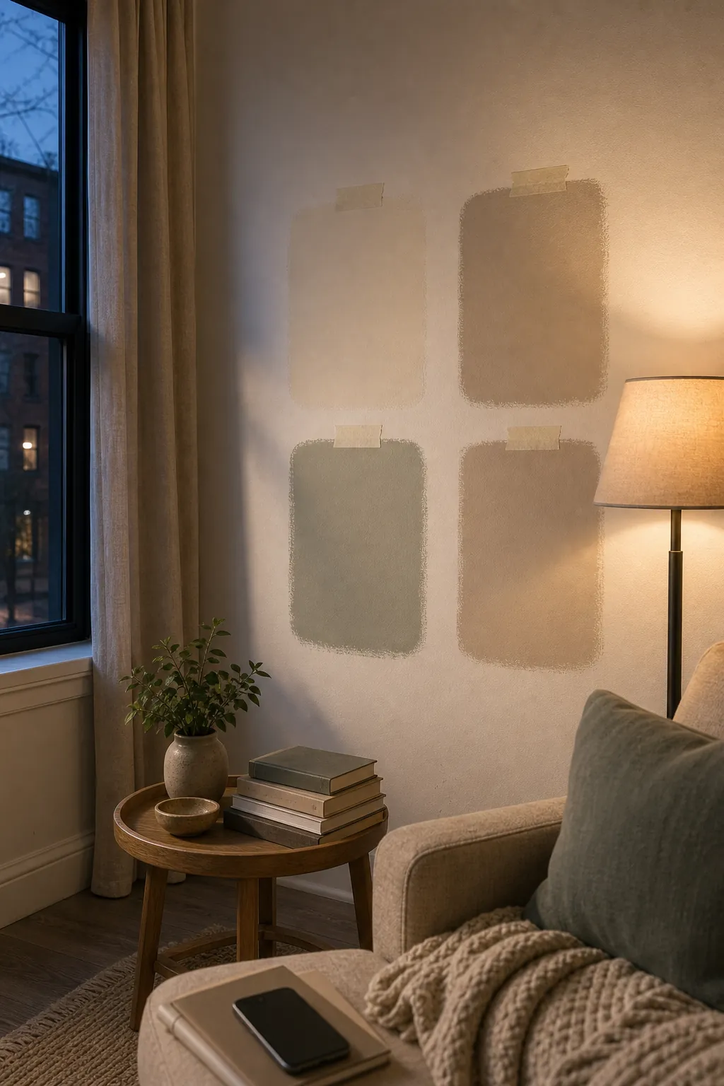
A Simple Way to Decide
When you are stuck between several color ideas, choose the one that makes the apartment easier to furnish. A good color should flatter the fixed finishes, work with your largest furniture, look acceptable in both daylight and lamplight, and give you a clear path for accents.
That is the difference between a favorite color and a useful color. A favorite color may look beautiful on a chip. A useful apartment color makes the whole space feel calmer, larger, and more connected.
Small apartments do not need timid palettes. They need disciplined palettes. Choose fewer colors, repeat them with intention, and let the apartment feel like one coherent place instead of a collection of compromises.