
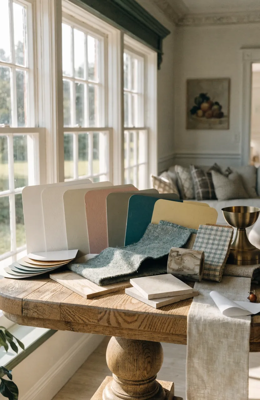
Choosing a room color combination gets confusing fast because paint never lives by itself. It has to sit beside flooring, bedding, curtains, wood tones, art, daylight, and the room next door. That is why the prettiest paint chip can look strangely cold once it is on a full wall.
The easiest way through it is to stop asking, “What color do I like?” and start asking, “What colors are already asking to be repeated here?” A good palette usually has one quiet base, one clear supporting color, and one small accent that gives the room personality without making every surface compete.
Start With The Pieces That Are Staying
The safest room color design starts with the things you are not replacing: the floor, sofa, bed frame, rug, curtains, tile, or artwork. Those fixed pieces already carry undertones. If the floor is warm oak, a cool gray wall may turn flat. If the rug has rust, blue, and cream, those colors can become your whole palette.
Pull three colors from one anchor piece: a main wall color, a softer secondary color, and a small accent. This keeps the room from feeling like every color was chosen in a separate shopping trip.
Use A Quiet Base Before Adding The Fun Color
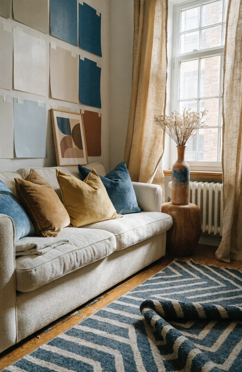
A room can be colorful without every wall being loud. Most beautiful room colour combination ideas use a calm base first: warm white, mushroom, soft greige, pale clay, or a very muted color with enough gray or brown in it to feel livable. Then the stronger color has somewhere to breathe.
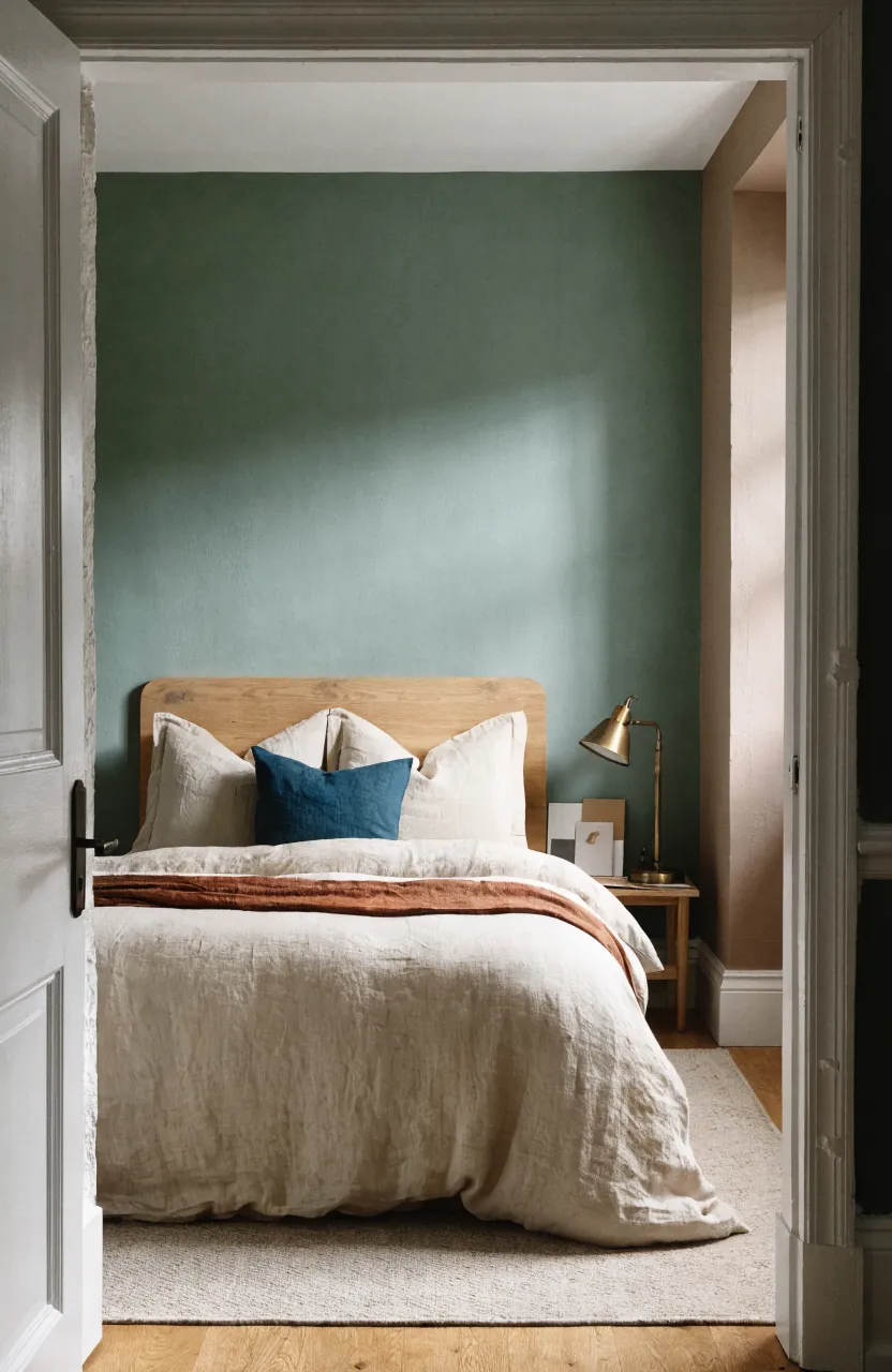
For bedrooms, this matters even more. A bedroom wall colour combination can use a deeper green, dusty blue, clay, or rose behind the bed while the other walls stay soft. The room still has color, but the bed area feels intentional instead of boxed in.
Let Open Rooms Share An Undertone
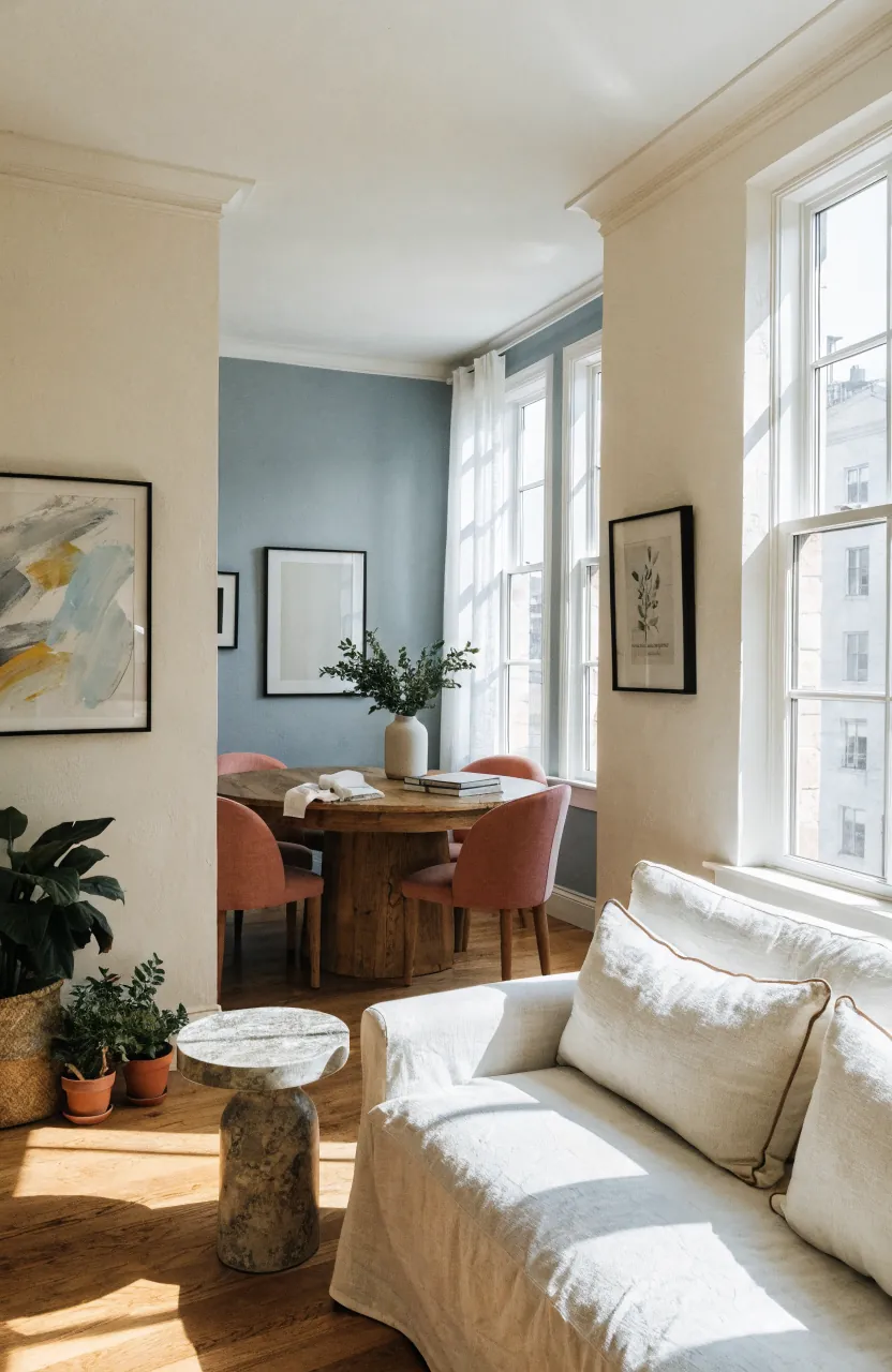
Open living rooms, dining areas, and kitchens do not have to be the same color, but they should agree with each other. The trick is to keep one connector consistent: the trim color, ceiling color, wood tone, or warm-versus-cool undertone. Then each zone can have its own mood.
If you want a color combination for home that flows, choose one neutral that appears in every visible space. Add one deeper color in the room that needs definition, then repeat that color once or twice in art, chairs, pillows, or pottery across the sight line.
Test Paint In The Actual Light
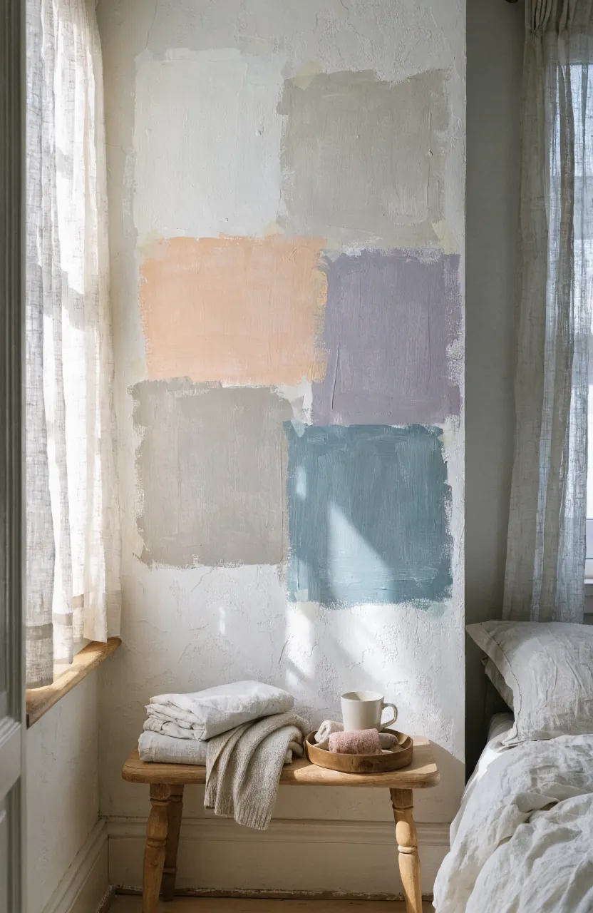
Paint changes with light. A creamy white can go yellow in a warm room. A pale blue can turn icy in a north-facing bedroom. A greige can look perfect in the store and muddy beside your flooring. That is why tiny paint chips are not enough for bedroom paint colors or full-room wall painting ideas.
Brush large samples on the wall or on movable boards. Check them in morning light, afternoon light, evening lamplight, and shade. The right color is the one that still looks good at the room’s worst hour.
Repeat Bold Colors In Small Doses
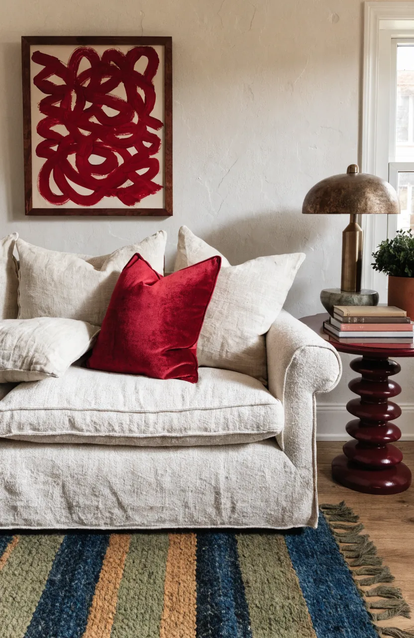
A bold color becomes easier to live with when it appears more than once but never everywhere. If you love berry, teal, saffron, coral, or emerald, try it in a pillow, artwork, vase, lampshade, or small painted piece before committing to every wall.
This is especially helpful for an aesthetic room colour combination. The room feels designed because the accent repeats, but it does not feel themed because the accent is restrained. Three small repeats are usually enough.
Do Not Forget Trim, Ceiling, And Doors
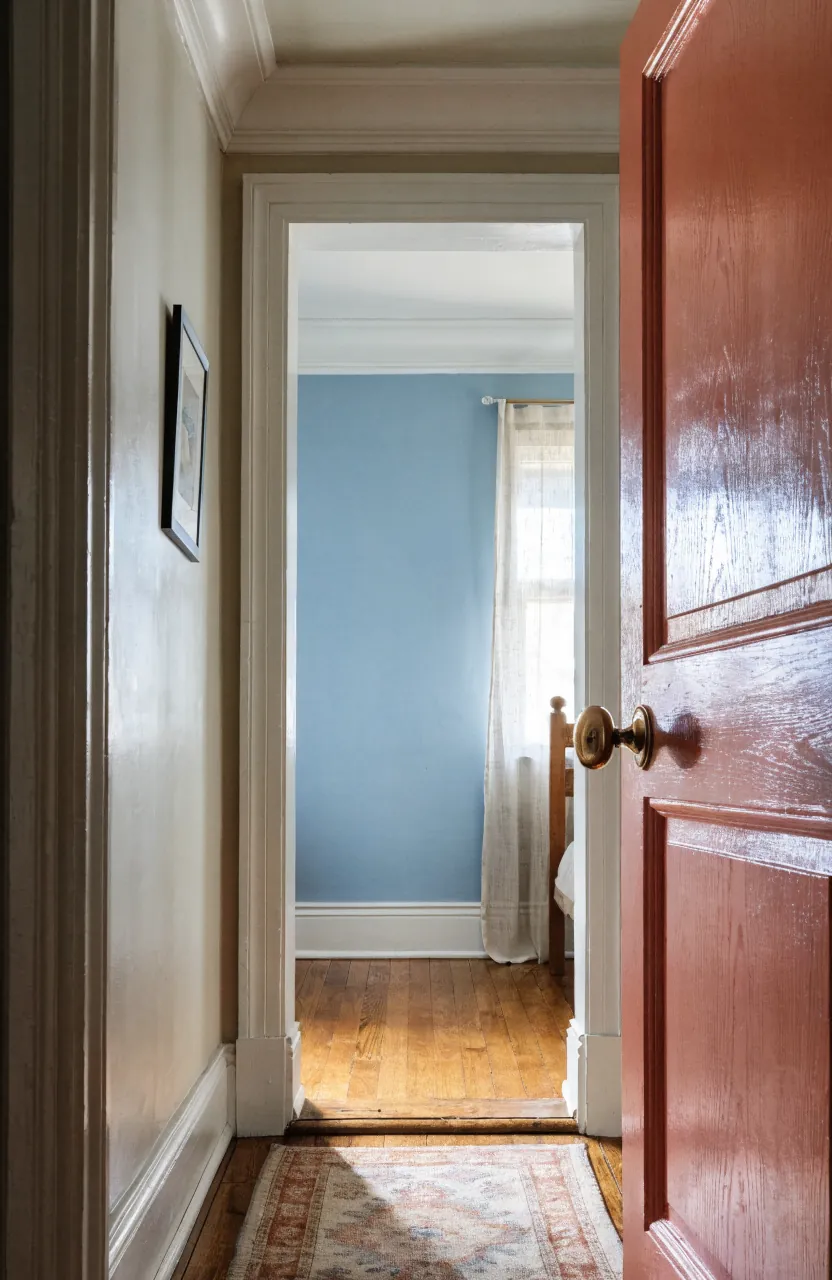
Trim and ceiling color can make or break home wall colour choices. Crisp white trim can organize several colorful rooms. A warmer off-white trim softens earthy palettes. A painted door can carry the accent color without making the wall too intense.
Before buying paint, decide whether the trim is part of the palette or a neutral frame around it. A finished room color combination includes the edges, not just the big walls.
A Simple Formula That Usually Works
When the choices feel endless, use this simple formula: one base color, one supporting color, one accent, and one repeating finish. The base might be warm white walls. The supporting color might be sage behind the bed. The accent might be rust in pillows and art. The repeating finish might be natural wood or black metal.
That formula gives you enough structure to avoid clashing, but enough freedom to make the room feel personal. Start with what is staying, test the colors in real light, and let the strongest color show up in carefully chosen moments. That is how a room color combination starts to feel less like a guess and more like a home.