
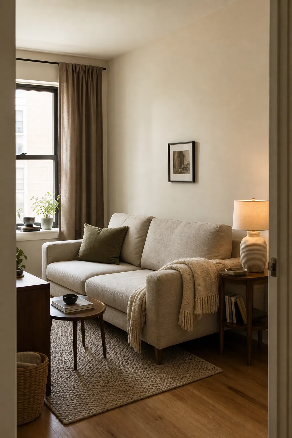
A small room does not need a stark white paint job to feel open. Beige, cream, and taupe can make tight square footage feel softer and more spacious, but only when the colors have a clear hierarchy. The problem is rarely “too much beige.” It is usually too many unrelated undertones, too little contrast, or lighting that turns a promising sample muddy after sunset.
The most reliable approach is to choose one pale neutral for the largest surface, repeat its undertone in two or three materials, and use a deeper neutral to give the eye somewhere to land. That creates depth without visually chopping up the room. The ideas below show how to build a beige color palette that feels warm, intentional, and genuinely useful in a small home.
Start With the Room’s Fixed Undertone
Before choosing interior paint, look at the things you are not replacing: flooring, tile, a large sofa, built-in cabinets, or a stone fireplace. Every one of those surfaces leans yellow, pink, orange, green, or gray. Your wall color does not have to match it exactly, but it should belong to the same undertone family.
A yellow-beige floor usually sits comfortably beside warm cream. A pink-beige carpet often works better with a rosy taupe than a green-gray one. If the fixed finishes are mixed, use the largest or most visually dominant surface as the deciding vote. Matching undertone matters more than matching the paint name on the label.
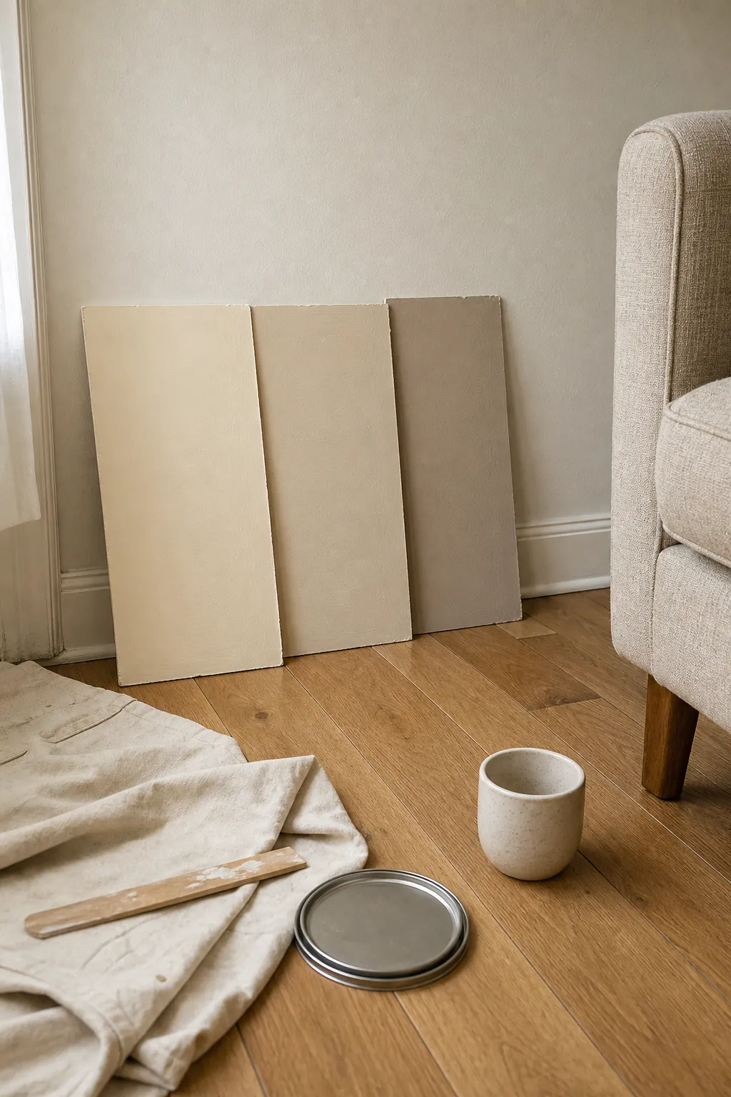
Place large sample boards vertically against the wall and beside the floor or upholstery. Tiny swatches hide undertone shifts. Move the boards around the room and check them in morning light, afternoon shade, and with the lamps you actually use.
Use Cream Where You Want Light to Travel
Cream is especially useful in a small room with one modest window because it reflects light without the hard, bluish feeling some whites create. Use it across connected planes—the main walls, a shallow alcove, or a low ceiling—so the eye does not stop at high-contrast boundaries.
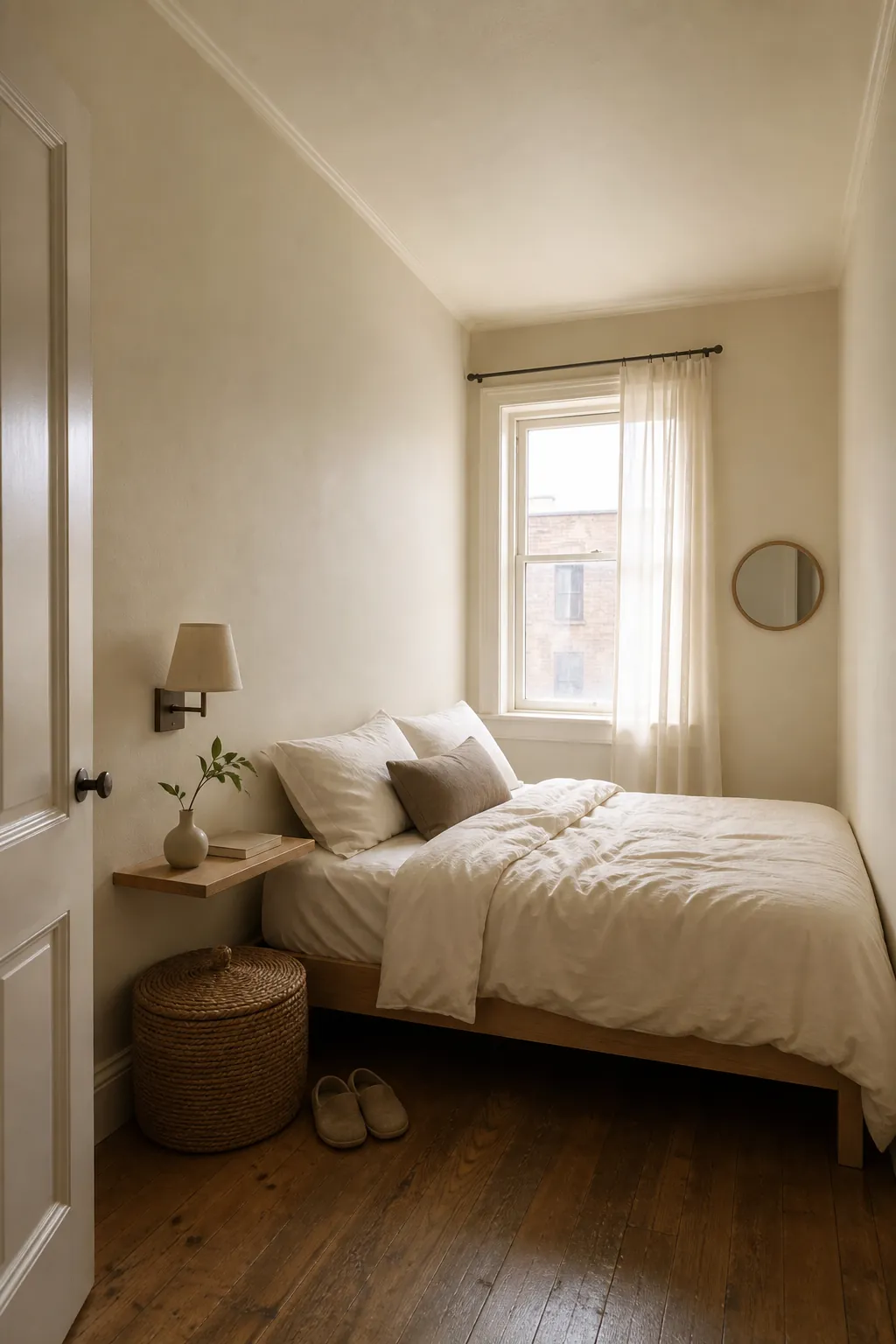
Keep the trim only slightly lighter than the walls if the room has many doors or short wall sections. Bright white outlines every edge and can make the architecture feel busier. A soft ivory trim creates enough definition while preserving flow. For a low ceiling, using the same cream overhead can make the transition feel quieter and less boxed in.
Let Beige Carry the Main Furniture
Beige works well on the largest upholstered piece because it provides a calm middle value between pale walls and darker accents. In a compact living room, a beige sofa can visually recede, but it still needs separation from the wall. Choose upholstery that is a few shades deeper, lighter, or more textured than the paint behind it.
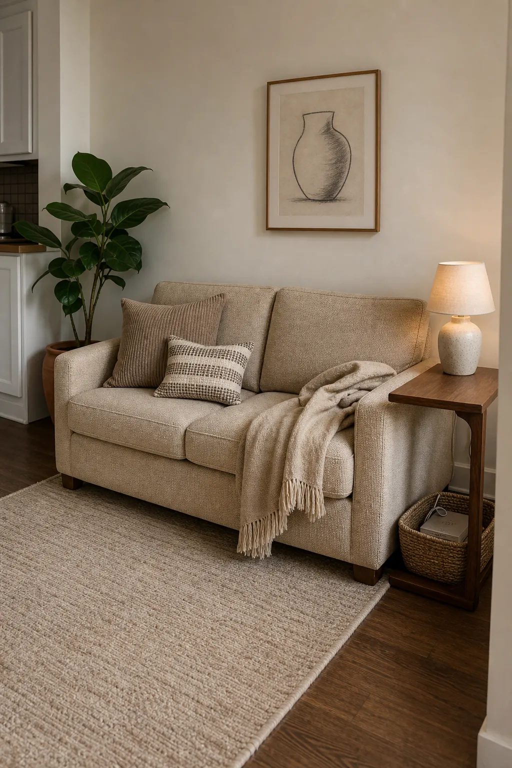
A flat room needs material contrast more than extra furniture. Mix a nubby linen-look sofa, a tightly woven rug, a ribbed ceramic lamp, and one smooth wood surface. These changes register as depth while keeping the neutral color palette cohesive. Texture is what prevents cream decor from looking like an unfinished rental.
Anchor the Room With Taupe
Taupe is the useful bridge between beige, brown, and gray. In small room colors, it is most effective as an anchor rather than an equal partner on every surface. A taupe curtain, compact cabinet, upholstered headboard, or reading chair gives the pale palette weight and helps define a focal zone.
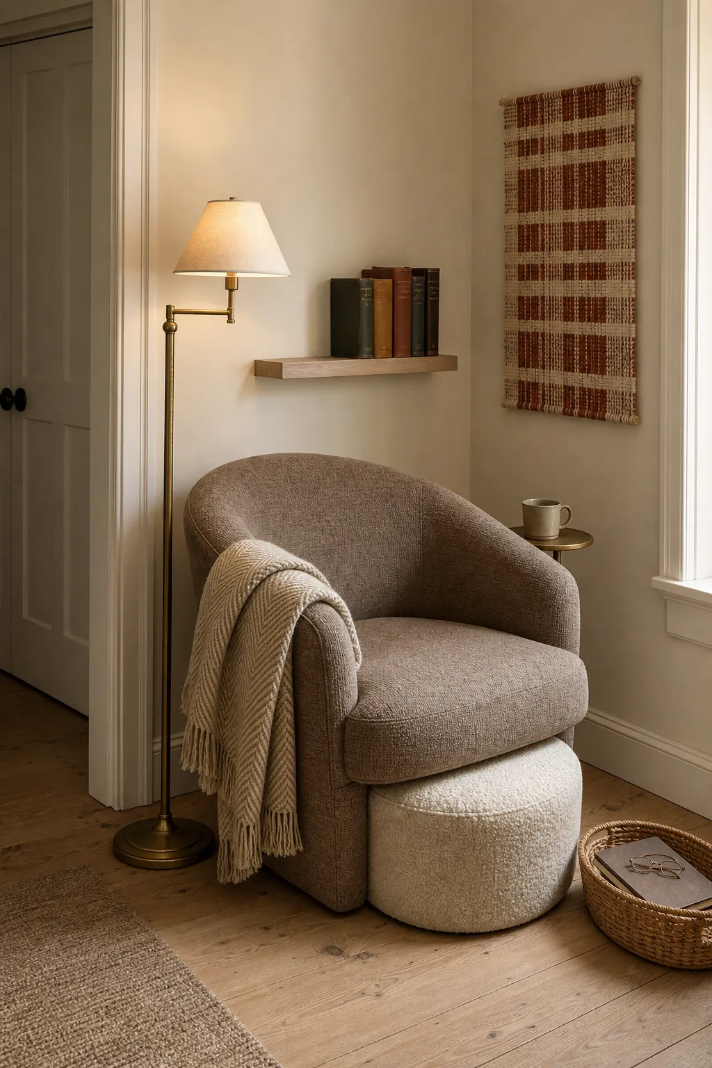
If the room receives cool northern light, avoid a taupe that reads strongly violet or steely gray. A mushroom or putty taupe with a subtle brown base will feel steadier beside warm neutrals. In a bright south-facing room, a slightly grayer taupe can balance the golden light without making the scheme cold.
Build Contrast Without Shrinking the Space
Small space decor still needs contrast. Without it, the boundaries blur into a beige haze and the room can look flatter, not larger. Keep darker notes narrow and repeated: a walnut frame, an aged bronze lamp, a dark brown cushion stripe, and the legs of a side table. Repetition makes these accents look planned rather than heavy.
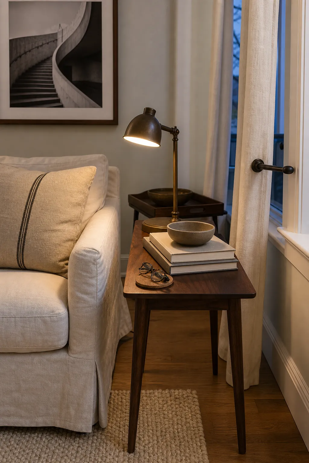
Try an approximate 70–20–10 balance: about 70 percent pale cream or light beige, 20 percent mid-tone beige or taupe, and 10 percent dark brown, muted color, or metal. It is not a rigid formula; it is a quick way to notice when every surface has landed at the same middle value.
Add One Muted Color for Personality
A neutral room does not have to be colorless. Dusty blue, olive, rust, muted terracotta, and burgundy all work with warm neutrals when their saturation stays low. Choose one accent based on something already in the room—an art print, a vintage textile, a book cover, or a plant—and repeat it only two or three times.
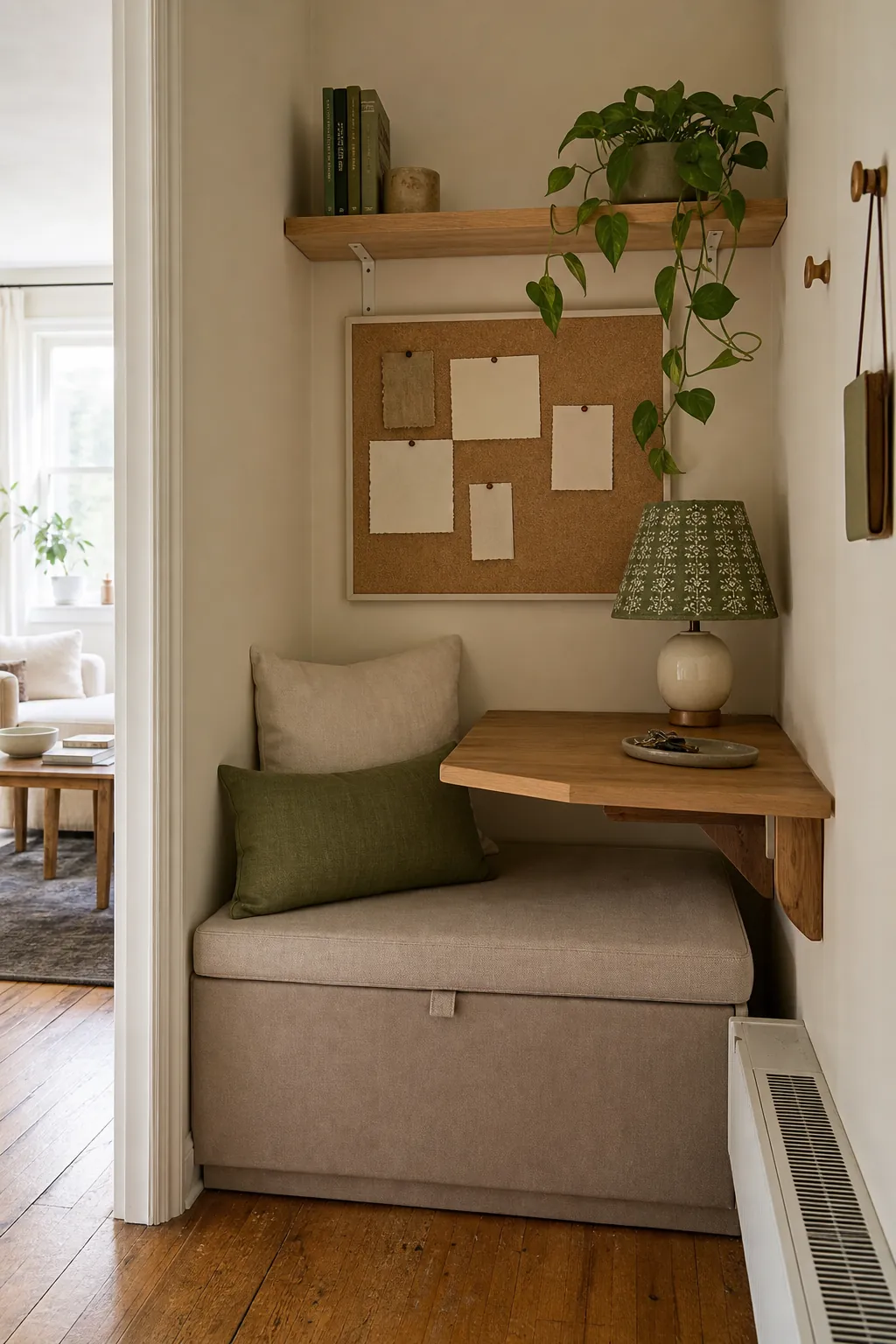
For renters, this can be as simple as an olive lumbar pillow, a small block-print shade, and green book spines. The accent does not need to dominate. Its job is to interrupt the neutral field and make the room feel collected. Avoid scattering five unrelated accent colors across tiny objects; that creates visual noise faster in limited square footage.
Test the Palette After Sunset
Warm neutrals are unusually sensitive to light bulbs. A very amber bulb can turn cream yellow and make taupe look brown, while a cool bulb can drain the warmth and expose green or violet undertones. Test your sample boards with every lamp switched on, not just in daylight.
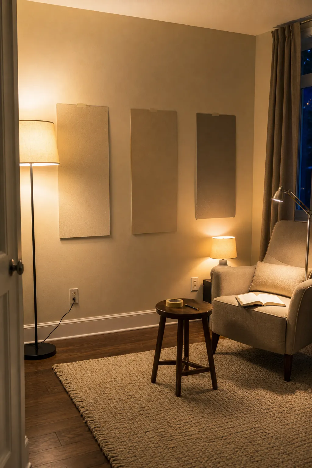
For most cozy lighting schemes, bulbs around 2700K to 3000K provide warmth without pushing the room into orange. Use more than one light source at different heights: a floor lamp that washes the wall, a shaded table lamp for a soft pool of light, and a focused reading light where needed. Good lighting should reveal the layers in the palette, not tint all of them the same color.
Choose a Simple Palette You Can Repeat
The easiest small-room palette to live with is one you can describe in a sentence: warm cream walls, oatmeal beige upholstery, mushroom taupe curtains, walnut accents, and a little muted olive. That sentence becomes a filter for every purchase. If an item is the wrong undertone or introduces a new finish with no relationship to the rest, it stays out.
Start with the fixed surfaces, make the palest neutral continuous, and reserve taupe and dark accents for structure. Then judge everything under real daylight and your actual lamps. A small room feels calm and open when its colors cooperate; it feels cramped when every undertone competes for attention.